
Search results for "Start accomplishing" in Home Design Ideas
 Glenview Haus – Custom Doors & Wine Cellars
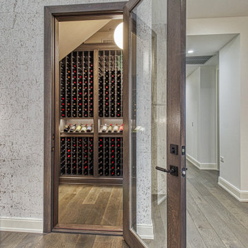
Underutilized space? A keen eye for design and a healthy passion (or obsession) for wine? It’s not every day that you see a luxury wine cellar in a luxe high-rise apartment building. Space is typically limited, and there is not room for expansion. Our client decided to transform space under his sweeping staircase to a clean and modern wine cellar. The Glenview Haus team devised a plan to provide our client with the full package! A temperature-controlled, modern wine cellar, complete with an insulated modern oak door.
Flexibility is one of our many strong suits as designers. We can adapt to any space and/or limitation. When our customer approached us with the idea of creating a modern wine cellar in this space, we jumped on the opportunity to measure and confirm this area could withhold his extensive wine collection. Once we determined our state-of-the-art cooling system would be compatible with this amount of square footage, we happily moved forward and provided all design details and guided this project from start to finish. From the inside out, we were able to provide our expertise on how to accomplish a timeless entity, with a modern twist.
This custom oak wine cellar was built to achieve a luxe design element in a chic downtown loft-style apartment. Adorned with a modern clear insulated glass door, guests are prompted to view the immaculate collection that our customer has to offer. Our goal in this project was to bring a sense cohesiveness to this new design element in our client’s home. We wanted to make sure that this space looked as though it has always been there! The first glimpse at the wine cellar is complemented with a custom oak wood modern door. This is the first impression that you are greeted by, and it does not disappoint. As you walk through the modern door, you enter a matching oak wood masterpiece that boasts several different design elements. Our custom wine racks display bottles in different directions, showing off each element of a wine bottle. Top-down, tilted back, or layered on top of each other in a diagonal cut out, regardless of how your wine is displayed, it is guaranteed to ‘wow’ in our custom oak cellar!
 Glenview Haus – Custom Doors & Wine Cellars
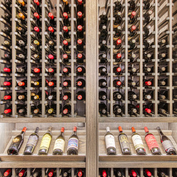
Underutilized space? A keen eye for design and a healthy passion (or obsession) for wine? It’s not every day that you see a luxury wine cellar in a luxe high-rise apartment building. Space is typically limited, and there is not room for expansion. Our client decided to transform space under his sweeping staircase to a clean and modern wine cellar. The Glenview Haus team devised a plan to provide our client with the full package! A temperature-controlled, modern wine cellar, complete with an insulated modern oak door.
Flexibility is one of our many strong suits as designers. We can adapt to any space and/or limitation. When our customer approached us with the idea of creating a modern wine cellar in this space, we jumped on the opportunity to measure and confirm this area could withhold his extensive wine collection. Once we determined our state-of-the-art cooling system would be compatible with this amount of square footage, we happily moved forward and provided all design details and guided this project from start to finish. From the inside out, we were able to provide our expertise on how to accomplish a timeless entity, with a modern twist.
This custom oak wine cellar was built to achieve a luxe design element in a chic downtown loft-style apartment. Adorned with a modern clear insulated glass door, guests are prompted to view the immaculate collection that our customer has to offer. Our goal in this project was to bring a sense cohesiveness to this new design element in our client’s home. We wanted to make sure that this space looked as though it has always been there! The first glimpse at the wine cellar is complemented with a custom oak wood modern door. This is the first impression that you are greeted by, and it does not disappoint. As you walk through the modern door, you enter a matching oak wood masterpiece that boasts several different design elements. Our custom wine racks display bottles in different directions, showing off each element of a wine bottle. Top-down, tilted back, or layered on top of each other in a diagonal cut out, regardless of how your wine is displayed, it is guaranteed to ‘wow’ in our custom oak cellar!
 Glenview Haus – Custom Doors & Wine Cellars
Underutilized space? A keen eye for design and a healthy passion (or obsession) for wine? It’s not every day that you see a luxury wine cellar in a luxe high-rise apartment building. Space is typically limited, and there is not room for expansion. Our client decided to transform space under his sweeping staircase to a clean and modern wine cellar. The Glenview Haus team devised a plan to provide our client with the full package! A temperature-controlled, modern wine cellar, complete with an insulated modern oak door.
Flexibility is one of our many strong suits as designers. We can adapt to any space and/or limitation. When our customer approached us with the idea of creating a modern wine cellar in this space, we jumped on the opportunity to measure and confirm this area could withhold his extensive wine collection. Once we determined our state-of-the-art cooling system would be compatible with this amount of square footage, we happily moved forward and provided all design details and guided this project from start to finish. From the inside out, we were able to provide our expertise on how to accomplish a timeless entity, with a modern twist.
This custom oak wine cellar was built to achieve a luxe design element in a chic downtown loft-style apartment. Adorned with a modern clear insulated glass door, guests are prompted to view the immaculate collection that our customer has to offer. Our goal in this project was to bring a sense cohesiveness to this new design element in our client’s home. We wanted to make sure that this space looked as though it has always been there! The first glimpse at the wine cellar is complemented with a custom oak wood modern door. This is the first impression that you are greeted by, and it does not disappoint. As you walk through the modern door, you enter a matching oak wood masterpiece that boasts several different design elements. Our custom wine racks display bottles in different directions, showing off each element of a wine bottle. Top-down, tilted back, or layered on top of each other in a diagonal cut out, regardless of how your wine is displayed, it is guaranteed to ‘wow’ in our custom oak cellar!
Find the right local pro for your project
 Glenview Haus – Custom Doors & Wine Cellars
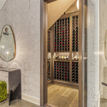
Underutilized space? A keen eye for design and a healthy passion (or obsession) for wine? It’s not every day that you see a luxury wine cellar in a luxe high-rise apartment building. Space is typically limited, and there is not room for expansion. Our client decided to transform space under his sweeping staircase to a clean and modern wine cellar. The Glenview Haus team devised a plan to provide our client with the full package! A temperature-controlled, modern wine cellar, complete with an insulated modern oak door.
Flexibility is one of our many strong suits as designers. We can adapt to any space and/or limitation. When our customer approached us with the idea of creating a modern wine cellar in this space, we jumped on the opportunity to measure and confirm this area could withhold his extensive wine collection. Once we determined our state-of-the-art cooling system would be compatible with this amount of square footage, we happily moved forward and provided all design details and guided this project from start to finish. From the inside out, we were able to provide our expertise on how to accomplish a timeless entity, with a modern twist.
This custom oak wine cellar was built to achieve a luxe design element in a chic downtown loft-style apartment. Adorned with a modern clear insulated glass door, guests are prompted to view the immaculate collection that our customer has to offer. Our goal in this project was to bring a sense cohesiveness to this new design element in our client’s home. We wanted to make sure that this space looked as though it has always been there! The first glimpse at the wine cellar is complemented with a custom oak wood modern door. This is the first impression that you are greeted by, and it does not disappoint. As you walk through the modern door, you enter a matching oak wood masterpiece that boasts several different design elements. Our custom wine racks display bottles in different directions, showing off each element of a wine bottle. Top-down, tilted back, or layered on top of each other in a diagonal cut out, regardless of how your wine is displayed, it is guaranteed to ‘wow’ in our custom oak cellar!


 Greensward LLC
Andrew Cutright
Inspiration for a small traditional full sun backyard concrete paver water fountain landscape in DC Metro.
Inspiration for a small traditional full sun backyard concrete paver water fountain landscape in DC Metro.

 Plaistow Cabinet
Shiloh Cabinetry. Polar White, Inset
Kitchen - transitional kitchen idea in Manchester with white cabinets, beaded inset cabinets, marble countertops, white backsplash, marble backsplash and stainless steel appliances
Kitchen - transitional kitchen idea in Manchester with white cabinets, beaded inset cabinets, marble countertops, white backsplash, marble backsplash and stainless steel appliances

 In Detail Interiors
Colorful and rich style
When a repeat client shows up on your doorstep with his third home to furnish and wants to start from scratch and go really bold, you just embrace him, scoot him right up to the resource room, and don’t ask questions! I mean, who does not love a client that embraces velvet, leather, silk and wallcoverings?
This lush, vibrant lounge space was all created from the want to really deep dive into something different, eclectic and more traveled. The original small, narrow, dimly lit room totally delivered on helping accomplish that mood. Mixing a little of that Ming dynasty-inspired strawberry red with a deep chocolate mohair on the sectional and cladding the room in a soft, amethyst woven wallcovering. We loved the interplay and “non-matchiness” that this space embraced.
Lighting and art were both about telling a story in this room – accenting conversational opportunities and an almost gallery-esque feel. Designating a more dynamic and unusual, sculptural feel – from the harder lines of the statement floor lamp in the living room across to the sprawling, slightly modern bloom of the dining area fixture.
Jewel of a space
The area rug had to ground the already bold furniture and lend itself to the darker wood floors, and a dusky green wool proved the ticket. We loved the almost pixelated pattern the hand-knotted wool lent to the overall design. A little hint of oxblood, chocolate and blue picked up in accents elsewhere, but the tone of almost jade really caught us about this piece.
Not enough can be said about the accent of a dining space either (which in terms of space planning was the only way to balance this long, narrow “hallway” of a room off the kitchen). Citron velvet on the low-profile chairs left the space feeling open, but fun for games and cocktail parties. Plus, the cerused wood dining table was a great complement – offering depth without a conflict to the existing flooring or nearby sectional.
Being able to view this space as a whole was very important to us! From the selection of sconces carried throughout (that wonky placement was existing and with so little opportunity to add cans we had to play up the new fixtures in a way that make them feel purposeful and desirable.), to the balance of color and temperature in each furniture grouping. Sometimes working floor to ceiling in an existing space can pose a lot of unique challenges when it comes to furnishing projects. However, we loved that the client embraced our drive to really punch up the visual feel of this living/dining combo. Also, we know the enjoyment he gets from the finished product is a testament to hunting for the right pieces, designing with unusual and luxe fabric combinations, and managing the inclusion of budget-friendly surprises that always balance a job well done.
What the client says
“From the moment that Cheryl arrived, I felt that she was definitely the designer that I needed to help facilitate & execute my vision for the space. I’m not the “cookie cutter” type, and I immediately realized that Cheryl had a knack for envisioning ideas that were unique, yet tasteful, timeless, and sophisticated.”
From its beginnings as a plain Jane envelope, this combination living/dining space becomes a study in texture and color!
 In Detail Interiors
Colorful and rich style
When a repeat client shows up on your doorstep with his third home to furnish and wants to start from scratch and go really bold, you just embrace him, scoot him right up to the resource room, and don’t ask questions! I mean, who does not love a client that embraces velvet, leather, silk and wallcoverings?
This lush, vibrant lounge space was all created from the want to really deep dive into something different, eclectic and more traveled. The original small, narrow, dimly lit room totally delivered on helping accomplish that mood. Mixing a little of that Ming dynasty-inspired strawberry red with a deep chocolate mohair on the sectional and cladding the room in a soft, amethyst woven wallcovering. We loved the interplay and “non-matchiness” that this space embraced.
Lighting and art were both about telling a story in this room – accenting conversational opportunities and an almost gallery-esque feel. Designating a more dynamic and unusual, sculptural feel – from the harder lines of the statement floor lamp in the living room across to the sprawling, slightly modern bloom of the dining area fixture.
Jewel of a space
The area rug had to ground the already bold furniture and lend itself to the darker wood floors, and a dusky green wool proved the ticket. We loved the almost pixelated pattern the hand-knotted wool lent to the overall design. A little hint of oxblood, chocolate and blue picked up in accents elsewhere, but the tone of almost jade really caught us about this piece.
Not enough can be said about the accent of a dining space either (which in terms of space planning was the only way to balance this long, narrow “hallway” of a room off the kitchen). Citron velvet on the low-profile chairs left the space feeling open, but fun for games and cocktail parties. Plus, the cerused wood dining table was a great complement – offering depth without a conflict to the existing flooring or nearby sectional.
Being able to view this space as a whole was very important to us! From the selection of sconces carried throughout (that wonky placement was existing and with so little opportunity to add cans we had to play up the new fixtures in a way that make them feel purposeful and desirable.), to the balance of color and temperature in each furniture grouping. Sometimes working floor to ceiling in an existing space can pose a lot of unique challenges when it comes to furnishing projects. However, we loved that the client embraced our drive to really punch up the visual feel of this living/dining combo. Also, we know the enjoyment he gets from the finished product is a testament to hunting for the right pieces, designing with unusual and luxe fabric combinations, and managing the inclusion of budget-friendly surprises that always balance a job well done.
What the client says
“From the moment that Cheryl arrived, I felt that she was definitely the designer that I needed to help facilitate & execute my vision for the space. I’m not the “cookie cutter” type, and I immediately realized that Cheryl had a knack for envisioning ideas that were unique, yet tasteful, timeless, and sophisticated.”
From its beginnings as a plain Jane envelope, this combination living/dining space becomes a study in texture and color!
 In Detail Interiors
Colorful and rich style
When a repeat client shows up on your doorstep with his third home to furnish and wants to start from scratch and go really bold, you just embrace him, scoot him right up to the resource room, and don’t ask questions! I mean, who does not love a client that embraces velvet, leather, silk and wallcoverings?
This lush, vibrant lounge space was all created from the want to really deep dive into something different, eclectic and more traveled. The original small, narrow, dimly lit room totally delivered on helping accomplish that mood. Mixing a little of that Ming dynasty-inspired strawberry red with a deep chocolate mohair on the sectional and cladding the room in a soft, amethyst woven wallcovering. We loved the interplay and “non-matchiness” that this space embraced.
Lighting and art were both about telling a story in this room – accenting conversational opportunities and an almost gallery-esque feel. Designating a more dynamic and unusual, sculptural feel – from the harder lines of the statement floor lamp in the living room across to the sprawling, slightly modern bloom of the dining area fixture.
Jewel of a space
The area rug had to ground the already bold furniture and lend itself to the darker wood floors, and a dusky green wool proved the ticket. We loved the almost pixelated pattern the hand-knotted wool lent to the overall design. A little hint of oxblood, chocolate and blue picked up in accents elsewhere, but the tone of almost jade really caught us about this piece.
Not enough can be said about the accent of a dining space either (which in terms of space planning was the only way to balance this long, narrow “hallway” of a room off the kitchen). Citron velvet on the low-profile chairs left the space feeling open, but fun for games and cocktail parties. Plus, the cerused wood dining table was a great complement – offering depth without a conflict to the existing flooring or nearby sectional.
Being able to view this space as a whole was very important to us! From the selection of sconces carried throughout (that wonky placement was existing and with so little opportunity to add cans we had to play up the new fixtures in a way that make them feel purposeful and desirable.), to the balance of color and temperature in each furniture grouping. Sometimes working floor to ceiling in an existing space can pose a lot of unique challenges when it comes to furnishing projects. However, we loved that the client embraced our drive to really punch up the visual feel of this living/dining combo. Also, we know the enjoyment he gets from the finished product is a testament to hunting for the right pieces, designing with unusual and luxe fabric combinations, and managing the inclusion of budget-friendly surprises that always balance a job well done.
What the client says
“From the moment that Cheryl arrived, I felt that she was definitely the designer that I needed to help facilitate & execute my vision for the space. I’m not the “cookie cutter” type, and I immediately realized that Cheryl had a knack for envisioning ideas that were unique, yet tasteful, timeless, and sophisticated.”
From its beginnings as a plain Jane envelope, this combination living/dining space becomes a study in texture and color!
 TKS Design Group
Download our free ebook, Creating the Ideal Kitchen. DOWNLOAD NOW
The homeowners built their traditional Colonial style home 17 years’ ago. It was in great shape but needed some updating. Over the years, their taste had drifted into a more contemporary realm, and they wanted our help to bridge the gap between traditional and modern.
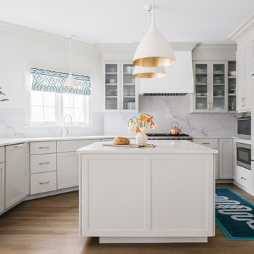
We decided the layout of the kitchen worked well in the space and the cabinets were in good shape, so we opted to do a refresh with the kitchen. The original kitchen had blond maple cabinets and granite countertops. This was also a great opportunity to make some updates to the functionality that they were hoping to accomplish.
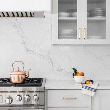
After re-finishing all the first floor wood floors with a gray stain, which helped to remove some of the red tones from the red oak, we painted the cabinetry Benjamin Moore “Repose Gray” a very soft light gray. The new countertops are hardworking quartz, and the waterfall countertop to the left of the sink gives a bit of the contemporary flavor.
We reworked the refrigerator wall to create more pantry storage and eliminated the double oven in favor of a single oven and a steam oven. The existing cooktop was replaced with a new range paired with a Venetian plaster hood above. The glossy finish from the hood is echoed in the pendant lights. A touch of gold in the lighting and hardware adds some contrast to the gray and white. A theme we repeated down to the smallest detail illustrated by the Jason Wu faucet by Brizo with its similar touches of white and gold (the arrival of which we eagerly awaited for months due to ripples in the supply chain – but worth it!).
The original breakfast room was pleasant enough with its windows looking into the backyard. Now with its colorful window treatments, new blue chairs and sculptural light fixture, this space flows seamlessly into the kitchen and gives more of a punch to the space.
The original butler’s pantry was functional but was also starting to show its age. The new space was inspired by a wallpaper selection that our client had set aside as a possibility for a future project. It worked perfectly with our pallet and gave a fun eclectic vibe to this functional space. We eliminated some upper cabinets in favor of open shelving and painted the cabinetry in a high gloss finish, added a beautiful quartzite countertop and some statement lighting. The new room is anything but cookie cutter.
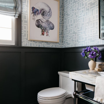
Next the mudroom. You can see a peek of the mudroom across the way from the butler’s pantry which got a facelift with new paint, tile floor, lighting and hardware. Simple updates but a dramatic change! The first floor powder room got the glam treatment with its own update of wainscoting, wallpaper, console sink, fixtures and artwork. A great little introduction to what’s to come in the rest of the home.
The whole first floor now flows together in a cohesive pallet of green and blue, reflects the homeowner’s desire for a more modern aesthetic, and feels like a thoughtful and intentional evolution. Our clients were wonderful to work with! Their style meshed perfectly with our brand aesthetic which created the opportunity for wonderful things to happen. We know they will enjoy their remodel for many years to come!
Photography by Margaret Rajic Photography
 TKS Design Group
Download our free ebook, Creating the Ideal Kitchen. DOWNLOAD NOW
The homeowners built their traditional Colonial style home 17 years’ ago. It was in great shape but needed some updating. Over the years, their taste had drifted into a more contemporary realm, and they wanted our help to bridge the gap between traditional and modern.
We decided the layout of the kitchen worked well in the space and the cabinets were in good shape, so we opted to do a refresh with the kitchen. The original kitchen had blond maple cabinets and granite countertops. This was also a great opportunity to make some updates to the functionality that they were hoping to accomplish.
After re-finishing all the first floor wood floors with a gray stain, which helped to remove some of the red tones from the red oak, we painted the cabinetry Benjamin Moore “Repose Gray” a very soft light gray. The new countertops are hardworking quartz, and the waterfall countertop to the left of the sink gives a bit of the contemporary flavor.
We reworked the refrigerator wall to create more pantry storage and eliminated the double oven in favor of a single oven and a steam oven. The existing cooktop was replaced with a new range paired with a Venetian plaster hood above. The glossy finish from the hood is echoed in the pendant lights. A touch of gold in the lighting and hardware adds some contrast to the gray and white. A theme we repeated down to the smallest detail illustrated by the Jason Wu faucet by Brizo with its similar touches of white and gold (the arrival of which we eagerly awaited for months due to ripples in the supply chain – but worth it!).
The original breakfast room was pleasant enough with its windows looking into the backyard. Now with its colorful window treatments, new blue chairs and sculptural light fixture, this space flows seamlessly into the kitchen and gives more of a punch to the space.
The original butler’s pantry was functional but was also starting to show its age. The new space was inspired by a wallpaper selection that our client had set aside as a possibility for a future project. It worked perfectly with our pallet and gave a fun eclectic vibe to this functional space. We eliminated some upper cabinets in favor of open shelving and painted the cabinetry in a high gloss finish, added a beautiful quartzite countertop and some statement lighting. The new room is anything but cookie cutter.
Next the mudroom. You can see a peek of the mudroom across the way from the butler’s pantry which got a facelift with new paint, tile floor, lighting and hardware. Simple updates but a dramatic change! The first floor powder room got the glam treatment with its own update of wainscoting, wallpaper, console sink, fixtures and artwork. A great little introduction to what’s to come in the rest of the home.
The whole first floor now flows together in a cohesive pallet of green and blue, reflects the homeowner’s desire for a more modern aesthetic, and feels like a thoughtful and intentional evolution. Our clients were wonderful to work with! Their style meshed perfectly with our brand aesthetic which created the opportunity for wonderful things to happen. We know they will enjoy their remodel for many years to come!
Photography by Margaret Rajic Photography

 Arquitecto Carlos Esquivel
Monica Esquivel
Example of a small trendy metal floating staircase design with wooden risers
Example of a small trendy metal floating staircase design with wooden risers


 Jordan Design Build Group
An old stone mansion built in 1924 had seen a number of renovations over the decades and the time had finally come to address a growing list of issues. All of the home’s bathrooms needed to be fully gutted and completely redone. In the master bathroom, we took this opportunity to rearrange the layout to incorporate a double vanity and relocate the toilet (the former bathroom had only a small single vanity with the toilet awkwardly located directly in front of the door). The bathtub was replaced with a generous walk-in shower complete with frameless glass and digital controls. We located a towel warmer immediately outside the shower to provide toasty towels within easy reach. A beautiful Calacatta and Bardigiglio Gray basketweave tile was used in combination with various sizes of Calacatta marble field tile and trim for a look that is both elegant and timeless.
 In Detail Interiors
Colorful and rich style
When a repeat client shows up on your doorstep with his third home to furnish and wants to start from scratch and go really bold, you just embrace him, scoot him right up to the resource room, and don’t ask questions! I mean, who does not love a client that embraces velvet, leather, silk and wallcoverings?
This lush, vibrant lounge space was all created from the want to really deep dive into something different, eclectic and more traveled. The original small, narrow, dimly lit room totally delivered on helping accomplish that mood. Mixing a little of that Ming dynasty-inspired strawberry red with a deep chocolate mohair on the sectional and cladding the room in a soft, amethyst woven wallcovering. We loved the interplay and “non-matchiness” that this space embraced.
Lighting and art were both about telling a story in this room – accenting conversational opportunities and an almost gallery-esque feel. Designating a more dynamic and unusual, sculptural feel – from the harder lines of the statement floor lamp in the living room across to the sprawling, slightly modern bloom of the dining area fixture.
Jewel of a space
The area rug had to ground the already bold furniture and lend itself to the darker wood floors, and a dusky green wool proved the ticket. We loved the almost pixelated pattern the hand-knotted wool lent to the overall design. A little hint of oxblood, chocolate and blue picked up in accents elsewhere, but the tone of almost jade really caught us about this piece.
Not enough can be said about the accent of a dining space either (which in terms of space planning was the only way to balance this long, narrow “hallway” of a room off the kitchen). Citron velvet on the low-profile chairs left the space feeling open, but fun for games and cocktail parties. Plus, the cerused wood dining table was a great complement – offering depth without a conflict to the existing flooring or nearby sectional.
Being able to view this space as a whole was very important to us! From the selection of sconces carried throughout (that wonky placement was existing and with so little opportunity to add cans we had to play up the new fixtures in a way that make them feel purposeful and desirable.), to the balance of color and temperature in each furniture grouping. Sometimes working floor to ceiling in an existing space can pose a lot of unique challenges when it comes to furnishing projects. However, we loved that the client embraced our drive to really punch up the visual feel of this living/dining combo. Also, we know the enjoyment he gets from the finished product is a testament to hunting for the right pieces, designing with unusual and luxe fabric combinations, and managing the inclusion of budget-friendly surprises that always balance a job well done.
What the client says
“From the moment that Cheryl arrived, I felt that she was definitely the designer that I needed to help facilitate & execute my vision for the space. I’m not the “cookie cutter” type, and I immediately realized that Cheryl had a knack for envisioning ideas that were unique, yet tasteful, timeless, and sophisticated.”
From its beginnings as a plain Jane envelope, this combination living/dining space becomes a study in texture and color!

 ROAM Architecture
Detail of LED wall sconce with white glass tile background
Inspiration for a small contemporary kids' white tile and glass tile porcelain tile and gray floor alcove bathtub remodel in New York with flat-panel cabinets, dark wood cabinets, a two-piece toilet, green walls and an integrated sink
Inspiration for a small contemporary kids' white tile and glass tile porcelain tile and gray floor alcove bathtub remodel in New York with flat-panel cabinets, dark wood cabinets, a two-piece toilet, green walls and an integrated sink
 TKS Design Group
Download our free ebook, Creating the Ideal Kitchen. DOWNLOAD NOW
The homeowners built their traditional Colonial style home 17 years’ ago. It was in great shape but needed some updating. Over the years, their taste had drifted into a more contemporary realm, and they wanted our help to bridge the gap between traditional and modern.
We decided the layout of the kitchen worked well in the space and the cabinets were in good shape, so we opted to do a refresh with the kitchen. The original kitchen had blond maple cabinets and granite countertops. This was also a great opportunity to make some updates to the functionality that they were hoping to accomplish.
After re-finishing all the first floor wood floors with a gray stain, which helped to remove some of the red tones from the red oak, we painted the cabinetry Benjamin Moore “Repose Gray” a very soft light gray. The new countertops are hardworking quartz, and the waterfall countertop to the left of the sink gives a bit of the contemporary flavor.
We reworked the refrigerator wall to create more pantry storage and eliminated the double oven in favor of a single oven and a steam oven. The existing cooktop was replaced with a new range paired with a Venetian plaster hood above. The glossy finish from the hood is echoed in the pendant lights. A touch of gold in the lighting and hardware adds some contrast to the gray and white. A theme we repeated down to the smallest detail illustrated by the Jason Wu faucet by Brizo with its similar touches of white and gold (the arrival of which we eagerly awaited for months due to ripples in the supply chain – but worth it!).
The original breakfast room was pleasant enough with its windows looking into the backyard. Now with its colorful window treatments, new blue chairs and sculptural light fixture, this space flows seamlessly into the kitchen and gives more of a punch to the space.
The original butler’s pantry was functional but was also starting to show its age. The new space was inspired by a wallpaper selection that our client had set aside as a possibility for a future project. It worked perfectly with our pallet and gave a fun eclectic vibe to this functional space. We eliminated some upper cabinets in favor of open shelving and painted the cabinetry in a high gloss finish, added a beautiful quartzite countertop and some statement lighting. The new room is anything but cookie cutter.
Next the mudroom. You can see a peek of the mudroom across the way from the butler’s pantry which got a facelift with new paint, tile floor, lighting and hardware. Simple updates but a dramatic change! The first floor powder room got the glam treatment with its own update of wainscoting, wallpaper, console sink, fixtures and artwork. A great little introduction to what’s to come in the rest of the home.
The whole first floor now flows together in a cohesive pallet of green and blue, reflects the homeowner’s desire for a more modern aesthetic, and feels like a thoughtful and intentional evolution. Our clients were wonderful to work with! Their style meshed perfectly with our brand aesthetic which created the opportunity for wonderful things to happen. We know they will enjoy their remodel for many years to come!
Photography by Margaret Rajic Photography


21