
Search results for "Start accomplishing" in Home Design Ideas


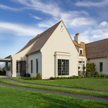
 Hawthorn Builders
Michael J Lee
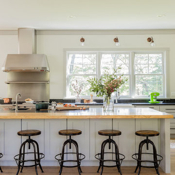
Example of a country l-shaped medium tone wood floor and brown floor eat-in kitchen design in Boston with a farmhouse sink, shaker cabinets, gray cabinets, stainless steel appliances, an island and black countertops
Example of a country l-shaped medium tone wood floor and brown floor eat-in kitchen design in Boston with a farmhouse sink, shaker cabinets, gray cabinets, stainless steel appliances, an island and black countertops
Find the right local pro for your project
 Bonnie McCarthy
Photo: Bonnie McCarthy © 2015 Houzz
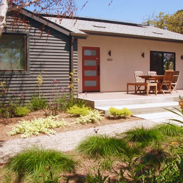
Inspiration for a contemporary exterior home remodel in Los Angeles
Inspiration for a contemporary exterior home remodel in Los Angeles
 Merits Design Group, Inc.
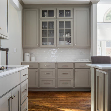
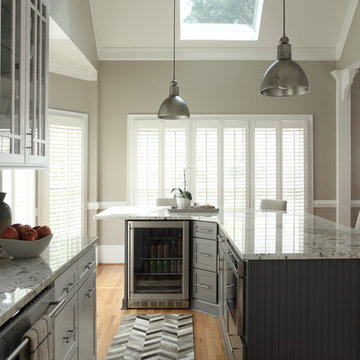
We reduced the number of glass profiles in the uppers to hide the practical items that aren't as pretty. Swapping about huge base cabinets with useful drawers offered more options for this service area.
 AJW Designs, Inc.
Chris Little Photography
Mid-sized transitional l-shaped light wood floor and beige floor enclosed kitchen photo in Other with shaker cabinets, gray cabinets, granite countertops, white backsplash, porcelain backsplash, stainless steel appliances and an island
Mid-sized transitional l-shaped light wood floor and beige floor enclosed kitchen photo in Other with shaker cabinets, gray cabinets, granite countertops, white backsplash, porcelain backsplash, stainless steel appliances and an island
 Winzor Homes
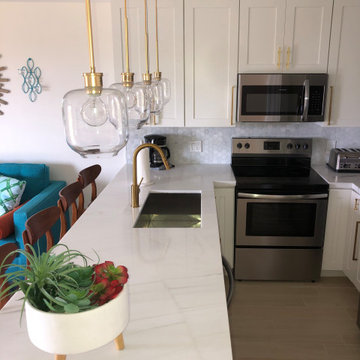
This property hasn't been updated since the 199o's and was very out-of-date. The client's wish was to keep the rooms light and bright, with a Mid Century, modern twist. This was accomplished with 2 months of prep work and 5 months total for completion.
The drab blue carpeting was removed and porcelain hickory honey floors laid throughout, pulling each detail together.
The kitchen cabinetry was replaced with driftwood floating shelves and marble countertops. It was kept light and bright with pops of color and an eye catching palm feature wall. Touched off with classic, brass hardware throughout the home, and drop pendant light fixtures.
The client was extremely satisfied with the interior design project.

 Metro Interiors
I first came to Mary Beth’s home to help with her living room. But that changed when we looked at the office, and started talking about how it wasn’t working. When I stepped it to take a look, I immediately noticed how heavy and cramped it felt. Too many large pieces and clutter created a feeling of overwhelm.
It needed to be redone. Since Mary Beth works full time from home, I wanted to help her make this a space where she could be productive, and feel good about being in for long periods of time.
The end result is an impressive transformation – and it was done very affordably. “Prior to the re-design, my office was a cluttered, disorganized mess that really said nothing about who I am. I tended to use it as a catch all for things I didn’t know where to put or what to do with,” tells Mary Beth. Now, she says it feels so much better working in there, and even got rave reviews from her family when they visited for the Holidays. “It’s now well-organized, bright and seems to flow in the way it’s laid out”.
To remove clutter and the “heavy” feeling, two large bookcases and the couch were removed, and lots of time was spent decluttering. A nicer bookcase was moved to a place that made more sense; together with a cozy rug and upholstered chair we created a lovely reading area, a place she can also relax.
A neutral green on the walls is also soothing, and brings an element of nature inside. Groupings of photos from her travels hang on the walls now, and a larger piece of art creates a focal point. A piece I was delighted to help her find – hand-painted but affordably priced – it makes Mary Beth feel happy, “The art above the desk is beautiful, and it showed me that big doesn’t have to be overwhelming”.
A new desk, relocated to the “command position” in the room (a more powerful placement) is also less weighty than what she had before, but functionally allows for more workspace. We upgraded her desk chair to a high-back leather one. In total, this setup was intentional, for an enhanced feeling of being in control. Mary Beth notes, “I love the desk and how it sits. I can either work by the window and look out at the garden and at the birds, which I love to do, or look out into the living room and be part of anything going on there”.
On the windows we replaced metal blinds with woven roman shades, also with a natural look. They’re cordless, so nothing hangs in front of the beautiful backyard view, and they feel lighter. With the new office design, we also gave Mary Beth plenty of places for storage. Now the things she does use and need don’t need to be out in plain sight, cluttering things up.
In the end, we accomplished our goal of creating a space for Mary Beth conducive to work and also enjoyable. She says, “My work attitude and feeling of what the office is has definitely changed – I like to be there even when I’m not working. It doesn’t feel only like an office but is actually a relaxing place to be”.
 TKS Design Group
Download our free ebook, Creating the Ideal Kitchen. DOWNLOAD NOW
The homeowners built their traditional Colonial style home 17 years’ ago. It was in great shape but needed some updating. Over the years, their taste had drifted into a more contemporary realm, and they wanted our help to bridge the gap between traditional and modern.
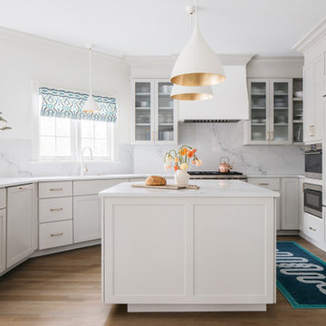
We decided the layout of the kitchen worked well in the space and the cabinets were in good shape, so we opted to do a refresh with the kitchen. The original kitchen had blond maple cabinets and granite countertops. This was also a great opportunity to make some updates to the functionality that they were hoping to accomplish.
After re-finishing all the first floor wood floors with a gray stain, which helped to remove some of the red tones from the red oak, we painted the cabinetry Benjamin Moore “Repose Gray” a very soft light gray. The new countertops are hardworking quartz, and the waterfall countertop to the left of the sink gives a bit of the contemporary flavor.
We reworked the refrigerator wall to create more pantry storage and eliminated the double oven in favor of a single oven and a steam oven. The existing cooktop was replaced with a new range paired with a Venetian plaster hood above. The glossy finish from the hood is echoed in the pendant lights. A touch of gold in the lighting and hardware adds some contrast to the gray and white. A theme we repeated down to the smallest detail illustrated by the Jason Wu faucet by Brizo with its similar touches of white and gold (the arrival of which we eagerly awaited for months due to ripples in the supply chain – but worth it!).
The original breakfast room was pleasant enough with its windows looking into the backyard. Now with its colorful window treatments, new blue chairs and sculptural light fixture, this space flows seamlessly into the kitchen and gives more of a punch to the space.
The original butler’s pantry was functional but was also starting to show its age. The new space was inspired by a wallpaper selection that our client had set aside as a possibility for a future project. It worked perfectly with our pallet and gave a fun eclectic vibe to this functional space. We eliminated some upper cabinets in favor of open shelving and painted the cabinetry in a high gloss finish, added a beautiful quartzite countertop and some statement lighting. The new room is anything but cookie cutter.
Next the mudroom. You can see a peek of the mudroom across the way from the butler’s pantry which got a facelift with new paint, tile floor, lighting and hardware. Simple updates but a dramatic change! The first floor powder room got the glam treatment with its own update of wainscoting, wallpaper, console sink, fixtures and artwork. A great little introduction to what’s to come in the rest of the home.
The whole first floor now flows together in a cohesive pallet of green and blue, reflects the homeowner’s desire for a more modern aesthetic, and feels like a thoughtful and intentional evolution. Our clients were wonderful to work with! Their style meshed perfectly with our brand aesthetic which created the opportunity for wonderful things to happen. We know they will enjoy their remodel for many years to come!
Photography by Margaret Rajic Photography
 Alair Homes Plano
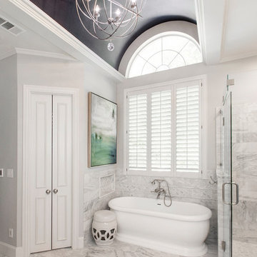
This luxurious master bathroom is a good mix between traditional and transitional, a perfect representation of the homeowners. They wanted our honest advice and opinions, as this is not their strong suite, so we put our designers to work. They wanted an updated master bathroom with a timeless, yet not too trendy look, but still flow into the style of their existing home.
We kept the layout of the bathroom the same but removed all finishes and started with a clean slate. We installed a beautiful freestanding pedestal tub which is surrounded by Arabescato Carrara honed marble walls and flooring. The shower floor and accent also has the Arabescato Carrara but in a herringbone pattern which adds nice detail work. The clients like everything to have a place and wanted easy storage solutions out of sight, so the bathroom looks clean. To accomplish this, two shower niches were placed above the built in bench to hide the shampoo bottles, as well as one at the end of the bathtub. Speakman Anystream brushed nickel shower head and Rohl Verona Satin Nickel hand shower, trim and grab bar were installed in the shower, as well as a fogless shower mirror, so the client can shave while he’s in the shower.
All new recessed panel soft close cabinets were installed and we added a seated make-up area to her vanity. Three beautiful antiqued silver leaf vanity mirrors were installed bringing out the traditional touch to this bathroom. Each mirror was flanked with Thomas O’Brien Bryant vanity sconces. And to top it all off, the simple Oona 6-light pendant hung from the barrel vaulted ceiling painted in deep purple adding a unique touch to this beautiful classic bathroom.
Design/Remodel by Hatfield Builders & Remodelers | Photography by Versatile Imaging
 Metro Interiors
I first came to Mary Beth’s home to help with her living room. But that changed when we looked at the office, and started talking about how it wasn’t working. When I stepped it to take a look, I immediately noticed how heavy and cramped it felt. Too many large pieces and clutter created a feeling of overwhelm.
It needed to be redone. Since Mary Beth works full time from home, I wanted to help her make this a space where she could be productive, and feel good about being in for long periods of time.
The end result is an impressive transformation – and it was done very affordably. “Prior to the re-design, my office was a cluttered, disorganized mess that really said nothing about who I am. I tended to use it as a catch all for things I didn’t know where to put or what to do with,” tells Mary Beth. Now, she says it feels so much better working in there, and even got rave reviews from her family when they visited for the Holidays. “It’s now well-organized, bright and seems to flow in the way it’s laid out”.
To remove clutter and the “heavy” feeling, two large bookcases and the couch were removed, and lots of time was spent decluttering. A nicer bookcase was moved to a place that made more sense; together with a cozy rug and upholstered chair we created a lovely reading area, a place she can also relax.
A neutral green on the walls is also soothing, and brings an element of nature inside. Groupings of photos from her travels hang on the walls now, and a larger piece of art creates a focal point. A piece I was delighted to help her find – hand-painted but affordably priced – it makes Mary Beth feel happy, “The art above the desk is beautiful, and it showed me that big doesn’t have to be overwhelming”.
A new desk, relocated to the “command position” in the room (a more powerful placement) is also less weighty than what she had before, but functionally allows for more workspace. We upgraded her desk chair to a high-back leather one. In total, this setup was intentional, for an enhanced feeling of being in control. Mary Beth notes, “I love the desk and how it sits. I can either work by the window and look out at the garden and at the birds, which I love to do, or look out into the living room and be part of anything going on there”.
On the windows we replaced metal blinds with woven roman shades, also with a natural look. They’re cordless, so nothing hangs in front of the beautiful backyard view, and they feel lighter. With the new office design, we also gave Mary Beth plenty of places for storage. Now the things she does use and need don’t need to be out in plain sight, cluttering things up.
In the end, we accomplished our goal of creating a space for Mary Beth conducive to work and also enjoyable. She says, “My work attitude and feeling of what the office is has definitely changed – I like to be there even when I’m not working. It doesn’t feel only like an office but is actually a relaxing place to be”.
 Nystrom Design
David Duncan Livingston
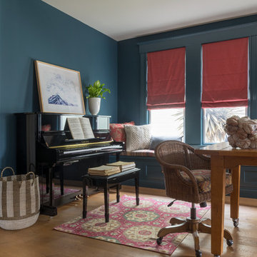
Living room - transitional medium tone wood floor and brown floor living room idea in San Francisco with a music area and blue walls
Living room - transitional medium tone wood floor and brown floor living room idea in San Francisco with a music area and blue walls

 Steve Masley Consulting and Design
Eggplants thrive in terra-cotta pots. Photo by Steve Masley.
Photo of a traditional landscaping in San Francisco.
Photo of a traditional landscaping in San Francisco.
 Interiors by Popov
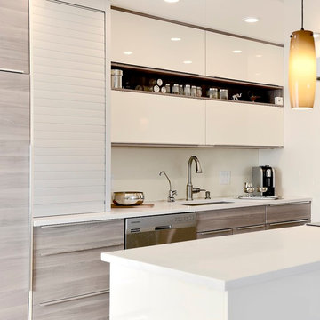
This is another favorite home redesign project.
Throughout my career, I've worked with some hefty budgets on a number of high-end projects. You can visit Paris Kitchens and Somerset Kitchens, companies that I have worked for previously, to get an idea of what I mean. I could start name dropping here, but I won’t, because that's not what this project is about. This project is about a small budget and a happy homeowner.
This was one of the first projects with a custom interior design at a fraction of a regular budget. I could use the term “value engineering” to describe it, because this particular interior was heavily value engineered.
The result: a sophisticated interior that looks so much more expensive than it is. And one ecstatic homeowner. Mission impossible accomplished.
P.S. Don’t ask me how much it cost, I promised the homeowner that their impressive budget will remain confidential.
In any case, no one would believe me even if I spilled the beans.
 Steve Masley Consulting and Design
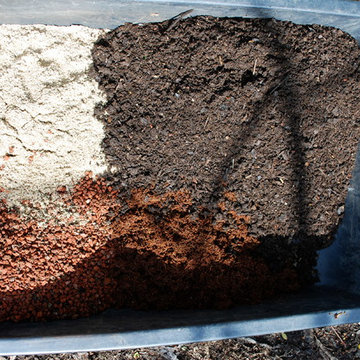
Potting mixes for container gardens need to drain freely, but still retain moisture. My base potting soil mix contains (clockwise from upper left) coarse builder's sand, high-quality organic compost or worm castings, coconut coir, and small lava rock. I supplement this with additional compost, fresh worm castings, and organic soil amendments, with the amounts varying depending on what I'm planting. Photo by Steve Masley

 Parker & Parker Design, LLC
The client recently moved from Connecticut to West Palm Beach, and she was thrilled about her tall ceilings and airy, open floor plan! However the home was too modern (and brown!) for her taste, so the design scope included a bit of remodeling and a lot of redecorating. We started by painting all the walls white to enhance & brighten the open spaces. Incorporating the client’s bohemian vibe was the most exciting part of this project. We picked a few rooms for fun wallpaper, and you’ll notice an animal theme throughout the home. Textured, layered accessories were curated to create depth, interest and accomplish a “lived-in” home design.
 AFT Construction
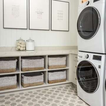
Large transitional u-shaped marble floor, gray floor and wallpaper utility room photo in Phoenix with a farmhouse sink, gray cabinets, quartz countertops, white backsplash, white walls, a stacked washer/dryer and white countertops
 butter+velvet DESIGN · HOME
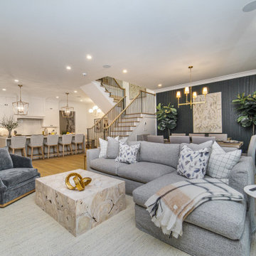
Our wonderful clients who are native to New Jersey purchased a new-build townhouse in Charlotte, North Carolina and asked us to turn it into a warm and welcoming home. We accomplished this by starting with an overall neutral palette and incorporating texture to every room along with dark elements which added depth throughout. Fun wallpaper and original artwork created by a local Charlotte artist were also focal points of the home which enhanced it's personality even more. Our most challenging space was the narrow outdoor area, which started out as a screened in porch with a fireplace. We were able to transform the space into a beautiful and function lounge and dining area which is used to entertain friends and family constantly. We couldn't be happier that our client was thrilled with the outcome!
 butter+velvet DESIGN · HOME
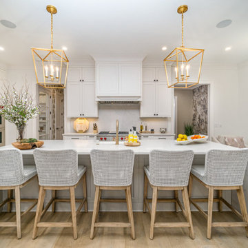
Our wonderful clients who are native to New Jersey purchased a new-build townhouse in Charlotte, North Carolina and asked us to turn it into a warm and welcoming home. We accomplished this by starting with an overall neutral palette and incorporating texture to every room along with dark elements which added depth throughout. Fun wallpaper and original artwork created by a local Charlotte artist were also focal points of the home which enhanced it's personality even more. Our most challenging space was the narrow outdoor area, which started out as a screened in porch with a fireplace. We were able to transform the space into a beautiful and function lounge and dining area which is used to entertain friends and family constantly. We couldn't be happier that our client was thrilled with the outcome!
 Tania Christensen
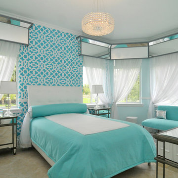
"Client was very nervous when we started her daughters room...very afraid of the color...when we were done, she said it was her favorite room in the house and found herself reading in the afternoons here!"
4