
Search results for "Start thinking" in Home Design Ideas
 Custom Design & Construction
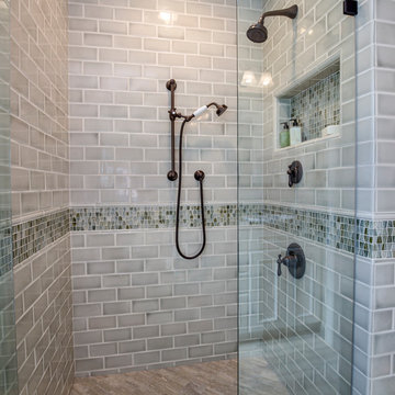
We choose to highlight this project because even though it is a more traditional design style its light neutral color palette represents the beach lifestyle of the south bay. Our relationship with this family started when they attended one of our complimentary educational seminars to learn more about the design / build approach to remodeling. They had been working with an architect and were having trouble getting their vision to translate to the plans. They were looking to add on to their south Redondo home in a manner that would allow for seamless transition between their indoor and outdoor space. Design / Build ended up to be the perfect solution to their remodeling need.
As the project started coming together and our clients were able to visualize their dream, they trusted us to add the adjacent bathroom remodel as a finishing touch. In keeping with our light and warm palette we selected ocean blue travertine for the floor and installed a complimentary tile wainscot. The tile wainscot is comprised of hand-made ceramic crackle tile accented with Lunada Bay Selenium Silk blend glass mosaic tile. However the piéce de résistance is the frameless shower enclosure with a wave cut top.
 Bella Vista Company
Shoot2Sell
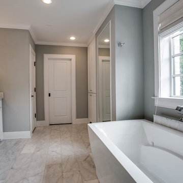
Bathroom - mid-sized traditional master white tile and stone tile marble floor bathroom idea in Dallas with an undermount sink, shaker cabinets, white cabinets, marble countertops and gray walls
Bathroom - mid-sized traditional master white tile and stone tile marble floor bathroom idea in Dallas with an undermount sink, shaker cabinets, white cabinets, marble countertops and gray walls

 TKS Design Group
Download our free ebook, Creating the Ideal Kitchen. DOWNLOAD NOW
Lakefront property in the northwest suburbs of Chicago is hard to come by, so when we were hired by this young family with exactly that, we were immediately inspired by not just the unusually large footprint of this 1950’s colonial revival but also the lovely views of the manmade lake it was sited on. The large 5-bedroom home was solidly stuck in the 1980’s, but we saw tons of potential. We started out by updating the existing staircase with a fresh coat of paint and adding new herringbone slate to the entry hall.
The powder room off the entryway also got a refresh - new flooring, new cabinets and fixtures. We ran the new slate right through into this space for some consistency. A fun wallpaper and shiplap trim add a welcoming feel and set the tone for the home.
Next, we tackled the kitchen. Located away from the rest of the first floor, the kitchen felt a little isolated, so we immediately began planning for how to better connect it to the rest of the first floor. We landed on removing the wall between the kitchen and dining room and designed a modified galley style space with separate cooking and clean up zones. The cooking zone consists of the refrigerator, prep sink and cooktop, along with a nice long run of prep space at the island. The cleanup side of the kitchen consists of the main sink and dishwasher. Both areas are situated so that the user can view the lake during prep work and cleanup!
One of the home’s main puzzles was how to incorporate the mudroom and area in front of the patio doors at the back of the house. We already had a breakfast table area, so the space by the patio doors was a bit of a no man’s land. We decided to separate the kitchen proper from what became the new mudroom with a large set of barn doors. That way you can quickly hide any mudroom messes but have easy access to the light coming in through the patio doors as well as the outdoor grilling station. We also love the impact the barn doors add to the overall space.
The homeowners’ first words to us were “it’s time to ditch the brown,” so we did! We chose a lovely blue pallet that reflects the home’s location on the lake which is also vibrant yet easy on the eye. Countertops are white quartz, and the natural oak floor works well with the other honey accents. The breakfast table was given a refresh with new chairs, chandelier and window treatments that frame the gorgeous views of the lake out the back.
We coordinated the slate mudroom flooring with that used in the home’s main entrance for a consistent feel. The storage area consists of open and closed storage to allow for some clutter control as needed.
Next on our “to do” list was revamping the dated brown bar area in the neighboring dining room. We eliminated the clutter by adding some closed cabinets and did some easy updates to help the space feel more current. One snag we ran into here was the discovery of a beam above the existing open shelving that had to be modified with a smaller structural beam to allow for our new design to work. This was an unexpected surprise, but in the end we think it was well worth it!
We kept the colors here a bit more muted to blend with the homeowner’s existing furnishings. Open shelving and polished nickel hardware add some simple detail to the new entertainment zone which also looks out onto the lake!
Next we tackled the upstairs starting with the homeowner’s son’s bath. The bath originally had both a tub shower and a separate shower, so we decided to swap out the shower for a new laundry area. This freed up some space downstairs in what used to be the mudroom/laundry room and is much more convenient for daily laundry needs.
We continued the blue palette here with navy cabinetry and the navy tile in the shower. Porcelain floor tile and chrome fixtures keep maintenance to a minimum while matte black mirrors and lighting add some depth the design. A low maintenance runner adds some warmth underfoot and ties the whole space together.
We added a pocket door to the bathroom to minimize interference with the door swings. The left door of the laundry closet is on a 180 degree hinge to allow for easy full access to the machines. Next we tackled the master bath which is an en suite arrangement. The original was typical of the 1980’s with the vanity outside of the bathroom, situated near the master closet. And the brown theme continued here with multiple shades of brown.
Our first move was to segment off the bath and the closet from the master bedroom. We created a short hall from the bedroom to the bathroom with his and hers walk-in closets on the left and right as well as a separate toilet closet outside of the main bathroom for privacy and flexibility.
The original bathroom had a giant soaking tub with steps (dangerous!) as well as a small shower that did not work well for our homeowner who is 6’3”. With other bathtubs in the home, they decided to eliminate the tub and create an oversized shower which takes up the space where the old tub was located. The double vanity is on the opposite wall and a bench is located under the window for morning conversations and a place to set a couple of towels.
The pallet in here is light and airy with a mix of blond wood, creamy porcelain and marble tile, and brass accents. A simple roman shade adds some texture and it’s top-down mechanism allows for light and privacy.
This large whole house remodel gave our homeowners not only the ability to maximize the potential of their home but also created a lovely new frame from which to view their fabulous lake views.
Designed by: Susan Klimala, CKD, CBD
Photography by: Michael Kaskel
For more information on kitchen and bath design ideas go to: www.kitchenstudio-ge.com
Find the right local pro for your project

 Orren Pickell Building Group
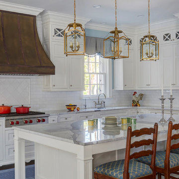
All eyes are on the beautifully designed, expansive kitchen and great room in this new construction home. Painted white cabinetry with inset doors makes the space feel warm and traditional, but hidden hinges keep the look clean. Tall ceilings were ideal for stacking decorative glass cabinetry all the way to the top. Photo by Mike Kaskel
 Studio Revolution
Designed by: Studio Revolution Photography by: Thomas Kuoh
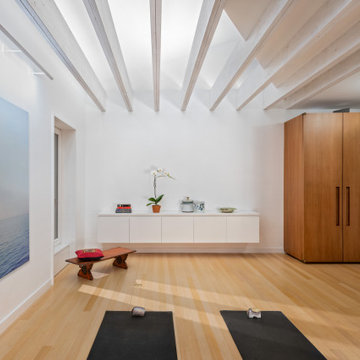
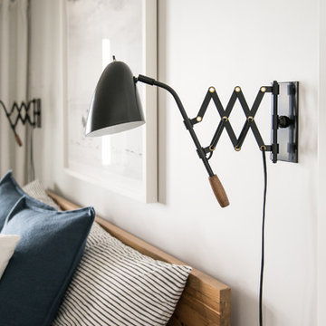
Inspiration for a contemporary bedroom remodel in San Francisco
Inspiration for a contemporary bedroom remodel in San Francisco
 Hunter Douglas
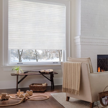
Living room - mid-sized transitional formal and open concept medium tone wood floor and brown floor living room idea in New York with beige walls, a standard fireplace, a brick fireplace and no tv


 Prentiss Balance Wickline Architects
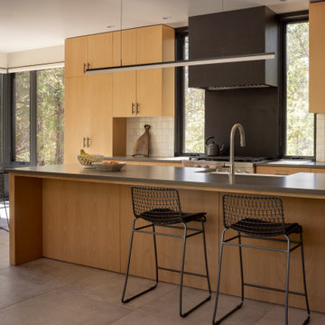
Example of a minimalist galley ceramic tile and gray floor kitchen design in Seattle with light wood cabinets, quartz countertops, white backsplash, ceramic backsplash, stainless steel appliances, an island, gray countertops, a farmhouse sink and flat-panel cabinets

 KitchenLab Interiors
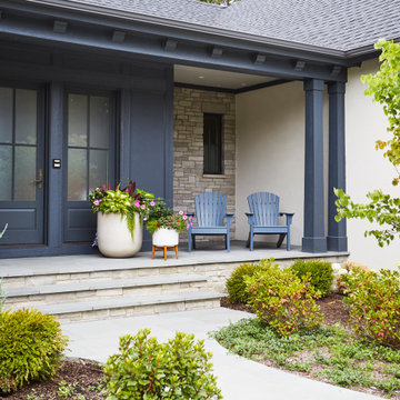
KitchenLab Interiors’ first, entirely new construction project in collaboration with GTH architects who designed the residence. KLI was responsible for all interior finishes, fixtures, furnishings, and design including the stairs, casework, interior doors, moldings and millwork. KLI also worked with the client on selecting the roof, exterior stucco and paint colors, stone, windows, and doors. The homeowners had purchased the existing home on a lakefront lot of the Valley Lo community in Glenview, thinking that it would be a gut renovation, but when they discovered a host of issues including mold, they decided to tear it down and start from scratch. The minute you look out the living room windows, you feel as though you're on a lakeside vacation in Wisconsin or Michigan. We wanted to help the homeowners achieve this feeling throughout the house - merging the causal vibe of a vacation home with the elegance desired for a primary residence. This project is unique and personal in many ways - Rebekah and the homeowner, Lorie, had grown up together in a small suburb of Columbus, Ohio. Lorie had been Rebekah's babysitter and was like an older sister growing up. They were both heavily influenced by the style of the late 70's and early 80's boho/hippy meets disco and 80's glam, and both credit their moms for an early interest in anything related to art, design, and style. One of the biggest challenges of doing a new construction project is that it takes so much longer to plan and execute and by the time tile and lighting is installed, you might be bored by the selections of feel like you've seen them everywhere already. “I really tried to pull myself, our team and the client away from the echo-chamber of Pinterest and Instagram. We fell in love with counter stools 3 years ago that I couldn't bring myself to pull the trigger on, thank god, because then they started showing up literally everywhere", Rebekah recalls. Lots of one of a kind vintage rugs and furnishings make the home feel less brand-spanking new. The best projects come from a team slightly outside their comfort zone. One of the funniest things Lorie says to Rebekah, "I gave you everything you wanted", which is pretty hilarious coming from a client to a designer.
 KitchenLab Interiors
KitchenLab Interiors’ first, entirely new construction project in collaboration with GTH architects who designed the residence. KLI was responsible for all interior finishes, fixtures, furnishings, and design including the stairs, casework, interior doors, moldings and millwork. KLI also worked with the client on selecting the roof, exterior stucco and paint colors, stone, windows, and doors. The homeowners had purchased the existing home on a lakefront lot of the Valley Lo community in Glenview, thinking that it would be a gut renovation, but when they discovered a host of issues including mold, they decided to tear it down and start from scratch. The minute you look out the living room windows, you feel as though you're on a lakeside vacation in Wisconsin or Michigan. We wanted to help the homeowners achieve this feeling throughout the house - merging the causal vibe of a vacation home with the elegance desired for a primary residence. This project is unique and personal in many ways - Rebekah and the homeowner, Lorie, had grown up together in a small suburb of Columbus, Ohio. Lorie had been Rebekah's babysitter and was like an older sister growing up. They were both heavily influenced by the style of the late 70's and early 80's boho/hippy meets disco and 80's glam, and both credit their moms for an early interest in anything related to art, design, and style. One of the biggest challenges of doing a new construction project is that it takes so much longer to plan and execute and by the time tile and lighting is installed, you might be bored by the selections of feel like you've seen them everywhere already. “I really tried to pull myself, our team and the client away from the echo-chamber of Pinterest and Instagram. We fell in love with counter stools 3 years ago that I couldn't bring myself to pull the trigger on, thank god, because then they started showing up literally everywhere", Rebekah recalls. Lots of one of a kind vintage rugs and furnishings make the home feel less brand-spanking new. The best projects come from a team slightly outside their comfort zone. One of the funniest things Lorie says to Rebekah, "I gave you everything you wanted", which is pretty hilarious coming from a client to a designer.
 KitchenLab Interiors
KitchenLab Interiors’ first, entirely new construction project in collaboration with GTH architects who designed the residence. KLI was responsible for all interior finishes, fixtures, furnishings, and design including the stairs, casework, interior doors, moldings and millwork. KLI also worked with the client on selecting the roof, exterior stucco and paint colors, stone, windows, and doors. The homeowners had purchased the existing home on a lakefront lot of the Valley Lo community in Glenview, thinking that it would be a gut renovation, but when they discovered a host of issues including mold, they decided to tear it down and start from scratch. The minute you look out the living room windows, you feel as though you're on a lakeside vacation in Wisconsin or Michigan. We wanted to help the homeowners achieve this feeling throughout the house - merging the causal vibe of a vacation home with the elegance desired for a primary residence. This project is unique and personal in many ways - Rebekah and the homeowner, Lorie, had grown up together in a small suburb of Columbus, Ohio. Lorie had been Rebekah's babysitter and was like an older sister growing up. They were both heavily influenced by the style of the late 70's and early 80's boho/hippy meets disco and 80's glam, and both credit their moms for an early interest in anything related to art, design, and style. One of the biggest challenges of doing a new construction project is that it takes so much longer to plan and execute and by the time tile and lighting is installed, you might be bored by the selections of feel like you've seen them everywhere already. “I really tried to pull myself, our team and the client away from the echo-chamber of Pinterest and Instagram. We fell in love with counter stools 3 years ago that I couldn't bring myself to pull the trigger on, thank god, because then they started showing up literally everywhere", Rebekah recalls. Lots of one of a kind vintage rugs and furnishings make the home feel less brand-spanking new. The best projects come from a team slightly outside their comfort zone. One of the funniest things Lorie says to Rebekah, "I gave you everything you wanted", which is pretty hilarious coming from a client to a designer.
 Closet Factory
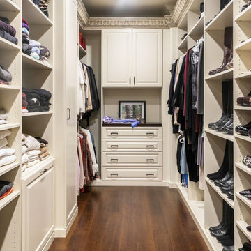
A walk-in closet is a luxurious and practical addition to any home, providing a spacious and organized haven for clothing, shoes, and accessories.
Typically larger than standard closets, these well-designed spaces often feature built-in shelves, drawers, and hanging rods to accommodate a variety of wardrobe items.
Ample lighting, whether natural or strategically placed fixtures, ensures visibility and adds to the overall ambiance. Mirrors and dressing areas may be conveniently integrated, transforming the walk-in closet into a private dressing room.
The design possibilities are endless, allowing individuals to personalize the space according to their preferences, making the walk-in closet a functional storage area and a stylish retreat where one can start and end the day with ease and sophistication.
 KitchenLab Interiors
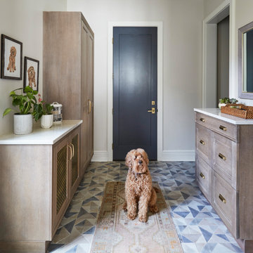
KitchenLab Interiors’ first, entirely new construction project in collaboration with GTH architects who designed the residence. KLI was responsible for all interior finishes, fixtures, furnishings, and design including the stairs, casework, interior doors, moldings and millwork. KLI also worked with the client on selecting the roof, exterior stucco and paint colors, stone, windows, and doors. The homeowners had purchased the existing home on a lakefront lot of the Valley Lo community in Glenview, thinking that it would be a gut renovation, but when they discovered a host of issues including mold, they decided to tear it down and start from scratch. The minute you look out the living room windows, you feel as though you're on a lakeside vacation in Wisconsin or Michigan. We wanted to help the homeowners achieve this feeling throughout the house - merging the causal vibe of a vacation home with the elegance desired for a primary residence. This project is unique and personal in many ways - Rebekah and the homeowner, Lorie, had grown up together in a small suburb of Columbus, Ohio. Lorie had been Rebekah's babysitter and was like an older sister growing up. They were both heavily influenced by the style of the late 70's and early 80's boho/hippy meets disco and 80's glam, and both credit their moms for an early interest in anything related to art, design, and style. One of the biggest challenges of doing a new construction project is that it takes so much longer to plan and execute and by the time tile and lighting is installed, you might be bored by the selections of feel like you've seen them everywhere already. “I really tried to pull myself, our team and the client away from the echo-chamber of Pinterest and Instagram. We fell in love with counter stools 3 years ago that I couldn't bring myself to pull the trigger on, thank god, because then they started showing up literally everywhere", Rebekah recalls. Lots of one of a kind vintage rugs and furnishings make the home feel less brand-spanking new. The best projects come from a team slightly outside their comfort zone. One of the funniest things Lorie says to Rebekah, "I gave you everything you wanted", which is pretty hilarious coming from a client to a designer.


 LMB Interiors
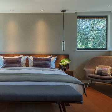
Wallpaper on bed wall: Phillip Jeffries, vinyl, color: Belgian Linen Khaki
Photo by Eric Rorer
While we adore all of our clients and the beautiful structures which we help fill and adorn, like a parent adores all of their children, this recent mid-century modern interior design project was a particular delight.
This client, a smart, energetic, creative, happy person, a man who, in-person, presents as refined and understated — he wanted color. Lots of color. When we introduced some color, he wanted even more color: Bright pops; lively art.
In fact, it started with the art.
This new homeowner was shopping at SLATE ( https://slateart.net) for art one day… many people choose art as the finishing touches to an interior design project, however this man had not yet hired a designer.
He mentioned his predicament to SLATE principal partner (and our dear partner in art sourcing) Danielle Fox, and she promptly referred him to us.
At the time that we began our work, the client and his architect, Jack Backus, had finished up a massive remodel, a thoughtful and thorough update of the elegant, iconic mid-century structure (originally designed by Ratcliff & Ratcliff) for modern 21st-century living.
And when we say, “the client and his architect” — we mean it. In his professional life, our client owns a metal fabrication company; given his skills and knowledge of engineering, build, and production, he elected to act as contractor on the project.
His eye for metal and form made its way into some of our furniture selections, in particular the coffee table in the living room, fabricated and sold locally by Turtle and Hare.
Color for miles: One of our favorite aspects of the project was the long hallway. By choosing to put nothing on the walls, and adorning the length of floor with an amazing, vibrant, patterned rug, we created a perfect venue. The rug stands out, drawing attention to the art on the floor.
In fact, the rugs in each room were as thoughtfully selected for color and design as the art on the walls. In total, on this project, we designed and decorated the living room, family room, master bedroom, and patio.
While my design firm is known for our work with traditional and transitional architecture, and we love those projects, I think it is clear from this project that Modern is also our cup of tea.
If you have a Modern house and are thinking about how to make it more vibrantly YOU, contact us for a consultation.
 TerraTrellis
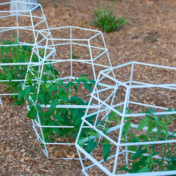
Geo Tomato Cage by TerraTrellis. Sturdy, sculptural support for edibles like tomatoes, cucumbers, eggplant or ornamental plants. Set on flat, level garden earth or on patio surface with container plant. Beautiful sculptural effect.
 Parker Design Build Remodel
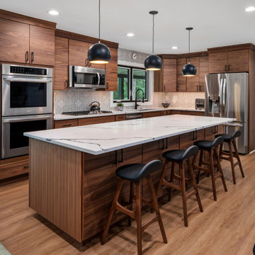
Walnut cabinets with distinctive horizontal grain are complemented by clean lines and black hardware and fixtures.
Inspiration for a contemporary kitchen remodel in Baltimore with flat-panel cabinets, medium tone wood cabinets, quartz countertops, black backsplash, ceramic backsplash and an island
Inspiration for a contemporary kitchen remodel in Baltimore with flat-panel cabinets, medium tone wood cabinets, quartz countertops, black backsplash, ceramic backsplash and an island
 Kathleen Jennison
An Arts & Crafts Bungalow is one of my favorite styles of homes. We have quite a few of them in our Stockton Mid-Town area. And when C&L called us to help them remodel their 1923 American Bungalow, I was beyond thrilled.
As per usual, when we get a new inquiry, we quickly Google the project location while we are talking to you on the phone. My excitement escalated when I saw the Google Earth Image of the sweet Sage Green bungalow in Mid-Town Stockton. "Yes, we would be interested in working with you," I said trying to keep my cool.
But what made it even better was meeting C&L and touring their home, because they are the nicest young couple, eager to make their home period perfect. Unfortunately, it had been slightly molested by some bad house-flippers, and we needed to bring the bathroom back to it "roots."
We knew we had to banish the hideous brown tile and cheap vanity quickly. But C&L complained about the condensation problems and the constant fight with mold. This immediately told me that improper remodeling had occurred and we needed to remedy that right away.
The Before: Frustrations with a Botched Remodel
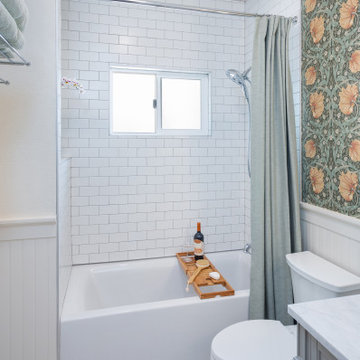
The bathroom needed to be brought back to period appropriate design with all the functionality of a modern bathroom. We thought of things like marble countertop, white mosaic floor tiles, white subway tile, board and batten molding, and of course a fabulous wallpaper.
This small (and only) bathroom on a tight budget required a little bit of design sleuthing to figure out how we could get the proper look and feel. Our goal was to determine where to splurge and where to economize and how to complete the remodel as quickly as possible because C&L would have to move out while construction was going on.
The Process: Hard Work to Remedy Design and Function
During our initial design study, (which included 2 hours in the owners’ home), we noticed framed images of William Morris Arts and Crafts textile patterns and knew this would be our design inspiration. We presented C&L with three options and they quickly selected the Pimpernel Design Concept.
We had originally selected the Black and Olive colors with a black vanity, mirror, and black and white floor tile. C&L liked it but weren’t quite sure about the black, We went back to the drawing board and decided the William & Co Pimpernel Wallpaper in Bayleaf and Manilla color with a softer gray painted vanity and mirror and white floor tile was more to their liking.
After the Design Concept was approved, we went to work securing the building permit, procuring all the elements, and scheduling our trusted tradesmen to perform the work.
We did uncover some shoddy work by the flippers such as live electrical wires hidden behind the wall, plumbing venting cut-off and buried in the walls (hence the constant dampness), the tub barely balancing on two fence boards across the floor joist, and no insulation on the exterior wall.
All of the previous blunders were fixed and the bathroom put back to its previous glory. We could feel the house thanking us for making it pretty again.
The After Reveal: Cohesive Design Decisions
We selected a simple white subway tile for the tub/shower. This is always classic and in keeping with the style of the house.
We selected a pre-fab vanity and mirror, but they look rich with the quartz countertop. There is much more storage in this small vanity than you would think.
The Transformation: A Period Perfect Refresh
We began the remodel just as the pandemic reared and stay-in-place orders went into effect. As C&L were already moved out and living with relatives, we got the go-ahead from city officials to get the work done (after all, how can you shelter in place without a bathroom?).
All our tradesmen were scheduled to work so that only one crew was on the job site at a time. We stayed on the original schedule with only a one week delay.
The end result is the sweetest little bathroom I've ever seen (and I can't wait to start work on C&L's kitchen next).
Thank you for joining me in this project transformation. I hope this inspired you to think about being creative with your design projects, determining what works best in keeping with the architecture of your space, and carefully assessing how you can have the best life in your home.

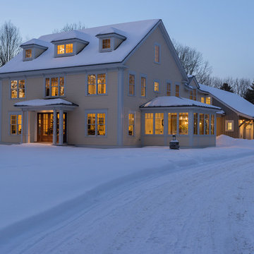
 Whitten Architects
photography by Rob Karosis
Large elegant three-story wood exterior home photo in Portland Maine
Large elegant three-story wood exterior home photo in Portland Maine
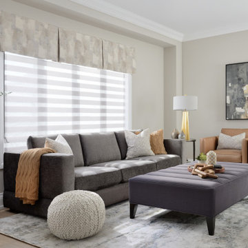
 Lumar Interiors
This busy family wanted to update the main floor of their two-story house. They loved the area but wanted to have a fresher contemporary feel in their home. It all started with the kitchen. We redesigned this, added a big island, and changed flooring, lighting, some furnishings, and wall decor. We also added some architectural detailing in the front hallway. They got a new look without having to move!
For more about Lumar Interiors, click here: https://www.lumarinteriors.com/
To learn more about this project, click here:
https://www.lumarinteriors.com/portfolio/upper-thornhill-renovation-decor/
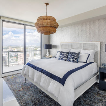
 Laure Nell Interiors
Every inch of this 4,200-square-foot condo on Las Olas—two units combined into one inside the tallest building in Fort Lauderdale—is dripping with glamour, starting right away in the entrance with Phillip Jeffries’ Cloud wallpaper and crushed velvet gold chairs by Koket. Along with tearing out some of the bathrooms and installing sleek and chic new vanities, Laure Nell Interiors outfitted the residence with all the accoutrements that make it perfect for the owners—two doctors without children—to enjoy an evening at home alone or entertaining friends and family. On one side of the condo, we turned the previous kitchen into a wet bar off the family room. Inspired by One Hotel, the aesthetic here gives off permanent vacation vibes. A large rattan light fixture sets a beachy tone above a custom-designed oversized sofa. Also on this side of the unit, a light and bright guest bedroom, affectionately named the Bali Room, features Phillip Jeffries’ silver leaf wallpaper and heirloom artifacts that pay homage to the Indian heritage of one of the owners. In another more-moody guest room, a Currey and Co. Grand Lotus light fixture gives off a golden glow against Phillip Jeffries’ dip wallcovering behind an emerald green bed, while an artist hand painted the look on each wall. The other side of the condo took on an aesthetic that reads: The more bling, the better. Think crystals and chrome and a 78-inch circular diamond chandelier. The main kitchen, living room (where we custom-surged together Surya rugs), dining room (embellished with jewelry-like chain-link Yale sconces by Arteriors), office, and master bedroom (overlooking downtown and the ocean) all reside on this side of the residence. And then there’s perhaps the jewel of the home: the powder room, illuminated by Tom Dixon pendants. The homeowners hiked Machu Picchu together and fell in love with a piece of art on their trip that we designed the entire bathroom around. It’s one of many personal objets found throughout the condo, making this project a true labor of love.
44