
Search results for "Straightforwardly" in Home Design Ideas
 Woodsmith Construction Inc
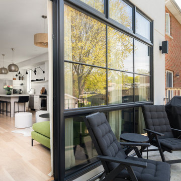
From a modest East End bungalow to a striking three-storey custom home — our Dundas St E project was anything but straightforward.
When we began demolition, we discovered the house sat on a former landfill site, which created serious structural challenges. Instead of seeing a problem, we saw an opportunity to apply innovative engineering. Our team designed and installed a foundation system using helical piles and structured footings, creating a rock-solid base for the new build. This project proves that no matter how complex the site conditions, smart design and skilled construction can transform challenges into stunning results. The proof? This home sold within two days of hitting the market.
 Vij5
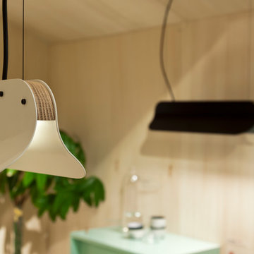
Vij5With the Long Shade we introduce a ‘hybrid’ LED light, feeling comfortable in both private residences as in contemporary office applications. The Long Shade is available in two lengths to create straightforward utilitarian light or domestic and playful configurations.
The name originates from the subtle reference to an archetypical lampshade, visible in the side view of the lamp body, as well as the stretching length of the available models.
The smaller version has a special High Power LED strip hidden between its wings to create a significant light output on only 400 mm length. The longer model doubles the length of the LED and even has an extra functionality built in; the switch on the top switches between two light colors ánd light volumes. In the standard position the dimmed light (Extra Warm White ±2700K) gives the perfect atmosphere for a cozy dinner with friends or a functional yet warm white in the house. When pulling the switch, the color changes to a brighter white (Warm White ±3000K) and more than doubles the amount of light shining down between the colored shades. This last position gives the perfect atmosphere to do some work at home or for use in office applications.
design by Daphna Laurens
photo credits by Vij5
 Woodsmith Construction Inc
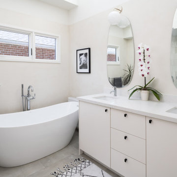
From a modest East End bungalow to a striking three-storey custom home — our Dundas St E project was anything but straightforward.
When we began demolition, we discovered the house sat on a former landfill site, which created serious structural challenges. Instead of seeing a problem, we saw an opportunity to apply innovative engineering. Our team designed and installed a foundation system using helical piles and structured footings, creating a rock-solid base for the new build. This project proves that no matter how complex the site conditions, smart design and skilled construction can transform challenges into stunning results. The proof? This home sold within two days of hitting the market.
Find the right local pro for your project
 Woodsmith Construction Inc
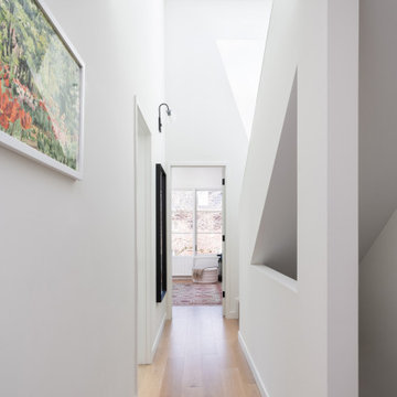
From a modest East End bungalow to a striking three-storey custom home — our Dundas St E project was anything but straightforward.
When we began demolition, we discovered the house sat on a former landfill site, which created serious structural challenges. Instead of seeing a problem, we saw an opportunity to apply innovative engineering. Our team designed and installed a foundation system using helical piles and structured footings, creating a rock-solid base for the new build. This project proves that no matter how complex the site conditions, smart design and skilled construction can transform challenges into stunning results. The proof? This home sold within two days of hitting the market.
 Century Stair Company
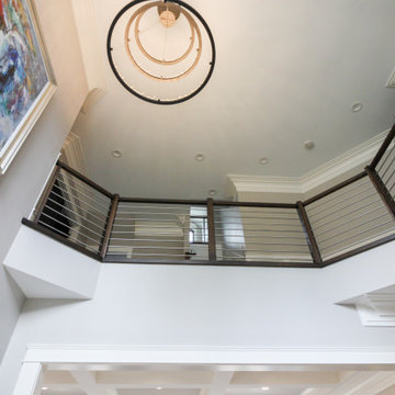
The balance of form and function is the hallmark of modern design. This staircase is a perfect example of that elegant simplicity. The dark-stained treads, newels, and smooth wood handrail create a rich foundation, while the parallel horizontal stainless steel rods add a sleek touch. With a beautiful overlook from the second floor, the staircase serves as a stunning focal point for the home. However, it's the interplay between the dark wood and gleaming steel elements that truly sets this project apart, demonstrating how material contrast can elevate a straightforward design into something memorable.
1976-2026 © Century Stair Company
 Soak Barrel Co. – Cedar Hot Tubs & Outdoor Saunas
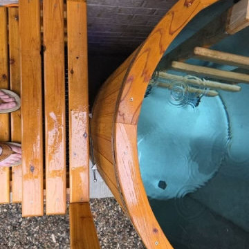
This project features the Viking Pro XL 60″ Tall Vertical Cedar Cold Plunge, constructed from solid Western Red Cedar and installed on a finished patio surface.
The plunge is built using thick, full-length cedar staves secured with stainless steel compression bands, creating a strong and watertight structure without synthetic liners or plastic shells. The vertical design maximizes immersion depth while maintaining a compact footprint.
Western Red Cedar was selected for its natural resistance to moisture, mold, and decay. Its dimensional stability allows the structure to perform reliably through seasonal temperature changes, making it well suited for year-round outdoor use.
The unit includes a dedicated equipment compartment housing the circulation and temperature control system, designed for easy access and straightforward maintenance.
With proper care, solid cedar construction is built to last 15–20+ years outdoors, offering a durable and fully natural alternative to acrylic or plastic cold plunge tubs.
 Woodsmith Construction Inc
From a modest East End bungalow to a striking three-
storey custom home — our Dundas St E project was anything but straightforward.
When we began demolition, we discovered the house sat on a former landfill site, which created serious structural challenges. Instead of seeing a problem, we saw an opportunity to apply innovative engineering. Our team designed and installed a foundation system using helical piles and structured footings, creating a rock-solid base for the new build. This project proves that no matter how complex the site conditions, smart design and skilled construction can transform challenges into stunning results. The proof? This home sold within two days of hitting the market.
 Century Stair Company
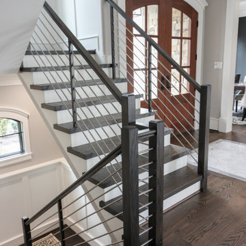
The balance of form and function is the hallmark of modern design. This staircase is a perfect example of that elegant simplicity. The dark-stained treads, newels, and smooth wood handrail create a rich foundation, while the parallel horizontal stainless steel rods add a sleek touch. With a beautiful overlook from the second floor, the staircase serves as a stunning focal point for the home. However, it's the interplay between the dark wood and gleaming steel elements that truly sets this project apart, demonstrating how material contrast can elevate a straightforward design into something memorable.
1976-2026 © Century Stair Company
 Woodsmith Construction Inc
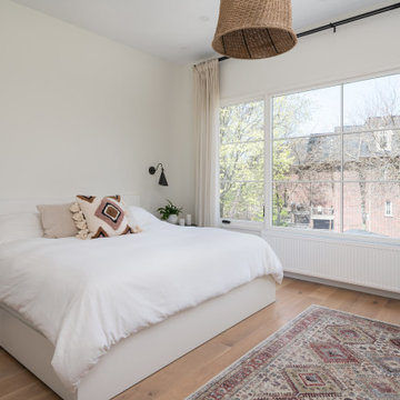
From a modest East End bungalow to a striking three-storey custom home — our Dundas St E project was anything but straightforward.
When we began demolition, we discovered the house sat on a former landfill site, which created serious structural challenges. Instead of seeing a problem, we saw an opportunity to apply innovative engineering. Our team designed and installed a foundation system using helical piles and structured footings, creating a rock-solid base for the new build. This project proves that no matter how complex the site conditions, smart design and skilled construction can transform challenges into stunning results. The proof? This home sold within two days of hitting the market.
 Bilotta Kitchen & Home
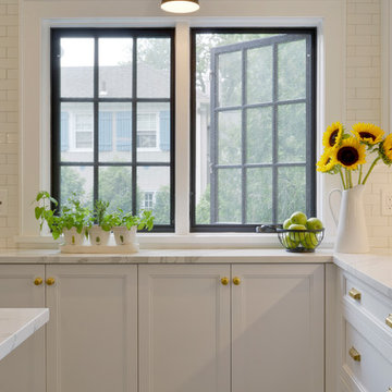
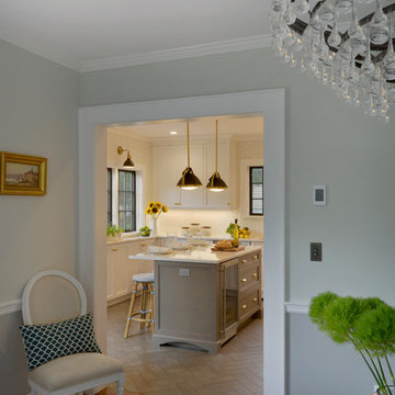
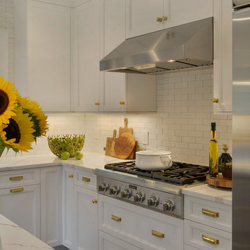
For this kitchen, designed by Peter Bittner, the client had a very clear idea of what she wanted right from the start. She did her research. The mother of a fast growing, young family, she wanted something as efficient as it was beautiful – on the simple, yet elegant side. Her requests were straightforward: white and light grey Bilotta cabinetry in a transitional style so as not to compete with the detailing inside her 1950s Tudor-style home; a heated tile floor (By Rye Ridge Tile); stainless appliances; white subway tile backsplash by Walker Zanger (again to keep it clean and not compete with its surroundings); and seating at the island for snacks and homework. The “pop” suggested by Peter was done through the satin brass hardware and lighting fixtures. The real challenge with this space was to fit as much as possible into the existing footprint which was overall on the smaller side. The solution was eliminating a doorway (with a swinging door that opened into the kitchen) and stairs from the kitchen to the basement. By moving the stairs and doorway, the usable space increased considerably. The typical working triangle became the focus for one side of the kitchen and the island overhang and seating became available on the other side. To make up for the limited amount of wall cabinets Peter designed shallow pantry-style cabinets along the back wall. Quartz Countertops by Rom Stone Fabrication. Designer: Peter Bittner Photographer: Peter Krupenye
 Drewett Works
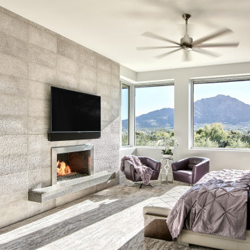
With nearly 14,000 square feet of transparent planar architecture, In Plane Sight, encapsulates — by a horizontal bridge-like architectural form — 180 degree views of Paradise Valley, iconic Camelback Mountain, the city of Phoenix, and its surrounding mountain ranges.
Large format wall cladding, wood ceilings, and an enviable glazing package produce an elegant, modernist hillside composition.
The challenges of this 1.25 acre site were few: a site elevation change exceeding 45 feet and an existing older home which was demolished. The client program was straightforward: modern and view-capturing with equal parts indoor and outdoor living spaces.
Though largely open, the architecture has a remarkable sense of spatial arrival and autonomy. A glass entry door provides a glimpse of a private bridge connecting master suite to outdoor living, highlights the vista beyond, and creates a sense of hovering above a descending landscape. Indoor living spaces enveloped by pocketing glass doors open to outdoor paradise.
The raised peninsula pool, which seemingly levitates above the ground floor plane, becomes a centerpiece for the inspiring outdoor living environment and the connection point between lower level entertainment spaces (home theater and bar) and upper outdoor spaces.
Project Details: In Plane Sight
Architecture: Drewett Works
Developer/Builder: Bedbrock Developers
Interior Design: Est Est and client
Photography: Werner Segarra
Awards
Room of the Year, Best in American Living Awards 2019
Platinum Award – Outdoor Room, Best in American Living Awards 2019
Silver Award – One-of-a-Kind Custom Home or Spec 6,001 – 8,000 sq ft, Best in American Living Awards 2019
 Lifetime Remodeling Systems
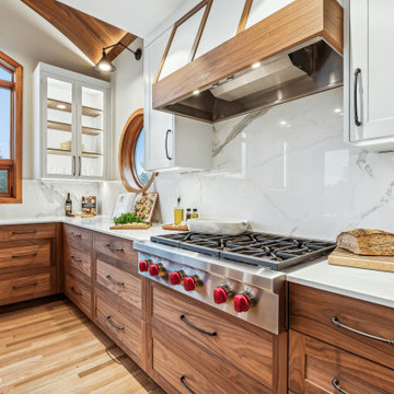
For this project, the customer envisioned enhancing their kitchen, creating a seamless connection to the living and dining areas, which had been raised. We presented options for the addition, showcasing designs that married simplicity with elegance. The first options featured straightforward roofing solutions, while the final design embraced the home's curves, incorporating the graceful rounded windows, entryway, and chimney.
We crafted the addition with a stunning barrel ceiling adorned with rich walnut wood paneling and accent lighting, creating an inviting atmosphere. After careful consideration, the clients chose the more intricate design, perfectly complementing their home's aesthetic. To elevate the space, we added a round window and an arched window in the kitchen, enhancing its character.
In the living area, they selected a Nana Wall door, allowing for a harmonious flow between indoors and the outdoor entertainment space. The kitchen showcases exquisite walnut cabinets, accented with white painted cabinets in a sleek shallow shaker style. The 2cm Dekton countertops & backsplash were designed with an island height of 2 1/4 inches, creating a more dynamic space.
As passionate cooks and bakers, the clients chose Wolf and SubZero appliances, panel-ready to harmonize beautifully with their kitchen design. This project turned out breathtakingly, and the clients are overjoyed to possess a kitchen that embodies beauty and functionality, exceeding their dreams and aspirations.
 Bilotta Kitchen & Home
For this kitchen, designed by Peter Bittner, the client had a very clear idea of what she wanted right from the start. She did her research. The mother of a fast growing, young family, she wanted something as efficient as it was beautiful – on the simple, yet elegant side. Her requests were straightforward: white and light grey Bilotta cabinetry in a transitional style so as not to compete with the detailing inside her 1950s Tudor-style home; a heated tile floor (By Rye Ridge Tile); stainless appliances; white subway tile backsplash by Walker Zanger (again to keep it clean and not compete with its surroundings); and seating at the island for snacks and homework. The “pop” suggested by Peter was done through the satin brass hardware and lighting fixtures. The real challenge with this space was to fit as much as possible into the existing footprint which was overall on the smaller side. The solution was eliminating a doorway (with a swinging door that opened into the kitchen) and stairs from the kitchen to the basement. By moving the stairs and doorway, the usable space increased considerably. The typical working triangle became the focus for one side of the kitchen and the island overhang and seating became available on the other side. To make up for the limited amount of wall cabinets Peter designed shallow pantry-style cabinets along the back wall. Quartz Countertops by Rom Stone Fabrication. Designer: Peter Bittner Photographer: Peter Krupenye




 Bilotta Kitchen & Home
For this kitchen, designed by Peter Bittner, the client had a very clear idea of what she wanted right from the start. She did her research. The mother of a fast growing, young family, she wanted something as efficient as it was beautiful – on the simple, yet elegant side. Her requests were straightforward: white and light grey Bilotta cabinetry in a transitional style so as not to compete with the detailing inside her 1950s Tudor-style home; a heated tile floor (By Rye Ridge Tile); stainless appliances; white subway tile backsplash by Walker Zanger (again to keep it clean and not compete with its surroundings); and seating at the island for snacks and homework. The “pop” suggested by Peter was done through the satin brass hardware and lighting fixtures. The real challenge with this space was to fit as much as possible into the existing footprint which was overall on the smaller side. The solution was eliminating a doorway (with a swinging door that opened into the kitchen) and stairs from the kitchen to the basement. By moving the stairs and doorway, the usable space increased considerably. The typical working triangle became the focus for one side of the kitchen and the island overhang and seating became available on the other side. To make up for the limited amount of wall cabinets Peter designed shallow pantry-style cabinets along the back wall. Quartz Countertops by Rom Stone Fabrication. Designer: Peter Bittner Photographer: Peter Krupenye
 TKS Design Group
Free ebook, Creating the Ideal Kitchen. DOWNLOAD NOW
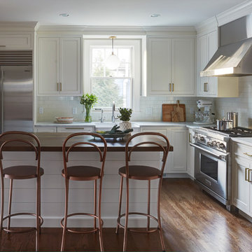
This Glen Ellyn couple wanted to transform their dated kitchen into a more family-friendly space to use on a daily basis for cooking family meals and for entertaining friends. The existing kitchen was quite chopped up with strange soffits and different ceiling heights. To make the space flow in a more logical manner, we borrowed an unused desk area from the adjoining hallway and reconfigured a neighboring bath. Getting it to work on paper was fairly straightforward, but there was a bit of complicated beam work involved as the new kitchen flows through what was an old exterior wall. The new ceiling is now completely flush as we were able to hide the support in the ceiling joists.
A new, larger window was added at the sink, the doorway to the room was widened and the resulting space creates a more easy flow from dining room to family room.
The clients chose white inset cabinets, white marble tops and an apron sink to keep the space feeling simple yet original to the home's Colonial styling.
Ship lap siding on the back of the island and at the pantry storage ceiling, a walnut butcher block, and antique brass details give the space an updated look.
Professional stainless appliances are functional and beautiful. In addition to a large built-in fridge and 36" range, a second oven is housed in the island for flexibility.
The pantry area has a convenience station that houses the family's espresso machine along with the microwave drawer. Another large bank of cabinets in the same area serves as pantry storage for dry goods.
The bathroom was also remodeled as part of this project. The full bath has a vanity, shower and convenient baby changing area.
The floor is encaustic tile, a type of concrete tile recognizable by its bold graphics. The mirror and lighting add a few modern touches to keep it in line with the Owner's personal style.
Designed by: Susan Klimala, CKD, CBD
Photography by: Carlos Vergara
For more information on kitchen and bath design ideas go to: www.kitchenstudio-ge.com
 La-Z-Boy
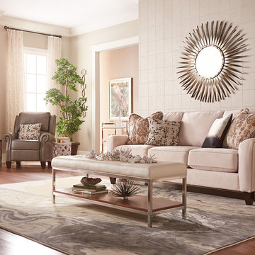
The Talbot Sofa is clean and informal - optional pillow accents, contrasting welt and nail head trim are also available to help you create the look that’s right for you.
47