
Search results for "Strategically" in Home Design Ideas
 DesignARC
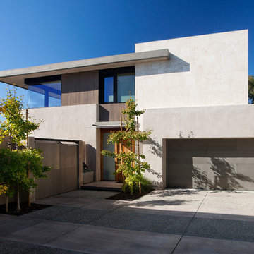
The Tice Residences replace a run-down and aging duplex with two separate, modern, Santa Barbara homes. Although the unique creek-side site (which the client’s original home looked toward across a small ravine) proposed significant challenges, the clients were certain they wanted to live on the lush “Riviera” hillside.
The challenges presented were ultimately overcome through a thorough and careful study of site conditions. With an extremely efficient use of space and strategic placement of windows and decks, privacy is maintained while affording expansive views from each home to the creek, downtown Santa Barbara and Pacific Ocean beyond. Both homes appear to have far more openness than their compact lots afford.
The solution strikes a balance between enclosure and openness. Walls and landscape elements divide and protect two private domains, and are in turn, carefully penetrated to reveal views.
Both homes are variations on one consistent theme: elegant composition of contemporary, “warm” materials; strong roof planes punctuated by vertical masses; and floating decks. The project forms an intimate connection with its setting by using site-excavated stone, terracing landscape planters with native plantings, and utilizing the shade provided by its ancient Riviera Oak trees.
2012 AIA Santa Barbara Chapter Merit Award
Jim Bartsch Photography
 FOUR POINT DESIGN BUILD INC
DESIGN BUILD REMODEL | Home Office Transformation | FOUR POINT DESIGN BUILD INC.
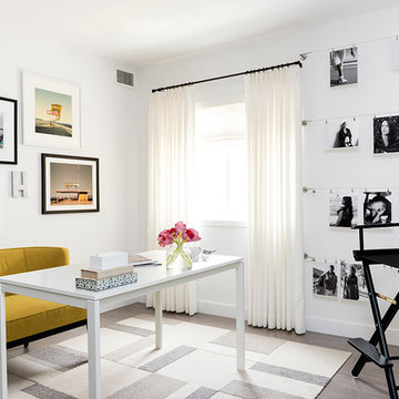
This space was once a child's bedroom and now doubles as a professional home photography post production office and a dressing room for graceful ballerinas!
This completely transformed 3,500+ sf family dream home sits atop the gorgeous hills of Calabasas, CA and celebrates the strategic and eclectic merging of contemporary and mid-century modern styles with the earthy touches of a world traveler!
AS SEEN IN Better Homes and Gardens | BEFORE & AFTER | 10 page feature and COVER | Spring 2016
To see more of this fantastic transformation, watch for the launch of our NEW website and blog THE FOUR POINT REPORT, where we celebrate this and other incredible design build journey! Launching September 2016.
Photography by Riley Jamison
#ballet #photography #remodel #LAinteriordesigner #builder #dreamproject #oneinamillion

Find the right local pro for your project
 FOUR POINT DESIGN BUILD INC
DESIGN BUILD REMODEL | Laundry Room and Guest Bath Remodel | FOUR POINT DESIGN BUILD INC.
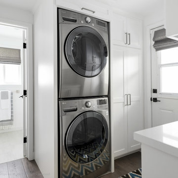
This completely transformed 3500+ sf family dream home sits atop the gorgeous hills of Calabasas, CA and celebrates the strategic and eclectic merging of contemporary and mid-century modern styles with the earthy touches of a world traveler! Home to an active family, including three dogs, a cat, two kids, and a constant stream of friends and family, when considering the LAUNDRY ROOM AND GUEST BATH, our focus was on high function, durability, and organization!
AS SEEN IN Better Homes and Gardens BEFORE & AFTER | 10 page feature and COVER | Spring 2016
Photography by Riley Jamison

 Level Design Build
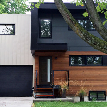
Front exterior of our custom modern home in Barrie, Ontario. Design and built by Level Design Build in collaboration with L+M Design. Minimal maintenance materials are used in inaccessible areas. Custom milled cedar siding with a 3/16" reveal is strategically cladded in areas that are accessible to refinish and provide a warm finishing touch to this 2200 square foot modern home in Barrie's east end.
 andisonresidentialdesign
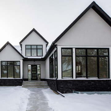
This is not your traditional bungalow! While it shares some of the hallmarks of this historic home style, this bungalow brings the classic single-story design into the twenty-first century.
The black-and-white facade shows a simple, but incredibly well thought out design consisting of mostly straight lines and glass. Modern architecture is all about simple designs where less is more. Clean and uncluttered home exterior trends have gained popularity over the years, as many homeowners are yearning to live peacefully without excess.
Clean lines, basic forms, single-use of colour, repetition of structures and strategic use of metal, stone, stucco and glass materials are defining characteristics of this custom home in the upper-scale, inner-city community of North Glenmore Park in Calgary, Alberta.
 The Cultural Landscape Foundation
Saturday June 20, 1:30 to 3:00pm | Greenwich Village
Urban Aerie by David Kamp, FASLA, of Dirtworks Landscape Architecture, PC
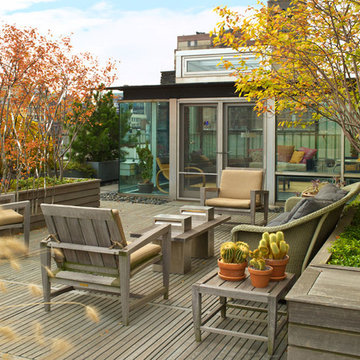
For their award-winning terrace design, the landscape architects created a relaxing setting using the same materials they employed on their client’s beachfront hideaway (as part of this Dialogue, attendees visit the terrace where they’ll also get a presentation about the beach property). Contrasts in texture and color are carefully arranged. Cedar, weathered to a buff grey, is used throughout for decking and set off in places with borders of dark round stones. The wood is carefully treated so it’s smooth underfoot. Two bow front metal perimeter planters overflow with grasses, which soften the edges. Strategically placed cedar planters with amelanchier, also known as juneberry, are used as a screening device, to frame dramatic views from the apartment and provide some canopy. A single pine, together with the juneberry, provides sculptural interest. All the plants, which are either native or naturalized, weather the harsh winter winds and temperatures. Photo copyright Andrew Bordwin Studio Inc.
 FOUR POINT DESIGN BUILD INC
DESIGN BUILD REMODEL | Tween Bedroom Transformation | FOUR POINT DESIGN BUILD INC | Part Twelve
This completely transformed 3,500+ sf family dream home sits atop the gorgeous hills of Calabasas, CA and celebrates the strategic and eclectic merging of contemporary and mid-century modern styles with the earthy touches of a world traveler!
AS SEEN IN Better Homes and Gardens | BEFORE & AFTER | 10 page feature and COVER | Spring 2016
To see more of this fantastic transformation, watch for the launch of our NEW website and blog THE FOUR POINT REPORT, where we celebrate this and other incredible design build journey! Launching September 2016.
Photography by Riley Jamison
#TweenBedroom #remodel #LAinteriordesigner #builder #dreamproject #oneinamillion

 Envision Builders Inc
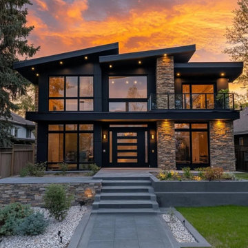
This Bellevue private residence showcases a contemporary Northwest design, blending clean architectural lines with warm natural materials and modern finishes throughout.
The home features an open-concept layout designed for functionality and everyday living, with a focus on natural light, efficient space planning, and seamless transitions between living areas. Interior finishes include light wood cabinetry, quartz countertops, and matte black fixtures, creating a balanced, modern aesthetic that feels both refined and livable.
Key spaces such as the kitchen and bathrooms were designed with both durability and style in mind, incorporating high-quality materials, clean detailing, and thoughtful layouts to support long-term performance and ease of use.
From exterior presentation to interior execution, this project reflects a commitment to quality craftsmanship, modern design standards, and efficient construction practices.
 Spaces Designed, Interior Design Studio, LLC
“We could never have envisioned what could be” – Steiner Ranch Homeowner and Client
It is an especially fulfilling Project for an Interior Designer when the outcome exceeds Client expectations, and imagination. This remodeling project required instilling modern sensibilities, openness, styles and textures into a dated house that was past its prime. Strategically, the goal was to tear down where it made sense without doing a complete teardown.
Starting with the soul of the home, the kitchen, we expanded out room by room to create a cohesiveness and flow that invites, supports and provides the warmth and relaxation that only a home can.
In the Kitchen, we started by removing the wooden beams and adding bright recessed lighting. We removed the old limestone accent wall and moved the sink and cooktop from the island on to the countertop – the key goal was to create room for the family to gather around the kitchen. We replaced all appliances with modern Energy Star ones, along with adding a wine rack.
The first order of business for the Living Room was to brighten it up by adding more lighting and replacing an unused section with a glass door to the backyard. Multi-section windows were replaced with large no-split glass overlooking the backyard. Once more, the limestone accent was removed to create a clean, modern look. Replacing the dated wooden staircase with the clean lines of a metal, wire and wooded staircase added interest and freshness. An odd bend in the staircase was removed to clean things up.
The Master Bedroom went from what looked like a motel room with green carpet and cheap blinds to an oasis of luxury and charm. A section of the wraparound doors were closed off to increase privacy, accentuate the best view from the bedroom and to add usable space. Artwork, rug, contemporary bed and other accent pieces brought together the seamless look across the home.
The Master Bathroom remodel started by replacing the standard windows with a single glass pane that enhanced the view of the outdoors. The dated shower was replaced by a walk-in shower and soaking tub to create the ultimate at-home spa experience. Lighted LED mirrors frame His & Hers sinks and bathe them in a soft light.
The flooring was upgraded throughout the house to reflect the contemporary color scheme.
Each of the smaller bedrooms were similarly upgraded to match the clean and modern décor of the rest of the house.
After such a transformation inside, it was only appropriate that the exterior needed an upgrade as well. All of the legacy limestone accents were replaced by stucco and the color scheme extended from the interior of the house to the gorgeous wrap around balconies, trim, garage doors etc. to complete the inside outside transformation.
 TOC design & construction inc.
DESIGNED BY TOC design
CONSTRUCTION BY TOC design & Construction inc.
PHOTOS BY : Tania Scardellato
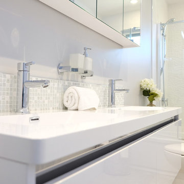
I was fortunate to have a young family approach me in desperate need to renovate there only 3 piece bathroom. This space was In dire need of a remodel, with old brown wall to wall tiles and a dated bulky yellow brown single sink vanity.
Storage was a must, lighting a necessity, and proper accessibility to the shower bath area.
We had a tight budget to respect, but a full gut of this bathroom was required. And a good thing too, once we started doing the demolition we noticed that mildew and rotting floors and walls had accumulated throughout the years. Doing it right the first time is no joke when dealing with water and electrical issues.
We discarded all reminisce of old and built from scratch, new walls, new plumbing, new electrical ,new insulation and a new window, a new fan that actually exhausted outside ( I say this laughing as you would be amazed at how many fans are installed but don’t exhaust outside, and you the client would never know unless you go inside the attic space.
Once all the hard stuff was done, the rest is just a matter of smart design. If you have a small bathroom here are some tips to guide you.
10 tips for making a small bathroom feel larger
Is your tiny bathroom cramping your functionality and style, leaving you longing for the enormous bathrooms gracing the pages of design magazines? Even if your bathroom is a fraction of the size, all it takes is some design savvy to make the most of the space you have. Consider these 10 smart tips that will help your bathroom look, feel and function like those larger contenders.
1-Get creative with corners
Space is at a premium in small bathrooms, so it's important to maximize every inch. Corners, for example, provide extra space for shelving, storage units and even hooks. Get creative and install unique design solutions that are not only functional, but also eye-catching. If you love the airiness of floating cabinets, add baskets or decorative boxes under for extra storage. If you are installing floating cabinets insure that they are installed securely to studs or plywood at wall.
2- Let solid colors shine
Busy patterns have a shrinking effect and make small bathrooms seem even smaller. Conversely, light natural hues make a space feel more open. If you're itching to get creative with design, experiment with textures but keep overpowering patterns to a minimum. Tone on tone is the best to achieve this.
3 - Maximize your bathtub
A bathtub takes up a significant portion of the room, but modern, compact options with curved basins, can make the tub feel larger when in use, all while conserving space.
4 - Select a smaller faucet
A faucet is jewelry for the bathroom. And just as accessories can overpower an outfit, a big bulky faucet isn't flattering in a small bath. Single-handle designs conserve counter space, while a wall-mount installation frees it up all together and can create quite the wow-factor, if the budget can accommodate the required changes to plumbing behind the wall.
5 - Make vanity storage simple
If you're in a storage war with your small bathroom, you're not alone in the battle. Toiletries and personal supplies without a place to call home only add clutter and chaos. Store smart with a space-saving vanity, the dual sink vanity shown here, looks quite simple, but in reality it has 4 sets of full extension drawers, and the vanity tower adds extra storage without overpowering the use of space.
6 - Show off the shower
Shower curtains may be pretty, but they interrupt the visual flow of a bathing space and make it feel significantly smaller. In bathrooms with small footprints, opt for a clear glass sliding shower door that doesn't require the clearance of one with a hinged design. Or as shown in this design and for fraction less expensive a half hinged panel installed on a fixed tempered glass panel. If you're embarking on a big remodel, create the illusion of more space by using same tile in the shower that's used throughout; instead of seeing them as two separate zones, the eye will read them as one.
7 - Discover the treasure of hidden storage
Work with a contractor, and you just might find some serious storage potential hidden behind your walls. Whether it's utilizing space between the studs for shallow shelving or a creating a small linen closet by annexing space from an adjacent room, even small additions can make a big difference.
8 - Focal Point
Tile is a beautiful, durable addition to any bathroom. For dainty spaces, consider installing tile at a diagonal to accentuate the focal point or as in this bathroom I used an oversized textured pattern to bring depth to the space at the window wall.
9 - Choose the right lights
Strategically install light to reflect and brighten a small bathroom to make it appear larger. Recessed lighting is an affordable solution for tiny rooms, offering ample light while taking up little space. Wall sconces alongside a mirror also reflect off the walls and make a room feel bright and airy. I always recommend going with LED lighting at 2800 to 3000K.
10 – Accessorize
This is your time to shine in your decorating skills, have fun with your towels, you can change the color scheme daily just by adding pops of color in your accessories, make sure to get items that serve a dual purpose, like baskets, boxes they can always be used as hampers, storing of towels and even a nice display for your guest.
 Kat Nelson Designs
 Lisa Konz Photography
This was such a fun project working with these clients who wanted to take an old school, traditional lake house and update it. We moved the kitchen from the previous location to the breakfast area to create a more open space floor plan. We also added ship lap strategically to some feature walls and columns. The color palette we went with was navy, black, tan and cream. The decorative and central feature of the kitchen tile and family room rug really drove the direction of this project. With plenty of light once we moved the kitchen and white walls, we were able to go with dramatic black cabinets. The solid brass pulls added a little drama, but the light reclaimed open shelves and cross detail on the island kept it from getting too fussy and clean white Quartz countertops keep the kitchen from feeling too dark.
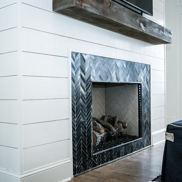
There previously wasn't a fireplace so added one for cozy winter lake days with a herringbone tile surround and reclaimed beam mantle.
To ensure this family friendly lake house can withstand the traffic, we added sunbrella slipcovers to all the upholstery in the family room.
The back screened porch overlooks the lake and dock and is ready for an abundance of extended family and friends to enjoy this beautiful updated and classic lake home.

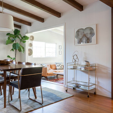
Great room - large mid-century modern medium tone wood floor and brown floor great room idea in Other with white walls

 User
UserThis modern farmhouse located outside of Spokane, Washington, creates a prominent focal point among the landscape of rolling plains. The composition of the home is dominated by three steep gable rooflines linked together by a central spine. This unique design evokes a sense of expansion and contraction from one space to the next. Vertical cedar siding, poured concrete, and zinc gray metal elements clad the modern farmhouse, which, combined with a shop that has the aesthetic of a weathered barn, creates a sense of modernity that remains rooted to the surrounding environment.
The Glo double pane A5 Series windows and doors were selected for the project because of their sleek, modern aesthetic and advanced thermal technology over traditional aluminum windows. High performance spacers, low iron glass, larger continuous thermal breaks, and multiple air seals allows the A5 Series to deliver high performance values and cost effective durability while remaining a sophisticated and stylish design choice. Strategically placed operable windows paired with large expanses of fixed picture windows provide natural ventilation and a visual connection to the outdoors.
 DesignARC
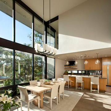
The Tice Residences replace a run-down and aging duplex with two separate, modern, Santa Barbara homes. Although the unique creek-side site (which the client’s original home looked toward across a small ravine) proposed significant challenges, the clients were certain they wanted to live on the lush “Riviera” hillside.
The challenges presented were ultimately overcome through a thorough and careful study of site conditions. With an extremely efficient use of space and strategic placement of windows and decks, privacy is maintained while affording expansive views from each home to the creek, downtown Santa Barbara and Pacific Ocean beyond. Both homes appear to have far more openness than their compact lots afford.
The solution strikes a balance between enclosure and openness. Walls and landscape elements divide and protect two private domains, and are in turn, carefully penetrated to reveal views.
Both homes are variations on one consistent theme: elegant composition of contemporary, “warm” materials; strong roof planes punctuated by vertical masses; and floating decks. The project forms an intimate connection with its setting by using site-excavated stone, terracing landscape planters with native plantings, and utilizing the shade provided by its ancient Riviera Oak trees.
2012 AIA Santa Barbara Chapter Merit Award
Jim Bartsch Photography
 Orren Pickell Building Group
**Project Overview**
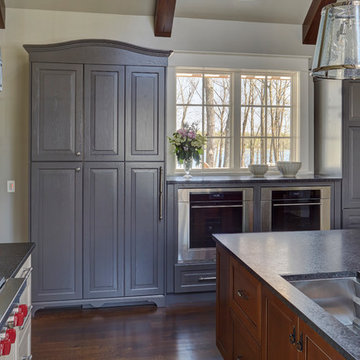
This new construction home built next to a serene lake features a gorgeous, large-scale kitchen that also connects to a bar, home office, breakfast room and great room. The homeowners sought the warmth of traditional styling, updated for today. In addition, they wanted to incorporate unexpected touches that would add personality. Strategic use of furniture details combined with clean lines brings the traditional style forward, making the kitchen feel fresh, new and timeless.
**What Makes This Project Unique?*
Three finishes, including vintage white paint, stained cherry and textured painted gray oak cabinetry, work together beautifully to create a varied, unique space. Above the wall cabinets, glass cabinets with X mullions add interest and decorative storage. Single ovens are tucked in cabinets under a window, and a warming drawer under one perfectly matches the cabinet drawer under the other. Matching furniture-style armoires flank the wall ovens, housing the freezer and a pantry in one and custom designed large scale appliance garage with retractable doors in the other. Other furniture touches can be found on the sink cabinet and range top cabinet that help complete the look. The variety of colors and textures of the stained and painted cabinetry, custom dark finish copper hood, wood ceiling beams, glass cabinets, wood floors and sleek backsplash bring the whole look together.
**Design Challenges*
Even though the space is large, we were challenged by having to work around the two doorways, two windows and many traffic patterns that run through the kitchen. Wall space for large appliances was quickly in short supply. Because we were involved early in the project, we were able to work with the architect to expanded the kitchen footprint in order to make the layout work and get appliance placement just right. We had other architectural elements to work with that we wanted to compliment the kitchen design but also dictated what we could do with the cabinetry. The wall cabinet height was determined based on the beams in the space. The oven wall with furniture armoires was designed around the window with the lake view. The height of the oven cabinets was determined by the window. We were able to use these obstacles and challenges to design creatively and make this kitchen one of a kind.
Photo by MIke Kaskel
 M.J. Whelan Construction
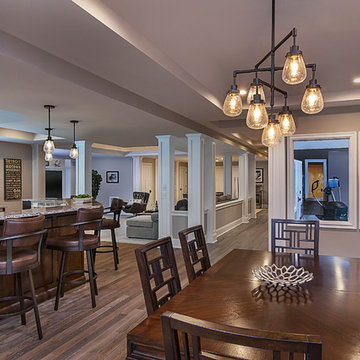
This Milford French country home’s 2,500 sq. ft. basement transformation is just as extraordinary as it is warm and inviting. The M.J. Whelan design team, along with our clients, left no details out. This luxury basement is a beautiful blend of modern and rustic materials. A unique tray ceiling with a hardwood inset defines the space of the full bar. Brookhaven maple custom cabinets with a dark bistro finish and Cambria quartz countertops were used along with state of the art appliances. A brick backsplash and vintage pendant lights with new LED Edison bulbs add beautiful drama. The entertainment area features a custom built-in entertainment center designed specifically to our client’s wishes. It houses a large flat screen TV, lots of storage, display shelves and speakers hidden by speaker fabric. LED accent lighting was strategically installed to highlight this beautiful space. The entertaining area is open to the billiards room, featuring a another beautiful brick accent wall with a direct vent fireplace. The old ugly steel columns were beautifully disguised with raised panel moldings and were used to create and define the different spaces, even a hallway. The exercise room and game space are open to each other and features glass all around to keep it open to the rest of the lower level. Another brick accent wall was used in the game area with hardwood flooring while the exercise room has rubber flooring. The design also includes a rear foyer coming in from the back yard with cubbies and a custom barn door to separate that entry. A playroom and a dining area were also included in this fabulous luxurious family retreat. Stunning Provenza engineered hardwood in a weathered wire brushed combined with textured Fabrica carpet was used throughout most of the basement floor which is heated hydronically. Tile was used in the entry and the new bathroom. The details are endless! Our client’s selections of beautiful furnishings complete this luxurious finished basement. Photography by Jeff Garland Photography
54