
Search results for "Structured approach" in Home Design Ideas
 Klopf Architecture
The Roger Lee designed house from 1962 was purchased by the current homeowners in almost original condition, as the previous owners elected to defer most maintenance projects over the years. The clients were able to see beyond the dated materials and finishes, single-paned glass and uninsulated walls and they approached Klopf Architecture to help them expand and update the entire home, one the family could settle into and enjoy for years to come. It was important that the new designs were aligned with Lee's original intent not only because of the client's appreciation for mid-century modern architecture, but also because the house was deemed historical. The Stanford Real Estate Office requires a stringent design review which safeguards the integrity of the community, which Klopf Architecture was happy to oblige going into their updated designs.
As with many original mid-century modern homes, the house was scaled to the 1960s lifestyle where rooms were smaller and openings to views were limited and tightly framed. The original conditions defined the direction the family of four would take in updating the house and making it comfortable for their modern lifestyle. Klopf designed a full gut remodel and major addition to bring the house into the 21st century and provide the living area needed for the client's family. The newly expanded house added just about 1,100 sf to create an airy, comfortable and family friendly house, taking full advantage of the beautiful southwestern views that extend out to the hills beyond. The enclosed garage created an additional 240 sf of covered space for long-term storage.
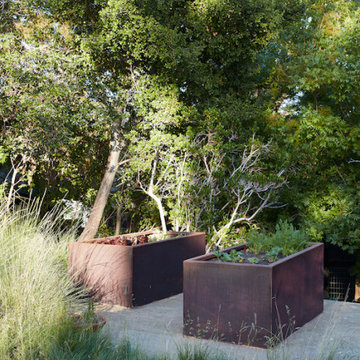
A cracked swimming pool created an eyesore taking up a majority of the backyard landscape, so it was one of the first elements to go during the transformation. Working with Outer Space Landscape Architects, the family asked for a mix of relaxing outdoor patio spaces that eventually blend into the native landscaping, extending their views outward toward the natural greenery of the trees beyond their property. Filling in the old pool was a smart way to expand the living spaces outward. The orientation of the house was designed to enjoy the views, but the original architecture provided the first homeowners with mere glimpses of the landscape outside.
Klopf was able to broaden those views, continuing and extending on the original architecture to take full advantage of the unobstructed natural views across the rear facade of the house. Small horizontal openings in the primary bedroom and office were replaced with much taller windows that now follow the angled roof line upward, extending across almost all of the facade. We worked with Western Windows, whose designs included an oblique-shaped, operable casement that allowed our design to rise with the slope. A new corner office added to the primary suite, offers a bright and functional work-from-home solution that looks out at the distant views and added natural light from the expanded window configuration that now wraps around the corner.
The existing lower level was designed by Lee as a utilitarian space, serving as a wet pool room with a drain in the center of the floor, bathroom, laundry and storage areas. Without the need for a pool room, Klopf was able to convert the area into a much more comfortable and functional living space with a new family room and guest suite. The new spaces enjoy easy access to a new outdoor patio through floor to ceiling, full-width glass sliders.
Continuing along the rear facade, a previously exposed deck extending from the living room and hallway provided access to the backyard through a single set of stairs leading toward the side of the house which made sense when the pool was in place. The new deck was re-envisioned as an extension of the main living room and now serves as a second outdoor living room. A new slatted pergola above provides the homeowners welcome relief from the hot afternoon sun. A second set of stairs now creates a better connection to the redesigned lower level. Klopf was able to reconfigure the spaces, extending the living room outward toward the views, where the family now claims it as the heart of the home, spending a large majority of their time outdoors.
Back inside, the original wood-burning Malm fireplace was beautifully restored and a gas burner installed to comply with California's strict air standards. It now rests in front of a wall of Heath accent tiles where a dated red brick wall used to stand. A new taller window brings more light and views into the refreshed interior living room. The original glass doors opposite the fireplace were replaced by larger sliders that when fully opened, create a seamless transition to the new outdoor living area so the two spaces feel like one connected space. The original utilitarian kitchen was needlessly tucked into the far back corner and closed-off, out of sight from the living room, so the clients asked Klopf to open it up and expand the kitchen forward so it felt more connected. Today the much larger kitchen is connected to the living area where a short wall with a cutout offers a visual glimpse into the kitchen and a handy pass-through counter for serving guests. A new breakfast nook was also added to create another spot where the family can gather for casual meals. Just outside, a new built-in outdoor grill and prep area extends the kitchen outside and connects to a new outdoor dining spot nestled amongst the trees, taking advantage of the views out back.
Klopf was able to expand the other two bedrooms, add a new laundry room and half-bath and convert the carport to an enclosed garage to add more storage areas which was lost when the pool house was converted to the family and guest room.
To maintain a historical connection to the original designs, the exterior siding was repeated on all exterior walls, a full-height stained glass window at the front entryway restored, and an interior slatted screen element repeated outside at the exterior entry courtyard and over the new outdoor living room to create a shade trellis. The new house stands proudly and shines against it's new landscaping features, while respecting and expanding on the original intent of Roger Lee's designs epitomizing the comforts of indoor-outdoor living in Northern California.
Completion year: 2020
Klopf Architecture project team: John Klopf, Klara Kevane, Noel Andrade
Contractor: ORB Construction, Brendan O'Reilly
Structural engineer: Sezen and Moon
Landscape architect: Outer space
Furnishings and decoration: Urbanism Designs
Photographer: Mariko Reed
 NK Construction And Design Inc
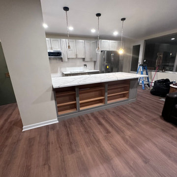
In this meticulously executed kitchen remodeling project, we transformed the space into a stunning open-plan design. Walls were skillfully removed, creating a seamless flow and maximizing the sense of openness. The centerpiece of the renovation is a spacious, well-crafted island that not only enhances functionality but also serves as a focal point, combining aesthetics with practicality. The attention to detail and thoughtful design choices make this kitchen a harmonious blend of beauty and functionality.
In addition to the structural enhancements, this comprehensive kitchen remodel extends to the flooring, where luxurious vinyl planks have been seamlessly integrated, elevating both style and durability. The project also involved a modernization of the electrical infrastructure, with the meticulous replacement of outdated wiring and fixtures. A new ceiling, adorned with energy-efficient LED recessed lighting, further enhances the ambiance, providing both aesthetic appeal and functional illumination to complement the transformed space. This multifaceted approach ensures that every aspect of the kitchen aligns with contemporary design standards and functional efficiency.
 User
UserOur approach to the dining room wall was a key decision for the entire project. The wall was load bearing and the homeowners considered only removing half of it. In the end, keeping the overall open concept design was important to the homeowners, therefore we installed a load bearing beam in the ceiling. The beam was finished with drywall to be cohesive so it looked like it was a part of the original design. Now that the kitchen and dining room were open, paint colors were used to designate the spaces and create visual boundaries. This made each area feel like it’s its own space without using any structures.
The original L-shaped kitchen was cut short because of bay windows that overlooked the backyard patio. These windows were lost in the space and not functional; they were replaced with double French doors leading onto the patio. A brick layer was brought in to patch up the window swap and now it looks like the French doors always existed. New crown molding was installed throughout and painted to match the kitchen cabinets.
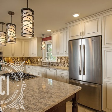
This window/door replacement allowed for a large pantry cabinet to be installed next to the refrigerator which was not in the old cabinet configuration. The replaced perimeter cabinets host custom storage solutions, like a mixer stand, spice organization, recycling center and functional corner cabinet with pull out shelving. The perimeter kitchen cabinets are painted with a glaze and the island is a cherry stain with glaze to amplify the raised panel door style.
We tripled the size of the kitchen island to expand countertop space. It seats five people and hosts charging stations for the family’s busy lifestyle. It was important that the cooktop in the island had a built in downdraft system because the homeowners did not want a ventilation hood in the center of the kitchen because it would obscure the open concept design.
The countertops are quartz and feature an under mount granite composite kitchen sink with a low divide center. The kitchen faucet, which features hands free and touch technology, and an instant hot water dispenser were added for convenience because of the homeowners’ busy lifestyle. The backsplash is a favorite, with a teal and red glass mosaic basket weave design. It stands out and holds its own among the expansive kitchen cabinets.
All recessed, under cabinet and decorative lights were installed on dimmer switches to allow the homeowners to adjust the lighting in each space of the project. All exterior and interior door hardware, hinges and knobs were replaced in oil rubbed bronze to match the dark stain throughout the space. The entire first floor remodel project uses 12x24 ceramic tile laid in a herringbone pattern. Since tile is typically cold, the flooring was also heated from below. This will also help with the homeowners’ original heating issues.
When accessorizing the kitchen, we used functional, everyday items the homeowners use like cutting boards, canisters for dry goods and place settings on the island. Ultimately, this project transformed their small, outdated kitchen into an expansive and functional workspace.
Find the right local pro for your project
 Plant Lane Farm
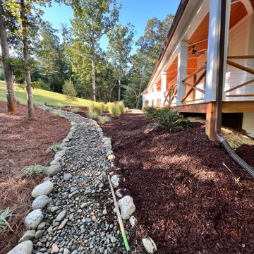
This inviting property features a modern farmhouse-style home with a wraparound porch and thoughtful landscaping that enhances its charm. Curved concrete pathways, mulched garden beds, and a lush green lawn create a welcoming approach, while tall trees frame the home in natural serenity. The design balances structure and softness, offering both curb appeal and a peaceful outdoor setting
 BMA Architects
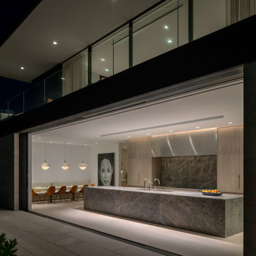
Though it’s located on 5.5 acres of pristine oceanfront in Southampton, this project came with inherent challenges. The clients had purchased the property with approvals in place, which locked in the size and location of the main house and accessory structure. The existing permits allowed for a 12,000 square foot traditional house with six bedrooms, yet the clients were looking to fit 11 bedrooms into the same footprint. Furthermore, the family regularly hosts large-scale gatherings and needed ample space for entertaining including a dining room that seats 50. The site boasts waterfront exposures on both the front and back sides of the property but shifting dunes had completely blocked the first-floor view toward the ocean.
In collaboration with a team of consultants, BMA determined that the tall dunes had grown unstable as ocean winds piled sand onto the site over decades. This created an opportunity to strategically re-sculpt the dunes for stability, with the added benefit of an improved view from the house. The view sequence was choreographed from the moment a visitor approaches the house, where a handful of stairs rise above the floodplain and lead to a dramatic courtyard. Moving toward the entry, views through the living area reveal the glimmering ocean beyond. Seen from the rear, the double-height living area anchors the volume, its minimalist grandeur framed in light limestone and crisp black wood. The design strategy ensures that water is visible from every major space in the house.
Despite the restrictive parameters that accompanied the project, gracious proportions and dramatic spaces transcend the initial limitations, giving the home a luxurious resort-like glamour. Interior spaces flow to the exterior, creating a house that engages with its site and celebrates the indoor-outdoor lifestyle for which the Hamptons are known.
 American Institute of Architects, San Francisco
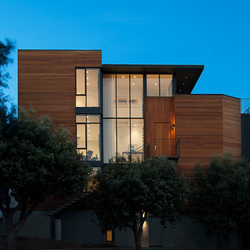
Situated on a triangular corner site, the Buena Vista Residence is a well proportioned home that responds to the scale of the neighborhood context. The building’s modern aesthetic is immediately apparent in the two wood-clad volumes connected by a tall glass atrium all sitting atop a concrete plinth. The variegated tone and grain of the redwood siding, reclaimed from nearby Hanger One at Moffett Field, achieves an ideal balance between the home’s clean, structured lines and the urban foliage surrounding the site. A concrete and steel exterior staircase provides a bold yet inviting approach to the home’s second floor entrance. Image by Sharon Risedorph.
 Kelvin Humenny
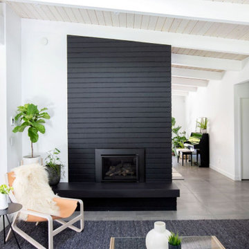
Edgemont has more than its share of mid-century post and beam homes — and the best of them have a quiet authority that demands respect. Adding onto a classic like this isn't just a design challenge, it's a responsibility. Get it wrong and you diminish something irreplaceable. Get it right and you give it another generation of life.
The approach here was restrained from the street and generous at the back. The original facade was preserved as faithfully as possible — the home reads from the front much as it always has, its proportions and character intact. The additions were pushed to the rear, where a new vaulted primary suite anchors the expansion. Separated from the children's rooms at the front of the home, it gives the parents of a young family something too many renovations forget to provide: a genuine retreat of their own.
The suite opens directly onto a private patio and yard, shared with the kitchen and dining area — an indoor-outdoor arrangement that feels like it was always meant to be there, which is the quiet test any addition to a home like this has to pass.
The post and beam language was carried through every new element — the structure, the ceiling lines, the way light enters the spaces. An addition that knows where it came from.
The original architect would approve.

Sponsored
Columbus, OH

Hope Restoration & General Contracting
Columbus Design-Build, Kitchen & Bath Remodeling, Historic Renovations
 CONTENT Architecture
Located in the Houston Heights, the Waverly Residence is a modern home on an established street of two story homes boasting front porch typologies. The family’s desire for privacy resulted in a porch that rotates to internalize most of its function while still addressing the street. For this active family, yard activity and it’s visibility from within the home emerged as a priority for approaching the building’s relationship to the lot. Justifying the building mass to the Northern half of the site reinforces the scale of the design to the surrounding buildings and creates a large southern yard dedicated to play and brisket (is a Texas house a house without a barbeque?).
The ground floor is clad in metal panel and a wood rainscreen that peels away from the structure to become both a fence and an entry threshold, blending the registration between the yard's privacy enclosure and the building skin. Variable width fiber-cement siding clads the second floor as a nod to the neighborhood vernacular. The pool and outdoor kitchen sit at the center of the yard, forming an island that divides the open play from private vehicular access at the alley.
Shifted volumes delineate private space from the open public areas. The second floor extends over the public entryway to create a covered procession with cascading steps into the southern yard that traverses the length of the living spaces. The public program expands beyond the building enclosure to encompass the yard and living spaces. A horizontal shift in the ground floor volume produces both a private courtyard away from the lively public spaces and exterior delineation between private vehicular access and public entry.
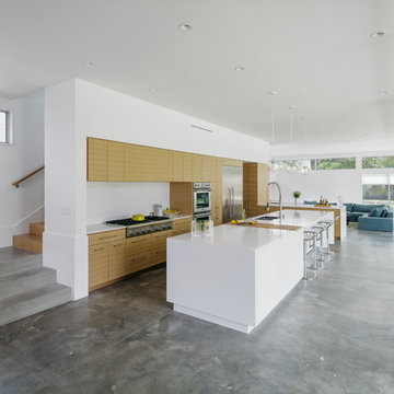
Within the open, ground floor plan, a change in elevation indicates the boundary between private and public space. Custom millwork provides ample storage for the young family. Playful patterns of enclosed storage with contrasting display boxes creates a cohesive millwork language throughout the home.
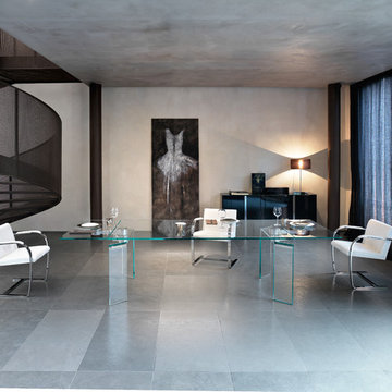
 RoomService 360
Founded in 1973, Fiam Italia is a global icon of glass culture with four decades of glass innovation and design that produced revolutionary structures and created a new level of utility for glass as a material in residential and commercial interior decor. Fiam Italia designs, develops and produces items of furniture in curved glass, creating them through a combination of craftsmanship and industrial processes, while merging tradition and innovation, through a hand-crafted approach.
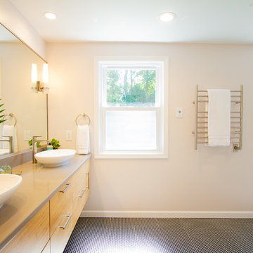
 dRemodeling Design-Build
Our clients approached us wanting to reclaim space from the L-shaped closet adjacent to their master bath. We re-structured the closet to use the space more efficiently, creating a spa-like retreat with clean lines in the European-style. Our designer Lauren pulled out all the stops with this one, from the luxurious curb-less walk-in shower and heated towel warmers to the custom bamboo vanity by Dura Supreme.
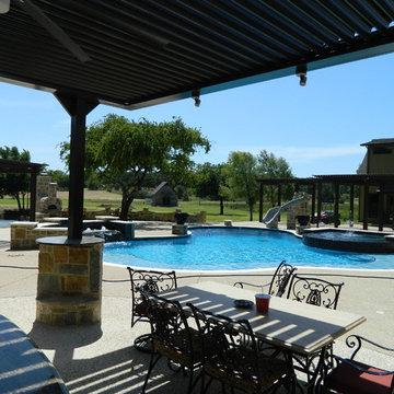
 CoverMyPatio.com
The Arcadia Louvered Roof enhances the beauty of any style home and provides the flexibility of having an open roof when the weather is good or a solid roof to keep the rain off your patio when the weather turns bad.
Eco-friendly Construction
The Arcadia system is made up of recycled aluminum making it an extremely Green product. It is also eco-friendly, helping consumers save on passive solar heating and cooling.
We Think Green
Arcadia is proud to continue the company's tradition with its approach to Environmental Innovation. From the choice of lightweight materials and lean production methods to the efficiency of its drive system and designs, Arcadia is committed to operating as a more sustainable business and reducing its overall environmental impact.
High-quality Building Materials
Each Arcadia system is a work of art, constructed with care and attention to every little detail.
Our system is powered coated, extruded aluminum with stainless steel components giving us the most durable louvered roof on the market today. From our superior drive system, which is UL & CE certified, down to the stainless steel tex screws that secures the system together. Nothing but the best!
Our low-maintenance components eliminate painting, staining, and waterproofing of traditional shading structures. Using powder-coated aluminum construction prevents warping, cracking, and corrosion.
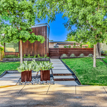
 Alterra Landscape Design
Clean lines and industrial materials define the front yard landscape architecture of this Vanguard Way residence. Floating concrete steppers lead to a custom wood-slat privacy fence, while corten steel planters featuring prickly pear cacti add a bold, desert-modern touch. This intentional design maximizes curb appeal while creating a structured, low-maintenance environment that perfectly introduces the home’s sophisticated approach to outdoor living.
 Cedarstone Group Inc.
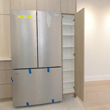
Kitchen – Integrated Tall Cabinet Concealing Mechanical Ductwork | Toronto
This kitchen detail highlights a thoughtful design-build solution where mechanical requirements and cabinetry design work seamlessly together. Behind the tall cabinet beside the refrigerator is a large air supply duct, required by the mechanical engineer to properly deliver conditioned air to the newly added second floor.
Rather than leaving the duct exposed or boxing it in as an obvious bulkhead, we strategically designed a shallow tall cabinet to conceal the ductwork. This approach maintains clean sightlines, preserves the kitchen’s modern aesthetic, and adds valuable storage space—turning a technical constraint into a functional design advantage.
This level of coordination between mechanical engineering, cabinetry layout, and construction execution is critical in full-home renovations and second floor additions, where systems must be upgraded without compromising design. The result is a kitchen that looks intentional, uncluttered, and highly functional—without revealing the complexity behind the walls.
This detail is a clear example of Cedarstone Group Inc.’s design-build philosophy: solve technical challenges early, integrate them thoughtfully, and make the final space feel effortless.

Sponsored
Columbus, OH

Structural Remodeling
Franklin County's Heavy Timber Specialists | Best of Houzz 2020!
 camilleriparismode
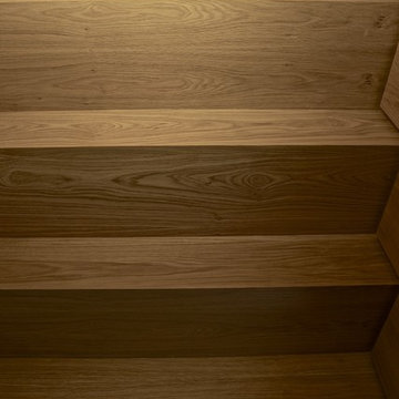
camilleriparismode projects and design team were approached to rethink a previously unused double height room in a wonderful villa. the lower part of the room was planned as a sitting and dining area, the sub level above as a tv den and games room. as the occupants enjoy their time together as a family, as well as their shared love of books, a floor-to-ceiling library was an ideal way of using and linking the large volume. the large library covers one wall of the room spilling into the den area above. it is given a sense of movement by the differing sizes of the verticals and shelves, broken up by randomly placed closed cupboards. the floating marble fireplace at the base of the library unit helps achieve a feeling of lightness despite it being a complex structure, while offering a cosy atmosphere to the family area below. the split-level den is reached via a solid oak staircase, below which is a custom made wine room. the staircase is concealed from the dining area by a high wall, painted in a bold colour on which a collection of paintings is displayed.
photos by: brian grech
 Susan Yeley Homes
We approached this new build as a seamless, full-service collaboration between architecture and interiors. Every decision—structural, spatial, and aesthetic—was shaped with intention, not to mention collaboration, since our contractor was also our client. Our contractor said, “make the rooflines simple and direct the water away.” His wife said, “I like color.” Check, and check. The bold exterior lines of the home both contrast with and recede into the woods around it, and the interiors are layered with cheerful hues, custom details, and playful patterns. Each room carries its own moment of cheer, while the overall palette ties together into a cohesive, uplifting whole, not unlike its namesake rainbow.
 Plant Lane Farm
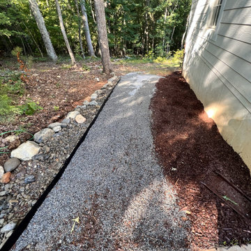
This inviting property features a modern farmhouse-style home with a wraparound porch and thoughtful landscaping that enhances its charm. Curved concrete pathways, mulched garden beds, and a lush green lawn create a welcoming approach, while tall trees frame the home in natural serenity. The design balances structure and softness, offering both curb appeal and a peaceful outdoor setting
 Dwellify
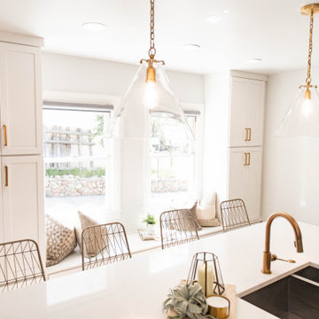
In this kitchen renovation, the aim was to revamp the space, making it not just functional, but stylish and inviting too. The decision to paint the walls predominantly white instantly promoted brightness and airiness into the room, setting the stage for a modern makeover. Knocking down the wall separating the kitchen from the family room added a touch of spaciousness and promoted seamless interaction between the two areas. Introducing a sleek floating island became the centerpiece, offering both practicality and a contemporary aesthetic. Upgrading to all new appliances ensured efficiency without sacrificing style. The end result? A chic, welcoming kitchen that's as perfect for cooking up a storm as it is for gathering with loved ones.
In this extensive bathroom remodel, a once cluttered and cramped primary bathroom has been meticulously transformed into a spacious and bright oasis. By prioritizing additional storage and leveraging the existing skylight, the space underwent a remarkable renovation without the need for significant structural changes. The skylight was maximized to its full potential by surrounding it with pristine white walls, creating an airy and luminous atmosphere. The introduction of a luxurious marble shower not only adds a touch of sophistication but also contributes to the overall cleanliness and sophistication of the space. Soft gray cabinets and warm wood accents were strategically incorporated to create a bathroom with a serene and welcoming ambiance, evoking a sense of tranquility and comfort. Every detail was meticulously considered, from the placement of storage solutions to the selection of materials, ensuring that the remodeled bathroom exudes both functionality and elegance.
The result is a blend of style and practicality, where every aspect of the design works in harmony to create a serene sanctuary where relaxation and rejuvenation are effortlessly embraced.

Sponsored
Columbus, OH
Free consultation for landscape design!

Peabody Landscape Group
Columbus' Reliable Landscape Design & Contracting
 McCabe By Design LLC
This bathroom was designed for two professionals who dedicate themselves to the health and wellness of others. The objective of the project was to be able to practice for themselves, what they preach to their patients.
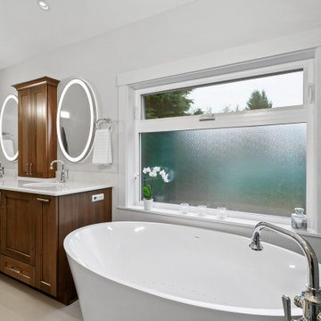
The original 90” x 162” primary bathroom had so many pain points (would you to look at a toilet when taking a relaxing bath?), that it should have been an easy task to meet their needs and desires, but it was anything but due to structural issues with the home. Several design layouts were considered before it was concluded that the only approach to check the ‘needs’ boxes was to flip the primary fixtures in the room from one end of this long, narrow bathroom to the other and incorporating a wet room.
The needs list included a soaking tub, a spacious shower that accommodated dual showering on business workday morning, more counter space, a bidet toilet, more storage, better lighting, better heat and humidity control, a soothing color pallet and privacy from the neighbors.
An air jet soaking tub (motor concealed in the nearby vented base cabinet) under a new window with privacy glass on the bottom and a clear glass awning window on top checked two boxes. The center drain for the bathing features provides space for two people to shower simultaneously while highlighting the soothing color pallet from every view point in the room. The integrated bidet toilet is an affordable luxury that delivers health and wellness multiples times in a day. The expanded vanity optimized storage while providing more, clutter free countertop space. Utilizing a variety of lighting types, with dimmers, provides the right illumination for every bathroom activity. Lastly, the in-floor heat, toe-kick heater and relocated bathroom exhaust fan over the shower help maintain a consistently comfortable temperature and humidity level in this bathroom transformation.
 camilleriparismode
camilleriparismode projects and design team were approached to rethink a previously unused double height room in a wonderful villa. the lower part of the room was planned as a sitting and dining area, the sub level above as a tv den and games room. as the occupants enjoy their time together as a family, as well as their shared love of books, a floor-to-ceiling library was an ideal way of using and linking the large volume. the large library covers one wall of the room spilling into the den area above. it is given a sense of movement by the differing sizes of the verticals and shelves, broken up by randomly placed closed cupboards. the floating marble fireplace at the base of the library unit helps achieve a feeling of lightness despite it being a complex structure, while offering a cosy atmosphere to the family area below. the split-level den is reached via a solid oak staircase, below which is a custom made wine room. the staircase is concealed from the dining area by a high wall, painted in a bold colour on which a collection of paintings is displayed.
photos by: brian grech
 Haifa Architects
Duplex Y is located in a multi apartment building, typical to the Carmel mountain neighborhoods. The building has several entrances due to the slope it sits on.
Duplex Y has its own separate entrance and a beautiful view towards Haifa bay and the Golan Heights that can be seen on a clear weather day.
The client - a computer high-tech couple, with their two small daughters asked us for a simple and functional design that could remind them of their frequent visits to central and northern Europe. Their request has been accepted.
Our planning approach was simple indeed, maybe even simple in a radical way:
We followed the principle of clean and ultra minimal spaces, that serve their direct mission only.
Complicated geometry of the rooms has been simplified by implementing built-in wood furniture into numerous niches.
The most 'complicated' room (due to its broken geometry, narrow proportions and sloped ceiling) has been turned into a kid's room shaped as a clean 'wood box' for fun, games and 'edutainment'.
The storage room has been refurbished to maximize it's purpose by creating enough space to store 90% of the entire family's demand.
We've tried to avoid unnecessary decoration. 97% of the design has its functional use in addition to its atmospheric qualities.
Several elements like the structural cylindrical column were exposed to show their original material - concrete.
Photos: Julia Berezina
113