
Search results for "Structured approach" in Home Design Ideas

 TN Nursery
Witch Hazel: A Shrub That Teaches Patience in the Garden
Witch hazel is a reminder that some of the most rewarding garden plants operate on a different timetable. Unlike shrubs that demand attention with bold flowers or fast growth, witch hazel reveals its value slowly and intentionally. Its most striking feature often appears when gardeners least expect it, with delicate, ribbon-like blooms emerging in late winter while much of the landscape still rests.
This timing alone sets witch hazel apart. Winter-blooming shrubs change the way gardeners experience their landscapes, encouraging observation during a season that is often overlooked. Planted near windows, paths, or entryways, witch hazel offers moments of surprise and quiet beauty when color is scarce. Its subtle fragrance and fine-textured flowers add depth without overwhelming the surrounding environment.
Beyond bloom, witch hazel contributes structure and balance to the garden year-round. Its branching form develops naturally into an open, graceful shape that rarely requires pruning. During the growing season, its foliage blends effortlessly with perennials, groundcovers, and woodland plants, creating cohesion rather than competition. In autumn, the leaves shift to soft golden tones, easing the transition into dormancy.
Witch hazel also supports a slower, more sustainable approach to gardening. Once established, it asks very little in return, adapting well to its surroundings and thriving without constant inputs. Its fallen leaves enrich the soil, reinforcing natural cycles that benefit neighboring plants.
In a garden culture often driven by instant results, witch hazel stands as a counterpoint. It rewards patience, invites reflection, and becomes more meaningful with time. For gardeners willing to embrace its rhythm, witch hazel offers not just seasonal interest, but a deeper connection to the quiet moments that make gardening truly fulfilling.
https://www.onlineplantnursery.com/products/witch-hazel
https://treenurseryco.com/witch-hazel-shrub
https://www.wholesalenurseryco.com/products/witch-hazel
https://www.tennesseewholesalenursery.com/products/witch-hazel
https://www.tnnursery.net/products/witch-hazel
 Vitruvius Built
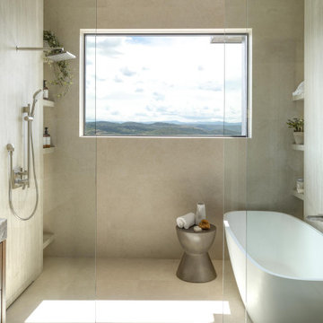
Situated between the iconic peaks of Deer Valley and the Jordanelle Reservoir, this unique four-bedroom estate home combines steel, wood, stone, and glass to offer synergistic ebullience and captivating panoramic vista views. Gemini Place provides functional flow and seamless indoor/outdoor living for all four seasons, replete with the luxury inclusions of a mountain modern dream home.
Gemini Place comprises 4,848 square feet of internal accommodation with four bedrooms, four bathrooms, 2 half baths, and one home office, on a 14,022 square-foot lot. Externally, the house blends harmoniously with its surroundings, but behind the discreet facade lies a playful home elevated with tailored embellishments throughout.
Welcomed into the home through a steel-clad portal, the oversized steel and glass pivot door baptizes entrants with breathtaking views. The main level showcases an open floor plan with an expansive kitchen, a dining room, and a living room with panoramic glass sliding doors that open onto over 1,500 square feet of exterior living space. The master suite on the main level surprises with elevated finishes. The informal lower level features a bar, bunk room, two additional en suite bedrooms, and a charming outdoor veranda.
Luxury is woven into Gemini Place throughout, including exposed steel beams, a Miele appliance package, and bespoke natural stone finishes. Just three minutes from Deer Valley's Jordanelle gondola and five minutes from the Jordanelle Reservoir, this home offers four-season resort-style living at its finest.
Architecture: Van Sickle Design
Interiors: TCH Design Interiors
 Candice Keilin & Bonnet Designs
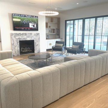
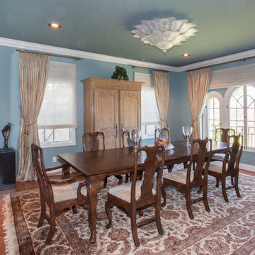
Ambient Comfort: A large area rug grounds the space, while Arteriors lighting and ambient lighting create a warm, inviting atmosphere for any time of day.
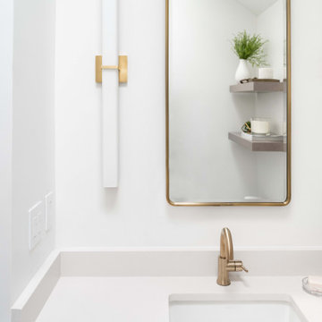
Designer Focus: By pairing the organic movement of violet marble with the structured lines of a tambour wood finish, we created a space that feels both luxurious and approachable.
Find the right local pro for your project
 Save home
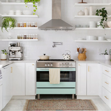
A clean, white, and fresh look never cease to accentuate your kitchen’s interior.
Whether you have a small kitchen or a large one, it is highly unlikely to make a wrong decision with the white color. A white kitchen is a timeless addition to your entire décor, which always radiates more light, a bright look, and an aesthetically soothing aura.
However, although the color white has the power to uplift the look of your kitchen, it is not enough to just paint the walls white. You need to strike a chord between various textures and colors along with kitchen elements, like shaker kitchen cabinets, countertop, etc.
In the following section, we have compiled a list of modern kitchen cabinets ideas. Read on see some of the best white kitchen cabinet styles for your kitchen.
Top 10 Modern White Kitchen Ideas
There’s no doubt in the fact that a white kitchen and RTA cabinets can form the perfect base for your kitchen’s interior. You can add some plants, a pinch of gold, and or a simple black countertop for a different yet appealing look. Below we have discussed some of these ideas. Read on:
1. Airy and Light
The simplest way to design your modern white kitchen is to use a white and timber combination. This can include white cabinets, timber doors, and white wall tiles. Or you can choose timber RTA cabinets paired with white tiles, flooring, and countertop.
2. Sophisticated
Another way is to sophisticatedly turn around your white choices. Here’s an example:
Use white cabinets, steel fittings, and accessories paired with textured white tiles and marble countertop. The flooring can also be white, similar to the countertop. This would give a nice, clean, and refreshing look to your modern white kitchen
.
3. Stone Look
The stone look is always best paired with white cabinets. So, if you utilize shaker kitchen cabinets, which are white, and pair it with everything white stone-like look, then your kitchen would look mesmerizing. This means using marble countertop, marble flooring, and stone-looking back tiles.
4. Monochrome
Black and white appeals to a lot of homeowners. It is the best combination that is unlikely to go wrong. In fact, it helps you move ahead of the ordinary kitchen interior.
You can set your monochrome modern white kitchen in two ways:
Firstly, you have white cabinets paired with black countertop and black fittings. Too much black would reduce lighting and make your kitchen look smaller. So, add white flooring and white back tiles.
Secondly, you can keep the lower RTA cabinets black, and rest everything white, such as textured back tiles, white knobs, etc. You can also pair it with timber upper cabinets.
5. Grey Shade
Similar to monochrome, grey is also amazing. It looks much more sophisticated than monochrome, but a little less bold. So, you can keep your modern white kitchen in these two shades. For example, grey cabinets and white countertop, tiles, and flooring. Here, glossy back tiles can accentuate the look.
6. Brass Touch
Brass touch can literally light up any dull space. If you just add a brass lamp to your living room or kitchen, it can drastically enhance the look. You can use brass in the form of brass windows and lamps. You can also add copper stools and upper cabinets for the same effect.
7. White Countertop
One thing that can make your modern white kitchen look extremely beautiful is the attention to detail. This includes adding a white countertop that really improves the look. A lot of people add a white countertop but making it complement your cabinets can improve the interior a lot.
For example, marble countertop, wooden flooring, white cabinets, and copper knobs.
8. Wood Shelves
The color of wood and timber automatically adds a sense of warmth to your kitchen. So, you can also use either upper or lower timber cabinets. If you are using timber or wood for the upper cabinet and RTA cabinets for the lower cabinets, then you can keep upper cabinets as open shelves. This can also be a bar wood shelf.
9. White Tiles
Basic, old-school white tiles are also great. Earlier, we had small white tiles that used to go with everything. These tiles still complement your kitchen. Use white RTA cabinets, black countertop, and white tiles for a perfect contrast.
10. Light and Bright
Another amazing way to install shaker kitchen cabinets in a modern white kitchen is to keep everything white but add colorful chairs to your dining table. This will add life to your kitchen.
Conclusion
If you are redesigning your kitchen or re-structuring it, modern white kitchen themes are the best option. Simply take inspiration from the above examples and choose a versatile approach for remodeling your kitchen. There’s no shortage of options that you can choose from, such as monochrome, black cabinets, etc. Just remember to check the kitchen size, your budget, and lighting in your kitchen to ensure that you are moving in the right direction.
Whether you have a small kitchen or a large one, it is highly unlikely to make a wrong decision with the white color. A white kitchen is a timeless addition to your entire décor, which always radiates more light, a bright look, and an aesthetically soothing aura.
However, although the color white has the power to uplift the look of your kitchen, it is not enough to just paint the walls white. You need to strike a chord between various textures and colors along with kitchen elements, like shaker kitchen cabinets, countertop, etc.
In the following section, we have compiled a list of modern kitchen cabinets ideas. Read on see some of the best white kitchen cabinet styles for your kitchen.
Top 10 Modern White Kitchen Ideas
There’s no doubt in the fact that a white kitchen and RTA cabinets can form the perfect base for your kitchen’s interior. You can add some plants, a pinch of gold, and or a simple black countertop for a different yet appealing look. Below we have discussed some of these ideas. Read on:
1. Airy and Light
The simplest way to design your modern white kitchen is to use a white and timber combination. This can include white cabinets, timber doors, and white wall tiles. Or you can choose timber RTA cabinets paired with white tiles, flooring, and countertop.
2. Sophisticated
Another way is to sophisticatedly turn around your white choices. Here’s an example:
Use white cabinets, steel fittings, and accessories paired with textured white tiles and marble countertop. The flooring can also be white, similar to the countertop. This would give a nice, clean, and refreshing look to your modern white kitchen
.
3. Stone Look
The stone look is always best paired with white cabinets. So, if you utilize shaker kitchen cabinets, which are white, and pair it with everything white stone-like look, then your kitchen would look mesmerizing. This means using marble countertop, marble flooring, and stone-looking back tiles.
4. Monochrome
Black and white appeals to a lot of homeowners. It is the best combination that is unlikely to go wrong. In fact, it helps you move ahead of the ordinary kitchen interior.
You can set your monochrome modern white kitchen in two ways:
Firstly, you have white cabinets paired with black countertop and black fittings. Too much black would reduce lighting and make your kitchen look smaller. So, add white flooring and white back tiles.
Secondly, you can keep the lower RTA cabinets black, and rest everything white, such as textured back tiles, white knobs, etc. You can also pair it with timber upper cabinets.
5. Grey Shade
Similar to monochrome, grey is also amazing. It looks much more sophisticated than monochrome, but a little less bold. So, you can keep your modern white kitchen in these two shades. For example, grey cabinets and white countertop, tiles, and flooring. Here, glossy back tiles can accentuate the look.
6. Brass Touch
Brass touch can literally light up any dull space. If you just add a brass lamp to your living room or kitchen, it can drastically enhance the look. You can use brass in the form of brass windows and lamps. You can also add copper stools and upper cabinets for the same effect.
7. White Countertop
One thing that can make your modern white kitchen look extremely beautiful is the attention to detail. This includes adding a white countertop that really improves the look. A lot of people add a white countertop but making it complement your cabinets can improve the interior a lot.
For example, marble countertop, wooden flooring, white cabinets, and copper knobs.
8. Wood Shelves
The color of wood and timber automatically adds a sense of warmth to your kitchen. So, you can also use either upper or lower timber cabinets. If you are using timber or wood for the upper cabinet and RTA cabinets for the lower cabinets, then you can keep upper cabinets as open shelves. This can also be a bar wood shelf.
9. White Tiles
Basic, old-school white tiles are also great. Earlier, we had small white tiles that used to go with everything. These tiles still complement your kitchen. Use white RTA cabinets, black countertop, and white tiles for a perfect contrast.
10. Light and Bright
Another amazing way to install shaker kitchen cabinets in a modern white kitchen is to keep everything white but add colorful chairs to your dining table. This will add life to your kitchen.
Conclusion
If you are redesigning your kitchen or re-structuring it, modern white kitchen themes are the best option. Simply take inspiration from the above examples and choose a versatile approach for remodeling your kitchen. There’s no shortage of options that you can choose from, such as monochrome, black cabinets, etc. Just remember to check the kitchen size, your budget, and lighting in your kitchen to ensure that you are moving in the right direction.
 Mark S. Garff, Landscape Architect
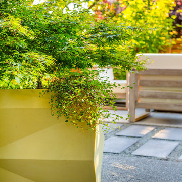
In Seattle's Fremont neighborhood SCJ Studio designed a new landscape to surround and set off a contemporary home by Coates Design Architects. The narrow spaces around the tall home needed structure and organization, and a thoughtful approach to layout and space programming. A concrete patio was installed with a Paloform Bento gas fire feature surrounded by lush, northwest planting. A horizontal board cedar fence provides privacy from the street and creates the cozy feeling of an outdoor room among the trees. LED low-voltage lighting by Kichler Lighting adds night-time warmth.
Photography by: Miranda Estes Photography
 Custom Design & Construction
We were excited when the homeowners of this project approached us to help them with their whole house remodel as this is a historic preservation project. The historical society has approved this remodel. As part of that distinction we had to honor the original look of the home; keeping the façade updated but intact. For example the doors and windows are new but they were made as replicas to the originals. The homeowners were relocating from the Inland Empire to be closer to their daughter and grandchildren. One of their requests was additional living space. In order to achieve this we added a second story to the home while ensuring that it was in character with the original structure. The interior of the home is all new. It features all new plumbing, electrical and HVAC. Although the home is a Spanish Revival the homeowners style on the interior of the home is very traditional. The project features a home gym as it is important to the homeowners to stay healthy and fit. The kitchen / great room was designed so that the homewoners could spend time with their daughter and her children. The home features two master bedroom suites. One is upstairs and the other one is down stairs. The homeowners prefer to use the downstairs version as they are not forced to use the stairs. They have left the upstairs master suite as a guest suite.
Enjoy some of the before and after images of this project:
http://www.houzz.com/discussions/3549200/old-garage-office-turned-gym-in-los-angeles
http://www.houzz.com/discussions/3558821/la-face-lift-for-the-patio
http://www.houzz.com/discussions/3569717/la-kitchen-remodel
http://www.houzz.com/discussions/3579013/los-angeles-entry-hall
http://www.houzz.com/discussions/3592549/exterior-shots-of-a-whole-house-remodel-in-la
http://www.houzz.com/discussions/3607481/living-dining-rooms-become-a-library-and-formal-dining-room-in-la
http://www.houzz.com/discussions/3628842/bathroom-makeover-in-los-angeles-ca
http://www.houzz.com/discussions/3640770/sweet-dreams-la-bedroom-remodels
Exterior: Approved by the historical society as a Spanish Revival, the second story of this home was an addition. All of the windows and doors were replicated to match the original styling of the house. The roof is a combination of Gable and Hip and is made of red clay tile. The arched door and windows are typical of Spanish Revival. The home also features a Juliette Balcony and window.
Library / Living Room: The library offers Pocket Doors and custom bookcases.
Powder Room: This powder room has a black toilet and Herringbone travertine.
Kitchen: This kitchen was designed for someone who likes to cook! It features a Pot Filler, a peninsula and an island, a prep sink in the island, and cookbook storage on the end of the peninsula. The homeowners opted for a mix of stainless and paneled appliances. Although they have a formal dining room they wanted a casual breakfast area to enjoy informal meals with their grandchildren. The kitchen also utilizes a mix of recessed lighting and pendant lights. A wine refrigerator and outlets conveniently located on the island and around the backsplash are the modern updates that were important to the homeowners.
Master bath: The master bath enjoys both a soaking tub and a large shower with body sprayers and hand held. For privacy, the bidet was placed in a water closet next to the shower. There is plenty of counter space in this bathroom which even includes a makeup table.
Staircase: The staircase features a decorative niche
Upstairs master suite: The upstairs master suite features the Juliette balcony
Outside: Wanting to take advantage of southern California living the homeowners requested an outdoor kitchen complete with retractable awning. The fountain and lounging furniture keep it light.
Home gym: This gym comes completed with rubberized floor covering and dedicated bathroom. It also features its own HVAC system and wall mounted TV.
 Dwellify
In this kitchen renovation, the aim was to revamp the space, making it not just functional, but stylish and inviting too. The decision to paint the walls predominantly white instantly promoted brightness and airiness into the room, setting the stage for a modern makeover. Knocking down the wall separating the kitchen from the family room added a touch of spaciousness and promoted seamless interaction between the two areas. Introducing a sleek floating island became the centerpiece, offering both practicality and a contemporary aesthetic. Upgrading to all new appliances ensured efficiency without sacrificing style. The end result? A chic, welcoming kitchen that's as perfect for cooking up a storm as it is for gathering with loved ones.
In this extensive bathroom remodel, a once cluttered and cramped primary bathroom has been meticulously transformed into a spacious and bright oasis. By prioritizing additional storage and leveraging the existing skylight, the space underwent a remarkable renovation without the need for significant structural changes. The skylight was maximized to its full potential by surrounding it with pristine white walls, creating an airy and luminous atmosphere. The introduction of a luxurious marble shower not only adds a touch of sophistication but also contributes to the overall cleanliness and sophistication of the space. Soft gray cabinets and warm wood accents were strategically incorporated to create a bathroom with a serene and welcoming ambiance, evoking a sense of tranquility and comfort. Every detail was meticulously considered, from the placement of storage solutions to the selection of materials, ensuring that the remodeled bathroom exudes both functionality and elegance.
The result is a blend of style and practicality, where every aspect of the design works in harmony to create a serene sanctuary where relaxation and rejuvenation are effortlessly embraced.
Sponsored
Columbus, OH

Structural Remodeling
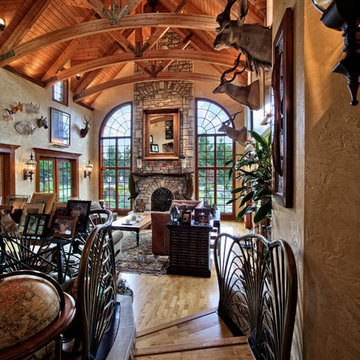
Franklin County's Heavy Timber Specialists | Best of Houzz 2020!
 camilleriparismode
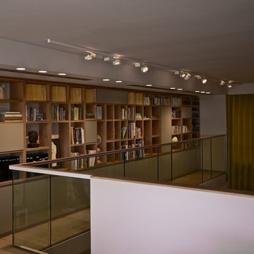
camilleriparismode projects and design team were approached to rethink a previously unused double height room in a wonderful villa. the lower part of the room was planned as a sitting and dining area, the sub level above as a tv den and games room. as the occupants enjoy their time together as a family, as well as their shared love of books, a floor-to-ceiling library was an ideal way of using and linking the large volume. the large library covers one wall of the room spilling into the den area above. it is given a sense of movement by the differing sizes of the verticals and shelves, broken up by randomly placed closed cupboards. the floating marble fireplace at the base of the library unit helps achieve a feeling of lightness despite it being a complex structure, while offering a cosy atmosphere to the family area below. the split-level den is reached via a solid oak staircase, below which is a custom made wine room. the staircase is concealed from the dining area by a high wall, painted in a bold colour on which a collection of paintings is displayed.
photos by: brian grech
 Glenview Haus – Custom Doors & Wine Cellars
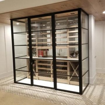
Form and function became one when this custom steel wine cellar room was completed. This temperature-controlled wine cellar room, made by artisan welders, includes a custom steel interior door with insulated glass, and adjacent custom steel wall panels with insulated glass. Our customer’s wine cellar room crafted from steel and insulated glass is sealed at all edges and kept at the recommended temperature of 55 degrees. In order to efficiently store collectible wine pieces and your daily go-to selections, we encourage a temperature-controlled environment.
Our goal was to provide a modern twist to an otherwise classic feature in a high-end home. This stand-alone wine cellar room crafted from steel was designed to be a focal point in our customer’s basement living area. The progression of wine cellar designs are showing that detached wine racking techniques are the new wave of innovation and style. The idea of creating a bold display for our customer’s wine collection was intriguing to us as designers, because we strive to be on the cutting edge of all things design and beauty.
To accentuate the modern twist of the independent wine cabinet, we suggested a sleek and modern steel interior door and steel wall units. Our ultra-thin steel stiles and rails are the perfect fit to allow optimal viewing into our customer’s collection. With insulated glass and fully sealed edges, no heat can enter and no cool air can escape. The custom interior steel door unit blends seamlessly with the accompanying steel wall structures. This seamless design creates a beautifully controlled environment for wine with a sleek steel appearance. Using steel doors and steel walls was a mindful approach because the star of the show is the carefully selected bottles of wine. The idea was to juxtapose the wood shelves inside of the cabinet and create another element that stands out, while still allowing for optimal viewing…and obsessing.
 CoverMyPatio.com
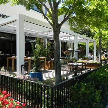
The Arcadia Louvered Roof enhances the beauty of any style home and provides the flexibility of having an open roof when the weather is good or a solid roof to keep the rain off your patio when the weather turns bad.
Eco-friendly Construction
The Arcadia system is made up of recycled aluminum making it an extremely Green product. It is also eco-friendly, helping consumers save on passive solar heating and cooling.
We Think Green
Arcadia is proud to continue the company's tradition with its approach to Environmental Innovation. From the choice of lightweight materials and lean production methods to the efficiency of its drive system and designs, Arcadia is committed to operating as a more sustainable business and reducing its overall environmental impact.
High-quality Building Materials
Each Arcadia system is a work of art, constructed with care and attention to every little detail.
Our system is powered coated, extruded aluminum with stainless steel components giving us the most durable louvered roof on the market today. From our superior drive system, which is UL & CE certified, down to the stainless steel tex screws that secures the system together. Nothing but the best!
Our low-maintenance components eliminate painting, staining, and waterproofing of traditional shading structures. Using powder-coated aluminum construction prevents warping, cracking, and corrosion.
Photographed by: Roger Chafin
 Evoscapes, Luxury Landscape Design and Build
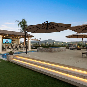
This San Diego backyard was designed to feel like a private resort, perfect for relaxing, entertaining, and spending time outdoors year-round.
At the heart of the space is a sleek custom pool and raised spa, finished with glass tile and surrounded by large-format porcelain decking. A raised stone wall with spillway water features adds movement and creates a beautiful focal point from throughout the yard.
The standout feature is the covered outdoor kitchen and bar pavilion, designed as a true outdoor living room. The structure includes exposed beams, integrated lighting, ceiling fans, and heaters for year-round comfort. A large quartz bar island provides seating for guests, while the kitchen includes a professional grill, refrigeration, and plenty of prep space.
Behind the bar, a decorative tile feature wall with floating shelves and a large outdoor TV creates the perfect setting for game days or evening gatherings.
An elevated lounge terrace with chaise seating, shade umbrellas, and a fire feature offers another place to unwind, while layered lighting and subtle pool illumination bring the entire backyard to life at night.
This project reflects Evoscapes’ approach to luxury backyard design in San Diego, combining modern pool construction, outdoor kitchen design, and thoughtful landscape architecture to create a seamless outdoor living experience.
 CONTENT Architecture
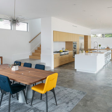
Located in the Houston Heights, the Waverly Residence is a modern home on an established street of two story homes boasting front porch typologies. The family’s desire for privacy resulted in a porch that rotates to internalize most of its function while still addressing the street. For this active family, yard activity and it’s visibility from within the home emerged as a priority for approaching the building’s relationship to the lot. Justifying the building mass to the Northern half of the site reinforces the scale of the design to the surrounding buildings and creates a large southern yard dedicated to play and brisket (is a Texas house a house without a barbeque?).
The ground floor is clad in metal panel and a wood rainscreen that peels away from the structure to become both a fence and an entry threshold, blending the registration between the yard's privacy enclosure and the building skin. Variable width fiber-cement siding clads the second floor as a nod to the neighborhood vernacular. The pool and outdoor kitchen sit at the center of the yard, forming an island that divides the open play from private vehicular access at the alley.
Shifted volumes delineate private space from the open public areas. The second floor extends over the public entryway to create a covered procession with cascading steps into the southern yard that traverses the length of the living spaces. The public program expands beyond the building enclosure to encompass the yard and living spaces. A horizontal shift in the ground floor volume produces both a private courtyard away from the lively public spaces and exterior delineation between private vehicular access and public entry.
Within the open, ground floor plan, a change in elevation indicates the boundary between private and public space. Custom millwork provides ample storage for the young family. Playful patterns of enclosed storage with contrasting display boxes creates a cohesive millwork language throughout the home.
 Custom Design & Construction
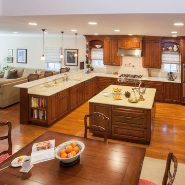
We were excited when the homeowners of this project approached us to help them with their whole house remodel as this is a historic preservation project. The historical society has approved this remodel. As part of that distinction we had to honor the original look of the home; keeping the façade updated but intact. For example the doors and windows are new but they were made as replicas to the originals. The homeowners were relocating from the Inland Empire to be closer to their daughter and grandchildren. One of their requests was additional living space. In order to achieve this we added a second story to the home while ensuring that it was in character with the original structure. The interior of the home is all new. It features all new plumbing, electrical and HVAC. Although the home is a Spanish Revival the homeowners style on the interior of the home is very traditional. The project features a home gym as it is important to the homeowners to stay healthy and fit. The kitchen / great room was designed so that the homewoners could spend time with their daughter and her children. The home features two master bedroom suites. One is upstairs and the other one is down stairs. The homeowners prefer to use the downstairs version as they are not forced to use the stairs. They have left the upstairs master suite as a guest suite.
Enjoy some of the before and after images of this project:
http://www.houzz.com/discussions/3549200/old-garage-office-turned-gym-in-los-angeles
http://www.houzz.com/discussions/3558821/la-face-lift-for-the-patio
http://www.houzz.com/discussions/3569717/la-kitchen-remodel
http://www.houzz.com/discussions/3579013/los-angeles-entry-hall
http://www.houzz.com/discussions/3592549/exterior-shots-of-a-whole-house-remodel-in-la
http://www.houzz.com/discussions/3607481/living-dining-rooms-become-a-library-and-formal-dining-room-in-la
http://www.houzz.com/discussions/3628842/bathroom-makeover-in-los-angeles-ca
http://www.houzz.com/discussions/3640770/sweet-dreams-la-bedroom-remodels
Exterior: Approved by the historical society as a Spanish Revival, the second story of this home was an addition. All of the windows and doors were replicated to match the original styling of the house. The roof is a combination of Gable and Hip and is made of red clay tile. The arched door and windows are typical of Spanish Revival. The home also features a Juliette Balcony and window.
Library / Living Room: The library offers Pocket Doors and custom bookcases.
Powder Room: This powder room has a black toilet and Herringbone travertine.
Kitchen: This kitchen was designed for someone who likes to cook! It features a Pot Filler, a peninsula and an island, a prep sink in the island, and cookbook storage on the end of the peninsula. The homeowners opted for a mix of stainless and paneled appliances. Although they have a formal dining room they wanted a casual breakfast area to enjoy informal meals with their grandchildren. The kitchen also utilizes a mix of recessed lighting and pendant lights. A wine refrigerator and outlets conveniently located on the island and around the backsplash are the modern updates that were important to the homeowners.
Master bath: The master bath enjoys both a soaking tub and a large shower with body sprayers and hand held. For privacy, the bidet was placed in a water closet next to the shower. There is plenty of counter space in this bathroom which even includes a makeup table.
Staircase: The staircase features a decorative niche
Upstairs master suite: The upstairs master suite features the Juliette balcony
Outside: Wanting to take advantage of southern California living the homeowners requested an outdoor kitchen complete with retractable awning. The fountain and lounging furniture keep it light.
Home gym: This gym comes completed with rubberized floor covering and dedicated bathroom. It also features its own HVAC system and wall mounted TV.

Sponsored
Columbus, OH

Hope Restoration & General Contracting
Columbus Design-Build, Kitchen & Bath Remodeling, Historic Renovations
 G. Christianson Construction, Inc.
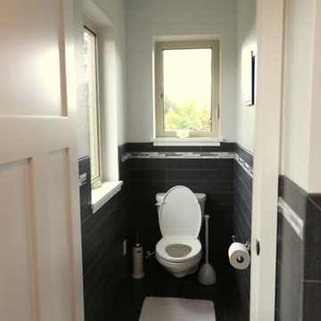
Our clients Bill and Tammy approached us to construct a bonus room above the garage for their exercise equipment with an additional bedroom and bathroom for guests. This project has a few unique challenges including installing a 2 hour fire rated wall so that their home can be considered two separate structures for the Philomath fire marshal (so we don’t need to install a residential sprinkler system). We are also keeping their existing home operational during construction including their furnace and electrical panel which are directly underneath the new addition!
 Klopf Architecture
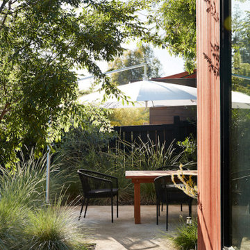
The Roger Lee designed house from 1962 was purchased by the current homeowners in almost original condition, as the previous owners elected to defer most maintenance projects over the years. The clients were able to see beyond the dated materials and finishes, single-paned glass and uninsulated walls and they approached Klopf Architecture to help them expand and update the entire home, one the family could settle into and enjoy for years to come. It was important that the new designs were aligned with Lee's original intent not only because of the client's appreciation for mid-century modern architecture, but also because the house was deemed historical. The Stanford Real Estate Office requires a stringent design review which safeguards the integrity of the community, which Klopf Architecture was happy to oblige going into their updated designs.
As with many original mid-century modern homes, the house was scaled to the 1960s lifestyle where rooms were smaller and openings to views were limited and tightly framed. The original conditions defined the direction the family of four would take in updating the house and making it comfortable for their modern lifestyle. Klopf designed a full gut remodel and major addition to bring the house into the 21st century and provide the living area needed for the client's family. The newly expanded house added just about 1,100 sf to create an airy, comfortable and family friendly house, taking full advantage of the beautiful southwestern views that extend out to the hills beyond. The enclosed garage created an additional 240 sf of covered space for long-term storage.
A cracked swimming pool created an eyesore taking up a majority of the backyard landscape, so it was one of the first elements to go during the transformation. Working with Outer Space Landscape Architects, the family asked for a mix of relaxing outdoor patio spaces that eventually blend into the native landscaping, extending their views outward toward the natural greenery of the trees beyond their property. Filling in the old pool was a smart way to expand the living spaces outward. The orientation of the house was designed to enjoy the views, but the original architecture provided the first homeowners with mere glimpses of the landscape outside.
Klopf was able to broaden those views, continuing and extending on the original architecture to take full advantage of the unobstructed natural views across the rear facade of the house. Small horizontal openings in the primary bedroom and office were replaced with much taller windows that now follow the angled roof line upward, extending across almost all of the facade. We worked with Western Windows, whose designs included an oblique-shaped, operable casement that allowed our design to rise with the slope. A new corner office added to the primary suite, offers a bright and functional work-from-home solution that looks out at the distant views and added natural light from the expanded window configuration that now wraps around the corner.
The existing lower level was designed by Lee as a utilitarian space, serving as a wet pool room with a drain in the center of the floor, bathroom, laundry and storage areas. Without the need for a pool room, Klopf was able to convert the area into a much more comfortable and functional living space with a new family room and guest suite. The new spaces enjoy easy access to a new outdoor patio through floor to ceiling, full-width glass sliders.
Continuing along the rear facade, a previously exposed deck extending from the living room and hallway provided access to the backyard through a single set of stairs leading toward the side of the house which made sense when the pool was in place. The new deck was re-envisioned as an extension of the main living room and now serves as a second outdoor living room. A new slatted pergola above provides the homeowners welcome relief from the hot afternoon sun. A second set of stairs now creates a better connection to the redesigned lower level. Klopf was able to reconfigure the spaces, extending the living room outward toward the views, where the family now claims it as the heart of the home, spending a large majority of their time outdoors.
Back inside, the original wood-burning Malm fireplace was beautifully restored and a gas burner installed to comply with California's strict air standards. It now rests in front of a wall of Heath accent tiles where a dated red brick wall used to stand. A new taller window brings more light and views into the refreshed interior living room. The original glass doors opposite the fireplace were replaced by larger sliders that when fully opened, create a seamless transition to the new outdoor living area so the two spaces feel like one connected space. The original utilitarian kitchen was needlessly tucked into the far back corner and closed-off, out of sight from the living room, so the clients asked Klopf to open it up and expand the kitchen forward so it felt more connected. Today the much larger kitchen is connected to the living area where a short wall with a cutout offers a visual glimpse into the kitchen and a handy pass-through counter for serving guests. A new breakfast nook was also added to create another spot where the family can gather for casual meals. Just outside, a new built-in outdoor grill and prep area extends the kitchen outside and connects to a new outdoor dining spot nestled amongst the trees, taking advantage of the views out back.
Klopf was able to expand the other two bedrooms, add a new laundry room and half-bath and convert the carport to an enclosed garage to add more storage areas which was lost when the pool house was converted to the family and guest room.
To maintain a historical connection to the original designs, the exterior siding was repeated on all exterior walls, a full-height stained glass window at the front entryway restored, and an interior slatted screen element repeated outside at the exterior entry courtyard and over the new outdoor living room to create a shade trellis. The new house stands proudly and shines against it's new landscaping features, while respecting and expanding on the original intent of Roger Lee's designs epitomizing the comforts of indoor-outdoor living in Northern California.
Completion year: 2020
Klopf Architecture project team: John Klopf, Klara Kevane, Noel Andrade
Contractor: ORB Construction, Brendan O'Reilly
Structural engineer: Sezen and Moon
Landscape architect: Outer space
Furnishings and decoration: Urbanism Designs
Photographer: Mariko Reed
 AEH Builders
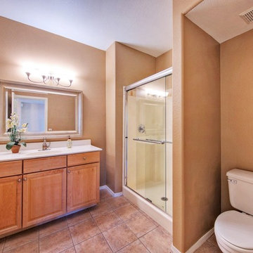
Regardless of the scope of the project, we take a client-centered approach. We are committed to our goal of creating structures and home improvements that reflect our clients’ visions and lifestyles, and we achieve this by communicating with clients at each stage of the process.
 AoDK Inc.
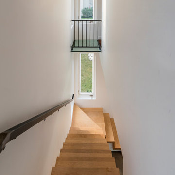
A couple wanted a weekend retreat without spending a majority of their getaway in an automobile. Therefore, a lot was purchased along the Rocky River with the vision of creating a nearby escape less than five miles away from their home. This 1,300 sf 24’ x 24’ dwelling is divided into a four square quadrant with the goal to create a variety of interior and exterior experiences while maintaining a rather small footprint.
Typically, when going on a weekend retreat one has the drive time to decompress. However, without this, the goal was to create a procession from the car to the house to signify such change of context. This concept was achieved through the use of a wood slatted screen wall which must be passed through. After winding around a collection of poured concrete steps and walls one comes to a wood plank bridge and crosses over a Japanese garden leaving all the stresses of the daily world behind.
The house is structured around a nine column steel frame grid, which reinforces the impression one gets of the four quadrants. The two rear quadrants intentionally house enclosed program space but once passed through, the floor plan completely opens to long views down to the mouth of the river into Lake Erie.
On the second floor the four square grid is stacked with one quadrant removed for the two story living area on the first floor to capture heightened views down the river. In a move to create complete separation there is a one quadrant roof top office with surrounding roof top garden space. The rooftop office is accessed through a unique approach by exiting onto a steel grated staircase which wraps up the exterior facade of the house. This experience provides an additional retreat within their weekend getaway, and serves as the apex of the house where one can completely enjoy the views of Lake Erie disappearing over the horizon.
Visually the house extends into the riverside site, but the four quadrant axis also physically extends creating a series of experiences out on the property. The Northeast kitchen quadrant extends out to become an exterior kitchen & dining space. The two-story Northwest living room quadrant extends out to a series of wrap around steps and lounge seating. A fire pit sits in this quadrant as well farther out in the lawn. A fruit and vegetable garden sits out in the Southwest quadrant in near proximity to the shed, and the entry sequence is contained within the Southeast quadrant extension. Internally and externally the whole house is organized in a simple and concise way and achieves the ultimate goal of creating many different experiences within a rationally sized footprint.
Photo: Sergiu Stoian
Sponsored
Columbus, OH
Structural Remodeling
Franklin County's Heavy Timber Specialists | Best of Houzz 2020!
 camilleriparismode
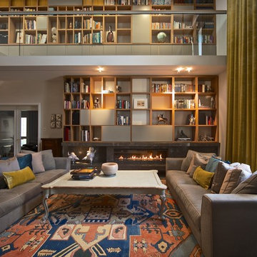
camilleriparismode projects and design team were approached to rethink a previously unused double height room in a wonderful villa. the lower part of the room was planned as a sitting and dining area, the sub level above as a tv den and games room. as the occupants enjoy their time together as a family, as well as their shared love of books, a floor-to-ceiling library was an ideal way of using and linking the large volume. the large library covers one wall of the room spilling into the den area above. it is given a sense of movement by the differing sizes of the verticals and shelves, broken up by randomly placed closed cupboards. the floating marble fireplace at the base of the library unit helps achieve a feeling of lightness despite it being a complex structure, while offering a cosy atmosphere to the family area below. the split-level den is reached via a solid oak staircase, below which is a custom made wine room. the staircase is concealed from the dining area by a high wall, painted in a bold colour on which a collection of paintings is displayed.
photos by: brian grech
 RoomService 360
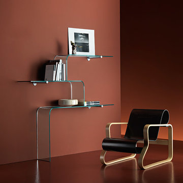
Founded in 1973, Fiam Italia is a global icon of glass culture with four decades of glass innovation and design that produced revolutionary structures and created a new level of utility for glass as a material in residential and commercial interior decor. Fiam Italia designs, develops and produces items of furniture in curved glass, creating them through a combination of craftsmanship and industrial processes, while merging tradition and innovation, through a hand-crafted approach.
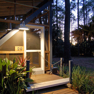
 felix day pretsch, architect
Welcoming front porch in a small neighborhood where the road sign warns "Road Ends in Water." It takes its design cues from the surrounding docks that extend into the marsh. Rugged pine 4x8 timbers for steps and landings. Upright fence posts with solid color stain, "Blueberry" - to match the porch structure. Bright white solid stain for way finding at the door and the step up adds a nautical look. Concept for the screen door closer is thanks to the sheep enclosure at Middleton Gardens.
Shed roof is for rain & sun, not snow.
© 2015 felix day pretsch
114