
Search results for "Style problem" in Home Design Ideas

 Renovisions
The owners of this 1980’s built-home wanted to create a completely new look for their outdated master bath and turned to Renovisions for design and build services. Having perused Renovisions website, they were confident they made the right choice to help them transform their ordinary space into something truly extraordinary. The design team created several configurations for the homeowners review until they nailed down one particular design that would create that wow factor.
The main challenges were creating an open, spacious feel and maximizing natural light and ventilation with plenty of storage and customizations. The addition of a second window allows ample light into the space throughout the day along with the recessed and sconce lights which were perfectly placed. Storage, which was a key element of this design, includes two separate vanity cabinets (his and hers) with plenty of space for needed toiletries, a matching framed medicine cabinet for her and a custom built cubby for him. Built on site was a linen closet with both roll out and stationary shelves for towels and shower supplies. The spacious walk-in, all tiled shower boasts ‘no door’ access with lineal drain, traditional fixed and hand-held shower heads and a rounded shower seat. Polished black granite was used inside the cubby and topping both the threshold and seat creating a nice contrast to and tying in with the floor. The decorative grab bar ensures safety for these homeowners while showering. The heated floors added throughout the bath take the edge off when stepping out of the warm shower and are conveniently operated by a 24 hour programmable thermostat. Classic white subway tile and chair rail trims adorne all walls and tie in nicely to each vanity station. Carrera look quartz was the perfect choice for countertops creating a clean fresh look. Stunning marble basket-weave mosaic floor tile set the stage in this exquisite bath as the beautiful white painted cabinetry softened the overall feel of the space.
These homeowners are not saving spa retreats for once-a-year vacations anymore, they now enjoy a relaxing spa-like shower experience every day in their own home!

 Advance Design Studio, Ltd.
After six years of living in their Huntley IL home, Chris and Meghan were tired of their dark, dingy, outdated kitchen and it was finally time for a long-anticipated change. “The kitchen is the place where we live, it’s where we do everything,” Meghan said. “It was important that it be a space where we wanted to be.” Meghan loves cooking and enjoys including their girls in healthy meal prepping, this led them to want a brighter, more enjoyable kitchen with increased functionality and improved storage.
For Chris especially, the laundry room was an entirely dysfunctional eyesore. “We had a washer and a dryer, but it was all kind-of cobbled together!” Chris said. “There were always laundry piles everywhere, we weren’t really sure what we wanted to do in there, but it was time for us to make a change.” The mess of the space was stressful every time they walked in the door from the garage each day. Kids’ backpacks and shoes piled up haphazardly in the makeshift boot-bench closet left the family feeling disorganized and stressed. They needed space for folding clothes and locker cubbies to help keep the family organized.
Having known Christine and Todd in the Huntley community for years, Chris and Meghan were familiar with their work. “We already trusted them personally and having seen their projects for years we knew they did top notch work. After we reviewed the initial round of designs, we knew that hiring them was definitely the right choice,” Meghan and Chris said. Although Chris had done a lot of work in their home himself, the kitchen and laundry room renovation was such a large undertaking that he didn’t want to steal time away from his family to spend what would surely be many long weekends doing the job himself. “That would not have been a wise choice for us,” Chris laughed.
“Our designer, Michelle was very, very, easy to work with; anything we wanted to see or weren’t sure about, she went above and beyond to make this easy for us. She was easy to get hold of and always quick to respond,” the couple said. Michelle pulled ideas that mirrored the couple’s taste and style and was adept at directing the couple to limited choices that didn’t overwhelm them and kept the process moving. “I have a hard time making decisions. Michelle made the decision-making process so easy. I loved how she listened to what I liked and then presented three great options for me to choose from,” Meghan said.
The main objectives for the kitchen were better storage solutions, they wanted the space to reflect their lifestyle and taste, and they wanted it to last for years with low maintenance. One of the first steps in creating a more functional kitchen was relocating the refrigerator, creating an improved workflow for the busy family.
“We didn’t know that we could even move the refrigerator to a new location where it is now, that was something that we never would have thought of,” Chris said. “The new refrigerator location makes the kitchen feel so much bigger. We didn’t add any space, but our whole kitchen with the new design just seems like it’s so much larger than before!” Meghan said.
The perimeter mist colored cabinets helped warm and brighten the entire room, while the graphite colored cabinets on the island added contrast. Using this fresh, clean color palette satisfied the couple’s desire for a bright space that was the exact opposite of what they had before. Organization accessories were also added to the cabinets such as a spice drawer tray and roll outs to create hidden convenience.
“I absolutely love the hidden spices – it makes cooking so much more enjoyable!” Chris said. “And all the pull outs, and the double trash bin, who would think you could get so excited about organization!” the couple said in unison.
One thing they hated in their original kitchen was how dark the space felt. Added lighting on the ceiling with the new light fixtures combined with the lighter cabinetry colors throughout solved this problem. “Our new kitchen has this warm, almost cozy feeling that our old kitchen never had, it’s just a space that I love spending my time in now,” Meghan said. The light airy feeling was accentuated with the use of floating white shelves on either side of the decorative range hood. “We have so much cabinetry space, the new design is amazing we actually have more storage space than we will ever need,” Meghan said.
The island was extended to create more work surface and added space for stool seating. “The new island changes how we live. Now the kids can be in the kitchen with us, doing homework, eating breakfast, and the three of us have special dinners there when Chris is working late,” Meghan said.
The Carrara Marmi Quartz countertops were chosen because they are, not only beautiful, but are made from hard-working material that doesn’t require maintenance. The white subway tile backsplash that wraps to the ceiling behind the focal point cooktop range/hood compliments the crisp white countertops perfectly, while brushed brass hardware and light fixtures keep the design fresh and new.
The couple had a few fears at the beginning of the project, as most homeowners do. Their biggest fear was being out of their kitchen and laundry room for an extended time. The crew made it very easy for the family to work in a limited space keeping the washer and dryer hooked up the majority of the time, and also getting appliances working with minimal downtime.
“They above and beyond accommodated us to get us through the process,” Meghan said. “They did a great job making sure we were as comfortable as possible throughout the process,” Chris added.
“Our project manager DJ did a great job. He was very good at updating us on schedule changes, getting guys in as quickly as possible. Everyone that stepped in the house was nice and did great work,” said Chris. They thought Advance’s carpenter was phenomenal and were impressed when he took a conceptual idea from a photograph and worked with designer Michelle to create a one of a kind range/hood that has become the topic of conversation with friends and family who visit the new kitchen. “He was in our house literally every day for several weeks. He was easy to work with and good at what he did,” Meghan and Chris said.
The focal point of the kitchen; a hand-crafted, custom-built ventilation hood was clad with handpicked reclaimed barnwood. Advance Design’s carpenter built the framework and the cladding to create a one-of-a-kind design element that the couple loves.
“I think it was especially fun for him to create something unique from scratch, showcasing his talent in this area,” Meghan said. “I love that my kitchen is not like everyone else’s. I got to pick out the wood on my hood and watch it being built and was able to choose what pieces of wood went where on it. It’s totally unique.”
Red Oak flooring was toothed-in throughout the kitchen and the rest of the first floor anywhere changes were made. Then the whole floor was refinished to tone down the orange undertones in the existing floor stain, ultimately changing the color complexion of the entire first floor. The result is a completely new feeling to the entire home.
Renovating the laundry room was extremely important to Meghan and Chris, but they had trouble visualizing what the possibilities were for the seemingly small space. Michelle produced beautiful 3D illustrations that helped them envision the space in a whole new way.
“I must have told Michelle 100 times that I am a visual person, seeing the designs in 3D made it so easy to make decisions and see what we could really do with our space,” Meghan said.
A dividing wall and doorway were removed between the existing laundry room and hallway formerly containing a coat closet, providing space to design specialized graphite colored cabinetry matching the kitchen island to house custom storage cubbies for each family member. Adding the tall utility cabinetry in the new laundry area helped solve the storage issue, tucking away cleaning supplies, household items, and even the cat got its own cubby.
“I love how everything is now hidden in its own space. I can’t tell you how much I hated coming home and seeing everything sitting around on counters,” Chris said.
Electrical outlets were planned for the inside of utility cabinets, so devices could charge in hidden locations. Stacking the washer and dryer allowed for wider countertop space to provide a folding area and a special space for clothes to hang. “The way I do laundry has been completely transformed! I can actually fold clothes and hang them now right out of the washer and dryer,” Meghan said.
“The end result in the kitchen and the laundry/mud room was an updated light and bright space, with a smarter work flow that better meets the needs of this family,” Michelle said.
“I would totally recommend Advance Design,” Meghan said. “Sometimes I sit and just look at my kitchen and laundry room and think ‘Wow, I can’t believe I get to live here!’ It’s an understatement to say we love our new space.”

 Tile Trends, Inc.
Subway Tile-Herringbone
Inspiration for a mid-sized rustic l-shaped dark wood floor and brown floor eat-in kitchen remodel with a farmhouse sink, raised-panel cabinets, dark wood cabinets, quartz countertops, white backsplash, subway tile backsplash, stainless steel appliances, an island and beige countertops
Inspiration for a mid-sized rustic l-shaped dark wood floor and brown floor eat-in kitchen remodel with a farmhouse sink, raised-panel cabinets, dark wood cabinets, quartz countertops, white backsplash, subway tile backsplash, stainless steel appliances, an island and beige countertops
Find the right local pro for your project
 Roeser Home Remodeling
This young couple in Glendale loved their home and their neighborhood, but with three growing children they felt they were running out of space. They began a list of needs which quickly grew after a couple of years. This list helped them to see how they used their current space, but also helped them identify what was lacking.
Their needs list quickly revealed that a two-story addition would be needed to fit all the family’s requirements. With much thought and discussion, a design was created by the Roeser Team in collaboration with Ann Begemann, architect. It was important to the homeowner that the design fit the look of the house. This is always a top priority for Roeser Home Remodeling. We pride ourselves in our finish product appearing as if it had always been there and especially in this remodel, we think we succeeded.
On the list of this family’s needs were to have ample storage space for the three children’s school and sporting equipment. A wider entrance hallway from the garage and the backyard provided a unique place to build custom locker spaces, along with a communication station that will close nice and neat when company is expected. Drawer units also give extra storage and allow for a filing system to keep track of all the paper work that comes home. Extra cabinets above the lockers provide much needed additional storage for out of season belongings. A 12 X 24 S140 tile floor laid in a broken joint pattern provides for easy cleaning of this space and keeps dirty shoes or boots from finding its way into the main living quarters.
The kitchen was at the top of the priority list for this family as well. The existing kitchen was just too small and narrow and did not allow for an eat-in kitchen, or an adequate workspace for the family. Since the homeowner loves to cook, our Roeser Home Remodeling designer came up with a beautiful design plan that allowed for both. The kitchen was moved to the addition, and the existing kitchen was remodeled with a breakfast nook, housing both a custom bench and a table with chairs, along with a pantry and dry bar. This was the perfect plan and now allows the homeowner to have seating and storage for the family and entertaining.
The custom bench was built to match a picture the homeowner had and was custom produced in our own little mill shop. A drawer on both sides of the bench is handy for any extra storage items that the family may need seasonally.
The kitchen quickly became a favorite with the Roeser Home Remodeling Team. With the mix of metals and the many extra features in this space, this kitchen is full of interest as well as function.
The perimeter cabinets are Wellborn Cabinet’s Premier Line, Charleston maple door style with glacier pewter finish. A Kohler Apron Front smart divide sink adds to the design and function of this beautiful kitchen.
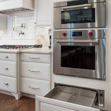
A wall mount pot filler hovers above a Wolfe five-burner stove top. The Wellborn hood unit passes the cabinet depth of the upper cabinets and compliments the Wellborn drawer unit underneath. Deeper drawers housed the 36” Wolf, five-burner professional gas stove top and added more storage. The addition of feet to the bottom of the drawer unit along with pushing back the toe kick gives an added detail and look of a furniture piece.
Flanking each end of the perimeter of cabinets are high end appliances. The 42” built-in French Door Sub-Zero Refrigerator/Freezer is left of the sink and concealed by Wellborn appliance panels. The Bosch 800 Series Dishwasher next in line is also concealed by a Wellborn appliance panel. However, the 30” Professional Wolf Oven and the 30” M Series Wolf Professional Convection Steam Oven sparkle with their stainless-steel finishes complimenting the Kohler Artifacts pull-down kitchen faucet, the Kohler Artifacts Pot Filler and the Top Knobs Hardware (Normandy Appliance Pulls in Polished Nickel, Button Faced Knob in Polish Nickel and the Tuscany Small D- Pull in Pewter Antique). A 30” Kitchen-Aid electric warming drawer is concealed by a Wellborn Drawer front and Top Knob hardware.
The Quartzite counter top in Taj Mahal is always an eye-catching feature for this beautiful kitchen. The large space of the island shows off its remarkable beauty. The island stands on its own with a custom design using Wellborn Cabinets Premier Line, Charleston maple door style in a Pebble Java finish, a darker finish cabinet not only serves as a focal point, but also warms the room against its starker contrast. The island houses a Sharp microwave drawer and its hardware is the same Tuscany small D-Pull as the rest of the kitchen, but in a German Bronze finish to compliment the island’s Hudson Valley Orchard Park light in an Aged Brass Finish.
The original half bath was the only bathroom on this floor of the house and the expense to move it was not an option. The location of the bathroom in the middle of the house was problematic. Roeser Home Remodeling solved the problem by creating an opening between the living room and new family room, along with giving the illusion of a small hallway behind the dry bar in the breakfast room. This created a nice space going into the living room and gave the feeling of an open floor plan, providing and a nice private entry to the existing half bath.
Updating the bath with wallpaper, a new Barclay- Stanford Pedestal Sink, a new Portsmouth wide-spread faucet in polished nickel, a new Devonshire comfort height toilet, new towel ring, paper holder, lighting and mirror made this cute little powder room a jewel in its own right!
The family room was also housed in the addition as a family hang-out place for homework, games and movie watching. Two sets of Sierra Pacific 6’0” X 6’8” aluminum clad wood French Sliding Patio Doors were installed to invite the outdoors in. This allowed for natural lighting and an open spacious feel to the room.
A Custom Entertainment Unit built by Roeser Home Remodeling in our mill shop, is the perfect space to house all the family’s television and gaming needs, keeping them neatly stored, but also close at hand.
Opposite of the French Doors is the original opening to the backyard. By keeping the opening and installing beautiful glass doors, it opened the flow of the house to the formal living room. By adding the glass doors, it provided a cozy area for quiet adult conversation while keeping an eye on the children as they play or watch TV.
 TV Lift Cabinet by Cabinet Tronix
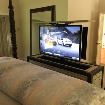
Having a hand-made TV lift cabinet in your home is the ultimate in bespoke luxury – so why not take that indulgence a step further by placing a gorgeous, handmade TV stand at the foot of your bed? Cabinet Tronix is a leading US manufacturer of the finest pop-up TV stands, and their specialist team of craftsmen can create tailor-made units which sit perfectly at the end of any bed. With a range of models and designer finishes to choose from, Cabinet Tronix can help give any bedroom that touch of A-list luxury that takes it from drab to fab.
A poll by the National Sleep Foundation found that an overwhelming 71% of Americans have a TV in their bedroom – but many of them are wall-mounted or positioned precariously on dressers or other stands. The end-of-bed TV lift units at Cabinet Tronix are specifically crafted to store flat-screen televisions safely and securely, while also complementing the existing interior beautifully. With so many people choosing to bring a TV into their bedroom, why not ensure it’s positioned perfectly, with a unit built to your specifications?
Trace McCullough, Director of Cabinet Tronix, says, “So many of us bring televisions into our bedroom so that we can catch up on our favorite shows or have movie marathons from the comfort of our own bed. Here at Cabinet Tronix, we say: if you’re going to have a TV in the bedroom, why not give it the platform it demands? Our handcrafted end-of-bed TV lift cabinet position television screens perfectly, with optimal viewing angles for those reclining against their pillows. Our stunning designs can also complement any existing bedroom space, whether you prefer a traditional look or a more contemporary style.”
The Toscana end-of-bed TV lift unit is one of the most sought-after designs at Cabinet Tronix, and a real favorite in bedrooms across the US. The chic studded design makes the unit a real focal point within the room, and the telescopic TV lift offers smooth and silent operation – so when you’re having a late-night Netflix marathon, you won’t wake the other half! These end-of-bed cabinets have been specifically designed to look great from any angle – there are no trailing wires or fake back panels; just a 100% high quality cabinet that is worthy of being the centerpiece of any bedroom.
 Xpand Inc. | Homes of Xcellence
At the outset, this project began with the transformation of a 2-car attached garage. The goal was to create a mudroom, an exercise room, and a breezeway to seamlessly connect the spacious detached garage with the main part of the house. Additionally, the project involved partial roof removal and the addition of a new front entry.
But then came an unexpected twist – scope creep.
We found ourselves veering away from the initial client-supplied architectural plans. After numerous consultations with the clients and several iterations of the design, we arrived at a significantly improved plan for the remodel and addition.
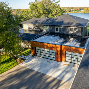
Our journey commenced with the demolition of almost the entire former 2-car garage, making space for a new, oversized 3-car garage measuring 40′ x 28′. This garage was strategically placed between the existing house and the large detached garage. We introduced a custom low-sloped flat roof, designed to address historical drainage issues.
To mitigate water pooling, we created a custom concrete step at the back corner of the garage, equipped with a sturdy metal grate that sits flush with the step. We also installed a PVC drainage system, commencing at the step and running beneath a newly designed patio, ultimately draining into the yard. These measures have significantly reduced water accumulation around the house.
The new garage boasts several features, including Longboard aluminum siding, custom full glass garage doors, interior drywall finished to a level 4, an abundance of can lights, an epoxy floor coating, vinyl base trim, a new forced air garage heater, and more.
The clients also requested a designated space for their three kids and their friends to enjoy, thus giving birth to the “Kid Zone.” We partitioned a section of the existing oversized garage, resulting in a space measuring approximately 22′ x 32′, brimming with entertainment possibilities. To enhance control over the temperature in the Kid Zone, we collaborated with our licensed HVAC partner to install a cold weather mini-split system.
One of the most significant challenges was the modernization and consolidation of the home’s main electrical systems. We reconfigured and combined 6-7 different electrical panels into just two. One panel serves the main house, while the second is dedicated to backup power from a generator. These panels, along with the boiler for the in-floor heating system, are housed in a newly constructed mechanical room within the Kid Zone.
Inside the main house, we completed various tasks, such as removing the ceiling in the hallway from the new garage to address prior water damage, improve insulation, and rework electrical and HVAC systems. We also replaced the ceiling from the front door to the base of the stairs, adding new can lighting and enhancing insulation. Skilled drywall specialists then installed and finished new drywall to a level 5 standard.
The exterior of the house underwent a complete overhaul. Before installing new roofing on the entire house and garage, we modified an existing flat roof by adding custom lumber and plywood to enhance the pitch, preventing future ice dams. A new rubber roof was expertly installed on the oversized 3-car garage, and the flat roof section we re-framed.
Our meticulous exterior team removed old white aluminum soffit, fascia, and gutters, replacing them with new framing to accommodate Longboard soffit material. This task was particularly challenging due to the age of the house and the non-standard wall and roof framing. Our skilled exterior subcontractors ensured a perfect fit.
Near the pool area, we discovered severe rot and decay from years of water intrusion. After informing the homeowners, we ordered and installed five new commercial-style block framed windows and a custom 8′ high Anderson patio door. This involved careful removal and replacement of window headers from the outside to avoid disturbing the finished part of the house. We reframed the large openings to fit the new windows, and our skilled trim carpenters installed new walnut casing, base, and window sills.
In total, we replaced around 900 lineal feet of soffit and installed approximately 32 squares of aluminum siding. The entire house was meticulously prepped, repaired, and painted according to the client’s chosen color.
Throughout the project, we incorporated numerous custom touches and unique design elements, some of which you can see in the pictures. Our team also addressed various unforeseen challenges, from soil issues to rot and decay repair, roof leaks, drainage problems, electrical and HVAC complexities, and much more.
At Xpand Inc., we take pride in making it all happen, turning your remodeling and renovation dreams into reality.

 Story Barns
Inspiration for a mid-sized rustic carpeted straight cable railing staircase remodel in Denver with carpeted risers

 Ferriss - Architectural Renderings
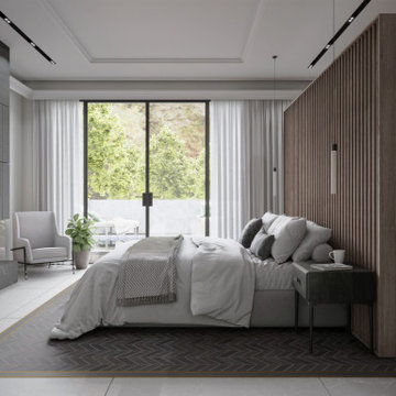
7 mistakes in bedroom design and ways to avoid them.
ERROR # 1 - Incorrect bed size.
This is a problem with any furniture in principle. When, according to the plan and ergonomic calculations, it becomes size to size, but in fact, it looks cumbersome, visually overflowing the space or, on the contrary, turns out to be too small and looks awkward.
How to avoid: Always be guided by the proportions of the size of the furniture in the room. Try to choose as big a bed as possible, but stay realistic. The main thing is that the width of the passageways in the bedroom should not be less than 70cm, and for comfortable movement, it is better to do everything 100cm.
ERROR # 2 - Poor lighting and switches.
Even in a small bedroom, you need multiple light sources. A single chandelier in the center of the ceiling is not enough, because it creates the effect of darkening the corners, and the room seems uncomfortable.
How to avoid: Hang a sconce over your headboard. Don't forget to light up the space next to the mirror and wardrobe. And be sure to place switches close to the bed so that you don't have to go to the other end of the room after an evening with a book in bed.
Do not forget about a sufficient number of outlets, this should be done even at the planning stage.
ERROR # 3 - Few storage locations
The fewer well-thought-out cabinets and shelving, the more things are visible. And the clutter spoils even the most stylish and expensive interior.
How to avoid: In addition to bedside tables, a chest of drawers (for storing small things) and a built-in wardrobe can be placed in a small bedroom: unlike a usual one, it takes up space from floor to ceiling, thereby accommodating more items. In addition, the built-in structure looks more solid and often merges with the walls, making the setting complete.
ERROR # 4 - Carpet of the wrong size.
The carpet in the bedroom is a great addition, and sometimes the final touch of the whole composition. But often people choose the wrong size or do not use it at all.
How to avoid: Choosing the right size can be guided by the unspoken rule, according to which the carpet should be 1 meter larger than the bed, both lengthwise and across. If the room is large, then it is recommended that the indentation of the carpet from the wall is 45-50 cm, if it is small, then 20-30 cm can be dispensed with.
ERROR # 5 Typical design.
If you buy a typical bed, bedside tables, and wardrobe from one manufacturer, then the interior will turn out to be formulaic and impersonal. No accessories and color schemes will help him.
How to avoid: The interior should reflect the character of its owner, and the person living in it will feel comfortable. Explore different collections of furniture and try to assemble a capsule in the same color scheme, but at the same time different in texture and shape.
ERROR # 6 Empty walls.
Even if the bedroom is a room for relaxation, it would be a mistake to make a space out of it that is intended solely for sleeping. Ascetic furnishings, unadorned walls, boring furniture, and bed linen - all this does not improve the mood at all, but, on the contrary, creates a gloomy mood.
How to avoid: The walls in the bedroom are a blank slate that you can transform into something original, beautiful, and unique to your liking. Even if you just paint one of the walls in a contrasting color, and decorate the other with several photos from the Internet, printed and inserted into frames, you can transform the atmosphere of the room as a whole.
ERROR # 7 Too dark interior.
One should not be deceived by the beauty of the thick dark tones of interior paint. It has long been known that dark blue, burgundy, blueberry, chocolate, and black for the bedroom should not be used in large quantities, since such an environment will have a tangible effect and interfere with a vigorous awakening in the morning.
How to avoid: If you like a rich range, try choosing derived shades a few tones lighter, for example, instead of black or graphite, choose gray-brown, dove-gray for the walls, and blue can be replaced with cornflower blue or azure.
Don't forget to combine dark tones with lots of whites, creams, complementing shimmery accessories, and vibrant décor.
https://www.ferriss.co/
#ferriss #We_bring_objects_to_life #3drendering #architecture #San_Francisco

 Ensotile - Atlanta Bathroom Remodeling
Damian at ensotile.com
Example of a trendy bathroom design in Atlanta
Example of a trendy bathroom design in Atlanta

 Mark Mobley Architecture
Mid-sized arts and crafts front porch idea in Baltimore with decking and a roof extension

 J&S by STARK
Mid-sized eclectic carpeted straight wood railing staircase photo in New York with carpeted risers

 Tuttle's Carpet One Floor & Home
Your Trusted Source for the Finest Flooring Solutions in Orange County
Location: Laguna Niguel, CA 92677
Trendy wooden spiral staircase photo in Orange County with wooden risers
Trendy wooden spiral staircase photo in Orange County with wooden risers
 Advance Design Studio, Ltd.
After six years of living in their Huntley IL home, Chris and Meghan were tired of their dark, dingy, outdated kitchen and it was finally time for a long-anticipated change. “The kitchen is the place where we live, it’s where we do everything,” Meghan said. “It was important that it be a space where we wanted to be.” Meghan loves cooking and enjoys including their girls in healthy meal prepping, this led them to want a brighter, more enjoyable kitchen with increased functionality and improved storage.
For Chris especially, the laundry room was an entirely dysfunctional eyesore. “We had a washer and a dryer, but it was all kind-of cobbled together!” Chris said. “There were always laundry piles everywhere, we weren’t really sure what we wanted to do in there, but it was time for us to make a change.” The mess of the space was stressful every time they walked in the door from the garage each day. Kids’ backpacks and shoes piled up haphazardly in the makeshift boot-bench closet left the family feeling disorganized and stressed. They needed space for folding clothes and locker cubbies to help keep the family organized.
Having known Christine and Todd in the Huntley community for years, Chris and Meghan were familiar with their work. “We already trusted them personally and having seen their projects for years we knew they did top notch work. After we reviewed the initial round of designs, we knew that hiring them was definitely the right choice,” Meghan and Chris said. Although Chris had done a lot of work in their home himself, the kitchen and laundry room renovation was such a large undertaking that he didn’t want to steal time away from his family to spend what would surely be many long weekends doing the job himself. “That would not have been a wise choice for us,” Chris laughed.
“Our designer, Michelle was very, very, easy to work with; anything we wanted to see or weren’t sure about, she went above and beyond to make this easy for us. She was easy to get hold of and always quick to respond,” the couple said. Michelle pulled ideas that mirrored the couple’s taste and style and was adept at directing the couple to limited choices that didn’t overwhelm them and kept the process moving. “I have a hard time making decisions. Michelle made the decision-making process so easy. I loved how she listened to what I liked and then presented three great options for me to choose from,” Meghan said.
The main objectives for the kitchen were better storage solutions, they wanted the space to reflect their lifestyle and taste, and they wanted it to last for years with low maintenance. One of the first steps in creating a more functional kitchen was relocating the refrigerator, creating an improved workflow for the busy family.
“We didn’t know that we could even move the refrigerator to a new location where it is now, that was something that we never would have thought of,” Chris said. “The new refrigerator location makes the kitchen feel so much bigger. We didn’t add any space, but our whole kitchen with the new design just seems like it’s so much larger than before!” Meghan said.
The perimeter mist colored cabinets helped warm and brighten the entire room, while the graphite colored cabinets on the island added contrast. Using this fresh, clean color palette satisfied the couple’s desire for a bright space that was the exact opposite of what they had before. Organization accessories were also added to the cabinets such as a spice drawer tray and roll outs to create hidden convenience.
“I absolutely love the hidden spices – it makes cooking so much more enjoyable!” Chris said. “And all the pull outs, and the double trash bin, who would think you could get so excited about organization!” the couple said in unison.
One thing they hated in their original kitchen was how dark the space felt. Added lighting on the ceiling with the new light fixtures combined with the lighter cabinetry colors throughout solved this problem. “Our new kitchen has this warm, almost cozy feeling that our old kitchen never had, it’s just a space that I love spending my time in now,” Meghan said. The light airy feeling was accentuated with the use of floating white shelves on either side of the decorative range hood. “We have so much cabinetry space, the new design is amazing we actually have more storage space than we will ever need,” Meghan said.
The island was extended to create more work surface and added space for stool seating. “The new island changes how we live. Now the kids can be in the kitchen with us, doing homework, eating breakfast, and the three of us have special dinners there when Chris is working late,” Meghan said.
The Carrara Marmi Quartz countertops were chosen because they are, not only beautiful, but are made from hard-working material that doesn’t require maintenance. The white subway tile backsplash that wraps to the ceiling behind the focal point cooktop range/hood compliments the crisp white countertops perfectly, while brushed brass hardware and light fixtures keep the design fresh and new.
The couple had a few fears at the beginning of the project, as most homeowners do. Their biggest fear was being out of their kitchen and laundry room for an extended time. The crew made it very easy for the family to work in a limited space keeping the washer and dryer hooked up the majority of the time, and also getting appliances working with minimal downtime.
“They above and beyond accommodated us to get us through the process,” Meghan said. “They did a great job making sure we were as comfortable as possible throughout the process,” Chris added.
“Our project manager DJ did a great job. He was very good at updating us on schedule changes, getting guys in as quickly as possible. Everyone that stepped in the house was nice and did great work,” said Chris. They thought Advance’s carpenter was phenomenal and were impressed when he took a conceptual idea from a photograph and worked with designer Michelle to create a one of a kind range/hood that has become the topic of conversation with friends and family who visit the new kitchen. “He was in our house literally every day for several weeks. He was easy to work with and good at what he did,” Meghan and Chris said.
The focal point of the kitchen; a hand-crafted, custom-built ventilation hood was clad with handpicked reclaimed barnwood. Advance Design’s carpenter built the framework and the cladding to create a one-of-a-kind design element that the couple loves.
“I think it was especially fun for him to create something unique from scratch, showcasing his talent in this area,” Meghan said. “I love that my kitchen is not like everyone else’s. I got to pick out the wood on my hood and watch it being built and was able to choose what pieces of wood went where on it. It’s totally unique.”
Red Oak flooring was toothed-in throughout the kitchen and the rest of the first floor anywhere changes were made. Then the whole floor was refinished to tone down the orange undertones in the existing floor stain, ultimately changing the color complexion of the entire first floor. The result is a completely new feeling to the entire home.
Renovating the laundry room was extremely important to Meghan and Chris, but they had trouble visualizing what the possibilities were for the seemingly small space. Michelle produced beautiful 3D illustrations that helped them envision the space in a whole new way.
“I must have told Michelle 100 times that I am a visual person, seeing the designs in 3D made it so easy to make decisions and see what we could really do with our space,” Meghan said.
A dividing wall and doorway were removed between the existing laundry room and hallway formerly containing a coat closet, providing space to design specialized graphite colored cabinetry matching the kitchen island to house custom storage cubbies for each family member. Adding the tall utility cabinetry in the new laundry area helped solve the storage issue, tucking away cleaning supplies, household items, and even the cat got its own cubby.
“I love how everything is now hidden in its own space. I can’t tell you how much I hated coming home and seeing everything sitting around on counters,” Chris said.
Electrical outlets were planned for the inside of utility cabinets, so devices could charge in hidden locations. Stacking the washer and dryer allowed for wider countertop space to provide a folding area and a special space for clothes to hang. “The way I do laundry has been completely transformed! I can actually fold clothes and hang them now right out of the washer and dryer,” Meghan said.
“The end result in the kitchen and the laundry/mud room was an updated light and bright space, with a smarter work flow that better meets the needs of this family,” Michelle said.
“I would totally recommend Advance Design,” Meghan said. “Sometimes I sit and just look at my kitchen and laundry room and think ‘Wow, I can’t believe I get to live here!’ It’s an understatement to say we love our new space.”
Sponsored
Westerville, OH

Custom Home Works
Franklin County's Award-Winning Design, Build and Remodeling Expert
 Advance Design Studio, Ltd.
Our clients in Tower Lakes, IL, needed more storage and functionality from their kitchen. They were primarily focused on finding the right combination of cabinets, shelves, and drawers that fit all their cookware, flatware, and appliances. They wanted a brighter, bigger space with a natural cooking flow and plenty of storage. Soffits and crown molding needed to be removed to make the kitchen feel larger. Redesign elements included: relocating the fridge, adding a baking station and coffee bar, and placing the microwave in the kitchen island.
Advance Design Studio’s Claudia Pop offered functional, creative, and unique solutions to the homeowners’ problems. Our clients wanted a unique kitchen that was not completely white, a balance of design and function. Claudia offered functional, creative, and unique solutions to Chad and Karen’s kitchen design challenges. The first thing to go was soffits. Today, most kitchens can benefit from the added height and space; removing soffits is nearly always step one. Steely gray-blue was the color of choice for a freshly unique look bringing a sophisticated-looking space to wrap around the fresh new kitchen. Cherry cabinetry in a true brown stain compliments the stormy accents with sharp contrasting white Cambria quartz top balancing out the space with a dramatic flair.
“We wanted something unique and special in this space, something none of the neighbors would have,” said Claudia.
The dramatic veined Cambria countertops continue upward into a backsplash behind three complimentary open shelves. These countertops provide visual texture and movement in the kitchen. The kitchen includes two larder cabinets for both the coffee bar and baking station. The kitchen is now functional and unique in design.
“When we design a new kitchen space, as designers, we are always looking for ways to balance interesting design elements with practical functionality,” Claudia said. “This kitchen’s new design is not only way more functional but is stunning in a way a piece of art can catch one’s attention.”
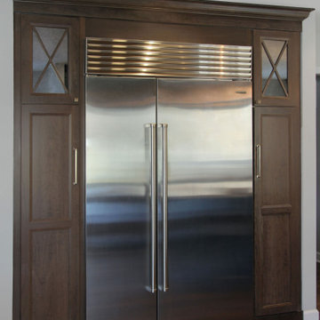
Decorative mullions with mirrored inserts sit atop dual sentinel pantries flanking the new refrigerator, while a 48″ dual fuel Wolf range replaced the island cooktop and double oven. The new microwave is cleverly hidden within the island, eliminating the cluttered counter and attention-grabbing wall of stainless steel from the previous space.
The family room was completely renovated, including a beautifully functional entertainment bar with the same combination of woods and stone as the kitchen and coffee bar. Mesh inserts instead of plain glass add visual texture while revealing pristine glassware. Handcrafted built-ins surround the fireplace.
The beautiful and efficient design created by designer Claudia transitioned directly to the installation team seamlessly, much like the basement project experience Chad and Karen enjoyed previously.
“We definitely will and have recommended Advance Design Studio to friends who are looking to embark on a project small or large,” Karen said.
“Everything that was designed and built exactly how we envisioned it, and we are really enjoying it to its full potential,” Karen said.
Our award-winning design team would love to create a beautiful, functional, and spacious place for you and your family. With our “Common Sense Remodeling” approach, the process of renovating your home has never been easier. Contact us today at 847-665-1711 or schedule an appointment.

 JM Carpets
Example of a mid-sized transitional 3/4 mosaic tile floor bathroom design in Milwaukee with shaker cabinets, white cabinets and yellow walls
 Advance Design Studio, Ltd.
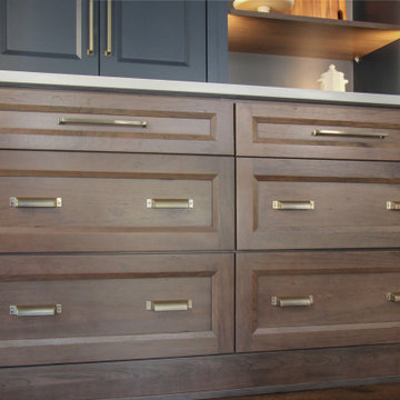
Our clients in Tower Lakes, IL, needed more storage and functionality from their kitchen. They were primarily focused on finding the right combination of cabinets, shelves, and drawers that fit all their cookware, flatware, and appliances. They wanted a brighter, bigger space with a natural cooking flow and plenty of storage. Soffits and crown molding needed to be removed to make the kitchen feel larger. Redesign elements included: relocating the fridge, adding a baking station and coffee bar, and placing the microwave in the kitchen island.
Advance Design Studio’s Claudia Pop offered functional, creative, and unique solutions to the homeowners’ problems. Our clients wanted a unique kitchen that was not completely white, a balance of design and function. Claudia offered functional, creative, and unique solutions to Chad and Karen’s kitchen design challenges. The first thing to go was soffits. Today, most kitchens can benefit from the added height and space; removing soffits is nearly always step one. Steely gray-blue was the color of choice for a freshly unique look bringing a sophisticated-looking space to wrap around the fresh new kitchen. Cherry cabinetry in a true brown stain compliments the stormy accents with sharp contrasting white Cambria quartz top balancing out the space with a dramatic flair.
“We wanted something unique and special in this space, something none of the neighbors would have,” said Claudia.
The dramatic veined Cambria countertops continue upward into a backsplash behind three complimentary open shelves. These countertops provide visual texture and movement in the kitchen. The kitchen includes two larder cabinets for both the coffee bar and baking station. The kitchen is now functional and unique in design.
“When we design a new kitchen space, as designers, we are always looking for ways to balance interesting design elements with practical functionality,” Claudia said. “This kitchen’s new design is not only way more functional but is stunning in a way a piece of art can catch one’s attention.”
Decorative mullions with mirrored inserts sit atop dual sentinel pantries flanking the new refrigerator, while a 48″ dual fuel Wolf range replaced the island cooktop and double oven. The new microwave is cleverly hidden within the island, eliminating the cluttered counter and attention-grabbing wall of stainless steel from the previous space.
The family room was completely renovated, including a beautifully functional entertainment bar with the same combination of woods and stone as the kitchen and coffee bar. Mesh inserts instead of plain glass add visual texture while revealing pristine glassware. Handcrafted built-ins surround the fireplace.
The beautiful and efficient design created by designer Claudia transitioned directly to the installation team seamlessly, much like the basement project experience Chad and Karen enjoyed previously.
“We definitely will and have recommended Advance Design Studio to friends who are looking to embark on a project small or large,” Karen said.
“Everything that was designed and built exactly how we envisioned it, and we are really enjoying it to its full potential,” Karen said.
Our award-winning design team would love to create a beautiful, functional, and spacious place for you and your family. With our “Common Sense Remodeling” approach, the process of renovating your home has never been easier. Contact us today at 847-665-1711 or schedule an appointment.
 Advance Design Studio, Ltd.
Jennifer and Dan have lived in their Deer Park Illinois home for 15 years, slowly making minor fixes like painting and decorating; but they had a new plan for their kitchen the entire time. An awkwardly placed garage door, and an island cooktop with a terrible downdraft made a full-scale kitchen remodel an absolute must. Jennifer had many ideas in mind and wanted to work with a company that could provide high-end work, while partnering with a designer that would tailor the kitchen to her ideas.
She was intrigued by the phrase “Common Sense Remodeling” in Advance Design’s feature she discovered while perusing an issue of the community’s Quintessential Barrington Magazine. Doing further research on the company’s website, as she looked through project profiles and read about Advance Design’s “Common Sense Remodeling” philosophy, she promptly scheduled an appointment to see if the people and ideas she read about were truly who they said they were. The more she read, the more she knew that the “Common Sense” approach to remodeling they described was exactly the type of company she was looking for.
The partnership was sealed after an initial consultation with Owner Todd Jurs and Project Designer Michelle Lecinski. They displayed a combination of friendliness, professionalism and respect that was unmatched by any of the other companies Jennifer talked to. She knew that with Advance Design, she would be able to retain the vision that she had in mind with high-quality craftsmanship.
“I reached out to Advance Design because of the ‘Common Sense Remodeling’ tagline,” Jennifer said. “That’s what lingered for me”. “Advance Design was the most respectful- of the house and of my design ideas, and the most professional of the handful of companies that looked at my project”.
Soon after the meeting Jennifer began working with Michelle on the project design. They quickly developed chemistry. Jennifer loved how Michelle researched and located every detail that Jennifer wanted for the kitchen. Between the two of them, every concept and idea was worked through and perfected. “Jennifer had definite ideas about what she wanted the new kitchen to look like, she just didn’t know how to bring it all together. We worked together really well to make her ideas into the practical reality necessary for a well-functioning kitchen, with the look and feel that she had envisioned”, says Michelle.
“Michelle was wonderful in using the CAD system she would show me new drawings every time we changed the layout while working through the design,” Jennifer said. “She was a really wonderful partner in execution, she made sure everything happened quickly and easily.”
The finished design drew out elements of Jennifer’s style and personality. The pair call the look “sophisticated farmhouse” to describe the kitchen renovation to family and friends. The result was a beautifully crafted, authentic-feeling space that satisfied Jennifer’s dreams 15 years in the making. The whole project consisted of a kitchen remodel, mudroom upgrade with powder room, and garage entry relocation. “The projects I personally like the best, are the ones that put the client’s dreams on display,” Project Designer Michelle said. “And this is one of those projects.”
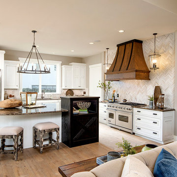
The main focal point of the kitchen is custom zinc and brass ventilation hood with a vintage sheen, which was hand made to order by a small company in Indiana named Vogler Metalworking. “It’s like sculpture, a true work of art”, says Jennifer. Your eye is immediately drawn towards this elegant yet practical hood that eliminated the home’s downdraft problem and added a striking conversation piece at the same time. The carpenters had to use special gloves when transporting and installing it, so they didn’t smudge it with fingerprints. The beautiful hood centers proudly over the stunning black enamel and brass LaCornue Range. “I had a friend who had a LaCornue range and after learning how easy it was to cook perfect meals, I was convinced I wanted to have one”, says Jennifer. This unique, breathtaking combination anchors the entire kitchen and is apparent immediately as you walk into the great room the surrounds the space.
DuraSupreme Crestwood cabinets with a Kendall Panel add function and sophistication. A custom gray paint color paired with a storm blue was developed so that the new kitchen looked like it belonged to the existing space. Unlacquered brass faucets and hardware were important to Jennifer because she wanted the living finishes to age over time. Remarkable brass diamond mesh cabinet door inserts imported from the UK continue to add this one-of-a-kind kitchen renovation; giving it a “you won’t see this everywhere” quality. The use of old railcar flooring for the coffee bar countertop and reclaimed oak for the open shelving gives an authenticity to the space uncommon in kitchens today.
Jennifer and Michelle fell in love with the Limestone Grey Stone while they were investigating unique island countertop ideas. They liked the fact that the limestone as a living finish will age and change over time. Calcutta Miel Quartz countertops made for an excellent pairing around the perimeter, as it’s durable and perfect for cooking preparations. A textured white subway tile backsplash that runs to the ceiling keeps your eye moving towards the open shelving, and to the main focal point of the stunning range hood combination.
“The kitchen functions beautifully, and it’s gorgeous,” beams Jennifer as she gestures with both hands while smiling ear to ear. “The most important thing was I wanted a kitchen that had a wonderful flow, cooked beautiful meals and was a great gathering place for family and friends, and this space does that perfectly! Beauty wise, it turned out exactly how I had envisioned. I felt the function part was the hardest part, and that was nailed”!
Relocating the garage entry to the new mudroom was a huge priority and has finally separated the family’s arriving home functions from their kitchen. Now coats and shoes and bags have their own area for dropping once members arrive home. Matching gray DuraSupreme cabinetry helped create gorgeous, purposeful lockers for the family. A reclaimed vintage sink and custom wall paper were added to the tiny powder room to beautify the once previously only functional space. Advance Design was even able to create a custom space for their dog to sleep while the family is away.
“It was unbelievable that a project of this size was completed in such a short time, and I think that’s because of the large amount of planning and preparation that went into it,” Jennifer marveled, “When we started, we were ready, and everything was prepared”.
When it came to execution, Project Manager Justin Davis and his crew were quick, accessible, and organized. Projects like this kitchen are typically completed in as little as 8-10 weeks. Jennifer’s kitchen however despite the relocation of some challenging HVAC in a soffit and moving of an exterior door was completed remarkably fast in part because the team was working with an existing tile floor that ran throughout the first floor that the client really loved.
“You get to know these people really well because they’re living in your house while you’re living in your house. They were so fast and really good, it didn’t take as long as even planned” reported Jennifer. “I would text Justin and he always responded almost immediately. I got to know all the guys who were working in our house and they were all wonderful people”.
Details in a customized kitchen like this one require skill and care from the people who install it. “All the guys on the job were skilled at what the did. I wanted small details like little feet to look like furniture, that is where their carpentry skill came in to make these all perfect”, said Jennifer. “The tile guys were wonderful. They even let me determine how I wanted the texture with the grout to appear for a salt and pepper look; now that is a very skilled trade person making it custom”.
In Jennifer’s interview, she continued to reference Advance Design’s “Common Sense Remodeling”, so I took a minute to ask her exactly what that phrase meant to her and how it played out in her experience with her project and the Advance Design team. Here is what she said: “I was intrigued about Common Sense Remodeling and in my head that there would be clear costs and prices, great communication between the design team, the execution team and me”, said Jennifer. They did deliver on that, it was so clear about the cost breakdown, what I could expect from everyone who came to my house, and everything that we had ordered. That to me is the Common Sense”!
It’s great to see a client take literally our assertion that a well-planned remodeling project is simply “Common Sense”! She anticipated each step of the way would be clear, concise, and predictable, all the while protecting the outcome due to the careful upfront planning. “Advance Design delivered on their ‘Common Sense Remodeling’ promise,” Jennifer said. “From the design team, to the execution team - everything was straight forward like I imagined. The project turned out exactly how I envisioned, I enjoyed this process and absolutely would recommend Advance Design Studio to anyone.”
Sponsored
Westerville, OH
Custom Home Works
Franklin County's Award-Winning Design, Build and Remodeling Expert
 Schemata Workshop
Tom Marks
Inspiration for a 1960s u-shaped home design remodel in Seattle with stainless steel appliances and an island
Inspiration for a 1960s u-shaped home design remodel in Seattle with stainless steel appliances and an island


 Xpand Inc. | Homes of Xcellence
At the outset, this project began with the transformation of a 2-car attached garage. The goal was to create a mudroom, an exercise room, and a breezeway to seamlessly connect the spacious detached garage with the main part of the house. Additionally, the project involved partial roof removal and the addition of a new front entry.
But then came an unexpected twist – scope creep.
We found ourselves veering away from the initial client-supplied architectural plans. After numerous consultations with the clients and several iterations of the design, we arrived at a significantly improved plan for the remodel and addition.
Our journey commenced with the demolition of almost the entire former 2-car garage, making space for a new, oversized 3-car garage measuring 40′ x 28′. This garage was strategically placed between the existing house and the large detached garage. We introduced a custom low-sloped flat roof, designed to address historical drainage issues.
To mitigate water pooling, we created a custom concrete step at the back corner of the garage, equipped with a sturdy metal grate that sits flush with the step. We also installed a PVC drainage system, commencing at the step and running beneath a newly designed patio, ultimately draining into the yard. These measures have significantly reduced water accumulation around the house.
The new garage boasts several features, including Longboard aluminum siding, custom full glass garage doors, interior drywall finished to a level 4, an abundance of can lights, an epoxy floor coating, vinyl base trim, a new forced air garage heater, and more.
The clients also requested a designated space for their three kids and their friends to enjoy, thus giving birth to the “Kid Zone.” We partitioned a section of the existing oversized garage, resulting in a space measuring approximately 22′ x 32′, brimming with entertainment possibilities. To enhance control over the temperature in the Kid Zone, we collaborated with our licensed HVAC partner to install a cold weather mini-split system.
One of the most significant challenges was the modernization and consolidation of the home’s main electrical systems. We reconfigured and combined 6-7 different electrical panels into just two. One panel serves the main house, while the second is dedicated to backup power from a generator. These panels, along with the boiler for the in-floor heating system, are housed in a newly constructed mechanical room within the Kid Zone.
Inside the main house, we completed various tasks, such as removing the ceiling in the hallway from the new garage to address prior water damage, improve insulation, and rework electrical and HVAC systems. We also replaced the ceiling from the front door to the base of the stairs, adding new can lighting and enhancing insulation. Skilled drywall specialists then installed and finished new drywall to a level 5 standard.
The exterior of the house underwent a complete overhaul. Before installing new roofing on the entire house and garage, we modified an existing flat roof by adding custom lumber and plywood to enhance the pitch, preventing future ice dams. A new rubber roof was expertly installed on the oversized 3-car garage, and the flat roof section we re-framed.
Our meticulous exterior team removed old white aluminum soffit, fascia, and gutters, replacing them with new framing to accommodate Longboard soffit material. This task was particularly challenging due to the age of the house and the non-standard wall and roof framing. Our skilled exterior subcontractors ensured a perfect fit.
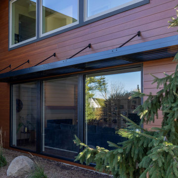
Near the pool area, we discovered severe rot and decay from years of water intrusion. After informing the homeowners, we ordered and installed five new commercial-style block framed windows and a custom 8′ high Anderson patio door. This involved careful removal and replacement of window headers from the outside to avoid disturbing the finished part of the house. We reframed the large openings to fit the new windows, and our skilled trim carpenters installed new walnut casing, base, and window sills.
In total, we replaced around 900 lineal feet of soffit and installed approximately 32 squares of aluminum siding. The entire house was meticulously prepped, repaired, and painted according to the client’s chosen color.
Throughout the project, we incorporated numerous custom touches and unique design elements, some of which you can see in the pictures. Our team also addressed various unforeseen challenges, from soil issues to rot and decay repair, roof leaks, drainage problems, electrical and HVAC complexities, and much more.
At Xpand Inc., we take pride in making it all happen, turning your remodeling and renovation dreams into reality.
141