
Search results for "Suffered" in Home Design Ideas
 Dad's For Hire, LLC
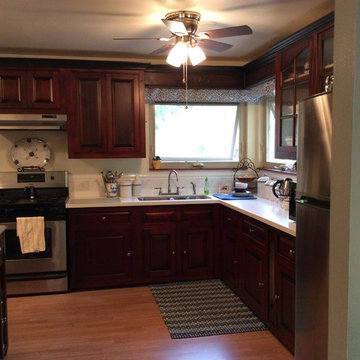
Kitchen suffered substantial water damage. Kitchen cabinets were removed and new flooring installed. New Solid Surface Counters. Cabinet to left of sink cabinet custom made to match existing.
 Synergy Design & Construction
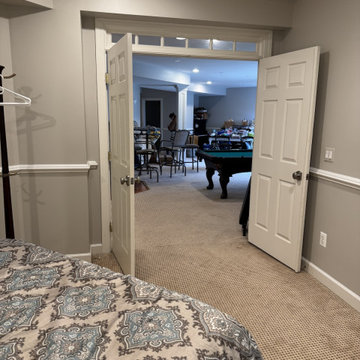
Before: The guest room suffered from the same tired finishes as the rest of the basement. It also didn’t have a closet and thus didn’t offer the comfort visitors expect.
 Spring Creek Design
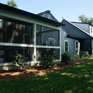
The homeowners loved the lot this home sat on, but it lacked a garage and the exterior suffered from years of deferred maintenance before they purchased. With new siding, windows, roof, and an attached two-car garage addition with bonus room above, they have more living and storage space, and a clearly dedicated path to the front door — the addition also added a foyer. Corrugated metal accents add interest. The new screened porch is convenient to the pool and house.
Photo by Liz Smutko
Find the right local pro for your project

 Lamont Bros. Design & Construction
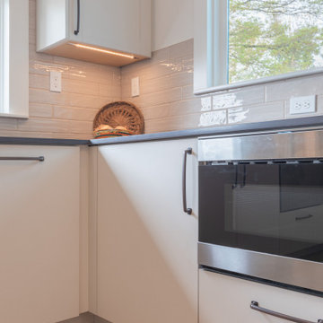
After years of suffering through a poorly designed kitchen that didn’t meet her needs, our client made the difficult decision to re-remodel her kitchen. Now that the kitchen is complete, she's happier than ever in her new kitchen. What used to be a space that was intimidating and difficult to use has become a place designed specifically for her needs, where every appliance and shelf is within comfortable reach and the design is tailored exactly to her personal style.
 Undercover Systems, LLC
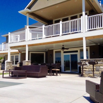
This project was a huge under deck ceiling system out in Yakima, WA. We added in a ceiling fan and over 1000 sq feet of under deck ceiling. This space is now 100% waterproof and allows the space to be used year round without the threat of getting wet or suffering from the elements.
 INSURED RESTORED LLC
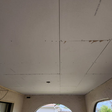
This home had over 80% of the drywall removed and replaced after suffering major water intrusion from hurricane Ian
This is an example of a traditional porch design in Miami.
This is an example of a traditional porch design in Miami.
 New Roots Landscaping
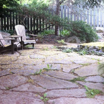
Natural bluestone patio replaces a lawn area that had suffered as the surrounding ornamental trees provided too much shade for the grass. Post intallation, ground cover just starting to fill in.
 Irene Designs
Kitchen — Project Description (Bolton, CT)
(Full Renovation • Reconfiguration • Architectural Corrections)
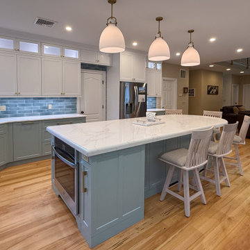
The original kitchen suffered from spatial imbalance and limited functionality: the right side was visually and physically heavy with cabinetry and appliances, the 135-degree angled walls lacked symmetry due to a missing window on the driveway side, and the small island could only seat two. Circulation was obstructed by a desk positioned in the main traffic flow, and the low French door felt disproportionate in scale compared to the large windows and adjacent two-story Great Room.
Major Structural & Functional Improvements
Repositioned window on the front elevation to the right, creating a long-desired view to the driveway while freeing space for a centered cooktop and statement hood — visually aligning with the Great Room’s redesigned fireplace focal wall.
Installed a new custom sliding door, significantly taller and wider than the original French door. This upgrade enhances natural light, visually opens the kitchen to the deck, and provides unobstructed traffic flow thanks to its sliding operation.
New Kitchen Layout & Enhanced Functionality
Designed an entirely new layout centered around a 10' double-slab island, providing expansive workspace and a natural gathering zone.
Added conversational seating for the whole family, allowing comfortable interaction on all sides of the island.
Introduced purpose-designed storage solutions, including pullouts, rollouts, spice towers, tray organizers, and deep drawers to maximize usability.
Reallocated the desk area to a dedicated window spot overlooking the backyard, removing it from traffic paths and improving both functionality and comfort.
Cabinetry & Architectural Detailing
Custom two-tone cabinetry in soft white and a serene blue-green tone reflects the visual language of the adjacent Great Room, creating whole-home cohesion.
Installed lit upper glass cabinets along the entire perimeter, balancing vertical proportions and creating an elegant display band throughout the kitchen.
A custom range hood was designed and painted to match the base cabinetry, becoming a focal point framed by symmetrical windows.
Surfaces, Lighting & Finishes
The island features a double-thickness quartz slab with a soft ogee radius for a timeless, furniture-like feel.
A full-height, handcrafted aqua subway tile backsplash introduces depth, texture, and a gentle reflective quality.
New layered lighting concept, including recessed lights, pendants, task lighting, and integrated cabinet lighting, ensures a warm and functional workspace at any time of day.
 Ravenwood Construction Ltd
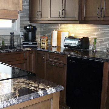
As seen in another photo within this project showing the before picture, this kitchen suffered from poor flow and felt quite cramped. During the first consultation, there was discussion about knocking walls down and including the dining room as part of the kitchen. We went to the design board and came up with the most economical solution we could to meet all the requirements. No walls needed to be removed.
We redesigned the entire kitchen to allow for better flow and space. The end product is still amazing. A few of the changes included the relocation of the dishwasher, fridge and the centering of the sink. Originally the dishwasher and sink were located on the same wall making it very cramped and non-functional. By moving the dishwasher to where the fridge originally was located and then centering the sink allows for a comfortable and functional use of space.
Lighting was an essential part of the design with the addition of numerous recessed lights and under cabinet lighting all with the ability to dim. This allows for a full range of ambient lighting.
A good portion of the budget went to installing the granite counter tops. The movement is unique in every piece and draws the eye immediately. The glass mosaic tile back splash adds glamour without taking anything away from the granite. The use of different size upper cabinets accentuates the crown molding and gives the kitchen a more custom look but helped stay on budget by using standard sizes. A new Delta kitchen faucet with two wave technology locations make clean up easy when your hands are dirty, and filling a pot less straining on the wrist as you just place it under the faucet and the water turns on automatically. Finishing the kitchen off is the Mannington vinyl tile flooring that requires grouting. Laid on a diagonal, again raises the level of this kitchen to a more custom feel.
 Charles Douglas
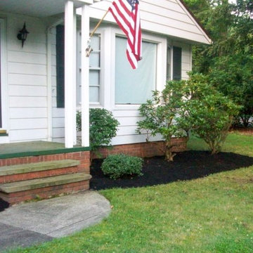
Trimmed hedges and the addition of mulch reinvigorated this drab area. in addition the Rhododendron were suffering from malnutrition so we added fertilizer to the so
 Tracy Berman Interiors
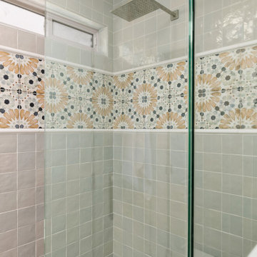
This beach house was not only dated but the kitchen was suffering from a wall that closed it off and a peninsula that cut the space in half. Those were the first things we corrected. The wall was removed which opened the space up. The new layout has a large island instead of the peninsula for better flow and entertaining. This home is across the street from the beach so our design cues came from the ocean and natural surroundings. Our color pallet is white and coastal blue for the cabinets. The new luxury vinyl plank floor is light like the sand. The glass backsplash tile and quartz countertops carry the coastal feel. The main bathroom for the lower level is off the kitchen. We improved the shower size and updated all of the finishes. This beach house is now bright and open with a warm coastal feel.
 KURV Architecture DPC (Alex Hughes Architects)
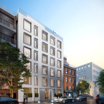
Located in the heart of Manhattan’s Lower East Side, the building was erected on a shallow commercial lot between two 120 year old masonry buildings and a new residential rental building. 330 Grand Street is a mix of 725 SF 1BRs and 1050 SF 2BR apartments. It also contains a 1100 SF two story duplex as well as private and public rooftop space, large private balconies for most units and two large private terraces for the ground floor units.
330 Grand Street was originally designed and approved at the NYC DOB as a prefabricated modular building. During the pandemic, as shipping costs skyrocketed putting the project at risk, we suggested redesigning the building as a reinforced cast-in-place concrete structure. Concrete was readily available and prices had not been affected by the demand increase that many other materials suffered in the pandemic. We took this opportunity to raise floor to ceiling heights, enlarge high performance windows and redistribute the buildings MEPFS and Structural Systems to create very open floor plans.
The challenge was to create a luxurious sensorial living experience with very limited means. In a city with very high construction costs, low cost residential buildings in the area are usually devoid of good quality, design and character. Our approach was to aim high for the end user, prioritizing natural light, open space with long visual perspectives, high ceilings and as always, rejecting the use of predefined building templates.
Our biggest challenge was to ensure that the small spaces feel as clean cut, large and bright as possible. Several unique design decisions were made to ensure low cost and high quality;
Floor plans were laid out so that spaces were wide open and free of clutter from mechanical or structural interruptions. Therefore all infrastructure was placed in lateral demising walls, which in turn act as the unit’s storage and kitchen. The apartments feel wide open, are super quiet and have more storage space than any other comparable apartment in the city.
To solve the problem of the site’s shallow commercial lot which is typically prone to dark interior spaces we focused our attention on the building’s envelope. Instead of the usual small punched window openings, oversized high performance windows were designed to ensure that light penetrated as far as possible into the units. In the smaller 1BR units, the full 50’ depth of the lot is perceived by partitioning spaces with sliding pocket doors that can be retracted to allow deep visual perspectives, making the sight lines in the space feel longer, larger, more ample than normal. In addition to the full height glazing, each unit above the 2nd floor receives a 7 foot covered balcony, adding 120 to 240 sf to each apartment, something unusual in New York City buildings. The space is large enough for a full size dining table, when the weather permits being outside.
We also worked hard to ensure modularity. For example, all kitchen units are all identical throughout the building. The idea of modularity and the economy of the repetitive unit is exercised to the maximum through the building.
Hardware, appliances, flooring, wall coverings and material finishes are all carefully selected to feel bespoke, high quality and unique.
It was important to KURV that the result of this work manifest into something that would deeply connect with the end user and sustain relationships with the consumers of this space.
All images by KURV Architecture ©
 iCork Floor
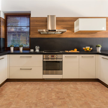
- Installation Type: Floating / Glue Down
- Edge type: square edge (seamless floor)
- Finish: Three coats German water based polyurethane
- Made with formaldehyde free adhesives
- 25 year warranty (residential installation)
- Underlayment not required
- Hypo-allergenic
- Healthy alternative to carpet
- Excellent thermal and acoustic insulation
- Stain resistant
- Naturally resistant to insects, mould, mildew due to anti-microbial properties.
- Low slip surface
- Excellent surface for seniors, children or people suffering from arthritis or joint pain
The photo shown is floating floor. We also have the glue down tile for this color.
Price for glue down tile: $2.29/sqft
*** Price may change without notice. Please check our website for the most current price.
Order FREE SAMPLES on our website: www.icorkfloor.com
 Halmann Vella
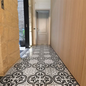
The original patterned tiles of the house suffered considerable damage and required replacement. Halmann Vella created a custom-made pattern reminiscent of the traditional Maltese patterned tiles. This new pattern perfectly marries the traditional aspect of the house with its branding.
Photograph by Fredrick Muscat.
 iCork Floor
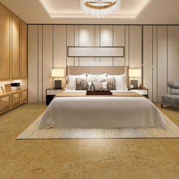
- Installation Type: Floating
- Licensed Uniclic Flooring system
- Square Edge Plank (seamless floor)
- Finish: Three coats water based polyurethane
- Wear Layer: 3mm genuine cork
- Middle Layer: 7mm E1 Class High Density Fiberboard (HDF)
- Integrated Underlayment: 1mm agglomerated cork.
- Plank Width: 12” (315mm)
- Plank Length: 36" (915mm)
- Plank Thickness: 7/16" (11mm)
- Carton coverage: 21.03 sqft
- Pieces per carton: 7
- 25 year warranty (residential installation)
- Underlayment not required
- Hypo-allergenic
- Healthy alternative to carpet
- Excellent thermal and acoustic insulation
- Stain resistant
- Naturally resistant to insects, mould, mildew due to anti-microbial properties
- Low slip surface
- Excellent surface for seniors, children or people suffering from arthritis or joint pain
Order FREE SAMPLES on our website: www.icorkfloor.com
 Poore & Company
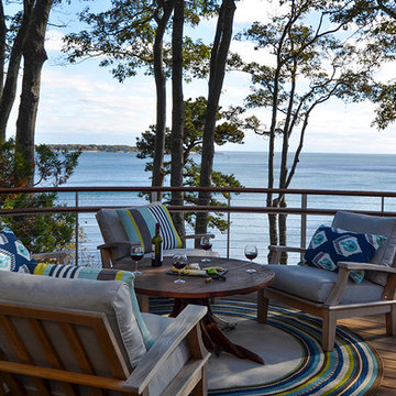
The original house was built as a kit on the coast. The potential view was spectacular but the existing house suffered from a deep sense of tunnel vision and the interior was a maze of disconnected spaces. By changing the location of the kitchen to a more commanding location and unfolding the spaces into a more logical flow the house not only captures the panoramic view but feels twice as big without adding one square foot to the building footprint. Small changes in the deck sizes with some sweeping curves and more logical exterior stair locations connect the interior with the surrounding natural landscape. An “away” space, affectionately called the Quiet Room, is crowned with a sculptural plaster ceiling that evokes a wave, or a shell, or a soft sky canopy floating above this unusual living area. Outdoors is an infinity edge spa overlooking Gloucester’s Eastern Point Lighthouse and the ocean beyond.
 Lamont Bros. Design & Construction
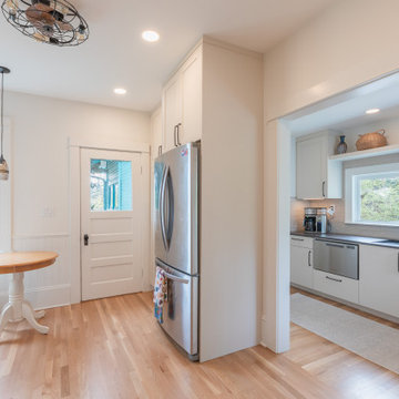
After years of suffering through a poorly designed kitchen that didn’t meet her needs, our client made the difficult decision to re-remodel her kitchen. Now that the kitchen is complete, she's happier than ever in her new kitchen. What used to be a space that was intimidating and difficult to use has become a place designed specifically for her needs, where every appliance and shelf is within comfortable reach and the design is tailored exactly to her personal style.
 TraceyJordan Collection
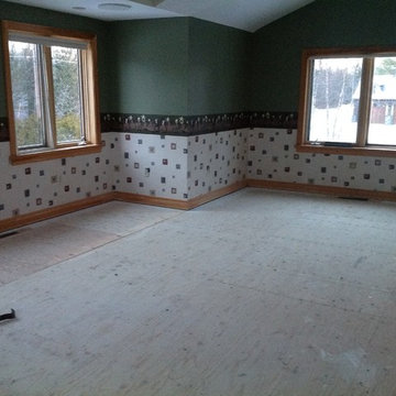
The original bunk room featured bright blue carpet, green blue and red wallpaper coupled with maple trim. Contrasted with the existing country cabinets in the kitchen, log home features in the living / dining area and the Tuscan bathroom off the foyer ... to say the house suffered from an identity crisis is an understatement.
We decided to re-imagine this space and create a fun yet functional bunk room that compliments the rustic industrial design throughout the rest of the property.
Photo Credit: TraceJordan Properties
 N Sabella Inc
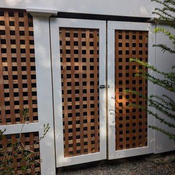
Deck restoration took center stage as our team revitalized this repeat client’s outdoor space with a complete structural and aesthetic upgrade. We replaced aging decking, reframed structural areas that had suffered rot from prior construction, and ensured the framework was solid.
To elevate both function and appearance, we installed new lattice panels around the deck. The lattice provides essential airflow beneath the structure while giving the deck a clean, finished look that complements the home’s exterior.
We also built custom double doors within the lattice enclosure, creating a convenient and discreet access point for under-deck storage. The result is a seamless design that hides clutter while maintaining the deck’s classic charm.
From structural repairs to fine finishing details, this project highlights our expertise in deck restoration, custom carpentry, and exterior upgrades that blend craftsmanship with lasting value.
31