
Search results for "Suffered" in Home Design Ideas
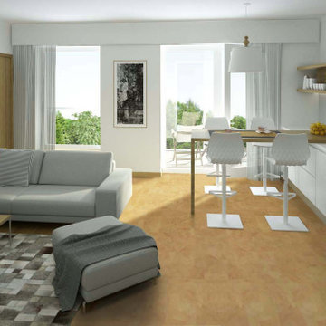
 iCork Floor
 https://www.icorkfloor.com/store/natural-cork-tiles-leather-8mm/
https://bit.ly/2FKlWuT
Better for you, great as a bedroom flooring – cork
Cork gives the best when it comes to bedroom flooring. Bringing to you the warmth and comfort of carpeting with the beauty and chic of hardwood. Cork flooring is warm and soft to walk on, absorbs sound and is easy to clean and maintain. But as cork is wood, you’re surrounded with the clean lines and beauty of a wood floor. So if you are looking for bedroom flooring ideas, head on over and check out the best flooring option, cork.
https://www.icorkfloor.com/store/floating-cork-floors-12mm-leather/
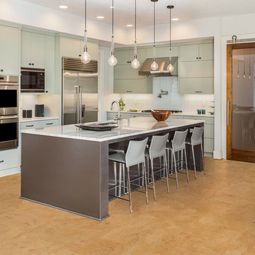 iCork Floor
- Installation Type: Floating
- Licensed Uniclic Flooring system
- Square Edge Plank (seamless floor)
- Finish: Three coats water based polyurethane
- Wear Layer: 3mm genuine cork
- Middle Layer: 7mm E1 Class High Density Fiberboard (HDF)
- Integrated Underlayment: 1mm agglomerated cork.
- Plank Width: 12” (315mm)
- Plank Length: 36" (915mm)
- Plank Thickness: 7/16" (11mm)
- Carton coverage: 21.03 sqft
- Pieces per carton: 7
- 25 year warranty (residential installation)
- Underlayment not required
- Hypo-allergenic
- Healthy alternative to carpet
- Excellent thermal and acoustic insulation
- Stain resistant
- Naturally resistant to insects, mould, mildew due to anti-microbial properties
- Low slip surface
- Excellent surface for seniors, children or people suffering from arthritis or joint pain
*** Price may change without notice. Please check our website for the most current price.
Order FREE SAMPLES on our website: www.icorkfloor.com
 MAC Design + Build
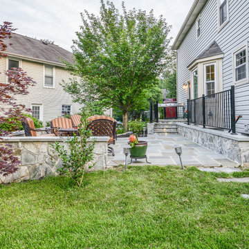
This backyard had tremendous issues from weather and wear. The original deck suffered from wood rot and some of the siding near the bay window was falling apart. There was also noticeable over spray from the deck staining that had been completed previously. All was completely fixed with a newly paved patio.
Photography by Ashley Sullivan Exposurely
Find the right local pro for your project


 David Moulton AIA
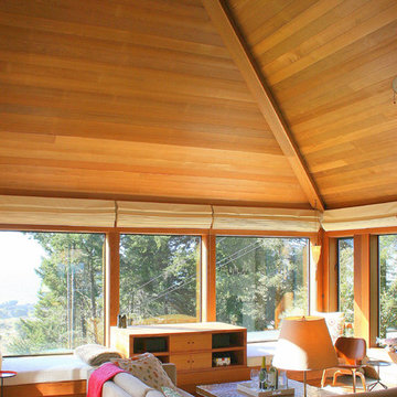
The house suffered from years of deferred maintenance and neglect when David Moulton AIA began an interior redesign and whole-house overhaul. Saved were the glorious, soaring clear redwood ceilings, the proportions, and most of the interior walls. Two large windows replaced an entertainment unit and fireplace that stood in the way of the view, thus creating the large, expansive stretch of windows that now take full advantage of the ocean and forest views. Added window seats provide cozy places to watch the scene unfold. A television lifts out of the central cabinet for optimal television viewing with no detraction of the views beyond. New Brazilian cherry floors throughout replaced dated vinyl, parquet and carpet. Removing channel walls on the stairway allowed space to lengthen the lower stair treads into a delightful waterfall of Brazilian hardwood, thereby creating visual interest and greater connection between the natural landscape and upper and lower floors.
 Archipelago Home, LLC
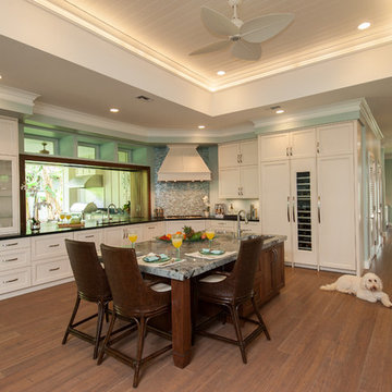
Kitchen designed for differing heights of kitchen cooks. One of the homeowners has an arm / shoulder injury making chopping food painful. The island countertop was lowered to accommodate her height and allow her to cut at a level that didn't cause pain.
Photography: Augie Salbosa
 KURV Architecture DPC (Alex Hughes Architects)
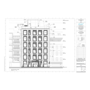
Located in the heart of Manhattan’s Lower East Side, the building was erected on a shallow commercial lot between two 120 year old masonry buildings and a new residential rental building. 330 Grand Street is a mix of 725 SF 1BRs and 1050 SF 2BR apartments. It also contains a 1100 SF two story duplex as well as private and public rooftop space, large private balconies for most units and two large private terraces for the ground floor units.
330 Grand Street was originally designed and approved at the NYC DOB as a prefabricated modular building. During the pandemic, as shipping costs skyrocketed putting the project at risk, we suggested redesigning the building as a reinforced cast-in-place concrete structure. Concrete was readily available and prices had not been affected by the demand increase that many other materials suffered in the pandemic. We took this opportunity to raise floor to ceiling heights, enlarge high performance windows and redistribute the buildings MEPFS and Structural Systems to create very open floor plans.
The challenge was to create a luxurious sensorial living experience with very limited means. In a city with very high construction costs, low cost residential buildings in the area are usually devoid of good quality, design and character. Our approach was to aim high for the end user, prioritizing natural light, open space with long visual perspectives, high ceilings and as always, rejecting the use of predefined building templates.
Our biggest challenge was to ensure that the small spaces feel as clean cut, large and bright as possible. Several unique design decisions were made to ensure low cost and high quality;
Floor plans were laid out so that spaces were wide open and free of clutter from mechanical or structural interruptions. Therefore all infrastructure was placed in lateral demising walls, which in turn act as the unit’s storage and kitchen. The apartments feel wide open, are super quiet and have more storage space than any other comparable apartment in the city.
To solve the problem of the site’s shallow commercial lot which is typically prone to dark interior spaces we focused our attention on the building’s envelope. Instead of the usual small punched window openings, oversized high performance windows were designed to ensure that light penetrated as far as possible into the units. In the smaller 1BR units, the full 50’ depth of the lot is perceived by partitioning spaces with sliding pocket doors that can be retracted to allow deep visual perspectives, making the sight lines in the space feel longer, larger, more ample than normal. In addition to the full height glazing, each unit above the 2nd floor receives a 7 foot covered balcony, adding 120 to 240 sf to each apartment, something unusual in New York City buildings. The space is large enough for a full size dining table, when the weather permits being outside.
We also worked hard to ensure modularity. For example, all kitchen units are all identical throughout the building. The idea of modularity and the economy of the repetitive unit is exercised to the maximum through the building.
Hardware, appliances, flooring, wall coverings and material finishes are all carefully selected to feel bespoke, high quality and unique.
It was important to KURV that the result of this work manifest into something that would deeply connect with the end user and sustain relationships with the consumers of this space.
All images by KURV Architecture ©
 Paradox Interior Design Inc.
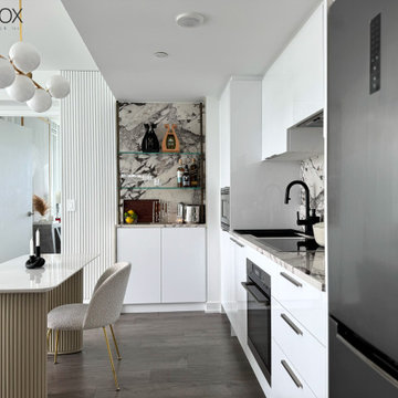
Challenge: Our client needed their downtown Toronto condo to serve as a peaceful retreat from the demanding pace of urban professional life. The space suffered from the sterile, impersonal aesthetic typical of many Toronto condos, lacking the warmth and tranquility needed to truly unwind after busy workdays in the city's core.
Solution: We approached this project in thoughtful stages, transforming the condo into a serene sanctuary that promotes relaxation and rejuvenation. By incorporating a palette of light, calming colors and introducing rich textural elements throughout the space, we elevated the sterile interior into a sophisticated retreat. Each design decision was made with the goal of creating visual and tactile interest that would engage the senses and promote a sense of calm.
Highlights: • Staged design approach that allowed for thoughtful evolution of the space • Light color palette that enhances natural light and creates an airy, peaceful atmosphere • Rich variety of textures that add warmth and visual interest to combat sterile condo interiors • Strategic material selection that transforms typical condo finishes into sophisticated design elements
Results: The transformed Downtown Zen condo now serves as the perfect urban escape—a space that immediately shifts the client's mindset from work mode to relaxation. This project demonstrates how thoughtful design can overcome the limitations of typical Toronto condo interiors, creating a personalized sanctuary that enhances daily life and well-being.
 TraceyJordan Collection
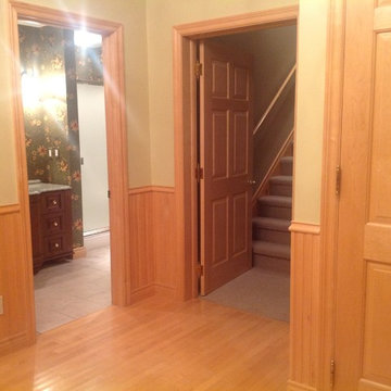
The original foyer featured light maple floors, beadboard & trim. Although the materials were in decent shape, the house suffered from an identity crisis as well as some layout challenges. We decided to gut the property and completely redesign.
Photo Credit: TraceJordan Properties
 Care Free Homes, Inc.
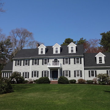
This beautiful colonial in Marion, Massachusetts is even more gorgeous with its new GAF Timberline HD roof!
There is more to a roof than shingles – in fact there are several components to a professionally installed GAF Lifetime Roofing System. Here is the anatomy of our Marion homeowner’s roof:
GAF Timberline HD Shingles Marion, MAGAF Timberline HD Roof Shingles: A beautiful architectural shingle at an affordable price! This is our most popular roof shingle here at Care Free Homes! Our Marion customer selected the classic color, Charcoal. This high performance shingle features a 130 mph wind rating and highest possible fire rating.
Underlayment: A felt/paper product that is installed over the entire roof deck, underlayment provides an additional layer of protection between the roof deck and the roof shingles.
Ice Dam and Water Shield: After a brutal winter and unprecedented snow fall, many New England homes suffered damage from ice dams. Ice Dam and Water Shield provides added protection for eves, rakes, valleys as well as flashed areas around vent pipes, chimneys, dormers, and skylights. Whether it’s a winter wonderland or a hurricane, this homeowner will not have to worry about ice dams or driving rain.
GAF Timberline HD, Marion, MA Dormers
Premium Aluminum Drip Edge: Installed along the rakes, drip edge serves several purposes. It improves the efficiency of water shedding, prevents leaking from a wind-driven rain as well as movement between the deck and fascia boards. Drip edge also keeps pesky insects from infiltrating the space between the roof deck and the fascia boards. With a choice of three colors, white, brown and gray, it provides a finished look for a roof.
GAF Pro-Start Eave/Rake Starter Strip: Every story has a beginning and every roof should have a starter strip. Here in New England we’ve got to have our roof be tougher than mother nature. To prevent shingle blow off, an ultra-adhered starter strip properly secures shingles in place during a storm. In contrast, the amateur roofer will often use cut-up shingles as a starter course. This weakened “starter course” lowers the wind resistance of a roof and makes it more susceptible to both wind and water damage. With straighter edges, Dura-Grip adhesive, and outstanding warranties – starter strip will provide beauty, performance and peace of mind.
GAF Cobra Ridge Vent: Ridge vents provide necessary airflow to remove excess heat and moisture in an attic. It inhibits the growth of mold and protects the health of the homeowners as well as their stored possessions. A properly vented attic will also protect homes in harsh winter climates from ice damming.
Why wait? Contact us today and make your house a Care Free home!
 KURV Architecture DPC (Alex Hughes Architects)
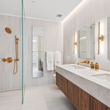
Located in the heart of Manhattan’s Lower East Side, the building was erected on a shallow commercial lot between two 120 year old masonry buildings and a new residential rental building. 330 Grand Street is a mix of 725 SF 1BRs and 1050 SF 2BR apartments. It also contains a 1100 SF two story duplex as well as private and public rooftop space, large private balconies for most units and two large private terraces for the ground floor units.
330 Grand Street was originally designed and approved at the NYC DOB as a prefabricated modular building. During the pandemic, as shipping costs skyrocketed putting the project at risk, we suggested redesigning the building as a reinforced cast-in-place concrete structure. Concrete was readily available and prices had not been affected by the demand increase that many other materials suffered in the pandemic. We took this opportunity to raise floor to ceiling heights, enlarge high performance windows and redistribute the buildings MEPFS and Structural Systems to create very open floor plans.
The challenge was to create a luxurious sensorial living experience with very limited means. In a city with very high construction costs, low cost residential buildings in the area are usually devoid of good quality, design and character. Our approach was to aim high for the end user, prioritizing natural light, open space with long visual perspectives, high ceilings and as always, rejecting the use of predefined building templates.
Our biggest challenge was to ensure that the small spaces feel as clean cut, large and bright as possible. Several unique design decisions were made to ensure low cost and high quality;
Floor plans were laid out so that spaces were wide open and free of clutter from mechanical or structural interruptions. Therefore all infrastructure was placed in lateral demising walls, which in turn act as the unit’s storage and kitchen. The apartments feel wide open, are super quiet and have more storage space than any other comparable apartment in the city.
To solve the problem of the site’s shallow commercial lot which is typically prone to dark interior spaces we focused our attention on the building’s envelope. Instead of the usual small punched window openings, oversized high performance windows were designed to ensure that light penetrated as far as possible into the units. In the smaller 1BR units, the full 50’ depth of the lot is perceived by partitioning spaces with sliding pocket doors that can be retracted to allow deep visual perspectives, making the sight lines in the space feel longer, larger, more ample than normal. In addition to the full height glazing, each unit above the 2nd floor receives a 7 foot covered balcony, adding 120 to 240 sf to each apartment, something unusual in New York City buildings. The space is large enough for a full size dining table, when the weather permits being outside.
We also worked hard to ensure modularity. For example, all kitchen units are all identical throughout the building. The idea of modularity and the economy of the repetitive unit is exercised to the maximum through the building.
Hardware, appliances, flooring, wall coverings and material finishes are all carefully selected to feel bespoke, high quality and unique.
It was important to KURV that the result of this work manifest into something that would deeply connect with the end user and sustain relationships with the consumers of this space.
All images by KURV Architecture ©
 Main Street Custom Homes & Remodeling
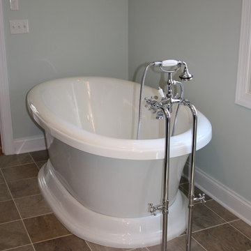
The entire home was renovated inside and out after suffering significant fire damage. A closed-in addition was also constructed in place of the original screened in porch.
 Moto Designshop
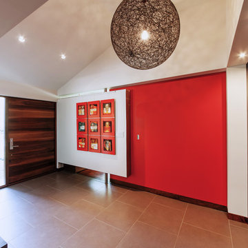
Over the years, this Gladwyne home suffered numerous piecemeal renovations and modifications, and was in dire need of a cohesive vision. Seeing past this, the new owners purchased the property because of the home’s unique siting on the land. Abutting the eastern property line, they noticed the potential of a proper renovation which would unify the home and create expansive views across the 2 acre site to the west.
Our office was commissioned to create a cohesive design which emphasized these ideas. This completed master bedroom and bathroom suite, marks the end of the first renovation phase. The master suite was expanded and focused around a new 16’ window overlooking the property. The bed is flanked at both sides with a sitting area and custom casework. The perpendicular floor boards define the space and pull the eye into the closet/bath. A composition of reflections distort boundaries, pulling outside inward and provide an evolving seasonal experience.
For the lower floor renovation, the client requested the removal of all dividing walls to make the space as visually open as possible. To do this, the entire 2nd floor was temporarily propped up while the 1st floor structure was removed and a strategically designed new structural steel frame system was installed. The remaining central bearing wall also stabilizes the custom stair treads while the guardrails suspend the opposite end from the ceiling. The floor to ceiling glazing opens the views of the sprawling grounds and provides a casual sitting area. A sliding bright red wall divides the office / family room area and the rough sawn wood cabinetry maintain a handmade warm character to the contemporary design.
 iCork Floor
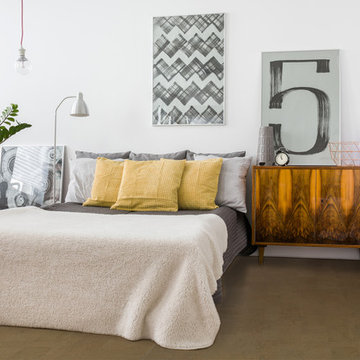
Forna Taupe Leather cork flooring
Ever been to a physical therapy center and wonder what kind of wood flooring they had that was so comfortable because you could never find that level of comfort from your hardwood or stone-based flooring. If you suffer from leg joint pains, feet pain, even back pain, you know what we’re talking about. Hardwood floors and stone floors are resistant flooring, anything coming into contact with them will find no give.
 Lamont Bros. Design & Construction
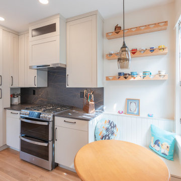
After years of suffering through a poorly designed kitchen that didn’t meet her needs, our client made the difficult decision to re-remodel her kitchen. Now that the kitchen is complete, she's happier than ever in her new kitchen. What used to be a space that was intimidating and difficult to use has become a place designed specifically for her needs, where every appliance and shelf is within comfortable reach and the design is tailored exactly to her personal style.
 Irene Designs
Kitchen — Project Description (Bolton, CT)
(Full Renovation • Reconfiguration • Architectural Corrections)
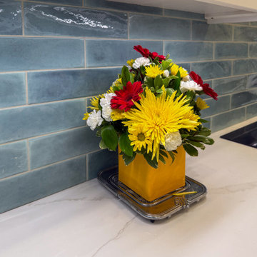
The original kitchen suffered from spatial imbalance and limited functionality: the right side was visually and physically heavy with cabinetry and appliances, the 135-degree angled walls lacked symmetry due to a missing window on the driveway side, and the small island could only seat two. Circulation was obstructed by a desk positioned in the main traffic flow, and the low French door felt disproportionate in scale compared to the large windows and adjacent two-story Great Room.
Major Structural & Functional Improvements
Repositioned window on the front elevation to the right, creating a long-desired view to the driveway while freeing space for a centered cooktop and statement hood — visually aligning with the Great Room’s redesigned fireplace focal wall.
Installed a new custom sliding door, significantly taller and wider than the original French door. This upgrade enhances natural light, visually opens the kitchen to the deck, and provides unobstructed traffic flow thanks to its sliding operation.
New Kitchen Layout & Enhanced Functionality
Designed an entirely new layout centered around a 10' double-slab island, providing expansive workspace and a natural gathering zone.
Added conversational seating for the whole family, allowing comfortable interaction on all sides of the island.
Introduced purpose-designed storage solutions, including pullouts, rollouts, spice towers, tray organizers, and deep drawers to maximize usability.
Reallocated the desk area to a dedicated window spot overlooking the backyard, removing it from traffic paths and improving both functionality and comfort.
Cabinetry & Architectural Detailing
Custom two-tone cabinetry in soft white and a serene blue-green tone reflects the visual language of the adjacent Great Room, creating whole-home cohesion.
Installed lit upper glass cabinets along the entire perimeter, balancing vertical proportions and creating an elegant display band throughout the kitchen.
A custom range hood was designed and painted to match the base cabinetry, becoming a focal point framed by symmetrical windows.
Surfaces, Lighting & Finishes
The island features a double-thickness quartz slab with a soft ogee radius for a timeless, furniture-like feel.
A full-height, handcrafted aqua subway tile backsplash introduces depth, texture, and a gentle reflective quality.
New layered lighting concept, including recessed lights, pendants, task lighting, and integrated cabinet lighting, ensures a warm and functional workspace at any time of day.
 Sharkey Design|Build
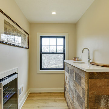
The historic Edward H.C. Taylor home was build in 1890, it suffered substantial fire damage and required extensive restoration of the interior and exterior. We were thrilled to have the opportunity to work on this gem.
 DANE AUSTIN INTERIOR DESIGN Boston & Cambridge
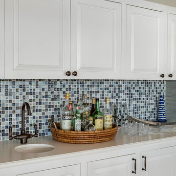
When this 6,000-square-foot vacation home suffered water damage in its family room, the homeowners decided it was time to update the interiors at large. They wanted an elegant, sophisticated, and comfortable style that served their lives but also required a design that would preserve and enhance various existing details.
To begin, we focused on the timeless and most interesting aspects of the existing design. Details such as Spanish tile floors in the entry and kitchen were kept, as were the dining room's spirited marine-blue combed walls, which were refinished to add even more depth. A beloved lacquered linen coffee table was also incorporated into the great room's updated design.
To modernize the interior, we looked to the home's gorgeous water views, bringing in colors and textures that related to sand, sea, and sky. In the great room, for example, textured wall coverings, nubby linen, woven chairs, and a custom mosaic backsplash all refer to the natural colors and textures just outside. Likewise, a rose garden outside the master bedroom and study informed color selections there. We updated lighting and plumbing fixtures and added a mix of antique and new furnishings.
In the great room, seating and tables were specified to fit multiple configurations – the sofa can be moved to a window bay to maximize summer views, for example, but can easily be moved by the fireplace during chillier months.
Project designed by Boston interior design Dane Austin Design. Dane serves Boston, Cambridge, Hingham, Cohasset, Newton, Weston, Lexington, Concord, Dover, Andover, Gloucester, as well as surrounding areas.
For more about Dane Austin Design, click here: https://daneaustindesign.com/
To learn more about this project, click here:
https://daneaustindesign.com/oyster-harbors-estate
 The Brooklyn Studio
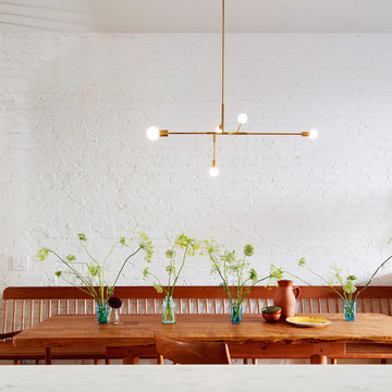
This residence was a complete gut renovation of a 4-story row house in Park Slope, and included a new rear extension and penthouse addition. The owners wished to create a warm, family home using a modern language that would act as a clean canvas to feature rich textiles and items from their world travels. As with most Brooklyn row houses, the existing house suffered from a lack of natural light and connection to exterior spaces, an issue that Principal Brendan Coburn is acutely aware of from his experience re-imagining historic structures in the New York area. The resulting architecture is designed around moments featuring natural light and views to the exterior, of both the private garden and the sky, throughout the house, and a stripped-down language of detailing and finishes allows for the concept of the modern-natural to shine.
Upon entering the home, the kitchen and dining space draw you in with views beyond through the large glazed opening at the rear of the house. An extension was built to allow for a large sunken living room that provides a family gathering space connected to the kitchen and dining room, but remains distinctly separate, with a strong visual connection to the rear garden. The open sculptural stair tower was designed to function like that of a traditional row house stair, but with a smaller footprint. By extending it up past the original roof level into the new penthouse, the stair becomes an atmospheric shaft for the spaces surrounding the core. All types of weather – sunshine, rain, lightning, can be sensed throughout the home through this unifying vertical environment. The stair space also strives to foster family communication, making open living spaces visible between floors. At the upper-most level, a free-form bench sits suspended over the stair, just by the new roof deck, which provides at-ease entertaining. Oak was used throughout the home as a unifying material element. As one travels upwards within the house, the oak finishes are bleached to further degrees as a nod to how light enters the home.
The owners worked with CWB to add their own personality to the project. The meter of a white oak and blackened steel stair screen was designed by the family to read “I love you” in Morse Code, and tile was selected throughout to reference places that hold special significance to the family. To support the owners’ comfort, the architectural design engages passive house technologies to reduce energy use, while increasing air quality within the home – a strategy which aims to respect the environment while providing a refuge from the harsh elements of urban living.
This project was published by Wendy Goodman as her Space of the Week, part of New York Magazine’s Design Hunting on The Cut.
Photography by Kevin Kunstadt
 Manubric
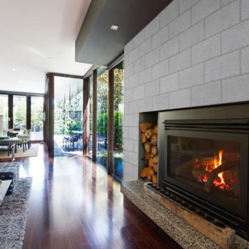
Faithful reproduction of concrete blocks that have suffered the bad weather of time.
This product is so easy to install and heat resistant. The look of this product is just magnificent. Those around you will undoubtedly remember it.
33