
Search results for "Suffered" in Home Design Ideas
 Solomon's Arbor, LLC
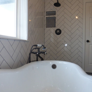
Imagine taking a nice long soak in the tub. You could suffer worse views than this!
Mid-sized master white tile and ceramic tile porcelain tile, multicolored floor and double-sink claw-foot bathtub photo in Boise with light wood cabinets, marble countertops, white countertops and a freestanding vanity
Mid-sized master white tile and ceramic tile porcelain tile, multicolored floor and double-sink claw-foot bathtub photo in Boise with light wood cabinets, marble countertops, white countertops and a freestanding vanity
 The Renowned Group
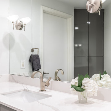
 The original Master bath suffered a tiny shower and a tub that was never used. It was very dark and cavernous and needed some softness to oppose angled walls. The tub was removed to make a larger, more accessible shower. The desired style was modern but not severe. We installed Cambria Britannica quartz slab with large veining and soft flowing movement on all the shower walls. A dark floor grounds the space. A combination of light walls, and sleek floating cabinets, creates an overall softness in this Modern Masterpiece.
 Samantha Smith
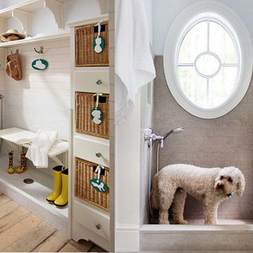
Pets can make our daily routines life more interesting. It is enough to find the videos with pets to make sure that they are so cute and funny. They know how to cheer up and to share their positive energy.
Often, children want to have a pet. However, before you go to the pet store, you need to decide for yourself the following questions.
1. Are you ready to take a full responsibility for the animal? This is not a toy to give, give back or throw. The animal is not a person, but it has a soul. It can be hurt. It also knows how to love.
2. Are you ready to become a true friend for an animal? It needs to be fed. You should give him leisure and walking and solve the issues of the toilet. You cannot bring it to the house as part of the new interior. He need your attention and serious care.
3. You will need to ensure the safety of those around him. For example, you need to control whether the dog does not hurt anyone, especially children. If the choice fell on the cat, try to make it not disturb the neighbors. Do not let snakes, spiders to walk alone on the street, sometimes they are and strive to get out of home. Love animals, but without fanaticism. They should not interfere a life of other people.
4. When you are ready to solve all these issues concerning the animal, it means that you really care about it. Can you fall in love with the animal as a member of your family? If you do not like it, then you will only irritate the duty to care for him. Both you and your animal will suffer.
5. Are you ready to take care of the health of the animal? After all, the animals can bring fleas or ringworm to your house. It is necessary to control that there are no such things, because in this case the animal becomes dangerous for people.
6. You need to give love and then it returns the positive energy to your. It is worth emphasizing, if you have a small child, the animal will teach your child the two main qualities: the ability to make friends and responsibility.
About the Author: Vivien Smith is a writer from California. She cooperates with a huge variety of online magazines like essaybuyers.com/research-paper-writing/ website.
Find the right local pro for your project
 The Brooklyn Studio
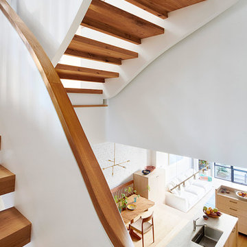
This residence was a complete gut renovation of a 4-story row house in Park Slope, and included a new rear extension and penthouse addition. The owners wished to create a warm, family home using a modern language that would act as a clean canvas to feature rich textiles and items from their world travels. As with most Brooklyn row houses, the existing house suffered from a lack of natural light and connection to exterior spaces, an issue that Principal Brendan Coburn is acutely aware of from his experience re-imagining historic structures in the New York area. The resulting architecture is designed around moments featuring natural light and views to the exterior, of both the private garden and the sky, throughout the house, and a stripped-down language of detailing and finishes allows for the concept of the modern-natural to shine.
Upon entering the home, the kitchen and dining space draw you in with views beyond through the large glazed opening at the rear of the house. An extension was built to allow for a large sunken living room that provides a family gathering space connected to the kitchen and dining room, but remains distinctly separate, with a strong visual connection to the rear garden. The open sculptural stair tower was designed to function like that of a traditional row house stair, but with a smaller footprint. By extending it up past the original roof level into the new penthouse, the stair becomes an atmospheric shaft for the spaces surrounding the core. All types of weather – sunshine, rain, lightning, can be sensed throughout the home through this unifying vertical environment. The stair space also strives to foster family communication, making open living spaces visible between floors. At the upper-most level, a free-form bench sits suspended over the stair, just by the new roof deck, which provides at-ease entertaining. Oak was used throughout the home as a unifying material element. As one travels upwards within the house, the oak finishes are bleached to further degrees as a nod to how light enters the home.
The owners worked with CWB to add their own personality to the project. The meter of a white oak and blackened steel stair screen was designed by the family to read “I love you” in Morse Code, and tile was selected throughout to reference places that hold special significance to the family. To support the owners’ comfort, the architectural design engages passive house technologies to reduce energy use, while increasing air quality within the home – a strategy which aims to respect the environment while providing a refuge from the harsh elements of urban living.
This project was published by Wendy Goodman as her Space of the Week, part of New York Magazine’s Design Hunting on The Cut.
Photography by Kevin Kunstadt
 King Construction Company LLC
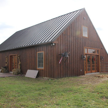
King's restored a bank barn that unfortunately suffered from a fire.
Inspiration for a small timeless brown two-story wood exterior home remodel in Philadelphia with a metal roof
Inspiration for a small timeless brown two-story wood exterior home remodel in Philadelphia with a metal roof
 Plain & Posh
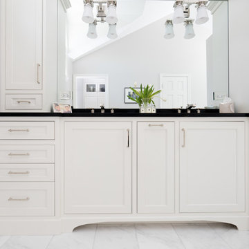
This master bath was long and narrow and suffered from a 1990's renovation with a huge tub no one used and a tiny shower area. The vanity was also quite small. By removing the tub and relocating the shower from the toilet room to the main area, the shower was able to double in size.
The vanity area is also almost twice as large as before.
 The Renowned Group
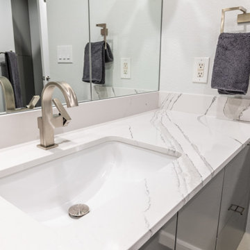
 The original Master bath suffered a tiny shower and a tub that was never used. It was very dark and cavernous and needed some softness to oppose angled walls. The tub was removed to make a larger, more accessible shower. The desired style was modern but not severe. We installed Cambria Britannica quartz slab with large veining and soft flowing movement on all the shower walls. A dark floor grounds the space. A combination of light walls, and sleek floating cabinets, creates an overall softness in this Modern Masterpiece.
 12/12 Architects & Planners
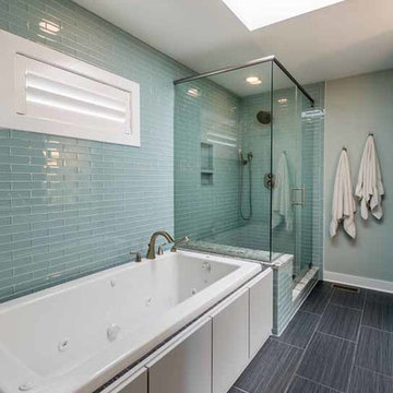
This family of 5 was quickly out-growing their 1,220sf ranch home on a beautiful corner lot. Rather than adding a 2nd floor, the decision was made to extend the existing ranch plan into the back yard, adding a new 2-car garage below the new space - for a new total of 2,520sf. With a previous addition of a 1-car garage and a small kitchen removed, a large addition was added for Master Bedroom Suite, a 4th bedroom, hall bath, and a completely remodeled living, dining and new Kitchen, open to large new Family Room. The new lower level includes the new Garage and Mudroom. The existing fireplace and chimney remain - with beautifully exposed brick. The homeowners love contemporary design, and finished the home with a gorgeous mix of color, pattern and materials.
The project was completed in 2011. Unfortunately, 2 years later, they suffered a massive house fire. The house was then rebuilt again, using the same plans and finishes as the original build, adding only a secondary laundry closet on the main level.
 Tile Doctor Ltd
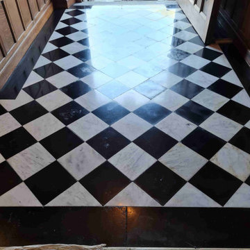
This Black and White Marble tiled hallway floor at a Grade II listed property in the village of Tattenhall has quite a history. The building was constructed in 1865 and at one time it has been the home to the high sheriff of Cheshire, and the family home of Edith Wignall the daughter of Sir Henry Tate the founder of the sugar company Tate and Lyle.
In more recent years the property had been used as a council building and even a nursing home for the elderly. After a long history of decline it has now been restored to a lavish family mansion however the marble floor had suffered over the years and still need attention. The current owner had been in touch as they wanted it restoring and basically brought back to life.
As it turns out I had already planned to go to Tattenhall the following week to work on another listed building which was formerly the village bank. After discussing the Marble floor over the phone, I agreed a date and time to pop over from the bank and inspect the floor in detail. I can provide a rough quote from photographs, which has been especially useful recently, but it’s far better for all concerned if I’m able to properly survey the floor first.
The Marble floor consisted of Black and White Mable tiles laid in a diamond pattern, it wasn’t a very large area perhaps 9 square metres in total. The tiles were well worn as described but also stained and scratched. I would see they would need a deep burnish and polish to bring them back to life and then protected with a fresh sealer. Following on from that visit I was able to provide an accurate quote which was accepted, and a date agreed for my return.
The first job was to protect the surrounding heavy wooden panelling with masking film. The floor was very heavily stained yellow with deep scratches, to remove these I would have to grind the marble back until a clean fresh tile was left. To start I used a 200-grit coarse pad fitted to a weighted buffing machine, the abrasive action of the pad was lubricated with water. After inspection I found that the staining and scratches were still there, so I needed to use stronger pads, so I worked my way through a set of very coarse milling pads starting at a 50, 100 and finishing with a 200-grit pad. Again, water was used to lubricate, and the resultant slurry was removed by a powerful wet vacuum and washed down between each pad.
The milling pads had the desired effect, and I was then able to bring back the polished appearance of the Marble surface using a set of finer burnishing pads with the same process. The 400 and 800-grit pads helped to clean and remove the fine scratches left by the milling pads and then the next 1500-grit pad started to build the shine back on the marble tile.
After finishing with 1500-grit pad I washed the Marble with Tile Doctor Stone Soap and vacuumed up the residue with the wet vacuum. I left an industrial blower in place overnight to dry out the floor ready for the next morning when it would be sealed.
The next morning, I used the last of the four burnishing pads which is a very fine 3000-grit to polish the floor further. This last pad is applied dry with just a spray of water to create a high gloss finish.
When I was happy, I sealed the floor with two coats of Tile Doctor Colour Grow which is an impregnating sealer that soaks into the fine pores of the Marble to protect it from within. This product also improves colour and after application it was left to soak into the tile for five minutes before polishing off and then leaving it to dry.
The last step was to I buff the floor with a white pad. The finish was impressive, and the family were very happy with the work we had carried out. For aftercare I recommended they use Stone Soap as its designed for the regular cleaning of sealed and polished stone, as well as cleaning it also helps build the patina.
Alastair Robb
West Cheshire TIle Doctor
 DANE AUSTIN INTERIOR DESIGN Boston & Cambridge
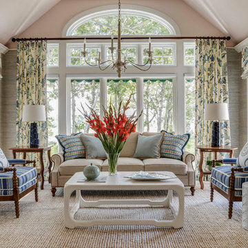
When this 6,000-square-foot vacation home suffered water damage in its family room, the homeowners decided it was time to update the interiors at large. They wanted an elegant, sophisticated, and comfortable style that served their lives but also required a design that would preserve and enhance various existing details.
To begin, we focused on the timeless and most interesting aspects of the existing design. Details such as Spanish tile floors in the entry and kitchen were kept, as were the dining room's spirited marine-blue combed walls, which were refinished to add even more depth. A beloved lacquered linen coffee table was also incorporated into the great room's updated design.
To modernize the interior, we looked to the home's gorgeous water views, bringing in colors and textures that related to sand, sea, and sky. In the great room, for example, textured wall coverings, nubby linen, woven chairs, and a custom mosaic backsplash all refer to the natural colors and textures just outside. Likewise, a rose garden outside the master bedroom and study informed color selections there. We updated lighting and plumbing fixtures and added a mix of antique and new furnishings.
In the great room, seating and tables were specified to fit multiple configurations – the sofa can be moved to a window bay to maximize summer views, for example, but can easily be moved by the fireplace during chillier months.
Project designed by Boston interior design Dane Austin Design. Dane serves Boston, Cambridge, Hingham, Cohasset, Newton, Weston, Lexington, Concord, Dover, Andover, Gloucester, as well as surrounding areas.
For more about Dane Austin Design, click here: https://daneaustindesign.com/
To learn more about this project, click here:
https://daneaustindesign.com/oyster-harbors-estate
 Kitchen Solvers of the Gulf Coast
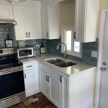
For this kitchen remodeling project, the homeowner’s mobile home suffered from water damage and the kitchen needed to be completely redone. We got busy tearing out all the old cabinets and flooring. The new cabinets were done in a birch Maui door in a polar white color. Next, we installed a new quartz countertop done in Blanco Maple and a Raku Ocean backsplash. To finish the new kitchen, we installed a new laminate plank floor. See how this kitchen went from a nightmare into a dream kitchen.
 KURV Architecture DPC (Alex Hughes Architects)
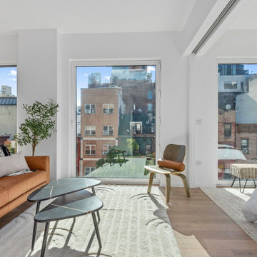
Located in the heart of Manhattan’s Lower East Side, the building was erected on a shallow commercial lot between two 120 year old masonry buildings and a new residential rental building. 330 Grand Street is a mix of 725 SF 1BRs and 1050 SF 2BR apartments. It also contains a 1100 SF two story duplex as well as private and public rooftop space, large private balconies for most units and two large private terraces for the ground floor units.
330 Grand Street was originally designed and approved at the NYC DOB as a prefabricated modular building. During the pandemic, as shipping costs skyrocketed putting the project at risk, we suggested redesigning the building as a reinforced cast-in-place concrete structure. Concrete was readily available and prices had not been affected by the demand increase that many other materials suffered in the pandemic. We took this opportunity to raise floor to ceiling heights, enlarge high performance windows and redistribute the buildings MEPFS and Structural Systems to create very open floor plans.
The challenge was to create a luxurious sensorial living experience with very limited means. In a city with very high construction costs, low cost residential buildings in the area are usually devoid of good quality, design and character. Our approach was to aim high for the end user, prioritizing natural light, open space with long visual perspectives, high ceilings and as always, rejecting the use of predefined building templates.
Our biggest challenge was to ensure that the small spaces feel as clean cut, large and bright as possible. Several unique design decisions were made to ensure low cost and high quality;
Floor plans were laid out so that spaces were wide open and free of clutter from mechanical or structural interruptions. Therefore all infrastructure was placed in lateral demising walls, which in turn act as the unit’s storage and kitchen. The apartments feel wide open, are super quiet and have more storage space than any other comparable apartment in the city.
To solve the problem of the site’s shallow commercial lot which is typically prone to dark interior spaces we focused our attention on the building’s envelope. Instead of the usual small punched window openings, oversized high performance windows were designed to ensure that light penetrated as far as possible into the units. In the smaller 1BR units, the full 50’ depth of the lot is perceived by partitioning spaces with sliding pocket doors that can be retracted to allow deep visual perspectives, making the sight lines in the space feel longer, larger, more ample than normal. In addition to the full height glazing, each unit above the 2nd floor receives a 7 foot covered balcony, adding 120 to 240 sf to each apartment, something unusual in New York City buildings. The space is large enough for a full size dining table, when the weather permits being outside.
We also worked hard to ensure modularity. For example, all kitchen units are all identical throughout the building. The idea of modularity and the economy of the repetitive unit is exercised to the maximum through the building.
Hardware, appliances, flooring, wall coverings and material finishes are all carefully selected to feel bespoke, high quality and unique.
It was important to KURV that the result of this work manifest into something that would deeply connect with the end user and sustain relationships with the consumers of this space.
All images by KURV Architecture ©
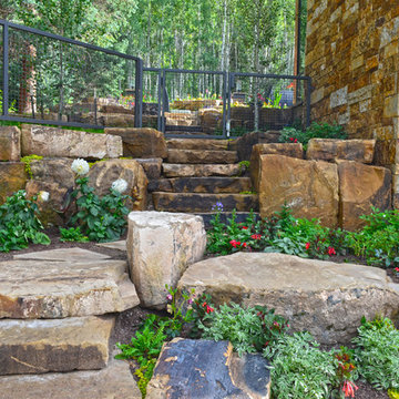
 Neils Lunceford, Inc.
Private Residence in Vail, CO
Company: Neils Lunceford, Inc.
Website: www.neilslunceford.com
Phone: 970-468-0340
Photo Credit: Dan Skinner
Design ideas for a modern landscaping in Denver.
Design ideas for a modern landscaping in Denver.
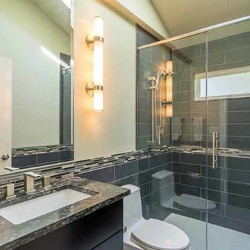 12/12 Architects & Planners
This family of 5 was quickly out-growing their 1,220sf ranch home on a beautiful corner lot. Rather than adding a 2nd floor, the decision was made to extend the existing ranch plan into the back yard, adding a new 2-car garage below the new space - for a new total of 2,520sf. With a previous addition of a 1-car garage and a small kitchen removed, a large addition was added for Master Bedroom Suite, a 4th bedroom, hall bath, and a completely remodeled living, dining and new Kitchen, open to large new Family Room. The new lower level includes the new Garage and Mudroom. The existing fireplace and chimney remain - with beautifully exposed brick. The homeowners love contemporary design, and finished the home with a gorgeous mix of color, pattern and materials.
The project was completed in 2011. Unfortunately, 2 years later, they suffered a massive house fire. The house was then rebuilt again, using the same plans and finishes as the original build, adding only a secondary laundry closet on the main level.
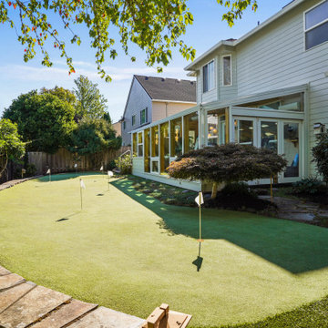
 G. Christianson Construction, Inc.
We recently completed a spectacularly beautiful sunroom for Richard and Cynthia. We worked previously with Cynthia on her business and because of our relationship, she felt comfortable asking us to build their Corvallis sunroom. The inspiration for this project came from the desire to have the ambiance of an outdoor hot tub, but without Corvallis’ cold wet weather. The sunroom adds a warm, bright 325 square feet just outside their kitchen and living room. This is the perfect addition if you are suffering from Corvallis’ cloud cover. The vibrant hues of the stained and finished Douglas fir glulam beams complement the beauty of the outdoors. These beams support the glass roof. In addition, the sunroom includes two operable skylights, a nine foot wide bifold door, a full glass roof system and full glass walls. Westview Sunrooms (the manufacturer) has a number of other beautiful ideas on their site: http://www.westviewproducts.com/pictures.html We would love the opportunity to build for you.
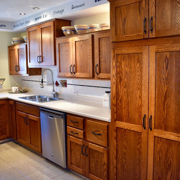
 Wood Front Kitchens
This customer spent over 40 years building and renovating his home. In his younger days, he was an amazing building and craftsman. Recently, he suffered a stroke and lost the ability to build. He wants to leave his home to his daughter, so he planned one last renovation project. For this project, he wanted to choose a renovation company that could build a kitchen as well as he could. Luckily, he chose Wood Front Kitchens. He was thrilled with the result. He loved that we were able to keep storage features he had built in his previous cabinets and transfer them to the new cabinets.
This homeowner chose shaker-style oak cabinets stained in Michels. He chose Amerock Conrad Square hardware in oil-rubbed bronze to give his rustic cabinets an industrial feel. He and his daughter are both pleased with the results, and with their huge increase in storage space.
 Tamara Rosenbloom Design LLC
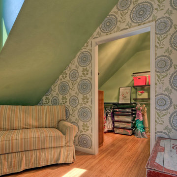
The twins were almost out of their toddler beds and outgrowing their small room when their mother called. Across from the girls’ existing bedroom was another bedroom and bathroom that lacked functionality and easy access. We combined the three spaces, added French doors from the hall and divided the second bedroom into a large walk in closet and play room. To unite the spaces (and please the allergy sufferers), we tore up the carpet and laid bamboo flooring. We enlarged the bathroom to allow for a custom horizontal strand bamboo double sink vanity and moved the entry to the bathroom off the bedroom. To maximize space and storage in the bedroom, we designed custom Chippendale inspired beds with storage drawers beneath and a bookcase/reading nook with a view between the two beds.
Photos by Mike Martin www.martinvisualtours.com
 dcap pllc
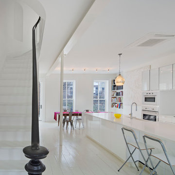
Built in 1853, this landmark townhouse suffered from decades of neglect. The new residence combines original materials such as the wide plank subfloors discovered beneath warped and rotted parquet with new insertions like the parlor floor steel structure and barn door. Energy conservation modifications including a fluid applied air barrier, continuous exterior wall insulation and a pair of compact boilers are hidden behind new interior finishes. Sprinkled throughout the house are rescued elements ranging from door knobs to a claw foot tub with a fresh coat of bright green paint.
Photos by Archphoto | Ines Leong.
 KURV Architecture DPC (Alex Hughes Architects)
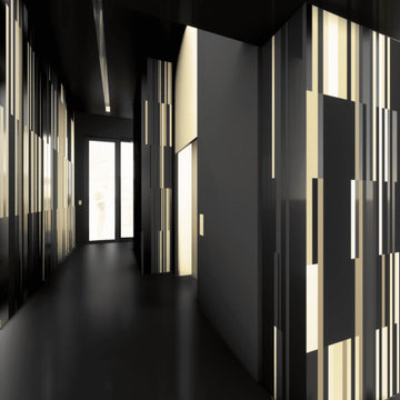
Located in the heart of Manhattan’s Lower East Side, the building was erected on a shallow commercial lot between two 120 year old masonry buildings and a new residential rental building. 330 Grand Street is a mix of 725 SF 1BRs and 1050 SF 2BR apartments. It also contains a 1100 SF two story duplex as well as private and public rooftop space, large private balconies for most units and two large private terraces for the ground floor units.
330 Grand Street was originally designed and approved at the NYC DOB as a prefabricated modular building. During the pandemic, as shipping costs skyrocketed putting the project at risk, we suggested redesigning the building as a reinforced cast-in-place concrete structure. Concrete was readily available and prices had not been affected by the demand increase that many other materials suffered in the pandemic. We took this opportunity to raise floor to ceiling heights, enlarge high performance windows and redistribute the buildings MEPFS and Structural Systems to create very open floor plans.
The challenge was to create a luxurious sensorial living experience with very limited means. In a city with very high construction costs, low cost residential buildings in the area are usually devoid of good quality, design and character. Our approach was to aim high for the end user, prioritizing natural light, open space with long visual perspectives, high ceilings and as always, rejecting the use of predefined building templates.
Our biggest challenge was to ensure that the small spaces feel as clean cut, large and bright as possible. Several unique design decisions were made to ensure low cost and high quality;
Floor plans were laid out so that spaces were wide open and free of clutter from mechanical or structural interruptions. Therefore all infrastructure was placed in lateral demising walls, which in turn act as the unit’s storage and kitchen. The apartments feel wide open, are super quiet and have more storage space than any other comparable apartment in the city.
To solve the problem of the site’s shallow commercial lot which is typically prone to dark interior spaces we focused our attention on the building’s envelope. Instead of the usual small punched window openings, oversized high performance windows were designed to ensure that light penetrated as far as possible into the units. In the smaller 1BR units, the full 50’ depth of the lot is perceived by partitioning spaces with sliding pocket doors that can be retracted to allow deep visual perspectives, making the sight lines in the space feel longer, larger, more ample than normal. In addition to the full height glazing, each unit above the 2nd floor receives a 7 foot covered balcony, adding 120 to 240 sf to each apartment, something unusual in New York City buildings. The space is large enough for a full size dining table, when the weather permits being outside.
We also worked hard to ensure modularity. For example, all kitchen units are all identical throughout the building. The idea of modularity and the economy of the repetitive unit is exercised to the maximum through the building.
Hardware, appliances, flooring, wall coverings and material finishes are all carefully selected to feel bespoke, high quality and unique.
It was important to KURV that the result of this work manifest into something that would deeply connect with the end user and sustain relationships with the consumers of this space.
All images by KURV Architecture ©
 The Home Depot
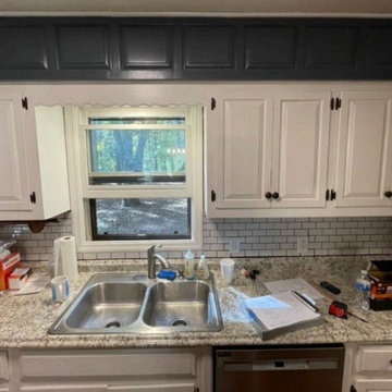
white was before, customer is military veteran, suffered chronic pain and migraines, we took the time to use color and explore the opportunities to reduce the issues. closed still plenty of natural light, ensuring a location that would be beneficial to the entire family.
28