
Search results for "Sufferers" in Home Design Ideas
 Alloy Architecture & Construction
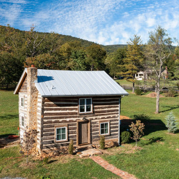
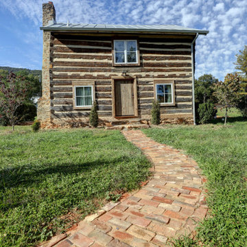
Alloy was truly fortunate to have the opportunity to restore and renovate this 1850’s log cabin at Afton Mountain. No home looks more at home than this cabin in the foothills.
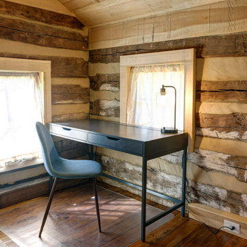
The cabin suffered years of decay and an unsympathetic interior renovation so our first step was to work with a local log cabin specialist to correctly restore the structure. We then rebuilt much of the interior to have everything a modern home needs while staying true to the log cabin aesthetic.
On all of our projects we carefully research materials and finishes but this one really took that to the next level. We enjoyed the challenge and the chance to show off the impressive craftsmanship of our carpenters.
As you approach on the winding path, the log cabin feels like a part of the landscape. And now, when you come inside, you can keep that connected feeling – in comfort.
 Serra Design Inc
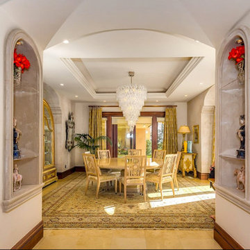
This poor dining room was suffering from post traumatic stress syndrome, before it received this update. You are welcomed to enter the space by these 2 very early 16th century wooden reliefs. The empty niches received crystal lucite shelving and these chinese figures (part of the clients personal collection) were added. The walls were brightened over a dreary faux sandy venetian plaster job. The iron chandelier was removed and this Murano Glass Chandelier was imported from Justine's of Paris, France. Previously there was an inserted commercial rug around the jerusalem tile floor, this was removed and this beautiful antique was laid. The antique Venetian mirror hangs opposite two 18th century Italianate commodes. The drapes are dual layered incorporated to create an elegant golden shimmer. The fabric for the chairs is from Bergamo. The China hutch was custom finished to match the 18th century commodes.
 N Sabella Inc
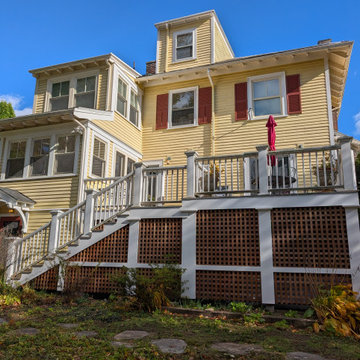
Deck restoration took center stage as our team revitalized this repeat client’s outdoor space with a complete structural and aesthetic upgrade. We replaced aging decking, reframed structural areas that had suffered rot from prior construction, and ensured the framework was solid.
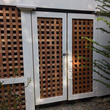
To elevate both function and appearance, we installed new lattice panels around the deck. The lattice provides essential airflow beneath the structure while giving the deck a clean, finished look that complements the home’s exterior.
We also built custom double doors within the lattice enclosure, creating a convenient and discreet access point for under-deck storage. The result is a seamless design that hides clutter while maintaining the deck’s classic charm.
From structural repairs to fine finishing details, this project highlights our expertise in deck restoration, custom carpentry, and exterior upgrades that blend craftsmanship with lasting value.
Find the right local pro for your project
 Alloy Architecture & Construction
Alloy was truly fortunate to have the opportunity to restore and renovate this 1850’s log cabin at Afton Mountain. No home looks more at home than this cabin in the foothills.
The cabin suffered years of decay and an unsympathetic interior renovation so our first step was to work with a local log cabin specialist to correctly restore the structure. We then rebuilt much of the interior to have everything a modern home needs while staying true to the log cabin aesthetic.
On all of our projects we carefully research materials and finishes but this one really took that to the next level. We enjoyed the challenge and the chance to show off the impressive craftsmanship of our carpenters.
As you approach on the winding path, the log cabin feels like a part of the landscape. And now, when you come inside, you can keep that connected feeling – in comfort.
 Alloy Architecture & Construction
Alloy was truly fortunate to have the opportunity to restore and renovate this 1850’s log cabin at Afton Mountain. No home looks more at home than this cabin in the foothills.
The cabin suffered years of decay and an unsympathetic interior renovation so our first step was to work with a local log cabin specialist to correctly restore the structure. We then rebuilt much of the interior to have everything a modern home needs while staying true to the log cabin aesthetic.
On all of our projects we carefully research materials and finishes but this one really took that to the next level. We enjoyed the challenge and the chance to show off the impressive craftsmanship of our carpenters.
As you approach on the winding path, the log cabin feels like a part of the landscape. And now, when you come inside, you can keep that connected feeling – in comfort.
 N Sabella Inc
Deck restoration took center stage as our team revitalized this repeat client’s outdoor space with a complete structural and aesthetic upgrade. We replaced aging decking, reframed structural areas that had suffered rot from prior construction, and ensured the framework was solid.
To elevate both function and appearance, we installed new lattice panels around the deck. The lattice provides essential airflow beneath the structure while giving the deck a clean, finished look that complements the home’s exterior.
We also built custom double doors within the lattice enclosure, creating a convenient and discreet access point for under-deck storage. The result is a seamless design that hides clutter while maintaining the deck’s classic charm.
From structural repairs to fine finishing details, this project highlights our expertise in deck restoration, custom carpentry, and exterior upgrades that blend craftsmanship with lasting value.
 Tamara Rosenbloom Design LLC
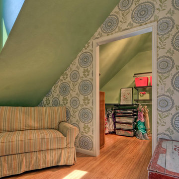
The twins were almost out of their toddler beds and outgrowing their small room when their mother called. Across from the girls’ existing bedroom was another bedroom and bathroom that lacked functionality and easy access. We combined the three spaces, added French doors from the hall and divided the second bedroom into a large walk in closet and play room. To unite the spaces (and please the allergy sufferers), we tore up the carpet and laid bamboo flooring. We enlarged the bathroom to allow for a custom horizontal strand bamboo double sink vanity and moved the entry to the bathroom off the bedroom. To maximize space and storage in the bedroom, we designed custom Chippendale inspired beds with storage drawers beneath and a bookcase/reading nook with a view between the two beds.
Photos by Mike Martin www.martinvisualtours.com
 BARCELONA DESIGN CORP
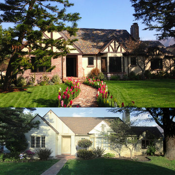
This nice little cottage located in Toluca Lake has a special story to all the team that we worked on. Our client, related to the movie industry, purchased it to make it his permanent residence and the realtor said that at a certain point it was bought by Bing Crosby for his mother. We were all excited to renovate and preserve such a part of local history. We had a great time reviving its structure and overall look. Barcelona Design was in charge of the artistic direction, as exterior finishes and design and interiors as well. The house suffered many unfortunate alterations during its history. Having a broad experience in building preservation and restoration made it easier to restore its charm.
 Poore & Company
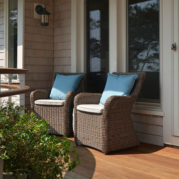
The original house was built as a kit on the coast. The potential view was spectacular but the existing house suffered from a deep sense of tunnel vision and the interior was a maze of disconnected spaces. By changing the location of the kitchen to a more commanding location and unfolding the spaces into a more logical flow the house not only captures the panoramic view but feels twice as big without adding one square foot to the building footprint. Small changes in the deck sizes with some sweeping curves and more logical exterior stair locations connect the interior with the surrounding natural landscape. An “away” space, affectionately called the Quiet Room, is crowned with a sculptural plaster ceiling that evokes a wave, or a shell, or a soft sky canopy floating above this unusual living area. Outdoors is an infinity edge spa overlooking Gloucester’s Eastern Point Lighthouse and the ocean beyond.
 Lincoln Lighthill Architect
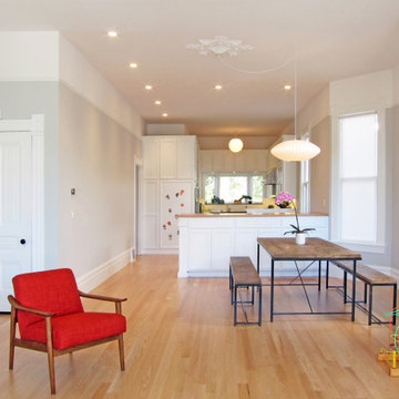
This 100 year old home was in disrepair and suffering from a layout that left it dark and uninviting. By removing walls between the living, dining, and kitchen areas, and reconfiguring some awkwardly placed kitchen cabinetry from a previous renovation, Lincoln Lighthill Architect created a 50 foot long great room, flooding the space with light and views to the front and rear yards. A new built-in credenza replaces a full height wall and matches the existing kitchen casework, which gets a cost-effective update with a coat of white paint.
 N Sabella Inc
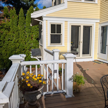
Deck restoration took center stage as our team revitalized this repeat client’s outdoor space with a complete structural and aesthetic upgrade. We replaced aging decking, reframed structural areas that had suffered rot from prior construction, and ensured the framework was solid.
To elevate both function and appearance, we installed new lattice panels around the deck. The lattice provides essential airflow beneath the structure while giving the deck a clean, finished look that complements the home’s exterior.
We also built custom double doors within the lattice enclosure, creating a convenient and discreet access point for under-deck storage. The result is a seamless design that hides clutter while maintaining the deck’s classic charm.
From structural repairs to fine finishing details, this project highlights our expertise in deck restoration, custom carpentry, and exterior upgrades that blend craftsmanship with lasting value.
 iCork Floor
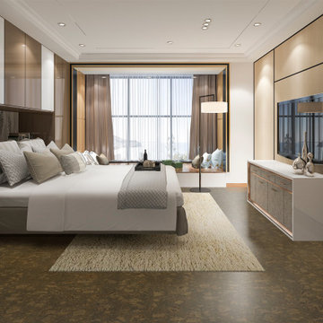
- Installation Type: Floating
- Licensed Uniclic Flooring system
- Square Edge Plank (seamless floor)
- Finish: Three coats water based polyurethane
- Wear Layer: 3mm genuine cork
- Middle Layer: 7mm E1 Class High Density Fiberboard (HDF)
- Integrated Underlayment: 1mm agglomerated cork.
- Plank Width: 12” (315mm)
- Plank Length: 36" (915mm)
- Plank Thickness: 7/16" (11mm)
- Carton coverage: 21.03 sqft
- Pieces per carton: 7
- 25 year warranty (residential installation)
- Underlayment not required
- Hypo-allergenic
- Healthy alternative to carpet
- Excellent thermal and acoustic insulation
- Stain resistant
- Naturally resistant to insects, mould, mildew due to anti-microbial propertiesi
- Low slip surface
- Excellent surface for seniors, children or people suffering from arthritis or joint pain
Order FREE SAMPLES on our website: www.icorkfloor.com
 Tile Doctor Ltd
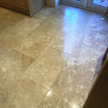
This customer, who lives in East Byfleet had been experiencing difficulties in keeping her fantastic Travertine tiled kitchen floor in good condition. Over the years it had suffered from a heavy build up of dirt and oily stains, not to mentioned a number of cracks and small holes. Needless to say, the customer was keen to restore the Travertine tiles to their former glory.
To begin the restoration, I applied Tile Doctor Remove and Go across the entirety of the large tiled area. This heavy duty remover breaks down any old sealers and other coatings, leaving the area ready to cleaned or, in this case, burnished.
Burnishing is a method for cleaning and polishing certain types of high-end stone, including Travertine, Marble, and Limestone. Our burnishing system involves the application of four diamond encrusted pads of varying grits. Firstly, I applied the Coarse grit pad, which helps to break down any dirt and stains on the surface of the tiles. Then, I worked my way through the Medium, Fine, and Very Fine pads, using a little water as lubricant, to gradually refine the polish on the Travertine. It was then rinsed and left to dry.
To round off the first day of work, I filled any cracks and holes using our two-part resin system which greatly improved the look of the tile.
The following day I returned to the property to seal the tiles checking first that the floor had dried. All was well so I proceeded to seal the floor using our colour intensifying impregnating sealer Tile Doctor Colour Grow. Once that was dry, I added the finishing touches by buffing the floor with a soft white buffing pad. As you can see from the photographs, the combination of a fresh seal and polish worked wonders.
We did such a good job with the floor that the customer asked if we could also improve the appearance of their natural stone fireplace which was suffering from bad rust and oil stains however I do a separate write up on that.
Wayne White
West Surrey Tile Doctor
 Alloy Architecture & Construction
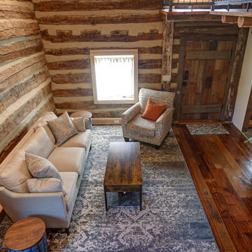
Alloy was truly fortunate to have the opportunity to restore and renovate this 1850’s log cabin at Afton Mountain. No home looks more at home than this cabin in the foothills.
The cabin suffered years of decay and an unsympathetic interior renovation so our first step was to work with a local log cabin specialist to correctly restore the structure. We then rebuilt much of the interior to have everything a modern home needs while staying true to the log cabin aesthetic.
On all of our projects we carefully research materials and finishes but this one really took that to the next level. We enjoyed the challenge and the chance to show off the impressive craftsmanship of our carpenters.
As you approach on the winding path, the log cabin feels like a part of the landscape. And now, when you come inside, you can keep that connected feeling – in comfort.
 Tamara Rosenbloom Design LLC
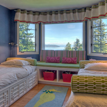
The twins were almost out of their toddler beds and outgrowing their small room when their mother called. Across from the girls’ existing bedroom was another bedroom and bathroom that lacked functionality and easy access. We combined the three spaces, added French doors from the hall and divided the second bedroom into a large walk in closet and play room. To unite the spaces (and please the allergy sufferers), we tore up the carpet and laid bamboo flooring. We enlarged the bathroom to allow for a custom horizontal strand bamboo double sink vanity and moved the entry to the bathroom off the bedroom. To maximize space and storage in the bedroom, we designed custom Chippendale inspired beds with storage drawers beneath and a bookcase/reading nook with a view between the two beds.
Photos by Mike Martin www.martinvisualtours.com
 iCork Floor
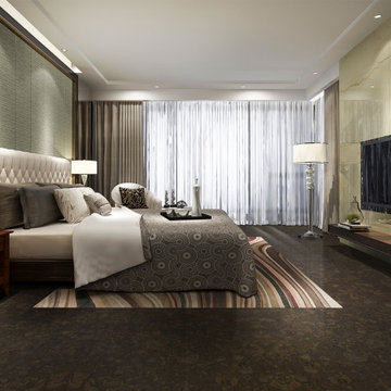
- Installation Type: Floating
- Licensed Uniclic Flooring system
- Square Edge Plank (seamless floor)
- Finish: Three coats water based polyurethane
- Wear Layer: 3mm genuine cork
- Middle Layer: 7mm E1 Class High Density Fiberboard (HDF)
- Integrated Underlayment: 1mm agglomerated cork.
- Plank Width: 12” (315mm)
- Plank Length: 36" (915mm)
- Plank Thickness: 7/16" (11mm)
- Carton coverage: 21.03 sqft
- Pieces per carton: 7
- 25 year warranty (residential installation)
- Underlayment not required
- Hypo-allergenic
- Healthy alternative to carpet
- Excellent thermal and acoustic insulation
- Stain resistant
- Naturally resistant to insects, mould, mildew due to anti-microbial properties
- Low slip surface
- Excellent surface for seniors, children or people suffering from arthritis or joint pain
Order FREE SAMPLES on our website: www.icorkfloor.com

 Sunset Western Garden Collection
Ideal as a low-growing hedge in the landscape, Sunshine Ligustrum offers year-round golden foliage that flourishes in full sun. This sterile, non-invasive cultivar will not re-seed into the landscape. In fact, it doesn’t bloom at all, which is good news for allergy sufferers!
Features
Feature/Bloom Sunny, year-round golden foliage
Evergreen or Deciduous evergreen
USDA Zones Hardy to -10°F Zones 6
Sunset Zones Hardy to -10°F Zones 6
Special Features Will not re-seed into the landscape
Landscape Use Hedge, contrasting foliage, full sun
Exposure Full sun
Bloom Season N/A
Dimension 3-4 ft H x 3-4 ft W
Growth Rate Moderate
Plant Type evergreen
About the Collection
Brought to you by the authority on Western gardening, the Sunset Western Garden Collection is an exclusive plant collection of top performing plants for the Western Gardener.
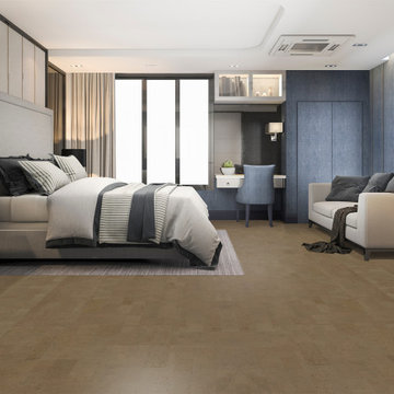 iCork Floor
- Installation Type: Floating
- Licensed Uniclic Flooring system
- Square Edge Plank (seamless floor)
- Finish: Three coats water based polyurethane
- Wear Layer: 3mm genuine cork
- Middle Layer: 7mm E1 Class High Density Fiberboard (HDF)
- Integrated Underlayment: 1mm agglomerated cork.
- Plank Width: 12” (315mm)
- Plank Length: 36" (915mm)
- Plank Thickness: 7/16" (11mm)
- Carton coverage: 21.03 sqft
- Pieces per carton: 7
- 25 year warranty (residential installation)
- Underlayment not required
- Hypo-allergenic
- Healthy alternative to carpet
- Excellent thermal and acoustic insulation
- Stain resistant
- Naturally resistant to insects, mould, mildew due to anti-microbial properties
- Low slip surface
- Excellent surface for seniors, children or people suffering from arthritis or joint pain
Price may change without notice. Please check our website for the guaranteed price.
Order FREE SAMPLES on our website: www.icorkfloor.com
 Fiorito Interior Design
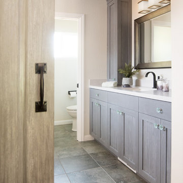
Finding a home is not easy in a seller’s market, but when my clients discovered one—even though it needed a bit of work—in a beautiful area of the Santa Cruz Mountains, they decided to jump in. Surrounded by old-growth redwood trees and a sense of old-time history, the house’s location informed the design brief for their desired remodel work. Yet I needed to balance this with my client’s preference for clean-lined, modern style.
Suffering from a previous remodel, the galley-like bathroom in the master suite was long and dank. My clients were willing to completely redesign the layout of the suite, so the bathroom became the walk-in closet. We borrowed space from the bedroom to create a new, larger master bathroom which now includes a separate tub and shower.
The look of the room nods to nature with organic elements like a pebbled shower floor and vertical accent tiles of honed green slate. A custom vanity of blue weathered wood and a ceiling that recalls the look of pressed tin evoke a time long ago when people settled this mountain region. At the same time, the hardware in the room looks to the future with sleek, modular shapes in a chic matte black finish. Harmonious, serene, with personality: just what my clients wanted.
Photo: Bernardo Grijalva
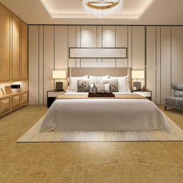 iCork Floor
- Installation Type: Floating
- Licensed Uniclic Flooring system
- Square Edge Plank (seamless floor)
- Finish: Three coats water based polyurethane
- Wear Layer: 3mm genuine cork
- Middle Layer: 7mm E1 Class High Density Fiberboard (HDF)
- Integrated Underlayment: 1mm agglomerated cork.
- Plank Width: 12” (315mm)
- Plank Length: 36" (915mm)
- Plank Thickness: 7/16" (11mm)
- Carton coverage: 21.03 sqft
- Pieces per carton: 7
- 25 year warranty (residential installation)
- Underlayment not required
- Hypo-allergenic
- Healthy alternative to carpet
- Excellent thermal and acoustic insulation
- Stain resistant
- Naturally resistant to insects, mould, mildew due to anti-microbial properties
- Low slip surface
- Excellent surface for seniors, children or people suffering from arthritis or joint pain
Order FREE SAMPLES on our website: www.icorkfloor.com
35