
Search results for "Sufferers" in Home Design Ideas
 Alloy Architecture & Construction
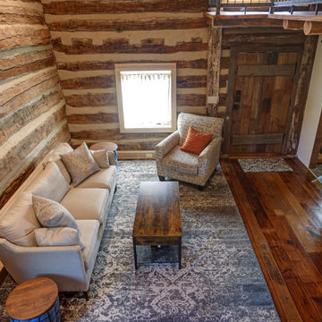
Alloy was truly fortunate to have the opportunity to restore and renovate this 1850’s log cabin at Afton Mountain. No home looks more at home than this cabin in the foothills.
The cabin suffered years of decay and an unsympathetic interior renovation so our first step was to work with a local log cabin specialist to correctly restore the structure. We then rebuilt much of the interior to have everything a modern home needs while staying true to the log cabin aesthetic.
On all of our projects we carefully research materials and finishes but this one really took that to the next level. We enjoyed the challenge and the chance to show off the impressive craftsmanship of our carpenters.
As you approach on the winding path, the log cabin feels like a part of the landscape. And now, when you come inside, you can keep that connected feeling – in comfort.
 Tamara Rosenbloom Design LLC
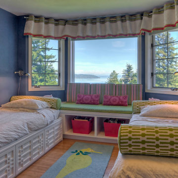
The twins were almost out of their toddler beds and outgrowing their small room when their mother called. Across from the girls’ existing bedroom was another bedroom and bathroom that lacked functionality and easy access. We combined the three spaces, added French doors from the hall and divided the second bedroom into a large walk in closet and play room. To unite the spaces (and please the allergy sufferers), we tore up the carpet and laid bamboo flooring. We enlarged the bathroom to allow for a custom horizontal strand bamboo double sink vanity and moved the entry to the bathroom off the bedroom. To maximize space and storage in the bedroom, we designed custom Chippendale inspired beds with storage drawers beneath and a bookcase/reading nook with a view between the two beds.
Photos by Mike Martin www.martinvisualtours.com
 iCork Floor
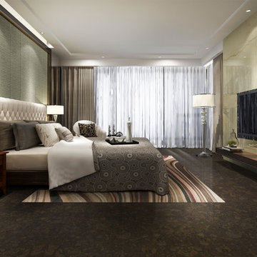
- Installation Type: Floating
- Licensed Uniclic Flooring system
- Square Edge Plank (seamless floor)
- Finish: Three coats water based polyurethane
- Wear Layer: 3mm genuine cork
- Middle Layer: 7mm E1 Class High Density Fiberboard (HDF)
- Integrated Underlayment: 1mm agglomerated cork.
- Plank Width: 12” (315mm)
- Plank Length: 36" (915mm)
- Plank Thickness: 7/16" (11mm)
- Carton coverage: 21.03 sqft
- Pieces per carton: 7
- 25 year warranty (residential installation)
- Underlayment not required
- Hypo-allergenic
- Healthy alternative to carpet
- Excellent thermal and acoustic insulation
- Stain resistant
- Naturally resistant to insects, mould, mildew due to anti-microbial properties
- Low slip surface
- Excellent surface for seniors, children or people suffering from arthritis or joint pain
Order FREE SAMPLES on our website: www.icorkfloor.com
Find the right local pro for your project

 Sunset Western Garden Collection
Ideal as a low-growing hedge in the landscape, Sunshine Ligustrum offers year-round golden foliage that flourishes in full sun. This sterile, non-invasive cultivar will not re-seed into the landscape. In fact, it doesn’t bloom at all, which is good news for allergy sufferers!
Features
Feature/Bloom Sunny, year-round golden foliage
Evergreen or Deciduous evergreen
USDA Zones Hardy to -10°F Zones 6
Sunset Zones Hardy to -10°F Zones 6
Special Features Will not re-seed into the landscape
Landscape Use Hedge, contrasting foliage, full sun
Exposure Full sun
Bloom Season N/A
Dimension 3-4 ft H x 3-4 ft W
Growth Rate Moderate
Plant Type evergreen
About the Collection
Brought to you by the authority on Western gardening, the Sunset Western Garden Collection is an exclusive plant collection of top performing plants for the Western Gardener.
 iCork Floor
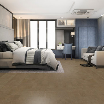
- Installation Type: Floating
- Licensed Uniclic Flooring system
- Square Edge Plank (seamless floor)
- Finish: Three coats water based polyurethane
- Wear Layer: 3mm genuine cork
- Middle Layer: 7mm E1 Class High Density Fiberboard (HDF)
- Integrated Underlayment: 1mm agglomerated cork.
- Plank Width: 12” (315mm)
- Plank Length: 36" (915mm)
- Plank Thickness: 7/16" (11mm)
- Carton coverage: 21.03 sqft
- Pieces per carton: 7
- 25 year warranty (residential installation)
- Underlayment not required
- Hypo-allergenic
- Healthy alternative to carpet
- Excellent thermal and acoustic insulation
- Stain resistant
- Naturally resistant to insects, mould, mildew due to anti-microbial properties
- Low slip surface
- Excellent surface for seniors, children or people suffering from arthritis or joint pain
Price may change without notice. Please check our website for the guaranteed price.
Order FREE SAMPLES on our website: www.icorkfloor.com
 Fiorito Interior Design
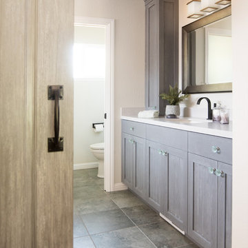
Finding a home is not easy in a seller’s market, but when my clients discovered one—even though it needed a bit of work—in a beautiful area of the Santa Cruz Mountains, they decided to jump in. Surrounded by old-growth redwood trees and a sense of old-time history, the house’s location informed the design brief for their desired remodel work. Yet I needed to balance this with my client’s preference for clean-lined, modern style.
Suffering from a previous remodel, the galley-like bathroom in the master suite was long and dank. My clients were willing to completely redesign the layout of the suite, so the bathroom became the walk-in closet. We borrowed space from the bedroom to create a new, larger master bathroom which now includes a separate tub and shower.
The look of the room nods to nature with organic elements like a pebbled shower floor and vertical accent tiles of honed green slate. A custom vanity of blue weathered wood and a ceiling that recalls the look of pressed tin evoke a time long ago when people settled this mountain region. At the same time, the hardware in the room looks to the future with sleek, modular shapes in a chic matte black finish. Harmonious, serene, with personality: just what my clients wanted.
Photo: Bernardo Grijalva
 iCork Floor
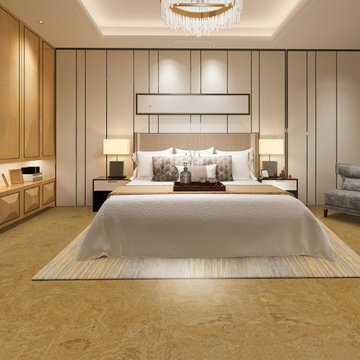
- Installation Type: Floating
- Licensed Uniclic Flooring system
- Square Edge Plank (seamless floor)
- Finish: Three coats water based polyurethane
- Wear Layer: 3mm genuine cork
- Middle Layer: 7mm E1 Class High Density Fiberboard (HDF)
- Integrated Underlayment: 1mm agglomerated cork.
- Plank Width: 12” (315mm)
- Plank Length: 36" (915mm)
- Plank Thickness: 7/16" (11mm)
- Carton coverage: 21.03 sqft
- Pieces per carton: 7
- 25 year warranty (residential installation)
- Underlayment not required
- Hypo-allergenic
- Healthy alternative to carpet
- Excellent thermal and acoustic insulation
- Stain resistant
- Naturally resistant to insects, mould, mildew due to anti-microbial properties
- Low slip surface
- Excellent surface for seniors, children or people suffering from arthritis or joint pain
Order FREE SAMPLES on our website: www.icorkfloor.com
 The Brooklyn Studio
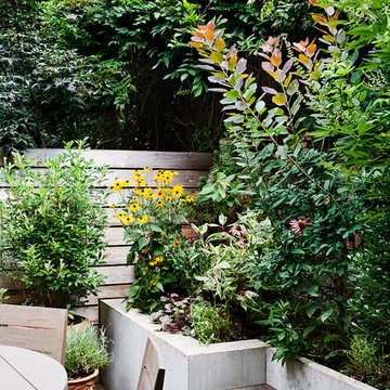
This residence was a complete gut renovation of a 4-story row house in Park Slope, and included a new rear extension and penthouse addition. The owners wished to create a warm, family home using a modern language that would act as a clean canvas to feature rich textiles and items from their world travels. As with most Brooklyn row houses, the existing house suffered from a lack of natural light and connection to exterior spaces, an issue that Principal Brendan Coburn is acutely aware of from his experience re-imagining historic structures in the New York area. The resulting architecture is designed around moments featuring natural light and views to the exterior, of both the private garden and the sky, throughout the house, and a stripped-down language of detailing and finishes allows for the concept of the modern-natural to shine.
Upon entering the home, the kitchen and dining space draw you in with views beyond through the large glazed opening at the rear of the house. An extension was built to allow for a large sunken living room that provides a family gathering space connected to the kitchen and dining room, but remains distinctly separate, with a strong visual connection to the rear garden. The open sculptural stair tower was designed to function like that of a traditional row house stair, but with a smaller footprint. By extending it up past the original roof level into the new penthouse, the stair becomes an atmospheric shaft for the spaces surrounding the core. All types of weather – sunshine, rain, lightning, can be sensed throughout the home through this unifying vertical environment. The stair space also strives to foster family communication, making open living spaces visible between floors. At the upper-most level, a free-form bench sits suspended over the stair, just by the new roof deck, which provides at-ease entertaining. Oak was used throughout the home as a unifying material element. As one travels upwards within the house, the oak finishes are bleached to further degrees as a nod to how light enters the home.
The owners worked with CWB to add their own personality to the project. The meter of a white oak and blackened steel stair screen was designed by the family to read “I love you” in Morse Code, and tile was selected throughout to reference places that hold special significance to the family. To support the owners’ comfort, the architectural design engages passive house technologies to reduce energy use, while increasing air quality within the home – a strategy which aims to respect the environment while providing a refuge from the harsh elements of urban living.
This project was published by Wendy Goodman as her Space of the Week, part of New York Magazine’s Design Hunting on The Cut.
Photography by Kevin Kunstadt
 G. Christianson Construction, Inc.
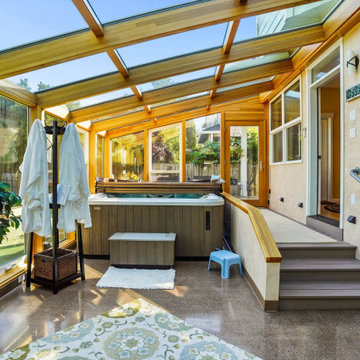
We recently completed a spectacularly beautiful sunroom for Richard and Cynthia. We worked previously with Cynthia on her business and because of our relationship, she felt comfortable asking us to build their Corvallis sunroom. The inspiration for this project came from the desire to have the ambiance of an outdoor hot tub, but without Corvallis’ cold wet weather. The sunroom adds a warm, bright 325 square feet just outside their kitchen and living room. This is the perfect addition if you are suffering from Corvallis’ cloud cover. The vibrant hues of the stained and finished Douglas fir glulam beams complement the beauty of the outdoors. These beams support the glass roof. In addition, the sunroom includes two operable skylights, a nine foot wide bifold door, a full glass roof system and full glass walls. Westview Sunrooms (the manufacturer) has a number of other beautiful ideas on their site: http://www.westviewproducts.com/pictures.html We would love the opportunity to build for you.

 Windy City Painters
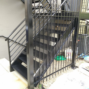
xterior Metal Staircase & Iron Railing Refinishing – Chicago, IL
Windy City Painters completed a comprehensive metal refinishing project featuring an exterior steel staircase, diamond mesh security screening, handrails, and surrounding perimeter railings on a Chicago multi-family property. The existing metalwork suffered from severe rust, flaking paint, and exposure to winter freeze-thaw cycles. Our team executed full mechanical rust removal, wire-brush prep, application of industrial rust-inhibiting Direct-To-Metal (DTM) primer, and finished with high-durability exterior oil-based alkyd enamel. Designed to provide long-lasting corrosion protection, enhance property security, and elevate curb appeal for Chicago homeowners, condo associations, and property managers.
 Studio Roundtop LLC
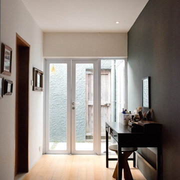
The owners of this house appreciate living in a home that is connected with its tropical context. Set in a dense residential neighborhood, the challenge was to create a home with a garden as an extension of its interior, whilst retaining a sense of privacy that the owners valued. Working within the existing shell of an old semi-detatched house, the interior layout was reconfigured to create a series spaces that open out to the lush tropical garden.
The existing kitchen was converted into an open kitchen, connecting the backyard to the dining and living room. Large sliding windows open the living/dining space to its patio and garden to offer an outdoor dining experience.
The existing hallway and common bathroom also suffered from daylight and natural ventilation. A skylight was inserted to brighten the otherwise existing dim hallway. The previously mechanically ventilated bathroom was also converted into a semi-outdoor bathroom with the introduction of an air-well and feature rock wall.
The guest bedroom, previously accessible through the kitchen, was turned into a home office now exclusive to the master bedroom. A private courtyard was introduced to connect the master bedroom and home office to create a private sanctuary for one residing in the the bedroom or working in the office.
 Tamara Rosenbloom Design LLC
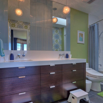
The twins were almost out of their toddler beds and outgrowing their small room when their mother called. Across from the girls’ existing bedroom was another bedroom and bathroom that lacked functionality and easy access. We combined the three spaces, added French doors from the hall and divided the second bedroom into a large walk in closet and play room. To unite the spaces (and please the allergy sufferers), we tore up the carpet and laid bamboo flooring. We enlarged the bathroom to allow for a custom horizontal strand bamboo double sink vanity and moved the entry to the bathroom off the bedroom. To maximize space and storage in the bedroom, we designed custom Chippendale inspired beds with storage drawers beneath and a bookcase/reading nook with a view between the two beds.
Photos by Mike Martin www.martinvisualtours.com
 Fiorito Interior Design
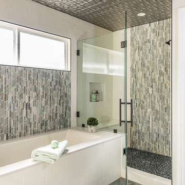
Finding a home is not easy in a seller’s market, but when my clients discovered one—even though it needed a bit of work—in a beautiful area of the Santa Cruz Mountains, they decided to jump in. Surrounded by old-growth redwood trees and a sense of old-time history, the house’s location informed the design brief for their desired remodel work. Yet I needed to balance this with my client’s preference for clean-lined, modern style.
Suffering from a previous remodel, the galley-like bathroom in the master suite was long and dank. My clients were willing to completely redesign the layout of the suite, so the bathroom became the walk-in closet. We borrowed space from the bedroom to create a new, larger master bathroom which now includes a separate tub and shower.
The look of the room nods to nature with organic elements like a pebbled shower floor and vertical accent tiles of honed green slate. A custom vanity of blue weathered wood and a ceiling that recalls the look of pressed tin evoke a time long ago when people settled this mountain region. At the same time, the hardware in the room looks to the future with sleek, modular shapes in a chic matte black finish. Harmonious, serene, with personality: just what my clients wanted.
Photo: Bernardo Grijalva
 David Moulton AIA
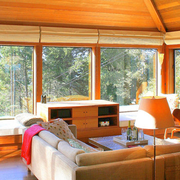
The house suffered from years of deferred maintenance and neglect when David Moulton AIA began an interior redesign and whole-house overhaul. Saved were the glorious, soaring clear redwood ceilings, the proportions, and most of the interior walls. Two large windows replaced an entertainment unit and fireplace that stood in the way of the view, thus creating the large, expansive stretch of windows that now take full advantage of the ocean and forest views. Added window seats provide cozy places to watch the scene unfold. A television lifts out of the central cabinet for optimal television viewing with no detraction of the views beyond. New Brazilian cherry floors throughout replaced dated vinyl, parquet and carpet. Removing channel walls on the stairway allowed space to lengthen the lower stair treads into a delightful waterfall of Brazilian hardwood, thereby creating visual interest and greater connection between the natural landscape and upper and lower floors.
 Freund Studio
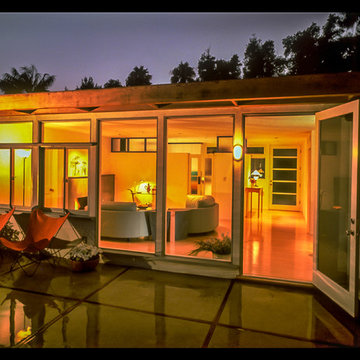
This 1948 house designed by renowned mid-century modernist Architect Gregory Ain suffered thru several bad remodels before we totally restored it and added on a new master suite.
 Master Blinds
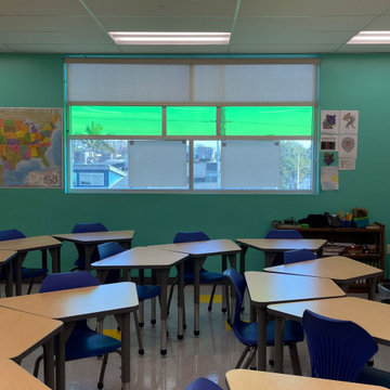
School settings require students to maintain concentration and sit still for long periods of time throughout the day. Needless to say, that can be tough not only for teenagers but adults as well. Harnessing sheer roller shades to cover classroom windows helps ensure sunlight doesn’t become a hindrance in the path of education, but a facilitator of better learning. By diffusing sunlight that enters the classrooms, students don’t suffer the negative cognitive impact of harsh glare that’s strainful on the eyes. Instead, they enjoy the benefits sunlight plays in maintaining alertness and attentiveness. Classroom window shades that provide better privacy also help to keep outside distractions from interfering with the lessons, keeping students focused on the subject at hand. The right use of colorful roller shades can also complement sensory cues for focus created by the classroom environment. Talk to Master Blinds’ design team to see what roller shades can offer your classroom spaces. Get in touch with us at 877-708-5883 to schedule a free in-person consultation with no obligation for more details!
 Studio Roundtop LLC
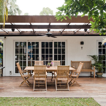
The owners of this house appreciate living in a home that is connected with its tropical context. Set in a dense residential neighborhood, the challenge was to create a home with a garden as an extension of its interior, whilst retaining a sense of privacy that the owners valued. Working within the existing shell of an old semi-detatched house, the interior layout was reconfigured to create a series spaces that open out to the lush tropical garden.
The existing kitchen was converted into an open kitchen, connecting the backyard to the dining and living room. Large sliding windows open the living/dining space to its patio and garden to offer an outdoor dining experience.
The existing hallway and common bathroom also suffered from daylight and natural ventilation. A skylight was inserted to brighten the otherwise existing dim hallway. The previously mechanically ventilated bathroom was also converted into a semi-outdoor bathroom with the introduction of an air-well and feature rock wall.
The guest bedroom, previously accessible through the kitchen, was turned into a home office now exclusive to the master bedroom. A private courtyard was introduced to connect the master bedroom and home office to create a private sanctuary for one residing in the the bedroom or working in the office.
 G. Christianson Construction, Inc.
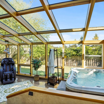
We recently completed a spectacularly beautiful sunroom for Richard and Cynthia. We worked previously with Cynthia on her business and because of our relationship, she felt comfortable asking us to build their Corvallis sunroom. The inspiration for this project came from the desire to have the ambiance of an outdoor hot tub, but without Corvallis’ cold wet weather. The sunroom adds a warm, bright 325 square feet just outside their kitchen and living room. This is the perfect addition if you are suffering from Corvallis’ cloud cover. The vibrant hues of the stained and finished Douglas fir glulam beams complement the beauty of the outdoors. These beams support the glass roof. In addition, the sunroom includes two operable skylights, a nine foot wide bifold door, a full glass roof system and full glass walls. Westview Sunrooms (the manufacturer) has a number of other beautiful ideas on their site: http://www.westviewproducts.com/pictures.html We would love the opportunity to build for you.
 Studio Roundtop LLC
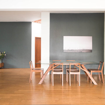
The owners of this house appreciate living in a home that is connected with its tropical context. Set in a dense residential neighborhood, the challenge was to create a home with a garden as an extension of its interior, whilst retaining a sense of privacy that the owners valued. Working within the existing shell of an old semi-detatched house, the interior layout was reconfigured to create a series spaces that open out to the lush tropical garden.
The existing kitchen was converted into an open kitchen, connecting the backyard to the dining and living room. Large sliding windows open the living/dining space to its patio and garden to offer an outdoor dining experience.
The existing hallway and common bathroom also suffered from daylight and natural ventilation. A skylight was inserted to brighten the otherwise existing dim hallway. The previously mechanically ventilated bathroom was also converted into a semi-outdoor bathroom with the introduction of an air-well and feature rock wall.
The guest bedroom, previously accessible through the kitchen, was turned into a home office now exclusive to the master bedroom. A private courtyard was introduced to connect the master bedroom and home office to create a private sanctuary for one residing in the the bedroom or working in the office.
32