
Search results for "Sufferers" in Home Design Ideas
 12/12 Architects & Planners
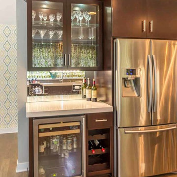
This family of 5 was quickly out-growing their 1,220sf ranch home on a beautiful corner lot. Rather than adding a 2nd floor, the decision was made to extend the existing ranch plan into the back yard, adding a new 2-car garage below the new space - for a new total of 2,520sf. With a previous addition of a 1-car garage and a small kitchen removed, a large addition was added for Master Bedroom Suite, a 4th bedroom, hall bath, and a completely remodeled living, dining and new Kitchen, open to large new Family Room. The new lower level includes the new Garage and Mudroom. The existing fireplace and chimney remain - with beautifully exposed brick. The homeowners love contemporary design, and finished the home with a gorgeous mix of color, pattern and materials.
The project was completed in 2011. Unfortunately, 2 years later, they suffered a massive house fire. The house was then rebuilt again, using the same plans and finishes as the original build, adding only a secondary laundry closet on the main level.
 Tracy Berman Interiors
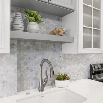
This beach house was not only dated but the kitchen was suffering from a wall that closed it off and a peninsula that cut the space in half. Those were the first things we corrected. The wall was removed which opened the space up. The new layout has a large island instead of the peninsula for better flow and entertaining. This home is across the street from the beach so our design cues came from the ocean and natural surroundings. Our color pallet is white and coastal blue for the cabinets. The new luxury vinyl plank floor is light like the sand. The glass backsplash tile and quartz countertops carry the coastal feel. The main bathroom for the lower level is off the kitchen. We improved the shower size and updated all of the finishes. This beach house is now bright and open with a warm coastal feel.
 Paradox Interior Design Inc.
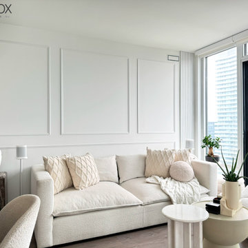
Challenge: Our client needed their downtown Toronto condo to serve as a peaceful retreat from the demanding pace of urban professional life. The space suffered from the sterile, impersonal aesthetic typical of many Toronto condos, lacking the warmth and tranquility needed to truly unwind after busy workdays in the city's core.
Solution: We approached this project in thoughtful stages, transforming the condo into a serene sanctuary that promotes relaxation and rejuvenation. By incorporating a palette of light, calming colors and introducing rich textural elements throughout the space, we elevated the sterile interior into a sophisticated retreat. Each design decision was made with the goal of creating visual and tactile interest that would engage the senses and promote a sense of calm.
Highlights: • Staged design approach that allowed for thoughtful evolution of the space • Light color palette that enhances natural light and creates an airy, peaceful atmosphere • Rich variety of textures that add warmth and visual interest to combat sterile condo interiors • Strategic material selection that transforms typical condo finishes into sophisticated design elements
Results: The transformed Downtown Zen condo now serves as the perfect urban escape—a space that immediately shifts the client's mindset from work mode to relaxation. This project demonstrates how thoughtful design can overcome the limitations of typical Toronto condo interiors, creating a personalized sanctuary that enhances daily life and well-being.
Find the right local pro for your project
 Lincoln Lighthill Architect
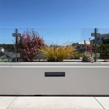
What does a roof deck look like when every part of the roof, even areas deemed uninhabitable and structurally weak, is utilized and optimized?
This large midcentury home on the edge of Presidio National Park in San Francisco had an incredible location and views. But the original roof deck suffered from poor design detailing that had rendered it a leaking, deteriorating mess. Even worse, the previous owner had covered three roof areas surrounding the deck with river stones, structurally overloading the building and endangering its occupants.
We removed the river stones and everything else down to the framing. An expertly detailed drainage and waterproofing system underlies everything above. The deck and access stairs are surfaced with durable and refined porcelain pavers. The guardrail is made from custom stainless steel supports with clear, low-iron, laminated glass spanning between for an unobstructed view. Heated seats make watching the chilly fog roll in through the gate comfy.
Planting and greenery surround the deck. The type varies depending on structural conditions- a deep planter sits on top of a structural wall, sedums in shallow soil occupy the strong edges of the surrounding rooftops, and faux grass turf fills out the middle in areas that can’t support the weight of wet soil.
 Wood Front Kitchens
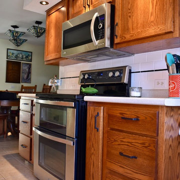
This customer spent over 40 years building and renovating his home. In his younger days, he was an amazing building and craftsman. Recently, he suffered a stroke and lost the ability to build. He wants to leave his home to his daughter, so he planned one last renovation project. For this project, he wanted to choose a renovation company that could build a kitchen as well as he could. Luckily, he chose Wood Front Kitchens. He was thrilled with the result. He loved that we were able to keep storage features he had built in his previous cabinets and transfer them to the new cabinets.
This homeowner chose shaker-style oak cabinets stained in Michels. He chose Amerock Conrad Square hardware in oil-rubbed bronze to give his rustic cabinets an industrial feel. He and his daughter are both pleased with the results, and with their huge increase in storage space.
 Wood Front Kitchens
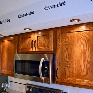
This customer spent over 40 years building and renovating his home. In his younger days, he was an amazing building and craftsman. Recently, he suffered a stroke and lost the ability to build. He wants to leave his home to his daughter, so he planned one last renovation project. For this project, he wanted to choose a renovation company that could build a kitchen as well as he could. Luckily, he chose Wood Front Kitchens. He was thrilled with the result. He loved that we were able to keep storage features he had built in his previous cabinets and transfer them to the new cabinets.
This homeowner chose shaker-style oak cabinets stained in Michels. He chose Amerock Conrad Square hardware in oil-rubbed bronze to give his rustic cabinets an industrial feel. He and his daughter are both pleased with the results, and with their huge increase in storage space.
 Wood Front Kitchens
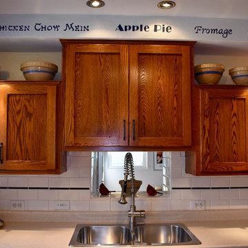
This customer spent over 40 years building and renovating his home. In his younger days, he was an amazing building and craftsman. Recently, he suffered a stroke and lost the ability to build. He wants to leave his home to his daughter, so he planned one last renovation project. For this project, he wanted to choose a renovation company that could build a kitchen as well as he could. Luckily, he chose Wood Front Kitchens. He was thrilled with the result. He loved that we were able to keep storage features he had built in his previous cabinets and transfer them to the new cabinets.
This homeowner chose shaker-style oak cabinets stained in Michels. He chose Amerock Conrad Square hardware in oil-rubbed bronze to give his rustic cabinets an industrial feel. He and his daughter are both pleased with the results, and with their huge increase in storage space.
 Pro-Tile & Marble
Pro-Tile & Marble, Inc.
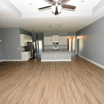
Wood Look Tile Pros
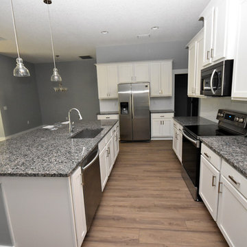
Value- Tile has always been a better value than hardwood.
Durability - It’s a fact. Tile is one of the most durable flooring materials you can buy. If you take care of it, it will still look new in 20 years; unlike its counterpart.
Maintenance - Tile is ridiculously easy to maintain. You won’t need fancy tools or expensive cleaners. A regular tile mop and static broom or tile vacuum will work fine.
Versatility - Do you long for versatile flooring that can go anywhere in your home? If so, wood-look tile fits the bill. You can install tile in bathrooms, and kitchens.
Variety - If you’re craving a flooring solution that allows for endless possibilities, wood-look tile is an excellent option.
Allergy-friendly - Wood grain tile is perfect for allergy sufferers. It doesn’t harbor dirt and dander like carpet can (that goes for both ceramic and porcelain).
Pet-friendly - Tile is a wise pet-friendly flooring option for the dog or cat owner who worries about scratches and scuff marks. Even if you have large dogs, quality tile won’t scratch like hardwood can. And unlike other surfaces, your cat can’t shred it or use it as a scratching post.
Pro-Tile & Marble 904-731-6471
 Pro-Tile & Marble
Pro-Tile & Marble, Inc.
Wood Look Tile Pros
Value- Tile has always been a better value than hardwood.
Durability - It’s a fact. Tile is one of the most durable flooring materials you can buy. If you take care of it, it will still look new in 20 years; unlike its counterpart.
Maintenance - Tile is ridiculously easy to maintain. You won’t need fancy tools or expensive cleaners. A regular tile mop and static broom or tile vacuum will work fine.
Versatility - Do you long for versatile flooring that can go anywhere in your home? If so, wood-look tile fits the bill. You can install tile in bathrooms, and kitchens.
Variety - If you’re craving a flooring solution that allows for endless possibilities, wood-look tile is an excellent option.
Allergy-friendly - Wood grain tile is perfect for allergy sufferers. It doesn’t harbor dirt and dander like carpet can (that goes for both ceramic and porcelain).
Pet-friendly - Tile is a wise pet-friendly flooring option for the dog or cat owner who worries about scratches and scuff marks. Even if you have large dogs, quality tile won’t scratch like hardwood can. And unlike other surfaces, your cat can’t shred it or use it as a scratching post.
Pro-Tile & Marble 904-731-6471
 Tracy Berman Interiors
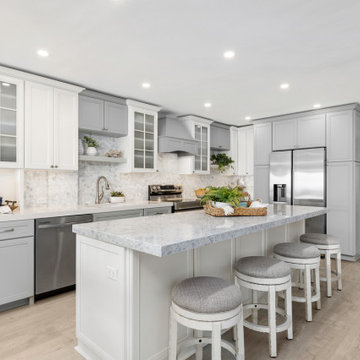
This beach house was not only dated but the kitchen was suffering from a wall that closed it off and a peninsula that cut the space in half. Those were the first things we corrected. The wall was removed which opened the space up. The new layout has a large island instead of the peninsula for better flow and entertaining. This home is across the street from the beach so our design cues came from the ocean and natural surroundings. Our color pallet is white and coastal blue for the cabinets. The new luxury vinyl plank floor is light like the sand. The glass backsplash tile and quartz countertops carry the coastal feel. The main bathroom for the lower level is off the kitchen. We improved the shower size and updated all of the finishes. This beach house is now bright and open with a warm coastal feel.
 12/12 Architects & Planners
This family of 5 was quickly out-growing their 1,220sf ranch home on a beautiful corner lot. Rather than adding a 2nd floor, the decision was made to extend the existing ranch plan into the back yard, adding a new 2-car garage below the new space - for a new total of 2,520sf. With a previous addition of a 1-car garage and a small kitchen removed, a large addition was added for Master Bedroom Suite, a 4th bedroom, hall bath, and a completely remodeled living, dining and new Kitchen, open to large new Family Room. The new lower level includes the new Garage and Mudroom. The existing fireplace and chimney remain - with beautifully exposed brick. The homeowners love contemporary design, and finished the home with a gorgeous mix of color, pattern and materials.
The project was completed in 2011. Unfortunately, 2 years later, they suffered a massive house fire. The house was then rebuilt again, using the same plans and finishes as the original build, adding only a secondary laundry closet on the main level.
 Tracy Berman Interiors
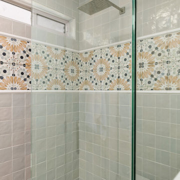
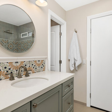
This beach house was not only dated but the kitchen was suffering from a wall that closed it off and a peninsula that cut the space in half. Those were the first things we corrected. The wall was removed which opened the space up. The new layout has a large island instead of the peninsula for better flow and entertaining. This home is across the street from the beach so our design cues came from the ocean and natural surroundings. Our color pallet is white and coastal blue for the cabinets. The new luxury vinyl plank floor is light like the sand. The glass backsplash tile and quartz countertops carry the coastal feel. The main bathroom for the lower level is off the kitchen. We improved the shower size and updated all of the finishes. This beach house is now bright and open with a warm coastal feel.
 Tracy Berman Interiors
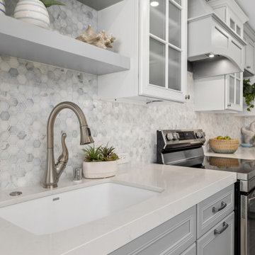
This beach house was not only dated but the kitchen was suffering from a wall that closed it off and a peninsula that cut the space in half. Those were the first things we corrected. The wall was removed which opened the space up. The new layout has a large island instead of the peninsula for better flow and entertaining. This home is across the street from the beach so our design cues came from the ocean and natural surroundings. Our color pallet is white and coastal blue for the cabinets. The new luxury vinyl plank floor is light like the sand. The glass backsplash tile and quartz countertops carry the coastal feel. The main bathroom for the lower level is off the kitchen. We improved the shower size and updated all of the finishes. This beach house is now bright and open with a warm coastal feel.
 Tracy Berman Interiors
This beach house was not only dated but the kitchen was suffering from a wall that closed it off and a peninsula that cut the space in half. Those were the first things we corrected. The wall was removed which opened the space up. The new layout has a large island instead of the peninsula for better flow and entertaining. This home is across the street from the beach so our design cues came from the ocean and natural surroundings. Our color pallet is white and coastal blue for the cabinets. The new luxury vinyl plank floor is light like the sand. The glass backsplash tile and quartz countertops carry the coastal feel. The main bathroom for the lower level is off the kitchen. We improved the shower size and updated all of the finishes. This beach house is now bright and open with a warm coastal feel.
 StudioLAB
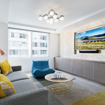
Close to Lincoln Center Plaza, two existing apartments were combined into a single custom tailored 4-bedroom residence. Characteristic with other buildings from the same post-war era, the existing apartments suffered greatly from a low, monotonous ceiling slab. To break up the ceiling, floating planes containing low-profile LED recessed lighting were incorporated throughout. Grey-washed birch veneer millwork is seen as you enter into the new foyer space. A blackened steel inlaid panel serves as a datum that continues throughout the apartment, wrapping the entry unit and extending around the corner to then transform into a floating bookshelf. The unit not only divides the entry area from the Living room, but also serves its utilitarian purpose on the foyer side as coat and storage closets, and then an entertaining function on the opposing side with a TV niche and custom liquor bar. Whitewashed rift and quartered white oak floors were used to brighten the space. In the kitchen, marble counters extend up the wall and onto the ceiling marking the separation of the kitchen/dining area from the living room/entry area. The kid’s room contains a custom curved desk area built beneath the bay windows to take advantage of the views. In the master bedroom, the blackened steel inlay reappears inset into the wardrobe wall unit.
 Pro-Tile & Marble
Pro-Tile & Marble, Inc.
Wood Look Tile Pros
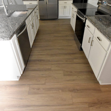
Value- Tile has always been a better value than hardwood.
Durability - It’s a fact. Tile is one of the most durable flooring materials you can buy. If you take care of it, it will still look new in 20 years; unlike its counterpart.
Maintenance - Tile is ridiculously easy to maintain. You won’t need fancy tools or expensive cleaners. A regular tile mop and static broom or tile vacuum will work fine.
Versatility - Do you long for versatile flooring that can go anywhere in your home? If so, wood-look tile fits the bill. You can install tile in bathrooms, and kitchens.
Variety - If you’re craving a flooring solution that allows for endless possibilities, wood-look tile is an excellent option.
Allergy-friendly - Wood grain tile is perfect for allergy sufferers. It doesn’t harbor dirt and dander like carpet can (that goes for both ceramic and porcelain).
Pet-friendly - Tile is a wise pet-friendly flooring option for the dog or cat owner who worries about scratches and scuff marks. Even if you have large dogs, quality tile won’t scratch like hardwood can. And unlike other surfaces, your cat can’t shred it or use it as a scratching post.
Pro-Tile & Marble 904-731-6471
 Paradox Interior Design Inc.
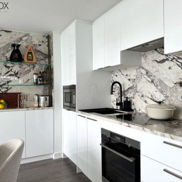
Challenge: Our client needed their downtown Toronto condo to serve as a peaceful retreat from the demanding pace of urban professional life. The space suffered from the sterile, impersonal aesthetic typical of many Toronto condos, lacking the warmth and tranquility needed to truly unwind after busy workdays in the city's core.
Solution: We approached this project in thoughtful stages, transforming the condo into a serene sanctuary that promotes relaxation and rejuvenation. By incorporating a palette of light, calming colors and introducing rich textural elements throughout the space, we elevated the sterile interior into a sophisticated retreat. Each design decision was made with the goal of creating visual and tactile interest that would engage the senses and promote a sense of calm.
Highlights: • Staged design approach that allowed for thoughtful evolution of the space • Light color palette that enhances natural light and creates an airy, peaceful atmosphere • Rich variety of textures that add warmth and visual interest to combat sterile condo interiors • Strategic material selection that transforms typical condo finishes into sophisticated design elements
Results: The transformed Downtown Zen condo now serves as the perfect urban escape—a space that immediately shifts the client's mindset from work mode to relaxation. This project demonstrates how thoughtful design can overcome the limitations of typical Toronto condo interiors, creating a personalized sanctuary that enhances daily life and well-being.
 Tracy Berman Interiors
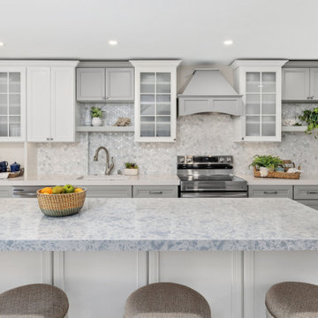
This beach house was not only dated but the kitchen was suffering from a wall that closed it off and a peninsula that cut the space in half. Those were the first things we corrected. The wall was removed which opened the space up. The new layout has a large island instead of the peninsula for better flow and entertaining. This home is across the street from the beach so our design cues came from the ocean and natural surroundings. Our color pallet is white and coastal blue for the cabinets. The new luxury vinyl plank floor is light like the sand. The glass backsplash tile and quartz countertops carry the coastal feel. The main bathroom for the lower level is off the kitchen. We improved the shower size and updated all of the finishes. This beach house is now bright and open with a warm coastal feel.
 12/12 Architects & Planners
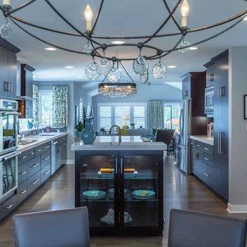
This family of 5 was quickly out-growing their 1,220sf ranch home on a beautiful corner lot. Rather than adding a 2nd floor, the decision was made to extend the existing ranch plan into the back yard, adding a new 2-car garage below the new space - for a new total of 2,520sf. With a previous addition of a 1-car garage and a small kitchen removed, a large addition was added for Master Bedroom Suite, a 4th bedroom, hall bath, and a completely remodeled living, dining and new Kitchen, open to large new Family Room. The new lower level includes the new Garage and Mudroom. The existing fireplace and chimney remain - with beautifully exposed brick. The homeowners love contemporary design, and finished the home with a gorgeous mix of color, pattern and materials.
The project was completed in 2011. Unfortunately, 2 years later, they suffered a massive house fire. The house was then rebuilt again, using the same plans and finishes as the original build, adding only a secondary laundry closet on the main level.
 Paradox Interior Design Inc.
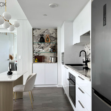
Challenge: Our client needed their downtown Toronto condo to serve as a peaceful retreat from the demanding pace of urban professional life. The space suffered from the sterile, impersonal aesthetic typical of many Toronto condos, lacking the warmth and tranquility needed to truly unwind after busy workdays in the city's core.
Solution: We approached this project in thoughtful stages, transforming the condo into a serene sanctuary that promotes relaxation and rejuvenation. By incorporating a palette of light, calming colors and introducing rich textural elements throughout the space, we elevated the sterile interior into a sophisticated retreat. Each design decision was made with the goal of creating visual and tactile interest that would engage the senses and promote a sense of calm.
Highlights: • Staged design approach that allowed for thoughtful evolution of the space • Light color palette that enhances natural light and creates an airy, peaceful atmosphere • Rich variety of textures that add warmth and visual interest to combat sterile condo interiors • Strategic material selection that transforms typical condo finishes into sophisticated design elements
Results: The transformed Downtown Zen condo now serves as the perfect urban escape—a space that immediately shifts the client's mindset from work mode to relaxation. This project demonstrates how thoughtful design can overcome the limitations of typical Toronto condo interiors, creating a personalized sanctuary that enhances daily life and well-being.
33