
Search results for "Sufferers" in Home Design Ideas

 Dream Kitchens
CONTACT
These home owners initially contacted their Designer to identify the reason that the floor in their upstairs bedroom suffered from a noticeable slant. The floor problem actually impacted a small bathroom and adjoining study also.
Early on, the decision was made to re-design the footprint for the 3 rooms in conjunction with repairing the uneven floor. The approach was to gut all three spaces of walls and floors and start from scratch. The new spaces were designed with the clients needs for accessibility in mind.
DESIGN
The design effort included identifying the products to be used throughout the spaces. This included everything from the flooring to the wall paint. Kohler plumbing fixtures and Adelphi cabinetry were decided on first. A radiant heat grid was included for the bathroom floor. Lighting, paint and tile soon followed. Wood flooring was installed throughout the adjoining spaces.
The master bedroom was redesigned to allow for entry from the study or the master bath via pocket doors. The study was given an access to the master bath also. The hardwood flooring ties the bedroom and study together and gives each room a very spacious feel. The original master bedroom was changed to incorporate a large walk-in closet that features custom storage throughout. The study that also doubles as the IT center for the home was updated with custom book cases and cabinetry from Adelphi Cabinets.
When discussing the reapportioning of the entire space for the individual rooms the bathroom was given priority. The previous small bathroom did not include a window for natural light. The new design corrected that in a big way by incorporating an existing bedroom window into the new space. The decision was made early on to allow for the inclusion of a large shower with full granite walls and custom plate glass surround. The shower system includes both fixed and hand held shower heads. A thermostatic control system was included to eliminate scalding. A large bench seat of matching granite allows for relaxing while getting squeaky clean. A separate air massage tub from Kohler centered under the new windows allows for a relaxed moment while being caressed by all those tiny bubbles. His and her side by side vanity sinks allows for efficient use of the space. The Caxton sinks and coordinated toilet were selected to match the color of the tub and do so beautifully!
CONSTRUCTION
We started the project not knowing what we were going to find. The slanting floor upstairs was not evident in the ceiling of the first floor
Once the demolition had been completed it was evident that the floor joists were at the heart of the problem. The home had been framed with floor joists that had been strung together to increase their length. Over time and with the house settling, the strung together joists started to droop from their connection point. This was concealed on the first floor by a large HVAC duct running through the garage. This was corrected by the addition of two laminated beams in the ceiling of the first floor (luckily in the garage) that re-supported the offending joists.
THE END
The project was a huge success in terms of problem solving and designing with budget and time frame in mind. The overall impact of the new space is impressive both visually and from a practicality point of view. The new master suite with upscale bathroom and study adds significant value to the home and the home owners quality of life!

 The Brooklyn Studio
This residence was a complete gut renovation of a 4-story row house in Park Slope, and included a new rear extension and penthouse addition. The owners wished to create a warm, family home using a modern language that would act as a clean canvas to feature rich textiles and items from their world travels. As with most Brooklyn row houses, the existing house suffered from a lack of natural light and connection to exterior spaces, an issue that Principal Brendan Coburn is acutely aware of from his experience re-imagining historic structures in the New York area. The resulting architecture is designed around moments featuring natural light and views to the exterior, of both the private garden and the sky, throughout the house, and a stripped-down language of detailing and finishes allows for the concept of the modern-natural to shine.
Upon entering the home, the kitchen and dining space draw you in with views beyond through the large glazed opening at the rear of the house. An extension was built to allow for a large sunken living room that provides a family gathering space connected to the kitchen and dining room, but remains distinctly separate, with a strong visual connection to the rear garden. The open sculptural stair tower was designed to function like that of a traditional row house stair, but with a smaller footprint. By extending it up past the original roof level into the new penthouse, the stair becomes an atmospheric shaft for the spaces surrounding the core. All types of weather – sunshine, rain, lightning, can be sensed throughout the home through this unifying vertical environment. The stair space also strives to foster family communication, making open living spaces visible between floors. At the upper-most level, a free-form bench sits suspended over the stair, just by the new roof deck, which provides at-ease entertaining. Oak was used throughout the home as a unifying material element. As one travels upwards within the house, the oak finishes are bleached to further degrees as a nod to how light enters the home.
The owners worked with CWB to add their own personality to the project. The meter of a white oak and blackened steel stair screen was designed by the family to read “I love you” in Morse Code, and tile was selected throughout to reference places that hold special significance to the family. To support the owners’ comfort, the architectural design engages passive house technologies to reduce energy use, while increasing air quality within the home – a strategy which aims to respect the environment while providing a refuge from the harsh elements of urban living.
This project was published by Wendy Goodman as her Space of the Week, part of New York Magazine’s Design Hunting on The Cut.
Photography by Kevin Kunstadt

 Arbor Illuminations
Driven by a passion for the salt life and a love of the natural beauty of the area, they will leave the Northeast on a trek for the Florida Gulf Coast. The winters there are simply too cold to tolerate for any length of time. And why would they suffer those freezing temperatures when the average temperature on Longboat Key in January is 71 degrees?
However, this is no migration and the subject is not a bird. My clients cannot be referred to as “Snowbirds” either. This is a homecoming. More so, it is a new beginning; a resurrection!
“From the crown of the palm tree, there grew a flame. The flame revealed a nest. As the flames of change kissed the nest, a new being was born. This fantastic creature was born in the image of its predecessor, but it was given a new life. Indeed, it was resurrected. Behold the Phoenix!”
Many years ago, they were pulled from the area in the pursuit of better employment. All the while, they maintained a strong connection with the Gulf Coast. This is where they would spend the best years of their lives. Now is their time of rebirth.
The property they chose is on boating water on the Bay side of Longboat Key. The property is among the few undeveloped lots scattered around the island. Over the years it had been planted with a variety of tropical species including many of the common house varieties such as Ficus, rubber trees, and Areca Palms. Loving the locale, these species quickly outgrew their space. In the shadows, native Sabal Palms stretched their trunks in an effort to survive. A Phoenix Reclinata Palm sat unassumingly beneath the shadow of a large Ficus. We liberated them by removing all of the invasive varieties. We then relocated all ten of the resident Sabal Palms (our State Tree) on site.
The home, designed by celebrated local architect Mark Sultana of DSDG, Inc., is a contemporary flat. The layout is a single living level above parking and grade level outdoor spaces. The architecture is crisp and inspiring and it is sensitive to the smaller scale of the eclectic neighborhood in which it will be constructed. From the elevated balcony, the residents will enjoy watching the many local manatees as they hug the sea wall looking for warmth on chilly mornings. From grade level decks, they will get up close and personal with the abundant schools of mullet in the canal. A northern exposure to the open side of the plan will allow for the amazing breezes offered by passing cool fronts.
Find the right local pro for your project

 Jarrett Design
This bathroom needed help as it was tired, dated and cramped! The vanity area was open to the master bedroom and sandwiched between a closet and existing bathroom wall. Behind the bathroom wall, was a second sink, a small walk-in shower and the commode. A poorly placed linen closet ate into the area and there was a soffit over the shower adding to the cramped feeling. The ceiling was cluttered with old-school heating lamps, flush-mount fixtures and ventilation grills. The “movie star” lighting meant to add some glamour only made the bathroom feel dated and sad. Our clients wanted to bring this bathroom to life.
We built a wall and added a door between the bedroom and bathroom to ensure more privacy and define the space. In addition, we removed the wall separating the actual bathroom and vanity area to make the master bathroom larger. The linen closet was also taken out so the shower could be expanded significantly. Our homeowner had recently suffered a knee injury so they were looking for future solutions that would work for them as they continued to age. We made the shower large enough to include a bench and installed a handheld sprayer located near the seat. Shower walls were reinforced so that when the day came that a grab bar was needed, they would be ready.
We added a tall cabinet that featured two, deep rollouts and interior shelving to keep linens and bathroom supplies organized. Beneath the sinks, we included rollout drawers so items would not get lost in those dark areas under the plumbing. Everything that had been cluttering the ceiling was removed including the shower soffit and heat lamp. With those gone, we added evenly-spaced, recessed ceiling lights to help brighten the space making it safer and more practical.
We chose a custom blue-green paint for the cabinets which was understated enough to provide a sense of serenity while still offering a splash of color to help liven up the room. Walnut-framed mirrors added a touch of warmth and the patterned floor tile made the whole room fun! An old bathroom came alive!

 Aquatica Plumbing Group
Coletta freestanding stone bathtub was designed with easy access as the principle advantage. The low profile walls of only 19.75” in height make it easier for older and physically challenged bathers such as those suffering from arthritis, to get in and out of the bathtub easily. Combining the low height feature and our firm yet smooth Aquatex material, the Coletta is a unique low step-in bathtub which puts it far ahead of the flimsy and obsolete looking competitor models found on the market.
Coletta – a charming bathtub of contrasts:
The Coletta freestanding bathtub is a wonderful paradox of contrasts. Large-scale capacity combines with elegance thanks to the carefully designed, fluid transition of the bath rim from very narrow to usefully wide. Its charm is further enhanced by the slightly tapered, narrower bath base, which looks delicate yet is very much in harmony with the rest of the design.
A small wooden masterpiece for a great number of Aquatica tubs
A stunning take on the traditional bathtub tray, this new bathtub tray incorporates the rich, warm tones of pure, solid, natural wood crafted in a very modern, uber chic design that exudes style. This is the ideal accessory for the most of Aquatica's bathtubs, as it reflects the same interpretation of the function in cleverly designed and beautifully rendered form. The solid wood balance and excellent strength. The overall size - 36.25 "x 8.25" (92 x 21 cm) gives you plenty of room to put all your bathing essentials right at hand. The wood used for this bathtub tray is 100% natural and has been treated with a teak oil to ensure waterproof impermeability and long life. It drains and self-dries freely. Can be made of Teak or Iroko wood upon request.
Integrated slot overflow brings sleek minimalistic design appeal, increased water depth, improved ergonomics, simpler and lower cost maintenance.
 Jarrett Design
This bathroom needed help as it was tired, dated and cramped! The vanity area was open to the master bedroom and sandwiched between a closet and existing bathroom wall. Behind the bathroom wall, was a second sink, a small walk-in shower and the commode. A poorly placed linen closet ate into the area and there was a soffit over the shower adding to the cramped feeling. The ceiling was cluttered with old-school heating lamps, flush-mount fixtures and ventilation grills. The “movie star” lighting meant to add some glamour only made the bathroom feel dated and sad. Our clients wanted to bring this bathroom to life.
We built a wall and added a door between the bedroom and bathroom to ensure more privacy and define the space. In addition, we removed the wall separating the actual bathroom and vanity area to make the master bathroom larger. The linen closet was also taken out so the shower could be expanded significantly. Our homeowner had recently suffered a knee injury so they were looking for future solutions that would work for them as they continued to age. We made the shower large enough to include a bench and installed a handheld sprayer located near the seat. Shower walls were reinforced so that when the day came that a grab bar was needed, they would be ready.
We added a tall cabinet that featured two, deep rollouts and interior shelving to keep linens and bathroom supplies organized. Beneath the sinks, we included rollout drawers so items would not get lost in those dark areas under the plumbing. Everything that had been cluttering the ceiling was removed including the shower soffit and heat lamp. With those gone, we added evenly-spaced, recessed ceiling lights to help brighten the space making it safer and more practical.
We chose a custom blue-green paint for the cabinets which was understated enough to provide a sense of serenity while still offering a splash of color to help liven up the room. Walnut-framed mirrors added a touch of warmth and the patterned floor tile made the whole room fun! An old bathroom came alive!
 SPACE DECOR CONTRACTORS LLC
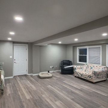
SDC Signature (Space Decor Contractors LLC) completely reimagined this tired, dated den, transforming it into a modern, beautiful, and fundamentally safe living space. The original room suffered from significantly uneven ceilings and an outdated aesthetic that caused the homeowner structural concerns. Our comprehensive scope of work went far beyond simple finishes—we focused on restoring absolute structural integrity and peace of mind.
We executed a precise structural overhaul, reinforcing the main central beam and implementing a custom scissor framing system to safely raise and perfectly level the ceiling joists. By removing all the outdated wiring and installing new, code-compliant electrical for energy-efficient recessed LED lighting, we eliminated hidden hazards behind the walls.
The homeowner was absolutely thrilled with the final result. Beyond the stunning visual upgrade, she now has the security and confidence of knowing the "bones" of her home are expertly reinforced and built to last.
Key Transformation Details:
Structural Engineering & Safety: Reinforcement of the main beam and installation of a custom scissor framing system to securely level and elevate the ceiling.
Modernization: Complete removal of heavy drop ceilings, old wall paneling, and a gas fireplace to create a clean, open, and safe layout.
Premium Finishes: Expertly hung and finished smooth drywall on ceilings and walls, fresh premium paint throughout, and new custom trim.
Upgrades: Installation of safe, modern recessed lighting, dedicated electrical connection prep for a future mini-split HVAC system, and professional floor repairs.
This project highlights our commitment to delivering uncompromised craftsmanship. At SDC Signature, we don't just build beautiful spaces; we build trust and lasting structural security for discerning homeowners.

 Archipelago Home, LLC
Kitchen designed for differing heights of kitchen cooks. One of the homeowners has an arm / shoulder injury making chopping food painful. The island countertop was lowered to accommodate her height and allow her to cut at a level that didn't cause pain.
Photography: Augie Salbosa
 Jarrett Design
This bathroom needed help as it was tired, dated and cramped! The vanity area was open to the master bedroom and sandwiched between a closet and existing bathroom wall. Behind the bathroom wall, was a second sink, a small walk-in shower and the commode. A poorly placed linen closet ate into the area and there was a soffit over the shower adding to the cramped feeling. The ceiling was cluttered with old-school heating lamps, flush-mount fixtures and ventilation grills. The “movie star” lighting meant to add some glamour only made the bathroom feel dated and sad. Our clients wanted to bring this bathroom to life.
We built a wall and added a door between the bedroom and bathroom to ensure more privacy and define the space. In addition, we removed the wall separating the actual bathroom and vanity area to make the master bathroom larger. The linen closet was also taken out so the shower could be expanded significantly. Our homeowner had recently suffered a knee injury so they were looking for future solutions that would work for them as they continued to age. We made the shower large enough to include a bench and installed a handheld sprayer located near the seat. Shower walls were reinforced so that when the day came that a grab bar was needed, they would be ready.
We added a tall cabinet that featured two, deep rollouts and interior shelving to keep linens and bathroom supplies organized. Beneath the sinks, we included rollout drawers so items would not get lost in those dark areas under the plumbing. Everything that had been cluttering the ceiling was removed including the shower soffit and heat lamp. With those gone, we added evenly-spaced, recessed ceiling lights to help brighten the space making it safer and more practical.
We chose a custom blue-green paint for the cabinets which was understated enough to provide a sense of serenity while still offering a splash of color to help liven up the room. Walnut-framed mirrors added a touch of warmth and the patterned floor tile made the whole room fun! An old bathroom came alive!
 Tile Doctor Ltd
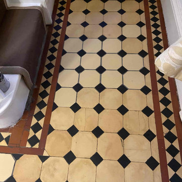
Detailed below is the restoration of a Victorian tiled hallway floor that we started back in June in Preston. Although we started in June there was so much damage to the subfloor and the tiles it took some time to complete, additionally, the client did not like the colour samples of the replacement tiles we had brought along and so decided to source their own which took some time.
Three months later with replacement tiles now sourced we were given the go ahead to start the restoration. The first day’s focus was cleaning the original floor using very coarse 100-grit and 200-grit Diamond pads fitted to a rotary buffer machine and applied to the floor using a strong dilution of Tile Doctor Remove and Go to add extra cleaning power. Tile edges were given special attention using a flex machine fitted with small diamond grit pads.
The floor was rinsed with water to remove the soil generated and this was followed up with an acid rinse using a 1:3 dilution of Tile Doctor Grout Clean Up. This last step in the cleaning process is especially recommend for old floors like this which don’t have a damp proof membrane and can suffer from efflorescence issues.
The next stage focused on repairing the floor and started by carefully knocking out all the broken and chipped tiles. We had previously estimated over 30 tiles needed replacing and so the client had bought two boxes, meaning I had plenty of spares to work with.
Before tiling however, the subfloor had suffered over the years and needed attention first. To deal with this the damaged areas were raked out, cleaned up and then back filled with rapid setting self-levelling screed from Mapie adhesives. Once the sub-base was fixed then we put the new tiles back in, they were not an exact match, about 5mm too short and lighter in tone, but the colour was pretty close.
Tiling an old Victorian floor like this can be a bit like dominoes as you move one out of place 2 decent ones come loose and then they also need refixing. Some of the tiles had hair line cracks in them and once they were loose, they just cracked in half. As such the 20 spare tiles that I thought were spare came into good use and I actually ended up using all of them. I could have done with a few more so it was decided to reset the last four broken tiles and grout them in. Luckily for me the client was very understanding about the nature of tile restoration and had accepted that there would be some imperfections and they were not expecting a new floor.
The Tiles were fixed down using Ultralite Rapid Flex (another product from Mapie) and then grouted using the same adhesive (not a grout, as they did not have grout back in the day, just cement and screed).
The floor was left this to cure overnight, and we came back the next day to finish the clean using a 200-grit diamond pad fitted to a buffing machine and lubricated with water, then one last acid rinse to get the tiles as clean as possible and remove any lingering grout haze. This last clean helps to blend the new tiles in with the original.
Before applying a protective sealer, the floor was left to dry for a couple of days, the tiles need to be thoroughly dry before sealing or you can end up with a patchy appearance.
For this floor with no damp proof membrane, it was important to use a fully breathable sealer that will allow moisture to rise through the tile and evaporate at the surface, so Tile Doctor Colour Grow was chosen. This is a good choice for old floors like this as its fully breathable, head wearing, and it contains a colour enhancer that improves the overall appearance of the tile.
Three coats of Tile Doctor Colour Grow which is a fully breathable, colour enhancing sealer hat works by soaking into the pores of the tile protecting it from within. It has a matt finish, and it works really well with all clay tiles and is ideal for these types of floors.
You can probably spot the lighter coloured tiles in the after photos on this page, however it’s a very subtle difference and I think they have blended in quite well with the original. Certainly, my client was very pleased with the newly restored floor, its completely transformed from when we first visited the client, and the floor has now gained character and history. For aftercare we recommend Tile Doctor Neutral Cleaner, its an effective pH neutral product that is compatible with the new sealer.
Russell Taylor
Lancashire Tile Doctor
 Jarrett Design
This bathroom needed help as it was tired, dated and cramped! The vanity area was open to the master bedroom and sandwiched between a closet and existing bathroom wall. Behind the bathroom wall, was a second sink, a small walk-in shower and the commode. A poorly placed linen closet ate into the area and there was a soffit over the shower adding to the cramped feeling. The ceiling was cluttered with old-school heating lamps, flush-mount fixtures and ventilation grills. The “movie star” lighting meant to add some glamour only made the bathroom feel dated and sad. Our clients wanted to bring this bathroom to life.
We built a wall and added a door between the bedroom and bathroom to ensure more privacy and define the space. In addition, we removed the wall separating the actual bathroom and vanity area to make the master bathroom larger. The linen closet was also taken out so the shower could be expanded significantly. Our homeowner had recently suffered a knee injury so they were looking for future solutions that would work for them as they continued to age. We made the shower large enough to include a bench and installed a handheld sprayer located near the seat. Shower walls were reinforced so that when the day came that a grab bar was needed, they would be ready.
We added a tall cabinet that featured two, deep rollouts and interior shelving to keep linens and bathroom supplies organized. Beneath the sinks, we included rollout drawers so items would not get lost in those dark areas under the plumbing. Everything that had been cluttering the ceiling was removed including the shower soffit and heat lamp. With those gone, we added evenly-spaced, recessed ceiling lights to help brighten the space making it safer and more practical.
We chose a custom blue-green paint for the cabinets which was understated enough to provide a sense of serenity while still offering a splash of color to help liven up the room. Walnut-framed mirrors added a touch of warmth and the patterned floor tile made the whole room fun! An old bathroom came alive!

 Care Free Homes, Inc.
This beautiful colonial in Marion, Massachusetts is even more gorgeous with its new GAF Timberline HD roof!
There is more to a roof than shingles – in fact there are several components to a professionally installed GAF Lifetime Roofing System. Here is the anatomy of our Marion homeowner’s roof:
GAF Timberline HD Shingles Marion, MAGAF Timberline HD Roof Shingles: A beautiful architectural shingle at an affordable price! This is our most popular roof shingle here at Care Free Homes! Our Marion customer selected the classic color, Charcoal. This high performance shingle features a 130 mph wind rating and highest possible fire rating.
Underlayment: A felt/paper product that is installed over the entire roof deck, underlayment provides an additional layer of protection between the roof deck and the roof shingles.
Ice Dam and Water Shield: After a brutal winter and unprecedented snow fall, many New England homes suffered damage from ice dams. Ice Dam and Water Shield provides added protection for eves, rakes, valleys as well as flashed areas around vent pipes, chimneys, dormers, and skylights. Whether it’s a winter wonderland or a hurricane, this homeowner will not have to worry about ice dams or driving rain.
GAF Timberline HD, Marion, MA Dormers
Premium Aluminum Drip Edge: Installed along the rakes, drip edge serves several purposes. It improves the efficiency of water shedding, prevents leaking from a wind-driven rain as well as movement between the deck and fascia boards. Drip edge also keeps pesky insects from infiltrating the space between the roof deck and the fascia boards. With a choice of three colors, white, brown and gray, it provides a finished look for a roof.
GAF Pro-Start Eave/Rake Starter Strip: Every story has a beginning and every roof should have a starter strip. Here in New England we’ve got to have our roof be tougher than mother nature. To prevent shingle blow off, an ultra-adhered starter strip properly secures shingles in place during a storm. In contrast, the amateur roofer will often use cut-up shingles as a starter course. This weakened “starter course” lowers the wind resistance of a roof and makes it more susceptible to both wind and water damage. With straighter edges, Dura-Grip adhesive, and outstanding warranties – starter strip will provide beauty, performance and peace of mind.
GAF Cobra Ridge Vent: Ridge vents provide necessary airflow to remove excess heat and moisture in an attic. It inhibits the growth of mold and protects the health of the homeowners as well as their stored possessions. A properly vented attic will also protect homes in harsh winter climates from ice damming.
Why wait? Contact us today and make your house a Care Free home!
 Tile Doctor Ltd
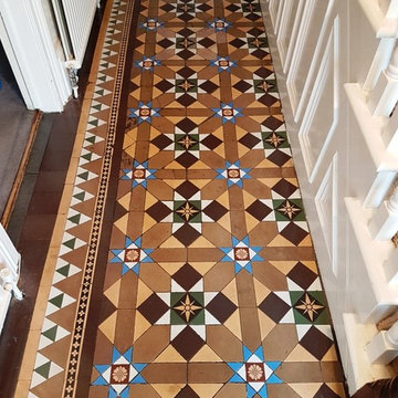
Shipley is a town in West Yorkshire that was heavily shaped by the Industrial Revolution and the Victorian period. It became particularly well-known for its textile industry and some of the original mills in which textiles were manufactured still survive in the town today. Being in West Yorkshire, Shipley is also part of what is commonly known as ‘Brontë country’ – once home to the famous Brontë sisters.
Many Victorian era properties still survive in the area too and all too often the original Victorian tiled floors contained within are not well maintained. I recently visited a customer in Shipley who had a Victorian tiled hallway that was in need of a deep clean and seal. What’s more, the customer told me that there were around 20 loose tiles in the hallway that would need to be reinstalled.
On the first day, I started by refitting the 20 loose tiles in the hallway. The problem however was a lot worse than originally thought and, in the end, I had to take up 108 tiles, so I could rebuild the base of the floor, and then relay them. This process took up most of the day but at least the adhesive and grout would be set in time for cleaning the next day.
On day two I focused on deep cleaning the tiles and removing any remaining sealer by applying a strong dilution of Tile Doctor Pro-Clean. Pro-Clean is a strong alkaline heavy-duty tile and grout cleaner that serves the purpose of both cleaning the stone and when used in a strong dilution will strip off sealers.
I applied the Pro Clean liberally across the length of the hallway and left it to soak into the tiles for about twenty minutes. This allows the product time to breakdown the sealer and dirt before being scrubbed in with a black scrubbing pad.
Special attention had to be paid to parts of the floor which had suffered paint splashes from previous decoration. I was also surprised to find that there were even some chewing gum stains marking the tiles. These were removed using the combination of a steam cleaner, more Pro-Clean and the careful use of a handheld scraper.
The floor was then given a thorough rinse with fresh water and then dried as much as possible with a wet vacuum. It was then also left to dry off overnight.
Upon returning to the property the next day I checked for any moisture issues with a damp tester. Thankfully, the floor proved dry and I could proceed with sealing the tiles which was done using four coats of Tile Doctor Seal and Go that leaves a deep satin finish that the customer had requested.
Nigel Stoker
North West Yorkshire Tile Doctor
 Tile Doctor Ltd
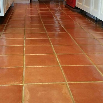
Here’s an interesting job I completed recently in the town of Lymington which is a lovely costal town within the New Forest and on the west side of the Solent. This Terracotta tiled floor was installed in the kitchen and was suffering from an efflorescence issue due to an ongoing leak which resulted in the salts in the water becoming deposited on the surface of the tiles as the water evaporated leaving a white bloom on the surface.
This process is more commonly known as efflorescence and is particularly common in old properties which have no damp proof membrane under the floor and white staining by the cupboards is especially visible in the below photograph.
My client was eager to have the problem fixed, and so enlisted Tile Doctor to get the job done.
To remove the efflorescence, the Terracotta tiled floor was acid washed using a mild dilution of Tile Doctor Grout Clean-Up which is primarily sold to remove grout smears but is equally effective at removing mineral deposits such as the white salts left behind by efflorescence.
The solution was scrubbed into the tiles using a stiff scrubbing brush and was successful at removing the white staining. Naturally it’s not advised to leave acid too long on any surface so the floor was treated in sections and then rinsed off with water and the residue removed using a wet-vacuum.
Following this, the floor was power-scrubbed in combination with a diluted solution of Tile Doctor Pro-Clean. Pro-Clean is a versatile cleaner that also contains stripping properties, allowing it to break down and remove old sealers, it also does a nice job getting the grout clean.
With the efflorescence treated and the floor now clean I was now happy with the condition of the tiles and give them a final rinse under pressure to ensure the floor was neutralised and any trace of products removed.
The Terracotta tiled floor was then left to dry overnight and I came back to seal the floor the next day. To seal the tiles I used three coats of Tile Doctor Seal & Go Extra, which provides a robust surface seal, and is recommended for internal floors with the damp issues.
Hopefully this quick report has offered some useful advice on how to treat efflorescence which is quite a common problem; naturally if you have further questions Tile Doctor does offer a free advice service so do get in touch.
Charles Okwechime
Hampshire Tile Doctor
 Tile Doctor Ltd
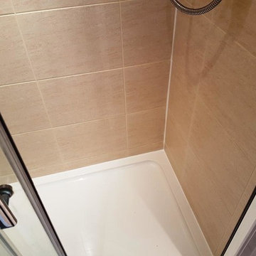
This is a great example of the difference we can make to a Shower Cubicle which suffer from a build up of soap scum, mould and staining from the dyes in shampoos and soaps etc.
This particular cubicle was installed at a property in the city of Edinburgh. The walls were Ceramic tiles which are ideal for shower areas as the glaze makes them completely water proof. However with grout being cementitious it does attract dirt and this shower was no different.
Cleaning Ceramic Tiled Shower Cubicle
The first step was to remove the wire accessory holder and then soak all the tile and grout in a strong solution of Tile Doctor Pro-Clean. I find decanting into a spray bottle works best as it mixes it with air which makes it easier to stick to the wall.
With the Pro-Clean in place it was then hand scrubbed to get the tile and especially the grout clean of all the mould and other stains. The shower walls were rinsed down and the process repeated where necessary.
Grout Colouring Shower Wall Tiles
With the tiles and grout now clean we could see that the grout was still discoloured in some areas where it had been badly stained. One option at this point would be rake out the grout and replace with new however overtime it would only discolour again, so in agreement with the customer we applied a grout colourant in a Limestone colour to better match the tile.
The Grout Colourant would ensure all the grout had a consistent appearance while also adding an impenetrable barrier that will keep its appearance for a long time. It takes a little time to do but is easily applied with a small brush and then you wipe off any excess that gets onto the tile.
The next step was to strip out the mastic silicone sealant strip from around the base of the shower cubicle and replace with new. I used high quality silicone sealant that left nice lines and fresh look, don’t use cheap sealant as it will soon discolour and some have been known to shrink.
Deep cleaning and re-colouring the grout made a huge difference; the shower cubicle has been transformed and now looks like a new installation.
Thomas Wilson
Edinburgh Tile Doctor
 Tile Doctor Ltd
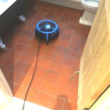
This is a job I recently completed in the small town of Braunstone, which lies just outside the city boundaries of Leicester, Leicestershire. My client wanted a restorative cleaning and sealing service for their very old Quarry tiled bathroom floor, which dates back to the Edwardian period. The floor was suffering from paint and adhesive staining, and was now in dire need of a thorough clean more generally along with a fresh seal to protect it from further damage.
I treated the floor in the first instance Tile Doctor Remove & Go which is a powerful stripper that breaks down old sealers remaining on the floor, as well as inherent paint and adhesive contamination. Remove & Go also contains cleaning properties which allows it to draw out ingrained dirt from the stone, lifting it to the surface. The product was applied to the floor and allowed to dwell for approximately thirty minutes prior to agitation with a hand-held rotary polisher fitted with a small black stripping pad.
The resulting slurry was promptly removed using a wet vacuum machine and our specialist Tile Doctor Acid Gel was then applied to the floor. Acid Gel is a blend of phosphoric and hydrochloric acids in gel form, and is specially formulated to treat grout haze and efflorescence on both wall and floor tiles.
Readers should be aware that this product is not suitable for use on acid-sensitive stone tiles such as Marble, Limestone and Travertine as it can potentially cause severe etching. In this case Acid Gel was left to dwell for ten minutes prior to agitation. This was effective in removing the white efflorescence salt staining that was present in several concentrated areas. Once again, the resulting slurry was vacuumed away, and the entire floor was rinsed with clean water.
The floor was left to dry for roughly twenty four hours before I returned to seal the floor. My choice of sealer in this case was Tile Doctor Colour Grow, a colour enhancing, impregnating sealer. The sealer will help to protect the tiles from soil ingress, and both water and oil based spills.
As you can see from the ‘Before’ and ‘After’ photographs, a marked difference was made to the appearance of this Quarry tiled floor. A professional and carefully thought out approach was taken to tackling the innate problems, particularly relating to efflorescence and paint and adhesive staining, and my client was extremely pleased with the results.
Kay Sylvester
Leicestershire Tile Doctor


 Tile Doctor Ltd
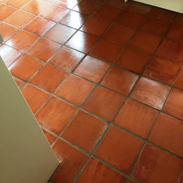
Newly built properties are not without their problems and often take a while to resolve all the snagging which occasionally extends to resolving problems with newly laid tiled floors. At this new property in the village of Malvern, and overlooked by the Malvern hills, the builders had left the Terracotta tiled kitchen floor covered in grout smears (also known as Grout Haze) following installation. They had also neglected to seal the tiles, which was actually quite fortunate in this case as they would have sealed in the grout haze, making it more difficult to remove.
Naturally, the property owner wanted the problem to be resolved as soon as possible, and for me to make the tiles easy to keep clean in future, which can be achieved by sealing the tile.
Before starting work, I made sure to fully protect any exposed woodwork with a plastic sheet covering to protect them from potential damage. I then proceeded to give the floor a thorough clean, using Tile Doctor Remove and Go to clean the floor and eradicate some stains that had been left behind as a result of the building work.
Next, I paid special attention to the grout, where the very visible problem of grout haze had arisen. To neutralise these smears I used Tile Doctor Grout Clean Up, a concentrated phosphoric acid cleaner that can also remove alkaline mineral deposits and efflorescence. Grout Clean Up is only to be used on acid resistant stone, as sensitive stone can suffer from irreparable etching if it comes into contact with the product.
Once completely clean and free of grout smears the floor was thoroughly rinsed with water to remove any trace of product and then dried as much as possible with a wet vacuum, afterwards an air mover was installed to speed up the drying process.
Later that afternoon the floor was dry and I was able to apply a sealer. To do this I opted to use several coats of Tile Doctor Seal and Go Extra, a topical, fully breathable sealer that works really well on Terracotta.
The sealer builds up a layer of protection on the surface of the tiles, protecting against ingrained dirt and stains. Seal and Go Extra also provides a high quality sheen finish which really did well to enhance the look of the Terracotta.
The property owner was exceptionally pleased with the results, and to have this problem dealt with quickly and efficiently, additionally the sealer will ensure the Kitchen floor is easy to keep clean in the future.
 The Brooklyn Studio
This residence was a complete gut renovation of a 4-story row house in Park Slope, and included a new rear extension and penthouse addition. The owners wished to create a warm, family home using a modern language that would act as a clean canvas to feature rich textiles and items from their world travels. As with most Brooklyn row houses, the existing house suffered from a lack of natural light and connection to exterior spaces, an issue that Principal Brendan Coburn is acutely aware of from his experience re-imagining historic structures in the New York area. The resulting architecture is designed around moments featuring natural light and views to the exterior, of both the private garden and the sky, throughout the house, and a stripped-down language of detailing and finishes allows for the concept of the modern-natural to shine.
Upon entering the home, the kitchen and dining space draw you in with views beyond through the large glazed opening at the rear of the house. An extension was built to allow for a large sunken living room that provides a family gathering space connected to the kitchen and dining room, but remains distinctly separate, with a strong visual connection to the rear garden. The open sculptural stair tower was designed to function like that of a traditional row house stair, but with a smaller footprint. By extending it up past the original roof level into the new penthouse, the stair becomes an atmospheric shaft for the spaces surrounding the core. All types of weather – sunshine, rain, lightning, can be sensed throughout the home through this unifying vertical environment. The stair space also strives to foster family communication, making open living spaces visible between floors. At the upper-most level, a free-form bench sits suspended over the stair, just by the new roof deck, which provides at-ease entertaining. Oak was used throughout the home as a unifying material element. As one travels upwards within the house, the oak finishes are bleached to further degrees as a nod to how light enters the home.
The owners worked with CWB to add their own personality to the project. The meter of a white oak and blackened steel stair screen was designed by the family to read “I love you” in Morse Code, and tile was selected throughout to reference places that hold special significance to the family. To support the owners’ comfort, the architectural design engages passive house technologies to reduce energy use, while increasing air quality within the home – a strategy which aims to respect the environment while providing a refuge from the harsh elements of urban living.
This project was published by Wendy Goodman as her Space of the Week, part of New York Magazine’s Design Hunting on The Cut.
Photography by Kevin Kunstadt


44