
Search results for "Swapping" in Home Design Ideas


 Bolen Designs
We love, love, love this rustic glam home office - music room! The client decided to combine her music room with her office, swapping the location with her previous dining room. The combination of the rustic wood desk with acrylic legs, white bookcase, black lacquer piano, zebra rug and crystal chandelier completely fit the bill. In the dining room, we combined a rustic wood wall and table with comfy cream parsons chairs illuminated with crystal sconces and a beautiful vintage-look chandelier. New curved wainscoting accents the stairwell and 18-foot curtains highlight the dramatic entry with its metallic accented ceiling.
Find the right local pro for your project

 Mackenzie Collier Interiors
James Stewart
Living room - small modern open concept porcelain tile living room idea in Phoenix with a wall-mounted tv and white walls
Living room - small modern open concept porcelain tile living room idea in Phoenix with a wall-mounted tv and white walls

 Corinthian Fine Homes
Our homeowner had worked with us in the past and asked us to design and renovate their 1980’s style master bathroom and closet into a modern oasis with a more functional layout. The original layout was chopped up and an inefficient use of space. Keeping the windows where they were, we simply swapped the vanity and the tub, and created an enclosed stool room. The shower was redesigned utilizing a gorgeous tile accent wall which was also utilized on the tub wall of the bathroom. A beautiful free-standing tub with modern tub filler were used to modernize the space and added a stunning focal point in the room. Two custom tall medicine cabinets were built to match the vanity and the closet cabinets for additional storage in the space with glass doors. The closet space was designed to match the bathroom cabinetry and provide closed storage without feeling narrow or enclosed. The outcome is a striking modern master suite that is not only functional but captures our homeowners’ great style.
 Stone House Collective
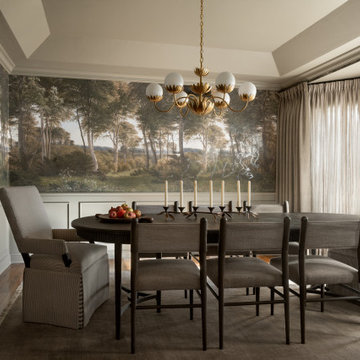
When the homeowners purchased this house, it had good bones — but needed a vision. Ready for a new chapter, they wanted their dining room transformed into a proper gathering space: formal enough for holidays, warm enough to linger. The direction was sophisticated, earthy, and organic with a slightly masculine edge, inspired by the wife's New England roots. We kept the architecture and gutted the built-ins, rebuilding with purpose — custom millwork featuring reeded cabinet faces, a mirrored backsplash, dark wood tones, an arched detail, and an exotic stone top strike a balance between feminine and masculine. A hidden pantry door disappears flush into the wall, and wainscoting was added to ground the space. Floor-to-ceiling window treatments fill the wall for balance, with the curtain track tucked inside the bay window for a clean, floating effect. An iconic mural-style print from Rebel Walls anchors the room as a large-scale work of art — a subtle wash of earthy tones that doubles as a focal point. Every outlet and switch was swapped for aged brass, tying every detail together into a room that feels like it was always there.

 Kitchen & Bath ReStylers
The original cabinet doors, drawer fronts, and moldings got tossed. We modified the oven cabinet to fit the new ovens, added a deeper and shorter refrigerator cabinet, and eliminated the old-school recessed sink front. New moldings were added and then the original cabinet boxes were painted in place. New hard, durable, factory-painted doors, and drawer fronts were installed. On the island, we added a couple of drawers, refaced in a complementary stained wood, and added posts to the backside for a touch of elegance. The old, non-functional, fluorescent under-cabinet lights were swapped-out for new LED tape-style versions. The existing tile floor was in great shape, so we just made sure it was protected during the project. It is amazing how the countertops, floor, backsplash, and wallpaper all got re-invigorated by association when we upgraded the look of the cabinetry. Photo's by Warren Smith, CMKBD
 Bolen Designs
We love, love, love this rustic glam home office - music room! The client decided to combine her music room with her office, swapping the location with her previous dining room. The combination of the rustic wood desk with acrylic legs, white bookcase, black lacquer piano, zebra rug and crystal chandelier completely fit the bill. In the dining room, we combined a rustic wood wall and table with comfy cream parsons chairs illuminated with crystal sconces and a beautiful vintage-look chandelier. New curved wainscoting accents the stairwell and 18-foot curtains highlight the dramatic entry with its metallic accented ceiling.

 DL Solutions inc.
In this Bucks County Dining Room, we designed, produced, and installed a dual layer of decorative ripplefold floor-to-ceiling draperies (manually operated on ceiling mounted, low-profile drapery tracks). These draperies offer a decorative focal point to the room, while also providing privacy when desired. Typically, the sheer layer of a drapery is spec'd to be installed closer to the glass, with the privacy layer in front of the sheer fabric (inside the room). Because the sheer layer of this application has such visual interest, we swapped the "normal" positioning of the layers to allow the privacy layer to act as a backdrop to the sheer layer, preventing the beauty of the sheer from being hidden behind the solid privacy fabric. In this photo, the sheer layer is fully stacked on the left and right walls beside the sliding doors, with the privacy layer of draperies in the closed position.

 Techo-Bloc
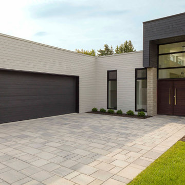
This driveway design is inspired by our Blu 80 Smooth paver. Smooth and sleek, Blu 80 mm Smooth is the perfect driveway paver to fit any modern home's exterior. Due to its 80 mm height, Blu is optimal for driveway use and paving any surface exposed to vehicular traffic.Now available in our HD2 technology for an ultra-tight poreless finish with anti-aging technology; this paver is offered in vibrant and neutral colors. If you're looking to add contrast around this subtle and clean paving stone, the Blu 6 × 13 mm can be added to create contrasting patterns or banding along the Blu 80 modular pattern. Blu 80's versatility doesn't end there. It can also be installed in a permeable application by swapping polymeric sand for stone and it benefits from all the de-icing salt resistance necessary for harsh winters. Check out our website to shop the look! https://www.techo-bloc.com/shop/pavers/blu-80-smooth/
 DL Solutions inc.
In this Bucks County Dining Room, we designed, produced, and installed a dual layer of decorative ripplefold floor-to-ceiling draperies (manually operated on ceiling mounted, low-profile drapery tracks). These draperies offer a decorative focal point to the room, while also providing privacy when desired. Typically, the sheer layer of a drapery is spec'd to be installed closer to the glass, with the privacy layer in front of the sheer fabric (inside the room). Because the sheer layer of this application has such visual interest, we swapped the "normal" positioning of the layers to allow the privacy layer to act as a backdrop to the sheer layer, preventing the beauty of the sheer from being hidden behind the solid privacy fabric. In this photo, the privacy layer is fully stacked on the left and right walls beside the sliding doors, with the sheer layer of draperies in the closed position.

 Lista & Vidmar - Storage & Workspace Systems
Richard's decision to go with Lista was made as methodically as his latest turned masterpiece. "I did some research, and Lista quickly moved to the top of the list, primarily because I was looking for flexibility in cabinet size, in drawer size to hold all my different size tools, and partitioning to keep them organized. I'm an engineer by training, and the high quality was obvious. I also liked the modular design, and have already swapped drawers between cabinets. I had my choice of color, and I think they came out looking really good."
Turns out he has a lot of great things to say about Lista support as well. "Dave Geller, my Lista distributor, was unbelievably helpful. He came over and spent several hours with me inventorying all my tools and designing the shop to have all the equipment I needed, where I needed it."
With Lista, Richard was able to make his favorite pastime even more enjoyable. "What I like about turning wood is that it's totally hands-on. You can feel the object take shape as you work it. And you see the results relatively quickly."

 Art and Cement Construction LLC
Photos By Dave Roe
Example of a mid-sized transitional l-shaped dark wood floor open concept kitchen design in DC Metro with an undermount sink, shaker cabinets, white cabinets, quartz countertops, beige backsplash, porcelain backsplash, stainless steel appliances and an island
Example of a mid-sized transitional l-shaped dark wood floor open concept kitchen design in DC Metro with an undermount sink, shaker cabinets, white cabinets, quartz countertops, beige backsplash, porcelain backsplash, stainless steel appliances and an island
 Corinthian Fine Homes
Our homeowner had worked with us in the past and asked us to design and renovate their 1980’s style master bathroom and closet into a modern oasis with a more functional layout. The original layout was chopped up and an inefficient use of space. Keeping the windows where they were, we simply swapped the vanity and the tub, and created an enclosed stool room. The shower was redesigned utilizing a gorgeous tile accent wall which was also utilized on the tub wall of the bathroom. A beautiful free-standing tub with modern tub filler were used to modernize the space and added a stunning focal point in the room. Two custom tall medicine cabinets were built to match the vanity and the closet cabinets for additional storage in the space with glass doors. The closet space was designed to match the bathroom cabinetry and provide closed storage without feeling narrow or enclosed. The outcome is a striking modern master suite that is not only functional but captures our homeowners’ great style.

 One Kings Lane
Inspired by the color-blocked wooden necklace, we kept pops of color in set zones in the kitchen.
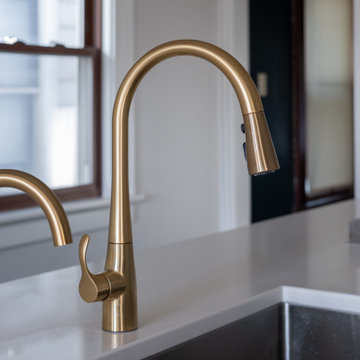
Brightening Up the Kitchen: Two growing children means the kitchen is in constant use. The goal was to give it an overarching style to better contain the daily chaos that every family-filled household has. This didn’t require major changes, just lots of little ones. A palette of blue, light gray, and glowing brass was created. Spotlight-like lighting was swapped out for modern black and brass fixtures, which diffuse light throughout the space, and all the hardware was changed to brass. The dark gray walls were lightened up a few shades, which made the tilework pop and brightened the entire space.
Photo by Manuel Rodriguez
 JJB Home Improvements, LLC
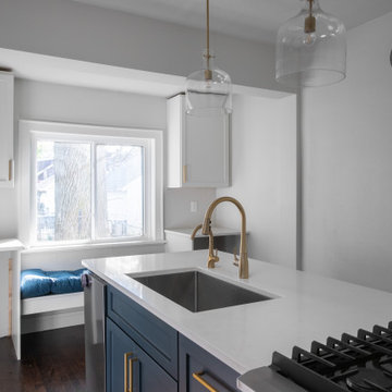
Somewhere in the northeast Shorewood neighborhood of Milwaukee near the University of Wisconsin-Milwaukee, a kitchen was ready for a fresh start. The owners wanted something clean, modern, and white—a space that would actually work with how they cook and live, not against it.
They weren't just swapping out cabinets and calling it done. This was a full transformation: tearing down walls, rewiring the electrical, rerouting plumbing, updating the HVAC. New insulation, fresh drywall, better lighting. The kind of work that happens behind the scenes but changes everything about how a room feels.
Then came the visible magic: crisp white cabinetry that maximized storage, countertops chosen for both beauty and durability, new flooring that tied it all together, and appliances that could keep up with real life. Every permit filed, every material selected with intention, every phase carefully managed.
The result? A kitchen that flows. A space where white isn't boring—it's a backdrop for life, meals, and the kind of everyday moments that make a house feel like home.

 Amazing Spaces
This project incorporated the main floor of the home. The existing kitchen was narrow and dated, and closed off from the rest of the common spaces. The client’s wish list included opening up the space to combine the dining room and kitchen, create a more functional entry foyer, and update the dark sunporch to be more inviting.
The concept resulted in swapping the kitchen and dining area, creating a perfect flow from the entry through to the sunporch.
The new kitchen features blue-gray cabinets with polished white countertops and a white island with a dramatic Cielo Quartzite countertop. The soffit above features stained shiplap, helping to create the boundary of the kitchen. Custom window treatments and rattan chairs make the space feel casual and sophisticated.
 JJB Home Improvements, LLC
Somewhere in the northeast Shorewood neighborhood of Milwaukee near the University of Wisconsin-Milwaukee, a kitchen was ready for a fresh start. The owners wanted something clean, modern, and white—a space that would actually work with how they cook and live, not against it.
They weren't just swapping out cabinets and calling it done. This was a full transformation: tearing down walls, rewiring the electrical, rerouting plumbing, updating the HVAC. New insulation, fresh drywall, better lighting. The kind of work that happens behind the scenes but changes everything about how a room feels.
Then came the visible magic: crisp white cabinetry that maximized storage, countertops chosen for both beauty and durability, new flooring that tied it all together, and appliances that could keep up with real life. Every permit filed, every material selected with intention, every phase carefully managed.
The result? A kitchen that flows. A space where white isn't boring—it's a backdrop for life, meals, and the kind of everyday moments that make a house feel like home.
 JJB Home Improvements, LLC
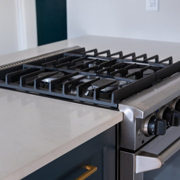
Somewhere in the northeast Shorewood neighborhood of Milwaukee near the University of Wisconsin-Milwaukee, a kitchen was ready for a fresh start. The owners wanted something clean, modern, and white—a space that would actually work with how they cook and live, not against it.
They weren't just swapping out cabinets and calling it done. This was a full transformation: tearing down walls, rewiring the electrical, rerouting plumbing, updating the HVAC. New insulation, fresh drywall, better lighting. The kind of work that happens behind the scenes but changes everything about how a room feels.
Then came the visible magic: crisp white cabinetry that maximized storage, countertops chosen for both beauty and durability, new flooring that tied it all together, and appliances that could keep up with real life. Every permit filed, every material selected with intention, every phase carefully managed.
The result? A kitchen that flows. A space where white isn't boring—it's a backdrop for life, meals, and the kind of everyday moments that make a house feel like home.
 Versa Style Design
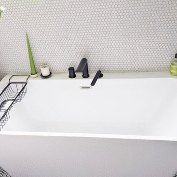
The clients wanted a larger, fun and eclectic bathroom with a separate tub and walk-in shower. We enlarged the bathroom by moving a wall in the adjoining bedroom closet and hallway linen closet. This added a few more feet to a very tight bathroom. We swapped out the alcove bath for a more spacious and elegant soaker tub with sleek black plumbing fixtures. A modern vanity and wall-mounted storage unit in white lacquer wood were included for a dynamic black and white palette, a perfect backdrop for hits of bright colour to create a bathroom full of character and whimsy.
150