
Search results for "Swapping" in Home Design Ideas
 Stone House Collective
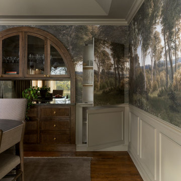
When the homeowners purchased this house, it had good bones — but needed a vision. Ready for a new chapter, they wanted their dining room transformed into a proper gathering space: formal enough for holidays, warm enough to linger. The direction was sophisticated, earthy, and organic with a slightly masculine edge, inspired by the wife's New England roots. We kept the architecture and gutted the built-ins, rebuilding with purpose — custom millwork featuring reeded cabinet faces, a mirrored backsplash, dark wood tones, an arched detail, and an exotic stone top strike a balance between feminine and masculine. A hidden pantry door disappears flush into the wall, and wainscoting was added to ground the space. Floor-to-ceiling window treatments fill the wall for balance, with the curtain track tucked inside the bay window for a clean, floating effect. An iconic mural-style print from Rebel Walls anchors the room as a large-scale work of art — a subtle wash of earthy tones that doubles as a focal point. Every outlet and switch was swapped for aged brass, tying every detail together into a room that feels like it was always there.
 JJB Home Improvements, LLC
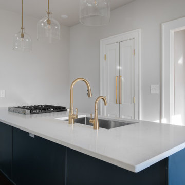
Somewhere in the northeast Shorewood neighborhood of Milwaukee near the University of Wisconsin-Milwaukee, a kitchen was ready for a fresh start. The owners wanted something clean, modern, and white—a space that would actually work with how they cook and live, not against it.
They weren't just swapping out cabinets and calling it done. This was a full transformation: tearing down walls, rewiring the electrical, rerouting plumbing, updating the HVAC. New insulation, fresh drywall, better lighting. The kind of work that happens behind the scenes but changes everything about how a room feels.
Then came the visible magic: crisp white cabinetry that maximized storage, countertops chosen for both beauty and durability, new flooring that tied it all together, and appliances that could keep up with real life. Every permit filed, every material selected with intention, every phase carefully managed.
The result? A kitchen that flows. A space where white isn't boring—it's a backdrop for life, meals, and the kind of everyday moments that make a house feel like home.
 Kitchen Solvers of Fort Wayne & Toledo
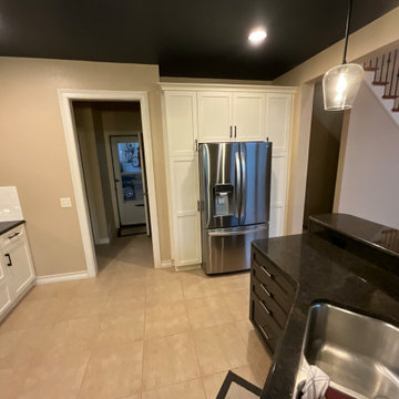
Our clients were ready to say goodbye to their dated stained cabinets and all the frustrations that came with them—hinges that weren’t soft-close, doors that wouldn’t stay aligned, and drawers and rollouts that just didn’t glide like they should. We transformed their space by refacing the cabinets with the Tribute door style from our Kitchen Solvers Showcase Collection. The perimeter cabinets were finished in a soft Eggshell, while the island got a rich Nightfall stain for a striking two-tone look. To fix the functionality issues, we swapped in new full-extension, undermount, soft-close slides so every drawer opens and closes like a dream. And even though the island stayed close to its original color, we gave it a full reface and upgraded the back with beadboard craftsman wainscoting for a fresh, custom touch. A smoother, brighter, beautifully updated kitchen—inside and out.
Find the right local pro for your project

 Interiors by Kate, LLC
Oftentimes you don't have to make big changes to see BIG results. When this client came to me, she needed help finishing off a space she had already started, but just got stuck. She had begun swapping out her more traditional decor for the contemporary glam style she loves, but needed a little help finishing it off. We kept the client's newly purchased velvet sofa and chair and finished the space off with a new rug, coffee table, side tables, art, pillows and decor.
I'm always excited to see what a little accessorizing can do, and sometimes the impact even surprises me! All decor and furniture items were purchased from Wayfair, Home Goods, and Target which goes to show, you don't need to spend on high end designer items to get stunning results. That's why I started Interiors by Kate, to make good design and beautiful spaces accessible to all!
 JJB Home Improvements, LLC
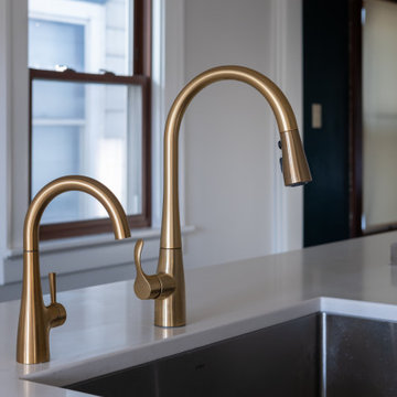
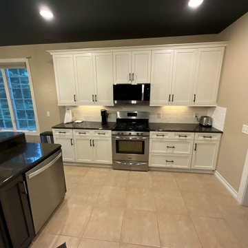
Somewhere in the northeast Shorewood neighborhood of Milwaukee near the University of Wisconsin-Milwaukee, a kitchen was ready for a fresh start. The owners wanted something clean, modern, and white—a space that would actually work with how they cook and live, not against it.
They weren't just swapping out cabinets and calling it done. This was a full transformation: tearing down walls, rewiring the electrical, rerouting plumbing, updating the HVAC. New insulation, fresh drywall, better lighting. The kind of work that happens behind the scenes but changes everything about how a room feels.
Then came the visible magic: crisp white cabinetry that maximized storage, countertops chosen for both beauty and durability, new flooring that tied it all together, and appliances that could keep up with real life. Every permit filed, every material selected with intention, every phase carefully managed.
The result? A kitchen that flows. A space where white isn't boring—it's a backdrop for life, meals, and the kind of everyday moments that make a house feel like home.
 Kitchen Solvers of Fort Wayne & Toledo
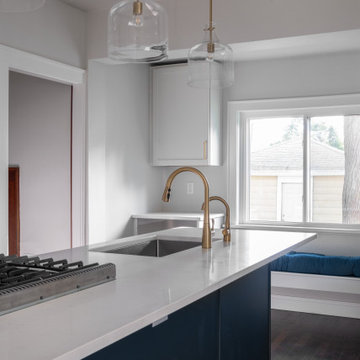
Our clients were ready to say goodbye to their dated stained cabinets and all the frustrations that came with them—hinges that weren’t soft-close, doors that wouldn’t stay aligned, and drawers and rollouts that just didn’t glide like they should. We transformed their space by refacing the cabinets with the Tribute door style from our Kitchen Solvers Showcase Collection. The perimeter cabinets were finished in a soft Eggshell, while the island got a rich Nightfall stain for a striking two-tone look. To fix the functionality issues, we swapped in new full-extension, undermount, soft-close slides so every drawer opens and closes like a dream. And even though the island stayed close to its original color, we gave it a full reface and upgraded the back with beadboard craftsman wainscoting for a fresh, custom touch. A smoother, brighter, beautifully updated kitchen—inside and out.
 JJB Home Improvements, LLC
Somewhere in the northeast Shorewood neighborhood of Milwaukee near the University of Wisconsin-Milwaukee, a kitchen was ready for a fresh start. The owners wanted something clean, modern, and white—a space that would actually work with how they cook and live, not against it.
They weren't just swapping out cabinets and calling it done. This was a full transformation: tearing down walls, rewiring the electrical, rerouting plumbing, updating the HVAC. New insulation, fresh drywall, better lighting. The kind of work that happens behind the scenes but changes everything about how a room feels.
Then came the visible magic: crisp white cabinetry that maximized storage, countertops chosen for both beauty and durability, new flooring that tied it all together, and appliances that could keep up with real life. Every permit filed, every material selected with intention, every phase carefully managed.
The result? A kitchen that flows. A space where white isn't boring—it's a backdrop for life, meals, and the kind of everyday moments that make a house feel like home.

 Corinthian Fine Homes
Our homeowner had worked with us in the past and asked us to design and renovate their 1980’s style master bathroom and closet into a modern oasis with a more functional layout. The original layout was chopped up and an inefficient use of space. Keeping the windows where they were, we simply swapped the vanity and the tub, and created an enclosed stool room. The shower was redesigned utilizing a gorgeous tile accent wall which was also utilized on the tub wall of the bathroom. A beautiful free-standing tub with modern tub filler were used to modernize the space and added a stunning focal point in the room. Two custom tall medicine cabinets were built to match the vanity and the closet cabinets for additional storage in the space with glass doors. The closet space was designed to match the bathroom cabinetry and provide closed storage without feeling narrow or enclosed. The outcome is a striking modern master suite that is not only functional but captures our homeowners’ great style.
 Laurel Wreath Homes
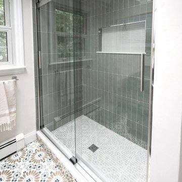
These clients saw a clogged shower as an opportunity for a full primary bath re-design. We were thrilled to collaborate on their vision of a sage green color scheme and their need for more storage while still maintaining the original floor plan. Extending a ¾ wall in the shower meant we could run the vertically stacked sage green tile all the way to the ceiling. Chrome shower fixtures were taken out and pipes relocated; an oversize niche was added in tile to match the shower floor. Swapping out the shower door for a modern sliding one saved on space and allows one to focus on the whimsical new acoustic tile we installed on the floor; our clients loved this tile so much they used it again in the kids bathroom! Painting the existing vanity a darker green and replacing the hardware in a subdued brushed nickel balanced out the playful tile. Additional wall storage was added in the form of a glass front arched cabinet, and pill topped robe hooks complete the overall look of this primary en suite bath.

 Bolen Designs
We love, love, love this rustic glam home office - music room! The client decided to combine her music room with her office, swapping the location with her previous dining room. The combination of the rustic wood desk with acrylic legs, white bookcase, black lacquer piano, zebra rug and crystal chandelier completely fit the bill. In the dining room, we combined a rustic wood wall and table with comfy cream parsons chairs illuminated with crystal sconces and a beautiful vintage-look chandelier. New curved wainscoting accents the stairwell and 18-foot curtains highlight the dramatic entry with its metallic accented ceiling.

 Jeff King & Company
Architect: Stephen Verner and Aleck Wilson Architects / Designer: Caitlin Jones Design / Photography: Paul Dyer
Family room - large transitional open concept dark wood floor family room idea in San Francisco with white walls, a standard fireplace, a tile fireplace and a wall-mounted tv
Family room - large transitional open concept dark wood floor family room idea in San Francisco with white walls, a standard fireplace, a tile fireplace and a wall-mounted tv
 Corinthian Fine Homes
Our homeowner had worked with us in the past and asked us to design and renovate their 1980’s style master bathroom and closet into a modern oasis with a more functional layout. The original layout was chopped up and an inefficient use of space. Keeping the windows where they were, we simply swapped the vanity and the tub, and created an enclosed stool room. The shower was redesigned utilizing a gorgeous tile accent wall which was also utilized on the tub wall of the bathroom. A beautiful free-standing tub with modern tub filler were used to modernize the space and added a stunning focal point in the room. Two custom tall medicine cabinets were built to match the vanity and the closet cabinets for additional storage in the space with glass doors. The closet space was designed to match the bathroom cabinetry and provide closed storage without feeling narrow or enclosed. The outcome is a striking modern master suite that is not only functional but captures our homeowners’ great style

 BANDD DESIGN
This was a big girl room makeover I did for my daughter. She has always been a party animal at bedtime and that includes her climbing out of her crib around 13 months! She’s almost 5 now and once she started showing that she was a bit more responsible at bedtime, we upgraded her space. I opted for a queen size bed with a bed frame that doesn't require a box spring, which opens up for storage underneath. I also wanted the space to speak to her, so I left a small area that was for playing and reading. This space will be good as she gets older and wants to spend time in her room more often. Thinking about how she would use the space for years to come was a big deal. I made sure the larger pieces were transitional and only small items like bedding or lighting would need to be swapped out in the future.
Designed by Sara Barney’s BANDD DESIGN, who are based in Austin, Texas and serving throughout Round Rock, Lake Travis, West Lake Hills, and Tarrytown.
For more about BANDD DESIGN, click here: https://bandddesign.com/
To learn more about this project, click here: https://bandddesign.com/big-girl-room-makeover/
 Synergy Design & Construction
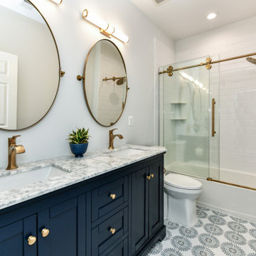
This beautiful navy blue vanity paired with a fun, flower-patterned floor tile were the jumping off point for the new finishes in this girl’s bath. The shower curtain is swapped for a more luxurious glass enclosure, gold fixtures bring more sparkle to the space, and round mirrors with light bars above make a bold statement.
 Interiors by Kate, LLC
Oftentimes you don't have to make big changes to see BIG results. When this client came to me, she needed help finishing off a space she had already started, but just got stuck. She had begun swapping out her more traditional decor for the contemporary glam style she loves, but needed a little help finishing it off. We kept the client's newly purchased velvet sofa and chair and finished the space off with a new rug, coffee table, side tables, art, pillows and decor.
I'm always excited to see what a little accessorizing can do, and sometimes the impact even surprises me! All decor and furniture items were purchased from Wayfair, Home Goods, and Target which goes to show, you don't need to spend on high end designer items to get stunning results. That's why I started Interiors by Kate, to make good design and beautiful spaces accessible to all!
 JJB Home Improvements, LLC
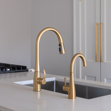
Somewhere in the northeast Shorewood neighborhood of Milwaukee near the University of Wisconsin-Milwaukee, a kitchen was ready for a fresh start. The owners wanted something clean, modern, and white—a space that would actually work with how they cook and live, not against it.
They weren't just swapping out cabinets and calling it done. This was a full transformation: tearing down walls, rewiring the electrical, rerouting plumbing, updating the HVAC. New insulation, fresh drywall, better lighting. The kind of work that happens behind the scenes but changes everything about how a room feels.
Then came the visible magic: crisp white cabinetry that maximized storage, countertops chosen for both beauty and durability, new flooring that tied it all together, and appliances that could keep up with real life. Every permit filed, every material selected with intention, every phase carefully managed.
The result? A kitchen that flows. A space where white isn't boring—it's a backdrop for life, meals, and the kind of everyday moments that make a house feel like home.

 Interior Concepts Design House
Corner bathtub - large cottage master white tile and mosaic tile marble floor corner bathtub idea in Salt Lake City with a vessel sink, recessed-panel cabinets, green cabinets, marble countertops, a two-piece toilet and white walls


 Corinthian Fine Homes
Our homeowner had worked with us in the past and asked us to design and renovate their 1980’s style master bathroom and closet into a modern oasis with a more functional layout. The original layout was chopped up and an inefficient use of space. Keeping the windows where they were, we simply swapped the vanity and the tub, and created an enclosed stool room. The shower was redesigned utilizing a gorgeous tile accent wall which was also utilized on the tub wall of the bathroom. A beautiful free-standing tub with modern tub filler were used to modernize the space and added a stunning focal point in the room. Two custom tall medicine cabinets were built to match the vanity and the closet cabinets for additional storage in the space with glass doors. The closet space was designed to match the bathroom cabinetry and provide closed storage without feeling narrow or enclosed. The outcome is a striking modern master suite that is not only functional but captures our homeowners’ great style.
 Techo-Bloc
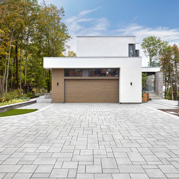
This driveway design is inspired by our Blu 80 Smooth paver. Smooth and sleek, Blu 80 mm Smooth is the perfect driveway paver to fit any modern home's exterior. Due to its 80 mm height, Blu is optimal for driveway use and paving any surface exposed to vehicular traffic.Now available in our HD2 technology for an ultra-tight poreless finish with anti-aging technology; this paver is offered in vibrant and neutral colors. If you're looking to add contrast around this subtle and clean paving stone, the Blu 6 × 13 mm can be added to create contrasting patterns or banding along the Blu 80 modular pattern. Blu 80's versatility doesn't end there. It can also be installed in a permeable application by swapping polymeric sand for stone and it benefits from all the de-icing salt resistance necessary for harsh winters. Check out our website to shop the look! https://www.techo-bloc.com/shop/pavers/blu-80-smooth/
153