
Search results for "Tall most" in Home Design Ideas

 Ward Jewell Architect AIA
These clients came to my office looking for an architect who could design their "empty nest" home that would be the focus of their soon to be extended family. A place where the kids and grand kids would want to hang out: with a pool, open family room/ kitchen, garden; but also one-story so there wouldn't be any unnecessary stairs to climb. They wanted the design to feel like "old Pasadena" with the coziness and attention to detail that the era embraced. My sensibilities led me to recall the wonderful classic mansions of San Marino, so I designed a manor house clad in trim Bluestone with a steep French slate roof and clean white entry, eave and dormer moldings that would blend organically with the future hardscape plan and thoughtfully landscaped grounds.
The site was a deep, flat lot that had been half of the old Joan Crawford estate; the part that had an abandoned swimming pool and small cabana. I envisioned a pavilion filled with natural light set in a beautifully planted park with garden views from all sides. Having a one-story house allowed for tall and interesting shaped ceilings that carved into the sheer angles of the roof. The most private area of the house would be the central loggia with skylights ensconced in a deep woodwork lattice grid and would be reminiscent of the outdoor “Salas” found in early Californian homes. The family would soon gather there and enjoy warm afternoons and the wonderfully cool evening hours together.
Working with interior designer Jeffrey Hitchcock, we designed an open family room/kitchen with high dark wood beamed ceilings, dormer windows for daylight, custom raised panel cabinetry, granite counters and a textured glass tile splash. Natural light and gentle breezes flow through the many French doors and windows located to accommodate not only the garden views, but the prevailing sun and wind as well. The graceful living room features a dramatic vaulted white painted wood ceiling and grand fireplace flanked by generous double hung French windows and elegant drapery. A deeply cased opening draws one into the wainscot paneled dining room that is highlighted by hand painted scenic wallpaper and a barrel vaulted ceiling. The walnut paneled library opens up to reveal the waterfall feature in the back garden. Equally picturesque and restful is the view from the rotunda in the master bedroom suite.
Architect: Ward Jewell Architect, AIA
Interior Design: Jeffrey Hitchcock Enterprises
Contractor: Synergy General Contractors, Inc.
Landscape Design: LZ Design Group, Inc.
Photography: Laura Hull

 Advance Design Studio, Ltd.
The major kitchen renovation of this old country farmhouse was a task of love, one that had been planned for many years by these Barrington seasoned homeowners. After interviewing no less than five companies, the homeowners chose the design team at Advance Design Studio to make the transformation they had long planned for.
“They had an understanding of the right design for the space almost from the instant they walked in the room”, says Sharon Scott of the design team of Nicole Ryan at Todd Jurs at Advance Design Studio. “They were the only designers who laid out ideas in the first meeting at the house that we really loved”, she says. “It was obvious that they understood the house, and understood us - and from then on the decision to hire them literally made itself”.
The original kitchen had a dividing “wall” of cabinetry…that made the rather large space seem very small, and cut off the kitchen from the eating area that has a beautiful garden view completely hidden from the main kitchen. Circulation was poor, leaving family members on top of one another when entertaining family and friends.
The new kitchen design nearly doubles the kitchen size within the original space; opening it up completely and enjoying an expansive island containing a new Kohler Whitehaven Smart Divide farm sink, a dishwasher, and pull out double trash receptacle. The great new gathering space accommodates four pull out stools beckoning grandchildren and friends alike. Removing the range from the island and relocating it to create a dramatic “feature” wall, completely out of the way of guests; it is now crowned with a beautiful completely customized wood hood designed to ventilate much more efficiently than the original island range containing a limited downdraft system.
The much more efficient use of the space after removing a pantry closet made way for a fully functional “tall wall” housing a double oven and refrigerator, out of the way of guests. Removing the restrictive cabinetry wall now allowed for an expansive floor to ceiling pantry cabinet with full extension pull out shelving, and an elegant display area complete with a beautiful furniture detailed buffet.
Fitting perfectly into the farmhouse charm of the old estate, Medallion Silver Lancaster cabinetry was chosen in a soft white Maple Divinity paint finish lining the perimeter. The stunning island hints to this old home’s past with Medallion Gold’s Maple Devonshire style graced with a Carriage Black Heirloom painted finish. The rubbed off black paint finish reveals the soft wood tones beneath, mimicking furniture you’d see in your grandmother’s home that has lovingly been polished for years to reveal a soft, subtly rubbed-off sheen.
Counter tops reverse contrast with perimeter tops of black “Raven” granite possessing a subtle honed finish, and a shift to Quartz Difinity Viareggio - resembling white Carrera marble on the island. A simple herringbone detail completes the decorative range wall, and subtle porcelain subway tiles grace the backsplash throughout.
The design is finished off with crisp Thermador and Bosch stainless steel appliances, and bright brushed cup pull and handle combination hardware. A pull down Kohler Bellaria faucet makes cleanup a breeze, and soft under-cabinet LED lighting throughout makes every work surface shine softly, and highlights the cabinetry display area with grace.
One special detail was created to make the dramatic ceiling transition to a vaulted area above the breakfast nook extra special. A tongue and groove solid wood ceiling was hung above, and a subtle greenish-grey distressed paint finish was hand developed on site by the talented crew, complementing the new kitchen with a completely unique surface that appears as if it’s been there for many, many years. It’s just one standout feature in the amazing new space that is sure to be in every conversation as newcomers enjoy the newest best hangout in this old home renewed!
After 30 years of renovating homes, this now content homeowner sips a cup of tea enjoying her new garden view, and reminisces projects of past – and lastly reports their experience with Advance Design Studio culminating with their amazing new kitchen to be the most enjoyable and satisfying home experience yet.
Designer: Nicole Ryan
Photographer: Joe Nowak

 Innovative Design Build
Five stars isn’t enough! Our project was to reconfigure and update the main floor of a house we recently purchased that was built in 1961. We wanted to maintain some of the unique feeling it originally had but bring it up-to-date and eliminate the closed-in rooms and downright weird layout that was the result of multiple, partial remodeling projects. We began with a long wishlist of changes which also required replacement of very antiquated plumbing, electrical wiring and HVAC. We even found a fireplace that had been walled in and needed major re-construction. Many other aspects and details on this incredible list we made included an all new kitchen layout, converting a bedroom into a master closet, adding new half-bath, completely rebuilding the master bath, and adding stone, tile and custom built cabinetry. Our design plans included many fixtures and details that we specified and required professional installation and careful handling. Innovative helped us make reasonable decisions. Their skilled staff took us through a design process that made sense. There were many questions and all were answered with sincere conversation and positive – innovation – on how we could achieve our goals. Innovative provided us with professional consultants, who listened and were courteous and creative, with solid knowledge and informative judgement. When they didn’t have an answer, they did the research. They developed a comprehensive project plan that exceeded our expectations. Every item on our long list was checked-off. All agreed on work was fulfilled and they completed all this in just under four months. Innovative took care of putting together a team of skilled professional specialists who were all dedicated to make everything right. Engineering, construction, supervision, and I cannot even begin to describe how much thanks we have for the demolition crew! Our multiple, detailed project designs from Raul and professional design advice from Mindy and the connections she recommended are all of the best quality. Diego Jr., Trevor and his team kept everything on track and neat and tidy every single day and Diego Sr., Mark, Ismael, Albert, Santiago and team are true craftsmen who follow-up and make the most minuscule woodworking details perfect. The cabinets by Tim and electrical work and installation of fixtures by Kemchan Harrilal-BB and Navindra Doolratram, and Augustine and his crew on tile and stone work – all perfection. Aisling and the office crew were always responsive to our calls and requests. And of course Clark and Eric who oversaw everything and gave us the best of the best! Apologies if we didn’t get everyone on this list – you’re all great! Thank you for your hard work and dedication. We can’t thank you enough Innovative Construction – we kind of want to do it again!
Dave Hallman & Matt DeGraffenreid
Find the right local pro for your project

 Bella Domicile
Dale Hall Photography, LLC
Dura Supreme Cabinetry
Example of an eclectic ceramic tile kitchen design in Milwaukee with a single-bowl sink, flat-panel cabinets, gray cabinets, granite countertops, white backsplash, subway tile backsplash, black appliances and a peninsula
Example of an eclectic ceramic tile kitchen design in Milwaukee with a single-bowl sink, flat-panel cabinets, gray cabinets, granite countertops, white backsplash, subway tile backsplash, black appliances and a peninsula

 Skill Construction & Design, LLC
It sparkles, it shimmers, it glitters, its glass. Glass mosaics are everywhere, from gorgeous kitchen backsplashes like this one, to color baths and reflective fireplaces. But as beautiful as this backsplash is, it’s only the beginning of this great kitchen.
Our kitchen begins with a little bump, a simple little peninsula with room for one. Upon the deep dark espresso cabinets sits the contrasting countertop. The super glossy white stone with subtle swirls reflects the colors of the glass mosaics. We gave the peninsula a little overhang and pulled up an enticing contemporary stool.
Although the kitchen space is fairly large, two walls contained openings to other spaces, while a third contained a large and sunny bay window. Rather than bottle neck our traffic flow, we chose to make the most of the walls we had. We started with a deep undermount stainless steel sink with a far-reaching faucet with pull out spray. Beside this, we placed our contemporary stainless steel dishwasher.
To keep the feeling open and airy we installed dark floating shelves, which really pop against our multicolored glass backsplash. We added lighting under the bottom shelf for extra sparkle, as well as the perfect task lighting.
We needed some wall cabinets, not just for storage but to compliment our microwave. Above the stainless steel stove our matching microwave serves multipurpose, from cooking, to venting, to task lighting the stove. When space counts, make the most of it. We nestled our stove beside the dishwasher, giving ourselves room for a landing zone at the end. The cooking area feels even more spacious set next to our large bay window.
To give us the greatest amount of storage, we added a floor to ceiling pantry. Although it is only 12″ deep, it’s 48″ wide. The clean “slab” style door create an uncluttered look that compliments the patterning of the floor. We used 6″ x 24″ porcelain wood look flooring. This flooring exploded on the market not too long ago, giving you the look of hardwoods, without fear of water, dents and scratches. The floor will never need to be refinished, no matter how much abuse it takes.
Look at all that storage. There’s even room on the bottom for that huge mixer we all seem to have. The pantry gives us plenty of room for all we need to store and it’s 12″ depth means it’s easy to find what you’re looking for. No more pulling out half your stored items just to find that product in the very back.
We round out this fabulous kitchen with a full-sized, bottom freezer, French door refrigerator. Espresso panels encase the sides while a deep and tall upper cabinet gives us room to store some more. By placing the refrigerator between the two entrances to the kitchen, family and friends can get a beverage without getting in the cook’s way.
To direct our lighting around the room and focus on specific areas, we used a long track of spot lights with a contemporary look. Between the window in the daytime, spots and undercabinet lights at night, the kitchen is always bright, even with the darker cabinetry.
http://www.rjkconstructioninc.com/
 Skill Construction & Design, LLC
It sparkles, it shimmers, it glitters, its glass. Glass mosaics are everywhere, from gorgeous kitchen backsplashes like this one, to color baths and reflective fireplaces. But as beautiful as this backsplash is, it’s only the beginning of this great kitchen.
Our kitchen begins with a little bump, a simple little peninsula with room for one. Upon the deep dark espresso cabinets sits the contrasting countertop. The super glossy white stone with subtle swirls reflects the colors of the glass mosaics. We gave the peninsula a little overhang and pulled up an enticing contemporary stool.
Although the kitchen space is fairly large, two walls contained openings to other spaces, while a third contained a large and sunny bay window. Rather than bottle neck our traffic flow, we chose to make the most of the walls we had. We started with a deep undermount stainless steel sink with a far-reaching faucet with pull out spray. Beside this, we placed our contemporary stainless steel dishwasher.
To keep the feeling open and airy we installed dark floating shelves, which really pop against our multicolored glass backsplash. We added lighting under the bottom shelf for extra sparkle, as well as the perfect task lighting.
We needed some wall cabinets, not just for storage but to compliment our microwave. Above the stainless steel stove our matching microwave serves multipurpose, from cooking, to venting, to task lighting the stove. When space counts, make the most of it. We nestled our stove beside the dishwasher, giving ourselves room for a landing zone at the end. The cooking area feels even more spacious set next to our large bay window.
To give us the greatest amount of storage, we added a floor to ceiling pantry. Although it is only 12″ deep, it’s 48″ wide. The clean “slab” style door create an uncluttered look that compliments the patterning of the floor. We used 6″ x 24″ porcelain wood look flooring. This flooring exploded on the market not too long ago, giving you the look of hardwoods, without fear of water, dents and scratches. The floor will never need to be refinished, no matter how much abuse it takes.
Look at all that storage. There’s even room on the bottom for that huge mixer we all seem to have. The pantry gives us plenty of room for all we need to store and it’s 12″ depth means it’s easy to find what you’re looking for. No more pulling out half your stored items just to find that product in the very back.
We round out this fabulous kitchen with a full-sized, bottom freezer, French door refrigerator. Espresso panels encase the sides while a deep and tall upper cabinet gives us room to store some more. By placing the refrigerator between the two entrances to the kitchen, family and friends can get a beverage without getting in the cook’s way.
To direct our lighting around the room and focus on specific areas, we used a long track of spot lights with a contemporary look. Between the window in the daytime, spots and undercabinet lights at night, the kitchen is always bright, even with the darker cabinetry.
http://www.rjkconstructioninc.com/
 Skill Construction & Design, LLC
It sparkles, it shimmers, it glitters, its glass. Glass mosaics are everywhere, from gorgeous kitchen backsplashes like this one, to color baths and reflective fireplaces. But as beautiful as this backsplash is, it’s only the beginning of this great kitchen.
Our kitchen begins with a little bump, a simple little peninsula with room for one. Upon the deep dark espresso cabinets sits the contrasting countertop. The super glossy white stone with subtle swirls reflects the colors of the glass mosaics. We gave the peninsula a little overhang and pulled up an enticing contemporary stool.
Although the kitchen space is fairly large, two walls contained openings to other spaces, while a third contained a large and sunny bay window. Rather than bottle neck our traffic flow, we chose to make the most of the walls we had. We started with a deep undermount stainless steel sink with a far-reaching faucet with pull out spray. Beside this, we placed our contemporary stainless steel dishwasher.
To keep the feeling open and airy we installed dark floating shelves, which really pop against our multicolored glass backsplash. We added lighting under the bottom shelf for extra sparkle, as well as the perfect task lighting.
We needed some wall cabinets, not just for storage but to compliment our microwave. Above the stainless steel stove our matching microwave serves multipurpose, from cooking, to venting, to task lighting the stove. When space counts, make the most of it. We nestled our stove beside the dishwasher, giving ourselves room for a landing zone at the end. The cooking area feels even more spacious set next to our large bay window.
To give us the greatest amount of storage, we added a floor to ceiling pantry. Although it is only 12″ deep, it’s 48″ wide. The clean “slab” style door create an uncluttered look that compliments the patterning of the floor. We used 6″ x 24″ porcelain wood look flooring. This flooring exploded on the market not too long ago, giving you the look of hardwoods, without fear of water, dents and scratches. The floor will never need to be refinished, no matter how much abuse it takes.
Look at all that storage. There’s even room on the bottom for that huge mixer we all seem to have. The pantry gives us plenty of room for all we need to store and it’s 12″ depth means it’s easy to find what you’re looking for. No more pulling out half your stored items just to find that product in the very back.
We round out this fabulous kitchen with a full-sized, bottom freezer, French door refrigerator. Espresso panels encase the sides while a deep and tall upper cabinet gives us room to store some more. By placing the refrigerator between the two entrances to the kitchen, family and friends can get a beverage without getting in the cook’s way.
To direct our lighting around the room and focus on specific areas, we used a long track of spot lights with a contemporary look. Between the window in the daytime, spots and undercabinet lights at night, the kitchen is always bright, even with the darker cabinetry.
http://www.rjkconstructioninc.com/
Sponsored
Columbus, OH

Wannemacher Interiors
Customized Award-Winning Interior Design Solutions in Franklin Cnty OH
 Katie Hutchison Studio
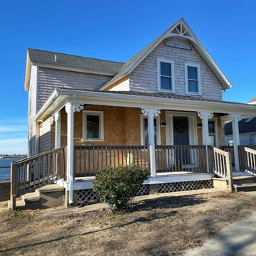
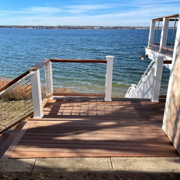
When the owner of this petite c. 1910 cottage in Riverside, RI first considered purchasing it, he fell for its charming front façade and the stunning rear water views. But it needed work. The weather-worn, water-facing back of the house was in dire need of attention. The first-floor kitchen/living/dining areas were cramped. There was no first-floor bathroom, and the second-floor bathroom was a fright. Most surprisingly, there was no rear-facing deck off the kitchen or living areas to allow for outdoor living along the Providence River.
In collaboration with the homeowner, KHS proposed a number of renovations and additions. The first priority was a new cantilevered rear deck off an expanded kitchen/dining area and reconstructed sunroom, which was brought up to the main floor level. The cantilever of the deck prevents the need for awkwardly tall supporting posts that could potentially be undermined by a future storm event or rising sea level.
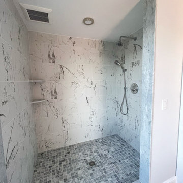
To gain more first-floor living space, KHS also proposed capturing the corner of the wrapping front porch as interior kitchen space in order to create a more generous open kitchen/dining/living area, while having minimal impact on how the cottage appears from the curb. Underutilized space in the existing mudroom was also reconfigured to contain a modest full bath and laundry closet. Upstairs, a new full bath was created in an addition between existing bedrooms. It can be accessed from both the master bedroom and the stair hall. Additional closets were added, too.
New windows and doors, new heart pine flooring stained to resemble the patina of old pine flooring that remained upstairs, new tile and countertops, new cabinetry, new plumbing and lighting fixtures, as well as a new color palette complete the updated look. Upgraded insulation in areas exposed during the construction and augmented HVAC systems also greatly improved indoor comfort. Today, the cottage continues to charm while also accommodating modern amenities and features.
 Katie Hutchison Studio
When the owner of this petite c. 1910 cottage in Riverside, RI first considered purchasing it, he fell for its charming front façade and the stunning rear water views. But it needed work. The weather-worn, water-facing back of the house was in dire need of attention. The first-floor kitchen/living/dining areas were cramped. There was no first-floor bathroom, and the second-floor bathroom was a fright. Most surprisingly, there was no rear-facing deck off the kitchen or living areas to allow for outdoor living along the Providence River.
In collaboration with the homeowner, KHS proposed a number of renovations and additions. The first priority was a new cantilevered rear deck off an expanded kitchen/dining area and reconstructed sunroom, which was brought up to the main floor level. The cantilever of the deck prevents the need for awkwardly tall supporting posts that could potentially be undermined by a future storm event or rising sea level.
To gain more first-floor living space, KHS also proposed capturing the corner of the wrapping front porch as interior kitchen space in order to create a more generous open kitchen/dining/living area, while having minimal impact on how the cottage appears from the curb. Underutilized space in the existing mudroom was also reconfigured to contain a modest full bath and laundry closet. Upstairs, a new full bath was created in an addition between existing bedrooms. It can be accessed from both the master bedroom and the stair hall. Additional closets were added, too.
New windows and doors, new heart pine flooring stained to resemble the patina of old pine flooring that remained upstairs, new tile and countertops, new cabinetry, new plumbing and lighting fixtures, as well as a new color palette complete the updated look. Upgraded insulation in areas exposed during the construction and augmented HVAC systems also greatly improved indoor comfort. Today, the cottage continues to charm while also accommodating modern amenities and features.
 Katie Hutchison Studio
When the owner of this petite c. 1910 cottage in Riverside, RI first considered purchasing it, he fell for its charming front façade and the stunning rear water views. But it needed work. The weather-worn, water-facing back of the house was in dire need of attention. The first-floor kitchen/living/dining areas were cramped. There was no first-floor bathroom, and the second-floor bathroom was a fright. Most surprisingly, there was no rear-facing deck off the kitchen or living areas to allow for outdoor living along the Providence River.
In collaboration with the homeowner, KHS proposed a number of renovations and additions. The first priority was a new cantilevered rear deck off an expanded kitchen/dining area and reconstructed sunroom, which was brought up to the main floor level. The cantilever of the deck prevents the need for awkwardly tall supporting posts that could potentially be undermined by a future storm event or rising sea level.
To gain more first-floor living space, KHS also proposed capturing the corner of the wrapping front porch as interior kitchen space in order to create a more generous open kitchen/dining/living area, while having minimal impact on how the cottage appears from the curb. Underutilized space in the existing mudroom was also reconfigured to contain a modest full bath and laundry closet. Upstairs, a new full bath was created in an addition between existing bedrooms. It can be accessed from both the master bedroom and the stair hall. Additional closets were added, too.
New windows and doors, new heart pine flooring stained to resemble the patina of old pine flooring that remained upstairs, new tile and countertops, new cabinetry, new plumbing and lighting fixtures, as well as a new color palette complete the updated look. Upgraded insulation in areas exposed during the construction and augmented HVAC systems also greatly improved indoor comfort. Today, the cottage continues to charm while also accommodating modern amenities and features.

 Donald Lococo Architects
Awarded by the Classical institute of art and architecture , the linnean house has a restrained and simple elevation of doors and windows. Nestled in the Forest Hills neighborhood of Washington, D.C., the Linnean House is classical in both plan and elevation throughout its award-winning house plans. The main mass, comprising of the most formal and public spaces, is a spatial triptych along a symmetrical main axis. Inside the luxury home, the limestone façade, simple but well-proportioned with classical elements, extends itself into both the entry portico and main foyer with consistent proportions and materiality. This introduction allows the flanking living and dining rooms to be perceived as separate pavilions, each equipped with eight equal-proportioned French doors symmetrical of the main axis.
Beyond the classical spaces are two wings which lead to the master suite and a kitchen/family space, respectively. Both of which are situated to queue from the French door axis, a focal feature in the repeatedly published home design. At the entry foyer, the stark stone luxury architecture is warmed by two symmetrical wood armoire-like freestanding sculptural objects, a persistent theme throughout the luxury house. In the kitchen, for instance, stand four similar wood armoire objects at opposite corners that act as columns and help give this space a sense of boundary and enclosure. The master bath vanity, in similar fashion, is introduced as a central free-standing form anchoring itself as a notable presence in the space. Lastly, the wine room is designed as a series of free-standing heavy wood cavity walls spanned only by a hint of glass.

 Gail Green
Direct inspiration for my Powder Room derives from Ascot’s Keith Haring ceramic tile collection, “Game of Fifteen.” Upon seeing the series, I knew that, in order to make a significant impact, the bathroom would have to be small in size, as the tile itself was high impact. Thus, we needed to keep the theme sharp and chic, graphic and poignant. The room had to maintain a proportional balance between the recessive background of the white tiles and the strength of the accent tile’s imagery. Thus equal elements of visual proportion and harmony was essential to a successfully designed room. In terms of color, the boldness of the tiles black and white pattern with its overall whimsical pattern made the selection a perfect fit for a playful and innovative room.
.
I liked the way the different shapes blend into each other, hardly indistinguishable from one another, yet decipherable. His shapes are visual mazes, archetypal ideograms of a sort. At a distance, they form a pattern; up close, they form a story. Many of the themes are about people and their connections to each other. Some are visually explicit; others are more reflective and discreet. Most are just fun and whimsical, appealing to children and to the uninhibited in us. They are also primitive in their bold lines and graphic imagery. Many shapes are of monsters and scary beings, relaying the innate fears of childhood and the exterior landscape of the reality of city life. In effect, they are graffiti like patterns, yet indelibly marked in our subconscious. In addition, the basic black, white, and red colors so essential to Haring’s work express the boldness and basic instincts of color and form.
In addition, my passion for both design and art found their aesthetic confluence in the expression of this whimsical statement of idea and function.
 Skill Construction & Design, LLC
It sparkles, it shimmers, it glitters, its glass. Glass mosaics are everywhere, from gorgeous kitchen backsplashes like this one, to color baths and reflective fireplaces. But as beautiful as this backsplash is, it’s only the beginning of this great kitchen.
Our kitchen begins with a little bump, a simple little peninsula with room for one. Upon the deep dark espresso cabinets sits the contrasting countertop. The super glossy white stone with subtle swirls reflects the colors of the glass mosaics. We gave the peninsula a little overhang and pulled up an enticing contemporary stool.
Although the kitchen space is fairly large, two walls contained openings to other spaces, while a third contained a large and sunny bay window. Rather than bottle neck our traffic flow, we chose to make the most of the walls we had. We started with a deep undermount stainless steel sink with a far-reaching faucet with pull out spray. Beside this, we placed our contemporary stainless steel dishwasher.
To keep the feeling open and airy we installed dark floating shelves, which really pop against our multicolored glass backsplash. We added lighting under the bottom shelf for extra sparkle, as well as the perfect task lighting.
We needed some wall cabinets, not just for storage but to compliment our microwave. Above the stainless steel stove our matching microwave serves multipurpose, from cooking, to venting, to task lighting the stove. When space counts, make the most of it. We nestled our stove beside the dishwasher, giving ourselves room for a landing zone at the end. The cooking area feels even more spacious set next to our large bay window.
To give us the greatest amount of storage, we added a floor to ceiling pantry. Although it is only 12″ deep, it’s 48″ wide. The clean “slab” style door create an uncluttered look that compliments the patterning of the floor. We used 6″ x 24″ porcelain wood look flooring. This flooring exploded on the market not too long ago, giving you the look of hardwoods, without fear of water, dents and scratches. The floor will never need to be refinished, no matter how much abuse it takes.
Look at all that storage. There’s even room on the bottom for that huge mixer we all seem to have. The pantry gives us plenty of room for all we need to store and it’s 12″ depth means it’s easy to find what you’re looking for. No more pulling out half your stored items just to find that product in the very back.
We round out this fabulous kitchen with a full-sized, bottom freezer, French door refrigerator. Espresso panels encase the sides while a deep and tall upper cabinet gives us room to store some more. By placing the refrigerator between the two entrances to the kitchen, family and friends can get a beverage without getting in the cook’s way.
To direct our lighting around the room and focus on specific areas, we used a long track of spot lights with a contemporary look. Between the window in the daytime, spots and undercabinet lights at night, the kitchen is always bright, even with the darker cabinetry.
http://www.rjkconstructioninc.com/
Sponsored
Plain City, OH

The Creative Kitchen Company
Columbus Area Kitchen Remodeling and Refacing Professional

 Sierra Living Concepts Inc
Dimension: 47" L X 21" D X 72" H
If you’re looking for a classic vintage beauty to grace your rooms with unfettered style, character, and amazing pragmatics, then our Dakota Contemporary Rustic Solid Wood Bedroom Armoire Wardrobe would be the perfect wardrobe cabinet for you!
Designed on the contemporary style, this solid wood bedroom armoire features undertones of classical and vintage nature with beats of modern in the mix. The overall design is extremely charismatic, and will definitely become a highlight of your bedroom. The exterior constitutes of a double-leaf wardrobe compartment underscored by two long drawers and a vertical closet unit on the right. All of this is complemented by a gorgeous hand rubbed stain and hand-wrought metal hardware.
The double-leaf compartment opens up to reveal an open shelf where you can store all your essentials within sight, and a stainless steel hanging rod up top. The two drawers provide sufficient space to keep folded laundry and other miscellaneous accessories while the vertical closet unit opens up to 4 equally divided shelves.
Handcrafted from solid Mahogany wood, this rustic armoire warrants the best of aesthetics and pragmatics, along with a sturdy, durable and long-lasting heirloom quality!
This solid hardwood armoire wardrobe is one of the most stylish and visually versatile furniture pieces you’ll ever find. You can easily match it up with a contemporary ambiance as a stunning accent piece, but it would look just as charming in a neo-classical, traditional or even a transitional style bedroom.
Special Features:
• 100% Handcrafted
• Solid Mahogany wood craftsmanship
• Contemporary Style bedroom armoire
• Double door wardrobe compartment with 1 open shelf and stainless steel rod
• 2 exterior drawers
• 1 vertical closet compartment with 4 shelves
• Metal hardware
• Heirloom quality
• Can be custom-made to have adjustable/removable shelves upon request
• Visually Versatile
• Easy maintenance
Note: Real wood is a product of nature, and as such, no two pieces are alike. Variations in solid wood grain patterns are to be expected and make each furniture uniquely beautiful, just like us humans.

 Jarrett Design
This timeless, traditional kitchen served as the original ‘showroom’ for Jarrett Design. As many small businesses start in the homes of their owners, Jarrett Design did, too. Home studios have their challenges, as one can imagine. In this case, the ‘showroom’ had to serve as inspiration for clients while also meeting the needs of the owner’s bustling family of nine!
Cooking and baking together were an integral part of family life, so the kitchen was designed accordingly. The opening between the family room and kitchen was expanded to unite the spaces and to bring the fireplace into view from the kitchen. A galley plan emerged featuring a 36” all refrigerator, a 48” pro range top, an advantium microwave, a roomy sink with a dishwasher under an enlarged window . A tall pull out for spices, oils, and vinegars along with roll out shelves and lots of cutlery dividers provides ample organization for items used most frequently. A wall was removed between the children’s study and the kitchen to make way for the large cooking island with seating and a second prep island with a sink, dishwasher and wine refrigerator. A wall with double ovens, coffee center with a beverage refrigerator below and a 30” freezer column rounds out the appliance list. Large, hand painted armoire-style pantries and a message center flank a rustic cherry hutch for glassware and pottery. A freestanding bookshelf houses the extensive cookbook collection. Pretty lighting and an array of different hardware pieces add the finishing touches.
Fun fact, these photos were taken in 2017. The kitchen was designed and installed over ten years prior! Proof that smart design, classic selections and quality custom cabinetry truly do stand the test of time even in the hardest working kitchens.
Matthew Villano Photography
 Katie Hutchison Studio
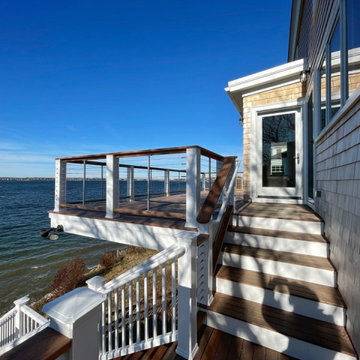
When the owner of this petite c. 1910 cottage in Riverside, RI first considered purchasing it, he fell for its charming front façade and the stunning rear water views. But it needed work. The weather-worn, water-facing back of the house was in dire need of attention. The first-floor kitchen/living/dining areas were cramped. There was no first-floor bathroom, and the second-floor bathroom was a fright. Most surprisingly, there was no rear-facing deck off the kitchen or living areas to allow for outdoor living along the Providence River.
In collaboration with the homeowner, KHS proposed a number of renovations and additions. The first priority was a new cantilevered rear deck off an expanded kitchen/dining area and reconstructed sunroom, which was brought up to the main floor level. The cantilever of the deck prevents the need for awkwardly tall supporting posts that could potentially be undermined by a future storm event or rising sea level.
To gain more first-floor living space, KHS also proposed capturing the corner of the wrapping front porch as interior kitchen space in order to create a more generous open kitchen/dining/living area, while having minimal impact on how the cottage appears from the curb. Underutilized space in the existing mudroom was also reconfigured to contain a modest full bath and laundry closet. Upstairs, a new full bath was created in an addition between existing bedrooms. It can be accessed from both the master bedroom and the stair hall. Additional closets were added, too.
New windows and doors, new heart pine flooring stained to resemble the patina of old pine flooring that remained upstairs, new tile and countertops, new cabinetry, new plumbing and lighting fixtures, as well as a new color palette complete the updated look. Upgraded insulation in areas exposed during the construction and augmented HVAC systems also greatly improved indoor comfort. Today, the cottage continues to charm while also accommodating modern amenities and features.
 Katie Hutchison Studio
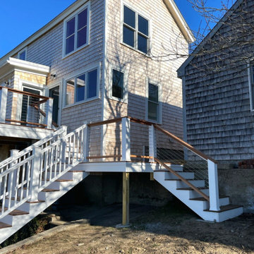
When the owner of this petite c. 1910 cottage in Riverside, RI first considered purchasing it, he fell for its charming front façade and the stunning rear water views. But it needed work. The weather-worn, water-facing back of the house was in dire need of attention. The first-floor kitchen/living/dining areas were cramped. There was no first-floor bathroom, and the second-floor bathroom was a fright. Most surprisingly, there was no rear-facing deck off the kitchen or living areas to allow for outdoor living along the Providence River.
In collaboration with the homeowner, KHS proposed a number of renovations and additions. The first priority was a new cantilevered rear deck off an expanded kitchen/dining area and reconstructed sunroom, which was brought up to the main floor level. The cantilever of the deck prevents the need for awkwardly tall supporting posts that could potentially be undermined by a future storm event or rising sea level.
To gain more first-floor living space, KHS also proposed capturing the corner of the wrapping front porch as interior kitchen space in order to create a more generous open kitchen/dining/living area, while having minimal impact on how the cottage appears from the curb. Underutilized space in the existing mudroom was also reconfigured to contain a modest full bath and laundry closet. Upstairs, a new full bath was created in an addition between existing bedrooms. It can be accessed from both the master bedroom and the stair hall. Additional closets were added, too.
New windows and doors, new heart pine flooring stained to resemble the patina of old pine flooring that remained upstairs, new tile and countertops, new cabinetry, new plumbing and lighting fixtures, as well as a new color palette complete the updated look. Upgraded insulation in areas exposed during the construction and augmented HVAC systems also greatly improved indoor comfort. Today, the cottage continues to charm while also accommodating modern amenities and features.
Sponsored
Columbus, OH

Hope Restoration & General Contracting
Columbus Design-Build, Kitchen & Bath Remodeling, Historic Renovations
 Advance Design Studio, Ltd.
After six years of living in their Huntley IL home, Chris and Meghan were tired of their dark, dingy, outdated kitchen and it was finally time for a long-anticipated change. “The kitchen is the place where we live, it’s where we do everything,” Meghan said. “It was important that it be a space where we wanted to be.” Meghan loves cooking and enjoys including their girls in healthy meal prepping, this led them to want a brighter, more enjoyable kitchen with increased functionality and improved storage.
For Chris especially, the laundry room was an entirely dysfunctional eyesore. “We had a washer and a dryer, but it was all kind-of cobbled together!” Chris said. “There were always laundry piles everywhere, we weren’t really sure what we wanted to do in there, but it was time for us to make a change.” The mess of the space was stressful every time they walked in the door from the garage each day. Kids’ backpacks and shoes piled up haphazardly in the makeshift boot-bench closet left the family feeling disorganized and stressed. They needed space for folding clothes and locker cubbies to help keep the family organized.
Having known Christine and Todd in the Huntley community for years, Chris and Meghan were familiar with their work. “We already trusted them personally and having seen their projects for years we knew they did top notch work. After we reviewed the initial round of designs, we knew that hiring them was definitely the right choice,” Meghan and Chris said. Although Chris had done a lot of work in their home himself, the kitchen and laundry room renovation was such a large undertaking that he didn’t want to steal time away from his family to spend what would surely be many long weekends doing the job himself. “That would not have been a wise choice for us,” Chris laughed.
“Our designer, Michelle was very, very, easy to work with; anything we wanted to see or weren’t sure about, she went above and beyond to make this easy for us. She was easy to get hold of and always quick to respond,” the couple said. Michelle pulled ideas that mirrored the couple’s taste and style and was adept at directing the couple to limited choices that didn’t overwhelm them and kept the process moving. “I have a hard time making decisions. Michelle made the decision-making process so easy. I loved how she listened to what I liked and then presented three great options for me to choose from,” Meghan said.
The main objectives for the kitchen were better storage solutions, they wanted the space to reflect their lifestyle and taste, and they wanted it to last for years with low maintenance. One of the first steps in creating a more functional kitchen was relocating the refrigerator, creating an improved workflow for the busy family.
“We didn’t know that we could even move the refrigerator to a new location where it is now, that was something that we never would have thought of,” Chris said. “The new refrigerator location makes the kitchen feel so much bigger. We didn’t add any space, but our whole kitchen with the new design just seems like it’s so much larger than before!” Meghan said.
The perimeter mist colored cabinets helped warm and brighten the entire room, while the graphite colored cabinets on the island added contrast. Using this fresh, clean color palette satisfied the couple’s desire for a bright space that was the exact opposite of what they had before. Organization accessories were also added to the cabinets such as a spice drawer tray and roll outs to create hidden convenience.
“I absolutely love the hidden spices – it makes cooking so much more enjoyable!” Chris said. “And all the pull outs, and the double trash bin, who would think you could get so excited about organization!” the couple said in unison.
One thing they hated in their original kitchen was how dark the space felt. Added lighting on the ceiling with the new light fixtures combined with the lighter cabinetry colors throughout solved this problem. “Our new kitchen has this warm, almost cozy feeling that our old kitchen never had, it’s just a space that I love spending my time in now,” Meghan said. The light airy feeling was accentuated with the use of floating white shelves on either side of the decorative range hood. “We have so much cabinetry space, the new design is amazing we actually have more storage space than we will ever need,” Meghan said.
The island was extended to create more work surface and added space for stool seating. “The new island changes how we live. Now the kids can be in the kitchen with us, doing homework, eating breakfast, and the three of us have special dinners there when Chris is working late,” Meghan said.
The Carrara Marmi Quartz countertops were chosen because they are, not only beautiful, but are made from hard-working material that doesn’t require maintenance. The white subway tile backsplash that wraps to the ceiling behind the focal point cooktop range/hood compliments the crisp white countertops perfectly, while brushed brass hardware and light fixtures keep the design fresh and new.
The couple had a few fears at the beginning of the project, as most homeowners do. Their biggest fear was being out of their kitchen and laundry room for an extended time. The crew made it very easy for the family to work in a limited space keeping the washer and dryer hooked up the majority of the time, and also getting appliances working with minimal downtime.
“They above and beyond accommodated us to get us through the process,” Meghan said. “They did a great job making sure we were as comfortable as possible throughout the process,” Chris added.
“Our project manager DJ did a great job. He was very good at updating us on schedule changes, getting guys in as quickly as possible. Everyone that stepped in the house was nice and did great work,” said Chris. They thought Advance’s carpenter was phenomenal and were impressed when he took a conceptual idea from a photograph and worked with designer Michelle to create a one of a kind range/hood that has become the topic of conversation with friends and family who visit the new kitchen. “He was in our house literally every day for several weeks. He was easy to work with and good at what he did,” Meghan and Chris said.
The focal point of the kitchen; a hand-crafted, custom-built ventilation hood was clad with handpicked reclaimed barnwood. Advance Design’s carpenter built the framework and the cladding to create a one-of-a-kind design element that the couple loves.
“I think it was especially fun for him to create something unique from scratch, showcasing his talent in this area,” Meghan said. “I love that my kitchen is not like everyone else’s. I got to pick out the wood on my hood and watch it being built and was able to choose what pieces of wood went where on it. It’s totally unique.”
Red Oak flooring was toothed-in throughout the kitchen and the rest of the first floor anywhere changes were made. Then the whole floor was refinished to tone down the orange undertones in the existing floor stain, ultimately changing the color complexion of the entire first floor. The result is a completely new feeling to the entire home.
Renovating the laundry room was extremely important to Meghan and Chris, but they had trouble visualizing what the possibilities were for the seemingly small space. Michelle produced beautiful 3D illustrations that helped them envision the space in a whole new way.
“I must have told Michelle 100 times that I am a visual person, seeing the designs in 3D made it so easy to make decisions and see what we could really do with our space,” Meghan said.
A dividing wall and doorway were removed between the existing laundry room and hallway formerly containing a coat closet, providing space to design specialized graphite colored cabinetry matching the kitchen island to house custom storage cubbies for each family member. Adding the tall utility cabinetry in the new laundry area helped solve the storage issue, tucking away cleaning supplies, household items, and even the cat got its own cubby.
“I love how everything is now hidden in its own space. I can’t tell you how much I hated coming home and seeing everything sitting around on counters,” Chris said.
Electrical outlets were planned for the inside of utility cabinets, so devices could charge in hidden locations. Stacking the washer and dryer allowed for wider countertop space to provide a folding area and a special space for clothes to hang. “The way I do laundry has been completely transformed! I can actually fold clothes and hang them now right out of the washer and dryer,” Meghan said.
“The end result in the kitchen and the laundry/mud room was an updated light and bright space, with a smarter work flow that better meets the needs of this family,” Michelle said.
“I would totally recommend Advance Design,” Meghan said. “Sometimes I sit and just look at my kitchen and laundry room and think ‘Wow, I can’t believe I get to live here!’ It’s an understatement to say we love our new space.”
 Skill Construction & Design, LLC
It sparkles, it shimmers, it glitters, its glass. Glass mosaics are everywhere, from gorgeous kitchen backsplashes like this one, to color baths and reflective fireplaces. But as beautiful as this backsplash is, it’s only the beginning of this great kitchen.
Our kitchen begins with a little bump, a simple little peninsula with room for one. Upon the deep dark espresso cabinets sits the contrasting countertop. The super glossy white stone with subtle swirls reflects the colors of the glass mosaics. We gave the peninsula a little overhang and pulled up an enticing contemporary stool.
Although the kitchen space is fairly large, two walls contained openings to other spaces, while a third contained a large and sunny bay window. Rather than bottle neck our traffic flow, we chose to make the most of the walls we had. We started with a deep undermount stainless steel sink with a far-reaching faucet with pull out spray. Beside this, we placed our contemporary stainless steel dishwasher.
To keep the feeling open and airy we installed dark floating shelves, which really pop against our multicolored glass backsplash. We added lighting under the bottom shelf for extra sparkle, as well as the perfect task lighting.
We needed some wall cabinets, not just for storage but to compliment our microwave. Above the stainless steel stove our matching microwave serves multipurpose, from cooking, to venting, to task lighting the stove. When space counts, make the most of it. We nestled our stove beside the dishwasher, giving ourselves room for a landing zone at the end. The cooking area feels even more spacious set next to our large bay window.
To give us the greatest amount of storage, we added a floor to ceiling pantry. Although it is only 12″ deep, it’s 48″ wide. The clean “slab” style door create an uncluttered look that compliments the patterning of the floor. We used 6″ x 24″ porcelain wood look flooring. This flooring exploded on the market not too long ago, giving you the look of hardwoods, without fear of water, dents and scratches. The floor will never need to be refinished, no matter how much abuse it takes.
Look at all that storage. There’s even room on the bottom for that huge mixer we all seem to have. The pantry gives us plenty of room for all we need to store and it’s 12″ depth means it’s easy to find what you’re looking for. No more pulling out half your stored items just to find that product in the very back.
We round out this fabulous kitchen with a full-sized, bottom freezer, French door refrigerator. Espresso panels encase the sides while a deep and tall upper cabinet gives us room to store some more. By placing the refrigerator between the two entrances to the kitchen, family and friends can get a beverage without getting in the cook’s way.
To direct our lighting around the room and focus on specific areas, we used a long track of spot lights with a contemporary look. Between the window in the daytime, spots and undercabinet lights at night, the kitchen is always bright, even with the darker cabinetry.
http://www.rjkconstructioninc.com/
 Skill Construction & Design, LLC
It sparkles, it shimmers, it glitters, its glass. Glass mosaics are everywhere, from gorgeous kitchen backsplashes like this one, to color baths and reflective fireplaces. But as beautiful as this backsplash is, it’s only the beginning of this great kitchen.
Our kitchen begins with a little bump, a simple little peninsula with room for one. Upon the deep dark espresso cabinets sits the contrasting countertop. The super glossy white stone with subtle swirls reflects the colors of the glass mosaics. We gave the peninsula a little overhang and pulled up an enticing contemporary stool.
Although the kitchen space is fairly large, two walls contained openings to other spaces, while a third contained a large and sunny bay window. Rather than bottle neck our traffic flow, we chose to make the most of the walls we had. We started with a deep undermount stainless steel sink with a far-reaching faucet with pull out spray. Beside this, we placed our contemporary stainless steel dishwasher.
To keep the feeling open and airy we installed dark floating shelves, which really pop against our multicolored glass backsplash. We added lighting under the bottom shelf for extra sparkle, as well as the perfect task lighting.
We needed some wall cabinets, not just for storage but to compliment our microwave. Above the stainless steel stove our matching microwave serves multipurpose, from cooking, to venting, to task lighting the stove. When space counts, make the most of it. We nestled our stove beside the dishwasher, giving ourselves room for a landing zone at the end. The cooking area feels even more spacious set next to our large bay window.
To give us the greatest amount of storage, we added a floor to ceiling pantry. Although it is only 12″ deep, it’s 48″ wide. The clean “slab” style door create an uncluttered look that compliments the patterning of the floor. We used 6″ x 24″ porcelain wood look flooring. This flooring exploded on the market not too long ago, giving you the look of hardwoods, without fear of water, dents and scratches. The floor will never need to be refinished, no matter how much abuse it takes.
Look at all that storage. There’s even room on the bottom for that huge mixer we all seem to have. The pantry gives us plenty of room for all we need to store and it’s 12″ depth means it’s easy to find what you’re looking for. No more pulling out half your stored items just to find that product in the very back.
We round out this fabulous kitchen with a full-sized, bottom freezer, French door refrigerator. Espresso panels encase the sides while a deep and tall upper cabinet gives us room to store some more. By placing the refrigerator between the two entrances to the kitchen, family and friends can get a beverage without getting in the cook’s way.
To direct our lighting around the room and focus on specific areas, we used a long track of spot lights with a contemporary look. Between the window in the daytime, spots and undercabinet lights at night, the kitchen is always bright, even with the darker cabinetry.
http://www.rjkconstructioninc.com/
203