
Search results for "Tan began" in Home Design Ideas

 Liz Schupanitz Designs
Cooking for Two
Location: Plymouth, MN, United States
When this couple’s last child graduated from college they began the process of looking for a new home. After a lengthy search they decided to stay with the neighborhood they loved, saving money by remodeling rather than starting over.
The top priorities on their wish list were adding character to their 1990’s era home with a classic white kitchen and a larger island while keeping within the existing footprint. With the intention of honing their cooking skills, they were also considering better appliances and two ovens.
Challenges and Solutions
Design a larger island with seating for at least two. The existing island was small and the area behind the seating was less than recommended clearances.
To solve this challenge, the seating area of the island was extended out into the open area of the kitchen. This created a larger island with seating for three, extra storage and a bookshelf across from the range.
The original kitchen had a range with microwave above, so adding another oven was a challenge with limited wall space.
Because the adjoining dining room is used infrequently, the homeowner was open to placing the second oven and microwave in the walkway. This made room for the small buffet between the built in refrigerator and ovens, creating one of her favorite areas.
The client requested a white painted kitchen but wanted to make sure it had warmth and character. To achieve this the following elements were chosen:
1) Cabinets painted with Benjamin Moore Capitol White, a luminous and warm shade of white.
2) The Range hood was painted with warm metallic shades to reflect the bronze of the Ashley Norton hardware.
3) Black Aqua Grantique granite was chosen for countertops because it looks like soapstone and adds contrast.
4) Walker Zanger Café tile in Latte was chosen for it’s handmade look with uneven edges.
5) The to-the-counter-cabinet with glass door shows off serving dishes and lends sophisticated charm.
The result is a welcoming classic kitchen, where this couple enjoys cooking more often and sharpening their skills with gourmet appliances.
Liz Schupanitz Designs
Photographed by: Andrea Rugg Photography
 Haven Design and Construction
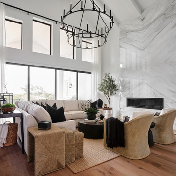
The grand living room needed large focal pieces, so our design team began by selecting the large iron chandelier to anchor the space. The black iron of the chandelier echoes the black window trim of the two story windows and fills the volume of space nicely. The plain fireplace wall was underwhelming, so our team selected four slabs of premium Calcutta gold marble and butterfly bookmatched the slabs to add a sophisticated focal point. Tall sheer drapes add height and subtle drama to the space. The comfortable sectional sofa and woven side chairs provide the perfect space for relaxing or for entertaining guests. Woven end tables, a woven table lamp, woven baskets and tall olive trees add texture and a casual touch to the space. The expansive sliding glass doors provide indoor/outdoor entertainment and ease of traffic flow when a large number of guests are gathered.

 House of Funk
The vintage secretary was finished by Ariana Hoffman & Co. / AH & Co. We began with Benjamin Moore, HC-158, Newburg Green in a high sheen and then a glaze that was applied to the top. We left the original wood finish on the interior and mullions. The desk chair is also vintage - painted and re-upholstered.
Find the right local pro for your project


 Cummings Architecture + Interiors
When Cummings Architects first met with the owners of this understated country farmhouse, the building’s layout and design was an incoherent jumble. The original bones of the building were almost unrecognizable. All of the original windows, doors, flooring, and trims – even the country kitchen – had been removed. Mathew and his team began a thorough design discovery process to find the design solution that would enable them to breathe life back into the old farmhouse in a way that acknowledged the building’s venerable history while also providing for a modern living by a growing family.
The redesign included the addition of a new eat-in kitchen, bedrooms, bathrooms, wrap around porch, and stone fireplaces. To begin the transforming restoration, the team designed a generous, twenty-four square foot kitchen addition with custom, farmers-style cabinetry and timber framing. The team walked the homeowners through each detail the cabinetry layout, materials, and finishes. Salvaged materials were used and authentic craftsmanship lent a sense of place and history to the fabric of the space.
The new master suite included a cathedral ceiling showcasing beautifully worn salvaged timbers. The team continued with the farm theme, using sliding barn doors to separate the custom-designed master bath and closet. The new second-floor hallway features a bold, red floor while new transoms in each bedroom let in plenty of light. A summer stair, detailed and crafted with authentic details, was added for additional access and charm.
Finally, a welcoming farmer’s porch wraps around the side entry, connecting to the rear yard via a gracefully engineered grade. This large outdoor space provides seating for large groups of people to visit and dine next to the beautiful outdoor landscape and the new exterior stone fireplace.
Though it had temporarily lost its identity, with the help of the team at Cummings Architects, this lovely farmhouse has regained not only its former charm but also a new life through beautifully integrated modern features designed for today’s family.
Photo by Eric Roth

 Timothy Godbold Ltd
Rikki Snyder
Inspiration for a huge cottage open concept light wood floor and brown floor living room remodel in New York with white walls, a standard fireplace and a brick fireplace
Inspiration for a huge cottage open concept light wood floor and brown floor living room remodel in New York with white walls, a standard fireplace and a brick fireplace

 Jennifer Grey Interiors Design & Color Specialist
This living room was designed for my great clients that required a stylish and comfortable space for entertaining friends and relaxing after a long day. The barn door was designing custom for this couple. It's double sided, with the same beautiful finish on both sides. We also designed the custom board and batten wall treatment around the perimeter of this space and into the hallway to give the space some depth as well as a great architectural wall feature. Most of the accessories in this space are from Pottery Barn as well as World Market. The sofa was purchased by the homeowners before we began this project.
Sponsored
Columbus, OH

Snider & Metcalf Interior Design, LTD
Leading Interior Designers in Columbus, Ohio & Ponte Vedra, Florida
 KitchenLab Interiors
Coconut Grove is Southwest of Miami beach near coral gables and south of downtown. It’s a very lush and charming neighborhood. It’s one of the oldest neighborhoods and is protected historically. It hugs the shoreline of Biscayne Bay. The 10,000sft project was originally built
17 years ago and was purchased as a vacation home. Prior to the renovation the owners could not get past all the brown. He sails and they have a big extended family with 6 kids in between them. The clients wanted a comfortable and causal vibe where nothing is too precious. They wanted to be able to sit on anything in a bathing suit. KitchenLab interiors used lots of linen and indoor/outdoor fabrics to ensure durability. Much of the house is outside with a covered logia.
The design doctor ordered the 1st prescription for the house- retooling but not gutting. The clients wanted to be living and functioning in the home by November 1st with permits the construction began in August. The KitchenLab Interiors (KLI) team began design in May so it was a tight timeline! KLI phased the project and did a partial renovation on all guest baths. They waited to do the master bath until May. The home includes 7 bathrooms + the master. All existing plumbing fixtures were Waterworks so KLI kept those along with some tile but brought in Tabarka tile. The designers wanted to bring in vintage hacienda Spanish with a small European influence- the opposite of Miami modern. One of the ways they were able to accomplish this was with terracotta flooring that has patina. KLI set out to create a boutique hotel where each bath is similar but different. Every detail was designed with the guest in mind- they even designed a place for suitcases.

 Bayview Builders
David Burroughs
Mountain style galley kitchen photo in Baltimore with an undermount sink, shaker cabinets, white cabinets, stone tile backsplash and an island
Mountain style galley kitchen photo in Baltimore with an undermount sink, shaker cabinets, white cabinets, stone tile backsplash and an island

 Ky-Kan Coatings
Concrete can be made to look like any substance. Tile, stone, wood, brick, etc. With unlimited color options, Ky-Kan Coatings can transform any room in your home or business using lightweight, beautiful concrete.

 Masterworks Window Fashions & Design, LLC
This house is adjacent to the first house, and was under construction when I began working with the clients. They had already selected red window frames, and the siding was unfinished, needing to be painted. Sherwin Williams colors were requested by the builder. They wanted it to work with the neighboring house, but have its own character, and to use a darker green in combination with other colors. The light trim is Sherwin Williams, Netsuke, the tan is Basket Beige. The color on the risers on the steps is slightly deeper. Basket Beige is used for the garage door, the indentation on the front columns, the accent in the front peak of the roof, the siding on the front porch, and the back of the house. It also is used for the fascia board above the two columns under the front curving roofline. The fascia and columns are outlined in Netsuke, which is also used for the details on the garage door, and the trim around the red windows. The Hardie shingle is in green, as is the siding on the side of the garage. Linda H. Bassert, Masterworks Window Fashions & Design, LLC

 Moderne Builders
Gorgeous master bath with dramatic retro "wave" tile. Peak Photography
Example of a 1950s bathroom design in Los Angeles
Example of a 1950s bathroom design in Los Angeles
 Katherine Stern Design
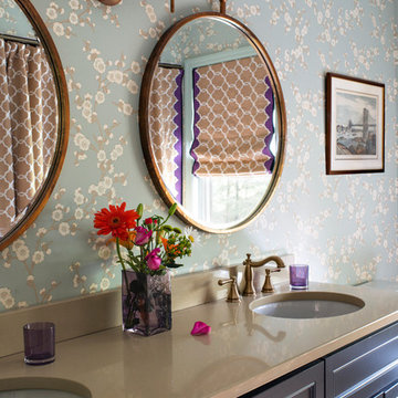
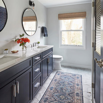
This was originally a hall bathroom badly in need of a face lift. Katherine Stern Design kept the toilet, tiling and tub to keep the budget down. A dramatic new vanity with a stone countertop, classic wall paper, elegant wall mirrors and new vanity lighting began the transformation . Using subtle tones of blue, and tan coupled with the black vanity and tan stone countertop, a sophisticated bathroom began to emerge.
Photography: Adam Macchia

 TKS Design Group
Download our free ebook, Creating the Ideal Kitchen. DOWNLOAD NOW
Lakefront property in the northwest suburbs of Chicago is hard to come by, so when we were hired by this young family with exactly that, we were immediately inspired by not just the unusually large footprint of this 1950’s colonial revival but also the lovely views of the manmade lake it was sited on. The large 5-bedroom home was solidly stuck in the 1980’s, but we saw tons of potential. We started out by updating the existing staircase with a fresh coat of paint and adding new herringbone slate to the entry hall.
The powder room off the entryway also got a refresh - new flooring, new cabinets and fixtures. We ran the new slate right through into this space for some consistency. A fun wallpaper and shiplap trim add a welcoming feel and set the tone for the home.
Next, we tackled the kitchen. Located away from the rest of the first floor, the kitchen felt a little isolated, so we immediately began planning for how to better connect it to the rest of the first floor. We landed on removing the wall between the kitchen and dining room and designed a modified galley style space with separate cooking and clean up zones. The cooking zone consists of the refrigerator, prep sink and cooktop, along with a nice long run of prep space at the island. The cleanup side of the kitchen consists of the main sink and dishwasher. Both areas are situated so that the user can view the lake during prep work and cleanup!
One of the home’s main puzzles was how to incorporate the mudroom and area in front of the patio doors at the back of the house. We already had a breakfast table area, so the space by the patio doors was a bit of a no man’s land. We decided to separate the kitchen proper from what became the new mudroom with a large set of barn doors. That way you can quickly hide any mudroom messes but have easy access to the light coming in through the patio doors as well as the outdoor grilling station. We also love the impact the barn doors add to the overall space.
The homeowners’ first words to us were “it’s time to ditch the brown,” so we did! We chose a lovely blue pallet that reflects the home’s location on the lake which is also vibrant yet easy on the eye. Countertops are white quartz, and the natural oak floor works well with the other honey accents. The breakfast table was given a refresh with new chairs, chandelier and window treatments that frame the gorgeous views of the lake out the back.
We coordinated the slate mudroom flooring with that used in the home’s main entrance for a consistent feel. The storage area consists of open and closed storage to allow for some clutter control as needed.
Next on our “to do” list was revamping the dated brown bar area in the neighboring dining room. We eliminated the clutter by adding some closed cabinets and did some easy updates to help the space feel more current. One snag we ran into here was the discovery of a beam above the existing open shelving that had to be modified with a smaller structural beam to allow for our new design to work. This was an unexpected surprise, but in the end we think it was well worth it!
We kept the colors here a bit more muted to blend with the homeowner’s existing furnishings. Open shelving and polished nickel hardware add some simple detail to the new entertainment zone which also looks out onto the lake!
Next we tackled the upstairs starting with the homeowner’s son’s bath. The bath originally had both a tub shower and a separate shower, so we decided to swap out the shower for a new laundry area. This freed up some space downstairs in what used to be the mudroom/laundry room and is much more convenient for daily laundry needs.
We continued the blue palette here with navy cabinetry and the navy tile in the shower. Porcelain floor tile and chrome fixtures keep maintenance to a minimum while matte black mirrors and lighting add some depth the design. A low maintenance runner adds some warmth underfoot and ties the whole space together.
We added a pocket door to the bathroom to minimize interference with the door swings. The left door of the laundry closet is on a 180 degree hinge to allow for easy full access to the machines. Next we tackled the master bath which is an en suite arrangement. The original was typical of the 1980’s with the vanity outside of the bathroom, situated near the master closet. And the brown theme continued here with multiple shades of brown.
Our first move was to segment off the bath and the closet from the master bedroom. We created a short hall from the bedroom to the bathroom with his and hers walk-in closets on the left and right as well as a separate toilet closet outside of the main bathroom for privacy and flexibility.
The original bathroom had a giant soaking tub with steps (dangerous!) as well as a small shower that did not work well for our homeowner who is 6’3”. With other bathtubs in the home, they decided to eliminate the tub and create an oversized shower which takes up the space where the old tub was located. The double vanity is on the opposite wall and a bench is located under the window for morning conversations and a place to set a couple of towels.
The pallet in here is light and airy with a mix of blond wood, creamy porcelain and marble tile, and brass accents. A simple roman shade adds some texture and it’s top-down mechanism allows for light and privacy.
This large whole house remodel gave our homeowners not only the ability to maximize the potential of their home but also created a lovely new frame from which to view their fabulous lake views.
Designed by: Susan Klimala, CKD, CBD
Photography by: Michael Kaskel
For more information on kitchen and bath design ideas go to: www.kitchenstudio-ge.com

 Kayron Brewer, CMKBD / Studio K B
Drew Rice, Red Pants Studio
Inspiration for a transitional l-shaped medium tone wood floor and brown floor open concept kitchen remodel in Seattle with an undermount sink, shaker cabinets, beige cabinets, quartzite countertops, stainless steel appliances and an island
Inspiration for a transitional l-shaped medium tone wood floor and brown floor open concept kitchen remodel in Seattle with an undermount sink, shaker cabinets, beige cabinets, quartzite countertops, stainless steel appliances and an island

 AlphaStudio Design Group
Conceptually the Clark Street remodel began with an idea of creating a new entry. The existing home foyer was non-existent and cramped with the back of the stair abutting the front door. By defining an exterior point of entry and creating a radius interior stair, the home instantly opens up and becomes more inviting. From there, further connections to the exterior were made through large sliding doors and a redesigned exterior deck. Taking advantage of the cool coastal climate, this connection to the exterior is natural and seamless
Photos by Zack Benson
 Haven Design and Construction
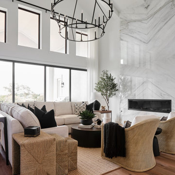
The grand living room needed large focal pieces, so our design team began by selecting the large iron chandelier to anchor the space. The black iron of the chandelier echoes the black window trim of the two story windows and fills the volume of space nicely. The plain fireplace wall was underwhelming, so our team selected four slabs of premium Calcutta gold marble and butterfly bookmatched the slabs to add a sophisticated focal point. Tall sheer drapes add height and subtle drama to the space. The comfortable sectional sofa and woven side chairs provide the perfect space for relaxing or for entertaining guests. Woven end tables, a woven table lamp, woven baskets and tall olive trees add texture and a casual touch to the space. The expansive sliding glass doors provide indoor/outdoor entertainment and ease of traffic flow when a large number of guests are gathered.

 Warm Timber Saunas & Wine Cellars
This previously unused attic space is now a sauna/yoga room. The left sauna wall follows the attic rafters down diagonally to allow a wider space for leg room on the twin sauna benches.

 Noble Architects, LLC
studiⓞbuell, Photography
Example of a mid-century modern exterior home design in Nashville
Example of a mid-century modern exterior home design in Nashville
1