
Search results for "Tendencies" in Home Design Ideas

 Victor Mulbauer
New Installation of Red Oak Wood, 3 1/4 in width. White-washed Bona Stain was used, Bona Finish, as well as Bona Traffic HD.
**This photo is of the Red Oak Wood (3 1/4 inch) prior to the application of the white-washed Bona Stain.

 186 Lighting Design Group - Gregg Mackell
Stair were illuminated with linear light channels integrated into the underside of each stair nosing to float the stair with light while providing functional lighting as the stair wraps the curved glass elevator.

 T.A. French - Custom Builder
Example of a mid-sized transitional dark wood floor and brown floor double front door design in Austin with gray walls and a black front door
Find the right local pro for your project

 The Artists Hands - Faux Finishes
This remodeled bedroom was upgraded to an elegant and sophisticated master retreat. Using metallic plasters and various techniques of application with this beautiful repeat stencil pattern, this accent wall is a stunning focal feature of this master bedroom. Copyright © 2016 The Artists Hands

 Benjamin Moore
Walls: Distant Gray OC-68, Regal Select, Pearl
Ceiling: Constellation AF-540, Regal Select, Flat
Lower Cabinets: Gray Cloud 2126-60, Regal Select, Pearl
A beachy blue kitchen with white cabinetry and paneling details, accented by two glass blown light fixtures

 CSDesign llc
We designed and installed this 15 years ago, before digital camera's....so I'm looking for a picture of it running! :)
This is an example of a contemporary landscaping in Seattle.
This is an example of a contemporary landscaping in Seattle.

 User
UserDetail of Iridescent Venetian plaster finish on all walls in Living Room by Christianson Lee Studios
Example of a transitional home design design in New York
Example of a transitional home design design in New York

 Refined House, LLC
Example of a small transitional kids' gray tile and ceramic tile ceramic tile and white floor alcove shower design with shaker cabinets, blue cabinets, a two-piece toilet, gray walls, an undermount sink, quartz countertops and a hinged shower door

 threshold interiors
Location: New York, NY, United States
This Loft was tastefully renovated back in the '90s, but was due for an update and an expansion of the kitchen and dining areas to accommodate the client's cooking skills and entertaining needs. EnlargIing the island and adding cabinetry to delineate the office, bar and dining areas was a priority. The bathroom was updated to feel like a tranquil spa with beautiful new tile, plumbing fixtures and cabinets. Our biggest challenge was coordinating the entire renovation while our client was out of town for the Summer!
Photographed by: James Salomon
 Kariouk Associates
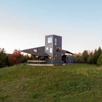
A Family Retreat in Rural Ontario
The clients for this project live abroad, and sought a Canadian homestead — an anchor — for their large, young family. During summer and winter holidays, the parents wanted their children immersed in an Ontario landscape like the one in which they were raised.
To this end, they requested a “rustic, modern retreat” for their 100-acre property of forest, wetland, and meadows.
The family sought a generous home to allow young teenagers and extended family to be comfortable in a remote area for long stays. They sought a casual, comfortable space for the family and their dogs that would encourage activities like hiking and snowshoeing — no fancy entertaining.
Under One Roof
The most powerful aspect of the design is the long, tent-like roof, which follows the site’s topography. The roof and its ridge beam became the design’s primary focus, shaping the circulation path through the home’s interior, ultimately extending a view toward the forest.
A primary technical challenge was the roof’s structure, which despite its 60-metre length needed to seem light. The folds and angles of the steel roof are supported by the meandering ridge-beam.
The roof cantilevers and tapers at all edges. At the entry side of the house, the roof lifts like a bird’s wing off the garage volume beneath, sheltering an outdoor terrace.
Playing with Heavy and Light
Monolithic slate-clad volumes anchor the home and define the space between the curtains of glass. These opaque volumes echo the property’s rock outcrops. The garage, bathrooms, stairs, and pantry are grouped inside, and appear to hold up the dynamic roof.
Steel construction was chosen to avoid using the expected material of heavy timber for this forest getaway. Being cognizant of the clients’ desire for a warm interior, it was also important to avoid modernist tendencies for box-like forms.
Because the main floor is lifted above the ground and the topography falls away, the main floor is in the treetops while simultaneously filling the lower recreation area with light.
A Contemporary Approach to Warmth and Closeness
The continuous space of the home, with only bedrooms and bathrooms closed off, is a layout that underscores closeness.
The family areas and parents’ area are on the main level. The kids’ bedrooms are bundled into a single slate-clad volume, suspended like a cocoon above the main floor from a 40’ steel beam and accessed by a catwalk.
Sustainability
To avoid cutting trees, the home was placed on an existing cleared ridge overlooking a wildflower meadow.
The home is heated and cooled via a geothermal unit with summer solar gain reduced by significant roof overhangs. The glass walls are triple-pane, and high-efficiency fixtures and equipment for the well and septic system help reduce the home’s environmental impact.
Historically, the Canadian identity has been defined by our relationship to the land. Fulfilling the client’s mandate, the home honours that emotional connection through visual and material harmonization with its surroundings.
 TreHus Architects+Interior Designers+Builders
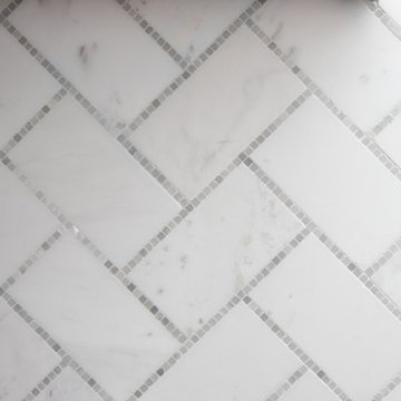
Example of a large classic u-shaped dark wood floor eat-in kitchen design in Minneapolis with a double-bowl sink, recessed-panel cabinets, white cabinets, white backsplash, stainless steel appliances, an island and black countertops


 Pinnacle Mountain Homes
Pinnacle Mountain Homes
©Darren Edwards Photographs
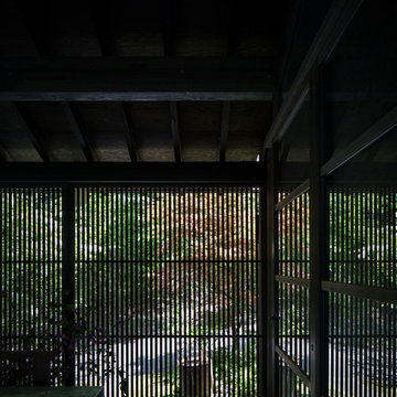
Example of a transitional kitchen/dining room combo design in Denver with white walls
Example of a transitional kitchen/dining room combo design in Denver with white walls
 Concrete Craft
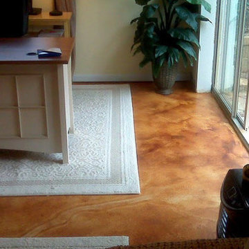
Acid based stains permeate concrete floors and provide luminous, translucent tones
that won't fade, chip off, or peel away.
Arts and crafts concrete floor home design photo in Atlanta
Arts and crafts concrete floor home design photo in Atlanta


 Atelier Armbruster
Master bathroom
Photos: Natalia Lorca Ruiz
Mid-sized trendy master white tile and ceramic tile ceramic tile and black floor doorless shower photo in New York with flat-panel cabinets, white cabinets, a wall-mount toilet, white walls, an integrated sink, solid surface countertops and a hinged shower door
Mid-sized trendy master white tile and ceramic tile ceramic tile and black floor doorless shower photo in New York with flat-panel cabinets, white cabinets, a wall-mount toilet, white walls, an integrated sink, solid surface countertops and a hinged shower door
 User
UserDECO Window Fashions.
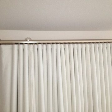
Ripple Fold Draperies
Home design - contemporary home design idea in Austin
Home design - contemporary home design idea in Austin
 M Atelier
If there is one big mistake that homeowners make when carrying out the decoration tasks of their interior design project, that would be over-accessorising. Indeed, experts in interior design in Singapore agree that there are styles where “more is more,” and there are also those where “less is more.”
While as a homeowner you may choose either of these two style directions, you should first think about the different aspects of interior design and make sure that your style choice fits with these elements. Not doing so may not only result to a poorly executed renovation, but a home that you will find uncomfortable to live in.
So how do you avoid the tendency of over-accessorising? You may want to follow these pieces of advice coming from professionals in interior design in Singapore:
Mistake #1: Using the same fabric on almost all surfaces.
It is common practice among most homeowners to use almost the same fabric on all table surfaces, and sometimes even on sofa covers and drapes. Indeed, this can be cost effective, but it does not contribute to the development of the home’s overall design.
This is because there are fabrics are created to meet specific purposes. For example, lace is often used as table runners, as they give more definition and style to these specific furniture pieces. However, they do not do your windows any favours when used as curtains.
Opaque and heavy fabrics are often intended for curtains and drapes for rooms that require more privacy; in contrast, sheer and fabric materials are more suited for living room windows as they allow natural light and ventilation to move around the house.
Mistake #2: Placing more accents than you actually need.
Another mistake which homeowners are prone to make when decorating their home is placing more accents than needed. There are homes you can see side tables that are overpopulated with picture frames, trinkets, and fancy souvenirs that do not have any connection to each other. Sometimes, you can find numerous throw pillows occupying almost the entire sofa, to the point that all the seats are already occupied.
These are classic examples of “fear of empty spaces,” which is prevalent in most Asian societies, and even in some Western countries. But while it is common practice to occupy empty spaces, you may also want to think about what to do with the space first.
Instead of piling up all your memorabilia in the side tables of your bedroom or living room, why not use a tiered stand so that they can be presented in an organised manner? You may also want to choose a designated area for your trinkets, such as a wall or an unoccupied corner in your room.
Mistake #3: Overdoing the lighting fixtures.
Some homeowners want to imitate the homes of the celebrities they see on TV, and apart from following the same colour schemes and choice of furniture, they also choose to add more lights in their rooms than necessary.
Well, you should understand that the purpose of lighting fixtures is to illuminate the rooms of the house, but this doesn’t mean that you have to brighten up your home all the time. You may want to use lamps that spread the light across the room, rather than several smaller bulbs. The latter only lights up specific parts of the room, and when all these bulbs are lit simultaneously, they only spike up your electric bill.
It would be better to choose lighting fixtures according to your need and the function of the room. Doing so not only illuminates your home properly, but also creates an ambiance that gives you the comfort you are looking for in a dwelling space.

 Story Barns
Inspiration for a mid-sized rustic carpeted straight cable railing staircase remodel in Denver with carpeted risers

 Cushion Source
Customer Photo: "Wanted a new papasan cushion and we figured Cushion Source was the best place to go to. Amazing quality and even better pattern than we expected. Love it!"
Featured Fabric
Premier Prints Isadella Premier Navy/Slub
14