
Search results for "Three point" in Home Design Ideas
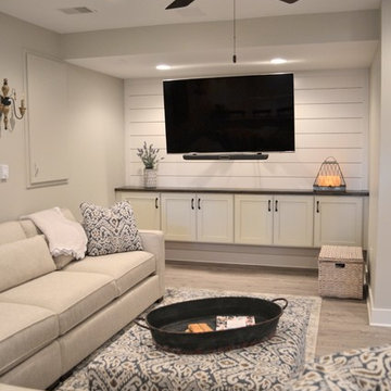
 Rosemary Lily
Inspiration for a large country look-out vinyl floor and gray floor basement remodel in Detroit with gray walls
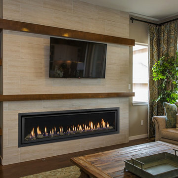
 Fireplace Xtrordinair
The 6015™ HO Linear Gas Fireplace presents you with superior heat performance, high quality construction and a stunning presentation of fire. The 6015™ is the largest unit in this three-part Linear Gas Fireplace Series, and is the perfect accompaniment to grand living spaces and custom homes. Like it's smaller counterparts, the 4415™ and 3615™, the 6015™ features a sleek 15 inch height and a long row of tall, dynamic flames over a bed of reflective crushed glass that is illuminated by bottom-lit Accent Lights. The 6015™ gas fireplace comes with the luxury of adding three different crushed glass options, the Driftwood and Stone Fyre-Art Kit, and multiple fireback selections to completely transition the look of this fireplace.
The 6015™ gas fireplace not only serves as a beautiful focal point in any home; it boasts an impressively high heat output of 56,000 BTUs and has the ability to heat up to 2,800 square feet, utilizing two concealed 90 CFM fans. It features high quality, ceramic glass that comes standard with the 2015 ANSI approved low visibility safety barrier, increasing the overall safety of this unit for you and your family. The GreenSmart® 2 Wall Mounted Thermostat Remote is also featured with the 6015™, which allows you to easily adjust every component of this fireplace. It even includes optional Power Heat Vent Kits, allowing you to heat additional rooms in your home. The 6015™ is built with superior Fireplace Xtrordinair craftsmanship using the highest quality materials and heavy-duty construction. Experience the difference in quality and performance with the 6015™ HO Linear Gas Fireplace by Fireplace Xtrordinair.
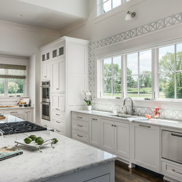
 Noble Architects, LLC
Photography: Garett + Carrie Buell of Studiobuell/ studiobuell.com
Example of a large transitional l-shaped dark wood floor open concept kitchen design in Nashville with a single-bowl sink, shaker cabinets, white cabinets, quartz countertops, white backsplash, porcelain backsplash, paneled appliances, an island and white countertops
Example of a large transitional l-shaped dark wood floor open concept kitchen design in Nashville with a single-bowl sink, shaker cabinets, white cabinets, quartz countertops, white backsplash, porcelain backsplash, paneled appliances, an island and white countertops
Find the right local pro for your project
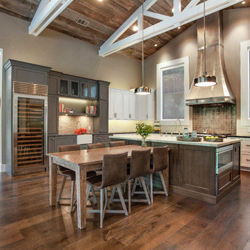
 LMK Interiors
Farmhouse style with an industrial, contemporary feel.
Inspiration for a large farmhouse u-shaped medium tone wood floor eat-in kitchen remodel in San Francisco with recessed-panel cabinets, white cabinets, soapstone countertops, gray backsplash, stainless steel appliances and an island
Inspiration for a large farmhouse u-shaped medium tone wood floor eat-in kitchen remodel in San Francisco with recessed-panel cabinets, white cabinets, soapstone countertops, gray backsplash, stainless steel appliances and an island
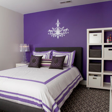
 Hubley Design Interiors, LLC
The eclectic chandelier adds to the mix of youthfulness and savvy sophistication that room portrays.
Inspiration for a contemporary kids' room remodel in New York with multicolored walls
Inspiration for a contemporary kids' room remodel in New York with multicolored walls
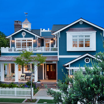
 Flagg Coastal Homes
This years Coastal Living Showhouse features expansive decks and porches including a rooftop deck with panoramic view of the Pacific Ocean, Point Loma, Mexico and Downtown San Diego,
2014 Ed Gohlich Photography, Inc.
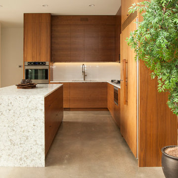
 Whitney Lyons
Photo: Whitney Lyons © 2014 Houzz
Inspiration for a mid-sized modern l-shaped concrete floor eat-in kitchen remodel in Portland with flat-panel cabinets, medium tone wood cabinets, white backsplash, subway tile backsplash and white walls
Inspiration for a mid-sized modern l-shaped concrete floor eat-in kitchen remodel in Portland with flat-panel cabinets, medium tone wood cabinets, white backsplash, subway tile backsplash and white walls
Sponsored
Fredericksburg, OH

High Point Cabinets
Columbus' Experienced Custom Cabinet Builder | 4x Best of Houzz Winner
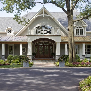
 Riley Custom Homes & Renovations
Inspiration for a timeless front door remodel in Baltimore with a medium wood front door
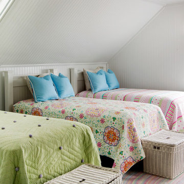
 kelly mcguill home
Photographer: Eric Roth; Stylist: Tracey Parkinson
Bedroom - mid-sized coastal guest bedroom idea in Boston with white walls and no fireplace
Bedroom - mid-sized coastal guest bedroom idea in Boston with white walls and no fireplace
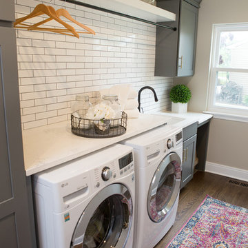
 Advance Design Studio, Ltd.
After six years of living in their Huntley IL home, Chris and Meghan were tired of their dark, dingy, outdated kitchen and it was finally time for a long-anticipated change. “The kitchen is the place where we live, it’s where we do everything,” Meghan said. “It was important that it be a space where we wanted to be.” Meghan loves cooking and enjoys including their girls in healthy meal prepping, this led them to want a brighter, more enjoyable kitchen with increased functionality and improved storage.
For Chris especially, the laundry room was an entirely dysfunctional eyesore. “We had a washer and a dryer, but it was all kind-of cobbled together!” Chris said. “There were always laundry piles everywhere, we weren’t really sure what we wanted to do in there, but it was time for us to make a change.” The mess of the space was stressful every time they walked in the door from the garage each day. Kids’ backpacks and shoes piled up haphazardly in the makeshift boot-bench closet left the family feeling disorganized and stressed. They needed space for folding clothes and locker cubbies to help keep the family organized.
Having known Christine and Todd in the Huntley community for years, Chris and Meghan were familiar with their work. “We already trusted them personally and having seen their projects for years we knew they did top notch work. After we reviewed the initial round of designs, we knew that hiring them was definitely the right choice,” Meghan and Chris said. Although Chris had done a lot of work in their home himself, the kitchen and laundry room renovation was such a large undertaking that he didn’t want to steal time away from his family to spend what would surely be many long weekends doing the job himself. “That would not have been a wise choice for us,” Chris laughed.
“Our designer, Michelle was very, very, easy to work with; anything we wanted to see or weren’t sure about, she went above and beyond to make this easy for us. She was easy to get hold of and always quick to respond,” the couple said. Michelle pulled ideas that mirrored the couple’s taste and style and was adept at directing the couple to limited choices that didn’t overwhelm them and kept the process moving. “I have a hard time making decisions. Michelle made the decision-making process so easy. I loved how she listened to what I liked and then presented three great options for me to choose from,” Meghan said.
The main objectives for the kitchen were better storage solutions, they wanted the space to reflect their lifestyle and taste, and they wanted it to last for years with low maintenance. One of the first steps in creating a more functional kitchen was relocating the refrigerator, creating an improved workflow for the busy family.
“We didn’t know that we could even move the refrigerator to a new location where it is now, that was something that we never would have thought of,” Chris said. “The new refrigerator location makes the kitchen feel so much bigger. We didn’t add any space, but our whole kitchen with the new design just seems like it’s so much larger than before!” Meghan said.
The perimeter mist colored cabinets helped warm and brighten the entire room, while the graphite colored cabinets on the island added contrast. Using this fresh, clean color palette satisfied the couple’s desire for a bright space that was the exact opposite of what they had before. Organization accessories were also added to the cabinets such as a spice drawer tray and roll outs to create hidden convenience.
“I absolutely love the hidden spices – it makes cooking so much more enjoyable!” Chris said. “And all the pull outs, and the double trash bin, who would think you could get so excited about organization!” the couple said in unison.
One thing they hated in their original kitchen was how dark the space felt. Added lighting on the ceiling with the new light fixtures combined with the lighter cabinetry colors throughout solved this problem. “Our new kitchen has this warm, almost cozy feeling that our old kitchen never had, it’s just a space that I love spending my time in now,” Meghan said. The light airy feeling was accentuated with the use of floating white shelves on either side of the decorative range hood. “We have so much cabinetry space, the new design is amazing we actually have more storage space than we will ever need,” Meghan said.
The island was extended to create more work surface and added space for stool seating. “The new island changes how we live. Now the kids can be in the kitchen with us, doing homework, eating breakfast, and the three of us have special dinners there when Chris is working late,” Meghan said.
The Carrara Marmi Quartz countertops were chosen because they are, not only beautiful, but are made from hard-working material that doesn’t require maintenance. The white subway tile backsplash that wraps to the ceiling behind the focal point cooktop range/hood compliments the crisp white countertops perfectly, while brushed brass hardware and light fixtures keep the design fresh and new.
The couple had a few fears at the beginning of the project, as most homeowners do. Their biggest fear was being out of their kitchen and laundry room for an extended time. The crew made it very easy for the family to work in a limited space keeping the washer and dryer hooked up the majority of the time, and also getting appliances working with minimal downtime.
“They above and beyond accommodated us to get us through the process,” Meghan said. “They did a great job making sure we were as comfortable as possible throughout the process,” Chris added.
“Our project manager DJ did a great job. He was very good at updating us on schedule changes, getting guys in as quickly as possible. Everyone that stepped in the house was nice and did great work,” said Chris. They thought Advance’s carpenter was phenomenal and were impressed when he took a conceptual idea from a photograph and worked with designer Michelle to create a one of a kind range/hood that has become the topic of conversation with friends and family who visit the new kitchen. “He was in our house literally every day for several weeks. He was easy to work with and good at what he did,” Meghan and Chris said.
The focal point of the kitchen; a hand-crafted, custom-built ventilation hood was clad with handpicked reclaimed barnwood. Advance Design’s carpenter built the framework and the cladding to create a one-of-a-kind design element that the couple loves.
“I think it was especially fun for him to create something unique from scratch, showcasing his talent in this area,” Meghan said. “I love that my kitchen is not like everyone else’s. I got to pick out the wood on my hood and watch it being built and was able to choose what pieces of wood went where on it. It’s totally unique.”
Red Oak flooring was toothed-in throughout the kitchen and the rest of the first floor anywhere changes were made. Then the whole floor was refinished to tone down the orange undertones in the existing floor stain, ultimately changing the color complexion of the entire first floor. The result is a completely new feeling to the entire home.
Renovating the laundry room was extremely important to Meghan and Chris, but they had trouble visualizing what the possibilities were for the seemingly small space. Michelle produced beautiful 3D illustrations that helped them envision the space in a whole new way.
“I must have told Michelle 100 times that I am a visual person, seeing the designs in 3D made it so easy to make decisions and see what we could really do with our space,” Meghan said.
A dividing wall and doorway were removed between the existing laundry room and hallway formerly containing a coat closet, providing space to design specialized graphite colored cabinetry matching the kitchen island to house custom storage cubbies for each family member. Adding the tall utility cabinetry in the new laundry area helped solve the storage issue, tucking away cleaning supplies, household items, and even the cat got its own cubby.
“I love how everything is now hidden in its own space. I can’t tell you how much I hated coming home and seeing everything sitting around on counters,” Chris said.
Electrical outlets were planned for the inside of utility cabinets, so devices could charge in hidden locations. Stacking the washer and dryer allowed for wider countertop space to provide a folding area and a special space for clothes to hang. “The way I do laundry has been completely transformed! I can actually fold clothes and hang them now right out of the washer and dryer,” Meghan said.
“The end result in the kitchen and the laundry/mud room was an updated light and bright space, with a smarter work flow that better meets the needs of this family,” Michelle said.
“I would totally recommend Advance Design,” Meghan said. “Sometimes I sit and just look at my kitchen and laundry room and think ‘Wow, I can’t believe I get to live here!’ It’s an understatement to say we love our new space.”
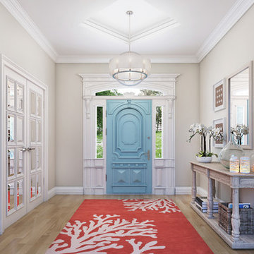
 Quoizel
Inspired by elegance and simplicity the Portland collection is on trend with today's decor. The clear organza hardback shade with light gray trim encases the candelabras that emit a soft glow making any room visually appealing. The Brushed Nickel finish completes the look where fashion meets form. Also available in a Western Bronze finish and a complementing light amber organza hardback shade with bronze trim.
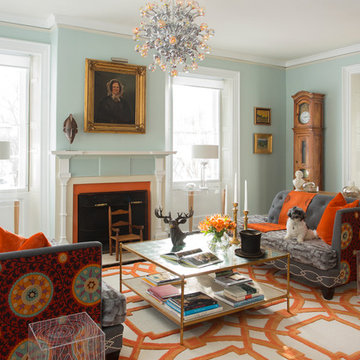
 Favreau Design
Inspiration for a victorian formal living room remodel in San Francisco with blue walls and a standard fireplace
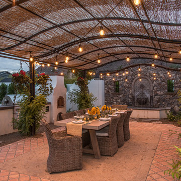
 Greey Pickett
The landscape of this home honors the formality of Spanish Colonial / Santa Barbara Style early homes in the Arcadia neighborhood of Phoenix. By re-grading the lot and allowing for terraced opportunities, we featured a variety of hardscape stone, brick, and decorative tiles that reinforce the eclectic Spanish Colonial feel. Cantera and La Negra volcanic stone, brick, natural field stone, and handcrafted Spanish decorative tiles are used to establish interest throughout the property.
A front courtyard patio includes a hand painted tile fountain and sitting area near the outdoor fire place. This patio features formal Boxwood hedges, Hibiscus, and a rose garden set in pea gravel.
The living room of the home opens to an outdoor living area which is raised three feet above the pool. This allowed for opportunity to feature handcrafted Spanish tiles and raised planters. The side courtyard, with stepping stones and Dichondra grass, surrounds a focal Crape Myrtle tree.
One focal point of the back patio is a 24-foot hand-hammered wrought iron trellis, anchored with a stone wall water feature. We added a pizza oven and barbecue, bistro lights, and hanging flower baskets to complete the intimate outdoor dining space.
Project Details:
Landscape Architect: Greey|Pickett
Architect: Higgins Architects
Landscape Contractor: Premier Environments
Metal Arbor: Porter Barn Wood
Photography: Scott Sandler
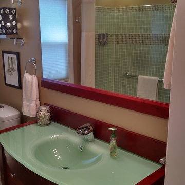

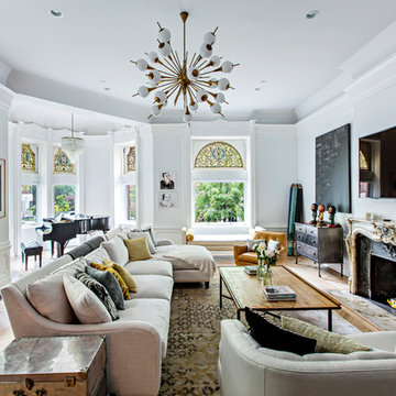
 Horrigan O'Malley Architects
Dorothy Hong, Photographer
Living room - large eclectic open concept medium tone wood floor and brown floor living room idea in New York with white walls, a standard fireplace, a metal fireplace, a wall-mounted tv and a music area
Living room - large eclectic open concept medium tone wood floor and brown floor living room idea in New York with white walls, a standard fireplace, a metal fireplace, a wall-mounted tv and a music area

 User
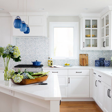
UserThis smart kitchen renovation in Silver Spring, Maryland, involved removing three walls and a centrally located powder room and a closet. The powder room was relocated into the original closet area, and the patio door moved nearby. The main window was enlarged to create an anchor and focal point for the new kitchen as well as to enhance the view onto the lovely backyard. An angled island keeps the room feeling spacious and open, and a corner pantry was designed so as not to lose precious storage space.
 CO Interiors
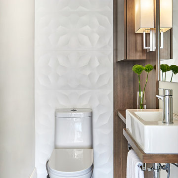
In this narrow powder room, texture creates impact without relying on bold colour. Three-dimensional white wall tile transforms the far wall into a sculptural focal point, drawing the eye through the room and giving the compact footprint a greater sense of depth. A vertical walnut feature visually emphasizes the ceiling height while supporting the wall-mounted sink, open ledges and contemporary sconce. Together, the streamlined fixtures and layered materials make the small space feel considered rather than constrained.

Sponsored
Fredericksburg, OH
High Point Cabinets
Columbus' Experienced Custom Cabinet Builder | 4x Best of Houzz Winner
 TKS Design Group
Free ebook, Creating the Ideal Kitchen. DOWNLOAD NOW
One of my favorite things to work on is older homes with a bit of history because I find it an interesting challenge to marry the historical architectural features of a home with modern design elements that work well for my client’s current lifestyle.
This home was particularly fun because it was the second kitchen we had done for this family and was quite a departure from the style of the first kitchen.
The before shot of the kitchen shows a view from the family room. See the dropped ceiling? We were curious, was this just part of the design or was the dropped ceiling there to hide mechanicals? Well we soon found out that it was mostly decorative (yay!), and with the exception of a little bit of work to some plumbing from an upstairs bathroom and rerouting of the ventilation system within the original floor joists, we were in the clear, phew! The shot of the completed kitchen from roughly the same vantage point shows how much taller the ceilings are. It makes a huge difference in the feel of the space. Dark and gloomy turned fresh and light!
Another serious consideration was what do we do with the skinny transom window above the refrigerator. After much back and forth, we decided to eliminate it and do some open shelving instead. This ended up being one of the nicest areas in the room. I am calling it the “fun zone” because it houses all the barware, wine cubbies and a bar fridge — the perfect little buffet spot for entertaining. It is flanked on either side by pull out pantries that I’m sure will get a ton of use. Since the neighboring room has literally three walls of almost full height windows, the kitchen gets plenty of light.
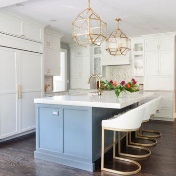
The gold shelving brackets, large pendant fixtures over the island and the tile mural behind the range all pay subtle homage to the home’s prairie style architecture and bring a bit of sparkle to the room.
Even though the room is quite large, the work triangle is very tight with the large Subzero fridge, sink and range all nearby for easy maneuvering during meal prep. There is seating for four at the island, and work aisles are generous.
Designed by: Susan Klimala, CKD, CBD
Photography by: LOMA Studios
For more information on kitchen and bath design ideas go to: www.kitchenstudio-ge.com
 Blue Heron
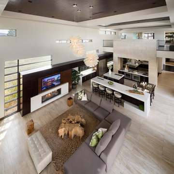
Great room and kitchen photographed from second story loft/game room area photographed by Trent Bell Photography.
Example of a huge trendy open concept living room design in Las Vegas with a ribbon fireplace and a media wall
Example of a huge trendy open concept living room design in Las Vegas with a ribbon fireplace and a media wall
 FineLine Kitchens, Inc.
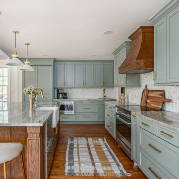
Hi everyone, I'm Sarah and Ogun we are here with fine line kitchens. So we are a couple working together. I do the interior design and remodeling of the space material selection meeting with the clients. And I handled operations outside, you know meaning all the construction work that is taking place the inside. The houses that we work in. I handle all the aspects of the construction, so today's project is very special. We're in Vienna and the client had a very big family. It's a family of seven that lives here. So we had a few aspects that we needed to keep in mind while designing this one. Having everybody be able to sit on the island. So we wanted plenty of seating all the way around. We didn't want anybody standing or anything like that. So what we did is we maximize the space. The center island is the biggest part of the kitchen. We use a natural stone to kind of give it a beautiful texture versus quartz. It's kind of standard white or kind of fabricated, so I wanted something very natural. We did this because I took my inspiration from the outside, so the inspiration if you look at the view right in front of me is there are so many greens there's a lot of brass accents and I wanted to bring this. Into this kitchen while designing it for my clients. She is very warm very. She wanted a very homey, comfy kind of look for the kitchen. So that's what we did today. As you can see, the cabinets are sage green, very light, so I still think it's a neutral, but it's a lighter color that again brings the outside in and we combine that with the oak right behind me so it's a slightly warm oak. It's not very dark. It's not very light. It's a medium brown and the same color went on the island. To kind of tie these two in and the backsplash, my favorite part is where you can see a little bit of design. It is, in my opinion still classic, but includes a pattern so the outside part is as we said in the beginning, is handled by my husband. I'd like him to speak a little bit about that. Thanks, Sarah, I want to talk to you guys a little bit about the construction part of this project. Originally this kitchen was located mostly in this area. They had their stove there sing. It was more of a peninsula layout in Sarah's and the customer vision they wanted. They wanted to get rid of the peninsula and they want to be able to have a huge island that can at least sit seven people because they're familiar with seven. So we wanted to make sure that we can achieve this design and bring it to life so that they can be happy with this layout. Some of the challenges we had, the house, the home being, you know, old home. There were a lot of you know the older electrical and plumbing that had to be replaced. We had to relocate the stove from here to this area. Over here we had put a nice foot fan that we had to relocate all the ductwork and the plumbing. Was being on the peninsula area. We had to relocate it to the center islands. So we achieved all this and kind of like bring it to bring in this kitchen up to date it looks beautiful. That's true, so yes, the old layout did not function for my clients because everything was kind of gathered on one side of the kitchen. So there was like a peninsula right there. So the end of this island kind of continued straight. And that was just the L shape. Kind of where everything was and there used to be another big table here, so they were using only kind of half of the space. So like I said at the beginning, our vision was to kind of feed everybody at the island, create some symmetry. 'cause I love that. So as you can see behind me, this is kind of the focal point symmetrical. Everything is kind of even we wanted to also panel the fridge here so it mimics the pantry and another size. So when you're looking at it, it is bringing again that symmetry back again. I hope you enjoyed this kitchen and this video and I'll see you soon. So how do you think this project turned out? It's nice. I like the color. I think it turned out nice. It's kind of like a little bit different color than what we always do. So I realize. Are you giving me a little bit of credit here that I did something different? Are you proud? I'm so proud of you. Other than that I like it. That they have kind of like a two sink. So if this was our kitchen, if we ever like you can have your own. I can have mine if we ever get into a fight then this can be like my own kitchen. Why are we gonna bring in a fight right now? So I'm cooking anyway. You're grilling most of the time, So what are you even talking about? My kitchen? That's my kitchen. You can just take the small sink. That's fine. It's always good to have your own space right there, so anyways. Thank you guys for watching. We hope to see you soon and if you have any questions please click the link below. It'll lead you to our website, house, YouTube and all of the social media is so nice to have you guys. We'll see you soon. Thanks bye bye-bye.
7