
Search results for "Time consuming task" in Home Design Ideas
 CITYDESKSTUDIO, Inc.
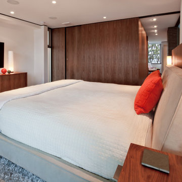
This home enjoys stunning views of Sweeney Lake from almost anywhere in the home; however it was in need of repair and a significant reorganization of the plan to take full advantage of site. The project is about the complete restoration and rethinking of this vintage 1965 mid-century gem. The house is deceivingly large with a full finished lower level and an indoor pool room; however it lived cramped and broken up. The entry was uninviting and small, the poolroom unused and poorly heated, the kitchen undersized, and the bedrooms and baths poorly accessed.
Our task was to open up the home through the rethinking of the floor plan and the introduction of a new central axis connecting and organizing the homes functions and spaces around view corridors and existing or new focal points. The home had beautiful features to build upon; the central brick fireplace, the raised roofs over the living and pool rooms, and the view to the lake itself. A fully redone exterior and interior preserve the homes proportion and scale, while at the same time bring greater connection to the site and a much needed clarity to the homes organization.
Project Team:
Ben Awes AIA, Principal-In-Charge
Bob Ganser AIA
Christian Dean AIA
Nate Dodge
 Schulte Design Build
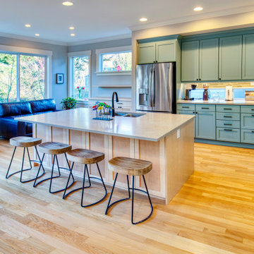
This kitchen project is in a newer build home (2007). The family liked everything about the space except for the island layout and location. Both ends of it were pinch points which made it cumbersome for multiple people to be in the space at a time. They liked the granite countertops but the one on the island was damaged and needed to be replaced to accommodate the new island configuration. Due to this, it made sense to replace all the countertops with quartz. The perimeter cabinets were in good shape but were a dark color which made the space dark and uninviting. We solved this by painting them a bright green/blue color with a two-part water-based paint. We added a couple of other cabinets in the adjacent spaces to provide them with more needed storage which did not impact the kitchen space. We relocated the existing 3 recessed lights over the island which saved them from the landfill. We replaced the old under cabinet fluorescent light fixtures with new energy efficient LED channel fixtures that provide much better counter task lighting. We painted both the ceiling and walls to freshen up the space. As you can see, we were able to solve this family’s kitchen problems in both an environmentally and budget conscious way with creative solutions.
 Grounded
Grounded, Anna Boeschenstein
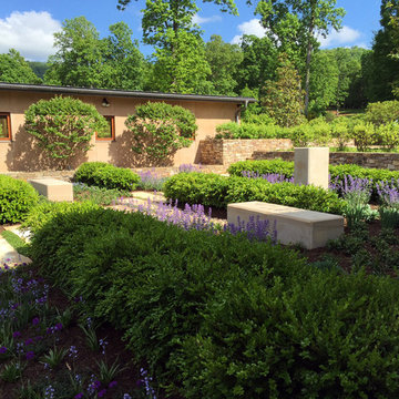
In this small space, Grounded was tasked with replanting and re-imagining the entry courtyard of a modern farm house. Working within an existing framework of walls, paving, and mature boxwoods, we developed a strategy for year-round interest.
Three stone cubes act as sculptural forms, pull the entry path into three dimensions and add winter life to the garden, which is viewed from the interior on all sides. Monoculture bands of four purple perennial plants come to life at different times throughout the season, creating an ever-changing mosaic of color and texture to the space, all within one cohesive color palette.
Find the right local pro for your project
 Daniel Scerri Periti
We were approached with a request to design the furnishings for an existing ‘finished’ apartment. The intention was to move in relatively fast, and the property already had an existing marble floor, kitchen and bathrooms which had to be kept. The property also boasted a fantastic 270 degree view, seen from most of the apartment. The clients had a very important role in the completion of the project. They were very involved during the design process and through various decoration choices. The final design was kept as a rigid guideline when faced with picking out all the different elements.
Once clear of all previous furniture, the space felt cold and bare; so we immediately felt the need for warmth, and raw, natural elements and textures to complement the cold marble floor while visually tying in the design of the whole apartment together.
Since the existing kitchen had a touch of dark walnut stain, we felt this material was one we should add to the palette of materials to contest the stark materials. A raw cement finish was another material we felt would add an interesting contrast and could be used in a variety of ways, from cabinets to walls and ceilings, to tie up the design of various areas of the apartment.
To warm up the living/dining area, keeping the existing marble floor but visually creating zones within the large living/dining area without hindering the flow, a dark timber custom-made soffit, continuous with a floor-to-ceiling drinks cabinet zones the dining area, giving it a degree of much-needed warmth.
The various windows with a stupendous 270 degree view needed to be visually tied together. This was done by introducing a continuous sheer [drape] which also doubled up as a sound-absorbing material along 2 of the 4 walls of the space.
A very large sofa was required to fill up the space correctly, also required for the size of the young family.
Services were integrated within the units and soffits, while a customized design in the corner between the kitchen and the living room took into consideration the viewpoints from the main areas to create a pantry without hindering the flow or views. A strategically placed floor-to-ceiling mirror doubles up the space and extends the view to the inner parts of the apartment.
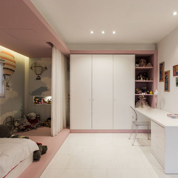
The daughter’s bedroom was a small challenge in itself, and a fun task, where we wanted to achieve the perception of a cozy niche with its own enclosed reading nook [for reading fairy tales], behind see-through curtains and a custom-ordered wall print sporting the girl’s favorite colors.
The sons’ bedroom had double the requirements in terms of space needed: more wardrobe, more homework desk space, a tv/play station area… “We combined a raised platform area between the boys’ beds to become an area with cushions where the kids can lay down and play, and face a hidden screen behind the homework desk’s sliding back panel for their play station”. The color of the homework desk was chosen in relation to the boys’ ages. A more masculine material palette was chosen for this room, in contrast to the light pastel palette of the girl’s bedroom. Again, this colour can easily be changed over time for a more mature look.
PROJECT DATA:
St. Paul’s Bay, Malta
DESIGN TEAM:
Perit Rebecca Zammit, Perit Daniel Scerri, Elyse Tonna
OTHER CREDITS:
Photography: Tonio Lombardi
Styling : TKS
 Drury Design
THE SETUP
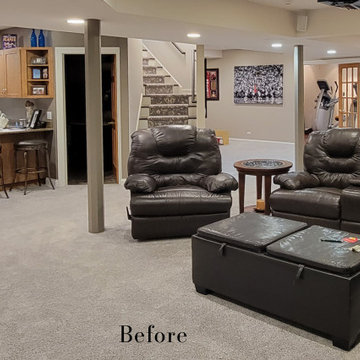
When we first encountered this basement for a family with three boys, we saw a space with untapped potential. Though previously remodeled, it lacked a cohesive design strategy. The expansive area housed various entertainment pieces (a shuffleboard table, air hockey, foosball, etc.) scattered haphazardly throughout the space.
While the basement included a workout room and a rudimentary kitchen area, it lacked a dedicated game room or proper bar. Excessive storage closets along the back wall consumed valuable real estate that could be repurposed for more engaging uses.
In essence, the basement was spacious but disjointed—functional for family use but falling short as an entertainment hub. It didn’t align with the sophistication of the rest of the home. Our clients envisioned a transformation: a fresh, organized space that would not only serve their family’s needs but also shine as an inviting arena for entertaining friends and hosting gatherings – especially sports-focused gatherings!
Design Objectives:
Reimagine the basement layout, creating distinct zones for varied activities.
Expand the workout area to accommodate new equipment, including a Smith machine.
Implement a multi-screen setup inspired by high-end sports bars, allowing guests to follow multiple games while socializing.
Enhance existing features while developing new areas:
Optimize a workout space for all equipment needs
Establish a dedicated children’s space with guest room capabilities
Create an integrated bar and entertainment area
Retain and incorporate the existing projector setup
Design Challenges:
Navigate layout constraints in the new workout room due to fixed utility areas.
Carve out a distinct space for kids within the open plan.
Revitalize an underutilized section of the basement.
Elevate the existing big screen area with purposeful design elements.
Develop a full-fledged bar area while maintaining kitchen functions applicable for hangout snacking.
Work around immovable structural elements (soffits, load-bearing support columns)
THE RENEWED SPACE
Design Solutions:
Install a stylish barn door for the utility area of the new workout space, improving aesthetics and accessibility.
Repurpose the former workout room into a dedicated game room for kids, utilizing couches with pull-out beds so the area can double as overflow guest accommodations.
Transform the unused area into a vibrant pub-style area for card and table games.
Enhance the big screen area with elegant wainscoting and ambient theatre-style lighting.
Design a multi-functional wet bar area featuring varied seating, prep areas, and a microwave.
Base the bar sink area width off the soffit above it.
In the big screen area, use the soffit to inform the width of a wainscoting section.
For the immovable support columns, dress one up to match the wainscoting of the nearby big screen wall. Hide the other one in a new wall.
Final Thoughts:
The reimagined basement has exceeded our clients’ expectations, evolving into the ultimate entertainment hub. With seven strategically placed screens, it’s perfect for gatherings focused on major sporting events and casual gatherings, as well. The space strikes a balance between adult sophistication and family-friendly functionality, featuring distinct zones for various activities.
The new design not only maximizes functionality for modern, multi-screen entertainment but also elevates the aesthetic appeal. It integrates flawlessly with the rest of the home’s transitional style while allowing each basement section to maintain its unique character. The result is a versatile space that caters to both intimate family time and large-scale entertaining.
 TOC design & construction inc.
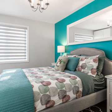
Girl and Boy Bedrooms:
Personalization: Allow each teenager to express their individual style and interests in their bedroom decor. Incorporate their favorite colors, artwork, and decor elements that reflect their personalities.
Ample Storage: Include sufficient storage options like closets, shelves, and drawers to accommodate their belongings and keep the rooms organized.
Flexibility: Design the space in a way that allows for flexibility and future adaptations as their needs and preferences may change over time.
 Thompson Remodeling
For 39 years, the owners of this four bedroom home lived with a cramped bathroom that hardly deserved to be called a master bath. Its limited space allowed only one user at a time, lacked counterspace, and was severely outdated.
The homeowners had specific needs and a very clear vision for their remodeled bath, which included:
- Enlarging the existing space to make it suitable for two to use
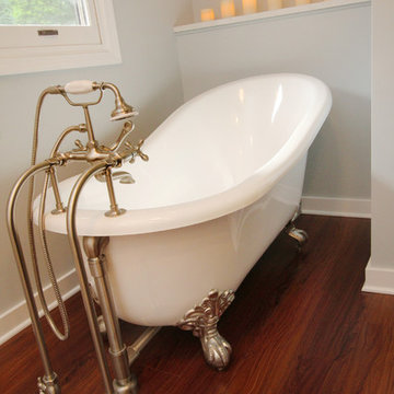
- A claw foot tub for daily baths
- A spa shower
- Plenty of counterspace and storage
- A modern European aesthetic
- “Bling factor”
The new design is the ultimate marriage of function and style. To start, the space from a seldom used spare bedroom was captured. A custom floating vanity provides much needed counterspace and storage. Multiple light sources provide task, ambient light and natural light.
A claw foot tub serves as the focal point and inspiration for the rest of the finishes. A crystal chandelier and wall sconces add an elegant “bling factor”. The curves of the vessel sinks balance nicely with the straight lines of the vanity. A spa shower provides a soothing option for days when the owner opts for a faster bathing option.
 CITYDESKSTUDIO, Inc.
So often our task as residential architects is not to create something out of nothing. Instead, it is to help evolve, or bring forward something that is already there; to see with new eyes the best of what exists and to clarify and expand it, so that the house supports and celebrates how the client lives, and hopes to live, in the home.
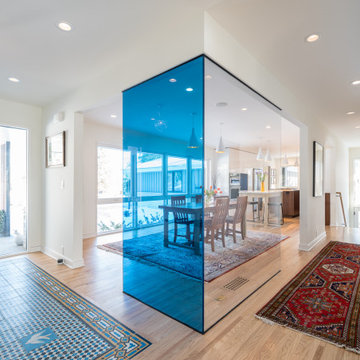
So was the case with our House of Blues. The house was already wonderful. There was plenty of space, good views, a functioning floor plan, and the home was in overall good condition. The best features however, were embedded in the time it was built – mid 1960’s. The views were good, but too small. The kitchen location worked well, but is was closed off, cramped, and lacking counter space. The dining room was elegant, but too large and isolated. The graceful central hallway remained the homes most unique feature, but it was dark and the entry to the rooms on either side were accessed via small doorways. The bathrooms were large enough, and in the right locations, but they were tired and dated, and there was no mudroom.
We created something out of something. Beautiful shades of blue permeated the owner’s things and became a central theme in new elements. Daylight was expanded and brought deeper into the space. Doorways were widened and walls removed. The central hallway was fully opened at the end with two-story glass to improve on an already good idea. The kitchen was wholly new and expanded by borrowing space from the dining room. A mudroom was carved out of the garage. All the bathrooms were remodeled with fresh materials and new features. The gracious concrete stoop was reclad in stone and the front door was changed out for a splash of color. Light now permeates all the rooms and spaces flow together without losing their identity or function. The owners no longer feel blue in their House of Blues!
Location: St Paul, MN
Project Team:
Ben Awes, AIA, Principal- in -Charge
Nate Dodge
 Kalota Topical Inspirations
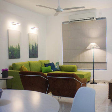
The task was to transform a timeworn two bedrooms unit at Edmonton government flats into a contemporary-style apartment. The building was constructed in 2000, and the client requested to modify the place with minimum structural changes. Therefore the whole renovation includes the least demolishes and reconstructions.
We removed the previous pantry that was broken at that time and redesigned it in a user-friendly manner. More space was given for the dining area by replacing the ‘u-shaped’ old pantry counter with a simple straight unit. We made sure to add extra storage space up to the height of the ceiling. The main construction challenge was to renovate the existing bathrooms. Kalota changed its appearance by carefully paying attention to waterproofing and adding new accessories and tiles. The living room was transformed into a more spacious seating area with modern furniture and the correct balance of lighting. We applied colors and wall textures to enhance the contemporary ambiance. The fabrications of the interior were completed under the supervision of Kalota. A special thank goes to the client for providing us with the necessary freedom to design and complete the project.
 Drury Design
THE SETUP
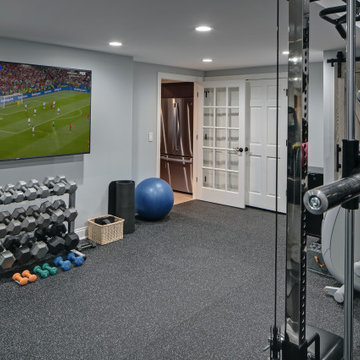
When we first encountered this basement for a family with three boys, we saw a space with untapped potential. Though previously remodeled, it lacked a cohesive design strategy. The expansive area housed various entertainment pieces (a shuffleboard table, air hockey, foosball, etc.) scattered haphazardly throughout the space.
While the basement included a workout room and a rudimentary kitchen area, it lacked a dedicated game room or proper bar. Excessive storage closets along the back wall consumed valuable real estate that could be repurposed for more engaging uses.
In essence, the basement was spacious but disjointed—functional for family use but falling short as an entertainment hub. It didn’t align with the sophistication of the rest of the home. Our clients envisioned a transformation: a fresh, organized space that would not only serve their family’s needs but also shine as an inviting arena for entertaining friends and hosting gatherings – especially sports-focused gatherings!
Design Objectives:
Reimagine the basement layout, creating distinct zones for varied activities.
Expand the workout area to accommodate new equipment, including a Smith machine.
Implement a multi-screen setup inspired by high-end sports bars, allowing guests to follow multiple games while socializing.
Enhance existing features while developing new areas:
Optimize a workout space for all equipment needs
Establish a dedicated children’s space with guest room capabilities
Create an integrated bar and entertainment area
Retain and incorporate the existing projector setup
Design Challenges:
Navigate layout constraints in the new workout room due to fixed utility areas.
Carve out a distinct space for kids within the open plan.
Revitalize an underutilized section of the basement.
Elevate the existing big screen area with purposeful design elements.
Develop a full-fledged bar area while maintaining kitchen functions applicable for hangout snacking.
Work around immovable structural elements (soffits, load-bearing support columns)
THE RENEWED SPACE
Design Solutions:
Install a stylish barn door for the utility area of the new workout space, improving aesthetics and accessibility.
Repurpose the former workout room into a dedicated game room for kids, utilizing couches with pull-out beds so the area can double as overflow guest accommodations.
Transform the unused area into a vibrant pub-style area for card and table games.
Enhance the big screen area with elegant wainscoting and ambient theatre-style lighting.
Design a multi-functional wet bar area featuring varied seating, prep areas, and a microwave.
Base the bar sink area width off the soffit above it.
In the big screen area, use the soffit to inform the width of a wainscoting section.
For the immovable support columns, dress one up to match the wainscoting of the nearby big screen wall. Hide the other one in a new wall.
Final Thoughts:
The reimagined basement has exceeded our clients’ expectations, evolving into the ultimate entertainment hub. With seven strategically placed screens, it’s perfect for gatherings focused on major sporting events and casual gatherings, as well. The space strikes a balance between adult sophistication and family-friendly functionality, featuring distinct zones for various activities.
The new design not only maximizes functionality for modern, multi-screen entertainment but also elevates the aesthetic appeal. It integrates flawlessly with the rest of the home’s transitional style while allowing each basement section to maintain its unique character. The result is a versatile space that caters to both intimate family time and large-scale entertaining.
 Jane Ellison
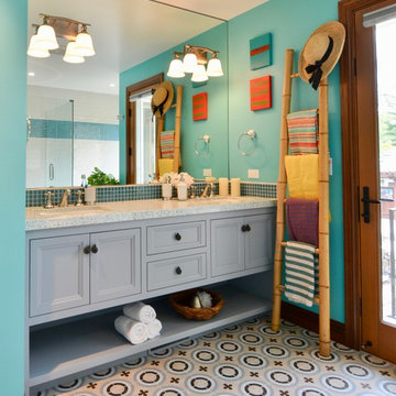
This newly remodeled family home and in law unit in San Anselmo is 4000sf of light and space. The first designer was let go for presenting grey one too many times. My task was to skillfully blend all the color my clients wanted from their mix of Latin, Hispanic and Italian heritage and get it to read successfully.
Wow, no easy feat. Clients alway teach us so much. I learned that much more color could work than I ever thought possible.
 Crystal Kitchen + Bath
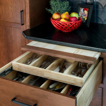
The goal for this 1939 Tudor-style story-and-a-half home was to create a kitchen that offered the conveniences, storage, and performance of a modern workspace while preserving the warmth, craftsmanship, and vintage charm that made the home special. The client, an avid home cook, wanted the room to feel as though it had always belonged to the house, with thoughtful upgrades that respected the original architecture rather than competing with it. Just as important, she needed a more efficient layout with enough storage for small appliances, so everyday cooking would no longer require carrying items up from the lower level.
Several existing conditions shaped the design approach. The kitchen retained original, amber-stained birch woodwork that the client wished to keep, and the compact footprint was interrupted by six doorways and two windows, none of which were to be moved, altered, or replaced. A previous flooring update had left the door casings undercut too short, creating visible gaps where the casing met the floor. The existing vintage 40-inch range also lacked proper ventilation, yet the client wished to accommodate a refrigerator, dishwasher, cooktop, double ovens, built-in microwave, and effective venting above the cooktop into the new kitchen layout.
To honor the original millwork, beaded inset-style cherry cabinetry was selected in a soft, hand-rubbed finish that will deepen over time and develop a natural patina. Charcoal-gray soapstone countertops complement the cabinetry while reinforcing the historic character of the home with an organic, timeworn texture. The former breakfast nook was transformed into a butler’s pantry, adding valuable base cabinet storage and expanded work surfaces for frequently used small appliances. Also in the butler’s pantry, a single upper cabinet was paired with open shelves to give an open, airy feeling while adding character and practical storage. A classic single-bowl apron-front workstation sink contributes both period-appropriate character and practical prep and cleanup function.
Because the home’s openings were such a defining feature, the design worked within the existing architecture instead of altering it. Custom plinth blocks were created for each doorway to extend the original casing gracefully down to the new natural red oak flooring, resolving the earlier construction issue while adding a detail that feels authentic to the age of the house. Despite the number of door and window openings, the new layout provides a significantly more functional, built-in kitchen with an improved work triangle for serious cooking.
Appliance placement was carefully planned to deliver the requested performance without overwhelming the small room. Three cooking functions (double ovens & microwave) were consolidated into one location with a GE Café double oven featuring Advantium Technology, while the client’s compact 31-inch refrigerator was reused to preserve space. A sleek 30-inch induction cooktop provides efficient cooking, and a Vent-A-Hood ARS ductless vent hood supplies needed ventilation without requiring a duct run to the exterior.
The finish palette balances richness, texture, and historical sensitivity. A deeply textured navy backsplash tile adds depth and dramatic shadow play against the soapstone, while wallpaper in the back entry echoes the tile’s geometric pattern to visually connect the adjoining spaces. Oil-rubbed bronze cabinet hardware and light fixtures enhance the warmth of the cherry cabinetry and complete the antique-inspired feel.
Lighting was layered to make the compact kitchen brighter, more useful, and more inviting. Vintage-style semi-flush ceiling fixtures establish the overall tone, while dimmable puck lights highlight select areas and undercabinet task lighting keeps work surfaces well illuminated.
The completed kitchen now feels both highly functional and deeply rooted in the home’s history. Rich cherry cabinetry, velvety soapstone, natural red oak flooring, navy tile, bronze accents, and carefully preserved birch trim work together to create a warm, cohesive space that celebrates timeless craftsmanship. By increasing storage, improving workflow, integrating modern appliances, and respecting the Tudor home’s original character, the design achieves the client’s vision: a kitchen that feels personal, practical, historically appropriate, and as though it has always been there.
 Design Perspective Interior Design, LLC
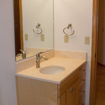
I designed this ADA bathroom and assisted the homeowner in making all of the fixture, material and finish choices while working at Corvallis Custom Kitchens and Baths.
Our client needed to update this bathroom for her husband who uses a walker and needs assistance with daily bathing and such.
We installed a frameless glass shower with a fixed panel and one slider section. In the fixed panel, we installed a small door so the controls for the shower can be accessed without having to enter the shower. A linear drain allows for a zero threshold entry into the shower allowing for the bather to enter without any barrier to step over.
We installed an American Standard Cadet Pro Right Height toilet and places blocking in the wall so drop down grab bars (one with a toilet paper holder) could be added if wanted at a later time.
We decided to install a narrower vanity than what was previously installed to allow more room in the toilet area. Maple flat panel cabinetry was installed with Silestone Phoenix quuartz countertops and backsplash with a Kohler Caxton undermount sink with a Moen single handle faucet.
Grab bars were installed in the shower stall and at the entry to the shower, along with a Speakman grab bar shower system with Hansgrohe shower controls. A combo niche for shampoo and such was installed close to the handheld showerhead for easy access.
LED lighting was added to the shower area on it's own dimmer switch. An additional LED fixture was installed over the vanity to provide excellent task lighting for anyone using the vanity.
The door to the bedroom was also changed to a pocket door and widened to allow easier access to the bathroom from the bedroom.
 Skelly Build
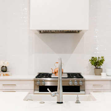
Depending on your kitchen layout, island sinks can save you space and functionality. One of the main reasons for the main sink in the island is how much time you spend at the sink. If you tend to socialize more in the kitchen while doing tasks, island sinks may be for you! Since this was a family home reno project, a ton of interaction will take place in this area! We made sure to create an inviting space along with Etch Design Group.
There was a full gut of the kitchen. This included all cabinetry, countertops, and backsplash. The main focus in this kitchen part of the reno was moving the sink location from the wall to the newly installed island. The new layout included new cabinets painted a beautiful shade of timeless white, on top of those polished Statuario quartz countertops with light veining were installed. These new custom cabinets were customized to the homeowners' specifications for her kitchenware items.
Electrically, we installed 6 new LED recessed canned lights and added new outlets to the island to add more lighting in the home.
 Clazak Kitchen and Bathroom
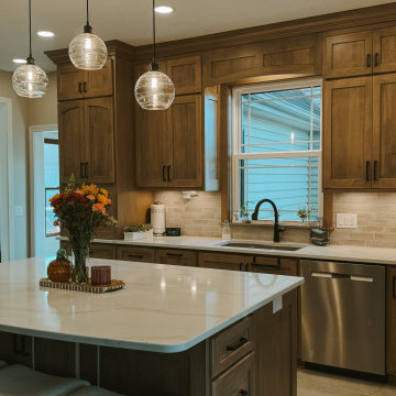
This transitional kitchen remodel features custom shaker cabinetry, a warm wood-stained island, and a highly functional U-shaped layout designed for everyday living. The original kitchen was reimagined to improve flow, storage, and lighting while maintaining a timeless, neutral color palette.
Warm wood custom cabinets extend to the ceiling with crown molding for a built-in look, paired with soft-close drawers and doors for lasting durability. Deep drawer storage near the range, expanded island storage, and improved corner cabinetry solutions maximize organization and efficiency. Under-cabinet lighting and recessed ceiling lighting enhance task areas and create a bright, welcoming atmosphere.
Ceramic tile flooring in a natural finish adds warmth and complements the neutral cabinetry, while the centered sink under the window brings in natural light and balances the layout.
This custom kitchen renovation blends classic design, modern functionality, and thoughtful storage solutions—creating a warm, family-friendly space built to stand the test of time.
 Schulte Design Build
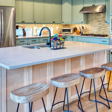
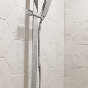
This kitchen project is in a newer build home (2007). The family liked everything about the space except for the island layout and location. Both ends of it were pinch points which made it cumbersome for multiple people to be in the space at a time. They liked the granite countertops but the one on the island was damaged and needed to be replaced to accommodate the new island configuration. Due to this, it made sense to replace all the countertops with quartz. The perimeter cabinets were in good shape but were a dark color which made the space dark and uninviting. We solved this by painting them a bright green/blue color with a two-part water-based paint. We added a couple of other cabinets in the adjacent spaces to provide them with more needed storage which did not impact the kitchen space. We relocated the existing 3 recessed lights over the island which saved them from the landfill. We replaced the old under cabinet fluorescent light fixtures with new energy efficient LED channel fixtures that provide much better counter task lighting. We painted both the ceiling and walls to freshen up the space. As you can see, we were able to solve this family’s kitchen problems in both an environmentally and budget conscious way with creative solutions.
 Astaneh Construction General Contractor
Our team was approached by a lovely client in early January 2022 to undertake a full home renovation project. The scope of the project initially included updating the interior of the home, with a focus on the kitchen, flooring, all the bathrooms, and the basement. We also took on the task of painting the entire interior of the house, giving it a fresh and updated look.
As the project progressed, the client expressed interest in updating the exterior of the home as well. We worked with them to design and build a new deck that provided a functional and stylish space for outdoor entertaining. We also tackled the landscaping of the front and backyard of the property, creating a cohesive and inviting look that complemented the updated interior design.
Throughout the project, we worked closely with the client to ensure that their vision was realized, taking care to incorporate their input and preferences into every aspect of the design. We also prioritized functionality and durability, selecting materials and finishes that would stand the test of time and provide lasting value for the homeowner.
Despite the scale of the project, we were able to complete it in just four months, from day one to last one. Our team worked efficiently and effectively to ensure that every detail was taken care of, from the initial design to the final finishing touches.
The end result is a stunning and functional home that the client is thrilled with. The updated interior provides a modern and comfortable living space, while the new deck and landscaping create a welcoming and inviting exterior. We are proud to have been a part of this transformative project and look forward to providing more high-quality renovation services in the future.
 Lori Delisle Interior Design & Decorating
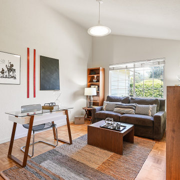
My client's mother had a love for all things 60's, 70's & 80's. Her home was overflowing with original pieces in every corner, on every wall and in every nook and cranny. It was a crazy mish mosh of pieces and styles. When my clients decided to sell their parent's beloved home the task of making the craziness look welcoming seemed overwhelming but I knew that it was not only do-able but also had the potential to look absolutely amazing.
We did a massive, and when I say massive, I mean MASSIVE, decluttering including an estate sale, many donation runs and haulers. Then it was time to use the special pieces I had reserved, along with modern new ones, some repairs and fresh paint here and there to revive this special gem in Willow Glen, CA for a new home owner to love.
 E. F. San Juan
Gulf-Front Grandeur
Private Residence / Alys Beach, Florida
Architect: Khoury & Vogt Architects
Builder: Hufham Farris Construction
---
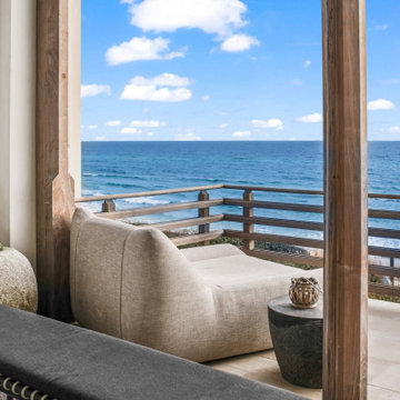
This one-of-a-kind Gulf-front residence in the New Urbanism community of Alys Beach, Florida, is truly a stunning piece of architecture matched only by its views. E. F. San Juan worked with the Alys Beach Town Planners at Khoury & Vogt Architects and the building team at Hufham Farris Construction on this challenging and fulfilling project.
We supplied character white oak interior boxed beams and stair parts. We also furnished all of the interior trim and paneling. The exterior products we created include ipe shutters, gates, fascia and soffit, handrails, and newels (balcony), ceilings, and wall paneling, as well as custom columns and arched cased openings on the balconies. In addition, we worked with our trusted partners at Loewen to provide windows and Loewen LiftSlide doors.
Challenges:
This was the homeowners’ third residence in the area for which we supplied products, and it was indeed a unique challenge. The client wanted as much of the exterior as possible to be weathered wood. This included the shutters, gates, fascia, soffit, handrails, balcony newels, massive columns, and arched openings mentioned above. The home’s Gulf-front location makes rot and weather damage genuine threats. Knowing that this home was to be built to last through the ages, we needed to select a wood species that was up for the task. It needed to not only look beautiful but also stand up to those elements over time.
Solution:
The E. F. San Juan team and the talented architects at KVA settled upon ipe (pronounced “eepay”) for this project. It is one of the only woods that will sink when placed in water (you would not want to make a boat out of ipe!). This species is also commonly known as ironwood because it is so dense, making it virtually rot-resistant, and therefore an excellent choice for the substantial pieces of millwork needed for this project.
However, ipe comes with its own challenges; its weight and density make it difficult to put through machines and glue. These factors also come into play for hinging when using ipe for a gate or door, which we did here. We used innovative joining methods to ensure that the gates and shutters had secondary and tertiary means of support with regard to the joinery. We believe the results speak for themselves!
---
Photography by Layne Lillie, courtesy of Khoury & Vogt Architects
 Just the Thing Decorating, Staging, and Windows
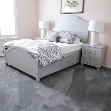
This wonderful client was keeping their New Hampshire home, but was relocating for 2 years to Texas for work. Before the family arrived, I was tasked with furnishing the whole house so the children feel "at home" when they arrived.
Using a unified color scheme, I procured and coordinated the essentials for an on time, and on budget, and on trend delivery!
Photo Credit: Boldly Beige
76