
Search results for "Traffic spaces" in Home Design Ideas

 design styles architecture
The interior of this single family residential home was in need of a remodel. The space was enhanced aesthetically, re-worked for better functionality, and opened up for more natural light and space. The Key areas of focus were the kitchen, master bathroom, and master walk in closet. These areas were most changed architecturally. The spaces we reconfigured to make them more user friendly, adding storage and better foot traffic paths. A wall was removed that divided the kitchen and the living space providing better lighting and an open concept peninsula. The kitchen layout was also re-worked moving the refrigerator, stove, and sink to provide a better configuration for cooking and entertaining. The rest of the home was remodeled to coordinate with the finishes and selections of the master bath and kitchen.

 Renovisions
These homeowners were anxiously ready to remodel their dated 80’s kitchen and reached out to Renovisions to handle the transformation. In this new undertaking we met to discuss plans to brighten the dark room with custom painted white inset cabinets, adding more functional storage, better task lighting and GE Monogram appliances, new hardwood flooring throughout and creating a better flow into the adjacent family room. In order to open up the space, Renovisions suggested creating an angle at the peninsula. Continuing with this approach we replaced the rear door with a new one-light door that swings out instead of in to accommodate new bar stools and a better flow of traffic in and out to the deck outside. Silestone’s quartz countertops in ‘Merope’ were the perfect choice adding a nice contrast yet truly durable and low maintenance. Creating a beautifully unique subway tile niche in linen color at cooktop area and backsplash added an elegant touch to the overall look and homeowners were thrilled with this refreshing look after the Renovision.
Now their newly renovated kitchen is a showcase and nicely outfitted for family and friends.

 The Cabinet Store + Culina Design
Over the course of six weeks we took their home from slightly outdated to stylishly modern. We began our work in the kitchen. Their existing space included oak raised panel cabinets and laminate countertops. We identified two problems right off the bat. First, the kitchen was home to an unfortunately placed island that broke up the room and made for horrible traffic flow. Second, the family was “oaked out,” with obviously dated oak cabinets abounding. The homeowners also requested that their countertops be replaced with a durable and low-maintenance material.
To begin, we replaced the island and created a peninsula to open up the kitchen. We upgraded the cabinets with Showplace Wood cherry cabinets in a truffle finish that matched the home’s entertainment center in the adjacent living room. Next, we replaced the family’s door with a Showplace Wood Concord style for a more modern feel. Finally, we swapped the existing laminate counters with Cambria natural quartz countertops in the Canterbury finish for a beautiful, maintenance free work surface.
Moving into the laundry room, we installed matching cabinets in this space as well. Last but not least, we installed new Wilsonart HD countertops and a Swanstone sink. With the remodel complete, we checked in with our homeowners and are happy to report pleased customers all around!
Find the right local pro for your project

 Amy Pearson Design
Relocating to Portland, Oregon from California, this young family immediately hired Amy to redesign their newly purchased home to better fit their needs. The project included updating the kitchen, hall bath, and adding an en suite to their master bedroom. Removing a wall between the kitchen and dining allowed for additional counter space and storage along with improved traffic flow and increased natural light to the heart of the home. This galley style kitchen is focused on efficiency and functionality through custom cabinets with a pantry boasting drawer storage topped with quartz slab for durability, pull-out storage accessories throughout, deep drawers, and a quartz topped coffee bar/ buffet facing the dining area. The master bath and hall bath were born out of a single bath and a closet. While modest in size, the bathrooms are filled with functionality and colorful design elements. Durable hex shaped porcelain tiles compliment the blue vanities topped with white quartz countertops. The shower and tub are both tiled in handmade ceramic tiles, bringing much needed texture and movement of light to the space. The hall bath is outfitted with a toe-kick pull-out step for the family’s youngest member!
 Renovisions
Our client was ready for a re-do and approached Renovisions for help to design and build a beautiful and durable space that will last as well as add value to her home.
The challenge was to design the new kitchen to allow for better traffic, flow and functionalize this space for much needed storage. Moving the refrigerator to the other side of the kitchen and opening up a section of the wall between the dining room and kitchen was a great design solution. We increased the flow to the dining room and created a spacious feel with better access from the dining area.
Warm hues from the granite countertops provided a rich contrast to the Ivory colored cabinetry that brightened up the room. Under-cabinet lighting was added over all countertop areas and is controlled by a dimmer switch for both task and ambient lighting.
The brushed nickel hardware compliments the stainless steel appliances and Jado pull-down single lever faucet.
The walls are a warm and inviting earthy green tone and ties in well with the soft linen hue of the beautiful subway tile backsplash.
Simple, clean lines and earthy materials like granite and stainless steel worked together to soften the whole look.
Renovisions turned this outdated kitchen into a magnificent space where this homeowner plans on spending a lot of time.

 Jarrett Design
This remodel was a dated 1980s Cape Cod style home that desperately needed updating with the kitchen starting as the foundation for the rest of the home. The owners purchased the property in 2013 with the intent of replacing the existing kitchen installed in 2000, as well as updating most surfaces throughout the home. The space while moderately sized, felt cramped due to the L-shaped design and eat-in island that disrupted traffic flow from the mudroom, dining room and sliding doors to the patio. The owners knew they wanted to bring the light from the southern facing front of the home to the dark cave-like feeling of the kitchen. This was remedied by knocking down the wall between the existing dining room (now a lounge area), widening the entrance to the family room and creating a pathway to the existing formal living room (now the dining room). Also to create better traffic flow into the kitchen, the existing mudroom door was moved to the opposite side of the wall.
A large work island with cooktop, oven and convection/microwave was designed for efficiency and maintaining clean site lines. The work triangle allows for quick and easy meal prep and clean-up for the busy family. Space at the end of the kitchen was perfectly suited for a large kitchen table with views of the back yard, easy conversation with the cook at the island or those hanging in the newly appointed lounge area. The new doorway between the kitchen and dining room showcases the 10ft floor to ceiling bay window, allows more light to flood into the space and creates easy access between the two rooms for family gatherings. Given the home owners relocated to the area for job reasons and are not sure how long they will be in this home, we helped them achieve a balance of a design and finishes that they not only love, but would be appealing to many if another move was in their near future.
Matt Villano Photography
 Inviting Spaces By Kim
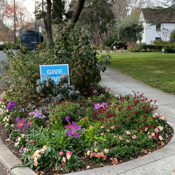
This centrally located intersection to a main thoroughfare a block away was a concern because of the corner lot visibility issue for cars making a turn driving in either direction. The Quince tree bloomed annually for just a short time and was originally planted by the prior home owners decades ago. Keeping it maintained to a height of 4’ maximum, dictated for safety reasons, was still obstructing and limiting the visibility of oncoming traffic at this busy intersection.
The existing roses planted in the same space as the Quince were a perfect backdrop to the new perennials and annuals planted to paint this corner with flowers. The project also included expanding the beautification to both corner areas in coordination with several other planting areas already seasonally updated on the property. With the Redwood Tree as a focal point and Roses, Daphnes, Iris, Azaleas, Fuchsias, Hydrangeas and Camilias highlighting the planting beds the addition of color, including around the driveway and side entrance, transformed the entire space.
Painting With Flowers Is Adding Beauty to Benefit Homeowners & Neighbors!
Kim Beber

 Jarrett Design
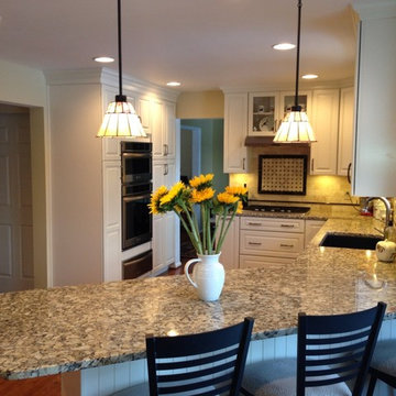
This remodel was a dated 1980s Cape Cod style home that desperately needed updating with the kitchen starting as the foundation for the rest of the home. The owners purchased the property in 2013 with the intent of replacing the existing kitchen installed in 2000, as well as updating most surfaces throughout the home. The space while moderately sized, felt cramped due to the L-shaped design and eat-in island that disrupted traffic flow from the mudroom, dining room and sliding doors to the patio. The owners knew they wanted to bring the light from the southern facing front of the home to the dark cave-like feeling of the kitchen. This was remedied by knocking down the wall between the existing dining room (now a lounge area), widening the entrance to the family room and creating a pathway to the existing formal living room (now the dining room). Also to create better traffic flow into the kitchen, the existing mudroom door was moved to the opposite side of the wall.
A large work island with cooktop, oven and convection/microwave was designed for efficiency and maintaining clean site lines. The work triangle allows for quick and easy meal prep and clean-up for the busy family. Space at the end of the kitchen was perfectly suited for a large kitchen table with views of the back yard, easy conversation with the cook at the island or those hanging in the newly appointed lounge area. The new doorway between the kitchen and dining room showcases the 10ft floor to ceiling bay window, allows more light to flood into the space and creates easy access between the two rooms for family gatherings. Given the home owners relocated to the area for job reasons and are not sure how long they will be in this home, we helped them achieve a balance of a design and finishes that they not only love, but would be appealing to many if another move was in their near future.
Matt Villano Photography

 Julie Kardatzke Architect, LLC
This home home previously belonged to the grandmother of my client, Cathy, and has been in her family for over 100 years. Although it had a lot of charm, the home needed a more functional kitchen and dining area.
The kitchen, located in the original part of the home, underwent an amazing transformation. Originally chopped up by multiple traffic patterns through the space, there was very little uninterrupted work area.
In order to create more wall space for counters and cabinets, I eliminated a door to the outside, relocated the basement stair and raised the sill of the windows to above counter height. The refrigerator, range and sink were relocated to a u-shaped space near the windows for a more efficient and sunny work triangle, and the small bump out where the sink had previously been located became the "butler's pantry", an additional work and storage space. All new cabinets in "Mexican white", a farmhouse sink, a backsplash of cheerful flower tiles, a reclaimed wood floor and the addition of vintage light fixtures all work together to create a modern kitchen which looks perfectly at home in this century-old house.

 Designs by BSB
HUGE transformation! The homes in this area quintessentially have smaller kitchens that dining rooms. In addition, there is no open floor concept so traffic flow is restricted. In this design, we choose to take over the dining room! The fortunate part is the sunroom on the backside of the home was conditioned as part of the home, so the furniture and space plan transformed this room into the "dining room". What a beautiful thing to have on the backside of the home where the view is great (future pictures to come!).
The improvements and challenges were to remove the wall between the kitchen and the formal dining room (which was rarely used) and then extend the kitchen into that space. !! This is a great challenge because it changes the flow, original architectural patterns to the home! We (client included) the plan achieved just that with some sacrifices -- but honestly, with so many more rewards.
Check back for more updates and plans to be uploaded - or send us a message to inquire about how this, is possible!
Photography by David Cannon
 Metropolis Drafting and Construction Inc
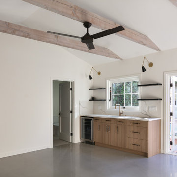
An ADU that will be mostly used as a pool house.
Large French doors with a good-sized awning window to act as a serving point from the interior kitchenette to the pool side.
A slick modern concrete floor finish interior is ready to withstand the heavy traffic of kids playing and dragging in water from the pool.
Vaulted ceilings with whitewashed cross beams provide a sensation of space.
An oversized shower with a good size vanity will make sure any guest staying over will be able to enjoy a comfort of a 5-star hotel.

 Michael Nash Design, Build & Homes
NARI CAPITAL COTY, HONORABLE MENTION AWARD WINNER, RESIDENTIAL KITCHEN $50,000 TO $100,000
The owners of this Mount Vernon home purchased it with plans to remodel the kitchen. The original space was tired, dark and disorganized. A peninsula separated the kitchen from the breakfast area and the adjacent sunroom was only accessed via a single door. The back pantry was poorly designed and there was no logic to the kitchen’s work space.
The first step in this stunning transformation involved replacing the original peninsula with a large central island. Built using espresso stained furniture-quality cabinets with icon legs, open bottoms and exotic dark granite countertops, all kitchen traffic now flows around the island.
The outside wall of the kitchen, featuring a 48” Thermador range, stainless steel range hood and glass tile backsplash, is the focal point of the new space. A stainless steel farm-style sink sits beneath one of two large windows that provide lots of natural light into the room. To the right, sits a 48” Sub Zero refrigerator/freezer.
The wall adjacent to the family room was never used properly. Now it is home to two tall pantries, double ovens and a microwave. Creative pass through arches let the homeowner attend to guests while preparing food in the kitchen. The butler area adjacent to the dining room is filled with glass front cabinetry and additional cabinetry for extra storage.
The kitchen is now part of an open concept design flowing from kitchen to dining room to sun room. By replacing a bearing wall with a structural header, traffic can flow from one room to the next making it brighter and more conducive to entertaining.
More spacious than ever, this new kitchen is the hub of the home for this couple who love to cook and entertain.




 Braswell Design+Build
This classy kitchen has better traffic flow and a bigger footprint after removing the wall between the kitchen and dining area. The glass wall between dining room and living room is functional, but also enhances the open feel of the space without being the focus. White quartz countertops and modern black and white glass and marble tile add a contemporary feel to the traditional kitchen cabinets. The pantry to the right of the fridge was sized to be the same as the freezer panel on the left to enhance symmetry.
Architect Erin May, Photographer Greg Hadley.
 design styles architecture
The interior of this single family residential home was in need of a remodel. The space was enhanced aesthetically, re-worked for better functionality, and opened up for more natural light and space. The Key areas of focus were the kitchen, master bathroom, and master walk in closet. These areas were most changed architecturally. The spaces we reconfigured to make them more user friendly, adding storage and better foot traffic paths. A wall was removed that divided the kitchen and the living space providing better lighting and an open concept peninsula. The kitchen layout was also re-worked moving the refrigerator, stove, and sink to provide a better configuration for cooking and entertaining. The rest of the home was remodeled to coordinate with the finishes and selections of the master bath and kitchen.
 The Cabinet Store + Culina Design
Over the course of six weeks we took their home from slightly outdated to stylishly modern. We began our work in the kitchen. Their existing space included oak raised panel cabinets and laminate countertops. We identified two problems right off the bat. First, the kitchen was home to an unfortunately placed island that broke up the room and made for horrible traffic flow. Second, the family was “oaked out,” with obviously dated oak cabinets abounding. The homeowners also requested that their countertops be replaced with a durable and low-maintenance material.
To begin, we replaced the island and created a peninsula to open up the kitchen. We upgraded the cabinets with Showplace Wood cherry cabinets in a truffle finish that matched the home’s entertainment center in the adjacent living room. Next, we replaced the family’s door with a Showplace Wood Concord style for a more modern feel. Finally, we swapped the existing laminate counters with Cambria natural quartz countertops in the Canterbury finish for a beautiful, maintenance free work surface.
Moving into the laundry room, we installed matching cabinets in this space as well. Last but not least, we installed new Wilsonart HD countertops and a Swanstone sink. With the remodel complete, we checked in with our homeowners and are happy to report pleased customers all around!

 Christine Donner Kitchen Design Inc.
A view into the fridge and ovens. The white perimeter frames the dark with island with seating for four. The island is painted in Benjamin Moore’s Raccoon Fur, with Imperial Danby marble countertop.
Photo by James Northen
Sponsored
Fredericksburg, OH

High Point Cabinets
Columbus' Experienced Custom Cabinet Builder | 4x Best of Houzz Winner

 Inndesign Inc.
This white kitchen is so fresh with a deep contrasting teal walls. Just a few cabinets have bead board which keeps it light. Behind the extended wall that holds the refrigerator is a shallow pantry storage, leaving a traffic pattern that flows to the laundry room.

 Techo-Bloc
This driveway design is inspired by our Blu 80 Slate paver. The best-selling driveway paver with a natural stone look. Our Blu 80mm slate textured paver is now available in our new HD2 technology and is offered in vibrant and neutral colors. For decorative landscape stonework options around the Blu 80 mm, the Blu 6 × 13 mm is packaged separately and can also be used alone for a large-scale herringbone pattern. Great for driveways and all exterior spaces exposed to vehicular traffic. This pavement is also de-icing salt resistant, and withstands harsh climates.Blu 80 mm can also be installed in a permeable application. https://www.techo-bloc.com/shop/pavers/blu-80-slate/

 TR2 Architecture
This green kitchen remodel makes efficient use of a small space and features reused bamboo flooring that was taken out of another home. Idaho Granite Works produced countertops from boulders that came from a quarry a few miles away. Quatersawn white oak cabinets with shaker style doors and pewter knobs were custom built by Mike Anderson and assembled in place. Old popcorn ceiling was scraped flat and floated smooth by Justin Jensen of Clear Sky Drywall. Kohler porcelain sink was bought used from the Habitat store and needed a few chip repairs. Extra deep upper cabinet above refrigerator has storage for baking sheets and bigger pots. A full side panel keeps refrigerator from getting scratched by traffic through adjacent deck door. Window and door were existing and didn't move. 30/70 Kohler sink fits in a smaller than standard sink base cabinet, which allowed the dishwasher and 30" fridge to fit in a tight space.
126