
Search results for "Traffic spaces" in Home Design Ideas
 Bilotta Kitchen & Home
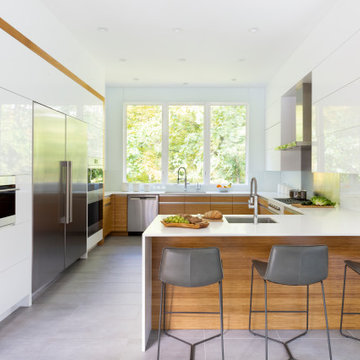
A convergence of sleek contemporary style and organic elements culminate in this elevated esthetic. High gloss white contrasts with sustainable bamboo veneers, run horizontally, and stained a warm matte caramel color. The showpiece is the 3” bamboo framing around the tall units, engineered in strips that perfectly align with the breaks in the surrounding cabinetry. So as not to clutter the clean lines of the flat panel doors, the white cabinets open with touch latches, most of which have lift-up mechanisms. Base cabinets have integrated channel hardware in stainless steel, echoing the appliances. Storage abounds, with such conveniences as tray partitions, corner swing-out lazy susans, and assorted dividers and inserts for the profusion of large drawers.
Pure white quartz countertops terminate in a waterfall end at the peninsula, where there’s room for three comfortable stools under the overhang. A unique feature is the execution of the cooktop: it’s set flush into the countertop, with a fascia of quartz below it; the cooktop’s knobs are set into that fascia. To assure a clean look throughout, the quartz is continued onto the backsplashes, punctuated by a sheet of stainless steel behind the rangetop and hood. Serenity and style in a hardworking space.
This project was designed in collaboration with Taylor Viazzo Architects.
Photography by Jason Taylor, R.A., AIA.
Written by Paulette Gambacorta, adapted for Houzz
Bilotta Designer: Danielle Florie
Architect: Taylor Viazzo Architects
Photographer: Jason Taylor, R.A., AIA
 Inviting Spaces By Kim
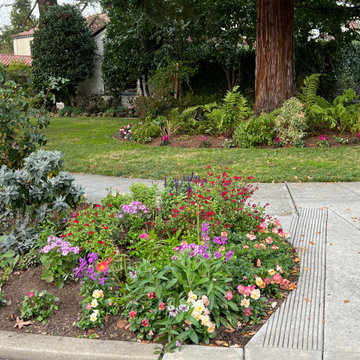
This centrally located intersection to a main thoroughfare a block away was a concern because of the corner lot visibility issue for cars making a turn driving in either direction. The Quince tree bloomed annually for just a short time and was originally planted by the prior home owners decades ago. Keeping it maintained to a height of 4’ maximum, dictated for safety reasons, was still obstructing and limiting the visibility of oncoming traffic at this busy intersection.
The existing roses planted in the same space as the Quince were a perfect backdrop to the new perennials and annuals planted to paint this corner with flowers. The project also included expanding the beautification to both corner areas in coordination with several other planting areas already seasonally updated on the property. With the Redwood Tree as a focal point and Roses, Daphnes, Iris, Azaleas, Fuchsias, Hydrangeas and Camilias highlighting the planting beds the addition of color, including around the driveway and side entrance, transformed the entire space.
Painting With Flowers Is Adding Beauty to Benefit Homeowners & Neighbors!
Kim Beber

 DreamMaker Bath & Kitchen
Our clients wanted to display their treasured paintings they purchased on trips to Belize, the husband's homeland, so they were carefully integrated into the traditional home. The space was redesigned for entertaining by opening up the main floor for clear sightlines and unrestricted traffic between the areas.
Photography by Ehlen Creative.
Find the right local pro for your project

 Amy Pearson Design
Relocating to Portland, Oregon from California, this young family immediately hired Amy to redesign their newly purchased home to better fit their needs. The project included updating the kitchen, hall bath, and adding an en suite to their master bedroom. Removing a wall between the kitchen and dining allowed for additional counter space and storage along with improved traffic flow and increased natural light to the heart of the home. This galley style kitchen is focused on efficiency and functionality through custom cabinets with a pantry boasting drawer storage topped with quartz slab for durability, pull-out storage accessories throughout, deep drawers, and a quartz topped coffee bar/ buffet facing the dining area. The master bath and hall bath were born out of a single bath and a closet. While modest in size, the bathrooms are filled with functionality and colorful design elements. Durable hex shaped porcelain tiles compliment the blue vanities topped with white quartz countertops. The shower and tub are both tiled in handmade ceramic tiles, bringing much needed texture and movement of light to the space. The hall bath is outfitted with a toe-kick pull-out step for the family’s youngest member!

 Astrid Gaiser Garden Design, LLC
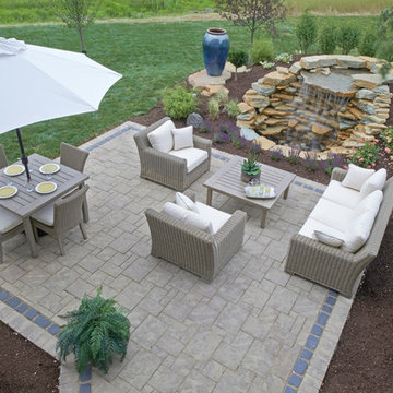
This garden was designed for maximum flower power in the front yard and for a family with five dogs in the back yard. While the front yard was densely planted and spills over with colors, we left ample space for the dogs to run in the large back yard. By developing an entertainment patio with a red fire pit and a gabion water feature for our human clients roughly in the middle of the yard, we had enough space to design a full “racetrack” for the canine clients. Back yard planting is held to a minimum and clustered around the human spaces, while mulch, boulders & low walls for directing the traffic flow define the paths for the dogs. A sports turf grade lawn allows for further ample exercise and is calming to (human) eyes when seen from the house.

 Julie Kardatzke Architect, LLC
This home home previously belonged to the grandmother of my client, Cathy, and has been in her family for over 100 years. Although it had a lot of charm, the home needed a more functional kitchen and dining area.
The kitchen, located in the original part of the home, underwent an amazing transformation. Originally chopped up by multiple traffic patterns through the space, there was very little uninterrupted work area.
In order to create more wall space for counters and cabinets, I eliminated a door to the outside, relocated the basement stair and raised the sill of the windows to above counter height. The refrigerator, range and sink were relocated to a u-shaped space near the windows for a more efficient and sunny work triangle, and the small bump out where the sink had previously been located became the "butler's pantry", an additional work and storage space. All new cabinets in "Mexican white", a farmhouse sink, a backsplash of cheerful flower tiles, a reclaimed wood floor and the addition of vintage light fixtures all work together to create a modern kitchen which looks perfectly at home in this century-old house.
 Inviting Spaces By Kim
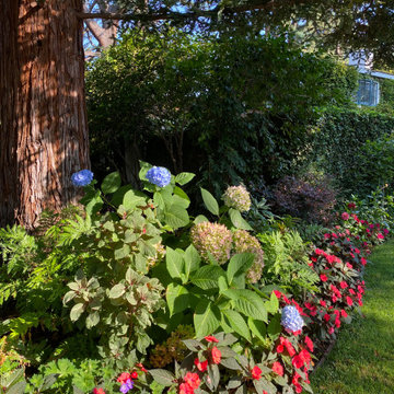
This centrally located intersection to a main thoroughfare a block away was a concern because of the corner lot visibility issue for cars making a turn driving in either direction. The Quince tree bloomed annually for just a short time and was originally planted by the prior home owners decades ago. Keeping it maintained to a height of 4’ maximum, dictated for safety reasons, was still obstructing and limiting the visibility of oncoming traffic at this busy intersection.
The existing roses planted in the same space as the Quince were a perfect backdrop to the new perennials and annuals planted to paint this corner with flowers. The project also included expanding the beautification to both corner areas in coordination with several other planting areas already seasonally updated on the property. With the Redwood Tree as a focal point and Roses, Daphnes, Iris, Azaleas, Fuchsias, Hydrangeas and Camilias highlighting the planting beds the addition of color, including around the driveway and side entrance, transformed the entire space.
Painting With Flowers Is Adding Beauty to Benefit Homeowners & Neighbors!
Kim Beber

 TI Concepts, Corp | True Identity Concepts
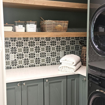
Combining a nature-inspired kids' bathroom with a laundry space creates a functional, serene environment that handles high traffic while maintaining a biophilic, calming aesthetic. This design often features soft sage or forest green tiles paired with warm oak cabinetry to bring an organic feel indoors.
Interior Design by Tina Harvey, TI Concepts Corp
Design-Build by Old World Craftsmen, LLC
Photos by Tina Harvey

 Renovisions
Our client was ready for a re-do and approached Renovisions for help to design and build a beautiful and durable space that will last as well as add value to her home.
The challenge was to design the new kitchen to allow for better traffic, flow and functionalize this space for much needed storage. Moving the refrigerator to the other side of the kitchen and opening up a section of the wall between the dining room and kitchen was a great design solution. We increased the flow to the dining room and created a spacious feel with better access from the dining area.
Warm hues from the granite countertops provided a rich contrast to the Ivory colored cabinetry that brightened up the room. Under-cabinet lighting was added over all countertop areas and is controlled by a dimmer switch for both task and ambient lighting.
The brushed nickel hardware compliments the stainless steel appliances and Jado pull-down single lever faucet.
The walls are a warm and inviting earthy green tone and ties in well with the soft linen hue of the beautiful subway tile backsplash.
Simple, clean lines and earthy materials like granite and stainless steel worked together to soften the whole look.
Renovisions turned this outdated kitchen into a magnificent space where this homeowner plans on spending a lot of time.

 Jarrett Design
This remodel was a dated 1980s Cape Cod style home that desperately needed updating with the kitchen starting as the foundation for the rest of the home. The owners purchased the property in 2013 with the intent of replacing the existing kitchen installed in 2000, as well as updating most surfaces throughout the home. The space while moderately sized, felt cramped due to the L-shaped design and eat-in island that disrupted traffic flow from the mudroom, dining room and sliding doors to the patio. The owners knew they wanted to bring the light from the southern facing front of the home to the dark cave-like feeling of the kitchen. This was remedied by knocking down the wall between the existing dining room (now a lounge area), widening the entrance to the family room and creating a pathway to the existing formal living room (now the dining room). Also to create better traffic flow into the kitchen, the existing mudroom door was moved to the opposite side of the wall.
A large work island with cooktop, oven and convection/microwave was designed for efficiency and maintaining clean site lines. The work triangle allows for quick and easy meal prep and clean-up for the busy family. Space at the end of the kitchen was perfectly suited for a large kitchen table with views of the back yard, easy conversation with the cook at the island or those hanging in the newly appointed lounge area. The new doorway between the kitchen and dining room showcases the 10ft floor to ceiling bay window, allows more light to flood into the space and creates easy access between the two rooms for family gatherings. Given the home owners relocated to the area for job reasons and are not sure how long they will be in this home, we helped them achieve a balance of a design and finishes that they not only love, but would be appealing to many if another move was in their near future.
Matt Villano Photography
 TI Concepts, Corp | True Identity Concepts
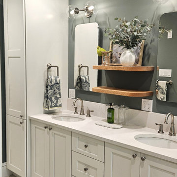
Merging a nature-inspired kids’ bathroom with a laundry space creates a peaceful and practical environment that accommodates high traffic while maintaining a calming biophilic atmosphere. The design incorporates soft sage hues with warm oak accents to create an organic indoor feel.
Interior Design by TI Concepts Corp
Design-Build by Old World Craftsmen, LLC
Photos by TI Concepts Corp

 Berry Design Build
Very seldom do we, at Berry Design Build, settle for “can’t”. Where there is a will (and a team of great sub contractors, project managers, and design team) there is a way… and boy are we glad!
This kitchen needed a little freedom. So removing a central, load bearing wall - with probably the most electrical, HVAC, and plumbing one wall can hold, did just the trick. In doing so there is the most perfect view of the living room and patio off the back, bringing in so much natural light to the already inviting space and welcoming the ebb and flow of traffic to such a centralized space.
Although there are so many wonderful things about this kitchen, the island really speaks for itself. From the gracious amount of seating, large functional storage space, to the beefy Quartzite slab and a perfectly mitered edge.

 Crespo Design Group
Dining room within a great room. This is a large great room that functions as a dining room, family room, and reading area. We tried to keep the area light while using a heavy table to anchor the space. There was not enough room because of traffic paths to use an area rug so we used fully upholstered chairs to soften the area.
Home located in Tampa, Florida. Designed by Florida-based interior design firm Crespo Design Group, who also serves Malibu, Tampa, New York City, the Caribbean, and other areas throughout the United States.
Sponsored
Columbus, OH
Free consultation for landscape design!

Peabody Landscape Group
Columbus' Reliable Landscape Design & Contracting

 design styles architecture
The interior of this single family residential home was in need of a remodel. The space was enhanced aesthetically, re-worked for better functionality, and opened up for more natural light and space. The Key areas of focus were the kitchen, master bathroom, and master walk in closet. These areas were most changed architecturally. The spaces we reconfigured to make them more user friendly, adding storage and better foot traffic paths. A wall was removed that divided the kitchen and the living space providing better lighting and an open concept peninsula. The kitchen layout was also re-worked moving the refrigerator, stove, and sink to provide a better configuration for cooking and entertaining. The rest of the home was remodeled to coordinate with the finishes and selections of the master bath and kitchen.
 Jarrett Design
This remodel was a dated 1980s Cape Cod style home that desperately needed updating with the kitchen starting as the foundation for the rest of the home. The owners purchased the property in 2013 with the intent of replacing the existing kitchen installed in 2000, as well as updating most surfaces throughout the home. The space while moderately sized, felt cramped due to the L-shaped design and eat-in island that disrupted traffic flow from the mudroom, dining room and sliding doors to the patio. The owners knew they wanted to bring the light from the southern facing front of the home to the dark cave-like feeling of the kitchen. This was remedied by knocking down the wall between the existing dining room (now a lounge area), widening the entrance to the family room and creating a pathway to the existing formal living room (now the dining room). Also to create better traffic flow into the kitchen, the existing mudroom door was moved to the opposite side of the wall.
A large work island with cooktop, oven and convection/microwave was designed for efficiency and maintaining clean site lines. The work triangle allows for quick and easy meal prep and clean-up for the busy family. Space at the end of the kitchen was perfectly suited for a large kitchen table with views of the back yard, easy conversation with the cook at the island or those hanging in the newly appointed lounge area. The new doorway between the kitchen and dining room showcases the 10ft floor to ceiling bay window, allows more light to flood into the space and creates easy access between the two rooms for family gatherings. Given the home owners relocated to the area for job reasons and are not sure how long they will be in this home, we helped them achieve a balance of a design and finishes that they not only love, but would be appealing to many if another move was in their near future.
Matt Villano Photography

 Designs by BSB
HUGE transformation! The homes in this area quintessentially have smaller kitchens that dining rooms. In addition, there is no open floor concept so traffic flow is restricted. In this design, we choose to take over the dining room! The fortunate part is the sunroom on the backside of the home was conditioned as part of the home, so the furniture and space plan transformed this room into the "dining room". What a beautiful thing to have on the backside of the home where the view is great (future pictures to come!).
The improvements and challenges were to remove the wall between the kitchen and the formal dining room (which was rarely used) and then extend the kitchen into that space. !! This is a great challenge because it changes the flow, original architectural patterns to the home! We (client included) the plan achieved just that with some sacrifices -- but honestly, with so many more rewards.
Check back for more updates and plans to be uploaded - or send us a message to inquire about how this, is possible!
Photography by David Cannon
 Archadeck of Akron OH
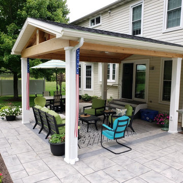
For the patio cover, we designed a roof with a stunning open-gable end. We used tongue and groove pine for the ceiling and wrapped all of the beams in cedar and posts in AZEK. If you look closely, you can see the steps we built for the doorway leading into the home. We used low-maintenance AZEK for the steps, an extremely durable material perfect for any high-traffic area. Also, bringing indoor comforts outdoors, we installed recessed can lights in the ceiling as well as everyone’s favorite, the ceiling fan.
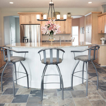
Sponsored
Plain City, OH

The Creative Kitchen Company
Columbus Area Kitchen Remodeling and Refacing Professional
 AG Millworks
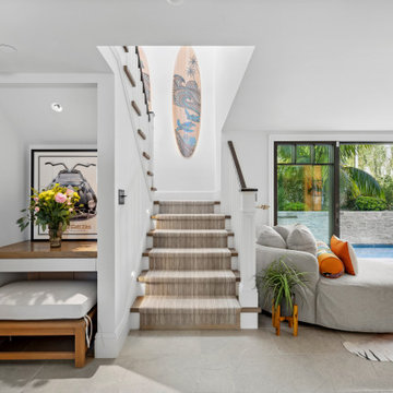
Multi-sliding doors are ideal for backyards, particularly for families that love entertaining. They are easy to operate and perfect for homes with pools, allowing guests to move in and out effortlessly. Sliding doors also offer a clear view of the yard, so you can enjoy your company whether you're indoors or outdoors. Their simple design ensures a smooth traffic flow, making them perfect for entertaining and enhancing the connection between indoor and outdoor spaces.
 Twelve Stones Designs, LLC
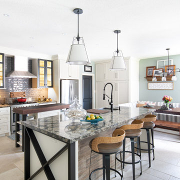
The owners of this kitchen had spent the money to upgrade the finishes in their kitchen upon building the home 12 years ago, but after living in the space for several years they realized how nonfunctional the layout really was. The (then) two preschool aged children had grown into busy, hungry teenagers with many friends who also liked to hang out at the house. So the family needed a more functional kitchen with better traffic flow, space for daily activities revolving around the kitchen at different times of day, and a kitchen that could accommodate cooking for and serving large groups. Furthermore, the dark, traditional finishes no longer reflected the homeowners’ style. They requested a brighter, more relaxed, coastal style that reflected their love of the seaside cities they like to visit.
Originally, the kitchen was U-shaped with a narrow island in the middle. The island created narrow aisles that bottle-necked at the dishwasher, refrigerator, and cooktop areas. There was a pass-through from the foyer into the kitchen, but the owners never liked that the pass-through was also located so close to the powder room. The awkward proximity was unappealing and made guests feel uncomfortable.
The kitchen’s storage was made up of lots of narrow cabinets, apothecary drawers, clipped corner units, and very few drawers. It lacked useful storage for the larger items the family used on a daily basis. And the kitchen’s only pantry was small closet that had only builder-grade, narrow shelving with no illumination to be able to see the contents inside.
Overall, the kitchen’s lighting plan was poorly executed. Only six recessed cans illuminated the entire kitchen and nook areas. The under cabinet lighting was not evenly distributed either. In fact, the builder had mis-placed the under cabinet lighting around the decorative pilasters which made for choppy, dark cubbies. Further, the builder didn’t include any lighting over the sink or the bar area, which meant whoever was doing the dishes was always in their own shadow. That, coupled with the steep overhang of the game room above made the bar area feel like a dim, cavernous space that wasn’t inviting or task oriented. The kitchen looked out into the main living space, but the raised bar and a narrow wall (which held the only large cabinet in the kitchen) created more of a barrier than a relationship to the living room or breakfast nook. In fact, one couldn’t even see the breakfast nook from the cooktop or sink areas due to its orientation. The raised bar top was too narrow to comfortably sit to either dine at or chat from due to the lack of knee space. The the homeowners confided that the kitchen felt more like a dark, dirty prison than place where the family, or their guests, wanted to gather and commune.
The clients' needs and desires were:
➢ to create a kitchen that would be a space the family loved to be in; to relate to the adjacent spaces all around, and to have better flow for entertaining large groups
➢ to remove the walls between the breakfast nook and living area and to be able to utilize the natural light from the windows in both those areas
➢ to incorporate a functional chopping block for prepping fresh food for home cooked meals, an island with a large sink and drain board, 2 pull out trash cans, and seating for at least the 2 teens to eat or do homework
➢ to design a kitchen and breakfast nook with an airy, coastal, relaxed vibe that blended with the rest of the house's coastal theme
➢ to integrate a layered lighting plan which would include ample general illumination, specific task lighting, decorative lighting, and lots of illuminated storage
➢ to design a kitchen with not only more storage for all the husband’s kitchen gadgets and collection of oils and spices, but smart storage, including a coffee/breakfast bar and a place to store and conceal the toaster oven and microwave
➢ to find a way to utilize the large open space between the kitchen, pantry area, and breakfast nook
Twelve Stones Designs achieved the owner's goals by:
➢ removing the walls between the kitchen and living room to allow the natural light to filter in from the adjacent rooms and to create a connection between the kitchen, nook, and living spaces for a sense of unity and communion
➢ removing the existing pantry and designing 3 large pantry style cabinets with LED tape lights and rollout drawers to house lots of kitchen appliances, gadgets, and tons of groceries. We also took the cabinets all the way up to the 9’ ceiling for additional storage for seasonal items and bulk storage.
➢ designing 2 islands - 1 with a gorgeous black walnut chopping block that houses a drawer for chopping and carving knives and a custom double pull out trash unit for point of use utilization - and 1 that houses the dishwasher, a large Blanco Gourmet sink with integrated drain board, woven baskets for fresh root vegetables and kitchen towels, plenty of drawer storage for kitchen items, and bar seating for up to 4 diners.
➢ closing off the space between the kitchen and the powder room to create a beautiful new private alcove for the powder room as well as adding some decorative storage. This also gave us space to include more tall storage near the new range for precision placement of the husband’s extensive oil and spice collection as well as a location for a combo-steam oven the wife wanted for baking and cooking healthy meals.
The project is enhanced functionally by:
➢ incorporated USB and standard receptacles for the kids’ laptops and phone charging in the large island
➢ designing the small island to include additional open shelving for items used on a daily basis such as a variety of bowls, plates, and colanders. This set up also works well for the husband who prefers to “plate” his dinners in restaurant-style fashion before presenting them to the table.
➢ the integration of specific storage units, such as double stacked cutlery drawers, a custom spice pull-out, a Kuerig coffee and tea pod drawer, and custom double stacked utensil drawers
➢ moving the refrigerator to the old oven location - this eliminated the bottle neck as well as created a better relationship to the eating table. It also utilizes the floor space between the pantry, nook, and kitchen
➢ creating a banquet style breakfast nook - this banquette seating not only doubles the amount of seating for large gatherings but it better utilizes the odd space between the kitchen and the previous nook area. It also helps to create a distinct pathway from the mudroom room through the pantry area, kitchen, nook, and living room.
➢ the coffee/breakfast bar area which includes the perfect location for the concealed microwave and toaster oven, convenient storage for the coffee pods and tea accoutrements. Roll-out drawers below also house the smoothie maker, hot water kettle, and a plethora of smoothie-making ingredients such as protein powders, smoothie additives, etc. Furthermore, the drawers below the Keurig house measuring utensil, cutlery, baking supplies and tupperware storage.
➢ incorporating lots of wide drawers and pullouts to accommodate large cookware.
➢ utilizing as much vertical space as possible by building storage to the ceiling which accommodates the family’s abundant amount of serving platters, baking sheets, bakeware, casserole dishes, and additional cutting boards.
The project is enhanced aesthetically by:
➢ new 5-piece Versailles pattern porcelain tile that now seamlessly joins the entire down stairs area together creating a bright, cohesiveness feeling instead of choppy separated spaces - it also adds a coastal feeling
➢ designing a cabinet to conceal the microwave and toaster oven
➢ the coastal influenced light fixtures over the nook table and island
➢ the sandy colors of the Langdon Cambria countertops. The swirling pattern and sparkling quartz pieces remind the homeowner of black-and-tan sandy beaches
➢ the striped banquet seating whose creamy white background and blue-green stripes were the inspiration for the cabinet and wall colors.
➢ All the interior doors were painted black to coordinate with the blacks and grays in the backsplash tile and countertop. This also adds a hint of tailored formality to an otherwise casual space.
➢ the use of WAC's Oculux small aperture LED units for the overhead lighting complimented with Diode LED strips for task lighting under the cabinets and inside the pantry and glass wall cabinets. All of the lighting applications are on separate dimmer switches.
Innovative uses of materials or construction methods by Realty Restoration LLC:
➢ Each 1-1/2” x 3” block of reclaimed end-grain black walnut that makes up the center island chopping block was hand milled and built in the shop. It was designed to look substantial and proportional to the surrounding elements, executed by creating the 4 inch tall top with a solid wood chamfered edge band.
➢ The metal doors on either side of the vent hood were also custom designed for this project and built in the Realty Restoration LLC shop. They are made 1x2, 11-gauge mild steel with ribbed glass. Weighing 60 lbs a piece, heavy duty cabinet hinges were added to support the weight of the door and keep them from sagging.
➢ Under-cabinet receptacles were added along the range wall in order to have a clean, uninterrupted backsplash.
Design obstacles to overcome:
➢ Because we were removing the demising walls between the kitchen and living room, we had to find a way to plumb and vent the new island. We did this by tunneling through the slab (the slab had post tension cables which prevented us from just trenching) to run a new wet vent through a nearby structural wall. We pulled the existing hot and cold lines between upper floor joists and ran them down the structural wall as well and up through a conduit in the tunnel.
➢ Since we were converting from wall overs to a gas range it allowed us to utilize the 220 feed for the wall ovens to provide a new sub panel for all the new kitchen circuits
➢ Due to framing deficiencies inherited from the original build there was a 1-1/2” differential in the floor-to-ceiling height over a 20 foot span; by utilizing the process of cutting and furring coupled with the crown moulding details on the cabinet elevations we were able to mask the problem and provide seamless transitions between the cabinet components.
Evidence of superior craftsmanship:
➢ uniquely designed, one-of-a-kind metal “X” end panels on the large island. The end panels were custom made in the Realty Restoration LLC shop and fitted to the exact dimensions of the island. The welding seams are completely indistinguishable - the posts look like they are cut from a single sheet of metal
➢ square metal posts on the small island were also custom made and designed to compliment and carry through the metal element s throughout the kitchen
➢ the beautiful, oversized end panels on the pantry cabinets which give the breakfast nook a tailored look
➢ integrating a large format 5 piece Versailles tile pattern to seamlessly flow from the existing spaces into the new kitchen space
➢ By constructing a custom cabinet that jogged around a corner we could not remodel (housing the entry way coat closet) we were able to camouflage the adjacent wall offset within the upper and lower cabinets. By designing around the existing jog in the structural walls we accomplished a few things: we were able to find the space to house, and hide, the microwave and toaster oven yet still have a clean cohesive appearance from the kitchen side. Additionally, the owners were able to keep their much needed coat closet and we didn’t have to increase the budget with unnecessary structural work.
 DJK Custom Homes
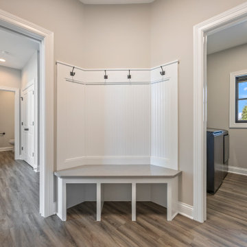
This thoughtfully designed mudroom offers both function and style, serving as the perfect transition between the outdoors and interior living spaces. A built-in corner bench with storage cubbies provides a convenient drop zone for shoes and bags, while beadboard paneling with coat hooks keeps the space tidy and organized. The neutral wall color pairs beautifully with crisp white millwork and trim, creating a light, fresh backdrop. Durable wood-look flooring enhances the practicality of this high-traffic area, while the open flow leads seamlessly to the laundry room and secondary hallway for added convenience.
127