
Search results for "Traffic spaces" in Home Design Ideas

 The Cabinet Store + Culina Design
Over the course of six weeks we took their home from slightly outdated to stylishly modern. We began our work in the kitchen. Their existing space included oak raised panel cabinets and laminate countertops. We identified two problems right off the bat. First, the kitchen was home to an unfortunately placed island that broke up the room and made for horrible traffic flow. Second, the family was “oaked out,” with obviously dated oak cabinets abounding. The homeowners also requested that their countertops be replaced with a durable and low-maintenance material.
To begin, we replaced the island and created a peninsula to open up the kitchen. We upgraded the cabinets with Showplace Wood cherry cabinets in a truffle finish that matched the home’s entertainment center in the adjacent living room. Next, we replaced the family’s door with a Showplace Wood Concord style for a more modern feel. Finally, we swapped the existing laminate counters with Cambria natural quartz countertops in the Canterbury finish for a beautiful, maintenance free work surface.
Moving into the laundry room, we installed matching cabinets in this space as well. Last but not least, we installed new Wilsonart HD countertops and a Swanstone sink. With the remodel complete, we checked in with our homeowners and are happy to report pleased customers all around!
 Swimming Pool Services
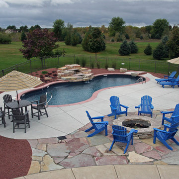
We used a local natural flag stone to create the seating area around the fire pit and the traffic areas to the pool from the existing patio. We also used the chilton stone to build the raised stone waterfall as a focal point for the space. We helped to settle concerns with safety and a diving board by instead installing a jump rock. To keep with the natural/ rustic feel the client craved we built a black bottomed pool.

 Rochelle Lynne Design
Karen was an existing client of ours who was tired of the crowded and cluttered laundry/mudroom that did not work well for her young family. The washer and dryer were right in the line of traffic when you stepped in her back entry from the garage and there was a lack of a bench for changing shoes/boots.
Planning began… then along came a twist! A new puppy that will grow to become a fair sized dog would become part of the family. Could the design accommodate dog grooming and a daytime “kennel” for when the family is away?
Having two young boys, Karen wanted to have custom features that would make housekeeping easier so custom drawer drying racks and ironing board were included in the design. All slab-style cabinet and drawer fronts are sturdy and easy to clean and the family’s coats and necessities are hidden from view while close at hand.
The selected quartz countertops, slate flooring and honed marble wall tiles will provide a long life for this hard working space. The enameled cast iron sink which fits puppy to full-sized dog (given a boost) was outfitted with a faucet conducive to dog washing, as well as, general clean up. And the piece de resistance is the glass, Dutch pocket door which makes the family dog feel safe yet secure with a view into the rest of the house. Karen and her family enjoy the organized, tidy space and how it works for them.
Find the right local pro for your project
 Garage Living Dallas
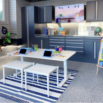
2020 has thrown a lot at us. One of the biggest challenges for parents and their kids has been adjusting to at-home learning.
Learning in high-traffic areas like the kitchen, living room, and dining room can be too distracting for kids. With families spending so much time indoors right now, the abundance of background noise from things like meal preparation, ringing phones, and conversations makes it particularly challenging for youngsters to focus on their studies.
We can turn any garage into a learning-friendly space without limiting its functionality.
Schedule a free design consultation with Garage Living by calling (817) 704-2356.
We’ll work with you to design a garage-to-classroom setup that gives you the peace of mind that your kids are getting their education in a safe space right in your own home.
#homeschooling #homelearning #studyspaces #garagelivingtexas #garage #garagelife #homedesign #homedecor

 EK Interiors
This space was completely transformed from a U shaped 90s kitchen to an open concept & entertainer's dream. These empty nesters love to cook and have visions of grandkids lining up for lunch at the wood bartop. We worked to create great large workspaces while also directing the flow of traffic out of the major workspaces. The overall goals for the aesthetics were to keep it light and bright, anchoring it with the dark island.

 Pro-Pack Contracting & Design Inc.
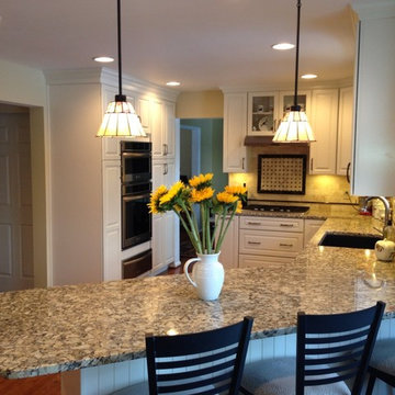
Client had a closed in tight space in their existing kitchen prior to the renovation. Their island was in a high traffic area and so seating was minimal. Removing the wall and add the peninsula gave ample seating and work space making it a much welcomed flow to this now functioning kitchen. . Revival Arts Photography
 EK Interiors
This space was completely transformed from a U shaped 90s kitchen to an open concept & entertainer's dream. These empty nesters love to cook and have visions of grandkids lining up for lunch at the wood bartop. We worked to create great large workspaces while also directing the flow of traffic out of the major workspaces. The overall goals for the aesthetics were to keep it light and bright, anchoring it with the dark island.


 Dynamic Rugs Inc.
Kidz rugs are attractive designs with engaging scenes that are sure to inspire the imaginations of young minds. With a velvety smooth surface, with skid-resistance backing make an inviting and secure play space. Kidz rugs cheerful colors and soft hues delight to create hours of fun and whimsical memories.

 Superior Woodcraft, Inc.
Superior Woodcraft's custom-made shaker cabinetry painted white is the foundation of this modern kitchen with marble counter tops. The integrated Wolf and Sub Zero appliances are cleverly concealed as furniture-like cabinetry. The two large cherry islands provide plenty of counter space and manage the flow of traffic in this larger kitchen. The design of the custom kitchen creates the feeling of being in a traditional living space as opposed to being in a messy kitchen.
Photo Credit; Randl Bye

 Room Envy
The Milania area rug in slate features a contemporary pattern with natural appeal. The gentle lines of this design evoke images of stonework that will add undeniable appeal to your floors. Shades of grey and gold with a watercolor finish are a versatile choice that will work with nearly any home decorating palette. Power-loomed in a pure polypropylene pile this contemporary design is inherently stain and fade resistant offering necessary durability for high traffic spaces in a home. The approachable color palette makes this style easy to decorate with while still ingenue for contemporary, modern, and eclectic home decor styles.

 Braitman Design Studio
Opening up the kitchen to the foyer allowed us to enlarge both rooms, improve traffic from one room to another, and to create view lines throughout the house to outdoor spaces. When fully opened, the Divided Lite Glass Pocket doors allow an unobstructed view of the gorgeous garden.


Sponsored
Columbus, OH

Structural Remodeling
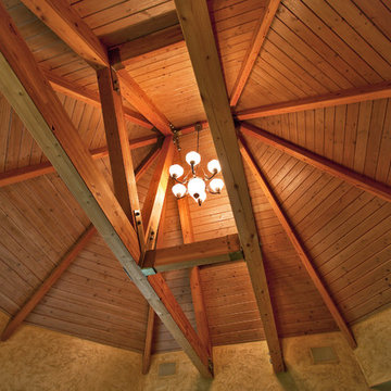
Franklin County's Heavy Timber Specialists | Best of Houzz 2020!
 Twelve Stones Designs, LLC
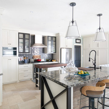
The owners of this kitchen had spent the money to upgrade the finishes in their kitchen upon building the home 12 years ago, but after living in the space for several years they realized how nonfunctional the layout really was. The (then) two preschool aged children had grown into busy, hungry teenagers with many friends who also liked to hang out at the house. So the family needed a more functional kitchen with better traffic flow, space for daily activities revolving around the kitchen at different times of day, and a kitchen that could accommodate cooking for and serving large groups. Furthermore, the dark, traditional finishes no longer reflected the homeowners’ style. They requested a brighter, more relaxed, coastal style that reflected their love of the seaside cities they like to visit.
Originally, the kitchen was U-shaped with a narrow island in the middle. The island created narrow aisles that bottle-necked at the dishwasher, refrigerator, and cooktop areas. There was a pass-through from the foyer into the kitchen, but the owners never liked that the pass-through was also located so close to the powder room. The awkward proximity was unappealing and made guests feel uncomfortable.
The kitchen’s storage was made up of lots of narrow cabinets, apothecary drawers, clipped corner units, and very few drawers. It lacked useful storage for the larger items the family used on a daily basis. And the kitchen’s only pantry was small closet that had only builder-grade, narrow shelving with no illumination to be able to see the contents inside.
Overall, the kitchen’s lighting plan was poorly executed. Only six recessed cans illuminated the entire kitchen and nook areas. The under cabinet lighting was not evenly distributed either. In fact, the builder had mis-placed the under cabinet lighting around the decorative pilasters which made for choppy, dark cubbies. Further, the builder didn’t include any lighting over the sink or the bar area, which meant whoever was doing the dishes was always in their own shadow. That, coupled with the steep overhang of the game room above made the bar area feel like a dim, cavernous space that wasn’t inviting or task oriented. The kitchen looked out into the main living space, but the raised bar and a narrow wall (which held the only large cabinet in the kitchen) created more of a barrier than a relationship to the living room or breakfast nook. In fact, one couldn’t even see the breakfast nook from the cooktop or sink areas due to its orientation. The raised bar top was too narrow to comfortably sit to either dine at or chat from due to the lack of knee space. The the homeowners confided that the kitchen felt more like a dark, dirty prison than place where the family, or their guests, wanted to gather and commune.
The clients' needs and desires were:
➢ to create a kitchen that would be a space the family loved to be in; to relate to the adjacent spaces all around, and to have better flow for entertaining large groups
➢ to remove the walls between the breakfast nook and living area and to be able to utilize the natural light from the windows in both those areas
➢ to incorporate a functional chopping block for prepping fresh food for home cooked meals, an island with a large sink and drain board, 2 pull out trash cans, and seating for at least the 2 teens to eat or do homework
➢ to design a kitchen and breakfast nook with an airy, coastal, relaxed vibe that blended with the rest of the house's coastal theme
➢ to integrate a layered lighting plan which would include ample general illumination, specific task lighting, decorative lighting, and lots of illuminated storage
➢ to design a kitchen with not only more storage for all the husband’s kitchen gadgets and collection of oils and spices, but smart storage, including a coffee/breakfast bar and a place to store and conceal the toaster oven and microwave
➢ to find a way to utilize the large open space between the kitchen, pantry area, and breakfast nook
Twelve Stones Designs achieved the owner's goals by:
➢ removing the walls between the kitchen and living room to allow the natural light to filter in from the adjacent rooms and to create a connection between the kitchen, nook, and living spaces for a sense of unity and communion
➢ removing the existing pantry and designing 3 large pantry style cabinets with LED tape lights and rollout drawers to house lots of kitchen appliances, gadgets, and tons of groceries. We also took the cabinets all the way up to the 9’ ceiling for additional storage for seasonal items and bulk storage.
➢ designing 2 islands - 1 with a gorgeous black walnut chopping block that houses a drawer for chopping and carving knives and a custom double pull out trash unit for point of use utilization - and 1 that houses the dishwasher, a large Blanco Gourmet sink with integrated drain board, woven baskets for fresh root vegetables and kitchen towels, plenty of drawer storage for kitchen items, and bar seating for up to 4 diners.
➢ closing off the space between the kitchen and the powder room to create a beautiful new private alcove for the powder room as well as adding some decorative storage. This also gave us space to include more tall storage near the new range for precision placement of the husband’s extensive oil and spice collection as well as a location for a combo-steam oven the wife wanted for baking and cooking healthy meals.
The project is enhanced functionally by:
➢ incorporated USB and standard receptacles for the kids’ laptops and phone charging in the large island
➢ designing the small island to include additional open shelving for items used on a daily basis such as a variety of bowls, plates, and colanders. This set up also works well for the husband who prefers to “plate” his dinners in restaurant-style fashion before presenting them to the table.
➢ the integration of specific storage units, such as double stacked cutlery drawers, a custom spice pull-out, a Kuerig coffee and tea pod drawer, and custom double stacked utensil drawers
➢ moving the refrigerator to the old oven location - this eliminated the bottle neck as well as created a better relationship to the eating table. It also utilizes the floor space between the pantry, nook, and kitchen
➢ creating a banquet style breakfast nook - this banquette seating not only doubles the amount of seating for large gatherings but it better utilizes the odd space between the kitchen and the previous nook area. It also helps to create a distinct pathway from the mudroom room through the pantry area, kitchen, nook, and living room.
➢ the coffee/breakfast bar area which includes the perfect location for the concealed microwave and toaster oven, convenient storage for the coffee pods and tea accoutrements. Roll-out drawers below also house the smoothie maker, hot water kettle, and a plethora of smoothie-making ingredients such as protein powders, smoothie additives, etc. Furthermore, the drawers below the Keurig house measuring utensil, cutlery, baking supplies and tupperware storage.
➢ incorporating lots of wide drawers and pullouts to accommodate large cookware.
➢ utilizing as much vertical space as possible by building storage to the ceiling which accommodates the family’s abundant amount of serving platters, baking sheets, bakeware, casserole dishes, and additional cutting boards.
The project is enhanced aesthetically by:
➢ new 5-piece Versailles pattern porcelain tile that now seamlessly joins the entire down stairs area together creating a bright, cohesiveness feeling instead of choppy separated spaces - it also adds a coastal feeling
➢ designing a cabinet to conceal the microwave and toaster oven
➢ the coastal influenced light fixtures over the nook table and island
➢ the sandy colors of the Langdon Cambria countertops. The swirling pattern and sparkling quartz pieces remind the homeowner of black-and-tan sandy beaches
➢ the striped banquet seating whose creamy white background and blue-green stripes were the inspiration for the cabinet and wall colors.
➢ All the interior doors were painted black to coordinate with the blacks and grays in the backsplash tile and countertop. This also adds a hint of tailored formality to an otherwise casual space.
➢ the use of WAC's Oculux small aperture LED units for the overhead lighting complimented with Diode LED strips for task lighting under the cabinets and inside the pantry and glass wall cabinets. All of the lighting applications are on separate dimmer switches.
Innovative uses of materials or construction methods by Realty Restoration LLC:
➢ Each 1-1/2” x 3” block of reclaimed end-grain black walnut that makes up the center island chopping block was hand milled and built in the shop. It was designed to look substantial and proportional to the surrounding elements, executed by creating the 4 inch tall top with a solid wood chamfered edge band.
➢ The metal doors on either side of the vent hood were also custom designed for this project and built in the Realty Restoration LLC shop. They are made 1x2, 11-gauge mild steel with ribbed glass. Weighing 60 lbs a piece, heavy duty cabinet hinges were added to support the weight of the door and keep them from sagging.
➢ Under-cabinet receptacles were added along the range wall in order to have a clean, uninterrupted backsplash.
Design obstacles to overcome:
➢ Because we were removing the demising walls between the kitchen and living room, we had to find a way to plumb and vent the new island. We did this by tunneling through the slab (the slab had post tension cables which prevented us from just trenching) to run a new wet vent through a nearby structural wall. We pulled the existing hot and cold lines between upper floor joists and ran them down the structural wall as well and up through a conduit in the tunnel.
➢ Since we were converting from wall overs to a gas range it allowed us to utilize the 220 feed for the wall ovens to provide a new sub panel for all the new kitchen circuits
➢ Due to framing deficiencies inherited from the original build there was a 1-1/2” differential in the floor-to-ceiling height over a 20 foot span; by utilizing the process of cutting and furring coupled with the crown moulding details on the cabinet elevations we were able to mask the problem and provide seamless transitions between the cabinet components.
Evidence of superior craftsmanship:
➢ uniquely designed, one-of-a-kind metal “X” end panels on the large island. The end panels were custom made in the Realty Restoration LLC shop and fitted to the exact dimensions of the island. The welding seams are completely indistinguishable - the posts look like they are cut from a single sheet of metal
➢ square metal posts on the small island were also custom made and designed to compliment and carry through the metal element s throughout the kitchen
➢ the beautiful, oversized end panels on the pantry cabinets which give the breakfast nook a tailored look
➢ integrating a large format 5 piece Versailles tile pattern to seamlessly flow from the existing spaces into the new kitchen space
➢ By constructing a custom cabinet that jogged around a corner we could not remodel (housing the entry way coat closet) we were able to camouflage the adjacent wall offset within the upper and lower cabinets. By designing around the existing jog in the structural walls we accomplished a few things: we were able to find the space to house, and hide, the microwave and toaster oven yet still have a clean cohesive appearance from the kitchen side. Additionally, the owners were able to keep their much needed coat closet and we didn’t have to increase the budget with unnecessary structural work.

 Copperstone Kitchens and Renovations
This kitchen was rearranged and opened up to allow a completely different way of living in the space. With the wall between the kitchen and family room removed, one window in the old eating area deleted and the doorway to the dining room moved over and enlarged, we were able to take a relatively small, closed off, u-shaped kitchen with a separate eating area and turn it into a large inviting kitchen with a huge island with room for stools, while improving traffic flow and sightlines at the same time. A pantry with roll outs, spice pull out, a double garbage pull out, lots of drawers for storage and an abundance of counter space make the space much more functional than the original kitchen!
Renovation Highlights include:
Complete re-arrangement of space
Hardwood added to kitchen and remainder of main level hardwood was refinished
Two colours for cabinetry plus a stained wood for the open shelving
Hanstone Montauk countertops
Layered lighting achieved with the use of pot lights in kitchen and family room, under cabinet puck lights and pendants over the island, all on dimmers to allow flexibility.

 Colorado Kitchen & Bath Design
This kitchen not only got an aesthetic lift but it now functions beautifully. A peninsula was removed, an island took its place for storage and counter space. The real gain came in the traffic flow and work space. It has been updated to a clean style but still has a Colorado rustic feel. The home owner's personality came through with the Vetrazzo recycled glass island top and back splash. Led under the cabinet lighting really sets off the glass in the splash and provides functional dimmable lighting that is the "icing on the cake".

 MainStreet Design Build
Home is where the heart is for this family and not surprisingly, a much needed mudroom entrance for their teenage boys and a soothing master suite to escape from everyday life are at the heart of this home renovation. With some small interior modifications and a 6′ x 20′ addition, MainStreet Design Build was able to create the perfect space this family had been hoping for.
In the original layout, the side entry of the home converged directly on the laundry room, which opened up into the family room. This unappealing room configuration created a difficult traffic pattern across carpeted flooring to the rest of the home. Additionally, the garage entry came in from a separate entrance near the powder room and basement, which also lead directly into the family room.
With the new addition, all traffic was directed through the new mudroom, providing both locker and closet storage for outerwear before entering the family room. In the newly remodeled family room space, MainStreet Design Build removed the old side entry door wall and made a game area with French sliding doors that opens directly into the backyard patio. On the second floor, the addition made it possible to expand and re-design the master bath and bedroom. The new bedroom now has an entry foyer and large living space, complete with crown molding and a very large private bath. The new luxurious master bath invites room for two at the elongated custom inset furniture vanity, a freestanding tub surrounded by built-in’s and a separate toilet/steam shower room.
Kate Benjamin Photography

 Bridgewater
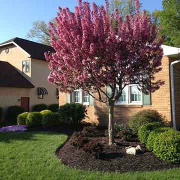
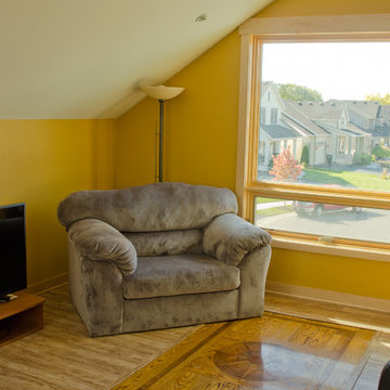
In-law apartment additions offer new, comfortable, bright space with an added benefit of a little privacy.
Inspiration for a contemporary home design remodel in Minneapolis
Inspiration for a contemporary home design remodel in Minneapolis

 Ekman Design Studio
This is the heart of the home. With its commercial grade kitchen, family room and opening to the outdoor terraces is a perfect entertaining area.. One large island is topped with butcher block wood blended into the marble countertop.

 Bianchi Design
When it comes to small spaces every inch counts! The key to making them work is to think of traffic flow, and how you’re going to arrange furniture for ease of access and comfort. This gives credence to the form over function motto!
For this project we knew we were expanding the indoor outdoor flow by removing a wall of the house, creating a pocket door, so the interior living room was going to merge perfectly with the new exterior living room.
The first element of the design we worked out was a built-in Banco seating around a central fire pit, with cushions and exterior fabrics, that even has a one piece cover that can snap in place. This will protect the fabrics in place while the couple travels, without having to drag them through the house to the garage for storage.
The second critical factor of the design was implementing an outdoor kitchen just off camera, built-in to a patio Column, so that it becomes a serving bar and the appliances are behind the bar not out in the public space.
Across the water, the vanishing edge spa was the visual draw, reflecting a fruitless olive tree, all enjoyed from the fire pit seating area.
The back edge of the pool features a knife edge tile to granite interface without a coping, to minimize the line between water and landscape.
Last but not least, the sweeping arc curvature of the pools leading edge was done so as to ease traffic flow from the entertaining and fire seating area to the spa, and to soften the otherwise rectangular lines of the yard.
86