
Search results for "Traffic spaces" in Home Design Ideas
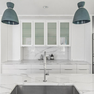
 BlueStar
 Regional Winner Suzanne & Gary Shumaker, Shumaker Design + Build Associates
Location: Evanston, IL
Project Name: Elm
This Mid-century home on Chicago’s North Shore was re-imagined with Mid-century modern sensibilities.
The kitchen was expanded to take advantage of clear views through the sunroom, now dining room, celebrating garden views and connecting the family living spaces to the new and now light filled Kitchen.
The uncluttered work spaces of the kitchen were crafted to provide continuous traffic flow and access for a family that cooks together.
The result is a space that is warm, open and inviting, while holding the clean Mid-century modern lines re-introduced to this house throughout the first floor living room, dining room and foyer spaces.

 Pro-Pack Contracting & Design Inc.
Client had a closed in tight space in their existing kitchen prior to the renovation. Their island was in a high traffic area and so seating was minimal. Removing the wall and add the peninsula gave ample seating and work space making it a much welcomed flow to this now functioning kitchen. . Revival Arts Photography

 MainStreet Design Build
Home is where the heart is for this family and not surprisingly, a much needed mudroom entrance for their teenage boys and a soothing master suite to escape from everyday life are at the heart of this home renovation. With some small interior modifications and a 6′ x 20′ addition, MainStreet Design Build was able to create the perfect space this family had been hoping for.
In the original layout, the side entry of the home converged directly on the laundry room, which opened up into the family room. This unappealing room configuration created a difficult traffic pattern across carpeted flooring to the rest of the home. Additionally, the garage entry came in from a separate entrance near the powder room and basement, which also lead directly into the family room.
With the new addition, all traffic was directed through the new mudroom, providing both locker and closet storage for outerwear before entering the family room. In the newly remodeled family room space, MainStreet Design Build removed the old side entry door wall and made a game area with French sliding doors that opens directly into the backyard patio. On the second floor, the addition made it possible to expand and re-design the master bath and bedroom. The new bedroom now has an entry foyer and large living space, complete with crown molding and a very large private bath. The new luxurious master bath invites room for two at the elongated custom inset furniture vanity, a freestanding tub surrounded by built-in’s and a separate toilet/steam shower room.
Kate Benjamin Photography
Find the right local pro for your project

 Michael Nash Design, Build & Homes
This growing family of six was struggling with a dysfunctional kitchen design. The center island had been installed at an odd angle that limited accessibility and traffic flow. Additionally, storage space was limited by poor cabinet design. Finally, doorways in and out of the kitchen were narrow and poorly located, especially for children dashing in and out.
Other design challenges included how to better use a 10’ x 12’ room for children’s jackets and toys and how to add a professional-quality gas range in a neighborhood were natural gas wasn’t available. The new design would address all of these issues.
DESIGN SOLUTIONS
The new kitchen design revolves around a more proportional island. Carefully placed in the center of the new space with seating for four, it includes a prep sink, a second dishwasher and a beverage center.
The distressed ebony-stained island and hutch provides a brilliant contrast between the white color cabinetry. White Carrera marble countertops and backsplash top both island and perimeter cabinets.
Tall, double stacked cabinetry lines two walls to maximize storage space. Across the room there was an unused wall that now contains a 36” tower fridge and freezer, both covered with matching panels, and a tall cabinet that contains a microwave, steam unit and warming drawer.
A propane tank was buried in the back yard to provide gas to a new 60” professional range and cooktop. A custom-made wood mantel hood blends perfectly with the cabinet style.
The old laundry room was reconfigured to have lots of locker space for all kids and added cabinetry for storage. A double entry door separated the new mudroom from the rest of the back hall. In the back hall the back windows were replaced with a set of French door and added decking to create a direct access to deck and backyard.
The end result is an open floor plan, high-end appliances, great traffic flow and pleasing colors. The homeowner calls it the “kitchen of her dreams.”
 Garrison Collection
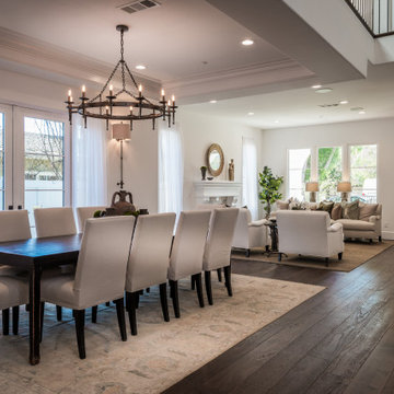
Discover a bold and character-rich foundation in the Bloomfield project, where Brigitte from the Garrison Du Bois Collection brings warmth, texture, and depth into the space. Designed to make a statement, this flooring showcases natural variation and a lived-in aesthetic that adds authenticity to both modern and rustic interiors.
Featuring a character-grade appearance, Brigitte highlights the organic beauty of the wood, creating a dynamic and visually engaging surface throughout the space. The micro-beveled edges enhance each plank’s definition, while the UV Oil finish provides a soft, natural look with added durability for everyday use.
Constructed as engineered hardwood flooring with a thick 4 mm wear layer, this floor is built to perform in both residential and commercial environments. Its durability and timeless aesthetic make it ideal for high-traffic areas, including open interiors, gathering spaces, and full project applications.
Blending the charm of aged wood with modern performance, Brigitte delivers a striking yet versatile foundation that elevates the overall design while remaining practical for long-term use.
Floor Name: Brigitte
Collection: Du Bois
Brand: Garrison Collection
Location: Bloomfield

 The Kitchen and Bath Gallery, Inc
The owners of this home wanted an exterior space that could be used for 3 seasons of entertaining. The doors and transoms were cut into the brick wall giving extra interior light as well as traffic flow to the new addition. The floor is stamped concrete.
Photograph by Patrick Wherritt

 TKS Design Group
Free ebook, Creating the Ideal Kitchen. DOWNLOAD NOW
This project started out as a kitchen remodel but ended up as so much more. As the original plan started to take shape, some water damage provided the impetus to remodel a small upstairs hall bath. Once this bath was complete, the homeowners enjoyed the result so much that they decided to set aside the kitchen and complete a large master bath remodel. Once that was completed, we started planning for the kitchen!
The original kitchen was just large enough to accommodate an island and a separate pantry but felt a little cramped, especially during the weekends when the couple likes to entertain. The primary goal was to maintain the functionality of the current space, but to add some breathing room as well as to provide a view to the homeowner’s side yard and substantial Hosta garden.
The solution was to bump out the space about 10 feet which provided ample room for large pro appliances, a large island for gathering and an upgraded pantry space. It was important to the homeowners to create a space that felt like it belonged in their historic 1866 home. Details such as matching new trim to the existing large custom profiles in the original home and re-purposing an existing door to be used for the new pantry, provided these touches. A large window at the main sink provides that view into the yard and a beautiful focal point for the room.
A mix of painted wood and stained cabinetry gives the new kitchen a sense of belonging in the older home, as do the Super White quartzite that has the look of marble, subway tile backsplash, polished nickel lanterns and glass and mirrored doors. The large pantry, filled with custom shelving built to the homeowner’s specifications, stainless steel appliances and the two Galley Workstations – sinks that do double duty as prep space – ensure that not only does the kitchen look great, but also functions in a personalized manner that works perfectly for the occupants.
Doing the bump out also allowed the opportunity for a small mudroom and powder room right off the kitchen as well as re-arranging some openings to allow for better traffic flow throughout the entire first floor. The result is a comfortable up-to-date home that feels both steeped in history yet allows for today’s style of living.
Designed by: Susan Klimala, CKD, CBD
Photography by: Michael Alan Kaskel
For more information on kitchen and bath design ideas go to: www.kitchenstudio-ge.com

 Michael Nash Design, Build & Homes
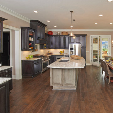
This growing family of six was struggling with a dysfunctional kitchen design. The center island had been installed at an odd angle that limited accessibility and traffic flow. Additionally, storage space was limited by poor cabinet design. Finally, doorways in and out of the kitchen were narrow and poorly located, especially for children dashing in and out.
Other design challenges included how to better use a 10’ x 12’ room for children’s jackets and toys and how to add a professional-quality gas range in a neighborhood were natural gas wasn’t available. The new design would address all of these issues.
DESIGN SOLUTIONS
The new kitchen design revolves around a more proportional island. Carefully placed in the center of the new space with seating for four, it includes a prep sink, a second dishwasher and a beverage center.
The distressed ebony-stained island and hutch provides a brilliant contrast between the white color cabinetry. White Carrera marble countertops and backsplash top both island and perimeter cabinets.
Tall, double stacked cabinetry lines two walls to maximize storage space. Across the room there was an unused wall that now contains a 36” tower fridge and freezer, both covered with matching panels, and a tall cabinet that contains a microwave, steam unit and warming drawer.
A propane tank was buried in the back yard to provide gas to a new 60” professional range and cooktop. A custom-made wood mantel hood blends perfectly with the cabinet style.
The old laundry room was reconfigured to have lots of locker space for all kids and added cabinetry for storage. A double entry door separated the new mudroom from the rest of the back hall. In the back hall the back windows were replaced with a set of French door and added decking to create a direct access to deck and backyard.
The end result is an open floor plan, high-end appliances, great traffic flow and pleasing colors. The homeowner calls it the “kitchen of her dreams.”

 Inviting Spaces By Kim
This centrally located intersection to a main thoroughfare a block away was a concern because of the corner lot visibility issue for cars making a turn driving in either direction. The Quince tree bloomed annually for just a short time and was originally planted by the prior home owners decades ago. Keeping it maintained to a height of 4’ maximum, dictated for safety reasons, was still obstructing and limiting the visibility of oncoming traffic at this busy intersection.
The existing roses planted in the same space as the Quince were a perfect backdrop to the new perennials and annuals planted to paint this corner with flowers. The project also included expanding the beautification to both corner areas in coordination with several other planting areas already seasonally updated on the property. With the Redwood Tree as a focal point and Roses, Daphnes, Iris, Azaleas, Fuchsias, Hydrangeas and Camilias highlighting the planting beds the addition of color, including around the driveway and side entrance, transformed the entire space.
Painting With Flowers Is Adding Beauty to Benefit Homeowners & Neighbors!
Kim Beber
 Pro-Pack Contracting & Design Inc.
Client had a closed in tight space in their existing kitchen prior to the renovation. Their island was in a high traffic area and so seating was minimal. Removing the wall and add the peninsula gave ample seating and work space making it a much welcomed flow to this now functioning kitchen. . Revival Arts Photography

Inspiration for a contemporary galley medium tone wood floor and brown floor kitchen remodel in Miami with flat-panel cabinets, black cabinets, white backsplash, an island and white countertops
 GR Burgess Co.
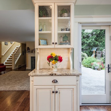
This beautiful custom built furniture piece fits perfectly where the commercial ovens were, opening up the space for improved function and traffic flow.
Photo: Sam Van Fleet

Sponsored
Columbus, OH
Free consultation for landscape design!

Peabody Landscape Group
Columbus' Reliable Landscape Design & Contracting

 Dream Kitchens
The original kitchen certainly wasn't what this avid baker had envisioned to create her confections. A small closed off kitchen flanked by a small entry area, living room and the main traffic pattern for the house ran right through the middle.
The new design solved all these challenges as well as improved the look of the space. Combining the spaces was achieved by simply removing a wall and increasing the opening to the small entry way. After much re-routing of plumbing, electrical and of course structure, the 3 small spaces where combined into 1 great kitchen, perfect for baking as well as entertaining.
Photography by Scott Sherman

 Weidmann Remodeling
As needs have changed, new home construction in Atlanta has trended towards more open floor plans. Weidmann helps owners of older residences to investigate and achieve these same open objectives by consolidating and reconfiguring the available space on both levels. This home was opened up with a little creative organization, which included relocating the powder room, changing traffic patterns and repurposing rooms for a renewed lifetime of living.
FotoGrafik Arts

 Dynamic Rugs Inc.
Kidz rugs are attractive designs with engaging scenes that are sure to inspire the imaginations of young minds. With a velvety smooth surface, with skid-resistance backing make an inviting and secure play space. Kidz rugs cheerful colors and soft hues delight to create hours of fun and whimsical memories.

 Corinthian Fine Homes
These homeowners requested a complete makeover of their dated lake house with an open floor plan that allowed for entertaining while enjoying the beautiful views of the lake from the kitchen and family room. We proposed taking out a loft area over the kitchen to open the space. This required moving the location of the stairs to access the basement bedrooms and moving the laundry and guest bath to new locations, which created improved flow of traffic. Each bathroom received a complete facelift complete with the powder bath taking a more polished finish for the lone female of the house to enjoy. We also painted the ceiling on the main floor, while leaving the beams stained to modernize the space. The renovation surpassed the goals and vision of the homeowner and allowed for a view of the lake the homeowner stated she never even knew she had.
Sponsored
Delaware, OH

Buckeye Basements, Inc.
Central Ohio's Basement Finishing ExpertsBest Of Houzz '13-'21

 Bianchi Design
When it comes to small spaces every inch counts! The key to making them work is to think of traffic flow, and how you’re going to arrange furniture for ease of access and comfort. This gives credence to the form over function motto!
For this project we knew we were expanding the indoor outdoor flow by removing a wall of the house, creating a pocket door, so the interior living room was going to merge perfectly with the new exterior living room.
The first element of the design we worked out was a built-in Banco seating around a central fire pit, with cushions and exterior fabrics, that even has a one piece cover that can snap in place. This will protect the fabrics in place while the couple travels, without having to drag them through the house to the garage for storage.
The second critical factor of the design was implementing an outdoor kitchen just off camera, built-in to a patio Column, so that it becomes a serving bar and the appliances are behind the bar not out in the public space.
Across the water, the vanishing edge spa was the visual draw, reflecting a fruitless olive tree, all enjoyed from the fire pit seating area.
The back edge of the pool features a knife edge tile to granite interface without a coping, to minimize the line between water and landscape.
Last but not least, the sweeping arc curvature of the pools leading edge was done so as to ease traffic flow from the entertaining and fire seating area to the spa, and to soften the otherwise rectangular lines of the yard.

 Jarrett Design
This remodel was a dated 1980s Cape Cod style home that desperately needed updating with the kitchen starting as the foundation for the rest of the home. The owners purchased the property in 2013 with the intent of replacing the existing kitchen installed in 2000, as well as updating most surfaces throughout the home. The space while moderately sized, felt cramped due to the L-shaped design and eat-in island that disrupted traffic flow from the mudroom, dining room and sliding doors to the patio. The owners knew they wanted to bring the light from the southern facing front of the home to the dark cave-like feeling of the kitchen. This was remedied by knocking down the wall between the existing dining room (now a lounge area), widening the entrance to the family room and creating a pathway to the existing formal living room (now the dining room). Also to create better traffic flow into the kitchen, the existing mudroom door was moved to the opposite side of the wall.
A large work island with cooktop, oven and convection/microwave was designed for efficiency and maintaining clean site lines. The work triangle allows for quick and easy meal prep and clean-up for the busy family. Space at the end of the kitchen was perfectly suited for a large kitchen table with views of the back yard, easy conversation with the cook at the island or those hanging in the newly appointed lounge area. The new doorway between the kitchen and dining room showcases the 10ft floor to ceiling bay window, allows more light to flood into the space and creates easy access between the two rooms for family gatherings. Given the home owners relocated to the area for job reasons and are not sure how long they will be in this home, we helped them achieve a balance of a design and finishes that they not only love, but would be appealing to many if another move was in their near future.
Matt Villano Photography

 Bilotta Kitchen & Home
For this project, the entire kitchen was designed around the “must-have” Lacanche range in the stunning French Blue with brass trim. That was the client’s dream and everything had to be built to complement it. Bilotta senior designer, Randy O’Kane, CKD worked with Paul Benowitz and Dipti Shah of Benowitz Shah Architects to contemporize the kitchen while staying true to the original house which was designed in 1928 by regionally noted architect Franklin P. Hammond. The clients purchased the home over two years ago from the original owner. While the house has a magnificent architectural presence from the street, the basic systems, appointments, and most importantly, the layout and flow were inappropriately suited to contemporary living.
The new plan removed an outdated screened porch at the rear which was replaced with the new family room and moved the kitchen from a dark corner in the front of the house to the center. The visual connection from the kitchen through the family room is dramatic and gives direct access to the rear yard and patio. It was important that the island separating the kitchen from the family room have ample space to the left and right to facilitate traffic patterns, and interaction among family members. Hence vertical kitchen elements were placed primarily on existing interior walls. The cabinetry used was Bilotta’s private label, the Bilotta Collection – they selected beautiful, dramatic, yet subdued finishes for the meticulously handcrafted cabinetry. The double islands allow for the busy family to have a space for everything – the island closer to the range has seating and makes a perfect space for doing homework or crafts, or having breakfast or snacks. The second island has ample space for storage and books and acts as a staging area from the kitchen to the dinner table. The kitchen perimeter and both islands are painted in Benjamin Moore’s Paper White. The wall cabinets flanking the sink have wire mesh fronts in a statuary bronze – the insides of these cabinets are painted blue to match the range. The breakfast room cabinetry is Benjamin Moore’s Lampblack with the interiors of the glass cabinets painted in Paper White to match the kitchen. All countertops are Vermont White Quartzite from Eastern Stone. The backsplash is Artistic Tile’s Kyoto White and Kyoto Steel. The fireclay apron-front main sink is from Rohl while the smaller prep sink is from Linkasink. All faucets are from Waterstone in their antique pewter finish. The brass hardware is from Armac Martin and the pendants above the center island are from Circa Lighting. The appliances, aside from the range, are a mix of Sub-Zero, Thermador and Bosch with panels on everything.
83