
Search results for "Typical client" in Home Design Ideas

 Advance Design Studio, Ltd.
Jennifer and Dan have lived in their Deer Park Illinois home for 15 years, slowly making minor fixes like painting and decorating; but they had a new plan for their kitchen the entire time. An awkwardly placed garage door, and an island cooktop with a terrible downdraft made a full-scale kitchen remodel an absolute must. Jennifer had many ideas in mind and wanted to work with a company that could provide high-end work, while partnering with a designer that would tailor the kitchen to her ideas.
She was intrigued by the phrase “Common Sense Remodeling” in Advance Design’s feature she discovered while perusing an issue of the community’s Quintessential Barrington Magazine. Doing further research on the company’s website, as she looked through project profiles and read about Advance Design’s “Common Sense Remodeling” philosophy, she promptly scheduled an appointment to see if the people and ideas she read about were truly who they said they were. The more she read, the more she knew that the “Common Sense” approach to remodeling they described was exactly the type of company she was looking for.
The partnership was sealed after an initial consultation with Owner Todd Jurs and Project Designer Michelle Lecinski. They displayed a combination of friendliness, professionalism and respect that was unmatched by any of the other companies Jennifer talked to. She knew that with Advance Design, she would be able to retain the vision that she had in mind with high-quality craftsmanship.
“I reached out to Advance Design because of the ‘Common Sense Remodeling’ tagline,” Jennifer said. “That’s what lingered for me”. “Advance Design was the most respectful- of the house and of my design ideas, and the most professional of the handful of companies that looked at my project”.
Soon after the meeting Jennifer began working with Michelle on the project design. They quickly developed chemistry. Jennifer loved how Michelle researched and located every detail that Jennifer wanted for the kitchen. Between the two of them, every concept and idea was worked through and perfected. “Jennifer had definite ideas about what she wanted the new kitchen to look like, she just didn’t know how to bring it all together. We worked together really well to make her ideas into the practical reality necessary for a well-functioning kitchen, with the look and feel that she had envisioned”, says Michelle.
“Michelle was wonderful in using the CAD system she would show me new drawings every time we changed the layout while working through the design,” Jennifer said. “She was a really wonderful partner in execution, she made sure everything happened quickly and easily.”
The finished design drew out elements of Jennifer’s style and personality. The pair call the look “sophisticated farmhouse” to describe the kitchen renovation to family and friends. The result was a beautifully crafted, authentic-feeling space that satisfied Jennifer’s dreams 15 years in the making. The whole project consisted of a kitchen remodel, mudroom upgrade with powder room, and garage entry relocation. “The projects I personally like the best, are the ones that put the client’s dreams on display,” Project Designer Michelle said. “And this is one of those projects.”
The main focal point of the kitchen is custom zinc and brass ventilation hood with a vintage sheen, which was hand made to order by a small company in Indiana named Vogler Metalworking. “It’s like sculpture, a true work of art”, says Jennifer. Your eye is immediately drawn towards this elegant yet practical hood that eliminated the home’s downdraft problem and added a striking conversation piece at the same time. The carpenters had to use special gloves when transporting and installing it, so they didn’t smudge it with fingerprints. The beautiful hood centers proudly over the stunning black enamel and brass LaCornue Range. “I had a friend who had a LaCornue range and after learning how easy it was to cook perfect meals, I was convinced I wanted to have one”, says Jennifer. This unique, breathtaking combination anchors the entire kitchen and is apparent immediately as you walk into the great room the surrounds the space.
DuraSupreme Crestwood cabinets with a Kendall Panel add function and sophistication. A custom gray paint color paired with a storm blue was developed so that the new kitchen looked like it belonged to the existing space. Unlacquered brass faucets and hardware were important to Jennifer because she wanted the living finishes to age over time. Remarkable brass diamond mesh cabinet door inserts imported from the UK continue to add this one-of-a-kind kitchen renovation; giving it a “you won’t see this everywhere” quality. The use of old railcar flooring for the coffee bar countertop and reclaimed oak for the open shelving gives an authenticity to the space uncommon in kitchens today.
Jennifer and Michelle fell in love with the Limestone Grey Stone while they were investigating unique island countertop ideas. They liked the fact that the limestone as a living finish will age and change over time. Calcutta Miel Quartz countertops made for an excellent pairing around the perimeter, as it’s durable and perfect for cooking preparations. A textured white subway tile backsplash that runs to the ceiling keeps your eye moving towards the open shelving, and to the main focal point of the stunning range hood combination.
“The kitchen functions beautifully, and it’s gorgeous,” beams Jennifer as she gestures with both hands while smiling ear to ear. “The most important thing was I wanted a kitchen that had a wonderful flow, cooked beautiful meals and was a great gathering place for family and friends, and this space does that perfectly! Beauty wise, it turned out exactly how I had envisioned. I felt the function part was the hardest part, and that was nailed”!
Relocating the garage entry to the new mudroom was a huge priority and has finally separated the family’s arriving home functions from their kitchen. Now coats and shoes and bags have their own area for dropping once members arrive home. Matching gray DuraSupreme cabinetry helped create gorgeous, purposeful lockers for the family. A reclaimed vintage sink and custom wall paper were added to the tiny powder room to beautify the once previously only functional space. Advance Design was even able to create a custom space for their dog to sleep while the family is away.
“It was unbelievable that a project of this size was completed in such a short time, and I think that’s because of the large amount of planning and preparation that went into it,” Jennifer marveled, “When we started, we were ready, and everything was prepared”.
When it came to execution, Project Manager Justin Davis and his crew were quick, accessible, and organized. Projects like this kitchen are typically completed in as little as 8-10 weeks. Jennifer’s kitchen however despite the relocation of some challenging HVAC in a soffit and moving of an exterior door was completed remarkably fast in part because the team was working with an existing tile floor that ran throughout the first floor that the client really loved.
“You get to know these people really well because they’re living in your house while you’re living in your house. They were so fast and really good, it didn’t take as long as even planned” reported Jennifer. “I would text Justin and he always responded almost immediately. I got to know all the guys who were working in our house and they were all wonderful people”.
Details in a customized kitchen like this one require skill and care from the people who install it. “All the guys on the job were skilled at what the did. I wanted small details like little feet to look like furniture, that is where their carpentry skill came in to make these all perfect”, said Jennifer. “The tile guys were wonderful. They even let me determine how I wanted the texture with the grout to appear for a salt and pepper look; now that is a very skilled trade person making it custom”.
In Jennifer’s interview, she continued to reference Advance Design’s “Common Sense Remodeling”, so I took a minute to ask her exactly what that phrase meant to her and how it played out in her experience with her project and the Advance Design team. Here is what she said: “I was intrigued about Common Sense Remodeling and in my head that there would be clear costs and prices, great communication between the design team, the execution team and me”, said Jennifer. They did deliver on that, it was so clear about the cost breakdown, what I could expect from everyone who came to my house, and everything that we had ordered. That to me is the Common Sense”!
It’s great to see a client take literally our assertion that a well-planned remodeling project is simply “Common Sense”! She anticipated each step of the way would be clear, concise, and predictable, all the while protecting the outcome due to the careful upfront planning. “Advance Design delivered on their ‘Common Sense Remodeling’ promise,” Jennifer said. “From the design team, to the execution team - everything was straight forward like I imagined. The project turned out exactly how I envisioned, I enjoyed this process and absolutely would recommend Advance Design Studio to anyone.”

 Neil Kelly Company
When our client wanted the design of their master bath to honor their Japanese heritage and emulate a Japanese bathing experience, they turned to us. They had very specific needs and ideas they needed help with — including blending Japanese design elements with their traditional Northwest-style home. The shining jewel of the project? An Ofuro soaking tub where the homeowners could relax, contemplate and meditate.
To learn more about this project visit our website:
https://www.neilkelly.com/blog/project_profile/japanese-inspired-spa/
To learn more about Neil Kelly Design Builder, Byron Kellar:
https://www.neilkelly.com/designers/byron_kellar/

 Robert Frank Interiors
Mid-sized elegant 3/4 mosaic tile and gray tile mosaic tile floor corner shower photo in Los Angeles with recessed-panel cabinets, white cabinets, a one-piece toilet, gray walls, an undermount sink, quartz countertops and a hinged shower door
Find the right local pro for your project

 FOUR POINT DESIGN BUILD INC
DESIGN BUILD REMODEL | Home Office Transformation | FOUR POINT DESIGN BUILD INC.
This space was once a child's bedroom and now doubles as a professional home photography post production office and a dressing room for graceful ballerinas!
This completely transformed 3,500+ sf family dream home sits atop the gorgeous hills of Calabasas, CA and celebrates the strategic and eclectic merging of contemporary and mid-century modern styles with the earthy touches of a world traveler!
AS SEEN IN Better Homes and Gardens | BEFORE & AFTER | 10 page feature and COVER | Spring 2016
To see more of this fantastic transformation, watch for the launch of our NEW website and blog THE FOUR POINT REPORT, where we celebrate this and other incredible design build journey! Launching September 2016.
Photography by Riley Jamison
#ballet #photography #remodel #LAinteriordesigner #builder #dreamproject #oneinamillion

 Jordan Design Build Group
The vintage inspired black and white tile is a nod to the past while the black stainless range and matte black faucet are unmistakably modern.
High on our client’s wish list was eliminating upper cabinets and keeping the countertops clear. In order to achieve this, we needed to ensure there was ample room in the base cabinets and reconfigured pantry for items typically stored above. The full height tile backsplash evokes exposed brick and serves as the backdrop for the custom wood-clad hood and decorative brass sconces – a perfect blend of rustic, modern and chic. Black and brass elements are repeated throughout the main floor in new hardware, lighting, and open shelves as well as the owners’ curated collection of family heirlooms and furnishings.

 Kala Interior Design
The breathtaking ocean views influenced the dramatic redesign of this water-front Poipu condo. The outdated condo was completely remodeled to allow full appreciation of the surrounding views, bring in a fresh new color palette, and modernize and update everything from the electrical wiring to the new luxury bath towels. The clients wanted the condo to feel “fun, happy, and cheerful,” and to stand apart from the typical vacation rental on Kauai. They wanted to turn this condo into the ultimate “beach house” that felt just as luxurious as the gorgeous natural surroundings.
Fresh white ship-lap walls set the backdrop for this modern beach style, which is further enhanced with bold stripes, natural textures, and ocean-themed decor. The palette of cobalt, aqua and lichen green is fresh and vibrant against the neutral backdrop. Trina Turk’s “Peacock Print” was the inspiration fabric for the living and dining room. The print is so lively, colorful, and modern, and was the perfect place to start.
Every custom detail was thoughtfully chosen to bring a sense of luxury and originality to the space. While some elements are whimsical, such as the playful octopus art & fish-themed fabric, other elements are sophisticated and classic, to help keep the design grounded.
Special features include a custom-made “Moroccan Fish Scale” tile backsplash in the kitchen, crushed marble counter tops with oyster shells and float glass, and blue glass pendant lights, reminiscent of water bubbles.

 Robert Paige Cabinetry LLC
Photography by William Quarles. Designed by Shannon Bogen. Built by Robert Paige Cabinetry. Contractor Tom Martin
Example of a mid-sized transitional l-shaped eat-in kitchen design in Charleston with stainless steel appliances, an undermount sink, recessed-panel cabinets, gray cabinets, quartz countertops and an island
Example of a mid-sized transitional l-shaped eat-in kitchen design in Charleston with stainless steel appliances, an undermount sink, recessed-panel cabinets, gray cabinets, quartz countertops and an island
Sponsored
Columbus, OH

Snider & Metcalf Interior Design, LTD
Leading Interior Designers in Columbus, Ohio & Ponte Vedra, Florida

 Welling Construction
An outdated 1960’s home with smaller rooms typical of this period was completely transformed into a timeless lakefront retreat that embraces the client’s traditions and memories. Anchoring it firmly in the present are modern appliances, extensive use of natural light, and a restructured floor plan that appears both spacious and intimate.

 Moore Designs Inc
Sizeable out buildings are typically the norm for most new construction projects. However, in the case of this new custom, arts and crafts project the client’s preference was to maintain a quaint architectural quality to their lake property.
 Sandra Costa Design Group
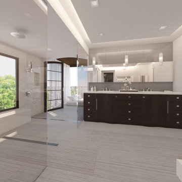
Bathrooms do not need to look like typical or expected. This room is on the second floor of a Beverly Hills Estate. The client wanted a room that did not show a shower. It was an easy challenge.

 Susan Brook Interiors
Huge re-model including taking ceiling from a flat ceiling to a complete transformation. Bamboo custom cabinetry was given a grey stain, mixed with walnut strip on the bar and the island given a different stain. Huge amounts of storage from deep pan corner drawers, roll out trash, coffee station, built in refrigerator, wine and alcohol storage, appliance garage, pantry and appliance storage, the amounts go on and on. Floating shelves with a back that just grabs the eye takes this kitchen to another level. The clients are thrilled with this huge difference from their original space.
 Amazing Spaces
The existing U-shaped kitchen was tucked away in a small corner while the dining table was swimming in a room much too large for its size. The client’s needs and the architecture of the home made it apparent that the perfect design solution for the home was to swap the spaces.
The homeowners entertain frequently and wanted the new layout to accommodate a lot of counter seating, a bar/buffet for serving hors d’oeuvres, an island with prep sink, and all new appliances. They had a strong preference that the hood be a focal point and wanted to go beyond a typical white color scheme even though they wanted white cabinets.
While moving the kitchen to the dining space gave us a generous amount of real estate to work with, two of the exterior walls are occupied with full-height glass creating a challenge how best to fulfill their wish list. We used one available wall for the needed tall appliances, taking advantage of its height to create the hood as a focal point. We opted for both a peninsula and island instead of one large island in order to maximize the seating requirements and create a barrier when entertaining so guests do not flow directly into the work area of the kitchen. This also made it possible to add a second sink as requested. Lastly, the peninsula sets up a well-defined path to the new dining room without feeling like you are walking through the kitchen. We used the remaining fourth wall for the bar/buffet.
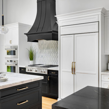
Black cabinetry adds strong contrast in several areas of the new kitchen. Wire mesh wall cabinet doors at the bar and gold accents on the hardware, light fixtures, faucets and furniture add further drama to the concept. The focal point is definitely the black hood, looking both dramatic and cohesive at the same time.

 Studio Roundtop
The brief was to transform the apartment into a home that was suited to our client’s (a young married couple) needs of entertainment and desire for an open plan.
By reimagining the spatial hierarchy of a typical Singaporean home, the existing living room was converted nto a guest room, 2 bedrooms were also transformed into a single living space centered in the heart of the apartment.
White frameless doors were used in the master and guest bedrooms, extending and brightening the hallway when left open. Accents of graphic and color were also used against a pared down material palette to form the backdrop for the owners’ collection of objects and artwork that was a reflection of the young couple’s vibrant personalities.
Photographer: Tessa Choo
Sponsored
Columbus, OH
Snider & Metcalf Interior Design, LTD
Leading Interior Designers in Columbus, Ohio & Ponte Vedra, Florida

 H3K Design
Patrick Ketchum
Mid-sized 1950s front door photo in Los Angeles with white walls and a yellow front door
Mid-sized 1950s front door photo in Los Angeles with white walls and a yellow front door

 suba | Suanne Bassett, Architect
A typical asphalt driveway was transformed into this beautiful entry garden oasis for the clients to enjoy year round.
This is an example of a large traditional partial sun front yard gravel landscaping in San Francisco for spring.
This is an example of a large traditional partial sun front yard gravel landscaping in San Francisco for spring.

 FOI Designs
The typical process of utilising 2 separate vertical posts in this corner to span glass at an awkward angle was not used here. Our client wanted very simple geometry so we custom machined angle wedges that matched the angle of the flooring to mechanically fasten the glass to the vertical post.

 Monarch & Maker
We commissioned this piece for our client with a Houston based artist we collaborate with frequently, Claire Richards. She does fantastic work, and her scale is typically very large, which isn't always easy to find. Transporting such a size of artwork can be interesting! We hired a U-haul, and transported it from the studio, straight to the client's home.
You can check out more of her pieces on her Facebook page:
https://www.facebook.com/Claire-Richards-Artist-300394363104/
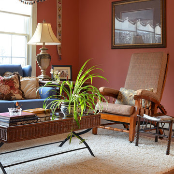
Sponsored
Columbus, OH

Wannemacher Interiors
Customized Award-Winning Interior Design Solutions in Franklin Cnty OH
 J Logan Interiors
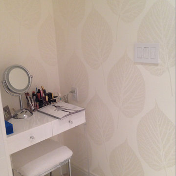
I took a typical Manhattan bathroom and enraged it giving the client room for a small vanity.


 Lisa Shaffer
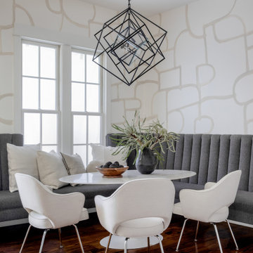
When our client requested storage for the entry table, we went with a dresser instead of a typical console table. The shagreen texture added just the right touch. Also, a tall and skinny mirror was the right move for such high ceilings.
7