
Search results for "Typical client" in Home Design Ideas

 Leanne Michael L U X E lifestyle design
This coastal kitchen was designed with modern simplicity in mind to compliment my clients Baja lifestyle. The goal was to make the kitchen space feel larger for their daily use and entertaining purposes. Therefore, we designed the refrigerator to be positioned in the corner of the L shape custom cabinetry plan. Doing so opened the space up for even better interior access into the fridge as the French doors can now open fully. Within the custom cabinet plan, we specifically added a pair of hidden storage garage cubbies on both sides of the refrigerator compartment which gives my clients the ability to capture additional would-be wasted space perfect for hiding items typically left on the counters such as their toaster, coffee maker, bottles of vitamins, etc..
The duel material island with waterfall edges has even more character by adding a solid alder wood counter surface that marries into the quartz utility area surface. The island also has tons of hidden storage space on the front side hidden behind touch release cabinet doors to store items not used as often. Hanging above the island are a pair of glazed clay planters found locally that were transformed into really interesting light pendants through the assistance of our sister company, iron | clay | wood, for all things custom!
Adding a bank of custom floating shelves in the same alder wood as the island also gave continuity and balance to the space perfect for displaying my clients collection of everyday dishes and stemware found in Rosarito.

 Painting in Partnership, Inc.
We just repainted a Victorian house, Circa 1885, for a new client in Chicago. When you see a house of this size and this level of detail, a question comes to mind: How often do you want to have to repaint a house like this? The answer is simple: The least often possible! The related question is: What can you do to extend the life of a paint job?
Depending on its size, its level of detail and the condition of its coatings and substrates, a Painted Lady’s paint job can cost between $20,000 and $50,000, sometimes even more. Because of its clapboard and extensive trim and millwork, a Victorian house is especially vulnerable to deterioration. Before having us start the painting project, the owners spent about $8,000 on carpentry repair work to the house. To minimize the future cost of carpentry repairs and prolong the longevity of the paint job, we recommend what we call “Maintenance Painting” to our clients. What does maintenance painting entail?
Maintenance painting consists of doing a close inspection of the coatings of a house, every couple of years. What do we look for: signs of failure in the caulking and coatings. When the coating or caulking starts to crack, it is an entry point to moisture, which gets trapped, rots the wood and causes paint failure. Once caulk starts to fail, the deterioration of the substrate and coatings accelerates rapidly. This is why early detection is critical to maintain the integrity of the paint job. We then do caulk and coating maintenance on those spots we detected. When we notice the beginning signs of wood rot, we also do epoxy restoration in those areas.
A homeowner needs the assistance of a dedicated painting and decorating contractor in order execute this periodic maintenance. The challenge is two-fold. One, owners are typically unaware of the importance of coating maintenance. Two, painting contractors do not seem to recognize the opportunity of offering this service to their clients. So, these expensive paint jobs are allowed to deteriorate, which adds to the future cost of the repaints.
The kind of coating maintenance we are talking about can cost between $500 and $1,500 every two years. The money saved in avoiding expensive carpentry repairs alone more than justifies coating maintenance. Our clients who own historic Victorian home or other “Period” homes in the Chicago area really appreciate this additional service we offer them.
 Concetti
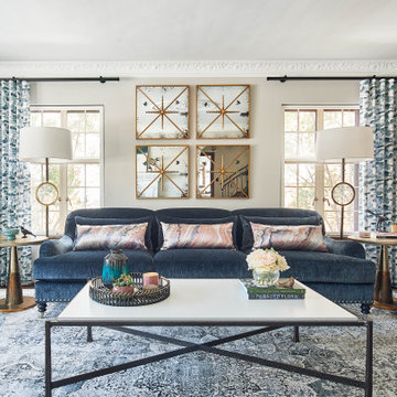
The potential in a historic 1930’s Royal Oak home with an abundance of original details is endless. Combine that with a client with a deep love for traditional Chinoiserie style and whimsical details and the result can only be stunning. Such is the case in the upholstery pieces and window treatments in this living room. Each piece in the space was hand selected to not only complement the gorgeous historical features of the home - such as the original herringbone flooring, plaster crown molding, ceiling medallion and fireplace - but also infuse the space with the whimsical, layered motifs and textures that are typical of the European interpretation of Chinoiserie style. The teal and white fabrics seen in the window treatments and accent chairs are reminiscent of the traditional blue and white patterns of chinoiserie but also tie the teal detailing of original stained glass windows and inlays on the original stone flooring. The inspiration for the palette comes from the chinoiserie mural on the back wall of the dining room with a blush backdrop that has been reinterpreted into modern silhouettes and patterns on the sofa pillows and swivel chairs that provide a playful juxtaposition to the traditional lines throughout the rest of the space.
Find the right local pro for your project

 Spire Integrated Systems Inc.
Sustainable Design Meets Smart Technology
This home featured a request from the client to use as many environmentally friendly materials and fabrics as possible. Many common shade manufacturers use materials with PVC plastic, which is known for off-gassing hazardous chemicals that linger in the air in the home for years. The main floor roller shades met the client’s request for an eco-friendly fabric by utilizing motorized shades with GreenScreen fabric. In other rooms, the designer and client wanted the classic look and soft fabrics with roman shades and drapery tracks on several windows in the house. By partnering with the interior designer and fabric workroom, we were able to provide a custom solution for motorization of roman shades and drapery.
Lighting Control
The client is able control all of the lighting and window treatments in the house with a single control system. This eliminates the need for extra devices on the wall or remote controls that clutter up the space and get lost. By utilizing the custom window treatments, the house is able to conserve energy by keeping the house warmer in the winter, and cooler in the summer by providing insulation and blocking sunlight. The lighting control system further helps to conserve energy by beautifully dimming LED lights as well as using quick buttons that turn off all of the lights in the house, or un-occupied rooms, with the press of a single button.
Motorized Window Treatments
Motorized window treatments add a high level of convenience to any project, especially those with many windows in hard to reach places. The challenge with many manufacturers is a limitation of style and fabric selection, some may be a s basic as only roller shades. Often times these come with un-reliable, wireless controls.
On this Birmingham, MI project completed in March 2019, we partnered with the interior designer and drapery workroom to provide a truly unique solution. The homeowner and designer’s requests included many different styles of window treatments including rollers shades, roman shades and motorized draperies. Typically, this would result in a collection of various shade manufacturers with unsightly remotes scattered across each room or stuck to the wall for control. Utilizing standard offerings, coupled with an incredible team effort by the designer and drapery workroom, we provided all of the requested styles of window treatments, and were able to control them all on a single system. This means that each room has a single, elegant keypad built into the wall that controls not only the window treatments, but the lighting as well.
When leaving/entering the home, all of the window coverings can be raised or lowered with a single button press. Shades and draperies can also be set to operate based on the time of day for automatic day-to-day operation using sunlight as a guide. In the end, we achieved convenience, function and sophisticated style.

 Tracy Berman Interiors
This kitchen was your typical builder basic design. Lot's of cabinets with no thought for function. An odd shaped island that took up space, but didn't provide much storage. We straightened out the island to create more storage and loads of function. It now has the sink, dishwasher, trash center, bookcase, mixer cabinet and microwave drawer plus more! We removed the wall double ovens and added a 48" range instead. This allowed us to flank either side of the fridge with roll out pantry cabinets. An appliance garage was added to the corner. The range has a custom hood over it that blends seamlessly with the cabinets. The client needed a space to sit and check the mail so we created an office space at the end of the wall. Behind the blinds is a new 10' slider for access to the patio. Luxury vinyl plank flooring went in throughout the house. Custom pendant lights were hung in clusters of three above the island. The kitchen was painted Accessible Beige by SW.

 ZeroEnergy Design
This LEED Platinum certified house reflects the homeowner's desire for an exceptionally healthy and comfortable living environment, within a traditional neighborhood.
INFILL SITE. The family, who moved from another area of Wellesley, sought out this property to be within walking distance of the high school and downtown area. An existing structure on the tight lot was removed to make way for the new home. 84% of the construction waste, from both the previous structure and the new home, was diverted from a landfill. ZED designed to preserve the existing mature trees on the perimeter of the property to minimize site impacts, and to maintain the character of the neighborhood as well as privacy on the site.
EXTERIOR EXPRESSION. The street facade of the home relates to the local New England vernacular. The rear uses contemporary language, a nod to the family’s Californian roots, to incorporate a roof deck, solar panels, outdoor living space, and the backyard swimming pool. ZED’s careful planning avoided to the need to face the garage doors towards the street, a common syndrome of a narrow lot.
THOUGHTFUL SPACE. Homes with dual entries can often result in duplicate and unused spaces. In this home, the everyday and formal entry areas are one and the same; the front and garage doors share the entry program of coat closets, mudroom storage with bench for removing your shoes, and a laundry room with generous closets for the children's sporting equipment. The entry area leads directly to the living space, encompassing the kitchen, dining and sitting area areas in an L-shaped open plan arrangement. The kitchen is placed at the south-west corner of the space to allow for a strong connection to the dining, sitting and outdoor living spaces. A fire pit on the deck satisfies the family’s desire for an open flame while a sealed gas fireplace is used indoors - ZED’s preference after omitting gas burning appliances completely from an airtight home. A small study, with a window seat, is conveniently located just off of the living space. A first floor guest bedroom includes an accessible bathroom for aging visitors and can be used as a master suite to accommodate aging in place.
HEALTHY LIVING. The client requested a home that was easy to clean and would provide a respite from seasonal allergies and common contaminants that are found in many indoor spaces. ZED selected easy to clean solid surface flooring throughout, provided ample space for cleaning supplies on each floor, and designed a mechanical system with ventilation that provides a constant supply of fresh outdoor air. ZED selected durable materials, finishes, cabinetry, and casework with low or no volatile organic compounds (VOCs) and no added urea formaldehyde.
YEAR-ROUND COMFORT. The home is super insulated and air-tight, paired with high performance triple-paned windows, to ensure it is draft-free throughout the winter (even when in front of the large windows and doors). ZED designed a right-sized heating and cooling system to pair with the thermally improved building enclosure to ensure year-round comfort. The glazing on the home maximizes passive solar gains, and facilitates cross ventilation and daylighting.
ENERGY EFFICIENT. As one of the most energy efficient houses built to date in Wellesley, the home highlights a practical solution for Massachusetts. First, the building enclosure reduces the largest energy requirement for typical houses (heating). Super-insulation, exceptional air sealing, a thermally broken wall assembly, triple pane windows, and passive solar gain combine for a sizable heating load reduction. Second, within the house only efficient systems consume energy. These include an air source heat pump for heating & cooling, a heat pump hot water heater, LED lighting, energy recovery ventilation, and high efficiency appliances. Lastly, photovoltaics provide renewable energy help offset energy consumption. The result is an 89% reduction in energy use compared to a similar brand new home built to code requirements.
RESILIENT. The home will fare well in extreme weather events. During a winter power outage, heat loss will be very slow due to the super-insulated and airtight envelope– taking multiple days to drop to 60 degrees even with no heat source. An engineered drainage system, paired with careful the detailing of the foundation, will help to keep the finished basement dry. A generator will provide full operation of the all-electric house during a power outage.
OVERALL. The home is a reflection of the family goals and an expression of their values, beautifully enabling health, comfort, safety, resilience, and utility, all while respecting the planet.
ZED - Architect & Mechanical Designer
Bevilacqua Builders Inc - Contractor
Creative Land & Water Engineering - Civil Engineering
Barbara Peterson Landscape - Landscape Design
Nest & Company - Interior Furnishings
Eric Roth Photography - Photography

 InnovationLand
Among our Houston outdoor kitchens, this one is unique because of its concrete countertops, pergola with stucco wrapping and custom storage.
"It's not one of our biggest covered outdoor kitchens in Houston," says Outdoor Homescapes of Houston owner Wayne Franks. "But it's unique, and it looks really nice, too!"
The client, a young family, wanted an outdoor kitchen with a more minimalistic, modern look, explains Outdoor Homescapes senior designer Lisha Maxey.
"They're both doctors and very much attuned to detail," she says. "Their primary goal was to create a space where they could lounge while the children played as well as an area to entertain family and friends while cooking and dining outside."
Like a growing number of people wanting small outdoor kitchens in Houston, this client expressed interest in using concrete as a surface material: "The look is contemporary and is easily paired with any type of outdoor furniture," says Maxey, "from wicker to teak to iron."
Here's a closeup of the concrete countertops. You'll notice that they're glossy and smooth like glass, thanks to special sealers and a topcoat of UV-resistant resin that prevents the countertop from yellowing.
Since these particular clients lean toward the minimalistic side of contemporary design, she continues, "the standard granite countertop of many Houston outdoor kitchens would not work, since it typically has a lot of movement and can be busy."
Lisha sees the use of concrete as a growing outdoor design trend for Houston outdoor kitchens: "It's easy to maintain and again, leans towards a more modern look for outdoor."
All the furniture and lighting is from Restoration Hardware, says Lisha, who's offering $500 in free outdoor furniture consultation services as a special promotion. (Interested? Just contact us!)
The dining and lounge chairs are from the Antibes collection in cast aluminum with a bronze finish. The table is a Belgian Trestle made of weathered concrete and teak. Simple track lighting was used on the pergola in keeping with the minimalist look of the space.
The pergola is a treated pine, stained a Minwax Jacobean, which appears almost black. "This client chose a pergola over a roof extension off the house because they wanted it to still seem light and airy in their outdoor space for their young children," explains Lisha. "They wanted a certain degree of sun and shade protection, which a pergola does provide, but they wanted it to seem a bit like a park for the kids to play in."
"The seating/storage bin was not a part of the original design," says Lisha. "As the project progressed, the client expressed interest in some sort of chest for the new outdoor furniture cushions to be stored in."
The design for the storage bin was developed to accommodate this request: "It eventually evolved into a seating area as well. And to keep the look consistent with the new kitchen, it was agreed that the stone be carried through the design. The wood top was necessary so we could design a hinged access for storage."
Sponsored
Delaware, OH

Buckeye Basements, Inc.
Central Ohio's Basement Finishing ExpertsBest Of Houzz '13-'21

 Bilotta Kitchen & Home
This kitchen by Bilotta’s Fabrice Garson was done in collaboration with Constantin Wickenburg Architects. Featuring Rutt cabinetry the client opted for a Shaker-style door with a step and thinner stiles and rails – a more sophisticated take on a typical Shaker. The perimeter is Super White paint and the island Baltic Grey. The drawers are Rutt’s patented dovetail drawer in walnut – like a jewelry box for your silverware and other accessories. Overall, the space is clean, classic and inviting. It’s a traditional design with transitional elements. The original kitchen had a flat ceiling – a coffered ceiling and central skylight were added to the space to bring in additional natural light. The kitchen is separated into two areas – the prepping, cooking area and the dining area with the custom china cabinet and banquet, both in the Baltic Grey to mimic the island. The cooking area has a lot more natural light with its big open windows on all sides allowing for the client to look out on her garden while preparing meals. The banquette area is a cozy nook, a little more formal than the rest of the space with the beautiful custom curved mullions on the china cabinet that light up inside to show off their serving pieces and stemware. The soft gray fabric on the banquette cushions make for a peaceful corner in which to relax after a long day or preparing a big meal. Appliances are a mix of Gaggenau, Sub-Zero and Marvel. The countertops are Super White quartzite with a square edge and backslash is marble subway tile. The countertop behind the banquette and at the china cabinet are natural walnut by Grothouse Lumber.
Designer: Fabrice Garson
Photographer – Peter Krupenye
 Bilotta Kitchen & Home
For this kitchen, designed by Peter Bittner, the client had a very clear idea of what she wanted right from the start. She did her research. The mother of a fast growing, young family, she wanted something as efficient as it was beautiful – on the simple, yet elegant side. Her requests were straightforward: white and light grey Bilotta cabinetry in a transitional style so as not to compete with the detailing inside her 1950s Tudor-style home; a heated tile floor (By Rye Ridge Tile); stainless appliances; white subway tile backsplash by Walker Zanger (again to keep it clean and not compete with its surroundings); and seating at the island for snacks and homework. The “pop” suggested by Peter was done through the satin brass hardware and lighting fixtures. The real challenge with this space was to fit as much as possible into the existing footprint which was overall on the smaller side. The solution was eliminating a doorway (with a swinging door that opened into the kitchen) and stairs from the kitchen to the basement. By moving the stairs and doorway, the usable space increased considerably. The typical working triangle became the focus for one side of the kitchen and the island overhang and seating became available on the other side. To make up for the limited amount of wall cabinets Peter designed shallow pantry-style cabinets along the back wall. Quartz Countertops by Rom Stone Fabrication. Designer: Peter Bittner Photographer: Peter Krupenye
 Tracy Berman Interiors
This kitchen was your typical builder basic design. Lot's of cabinets with no thought for function. An odd shaped island that took up space, but didn't provide much storage. We straightened out the island to create more storage and loads of function. It now has the sink, dishwasher, trash center, bookcase, mixer cabinet and microwave drawer plus more! We removed the wall double ovens and added a 48" range instead. This allowed us to flank either side of the fridge with roll out pantry cabinets. An appliance garage was added to the corner. The range has a custom hood over it that blends seamlessly with the cabinets. The client needed a space to sit and check the mail so we created an office space at the end of the wall. Behind the blinds is a new 10' slider for access to the patio. Luxury vinyl plank flooring went in throughout the house. Custom pendant lights were hung in clusters of three above the island. The kitchen was painted Accessible Beige by SW.

 Copper Sky Design + Remodel
The homeowners of a 1930s Tudor in East Atlanta Village envisioned a colorful renovation that blended original charm with modern updates. The creative couple, who cherish antiques and quirky collectibles, aimed to preserve the home's historic layout and architectural elements. The overall color palette and aesthetic was inspired by their grandmother's fine China collection.
The renovation encompassed the kitchen, mudroom, breakfast nook, living room, bar, powder room, and primary bathroom. Copper Sky Design + Remodel placed emphasis on integrating color, patterns, and specialty details to honor the home's history while reflecting the homeowners' unique style.
Key design choices included retaining the functional galley kitchen, featuring a dishrack over the sink to display the clients' depression-era glass and antique China. Floral cutouts on cabinet doors and refrigerator panels, reminiscent of the 1930s, were incorporated. A scalloped built-in cabinet in the butler’s pantry, designed to fit a niche previously housing an original piece, ties into the brass scalloped hood in the kitchen. The mudroom and butler’s pantry cabinets also feature a scallop motif.
Custom mosaic floor tiles, typical of the 1930s, required meticulous planning and execution. The 2” hexagon mosaic tile pattern in the kitchen, mudroom, and butler’s pantry was digitally designed and hand-laid on site. The primary bathroom's wall tile pattern demanded precision, resulting in a symmetrical and stunning design.
The primary bathroom was expanded to include a Japanese-style soaking tub and a bidet within its modest 10’ x 9’ size. The powder room, though small, is vibrant with “Dinosauria” wallpaper, Tiffany-style lighting, and a square mosaic tile floor.
This thoughtful renovation preserved the Tudor's historical integrity while infusing it with the homeowners' vibrant aesthetic, creating a harmonious blend of past and present.
 Tracy Berman Interiors
This kitchen was your typical builder basic design. Lot's of cabinets with no thought for function. An odd shaped island that took up space, but didn't provide much storage. We straightened out the island to create more storage and loads of function. It now has the sink, dishwasher, trash center, bookcase, mixer cabinet and microwave drawer plus more! We removed the wall double ovens and added a 48" range instead. This allowed us to flank either side of the fridge with roll out pantry cabinets. An appliance garage was added to the corner. The range has a custom hood over it that blends seamlessly with the cabinets. The client needed a space to sit and check the mail so we created an office space at the end of the wall. Behind the blinds is a new 10' slider for access to the patio. Luxury vinyl plank flooring went in throughout the house. Custom pendant lights were hung in clusters of three above the island. The kitchen was painted Accessible Beige by SW.

 Balber Architecture, Inc.
This is a clean-lined modern home on a "finger" of Old Tampa Bay. This house was inspired by mid-century modern architecture...to a point. The problem is that the clients wanted a 2-story home where mid-century modern homes tend to be one-story buildings. The fact that it is 2-stories in height right off the bat will make it deviate from the architectural vocabulary typically associated with mid-century modern design, however the home does take a few cues from that aesthetic. The house appears mysterious from the street in that it will be hard to tell how many stories there are, how the spaces are used, and how the roof works...but as one will view the home from the water it will reveal itself via large floor-to-ceiling glass walls, cascading infinity edge pool that starts over 4' off the ground, and an exterior, two-story spiral staircase that will take people from poolside all the way to the roof top terrace. The double height foyer has cantilevered stairs that appear to hang off he walls with open risers and the men's den area opens to the theater room via an interior glass and steel garage door. This house has nonstop "wow" factors around every turn including blue glass windows and a pool that is integrated into the building itself. This highly modern home was a joy to design.
Sponsored
Columbus, OH

Wannemacher Interiors
Customized Award-Winning Interior Design Solutions in Franklin Cnty OH
 Paradise Tiny Homes LLC
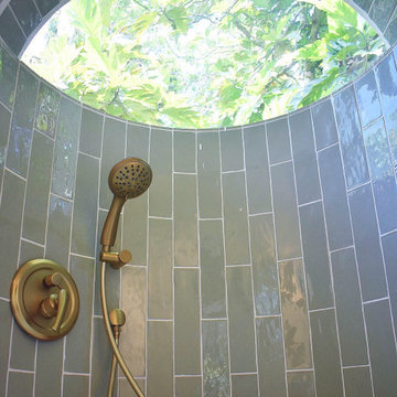
The Soaking Tub! I love working with clients that have ideas that I have been waiting to bring to life. All of the owner requests were things I had been wanting to try in an Oasis model. The table and seating area in the circle window bump out that normally had a bar spanning the window; the round tub with the rounded tiled wall instead of a typical angled corner shower; an extended loft making a big semi circle window possible that follows the already curved roof. These were all ideas that I just loved and was happy to figure out. I love how different each unit can turn out to fit someones personality.
The Oasis model is known for its giant round window and shower bump-out as well as 3 roof sections (one of which is curved). The Oasis is built on an 8x24' trailer. We build these tiny homes on the Big Island of Hawaii and ship them throughout the Hawaiian Islands.

 Flavin Architects
This new house is perched on a bluff overlooking Long Pond. The compact dwelling is carefully sited to preserve the property's natural features of surrounding trees and stone outcroppings. The great room doubles as a recording studio with high clerestory windows to capture views of the surrounding forest.
Photo by: Nat Rea Photography
 Copper Sky Design + Remodel
The homeowners of a 1930s Tudor in East Atlanta Village envisioned a colorful renovation that blended original charm with modern updates. The creative couple, who cherish antiques and quirky collectibles, aimed to preserve the home's historic layout and architectural elements. The overall color palette and aesthetic was inspired by their grandmother's fine China collection.
The renovation encompassed the kitchen, mudroom, breakfast nook, living room, bar, powder room, and primary bathroom. Copper Sky Design + Remodel placed emphasis on integrating color, patterns, and specialty details to honor the home's history while reflecting the homeowners' unique style.
Key design choices included retaining the functional galley kitchen, featuring a dishrack over the sink to display the clients' depression-era glass and antique China. Floral cutouts on cabinet doors and refrigerator panels, reminiscent of the 1930s, were incorporated. A scalloped built-in cabinet in the butler’s pantry, designed to fit a niche previously housing an original piece, ties into the brass scalloped hood in the kitchen. The mudroom and butler’s pantry cabinets also feature a scallop motif.
Custom mosaic floor tiles, typical of the 1930s, required meticulous planning and execution. The 2” hexagon mosaic tile pattern in the kitchen, mudroom, and butler’s pantry was digitally designed and hand-laid on site. The primary bathroom's wall tile pattern demanded precision, resulting in a symmetrical and stunning design.
The primary bathroom was expanded to include a Japanese-style soaking tub and a bidet within its modest 10’ x 9’ size. The powder room, though small, is vibrant with “Dinosauria” wallpaper, Tiffany-style lighting, and a square mosaic tile floor.
This thoughtful renovation preserved the Tudor's historical integrity while infusing it with the homeowners' vibrant aesthetic, creating a harmonious blend of past and present.
 Tracy Berman Interiors
This kitchen was your typical builder basic design. Lot's of cabinets with no thought for function. An odd shaped island that took up space, but didn't provide much storage. We straightened out the island to create more storage and loads of function. It now has the sink, dishwasher, trash center, bookcase, mixer cabinet and microwave drawer plus more! We removed the wall double ovens and added a 48" range instead. This allowed us to flank either side of the fridge with roll out pantry cabinets. An appliance garage was added to the corner. The range has a custom hood over it that blends seamlessly with the cabinets. The client needed a space to sit and check the mail so we created an office space at the end of the wall. Behind the blinds is a new 10' slider for access to the patio. Luxury vinyl plank flooring went in throughout the house. Custom pendant lights were hung in clusters of three above the island. The kitchen was painted Accessible Beige by SW.
Sponsored
Columbus, OH
Wannemacher Interiors
Customized Award-Winning Interior Design Solutions in Franklin Cnty OH
 InnovationLand
Among our Houston outdoor kitchens, this one is unique because of its concrete countertops, pergola with stucco wrapping and custom storage.
"It's not one of our biggest covered outdoor kitchens in Houston," says Outdoor Homescapes of Houston owner Wayne Franks. "But it's unique, and it looks really nice, too!"
The client, a young family, wanted an outdoor kitchen with a more minimalistic, modern look, explains Outdoor Homescapes senior designer Lisha Maxey.
"They're both doctors and very much attuned to detail," she says. "Their primary goal was to create a space where they could lounge while the children played as well as an area to entertain family and friends while cooking and dining outside."
Like a growing number of people wanting small outdoor kitchens in Houston, this client expressed interest in using concrete as a surface material: "The look is contemporary and is easily paired with any type of outdoor furniture," says Maxey, "from wicker to teak to iron."
Here's a closeup of the concrete countertops. You'll notice that they're glossy and smooth like glass, thanks to special sealers and a topcoat of UV-resistant resin that prevents the countertop from yellowing.
Since these particular clients lean toward the minimalistic side of contemporary design, she continues, "the standard granite countertop of many Houston outdoor kitchens would not work, since it typically has a lot of movement and can be busy."
Lisha sees the use of concrete as a growing outdoor design trend for Houston outdoor kitchens: "It's easy to maintain and again, leans towards a more modern look for outdoor."
All the furniture and lighting is from Restoration Hardware, says Lisha, who's offering $500 in free outdoor furniture consultation services as a special promotion. (Interested? Just contact us!)
The dining and lounge chairs are from the Antibes collection in cast aluminum with a bronze finish. The table is a Belgian Trestle made of weathered concrete and teak. Simple track lighting was used on the pergola in keeping with the minimalist look of the space.
The pergola is a treated pine, stained a Minwax Jacobean, which appears almost black. "This client chose a pergola over a roof extension off the house because they wanted it to still seem light and airy in their outdoor space for their young children," explains Lisha. "They wanted a certain degree of sun and shade protection, which a pergola does provide, but they wanted it to seem a bit like a park for the kids to play in."
"The seating/storage bin was not a part of the original design," says Lisha. "As the project progressed, the client expressed interest in some sort of chest for the new outdoor furniture cushions to be stored in."
The design for the storage bin was developed to accommodate this request: "It eventually evolved into a seating area as well. And to keep the look consistent with the new kitchen, it was agreed that the stone be carried through the design. The wood top was necessary so we could design a hinged access for storage."

 Vetter Architects
A tea pot, being a vessel, is defined by the space it contains, it is not the tea pot that is important, but the space.
Crispin Sartwell
Located on a lake outside of Milwaukee, the Vessel House is the culmination of an intense 5 year collaboration with our client and multiple local craftsmen focused on the creation of a modern analogue to the Usonian Home.
As with most residential work, this home is a direct reflection of it’s owner, a highly educated art collector with a passion for music, fine furniture, and architecture. His interest in authenticity drove the material selections such as masonry, copper, and white oak, as well as the need for traditional methods of construction.
The initial diagram of the house involved a collection of embedded walls that emerge from the site and create spaces between them, which are covered with a series of floating rooves. The windows provide natural light on three sides of the house as a band of clerestories, transforming to a floor to ceiling ribbon of glass on the lakeside.
The Vessel House functions as a gallery for the owner’s art, motorcycles, Tiffany lamps, and vintage musical instruments – offering spaces to exhibit, store, and listen. These gallery nodes overlap with the typical house program of kitchen, dining, living, and bedroom, creating dynamic zones of transition and rooms that serve dual purposes allowing guests to relax in a museum setting.
Through it’s materiality, connection to nature, and open planning, the Vessel House continues many of the Usonian principles Wright advocated for.
Overview
Oconomowoc, WI
Completion Date
August 2015
Services
Architecture, Interior Design, Landscape Architecture
 Gramophone
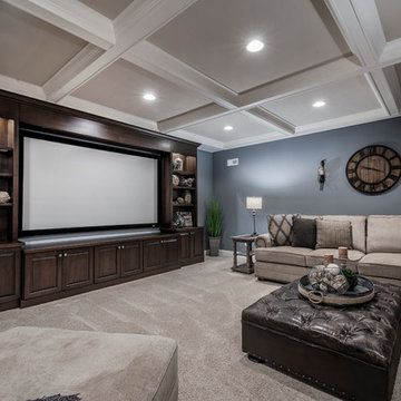
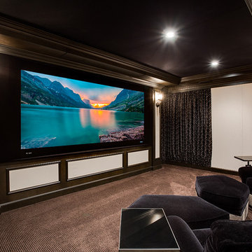
 and its Design & Build team worked together to design and create this elegant but casual theater, inspired by and evolved from the aesthetics of the client's yacht. Black mohair and alligator leather textures along with vintage touches set this space apart from others considered off the shelf. To keep the space neat, the projector was hidden away in a projector room behind the theater, while components were nestled away in a rack tower. As well as that the video quality and in-wall Meridian sound system could rival that of any Baltimore home theater. Photography by Maryland Photography, Inc.
83