
Search results for "Typical one hour" in Home Design Ideas
 TKS Design Group
Download our free ebook, Creating the Ideal Kitchen. DOWNLOAD NOW
Lakefront property in the northwest suburbs of Chicago is hard to come by, so when we were hired by this young family with exactly that, we were immediately inspired by not just the unusually large footprint of this 1950’s colonial revival but also the lovely views of the manmade lake it was sited on. The large 5-bedroom home was solidly stuck in the 1980’s, but we saw tons of potential. We started out by updating the existing staircase with a fresh coat of paint and adding new herringbone slate to the entry hall.
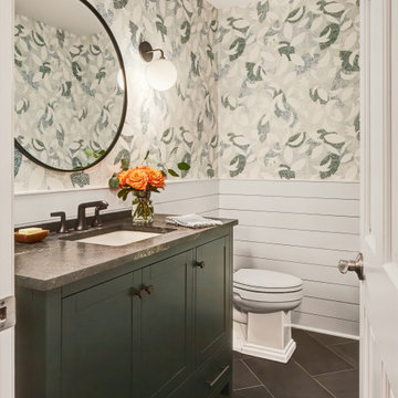
The powder room off the entryway also got a refresh - new flooring, new cabinets and fixtures. We ran the new slate right through into this space for some consistency. A fun wallpaper and shiplap trim add a welcoming feel and set the tone for the home.
Next, we tackled the kitchen. Located away from the rest of the first floor, the kitchen felt a little isolated, so we immediately began planning for how to better connect it to the rest of the first floor. We landed on removing the wall between the kitchen and dining room and designed a modified galley style space with separate cooking and clean up zones. The cooking zone consists of the refrigerator, prep sink and cooktop, along with a nice long run of prep space at the island. The cleanup side of the kitchen consists of the main sink and dishwasher. Both areas are situated so that the user can view the lake during prep work and cleanup!
One of the home’s main puzzles was how to incorporate the mudroom and area in front of the patio doors at the back of the house. We already had a breakfast table area, so the space by the patio doors was a bit of a no man’s land. We decided to separate the kitchen proper from what became the new mudroom with a large set of barn doors. That way you can quickly hide any mudroom messes but have easy access to the light coming in through the patio doors as well as the outdoor grilling station. We also love the impact the barn doors add to the overall space.
The homeowners’ first words to us were “it’s time to ditch the brown,” so we did! We chose a lovely blue pallet that reflects the home’s location on the lake which is also vibrant yet easy on the eye. Countertops are white quartz, and the natural oak floor works well with the other honey accents. The breakfast table was given a refresh with new chairs, chandelier and window treatments that frame the gorgeous views of the lake out the back.
We coordinated the slate mudroom flooring with that used in the home’s main entrance for a consistent feel. The storage area consists of open and closed storage to allow for some clutter control as needed.
Next on our “to do” list was revamping the dated brown bar area in the neighboring dining room. We eliminated the clutter by adding some closed cabinets and did some easy updates to help the space feel more current. One snag we ran into here was the discovery of a beam above the existing open shelving that had to be modified with a smaller structural beam to allow for our new design to work. This was an unexpected surprise, but in the end we think it was well worth it!
We kept the colors here a bit more muted to blend with the homeowner’s existing furnishings. Open shelving and polished nickel hardware add some simple detail to the new entertainment zone which also looks out onto the lake!
Next we tackled the upstairs starting with the homeowner’s son’s bath. The bath originally had both a tub shower and a separate shower, so we decided to swap out the shower for a new laundry area. This freed up some space downstairs in what used to be the mudroom/laundry room and is much more convenient for daily laundry needs.
We continued the blue palette here with navy cabinetry and the navy tile in the shower. Porcelain floor tile and chrome fixtures keep maintenance to a minimum while matte black mirrors and lighting add some depth the design. A low maintenance runner adds some warmth underfoot and ties the whole space together.
We added a pocket door to the bathroom to minimize interference with the door swings. The left door of the laundry closet is on a 180 degree hinge to allow for easy full access to the machines. Next we tackled the master bath which is an en suite arrangement. The original was typical of the 1980’s with the vanity outside of the bathroom, situated near the master closet. And the brown theme continued here with multiple shades of brown.
Our first move was to segment off the bath and the closet from the master bedroom. We created a short hall from the bedroom to the bathroom with his and hers walk-in closets on the left and right as well as a separate toilet closet outside of the main bathroom for privacy and flexibility.
The original bathroom had a giant soaking tub with steps (dangerous!) as well as a small shower that did not work well for our homeowner who is 6’3”. With other bathtubs in the home, they decided to eliminate the tub and create an oversized shower which takes up the space where the old tub was located. The double vanity is on the opposite wall and a bench is located under the window for morning conversations and a place to set a couple of towels.
The pallet in here is light and airy with a mix of blond wood, creamy porcelain and marble tile, and brass accents. A simple roman shade adds some texture and it’s top-down mechanism allows for light and privacy.
This large whole house remodel gave our homeowners not only the ability to maximize the potential of their home but also created a lovely new frame from which to view their fabulous lake views.
Designed by: Susan Klimala, CKD, CBD
Photography by: Michael Kaskel
For more information on kitchen and bath design ideas go to: www.kitchenstudio-ge.com
 Klopf Architecture
Klopf Architecture, Arterra Landscape Architects and Henry Calvert of Calvert Ventures Designed and built a new warm, modern, Eichler-inspired, open, indoor-outdoor home on a deeper-than-usual San Mateo Highlands property where an original Eichler house had burned to the ground.
The owners wanted multi-generational living and larger spaces than the original home offered, but all parties agreed that the house should respect the neighborhood and blend in stylistically with the other Eichlers. At first the Klopf team considered re-using what little was left of the original home and expanding on it. But after discussions with the owner and builder, all parties agreed that the last few remaining elements of the house were not practical to re-use, so Klopf Architecture designed a new home that pushes the Eichler approach in new directions.
One disadvantage of Eichler production homes is that the house designs were not optimized for each specific lot. A new custom home offered the team a chance to start over. In this case, a longer house that opens up sideways to the south fit the lot better than the original square-ish house that used to open to the rear (west). Accordingly, the Klopf team designed an L-shaped “bar” house with a large glass wall with large sliding glass doors that faces sideways instead of to the rear like a typical Eichler. This glass wall opens to a pool and landscaped yard designed by Arterra Landscape Architects.
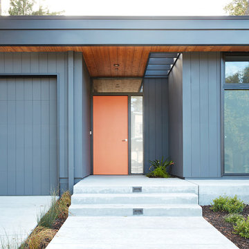
Driving by the house, one might assume at first glance it is an Eichler because of the horizontality, the overhanging flat roof eaves, the dark gray vertical siding, and orange solid panel front door, but the house is designed for the 21st Century and is not meant to be a “Likeler.” You won't see any posts and beams in this home. Instead, the ceiling decking is a western red cedar that covers over all the beams. Like Eichlers, this cedar runs continuously from inside to out, enhancing the indoor / outdoor feeling of the house, but unlike Eichlers it conceals a cavity for lighting, wiring, and insulation. Ceilings are higher, rooms are larger and more open, the master bathroom is light-filled and more generous, with a separate tub and shower and a separate toilet compartment, and there is plenty of storage. The garage even easily fits two of today's vehicles with room to spare.
A massive 49-foot by 12-foot wall of glass and the continuity of materials from inside to outside enhance the inside-outside living concept, so the owners and their guests can flow freely from house to pool deck to BBQ to pool and back.
During construction in the rough framing stage, Klopf thought the front of the house appeared too tall even though the house had looked right in the design renderings (probably because the house is uphill from the street). So Klopf Architecture paid the framer to change the roofline from how we had designed it to be lower along the front, allowing the home to blend in better with the neighborhood. One project goal was for people driving up the street to pass the home without immediately noticing there is an "imposter" on this lot, and making that change was essential to achieve that goal.
This 2,606 square foot, 3 bedroom, 3 bathroom Eichler-inspired new house is located in San Mateo in the heart of the Silicon Valley.
Klopf Architecture Project Team: John Klopf, AIA, Klara Kevane
Landscape Architect: Arterra Landscape Architects
Contractor: Henry Calvert of Calvert Ventures
Photography ©2016 Mariko Reed
Location: San Mateo, CA
Year completed: 2016
 User
UserAlise O'Brien Photography
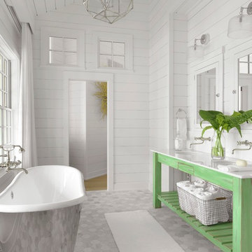
Inspiration for a coastal freestanding bathtub remodel in St Louis with open cabinets, green cabinets, white walls and an undermount sink
Inspiration for a coastal freestanding bathtub remodel in St Louis with open cabinets, green cabinets, white walls and an undermount sink
Find the right local pro for your project
 AoDK Inc.
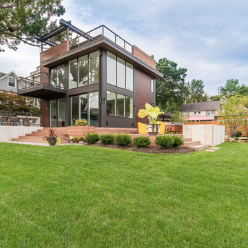
A couple wanted a weekend retreat without spending a majority of their getaway in an automobile. Therefore, a lot was purchased along the Rocky River with the vision of creating a nearby escape less than five miles away from their home. This 1,300 sf 24’ x 24’ dwelling is divided into a four square quadrant with the goal to create a variety of interior and exterior experiences while maintaining a rather small footprint.
Typically, when going on a weekend retreat one has the drive time to decompress. However, without this, the goal was to create a procession from the car to the house to signify such change of context. This concept was achieved through the use of a wood slatted screen wall which must be passed through. After winding around a collection of poured concrete steps and walls one comes to a wood plank bridge and crosses over a Japanese garden leaving all the stresses of the daily world behind.
The house is structured around a nine column steel frame grid, which reinforces the impression one gets of the four quadrants. The two rear quadrants intentionally house enclosed program space but once passed through, the floor plan completely opens to long views down to the mouth of the river into Lake Erie.
On the second floor the four square grid is stacked with one quadrant removed for the two story living area on the first floor to capture heightened views down the river. In a move to create complete separation there is a one quadrant roof top office with surrounding roof top garden space. The rooftop office is accessed through a unique approach by exiting onto a steel grated staircase which wraps up the exterior facade of the house. This experience provides an additional retreat within their weekend getaway, and serves as the apex of the house where one can completely enjoy the views of Lake Erie disappearing over the horizon.
Visually the house extends into the riverside site, but the four quadrant axis also physically extends creating a series of experiences out on the property. The Northeast kitchen quadrant extends out to become an exterior kitchen & dining space. The two-story Northwest living room quadrant extends out to a series of wrap around steps and lounge seating. A fire pit sits in this quadrant as well farther out in the lawn. A fruit and vegetable garden sits out in the Southwest quadrant in near proximity to the shed, and the entry sequence is contained within the Southeast quadrant extension. Internally and externally the whole house is organized in a simple and concise way and achieves the ultimate goal of creating many different experiences within a rationally sized footprint.
 Custom Design & Construction
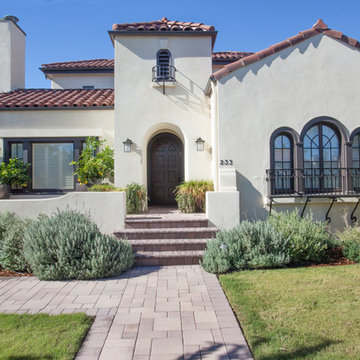
We were excited when the homeowners of this project approached us to help them with their whole house remodel as this is a historic preservation project. The historical society has approved this remodel. As part of that distinction we had to honor the original look of the home; keeping the façade updated but intact. For example the doors and windows are new but they were made as replicas to the originals. The homeowners were relocating from the Inland Empire to be closer to their daughter and grandchildren. One of their requests was additional living space. In order to achieve this we added a second story to the home while ensuring that it was in character with the original structure. The interior of the home is all new. It features all new plumbing, electrical and HVAC. Although the home is a Spanish Revival the homeowners style on the interior of the home is very traditional. The project features a home gym as it is important to the homeowners to stay healthy and fit. The kitchen / great room was designed so that the homewoners could spend time with their daughter and her children. The home features two master bedroom suites. One is upstairs and the other one is down stairs. The homeowners prefer to use the downstairs version as they are not forced to use the stairs. They have left the upstairs master suite as a guest suite.
Enjoy some of the before and after images of this project:
http://www.houzz.com/discussions/3549200/old-garage-office-turned-gym-in-los-angeles
http://www.houzz.com/discussions/3558821/la-face-lift-for-the-patio
http://www.houzz.com/discussions/3569717/la-kitchen-remodel
http://www.houzz.com/discussions/3579013/los-angeles-entry-hall
http://www.houzz.com/discussions/3592549/exterior-shots-of-a-whole-house-remodel-in-la
http://www.houzz.com/discussions/3607481/living-dining-rooms-become-a-library-and-formal-dining-room-in-la
http://www.houzz.com/discussions/3628842/bathroom-makeover-in-los-angeles-ca
http://www.houzz.com/discussions/3640770/sweet-dreams-la-bedroom-remodels
Exterior: Approved by the historical society as a Spanish Revival, the second story of this home was an addition. All of the windows and doors were replicated to match the original styling of the house. The roof is a combination of Gable and Hip and is made of red clay tile. The arched door and windows are typical of Spanish Revival. The home also features a Juliette Balcony and window.
Library / Living Room: The library offers Pocket Doors and custom bookcases.
Powder Room: This powder room has a black toilet and Herringbone travertine.
Kitchen: This kitchen was designed for someone who likes to cook! It features a Pot Filler, a peninsula and an island, a prep sink in the island, and cookbook storage on the end of the peninsula. The homeowners opted for a mix of stainless and paneled appliances. Although they have a formal dining room they wanted a casual breakfast area to enjoy informal meals with their grandchildren. The kitchen also utilizes a mix of recessed lighting and pendant lights. A wine refrigerator and outlets conveniently located on the island and around the backsplash are the modern updates that were important to the homeowners.
Master bath: The master bath enjoys both a soaking tub and a large shower with body sprayers and hand held. For privacy, the bidet was placed in a water closet next to the shower. There is plenty of counter space in this bathroom which even includes a makeup table.
Staircase: The staircase features a decorative niche
Upstairs master suite: The upstairs master suite features the Juliette balcony
Outside: Wanting to take advantage of southern California living the homeowners requested an outdoor kitchen complete with retractable awning. The fountain and lounging furniture keep it light.
Home gym: This gym comes completed with rubberized floor covering and dedicated bathroom. It also features its own HVAC system and wall mounted TV.
 Pineapple House Interior Design
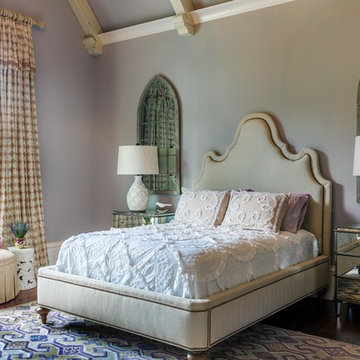
Ruffles update the teen girl's bedroom because of their unexpected circular overlapping pattern on the bedding. The shams bring another layer of ruffle into play, as does the crinoline in the chair's accent pillow. The mirrored dressers and gothic mirrors over the pieces help expand and brighten the room.
A Bonisolli Photography
 Arizona Tile
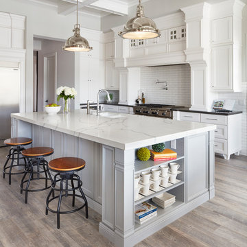
Della Terra is a natural quartz surface, it is a blend of nature and technology, combining beauty and functionality in a high performance surface. Della Terra is comprised of more than 93% natural quartz crystals, one of the hardest minerals in nature. Color controlled quartz is blended together with technologically advanced polymers. Because of its high quartz content, Arizona Tile's Della Terra Quartz surfaces are ultra-durable and resistant to scratches and chipping. Its dense composition also makes Della Terra Quartz highly resistant to staining.
Photo: Aperture Architectural Images

Sponsored
Delaware, OH

Buckeye Basements, Inc.
Central Ohio's Basement Finishing ExpertsBest Of Houzz '13-'21
 Carl Mattison Design
josh vick, home tour america
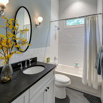
Tub/shower combo - mid-sized traditional white tile and ceramic tile mosaic tile floor tub/shower combo idea in Atlanta with an undermount sink, shaker cabinets, white cabinets, granite countertops, a one-piece toilet and blue walls
Tub/shower combo - mid-sized traditional white tile and ceramic tile mosaic tile floor tub/shower combo idea in Atlanta with an undermount sink, shaker cabinets, white cabinets, granite countertops, a one-piece toilet and blue walls

 Liz Schupanitz Designs
Cooking for Two
Location: Plymouth, MN, United States
When this couple’s last child graduated from college they began the process of looking for a new home. After a lengthy search they decided to stay with the neighborhood they loved, saving money by remodeling rather than starting over.
The top priorities on their wish list were adding character to their 1990’s era home with a classic white kitchen and a larger island while keeping within the existing footprint. With the intention of honing their cooking skills, they were also considering better appliances and two ovens.
Challenges and Solutions
Design a larger island with seating for at least two. The existing island was small and the area behind the seating was less than recommended clearances.
To solve this challenge, the seating area of the island was extended out into the open area of the kitchen. This created a larger island with seating for three, extra storage and a bookshelf across from the range.
The original kitchen had a range with microwave above, so adding another oven was a challenge with limited wall space.
Because the adjoining dining room is used infrequently, the homeowner was open to placing the second oven and microwave in the walkway. This made room for the small buffet between the built in refrigerator and ovens, creating one of her favorite areas.
The client requested a white painted kitchen but wanted to make sure it had warmth and character. To achieve this the following elements were chosen:
1) Cabinets painted with Benjamin Moore Capitol White, a luminous and warm shade of white.
2) The Range hood was painted with warm metallic shades to reflect the bronze of the Ashley Norton hardware.
3) Black Aqua Grantique granite was chosen for countertops because it looks like soapstone and adds contrast.
4) Walker Zanger Café tile in Latte was chosen for it’s handmade look with uneven edges.
5) The to-the-counter-cabinet with glass door shows off serving dishes and lends sophisticated charm.
The result is a welcoming classic kitchen, where this couple enjoys cooking more often and sharpening their skills with gourmet appliances.
Liz Schupanitz Designs
Photographed by: Andrea Rugg Photography
 ZeroEnergy Design
This LEED Platinum certified house reflects the homeowner's desire for an exceptionally healthy and comfortable living environment, within a traditional neighborhood.
INFILL SITE. The family, who moved from another area of Wellesley, sought out this property to be within walking distance of the high school and downtown area. An existing structure on the tight lot was removed to make way for the new home. 84% of the construction waste, from both the previous structure and the new home, was diverted from a landfill. ZED designed to preserve the existing mature trees on the perimeter of the property to minimize site impacts, and to maintain the character of the neighborhood as well as privacy on the site.
EXTERIOR EXPRESSION. The street facade of the home relates to the local New England vernacular. The rear uses contemporary language, a nod to the family’s Californian roots, to incorporate a roof deck, solar panels, outdoor living space, and the backyard swimming pool. ZED’s careful planning avoided to the need to face the garage doors towards the street, a common syndrome of a narrow lot.
THOUGHTFUL SPACE. Homes with dual entries can often result in duplicate and unused spaces. In this home, the everyday and formal entry areas are one and the same; the front and garage doors share the entry program of coat closets, mudroom storage with bench for removing your shoes, and a laundry room with generous closets for the children's sporting equipment. The entry area leads directly to the living space, encompassing the kitchen, dining and sitting area areas in an L-shaped open plan arrangement. The kitchen is placed at the south-west corner of the space to allow for a strong connection to the dining, sitting and outdoor living spaces. A fire pit on the deck satisfies the family’s desire for an open flame while a sealed gas fireplace is used indoors - ZED’s preference after omitting gas burning appliances completely from an airtight home. A small study, with a window seat, is conveniently located just off of the living space. A first floor guest bedroom includes an accessible bathroom for aging visitors and can be used as a master suite to accommodate aging in place.
HEALTHY LIVING. The client requested a home that was easy to clean and would provide a respite from seasonal allergies and common contaminants that are found in many indoor spaces. ZED selected easy to clean solid surface flooring throughout, provided ample space for cleaning supplies on each floor, and designed a mechanical system with ventilation that provides a constant supply of fresh outdoor air. ZED selected durable materials, finishes, cabinetry, and casework with low or no volatile organic compounds (VOCs) and no added urea formaldehyde.
YEAR-ROUND COMFORT. The home is super insulated and air-tight, paired with high performance triple-paned windows, to ensure it is draft-free throughout the winter (even when in front of the large windows and doors). ZED designed a right-sized heating and cooling system to pair with the thermally improved building enclosure to ensure year-round comfort. The glazing on the home maximizes passive solar gains, and facilitates cross ventilation and daylighting.
ENERGY EFFICIENT. As one of the most energy efficient houses built to date in Wellesley, the home highlights a practical solution for Massachusetts. First, the building enclosure reduces the largest energy requirement for typical houses (heating). Super-insulation, exceptional air sealing, a thermally broken wall assembly, triple pane windows, and passive solar gain combine for a sizable heating load reduction. Second, within the house only efficient systems consume energy. These include an air source heat pump for heating & cooling, a heat pump hot water heater, LED lighting, energy recovery ventilation, and high efficiency appliances. Lastly, photovoltaics provide renewable energy help offset energy consumption. The result is an 89% reduction in energy use compared to a similar brand new home built to code requirements.
RESILIENT. The home will fare well in extreme weather events. During a winter power outage, heat loss will be very slow due to the super-insulated and airtight envelope– taking multiple days to drop to 60 degrees even with no heat source. An engineered drainage system, paired with careful the detailing of the foundation, will help to keep the finished basement dry. A generator will provide full operation of the all-electric house during a power outage.
OVERALL. The home is a reflection of the family goals and an expression of their values, beautifully enabling health, comfort, safety, resilience, and utility, all while respecting the planet.
ZED - Architect & Mechanical Designer
Bevilacqua Builders Inc - Contractor
Creative Land & Water Engineering - Civil Engineering
Barbara Peterson Landscape - Landscape Design
Nest & Company - Interior Furnishings
Eric Roth Photography - Photography
 William Quarles Photography
Photography by William Quarles. Custom Built Home by Arthur Rutenberg Homes/Chuck Lattif, President Coastal Premier Homes LLC/clattif@arhomes.com
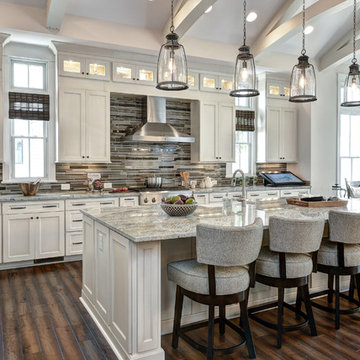
Example of a classic galley dark wood floor eat-in kitchen design in Charleston with shaker cabinets, white cabinets, multicolored backsplash and an island
Example of a classic galley dark wood floor eat-in kitchen design in Charleston with shaker cabinets, white cabinets, multicolored backsplash and an island
 Tanya Capaldo Designs
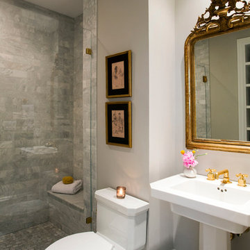
Waterworks unlacquered brass fixtures, Antique French mirror,
Photography by Eric Roth
Alcove shower - mid-sized traditional 3/4 gray tile and stone tile mosaic tile floor alcove shower idea in Boston with a pedestal sink, a one-piece toilet and gray walls
Alcove shower - mid-sized traditional 3/4 gray tile and stone tile mosaic tile floor alcove shower idea in Boston with a pedestal sink, a one-piece toilet and gray walls
 TKS Design Group
Download our free ebook, Creating the Ideal Kitchen. DOWNLOAD NOW
Lakefront property in the northwest suburbs of Chicago is hard to come by, so when we were hired by this young family with exactly that, we were immediately inspired by not just the unusually large footprint of this 1950’s colonial revival but also the lovely views of the manmade lake it was sited on. The large 5-bedroom home was solidly stuck in the 1980’s, but we saw tons of potential. We started out by updating the existing staircase with a fresh coat of paint and adding new herringbone slate to the entry hall.
The powder room off the entryway also got a refresh - new flooring, new cabinets and fixtures. We ran the new slate right through into this space for some consistency. A fun wallpaper and shiplap trim add a welcoming feel and set the tone for the home.
Next, we tackled the kitchen. Located away from the rest of the first floor, the kitchen felt a little isolated, so we immediately began planning for how to better connect it to the rest of the first floor. We landed on removing the wall between the kitchen and dining room and designed a modified galley style space with separate cooking and clean up zones. The cooking zone consists of the refrigerator, prep sink and cooktop, along with a nice long run of prep space at the island. The cleanup side of the kitchen consists of the main sink and dishwasher. Both areas are situated so that the user can view the lake during prep work and cleanup!
One of the home’s main puzzles was how to incorporate the mudroom and area in front of the patio doors at the back of the house. We already had a breakfast table area, so the space by the patio doors was a bit of a no man’s land. We decided to separate the kitchen proper from what became the new mudroom with a large set of barn doors. That way you can quickly hide any mudroom messes but have easy access to the light coming in through the patio doors as well as the outdoor grilling station. We also love the impact the barn doors add to the overall space.
The homeowners’ first words to us were “it’s time to ditch the brown,” so we did! We chose a lovely blue pallet that reflects the home’s location on the lake which is also vibrant yet easy on the eye. Countertops are white quartz, and the natural oak floor works well with the other honey accents. The breakfast table was given a refresh with new chairs, chandelier and window treatments that frame the gorgeous views of the lake out the back.
We coordinated the slate mudroom flooring with that used in the home’s main entrance for a consistent feel. The storage area consists of open and closed storage to allow for some clutter control as needed.
Next on our “to do” list was revamping the dated brown bar area in the neighboring dining room. We eliminated the clutter by adding some closed cabinets and did some easy updates to help the space feel more current. One snag we ran into here was the discovery of a beam above the existing open shelving that had to be modified with a smaller structural beam to allow for our new design to work. This was an unexpected surprise, but in the end we think it was well worth it!
We kept the colors here a bit more muted to blend with the homeowner’s existing furnishings. Open shelving and polished nickel hardware add some simple detail to the new entertainment zone which also looks out onto the lake!
Next we tackled the upstairs starting with the homeowner’s son’s bath. The bath originally had both a tub shower and a separate shower, so we decided to swap out the shower for a new laundry area. This freed up some space downstairs in what used to be the mudroom/laundry room and is much more convenient for daily laundry needs.
We continued the blue palette here with navy cabinetry and the navy tile in the shower. Porcelain floor tile and chrome fixtures keep maintenance to a minimum while matte black mirrors and lighting add some depth the design. A low maintenance runner adds some warmth underfoot and ties the whole space together.
We added a pocket door to the bathroom to minimize interference with the door swings. The left door of the laundry closet is on a 180 degree hinge to allow for easy full access to the machines. Next we tackled the master bath which is an en suite arrangement. The original was typical of the 1980’s with the vanity outside of the bathroom, situated near the master closet. And the brown theme continued here with multiple shades of brown.
Our first move was to segment off the bath and the closet from the master bedroom. We created a short hall from the bedroom to the bathroom with his and hers walk-in closets on the left and right as well as a separate toilet closet outside of the main bathroom for privacy and flexibility.
The original bathroom had a giant soaking tub with steps (dangerous!) as well as a small shower that did not work well for our homeowner who is 6’3”. With other bathtubs in the home, they decided to eliminate the tub and create an oversized shower which takes up the space where the old tub was located. The double vanity is on the opposite wall and a bench is located under the window for morning conversations and a place to set a couple of towels.
The pallet in here is light and airy with a mix of blond wood, creamy porcelain and marble tile, and brass accents. A simple roman shade adds some texture and it’s top-down mechanism allows for light and privacy.
This large whole house remodel gave our homeowners not only the ability to maximize the potential of their home but also created a lovely new frame from which to view their fabulous lake views.
Designed by: Susan Klimala, CKD, CBD
Photography by: Michael Kaskel
For more information on kitchen and bath design ideas go to: www.kitchenstudio-ge.com

Sponsored
Columbus, OH

Hope Restoration & General Contracting
Columbus Design-Build, Kitchen & Bath Remodeling, Historic Renovations
 Kathy Tracey Design LLC
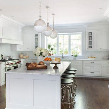
Kitchen - mid-sized traditional l-shaped dark wood floor kitchen idea in New York with shaker cabinets, white cabinets, white backsplash, subway tile backsplash, stainless steel appliances, an undermount sink, marble countertops and an island
 Lorraine G Vale, ASID Allied
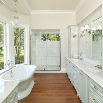
One of the main features of the space is the natural lighting. The windows allow someone to feel they are in their own private oasis. The wide plank European oak floors, with a brushed finish, contribute to the warmth felt in this bathroom, along with warm neutrals, whites and grays. The counter tops are a stunning Calcatta Latte marble as is the basket weaved shower floor, 1x1 square mosaics separating each row of the large format, rectangular tiles, also marble. Lighting is key in any bathroom and there is more than sufficient lighting provided by Ralph Lauren, by Circa Lighting. Classic, custom designed cabinetry optimizes the space by providing plenty of storage for toiletries, linens and more. Holger Obenaus Photography did an amazing job capturing this light filled and luxurious master bathroom. Built by Novella Homes and designed by Lorraine G Vale
Holger Obenaus Photography
 Marcye Philbrook
Siri Blanchette/Blind Dog Photo Associates
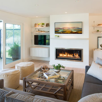
This living room designed by Marcye Philbrook is textural, soothing, comfortable and contemporary. The cable rail "holding" up the shelves, concrete mantel in a sandy tone, floating shelves in a very textural laminate, modern fireplace with driftwood inside as well as the warm beiges and cool grays playing off of each other remind one of the natural Maine shore.
 Woodmaster Kitchens
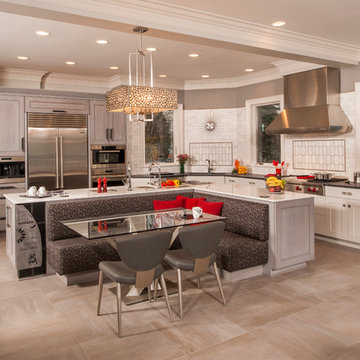
This contemporary kitchen design is a dream come true, full of stylish, practical, and one-of-a-kind features. The large kitchen is part of a great room that includes a living area with built in display shelves for artwork. The kitchen features two separate islands, one for entertaining and one for casual dining and food preparation. A 5' Galley Workstation, pop up knife block, and specialized storage accessories complete one island, along with the fabric wrapped banquette and personalized stainless steel corner wrap designed by Woodmaster Kitchens. The second island includes seating and an undercounter refrigerator allowing guests easy access to beverages. Every detail of this kitchen including the waterfall countertop ends, lighting design, tile features, and hardware work together to create a kitchen design that is a masterpiece at the center of this home.
Steven Paul Whitsitt
Sponsored
Columbus, OH
Hope Restoration & General Contracting
Columbus Design-Build, Kitchen & Bath Remodeling, Historic Renovations
 Pennsylvania Landscape & Nursery Association
u2014 ALE: Wayne Rain Garden
Pennsylvania Landscape & Nursery Association
u2014 ALE: Wayne Rain Garden
Terren Landscapes http://www.terrenlandscapes.com
2014 PLNA Awards for Landscape Excellence winner
Category: Residential Up to $15,000
Award Level: Gold
Project Description:
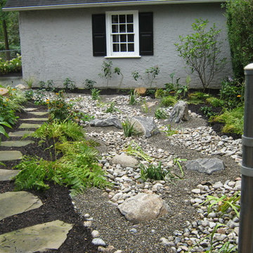
Our company was contracted by the client to provide a creative solution to an ongoing drainage problem. Their property is located within 30 feet of a local stream that collects storm water from the surrounding area. The nearby stream and high water table caused the lawn area at the side of their home to flood and to remain waterlogged for a few days after each storm. The client not only had difficulty growing plants in the existing conditions, but also had a problem with mosquitoes due to standing water.
Our goal was to design a self-contained, naturalistic rain garden that slowed storm water runoff, allowed for percolation, and promoted infiltration while permitting excess clean water to enter the nearby stream with diminished force. As designed, the rain garden allows the earth to slowly and more naturally
absorb excess storm water while filtering out toxins such as excess nitrogen and phosphorous which are frequently found in the landscape, therefore reducing the contaminants entering the stream.
A percolation test was conducted with criteria of absorbing a one-inch rainstorm within four hours without overflow. The one-inch storm calculation included an existing downspout from the home, which would be piped into the rain garden to reduce roof runoff. The first test failed due to a deep layer of high clay-content soil. Excavation continued until a layer of sandy loam was reached, the percolation test was repeated, and a successful test result was achieved. Next, the entire rain garden basin was excavated to the sandy loam layer and the soil amended with compost and sand to create a highly porous planting media.
Geotextile fabric was placed to help reduce migration of the surface stone into the soil and allow for minimal maintenance. Gravel, river stone and small boulders were carefully placed to achieve the look of a natural streambed.
A palette of mostly native plants with a few non-invasive ornamentals were chosen for their ability to survive in extreme conditions ranging from floods to drought and were placed according to their specific preferences.
Wetland plants were chosen for the lowest portion of the rain garden as that area remains saturated for longer periods of time, with a Chionanthus virginicus as a focal point surrounded by irises and ferns at the lowest depth.
Plants tolerant of drier conditions were chosen for the upper edges of the garden. The beautiful colors of Monarda, Ligularia, Eupatorium, Solidago, Chelone, and Rudbeckia were scattered within the upper edge, while movement and softness were incorporated by use of the graceful Nassella that lines the border. Finally, winter interest was provided with a backdrop of Cornus sericea.
As built, this small rain garden creates tremendous impact by decreasing the amount of storm water runoff not only on our client's property, but also in the neighboring stream. It serves as a means of slowing the water and providing an area for infiltration back into the earth. The plants provide a habitat for birds, butterflies, and insects, working in harmony with nature and providing beautiful visual interest year-round.
Photo Credit:
Lisa C. Falls
 TKS Design Group
Free ebook, Creating the Ideal Kitchen. DOWNLOAD NOW
The Klimala’s and their three kids are no strangers to moving, this being their fifth house in the same town over the 20-year period they have lived there. “It must be the 7-year itch, because every seven years, we seem to find ourselves antsy for a new project or a new environment. I think part of it is being a designer, I see my own taste evolve and I want my environment to reflect that. Having easy access to wonderful tradesmen and a knowledge of the process makes it that much easier”.
This time, Klimala’s fell in love with a somewhat unlikely candidate. The 1950’s ranch turned cape cod was a bit of a mutt, but it’s location 5 minutes from their design studio and backing up to the high school where their kids can roll out of bed and walk to school, coupled with the charm of its location on a private road and lush landscaping made it an appealing choice for them.
“The bones of the house were really charming. It was typical 1,500 square foot ranch that at some point someone added a second floor to. Its sloped roofline and dormered bedrooms gave it some charm.” With the help of architect Maureen McHugh, Klimala’s gutted and reworked the layout to make the house work for them. An open concept kitchen and dining room allows for more frequent casual family dinners and dinner parties that linger. A dingy 3-season room off the back of the original house was insulated, given a vaulted ceiling with skylights and now opens up to the kitchen. This room now houses an 8’ raw edge white oak dining table and functions as an informal dining room. “One of the challenges with these mid-century homes is the 8’ ceilings. I had to have at least one room that had a higher ceiling so that’s how we did it” states Klimala.
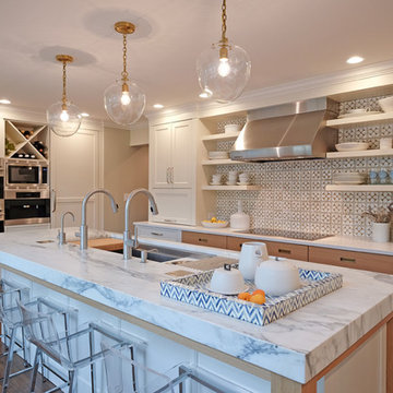
The kitchen features a 10’ island which houses a 5’0” Galley Sink. The Galley features two faucets, and double tiered rail system to which accessories such as cutting boards and stainless steel bowls can be added for ease of cooking. Across from the large sink is an induction cooktop. “My two teen daughters and I enjoy cooking, and the Galley and induction cooktop make it so easy.” A wall of tall cabinets features a full size refrigerator, freezer, double oven and built in coffeemaker. The area on the opposite end of the kitchen features a pantry with mirrored glass doors and a beverage center below.
The rest of the first floor features an entry way, a living room with views to the front yard’s lush landscaping, a family room where the family hangs out to watch TV, a back entry from the garage with a laundry room and mudroom area, one of the home’s four bedrooms and a full bath. There is a double sided fireplace between the family room and living room. The home features pops of color from the living room’s peach grass cloth to purple painted wall in the family room. “I’m definitely a traditionalist at heart but because of the home’s Midcentury roots, I wanted to incorporate some of those elements into the furniture, lighting and accessories which also ended up being really fun. We are not formal people so I wanted a house that my kids would enjoy, have their friends over and feel comfortable.”
The second floor houses the master bedroom suite, two of the kids’ bedrooms and a back room nicknamed “the library” because it has turned into a quiet get away area where the girls can study or take a break from the rest of the family. The area was originally unfinished attic, and because the home was short on closet space, this Jack and Jill area off the girls’ bedrooms houses two large walk-in closets and a small sitting area with a makeup vanity. “The girls really wanted to keep the exposed brick of the fireplace that runs up the through the space, so that’s what we did, and I think they feel like they are in their own little loft space in the city when they are up there” says Klimala.
Designed by: Susan Klimala, CKD, CBD
Photography by: Carlos Vergara
For more information on kitchen and bath design ideas go to: www.kitchenstudio-ge.com
 Mark D. Evernden & Associates - Engel & Völkers
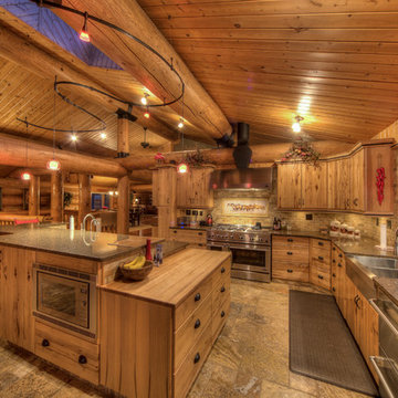
Welcome to a world class horse facility in the county of Lacombe situated on 160 Acres just one hour south of Edmonton. This stunning riding facility with a 24inch larch log home boasting just under 9000 square feet of living quarters. All custom appointed and designed, this upscale log home has been transformed to an amazing rancher features 5 bedrooms, 4 washrooms, vaulted ceiling, this open concept design features a grand fireplace with a rocked wall. The amazing indoor 140 x 350 riding arena, one of only 2 in Alberta of this size. The arena was constructed in 2009 and features a complete rehab therapy centre supported with performance solarium, equine water treadmill, equine therapy spa. The additional attached 30x320 attached open face leantoo with day pens and a 30x320 attached stable area with pens built with soft floors and with water bowls in each stall. The building is complete with lounge, tack room, laundry area..this is truly one of a kind facility and is a must see.
4,897 Sq Feet Above Ground
3 Bedrooms, 4 Bath
Bungalow, Built in 1982
12