
Search results for "Typical" in Home Design Ideas

 romero + obeji interior design
Vintage hunting trophy plays referee over a traditional ball and claw foot pool table - Oversize swing arm light is a great alternative to typical pool table lighting. More images on our website: http://www.romero-obeji-interiordesign.com


Find the right local pro for your project

 KraftMaster Renovations
This Vanity by Starmark is topped with a reclaimed barnwood mirror on typical sliding barn door track. Revealing behind is a recessed medicine cabinet into a natural stone wall.
Chris Veith

 Alair Homes Arlington
Modern addition with office, family room, and full kitchen renovation. Used IKEA for kitchen. Features a large modern corner window.
Example of a trendy open concept living room design in DC Metro with white walls and no fireplace
Example of a trendy open concept living room design in DC Metro with white walls and no fireplace

 Ann Lowengart Interiors
The family living in this shingled roofed home on the Peninsula loves color and pattern. At the heart of the two-story house, we created a library with high gloss lapis blue walls. The tête-à-tête provides an inviting place for the couple to read while their children play games at the antique card table. As a counterpoint, the open planned family, dining room, and kitchen have white walls. We selected a deep aubergine for the kitchen cabinetry. In the tranquil master suite, we layered celadon and sky blue while the daughters' room features pink, purple, and citrine.

 City Homes, LLC
Example of a large beach style dark wood floor and brown floor eat-in kitchen design in Minneapolis with white cabinets, marble countertops, white backsplash, ceramic backsplash, stainless steel appliances, an island, glass-front cabinets and gray countertops


 LeichtUSA
Attractive living as an architectural experiment: a 136-year-old water tower, a listed building with a spectacular 360-degree panorama view over the City of London. The task, to transform it into a superior residence, initially seemed an absolute impossibility. But when the owners came across architect Mike Collier, they had found a partner who was to make the impossible possible. The tower, which had been empty for decades, underwent radical renovation work and was extended by a four-storey cube containing kitchen, dining and living room - connected by glazed tunnels and a lift shaft. The kitchen, realised by Enclosure Interiors in Tunbridge Wells, Kent, with furniture from LEICHT is the very heart of living in this new building.
Shiny white matt-lacquered kitchen fronts (AVANCE-LR), tone-on-tone with the worktops, reflect the light in the room and thus create expanse and openness. The surface of the handle-less kitchen fronts has a horizontal relief embossing; depending on the light incidence, this results in a vitally structured surface. The free-standing preparation isle with its vertical side panels with a seamlessly integrated sink represents the transition between kitchen and living room. The fronts of the floor units facing the dining table were extended to the floor to do away with the plinth typical of most kitchens. Ceiling-high tall units on the wall provide plenty of storage space; the electrical appliances are integrated here invisible to the eye. Floor units on a high plinth which thus appear to be floating form the actual cooking centre within the kitchen, attached to the wall. A range of handle-less wall units concludes the glazed niche at the top.
LEICHT international: “Architecture and kitchen” in the centre of London. www.LeichtUSA.com

 Vetter Architects
The client’s request was quite common - a typical 2800 sf builder home with 3 bedrooms, 2 baths, living space, and den. However, their desire was for this to be “anything but common.” The result is an innovative update on the production home for the modern era, and serves as a direct counterpoint to the neighborhood and its more conventional suburban housing stock, which focus views to the backyard and seeks to nullify the unique qualities and challenges of topography and the natural environment.
The Terraced House cautiously steps down the site’s steep topography, resulting in a more nuanced approach to site development than cutting and filling that is so common in the builder homes of the area. The compact house opens up in very focused views that capture the natural wooded setting, while masking the sounds and views of the directly adjacent roadway. The main living spaces face this major roadway, effectively flipping the typical orientation of a suburban home, and the main entrance pulls visitors up to the second floor and halfway through the site, providing a sense of procession and privacy absent in the typical suburban home.
Clad in a custom rain screen that reflects the wood of the surrounding landscape - while providing a glimpse into the interior tones that are used. The stepping “wood boxes” rest on a series of concrete walls that organize the site, retain the earth, and - in conjunction with the wood veneer panels - provide a subtle organic texture to the composition.
The interior spaces wrap around an interior knuckle that houses public zones and vertical circulation - allowing more private spaces to exist at the edges of the building. The windows get larger and more frequent as they ascend the building, culminating in the upstairs bedrooms that occupy the site like a tree house - giving views in all directions.
The Terraced House imports urban qualities to the suburban neighborhood and seeks to elevate the typical approach to production home construction, while being more in tune with modern family living patterns.
Overview:
Elm Grove
Size:
2,800 sf,
3 bedrooms, 2 bathrooms
Completion Date:
September 2014
Services:
Architecture, Landscape Architecture
Interior Consultants: Amy Carman Design


 Isla Homes
SeaThru is a new, waterfront, modern home. SeaThru was inspired by the mid-century modern homes from our area, known as the Sarasota School of Architecture.
This homes designed to offer more than the standard, ubiquitous rear-yard waterfront outdoor space. A central courtyard offer the residents a respite from the heat that accompanies west sun, and creates a gorgeous intermediate view fro guest staying in the semi-attached guest suite, who can actually SEE THROUGH the main living space and enjoy the bay views.
Noble materials such as stone cladding, oak floors, composite wood louver screens and generous amounts of glass lend to a relaxed, warm-contemporary feeling not typically common to these types of homes.
Photos by Ryan Gamma Photography

 Tell Projects
This show stopper, Houston Heights, impressive master bath proves just how much you can do when your space is limited. Universal Gray Sherwin Williams was used throughout the house. White shaker cabinetry with 10" chrome cabinet handles. Venatino Quartz was used to give a bit of warmth. Vintage and chrome 3 piece faucets with square undermount sinks and crystal lighting to give this place a bit of shimmer.
 TKS Design Group
Download our free ebook, Creating the Ideal Kitchen. DOWNLOAD NOW
Lakefront property in the northwest suburbs of Chicago is hard to come by, so when we were hired by this young family with exactly that, we were immediately inspired by not just the unusually large footprint of this 1950’s colonial revival but also the lovely views of the manmade lake it was sited on. The large 5-bedroom home was solidly stuck in the 1980’s, but we saw tons of potential. We started out by updating the existing staircase with a fresh coat of paint and adding new herringbone slate to the entry hall.
The powder room off the entryway also got a refresh - new flooring, new cabinets and fixtures. We ran the new slate right through into this space for some consistency. A fun wallpaper and shiplap trim add a welcoming feel and set the tone for the home.
Next, we tackled the kitchen. Located away from the rest of the first floor, the kitchen felt a little isolated, so we immediately began planning for how to better connect it to the rest of the first floor. We landed on removing the wall between the kitchen and dining room and designed a modified galley style space with separate cooking and clean up zones. The cooking zone consists of the refrigerator, prep sink and cooktop, along with a nice long run of prep space at the island. The cleanup side of the kitchen consists of the main sink and dishwasher. Both areas are situated so that the user can view the lake during prep work and cleanup!
One of the home’s main puzzles was how to incorporate the mudroom and area in front of the patio doors at the back of the house. We already had a breakfast table area, so the space by the patio doors was a bit of a no man’s land. We decided to separate the kitchen proper from what became the new mudroom with a large set of barn doors. That way you can quickly hide any mudroom messes but have easy access to the light coming in through the patio doors as well as the outdoor grilling station. We also love the impact the barn doors add to the overall space.
The homeowners’ first words to us were “it’s time to ditch the brown,” so we did! We chose a lovely blue pallet that reflects the home’s location on the lake which is also vibrant yet easy on the eye. Countertops are white quartz, and the natural oak floor works well with the other honey accents. The breakfast table was given a refresh with new chairs, chandelier and window treatments that frame the gorgeous views of the lake out the back.
We coordinated the slate mudroom flooring with that used in the home’s main entrance for a consistent feel. The storage area consists of open and closed storage to allow for some clutter control as needed.
Next on our “to do” list was revamping the dated brown bar area in the neighboring dining room. We eliminated the clutter by adding some closed cabinets and did some easy updates to help the space feel more current. One snag we ran into here was the discovery of a beam above the existing open shelving that had to be modified with a smaller structural beam to allow for our new design to work. This was an unexpected surprise, but in the end we think it was well worth it!
We kept the colors here a bit more muted to blend with the homeowner’s existing furnishings. Open shelving and polished nickel hardware add some simple detail to the new entertainment zone which also looks out onto the lake!
Next we tackled the upstairs starting with the homeowner’s son’s bath. The bath originally had both a tub shower and a separate shower, so we decided to swap out the shower for a new laundry area. This freed up some space downstairs in what used to be the mudroom/laundry room and is much more convenient for daily laundry needs.
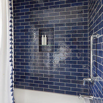
We continued the blue palette here with navy cabinetry and the navy tile in the shower. Porcelain floor tile and chrome fixtures keep maintenance to a minimum while matte black mirrors and lighting add some depth the design. A low maintenance runner adds some warmth underfoot and ties the whole space together.
We added a pocket door to the bathroom to minimize interference with the door swings. The left door of the laundry closet is on a 180 degree hinge to allow for easy full access to the machines. Next we tackled the master bath which is an en suite arrangement. The original was typical of the 1980’s with the vanity outside of the bathroom, situated near the master closet. And the brown theme continued here with multiple shades of brown.
Our first move was to segment off the bath and the closet from the master bedroom. We created a short hall from the bedroom to the bathroom with his and hers walk-in closets on the left and right as well as a separate toilet closet outside of the main bathroom for privacy and flexibility.
The original bathroom had a giant soaking tub with steps (dangerous!) as well as a small shower that did not work well for our homeowner who is 6’3”. With other bathtubs in the home, they decided to eliminate the tub and create an oversized shower which takes up the space where the old tub was located. The double vanity is on the opposite wall and a bench is located under the window for morning conversations and a place to set a couple of towels.
The pallet in here is light and airy with a mix of blond wood, creamy porcelain and marble tile, and brass accents. A simple roman shade adds some texture and it’s top-down mechanism allows for light and privacy.
This large whole house remodel gave our homeowners not only the ability to maximize the potential of their home but also created a lovely new frame from which to view their fabulous lake views.
Designed by: Susan Klimala, CKD, CBD
Photography by: Michael Kaskel
For more information on kitchen and bath design ideas go to: www.kitchenstudio-ge.com

 Hills & Grant
Lisa Petrole
Example of a transitional master medium tone wood floor bedroom design in Sacramento with white walls
Example of a transitional master medium tone wood floor bedroom design in Sacramento with white walls


 D2 Interiors
Dining Room in a Craftsman Home. Pending Publication. Please email sabrina@d2interiors.com for more photos. Photos by Amy Bartlam
Example of an arts and crafts dining room design in Los Angeles
Example of an arts and crafts dining room design in Los Angeles


 Springhouse Architects, LLC
Kelly Ann Photos
Inspiration for a mid-sized modern l-shaped marble floor and white floor eat-in kitchen remodel with an undermount sink, flat-panel cabinets, dark wood cabinets, quartzite countertops, beige backsplash, stone tile backsplash, stainless steel appliances and an island
Inspiration for a mid-sized modern l-shaped marble floor and white floor eat-in kitchen remodel with an undermount sink, flat-panel cabinets, dark wood cabinets, quartzite countertops, beige backsplash, stone tile backsplash, stainless steel appliances and an island

 Susan Serra
Earl Kendall
Kitchen - mid-sized scandinavian kitchen idea in New York with flat-panel cabinets, medium tone wood cabinets, quartz countertops, black backsplash, stone slab backsplash, stainless steel appliances, white walls and an island
Kitchen - mid-sized scandinavian kitchen idea in New York with flat-panel cabinets, medium tone wood cabinets, quartz countertops, black backsplash, stone slab backsplash, stainless steel appliances, white walls and an island
95