
Search results for "Typically encourage" in Home Design Ideas
 Matt Fajkus Architecture
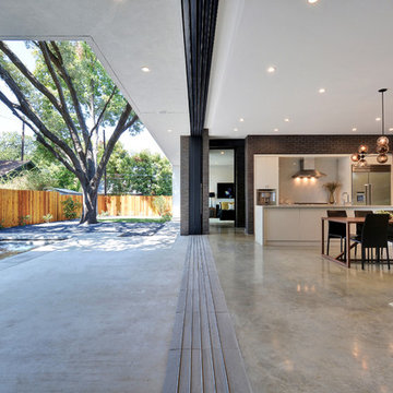
The Main Stay House exists as a straightforward proposal on an urban infill lot, paring down the components of a house to a minimal amount of planes and openings. The scheme is anchored by a modern entry sequence and a staircase volume, both clad in iron spot masonry externally and internally, creating thresholds between the respective realms of public, common and private, by minimal means. The masonry contrasts with an otherwise muted interior atmosphere of smooth, desaturated surfaces.
The entry sequence is a twist upon the conventional domestic front door, front facade, and fence. The front masonry wall replaces the typical residential fence and frames an indirect access to the front door, functioning as a privacy barrier while revealing slices of the interior to the public street.
The staircase bifurcates the layout to provide a clear division between the common and private zones of the house, while clearly reading as a mass from all outside view. Brick and glass become portals between common and private zones.
The design consolidates the service core along the west façade, allowing the structure to fully open the living zone to the pool court and existing trees. This directly connects interior and exterior, as well as human and nature. Freedom to vary the program or functional use of the area is enabled and strongly encouraged.
Photography: Twist Tours
 Nicole Lee Interior Designs
Amy E. Photography
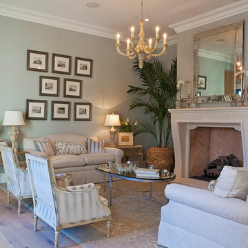
Mid-sized elegant formal and open concept light wood floor and beige floor living room photo in Phoenix with green walls, a standard fireplace, a stone fireplace and no tv
Mid-sized elegant formal and open concept light wood floor and beige floor living room photo in Phoenix with green walls, a standard fireplace, a stone fireplace and no tv
 Rikki Snyder
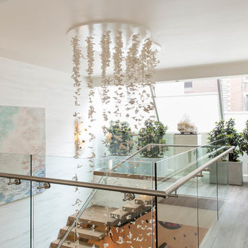
Photo: Rikki Snyder © 2018 Houzz
https://www.houzz.com/ideabooks/108513781/list/bold-and-daring-designs-at-the-2018-kips-bay-decorator-show-house
Find the right local pro for your project
 Matt Fajkus Architecture
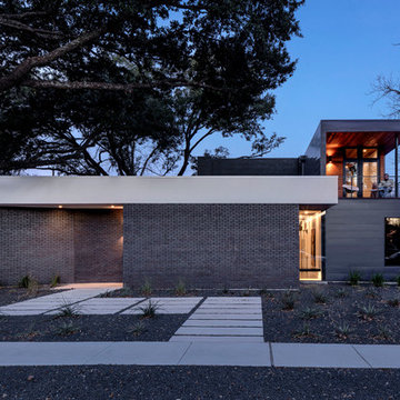
The Main Stay House exists as a straightforward proposal on an urban infill lot, paring down the components of a house to a minimal amount of planes and openings. The scheme is anchored by a modern entry sequence and a staircase volume, both clad in iron spot masonry externally and internally, creating thresholds between the respective realms of public, common and private, by minimal means. The masonry contrasts with an otherwise muted interior atmosphere of smooth, desaturated surfaces.
The entry sequence is a twist upon the conventional domestic front door, front facade, and fence. The front masonry wall replaces the typical residential fence and frames an indirect access to the front door, functioning as a privacy barrier while revealing slices of the interior to the public street.
The staircase bifurcates the layout to provide a clear division between the common and private zones of the house, while clearly reading as a mass from all outside view. Brick and glass become portals between common and private zones.
The design consolidates the service core along the west façade, allowing the structure to fully open the living zone to the pool court and existing trees. This directly connects interior and exterior, as well as human and nature. Freedom to vary the program or functional use of the area is enabled and strongly encouraged.
Photography: Charles Davis Smith
 Creative Design Construction, Inc.
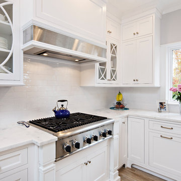
This light, elegant kitchen puts stunning marble countertops on display. The center island features a double thick marble slab that provides depth to the classic white kitchen.
The shaker style cabinetry with glass mullion doors adds a touch of character and charm. The snow white subway tile help to produce clean lines and virtually go unnoticed in this spectacular space.
Accented only by stainless steel appliances, we encouraged the homeowner to add a pop of color with sea green upholstered bar chairs. Now the family cans sit comfortably and stylishly in this beautiful kitchen.
 Vetter Architects
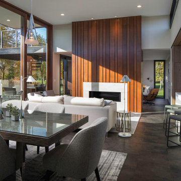
The mHouse is the brainchild of a magazine publisher intent on changing the way houses are constructed and how their owners relate to them. Named after one of the company’s website, the mHouse serves as a built manifesto of innovative panel materials such as rice hull composites and thermally fused laminate – becoming a case study house for over 30 international material suppliers.
The design challenge was quite clear – how to use a series of new materials unproven in the US building trades to create a beautiful house that meets the unique needs of today’s family. The result is a building that is highly rational in its construction systems, while encouraging social gathering.
The mHouse serves as a direct counterpoint to the typical suburban builder home – creating unique outdoor spaces in place of the typical open lawn, a variety of different views in contrast to one major view, and expressing a confidence in the future over nostalgia for the past.
Through a series of layers and nodes, the landscape grounds the house and heightens the views from inside, using indigenous plantings applied in non-traditional ways, the landscape mirrors the house in rethinking the suburban home.
The mHouse strikes a balance between proven methods and innovative solutions, resulting in one version of what is possible with these materials and setting the stage for future iterations and new possibilities.
Size
Total Finished Area: 3,405 sf
Completion Date
September 2015
Services
Architecture
Interior Design Consultant: Amy Carman Design
Landscape Consultant: Texten
 Vetter Architects
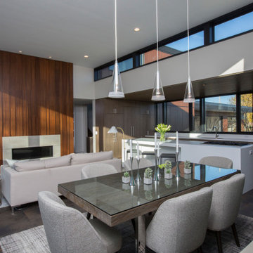
The mHouse is the brainchild of a magazine publisher intent on changing the way houses are constructed and how their owners relate to them. Named after one of the company’s website, the mHouse serves as a built manifesto of innovative panel materials such as rice hull composites and thermally fused laminate – becoming a case study house for over 30 international material suppliers.
The design challenge was quite clear – how to use a series of new materials unproven in the US building trades to create a beautiful house that meets the unique needs of today’s family. The result is a building that is highly rational in its construction systems, while encouraging social gathering.
The mHouse serves as a direct counterpoint to the typical suburban builder home – creating unique outdoor spaces in place of the typical open lawn, a variety of different views in contrast to one major view, and expressing a confidence in the future over nostalgia for the past.
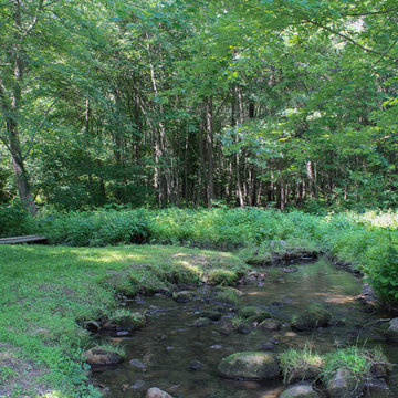
Through a series of layers and nodes, the landscape grounds the house and heightens the views from inside, using indigenous plantings applied in non-traditional ways, the landscape mirrors the house in rethinking the suburban home.
The mHouse strikes a balance between proven methods and innovative solutions, resulting in one version of what is possible with these materials and setting the stage for future iterations and new possibilities.
Size
Total Finished Area: 3,405 sf
Completion Date
September 2015
Services
Architecture
Interior Design Consultant: Amy Carman Design
Landscape Consultant: Texten


 Matt Fajkus Architecture
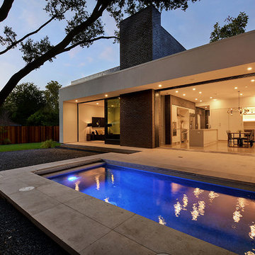
The Main Stay House exists as a straightforward proposal on an urban infill lot, paring down the components of a house to a minimal amount of planes and openings. The scheme is anchored by a modern entry sequence and a staircase volume, both clad in iron spot masonry externally and internally, creating thresholds between the respective realms of public, common and private, by minimal means. The masonry contrasts with an otherwise muted interior atmosphere of smooth, desaturated surfaces.
The entry sequence is a twist upon the conventional domestic front door, front facade, and fence. The front masonry wall replaces the typical residential fence and frames an indirect access to the front door, functioning as a privacy barrier while revealing slices of the interior to the public street.
The staircase bifurcates the layout to provide a clear division between the common and private zones of the house, while clearly reading as a mass from all outside view. Brick and glass become portals between common and private zones.
The design consolidates the service core along the west façade, allowing the structure to fully open the living zone to the pool court and existing trees. This directly connects interior and exterior, as well as human and nature. Freedom to vary the program or functional use of the area is enabled and strongly encouraged.
Photography: Twist Tours
 Vetter Architects
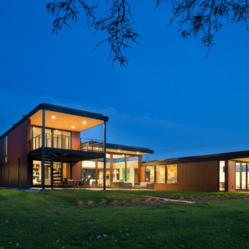
The mHouse is the brainchild of a magazine publisher intent on changing the way houses are constructed and how their owners relate to them. Named after one of the company’s website, the mHouse serves as a built manifesto of innovative panel materials such as rice hull composites and thermally fused laminate – becoming a case study house for over 30 international material suppliers.
The design challenge was quite clear – how to use a series of new materials unproven in the US building trades to create a beautiful house that meets the unique needs of today’s family. The result is a building that is highly rational in its construction systems, while encouraging social gathering.
The mHouse serves as a direct counterpoint to the typical suburban builder home – creating unique outdoor spaces in place of the typical open lawn, a variety of different views in contrast to one major view, and expressing a confidence in the future over nostalgia for the past.
Through a series of layers and nodes, the landscape grounds the house and heightens the views from inside, using indigenous plantings applied in non-traditional ways, the landscape mirrors the house in rethinking the suburban home.
The mHouse strikes a balance between proven methods and innovative solutions, resulting in one version of what is possible with these materials and setting the stage for future iterations and new possibilities.
Size
Total Finished Area: 3,405 sf
Completion Date
September 2015
Services
Architecture
Interior Design Consultant: Amy Carman Design
Landscape Consultant: Texten
 Furnitureland South
[Michael Moran - Photographer]
Media Room:
In the downstairs media room Stephanie started with the fireplace as a focal point, creating a global feel within a club-like atmosphere. Dark, rich browns and blues combine with fabrics from velvet to leather to create an inviting space unlike the typical media room or man cave. Stephanie featured pieces from Century Furniture, Lazar and Natuzzi, selecting recliners and swivel chairs to encourage engagement among guests. Outside the media room, Stephanie created a seating area with selections from Vanguard and Century Furniture. Complementary colors connect the two spaces and offer an overflow room for entertaining.
This home was designed from start to finish by Stephanie James with Allen and James Interiors at Furnitureland South. While Stephanie’s long-time clients were in the process of determining finishes and textures, from cabinetry to flooring to counter tops, they visited Furnitureland South. He had contemporary tastes that gravitated toward leather and angles; she was drawn toward softer fabrics and curves that occasionally bordered on traditional. They both agreed that Stephanie should help them select furnishings, fabrics and textures that would result in a contemporary home with warm elements that were beautiful, comfortable and welcoming, while reflecting both their aesthetics. The slideshow above visualizes the story of their search for beauty and art in each piece of furniture, in each room and within the house as a whole.
 Powell Construction
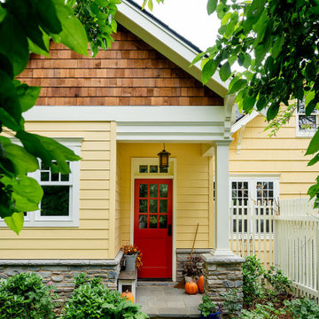
Originally built in 1938, this bungalow cottage had enduring character, but its traditional closed kitchen layout – typical of the era – didn’t align with the way the homeowners envisioned living in the space. Inspired by their travels through England’s Cotswolds, the French countryside, and Carmel’s whimsical Storybook Cottages by the Sea, the homeowners dreamed of a home that captured the romance of cottages and one that would seamlessly connect with their stunning English-style garden.
After years of attempting to reimagine the kitchen in its original location the homeowners realized it would never truly suit the way they lived & wanted to entertain. The original kitchen was historical & was built when the kitchen was the last room you wanted guests to see. It was tucked into the front corner of the home off a hallway leading to the main level bedrooms and bath. To reach the dining room, you passed through a servery swing door, then continued into the living room. While the original door had charm, it disrupted the flow and connection between the kitchen and the main living areas.
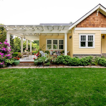
To bring the homeowners’ vision to life, the design called for a bold move—relocating the kitchen entirely. We designed a 560-square-foot addition off the living room – placing the kitchen at the heart of the home and connecting it to the gardens. The new space includes a sunlit breakfast nook, a charming butler’s pantry, a garden vestibule with its own entry porch, and a wraparound porch that encourages indoor-outdoor living. The main level remodel also redefined existing spaces: the old dining room was transformed into a cozy study library, while a former bedroom became an elegant dining room just off the new kitchen.
Every design decision honored the home’s original 1938 architecture and character. Matching the home’s original 1.5-story proportions, the new kitchen wing was designed with intersecting gables that echo the scale and pitch of the existing roofline. A stone-wrapped chimney topped with a handcrafted copper cap is straight from the pages of a storybook. Decorative corbels, intricate window trim, and cedar shake in the gable ends further connect the new architecture to the home’s historic detailing.
Finishes and fixtures were thoughtfully chosen to marry the home’s moodier, character-rich original rooms with the brighter, lighter new spaces. The result is a timeless transformation that feels as though it has always been part of the home – an enchanting blend of storybook charm, functional design, and garden-centered living.
At the ground level, a Pennsylvania bluestone porch and stone skirting ground the addition in traditional materials. Inside, a tongue-and-groove ceiling with hand-hewn beams gives purpose and intimacy to the heightened kitchen ceiling. The home’s signature arched openings were meticulously replicated in the new kitchen, breakfast nook, and dining room, ensuring a seamless transition between old and new. Every element – inside and out – was chosen to honor the original home while enhancing the charm, character, and connection to the garden.
Photos by MK Photography
 Powell Construction
Originally built in 1938, this bungalow cottage had enduring character, but its traditional closed kitchen layout – typical of the era – didn’t align with the way the homeowners envisioned living in the space. Inspired by their travels through England’s Cotswolds, the French countryside, and Carmel’s whimsical Storybook Cottages by the Sea, the homeowners dreamed of a home that captured the romance of cottages and one that would seamlessly connect with their stunning English-style garden.
After years of attempting to reimagine the kitchen in its original location the homeowners realized it would never truly suit the way they lived & wanted to entertain. The original kitchen was historical & was built when the kitchen was the last room you wanted guests to see. It was tucked into the front corner of the home off a hallway leading to the main level bedrooms and bath. To reach the dining room, you passed through a servery swing door, then continued into the living room. While the original door had charm, it disrupted the flow and connection between the kitchen and the main living areas.
To bring the homeowners’ vision to life, the design called for a bold move—relocating the kitchen entirely. We designed a 560-square-foot addition off the living room – placing the kitchen at the heart of the home and connecting it to the gardens. The new space includes a sunlit breakfast nook, a charming butler’s pantry, a garden vestibule with its own entry porch, and a wraparound porch that encourages indoor-outdoor living. The main level remodel also redefined existing spaces: the old dining room was transformed into a cozy study library, while a former bedroom became an elegant dining room just off the new kitchen.
Every design decision honored the home’s original 1938 architecture and character. Matching the home’s original 1.5-story proportions, the new kitchen wing was designed with intersecting gables that echo the scale and pitch of the existing roofline. A stone-wrapped chimney topped with a handcrafted copper cap is straight from the pages of a storybook. Decorative corbels, intricate window trim, and cedar shake in the gable ends further connect the new architecture to the home’s historic detailing.
Finishes and fixtures were thoughtfully chosen to marry the home’s moodier, character-rich original rooms with the brighter, lighter new spaces. The result is a timeless transformation that feels as though it has always been part of the home – an enchanting blend of storybook charm, functional design, and garden-centered living.
At the ground level, a Pennsylvania bluestone porch and stone skirting ground the addition in traditional materials. Inside, a tongue-and-groove ceiling with hand-hewn beams gives purpose and intimacy to the heightened kitchen ceiling. The home’s signature arched openings were meticulously replicated in the new kitchen, breakfast nook, and dining room, ensuring a seamless transition between old and new. Every element – inside and out – was chosen to honor the original home while enhancing the charm, character, and connection to the garden.
Photos by MK Photography
 Charles Rose Architects Inc.
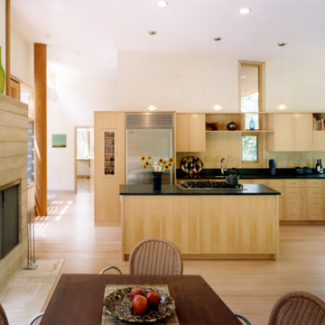
A rustic stone path meanders through a wooded site to arrive at the entry of this 2,800-square-foot home on Martha’s Vineyard, completed in 2001. The path sets the tone for the project itself: simple, functional, and integrated with the natural environment. The couple that commissioned the residence uses it as a summer getaway for family and friends. A master bedroom wing, a guest wing, and a central living, dining, and kitchen area provide a variety of spaces for living and entertaining. Augmenting these spaces are a porch, terrace, and roof deck—providing places for quite reading, gathering for drinks, or taking in unobstructed views of the night sky. The house generates human interaction and connections with the natural world. Ground level terraces and rooftop decks promote this interactivity while large sliding windows and doors literally bring the outdoors inside and encourage individuals to venture outside. The typical inside vs. outside boundaries of traditional buildings are dissolved.
 Summit Design Build LLC
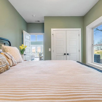
Quaint and cozy bedrooms with a view can offer a peaceful and relaxing retreat that brings the beauty of nature into the home.
A quaint and cozy bedroom is typically designed with a warm and inviting ambiance that encourages relaxation and rest. This can be achieved through the use of soft lighting, comfortable bedding, and tasteful decor that creates a calming atmosphere. The addition of a view can further enhance the peaceful atmosphere by providing a picturesque backdrop that can be enjoyed from the comfort of the bed.
The view can be of many different types of natural scenery, such as a mountain range, a lake, a forest, or a garden. It can be framed by large windows, a balcony, or a porch that allows for fresh air and natural light to flow into the room.
Together, a quaint and cozy bedroom with a view can create a peaceful and rejuvenating space where you can escape from the stresses of daily life and unwind in the beauty of nature. It can be the perfect place to read a book, enjoy a cup of tea or coffee, or simply relax and enjoy the view.
 Vetter Architects
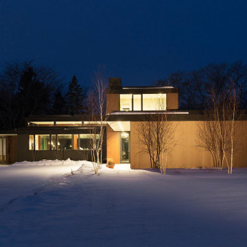
The mHouse is the brainchild of a magazine publisher intent on changing the way houses are constructed and how their owners relate to them. Named after one of the company’s website, the mHouse serves as a built manifesto of innovative panel materials such as rice hull composites and thermally fused laminate – becoming a case study house for over 30 international material suppliers.
The design challenge was quite clear – how to use a series of new materials unproven in the US building trades to create a beautiful house that meets the unique needs of today’s family. The result is a building that is highly rational in its construction systems, while encouraging social gathering.
The mHouse serves as a direct counterpoint to the typical suburban builder home – creating unique outdoor spaces in place of the typical open lawn, a variety of different views in contrast to one major view, and expressing a confidence in the future over nostalgia for the past.
Through a series of layers and nodes, the landscape grounds the house and heightens the views from inside, using indigenous plantings applied in non-traditional ways, the landscape mirrors the house in rethinking the suburban home.
The mHouse strikes a balance between proven methods and innovative solutions, resulting in one version of what is possible with these materials and setting the stage for future iterations and new possibilities.
Size
Total Finished Area: 3,405 sf
Completion Date
September 2015
Services
Architecture
Interior Design Consultant: Amy Carman Design
Landscape Consultant: Texten
 Vetter Architects
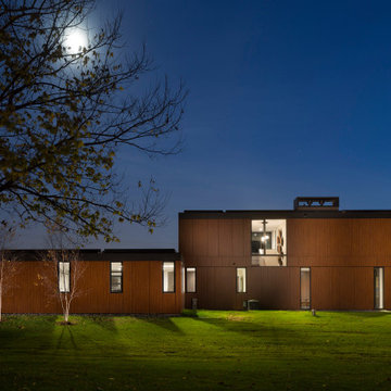
The mHouse is the brainchild of a magazine publisher intent on changing the way houses are constructed and how their owners relate to them. Named after one of the company’s website, the mHouse serves as a built manifesto of innovative panel materials such as rice hull composites and thermally fused laminate – becoming a case study house for over 30 international material suppliers.
The design challenge was quite clear – how to use a series of new materials unproven in the US building trades to create a beautiful house that meets the unique needs of today’s family. The result is a building that is highly rational in its construction systems, while encouraging social gathering.
The mHouse serves as a direct counterpoint to the typical suburban builder home – creating unique outdoor spaces in place of the typical open lawn, a variety of different views in contrast to one major view, and expressing a confidence in the future over nostalgia for the past.
Through a series of layers and nodes, the landscape grounds the house and heightens the views from inside, using indigenous plantings applied in non-traditional ways, the landscape mirrors the house in rethinking the suburban home.
The mHouse strikes a balance between proven methods and innovative solutions, resulting in one version of what is possible with these materials and setting the stage for future iterations and new possibilities.
Size
Total Finished Area: 3,405 sf
Completion Date
September 2015
Services
Architecture
Interior Design Consultant: Amy Carman Design
Landscape Consultant: Texten
 Vetter Architects
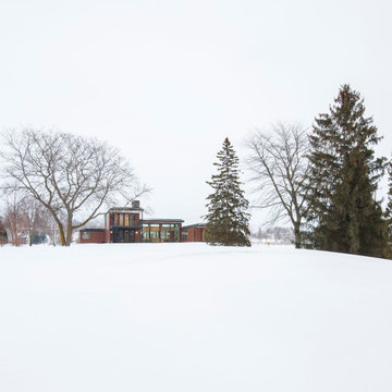
The mHouse is the brainchild of a magazine publisher intent on changing the way houses are constructed and how their owners relate to them. Named after one of the company’s website, the mHouse serves as a built manifesto of innovative panel materials such as rice hull composites and thermally fused laminate – becoming a case study house for over 30 international material suppliers.
The design challenge was quite clear – how to use a series of new materials unproven in the US building trades to create a beautiful house that meets the unique needs of today’s family. The result is a building that is highly rational in its construction systems, while encouraging social gathering.
The mHouse serves as a direct counterpoint to the typical suburban builder home – creating unique outdoor spaces in place of the typical open lawn, a variety of different views in contrast to one major view, and expressing a confidence in the future over nostalgia for the past.
Through a series of layers and nodes, the landscape grounds the house and heightens the views from inside, using indigenous plantings applied in non-traditional ways, the landscape mirrors the house in rethinking the suburban home.
The mHouse strikes a balance between proven methods and innovative solutions, resulting in one version of what is possible with these materials and setting the stage for future iterations and new possibilities.
Size
Total Finished Area: 3,405 sf
Completion Date
September 2015
Services
Architecture
Interior Design Consultant: Amy Carman Design
Landscape Consultant: Texten
 UpperKey
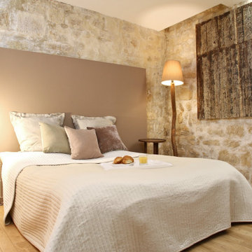
A master bedroom in a Paris apartment is a luxurious and comfortable space designed for relaxation and rest. These rooms typically feature a large and comfortable bed, plush bedding, and tasteful decor that exudes sophistication. With ample storage space, en-suite bathrooms with modern fixtures, and tasteful accents such as artwork and lighting, a master bedroom in a Paris apartment offers the ultimate in comfort and convenience. The decor can vary widely, from classic and ornate to modern and minimalist, but the focus is always on creating a warm and inviting atmosphere that encourages relaxation. Overall, a master bedroom in a Paris apartment is the perfect retreat for those seeking the ultimate in luxury and comfort.
3