
Search results for "Typically lower" in Home Design Ideas
 Andrea Mars
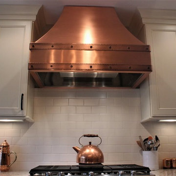
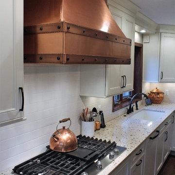
My clients had a typical peninsula style kitchen with an area toward the patio door for a kitchen table which was not functional for their lifestyle. We developed a plan to eliminate the peninsula utilize and island with a prep and work space as well as a lowered area to serve as their new seating area. This kitchen features a striking custom made copper range hood, MidContinent Cabinetry in Portico Maple painted Antique White and the island in Cherry stained Harvest with Black Glaze. The countertops are Zodiaq engineered quartz in Toffee. The sink is Blanco Silgranit. Tile backsplash is American Olean Profiles 3x6 in Matte Bisque. The gorgeous floors are Sant'Augustino S Wood 6" x 48" wood look tile in Brown with Espresso Grout. The chandelier is Kichler Archibald in Antique Copper.
 Richardson Pribuss Architects
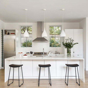
By designing the lower level as a gathering area that connects to a large flattened rear yard, the typical organization of a residential space is reversed.
 Armadillo Convertible Room Solutions
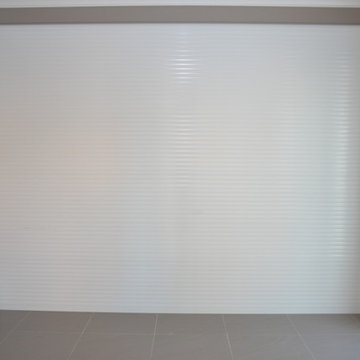
All products are custom made.
Available in different fabrics and colors (extruded aluminum and cold-formed steel). Accordion shutters also available.
Our gates and shutters are designed for privacy and protection. They are built with extruded aluminum for added protection and durability. Traditional gates and shutters are typically built with steel. Aluminum is more aesthetically pleasing and offers maximum security.
Roller gates and shutters are useful throughout the year for privacy, security, and protection from the sun. Many clients install roller gates and shutters over doors and windows. Roller gates and shutters are optimal for hurricane protection and energy saving. They are easy to use and can be raised or lowered with the push of a button.
All gates and shutters are custom designed and are available in a variety of materials, fabrics and colors (extruded or foam-filled).
• Optional: Tension pins to prevent forced entry.
• Optional: Vent holes in slats are optional for ventilation.
Find the right local pro for your project
 KURV Architecture DPC (Alex Hughes Architects)
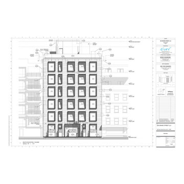
Located in the heart of Manhattan’s Lower East Side, the building was erected on a shallow commercial lot between two 120 year old masonry buildings and a new residential rental building. 330 Grand Street is a mix of 725 SF 1BRs and 1050 SF 2BR apartments. It also contains a 1100 SF two story duplex as well as private and public rooftop space, large private balconies for most units and two large private terraces for the ground floor units.
330 Grand Street was originally designed and approved at the NYC DOB as a prefabricated modular building. During the pandemic, as shipping costs skyrocketed putting the project at risk, we suggested redesigning the building as a reinforced cast-in-place concrete structure. Concrete was readily available and prices had not been affected by the demand increase that many other materials suffered in the pandemic. We took this opportunity to raise floor to ceiling heights, enlarge high performance windows and redistribute the buildings MEPFS and Structural Systems to create very open floor plans.
The challenge was to create a luxurious sensorial living experience with very limited means. In a city with very high construction costs, low cost residential buildings in the area are usually devoid of good quality, design and character. Our approach was to aim high for the end user, prioritizing natural light, open space with long visual perspectives, high ceilings and as always, rejecting the use of predefined building templates.
Our biggest challenge was to ensure that the small spaces feel as clean cut, large and bright as possible. Several unique design decisions were made to ensure low cost and high quality;
Floor plans were laid out so that spaces were wide open and free of clutter from mechanical or structural interruptions. Therefore all infrastructure was placed in lateral demising walls, which in turn act as the unit’s storage and kitchen. The apartments feel wide open, are super quiet and have more storage space than any other comparable apartment in the city.
To solve the problem of the site’s shallow commercial lot which is typically prone to dark interior spaces we focused our attention on the building’s envelope. Instead of the usual small punched window openings, oversized high performance windows were designed to ensure that light penetrated as far as possible into the units. In the smaller 1BR units, the full 50’ depth of the lot is perceived by partitioning spaces with sliding pocket doors that can be retracted to allow deep visual perspectives, making the sight lines in the space feel longer, larger, more ample than normal. In addition to the full height glazing, each unit above the 2nd floor receives a 7 foot covered balcony, adding 120 to 240 sf to each apartment, something unusual in New York City buildings. The space is large enough for a full size dining table, when the weather permits being outside.
We also worked hard to ensure modularity. For example, all kitchen units are all identical throughout the building. The idea of modularity and the economy of the repetitive unit is exercised to the maximum through the building.
Hardware, appliances, flooring, wall coverings and material finishes are all carefully selected to feel bespoke, high quality and unique.
It was important to KURV that the result of this work manifest into something that would deeply connect with the end user and sustain relationships with the consumers of this space.
All images by KURV Architecture ©
 Andrea Mars
My clients had a typical peninsula style kitchen with an area toward the patio door for a kitchen table which was not functional for their lifestyle. We developed a plan to eliminate the peninsula utilize and island with a prep and work space as well as a lowered area to serve as their new seating area. This kitchen features a striking custom made copper range hood, MidContinent Cabinetry in Portico Maple painted Antique White and the island in Cherry stained Harvest with Black Glaze. The countertops are Zodiaq engineered quartz in Toffee. The sink is Blanco Silgranit. Tile backsplash is American Olean Profiles 3x6 in Matte Bisque. The gorgeous floors are Sant'Augustino S Wood 6" x 48" wood look tile in Brown with Espresso Grout. The chandelier is Kichler Archibald in Antique Copper.
 STACT Wine Displays Inc.
 http://www.getSTACT.com
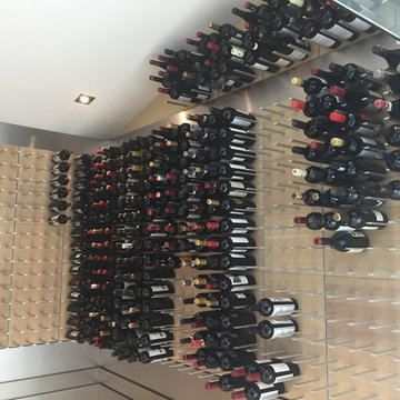
STACT wine racks are incredibly easy to specify and incorporate into wine cellars, wine rooms, kitchens, home bars, commercial bars, and restaurants. Our customers have found that when it comes to modern wine cellar solutions, our system offers a number of advantages versus other wine storage solutions available on the market, here are just a few:
✓ Quality - premium *furniture grade* solution is unique to the industry, with unrivalled refinement when it comes to materials, aesthetic and craftsmanship. Our panels feature a premium high-gloss painted finish (not a laminated surface). Each panel takes more than a week to complete, with meticulous attention to detail. Once numerous coats of lacquer have been applied, each panel is hand buffed to a mirror-like piano finish.
✓ Versatility - mount any way you wish, and designed to work equally well within both commercial and residential applications, our clients have found our modular system to be the most versatile, and easiest to specify, assemble, and install - whether for 9 bottles or 9,000 within a large scale wine cellar application (www.stact.co/cellars). Available on your choice of 10 finishes, mix and match STACT panels to create your own unique look (3,628,800 possible configurations).
✓ Convenience - designed for quick and easy *DIY installation*, our patented system comes ready-to-install to any drywall surface right out of the box, minimizing the costs associated with labor and installation when compared with many custom solutions you will find on the market. Avoiding the need for a dedicated wine cellar builder to produce and arrive on site for assembly and installation. In-stock items typically ship within 1 business day.
✓ Value - direct-to-client distribution model to effectively cut out retail markup. Builders and specifiers have found STACT to be a fraction of the price of what it would cost to develop and produce a comparable custom solution. Plus currently we are offering *free shipping worldwide*.
✓ Design pedigree - created by 2012 ICFF winning designer Eric Pfeiffer, our patented prefabricated ready-to-assemble modular design is unique to the industry.
✓ Space-saving - highest bottle capacity on the market (10.7 bottles / sq ft). Each panel supports 9-12 bottles depending on how they are configured.
✓ Security - superior bottle stability, versus other wall-mounted wine storage solutions on the market. The aircraft grade aluminum bottle support structure ensures a lower center of gravity there is a more substantial portion of the bottle resting below the contact points. Thus a minimalist design aesthetic is retained, while eliminating the need for unnecessary and unsightly materials/clutter such as rubber gaskets, straps, etc.
Learn more at www.getSTACT.com
 Century Stair Company
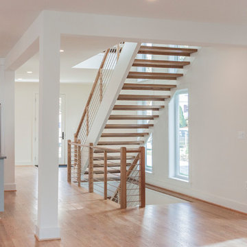
This project blends warm wood with industrial style concepts for a result that transcends typical modern minimalism. Created with a visionary architect and builder, the four-level structure features thick solid oak treads with extended noses that float against finished poplar stringers. Open risers preserve light flow from the adjacent wall of windows.
A horizontal stainless steel rod balustrade system flows from the lower-level recreation room to the fourth-level rooftop deck, creating visual continuity across the home's entire vertical span. The geometric design echoes custom millwork throughout the residence and connects the chef's kitchen and family room while celebrating natural light at every level.
1976-2026 © Century Stair Company
Sponsored
Columbus, OH

Snider & Metcalf Interior Design, LTD
Leading Interior Designers in Columbus, Ohio & Ponte Vedra, Florida
 KURV Architecture DPC (Alex Hughes Architects)
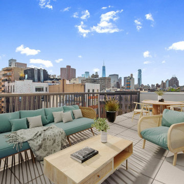
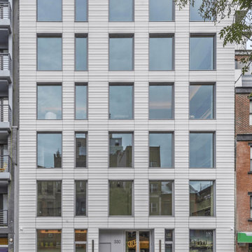
Located in the heart of Manhattan’s Lower East Side, the building was erected on a shallow commercial lot between two 120 year old masonry buildings and a new residential rental building. 330 Grand Street is a mix of 725 SF 1BRs and 1050 SF 2BR apartments. It also contains a 1100 SF two story duplex as well as private and public rooftop space, large private balconies for most units and two large private terraces for the ground floor units.
330 Grand Street was originally designed and approved at the NYC DOB as a prefabricated modular building. During the pandemic, as shipping costs skyrocketed putting the project at risk, we suggested redesigning the building as a reinforced cast-in-place concrete structure. Concrete was readily available and prices had not been affected by the demand increase that many other materials suffered in the pandemic. We took this opportunity to raise floor to ceiling heights, enlarge high performance windows and redistribute the buildings MEPFS and Structural Systems to create very open floor plans.
The challenge was to create a luxurious sensorial living experience with very limited means. In a city with very high construction costs, low cost residential buildings in the area are usually devoid of good quality, design and character. Our approach was to aim high for the end user, prioritizing natural light, open space with long visual perspectives, high ceilings and as always, rejecting the use of predefined building templates.
Our biggest challenge was to ensure that the small spaces feel as clean cut, large and bright as possible. Several unique design decisions were made to ensure low cost and high quality;
Floor plans were laid out so that spaces were wide open and free of clutter from mechanical or structural interruptions. Therefore all infrastructure was placed in lateral demising walls, which in turn act as the unit’s storage and kitchen. The apartments feel wide open, are super quiet and have more storage space than any other comparable apartment in the city.
To solve the problem of the site’s shallow commercial lot which is typically prone to dark interior spaces we focused our attention on the building’s envelope. Instead of the usual small punched window openings, oversized high performance windows were designed to ensure that light penetrated as far as possible into the units. In the smaller 1BR units, the full 50’ depth of the lot is perceived by partitioning spaces with sliding pocket doors that can be retracted to allow deep visual perspectives, making the sight lines in the space feel longer, larger, more ample than normal. In addition to the full height glazing, each unit above the 2nd floor receives a 7 foot covered balcony, adding 120 to 240 sf to each apartment, something unusual in New York City buildings. The space is large enough for a full size dining table, when the weather permits being outside.
We also worked hard to ensure modularity. For example, all kitchen units are all identical throughout the building. The idea of modularity and the economy of the repetitive unit is exercised to the maximum through the building.
Hardware, appliances, flooring, wall coverings and material finishes are all carefully selected to feel bespoke, high quality and unique.
It was important to KURV that the result of this work manifest into something that would deeply connect with the end user and sustain relationships with the consumers of this space.
All images by KURV Architecture ©
 KURV Architecture DPC (Alex Hughes Architects)
Located in the heart of Manhattan’s Lower East Side, the building was erected on a shallow commercial lot between two 120 year old masonry buildings and a new residential rental building. 330 Grand Street is a mix of 725 SF 1BRs and 1050 SF 2BR apartments. It also contains a 1100 SF two story duplex as well as private and public rooftop space, large private balconies for most units and two large private terraces for the ground floor units.
330 Grand Street was originally designed and approved at the NYC DOB as a prefabricated modular building. During the pandemic, as shipping costs skyrocketed putting the project at risk, we suggested redesigning the building as a reinforced cast-in-place concrete structure. Concrete was readily available and prices had not been affected by the demand increase that many other materials suffered in the pandemic. We took this opportunity to raise floor to ceiling heights, enlarge high performance windows and redistribute the buildings MEPFS and Structural Systems to create very open floor plans.
The challenge was to create a luxurious sensorial living experience with very limited means. In a city with very high construction costs, low cost residential buildings in the area are usually devoid of good quality, design and character. Our approach was to aim high for the end user, prioritizing natural light, open space with long visual perspectives, high ceilings and as always, rejecting the use of predefined building templates.
Our biggest challenge was to ensure that the small spaces feel as clean cut, large and bright as possible. Several unique design decisions were made to ensure low cost and high quality;
Floor plans were laid out so that spaces were wide open and free of clutter from mechanical or structural interruptions. Therefore all infrastructure was placed in lateral demising walls, which in turn act as the unit’s storage and kitchen. The apartments feel wide open, are super quiet and have more storage space than any other comparable apartment in the city.
To solve the problem of the site’s shallow commercial lot which is typically prone to dark interior spaces we focused our attention on the building’s envelope. Instead of the usual small punched window openings, oversized high performance windows were designed to ensure that light penetrated as far as possible into the units. In the smaller 1BR units, the full 50’ depth of the lot is perceived by partitioning spaces with sliding pocket doors that can be retracted to allow deep visual perspectives, making the sight lines in the space feel longer, larger, more ample than normal. In addition to the full height glazing, each unit above the 2nd floor receives a 7 foot covered balcony, adding 120 to 240 sf to each apartment, something unusual in New York City buildings. The space is large enough for a full size dining table, when the weather permits being outside.
We also worked hard to ensure modularity. For example, all kitchen units are all identical throughout the building. The idea of modularity and the economy of the repetitive unit is exercised to the maximum through the building.
Hardware, appliances, flooring, wall coverings and material finishes are all carefully selected to feel bespoke, high quality and unique.
It was important to KURV that the result of this work manifest into something that would deeply connect with the end user and sustain relationships with the consumers of this space.
All images by KURV Architecture ©
 Ron Szerlong Architect
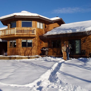
The unique functions of the home were achieved by the close collaboraton between the Owners and the Architect. A two story Octangonal structure was designed to provide a lowere level kitchen and work space.
The second story accommodes an office with a protected balcony.
The typical 3 feet roof overhangs allows winter heat gain and excludes the summer intense sun, while also protections the wall materials from snow and rain exposure.
photo: Scott Hoffner
 Century Stair Company
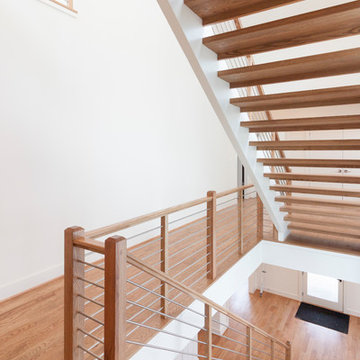
This project blends warm wood with industrial style concepts for a result that transcends typical modern minimalism. Created with a visionary architect and builder, the four-level structure features thick solid oak treads with extended noses that float against finished poplar stringers. Open risers preserve light flow from the adjacent wall of windows.
A horizontal stainless steel rod balustrade system flows from the lower-level recreation room to the fourth-level rooftop deck, creating visual continuity across the home's entire vertical span. The geometric design echoes custom millwork throughout the residence and connects the chef's kitchen and family room while celebrating natural light at every level.
1976-2026 © Century Stair Company
 Drury Design
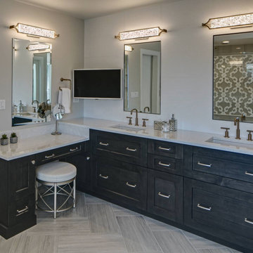
The original idea was to update the tile floor and the tub. That’s it.
A further discussion of wants and needs revealed intentions for an eventual larger shower and an improved vanity storage. It made sense to map out the possibilities and design our update with potential next steps in mind. The process was exciting, ultimately leading to the decision to do a full primary bath remodel.
Design Objectives:
-Maintain existing locations for all major bathroom functions
-Make the shower larger and more open
-Use luxurious materials throughout
-Improve vanity storage and define accessories for specific items
-Incorporate luxury shower fixtures
-Include the latest technology
Design Challenges
-Enlarging the shower in a typical rectangular shape would block the view and light from the alcove windows behind the tub
-Logical placement of the built-in shower caddy and all shower components in accordance with how and where they were to be used
-Keeping the long, back wall free from any shower modules to maintain the decorative tile design
-Combining the owner’s existing smart home system with a comprehensive shower system
-Planning cabinetry for hidden storage and use for various small appliances and make-up
-Integrating expensive shower wall tile with less expensive wall tile for aesthetic and budget purposes
-Incorporating special design features to balance the highly decorative shower tile
Design solutions:
-A clipped corner was planned for the shower bench seat – this allowed for a larger glass wall. The glass wall at the angled bench also brought more natural light into the shower
-Thoughtful shower space design prevented the crowding of features – the shower caddy and handheld shower head were placed on the full-height wall by the shower bench, the regular shower head and body sprays remained on the opposite wall, and the rain head was placed in the center of the shower
-A multi-port DTV system was installed, providing control of all shower components, including chromotherapy and music inside and outside the shower
-The lavish water-jet stone and glass decorative tile was paired with a less-expensive glass tile found in the mosaic
-Pull-out grooming organizers and electrical docking stations were incorporated into the cabinetry
Additional storage was created in the lower corner cabinet
The homeowners are thrilled with their new primary bathroom. Clear goals and carefully evaluated materials informed a fun and functional design that is both thoughtful and sumptuous!
 KCBR Design | Remodel
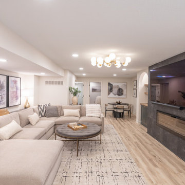
Designed to feel anything but typical, this basement remodel was centered around warmth, character, and livability. The goal was to create a space that feels fully integrated with the home above, both in function and aesthetic.
An egress window was introduced to bring natural light into the new bedroom, transforming the lower level into a bright and comfortable extension of the home. The main living area is anchored by a custom built-in TV wall, creating a natural gathering space for movie nights and game days.
Just off the living area, a custom wet bar adds both convenience and visual interest, making entertaining effortless. Built-in storage solutions were thoughtfully incorporated throughout, keeping the space organized while adding depth and detail to the design.
The result is a basement that feels open, inviting, and intentionally designed for everyday living, seamlessly blending comfort, function, and style.

 Asher Seaton Homes
INTERIOR
---
-Two-zone heating and cooling system results in higher energy efficiency and quicker warming/cooling times
-Fiberglass and 3.5” spray foam insulation that exceeds industry standards
-Sophisticated hardwood flooring, engineered for an elevated design aesthetic, greater sustainability, and the highest green-build rating, with a 25-year warranty
-Custom cabinetry made from solid wood and plywood for sustainable, quality cabinets in the kitchen and bathroom vanities
-Fisher & Paykel DCS Professional Grade home appliances offer a chef-quality cooking experience everyday
-Designer's choice quartz countertops offer both a luxurious look and excellent durability
-Danze plumbing fixtures throughout the home provide unparalleled quality
-DXV luxury single-piece toilets with significantly higher ratings than typical builder-grade toilets
-Lighting fixtures by Matteo Lighting, a premier lighting company known for its sophisticated and contemporary designs
-All interior paint is designer grade by Benjamin Moore
-Locally sourced and produced, custom-made interior wooden doors with glass inserts
-Spa-style mater bath featuring Italian designer tile and heated flooring
-Lower level flex room plumbed and wired for a secondary kitchen - au pair quarters, expanded generational family space, entertainment floor - you decide!
-Electric car charging
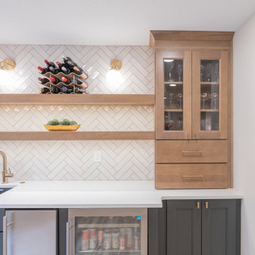 KCBR Design | Remodel
Designed to feel anything but typical, this basement remodel was centered around warmth, character, and livability. The goal was to create a space that feels fully integrated with the home above, both in function and aesthetic.
An egress window was introduced to bring natural light into the new bedroom, transforming the lower level into a bright and comfortable extension of the home. The main living area is anchored by a custom built-in TV wall, creating a natural gathering space for movie nights and game days.
Just off the living area, a custom wet bar adds both convenience and visual interest, making entertaining effortless. Built-in storage solutions were thoughtfully incorporated throughout, keeping the space organized while adding depth and detail to the design.
The result is a basement that feels open, inviting, and intentionally designed for everyday living, seamlessly blending comfort, function, and style.
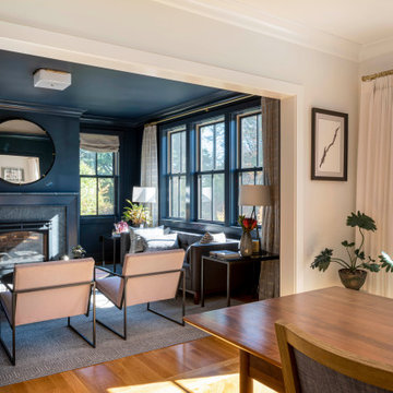
 Lim Design Studio, Inc
Located just outside of Boston, this home was built from the ground up to serve a bustling working family. The home contains a work/office space for client visits and an asymmetrical floor plan that distinguishes itself from typical New England vernacular. The entry sequence creates an enfilade to the main living spaces of the house. Smaller programmatic spaces such as the indoor pool, office, mud room, and staircase are kept to the perimeter of the main living areas on the lower floor. Upstairs, the stair ends at a reading nook and crafts area for children. Project featured in The Boston Globe. Completed in 2020. Photography by Sabrina Cole Quinn.
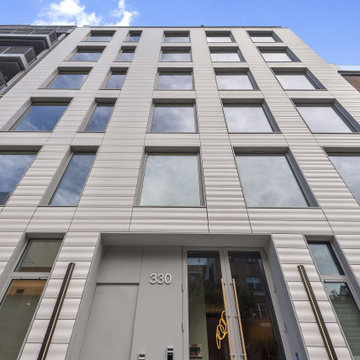 KURV Architecture DPC (Alex Hughes Architects)
Located in the heart of Manhattan’s Lower East Side, the building was erected on a shallow commercial lot between two 120 year old masonry buildings and a new residential rental building. 330 Grand Street is a mix of 725 SF 1BRs and 1050 SF 2BR apartments. It also contains a 1100 SF two story duplex as well as private and public rooftop space, large private balconies for most units and two large private terraces for the ground floor units.
330 Grand Street was originally designed and approved at the NYC DOB as a prefabricated modular building. During the pandemic, as shipping costs skyrocketed putting the project at risk, we suggested redesigning the building as a reinforced cast-in-place concrete structure. Concrete was readily available and prices had not been affected by the demand increase that many other materials suffered in the pandemic. We took this opportunity to raise floor to ceiling heights, enlarge high performance windows and redistribute the buildings MEPFS and Structural Systems to create very open floor plans.
The challenge was to create a luxurious sensorial living experience with very limited means. In a city with very high construction costs, low cost residential buildings in the area are usually devoid of good quality, design and character. Our approach was to aim high for the end user, prioritizing natural light, open space with long visual perspectives, high ceilings and as always, rejecting the use of predefined building templates.
Our biggest challenge was to ensure that the small spaces feel as clean cut, large and bright as possible. Several unique design decisions were made to ensure low cost and high quality;
Floor plans were laid out so that spaces were wide open and free of clutter from mechanical or structural interruptions. Therefore all infrastructure was placed in lateral demising walls, which in turn act as the unit’s storage and kitchen. The apartments feel wide open, are super quiet and have more storage space than any other comparable apartment in the city.
To solve the problem of the site’s shallow commercial lot which is typically prone to dark interior spaces we focused our attention on the building’s envelope. Instead of the usual small punched window openings, oversized high performance windows were designed to ensure that light penetrated as far as possible into the units. In the smaller 1BR units, the full 50’ depth of the lot is perceived by partitioning spaces with sliding pocket doors that can be retracted to allow deep visual perspectives, making the sight lines in the space feel longer, larger, more ample than normal. In addition to the full height glazing, each unit above the 2nd floor receives a 7 foot covered balcony, adding 120 to 240 sf to each apartment, something unusual in New York City buildings. The space is large enough for a full size dining table, when the weather permits being outside.
We also worked hard to ensure modularity. For example, all kitchen units are all identical throughout the building. The idea of modularity and the economy of the repetitive unit is exercised to the maximum through the building.
Hardware, appliances, flooring, wall coverings and material finishes are all carefully selected to feel bespoke, high quality and unique.
It was important to KURV that the result of this work manifest into something that would deeply connect with the end user and sustain relationships with the consumers of this space.
All images by KURV Architecture ©

Sponsored
Delaware, OH

Buckeye Basements, Inc.
Central Ohio's Basement Finishing ExpertsBest Of Houzz '13-'21

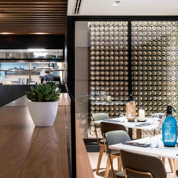 STACT Wine Displays Inc.
 http://www.getSTACT.com
STACT wine racks are incredibly easy to specify and incorporate into wine cellars, wine rooms, kitchens, home bars, commercial bars, and restaurants. Our customers have found that when it comes to modern wine cellar solutions, our system offers a number of advantages versus other wine storage solutions available on the market, here are just a few:
✓ Quality - premium *furniture grade* solution is unique to the industry, with unrivalled refinement when it comes to materials, aesthetic and craftsmanship. Our panels feature a premium high-gloss painted finish (not a laminated surface). Each panel takes more than a week to complete, with meticulous attention to detail. Once numerous coats of lacquer have been applied, each panel is hand buffed to a mirror-like piano finish.
✓ Versatility - mount any way you wish, and designed to work equally well within both commercial and residential applications, our clients have found our modular system to be the most versatile, and easiest to specify, assemble, and install - whether for 9 bottles or 9,000 within a large scale wine cellar application (www.stact.co/cellars). Available on your choice of 10 finishes, mix and match STACT panels to create your own unique look (3,628,800 possible configurations).
✓ Convenience - designed for quick and easy *DIY installation*, our patented system comes ready-to-install to any drywall surface right out of the box, minimizing the costs associated with labor and installation when compared with many custom solutions you will find on the market. Avoiding the need for a dedicated wine cellar builder to produce and arrive on site for assembly and installation. In-stock items typically ship within 1 business day.
✓ Value - direct-to-client distribution model to effectively cut out retail markup. Builders and specifiers have found STACT to be a fraction of the price of what it would cost to develop and produce a comparable custom solution. Plus currently we are offering *free shipping worldwide*.
✓ Design pedigree - created by 2012 ICFF winning designer Eric Pfeiffer, our patented prefabricated ready-to-assemble modular design is unique to the industry.
✓ Space-saving - highest bottle capacity on the market (10.7 bottles / sq ft). Each panel supports 9-12 bottles depending on how they are configured.
✓ Security - superior bottle stability, versus other wall-mounted wine storage solutions on the market. The aircraft grade aluminum bottle support structure ensures a lower center of gravity there is a more substantial portion of the bottle resting below the contact points. Thus a minimalist design aesthetic is retained, while eliminating the need for unnecessary and unsightly materials/clutter such as rubber gaskets, straps, etc.
Learn more at www.getSTACT.com
 Deskins Group LLC
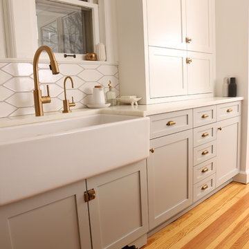
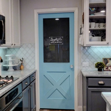
This project was a typical suburban house that the owner wanted to modernize. The home was only 10 years old so we reused the cabinets and appliances. We lowered the bar and added some farmhouse style accents.
25