
Search results for "Ultimate composition" in Home Design Ideas

 Shoa Gallery
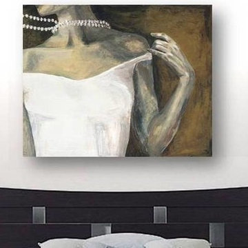
Contemporary Parisian style artwork in a bedroom setting.
Example of a minimalist bedroom design in Los Angeles
Example of a minimalist bedroom design in Los Angeles
Find the right local pro for your project

 Jordan Iverson Signature Homes
KuDa Photography
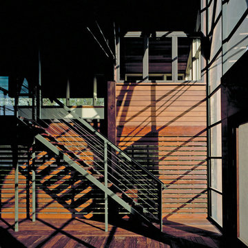
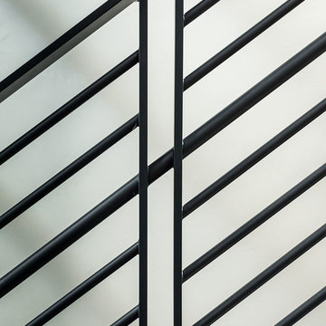
Large minimalist wooden u-shaped staircase photo with metal risers
Large minimalist wooden u-shaped staircase photo with metal risers




 Borden Interiors & Associates
Riad Tile
Bathroom - contemporary cement tile floor and pink floor bathroom idea in Santa Barbara
Bathroom - contemporary cement tile floor and pink floor bathroom idea in Santa Barbara
 User
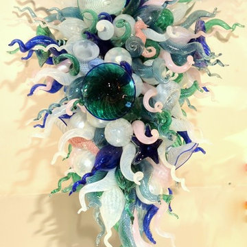
UserOur custom blown glass chandeliers are made totally custom to fit perfectly in your unique space. We work with you to capture the inner essence you wish to express.
Our client wished to add color to their sun room. This Deep Cobalt chandelier looks absolutely brilliant, as the outside sun and internal light of the chandelier converge in a kaleidoscope of blue. The glass dining room table and casual wooden chairs combined with the outside forestry make for a phenomenal combination.
This custom blown glass art platter chandelier is made from our golden topaz sconce flowers. This style of chandelier is wonderful for modern contemporary homes, and matches the wooden floors, grey rug, and white ceilings. This custom blown glass art platter chandelier is made from our golden topaz sconce flowers. This style of chandelier is wonderful for modern contemporary homes, and matches the wooden floors, grey rug, and white ceilings. It looks stunning over this wooden kitchen island.
Our custom-made glass lighting fixtures are perfect for your foyer, entryway, stairwell, living room, dining room, kitchen, or any room in your home. All of our chandeliers and custom blown glass lighting is fully customizable and tailored to fit your unique space. No two works are the same, each piece is custom made exactly for you.
This is a totally unique, Elongated, all-clear Ribbon chandelier we produced for a client's dining room. This fits in with traditional decor but with a modern twist, It matches the wood flooring, oak table, and mahogany dresser, and the abundance of natural sunlight from large windows makes this custom lighting glass fixture sparkle.
This is a totally unique, Elongated, all-clear Ribbon chandelier we produced for a client's dining room. This fits in with traditional decor but with a modern twist, It matches the wood flooring, oak table, and mahogany dresser, and the abundance of natural sunlight from large windows makes this custom lighting glass fixture sparkle.
We are a three generation family business, with over 50 years of experience. We have installations all over the world, for governments, civic memorials, public works, interior designers, decorators, architects, engineers, museums, art galleries, hotels, restaurants, corporations, corporate clients, businesses, ranches, oceanfront properties, apartment buildings, condominiums, and numerous private clients.
This floral custom dining room chandelier chandelier looks like an upside down flower pot miraculously suspended in mid-air. The reds in the chandelier match the red painted walls, while the yellows bring out the bamboo floors and light wood dining room table and dining room chairs. There is also plenty of natural sunlight from big sky windows. This home is traditional with a touch of contemporary in the furniture.
For this particular client living in Malibu, we procured for them a chandelier to fit the ultra-contemporary decor of their interior, enhance their home's natural light, and compliment the sun-abundant environment in which they live.
48" high x 72" long x 48" wide Colors shown: Orange, Fire Red, Yellow This blown-glass garden sculpture is designed to uniquely enhance your outdoor space. Dimensions and colors fully customizable, and sculpture can be lit from within for a nighttime glowing effect.
48" high x 72" long x 48" wide Colors shown: Aqua Blue, Lime, Emerald Green, Violet This blown-glass garden sculpture is designed to uniquely enhance your outdoor space. Dimensions and colors fully customizable, and sculpture can be lit from within for a nighttime glowing.
48" high x 48" wide x 24" deep These Opal White sconces seem to work in any space, as their internal lights cast a soft, agreeable glow. This particular pair adds a subtle touch to a forest view, and softens the juxtaposition between inside and out. Just like our chandeliers, our sconces are internally lit with ultra long-lasting, dimmable LEDs.
50" high x 46" wide x 26" deep This is a honey, wood, and grey sconce we produced for a client to accentuate a warm, wooden, yet contemporary feel. Just like our chandeliers, our sconces are internally lit with ultra long-lasting, dimmable LEDs.
72" high x 60" wide x 24" deep This wall sconce is simply fun. Vibrant colors play with each other, yet match because they fall in the same color spectrum, as the client's sitting room is transformed into a display of modern art. Just like our chandeliers, our sconces are internally lit with ultra long-lasting, dimmable LEDs.
We serve the entire United States and Canada. We service all 50 states, including Alabama, Alaska, Arizona, Arkansas, California, Colorado, Connecticut, Delaware, Florida, Georgia, Hawaii, Idaho, Illinois, Indiana, Iowa, Kansas, Kentucky, Louisiana, Maine, Maryland, Massachusetts, Michigan, Minnesota, Mississippi, Missouri, Montana, Nebraska, Nevada, New Hampshire, New Jersey, New Mexico, New York, North Carolina, North Dakota, Ohio, Oklahoma, Oregon, Pennsylvania, Rhode Island, South Florida, Miami, Coral Gables, South Carolina, South Dakota, Tennessee, Texas, Utah, Vermont, Virginia, Washington, West Virginia, Wisconsin, Wyoming. In California, we specifically service Orange County, Los Angeles, LA County, and Malibu. Zip code 90210. In the Washington D.C. area, we specifically serve Alexandria, Arlington, Loudon, Bethesda, Upper Marlboro, Kalorama, and the Palisades. In Connecticut, we specifically serve Greenwich. Zip codes 22314 and 2203.
Our custom made, blown glass chandeliers are functional glass art and can be customized for apartments, condos, a client’s foyer, living room, dining room, great room, family room, kitchen, kitchen island, even bathroom and bedroom.
Our fully custom glass art chandeliers are all blown here in the United States of America. We customize them to go with all furnishings, including one’s mahogany dining room table, wood dining room table, contemporary dining room table, traditional dining room table, and modern dining room table. They also match one’s marble kitchen island, skylight, coffee table, custom wallpaper, other lighting fixtures, custom wall sconces, dining room chairs, marble countertops. They look phenomenal in large or small homes, and seaside villas. Ocean front properties are a speciality of ours as well.
A closeup photo of the outdoor patio chandelier, displaying the incredible detail and craftsmanship in each individual piece. This picture is art unto itself.
We provide full personalized service, including Lighting Design, Lighting Manufacturer, Custom Lighting, Custom Chandeliers, Multi-story Chandeliers, Multi-level Chandeliers, Glass Lighting, Pendant Lighting, Commercial Lighting, Residential Lighting, Blown Glass, Fused Glass, Bubble Glass Lighting, Bubble Chandeliers, Dining Room Lighting, Kitchen Pendants, Lighting Design Consultation.
All chandeliers are hand crafted by our talented artists here in the USA. That’s right, all of our artists and craftsmen are here in the U.S. Each piece is a truly functional work of art. We like to think of it as art primarily, it just happens to be functional! It is true artistic creativity combined with engineering and architectural practicality. At Ethel A. Furman & Associates, the online gallery of GlassArt.net, you are the creator. We like to push the limits of light, color and texture, with our dramatic custom lighting and decor made from our exotic, fused & blown glass.
As a lighting and glass manufacturer, Ethel A. Furman & Associates, the online gallery of GlassArt.net is as unique as the products we offer. We're small enough to provide an unparalleled level of service and craftsmanship. That said, we are large enough to handle residential and commercial jobs of any size. Not found everywhere, you can see our exotic materials displayed around the globe.
Whether you have a vision or you're looking for one, or several, our artists can create something way beyond the expected.
Let us create something exceptional for you.
This is the chandelier in full of the previous closeup photo. We produced this vibrantly colored outdoor chandelier for a client's roofed patio area. Do not be deceived by the thin wires; we use taut, aircraft-strength cables that keep the chandelier stable in virtually any weather condition. Please again note the closeup photo of this chandelier, as it is exemplary of the world class quality we are so proud of in our glasswork.
This totally fun sculpture was created for a client's wine cellar. Your vision is our direction. You are only restricted by the contents of your imagination.
This client wished to have a tropical chandelier while also employing her favorite color: lavender. We played the opaque lavender horns with the transparent ruby and yellow, and green gourds for a wonderfully fun, tropical chandelier that also serve functions as the main dining room light.
This is a closeup of an individual platter sconce. These can be used in a large group, like the previous picture, yet are equally elegant hanging alone. These are backlit, just like our chandeliers and other sconces, with ultra long-lasting, dimmable LEDs.
Our custom glass art comes in any color and/or color combination imaginable, including purple, grey, clear, gold, silver, white, black, green, yellow, purple, taupe, turquoise, blue, baby blue, lavender, violet, red, and orange.
Organic, perforated glass spheres with a lace-like texture. Made from our unique blown glass. Available as individual pendants or multi-pendant chandeliers. Multiple sizes and colors are available.
Our modern Custom Glass Lighting perfect for your entryway, foyer, stairwell, living room, dining room, kitchen, and any room in your home. Our dramatic lighting that is fully customizable and tailored to fit your space perfectly. No two pieces are the same
72" high x 48" wide This eclectic and highly complex chandelier was designed to be reminiscent of a coral reef
96" high x 60" wide x 60" deep Absolutely humongous and stunning chandelier we produced for an javascript:;exceptionally large foyer. Appropriately dubbed "Autumn" because it reminds one of the leaves turning from green to red and slowly falling.
We produced our spectacular "Summer Fire" chandelier for The Park at Fourteenth, an exclusive restaurant & nightclub in Washington D.C. This is one of 2 chandeliers we designed and produced for them.
Like all of our chandeliers, these are internally lit with warm-colored, dimmable LED's, so the light lasts for many tens of thousands of hours and can be set to the exact brightness to fit any mood.
We produced our spectacular "Summer Fire" chandelier for The Park at Fourteenth, an exclusive restaurant & nightclub in Washington D.C. This is one of 2 chandeliers we designed and produced for them. Like all of our chandeliers, these are internally lit with warm-colored, dimmable LED's, so the light lasts for many tens of thousands of hours and can be set to your exact specifications.
We produced our spectacular "Miami Sunrise" chandelier for The Park at Fourteenth, an exclusive restaurant & nightclub in Washington D.C.
This is one of 2 chandeliers we designed and produced for them.
Like all of our chandeliers, these are internally lit with warm-colored, dimmable LED's, so the light lasts for many tens of thousands of hours and can be set to the exact brightness to fit any mood.
We produced our spectacular "Summer Fire" chandelier for The Park at Fourteenth, an exclusive restaurant & nightclub in Washington D.C. This is one of 2 chandeliers we designed and produced for them.
Like all of our chandeliers, these are internally lit with warm-colored, dimmable LED's, so the light lasts for many tens of thousands of hours and can be set to the exact brightness to fit any mood. Our blown glass chandeliers are made totally custom for your unique tastes and home. We work with you to not only capture the colors and style that fit your space perfectly, but also your unique desired “vibe.”
Our client wished to add color to their sun room. This Deep Cobalt chandelier looks absolutely brilliant, as the outside sun and internal light of the chandelier converge in a kaleidoscope of blue. The glass dining room table and casual wooden chairs combined with the outside forestry make for a phenomenal combination.
This custom blown glass art platter chandelier is made from our golden topaz sconce flowers. This style of chandelier is wonderful for modern contemporary homes, and matches the wooden floors, grey rug, and white ceilings. This custom blown glass art platter chandelier is made from our golden topaz sconce flowers. This style of chandelier is wonderful for modern contemporary homes, and matches the wooden floors, grey rug, and white ceilings. It looks stunning over this wooden kitchen island.
Our custom-made glass lighting fixtures are perfect for your foyer, entryway, stairwell, living room, dining room, kitchen, or any room in your home. All of our chandeliers and custom blown glass lighting is fully customizable and tailored to fit your unique space. No two works are the same, each piece is custom made exactly for you.
This is a totally unique, Elongated, all-clear Ribbon chandelier we produced for a client's dining room. This fits in with traditional decor but with a modern twist, It matches the wood flooring, oak table, and mahogany dresser, and the abundance of natural sunlight from large windows makes this custom lighting glass fixture sparkle.
This is a totally unique, Elongated, all-clear Ribbon chandelier we produced for a client's dining room. This fits in with traditional decor but with a modern twist, It matches the wood flooring, oak table, and mahogany dresser, and the abundance of natural sunlight from large windows makes this custom lighting glass fixture sparkle.
This floral custom dining room chandelier chandelier looks like an upside down flower pot miraculously suspended in mid-air. The reds in the chandelier match the red painted walls, while the yellows bring out the bamboo floors and light wood dining room table and dining room chairs. There is also plenty of natural sunlight from big sky windows. This home is traditional with a touch of contemporary in the furniture.
For this particular client living in Malibu, we procured for them a chandelier to fit the ultra-contemporary decor of their interior, enhance their home's natural light, and compliment the sun-abundant environment in which they live.
48" high x 72" long x 48" wide Colors shown: Orange, Fire Red, Yellow This blown-glass garden sculpture is designed to uniquely enhance your outdoor space. Dimensions and colors fully customizable, and sculpture can be lit from within for a nighttime glowing effect.
48" high x 72" long x 48" wide Colors shown: Aqua Blue, Lime, Emerald Green, Violet This blown-glass garden sculpture is designed to uniquely enhance your outdoor space. Dimensions and colors fully customizable, and sculpture can be lit from within for a nighttime glowing.
48" high x 48" wide x 24" deep These Opal White sconces seem to work in any space, as their internal lights cast a soft, agreeable glow. This particular pair adds a subtle touch to a forest view, and softens the juxtaposition between inside and out. Just like our chandeliers, our sconces are internally lit with ultra long-lasting, dimmable LEDs.
50" high x 46" wide x 26" deep This is a honey, wood, and grey sconce we produced for a client to accentuate a warm, wooden, yet contemporary feel. Just like our chandeliers, our sconces are internally lit with ultra long-lasting, dimmable LEDs.
72" high x 60" wide x 24" deep This wall sconce is simply fun. Vibrant colors play with each other, yet match because they fall in the same color spectrum, as the client's sitting room is transformed into a display of modern art. Just like our chandeliers, our sconces are internally lit with ultra long-lasting, dimmable LEDs.
We serve the entire United States and Canada. We service all 50 states, including Alabama, Alaska, Arizona, Arkansas, California, Colorado, Connecticut, Delaware, Florida, Georgia, Hawaii, Idaho, Illinois, Indiana, Iowa, Kansas, Kentucky, Louisiana, Maine, Maryland, Massachusetts, Michigan, Minnesota, Mississippi, Missouri, Montana, Nebraska, Nevada, New Hampshire, New Jersey, New Mexico, New York, North Carolina, North Dakota, Ohio, Oklahoma, Oregon, Pennsylvania, Rhode Island, South Florida, Miami, Coral Gables, South Carolina, South Dakota, Tennessee, Texas, Utah, Vermont, Virginia, Washington, West Virginia, Wisconsin, Wyoming. In California, we specifically service Orange County, Los Angeles, LA County, and Malibu. Zip code 90210. In the Washington D.C. area, we specifically serve Alexandria, Arlington, Loudon, Bethesda, Upper Marlboro, Kalorama, and the Palisades. In Connecticut, we specifically serve Greenwich. Zip codes 22314 and 2203.
Our custom made, blown glass chandeliers are functional glass art and can be customized for apartments, condos, a client’s foyer, living room, dining room, great room, family room, kitchen, kitchen island, even bathroom and bedroom.
Our fully custom glass art chandeliers are all blown here in the United States of America. We customize them to go with all furnishings, including one’s mahogany dining room table, wood dining room table, contemporary dining room table, traditional dining room table, and modern dining room table. They also match one’s marble kitchen island, skylight, coffee table, custom wallpaper, other lighting fixtures, custom wall sconces, dining room chairs, marble countertops. They look phenomenal in large or small homes, and seaside villas. Ocean front properties are a speciality of ours as well.
A closeup photo of the outdoor patio chandelier, displaying the incredible detail and craftsmanship in each individual piece. This picture is art unto itself.
We provide full personalized service, including Lighting Design, Lighting Manufacturer, Custom Lighting, Custom Chandeliers, Multi-story Chandeliers, Multi-level Chandeliers, Glass Lighting, Pendant Lighting, Commercial Lighting, Residential Lighting, Blown Glass, Fused Glass, Bubble Glass Lighting, Bubble Chandeliers, Dining Room Lighting, Kitchen Pendants, Lighting Design Consultation.
All chandeliers are hand crafted by our talented artists here in the USA. That’s right, all of our artists and craftsmen are here in the U.S. Each piece is a truly functional work of art. We like to think of it as art primarily, it just happens to be functional! It is true artistic creativity combined with engineering and architectural practicality. At Ethel A. Furman & Associates, the online gallery of GlassArt.net, you are the creator. We like to push the limits of light, color and texture, with our dramatic custom lighting and decor made from our exotic, fused & blown glass.
As a lighting and glass manufacturer, Ethel A. Furman & Associates, the online gallery of GlassArt.net is as unique as the products we offer. We're small enough to provide an unparalleled level of service and craftsmanship. That said, we are large enough to handle residential and commercial jobs of any size. Not found everywhere, you can see our exotic materials displayed around the globe.
Whether you have a vision or you're looking for one, or several, our artists can create something way beyond the expected.
Let us create something exceptional for you.
This is the chandelier in full of the previous closeup photo. We produced this vibrantly colored outdoor chandelier for a client's roofed patio area. Do not be deceived by the thin wires; we use taut, aircraft-strength cables that keep the chandelier stable, secure and safe.
 ROAM Architecture
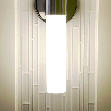
Detail of LED wall sconce with white glass tile background
Inspiration for a small contemporary kids' white tile and glass tile porcelain tile and gray floor alcove bathtub remodel in New York with flat-panel cabinets, dark wood cabinets, a two-piece toilet, green walls and an integrated sink
Inspiration for a small contemporary kids' white tile and glass tile porcelain tile and gray floor alcove bathtub remodel in New York with flat-panel cabinets, dark wood cabinets, a two-piece toilet, green walls and an integrated sink

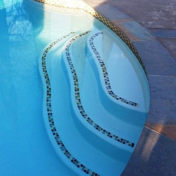
 Coral Pool's
Coral Pool and Spa
Hot tub - large contemporary backyard stamped concrete and custom-shaped natural hot tub idea in San Francisco
Hot tub - large contemporary backyard stamped concrete and custom-shaped natural hot tub idea in San Francisco

 Charlen's Abstracts
This 30" x 24" abstract acrylic painting has been done in shades of cobalt blue, sky blue, citrine, chartreuse, white, soft sea green, and royal blue. Finished in gloss varnish to protect the piece from dust and UV light for years to come. Can be hung vertically or horizontally. Gorgeous vivid rich colors in a great contemporary style.
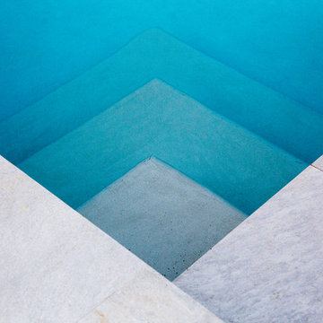

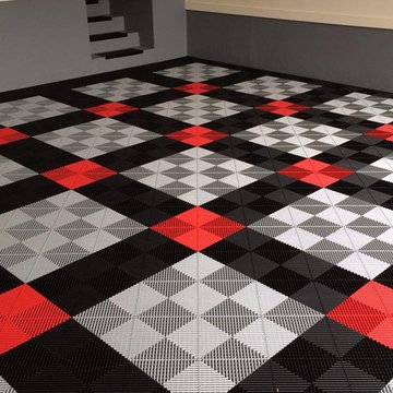

 McCullough's Flooring
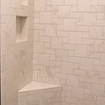
Example of a small classic white tile and subway tile pebble tile floor alcove shower design in St Louis with white walls
 threshold interiors
Location: New York, NY, United States
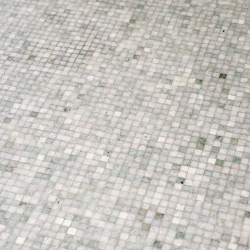
This Loft was tastefully renovated back in the '90s, but was due for an update and an expansion of the kitchen and dining areas to accommodate the client's cooking skills and entertaining needs. EnlargIing the island and adding cabinetry to delineate the office, bar and dining areas was a priority. The bathroom was updated to feel like a tranquil spa with beautiful new tile, plumbing fixtures and cabinets. Our biggest challenge was coordinating the entire renovation while our client was out of town for the Summer!
Photographed by: James Salomon

 User
UserDECO Window Fashions
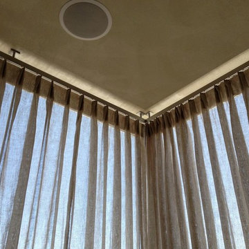
Sheer pleated custom made drapes, ceiling mount metal rod.
Trendy bedroom photo in Austin
Trendy bedroom photo in Austin
 LM // PM Productions, LLC
Large trendy gender-neutral light wood floor and beige floor playroom photo in New York with gray walls
18