
Search results for "Underlying issues" in Home Design Ideas
 McCabe By Design LLC
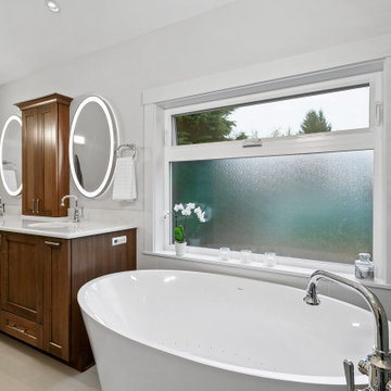
This bathroom was designed for two professionals who dedicate themselves to the health and wellness of others. The objective of the project was to be able to practice for themselves, what they preach to their patients.
The original 90” x 162” primary bathroom had so many pain points (would you to look at a toilet when taking a relaxing bath?), that it should have been an easy task to meet their needs and desires, but it was anything but due to structural issues with the home. Several design layouts were considered before it was concluded that the only approach to check the ‘needs’ boxes was to flip the primary fixtures in the room from one end of this long, narrow bathroom to the other and incorporating a wet room.
The needs list included a soaking tub, a spacious shower that accommodated dual showering on business workday morning, more counter space, a bidet toilet, more storage, better lighting, better heat and humidity control, a soothing color pallet and privacy from the neighbors.
An air jet soaking tub (motor concealed in the nearby vented base cabinet) under a new window with privacy glass on the bottom and a clear glass awning window on top checked two boxes. The center drain for the bathing features provides space for two people to shower simultaneously while highlighting the soothing color pallet from every view point in the room. The integrated bidet toilet is an affordable luxury that delivers health and wellness multiples times in a day. The expanded vanity optimized storage while providing more, clutter free countertop space. Utilizing a variety of lighting types, with dimmers, provides the right illumination for every bathroom activity. Lastly, the in-floor heat, toe-kick heater and relocated bathroom exhaust fan over the shower help maintain a consistently comfortable temperature and humidity level in this bathroom transformation.

 TOC design & construction inc.
Designed by: TOC design - Tania Scardellato
Construction by : TOC design & Construction inc.
Pictures by: Mathieu Laflamme
Patricia and David came to me with a dilemma, they could not sell their small home situated In the heart of Westmount. The ground floor was poorly divided, the kitchen was so small and closed in, every room on the ground floor felt like a small cave. So they made the right decision and turned to professionals.
When I first spoke with Patricia over the phone I immediately had great feeling about her and her lovely husband David.
This couple knew what they wanted, they were well informed and opened to ideas and suggestions.
I came up with 3 preliminaries and from there designed a forth. Once they saw my Renderings I could see that spark in their eyes, That’s when I knew that we were all on the same page.
The architectural drawings where completed as well as the millwork shop drawings.
The estimates where accurate and all materials choices fit perfectly with their style.
We began Construction mid February . Patricia and David left for Florida but I did not want to leave them with any surprises during the construction stage, We Skyped every week and although we had some structural, electrical and plumbing issues. The project advanced nicely. As the weeks came to an end I could see How happy they were.
WE completed this extensive renovation in 8 weeks on time and under budget.
A+ to the TOC design & Construction inc. team
Once Patricia and David settled into their new space and after I staged it for them, I asked, “ so are you still planning on moving?” to no surprise they are staying and loving there new renovated ground floor.
 McCabe By Design LLC
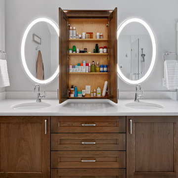
This bathroom was designed for two professionals who dedicate themselves to the health and wellness of others. The objective of the project was to be able to practice for themselves, what they preach to their patients.
The original 90” x 162” primary bathroom had so many pain points (would you to look at a toilet when taking a relaxing bath?), that it should have been an easy task to meet their needs and desires, but it was anything but due to structural issues with the home. Several design layouts were considered before it was concluded that the only approach to check the ‘needs’ boxes was to flip the primary fixtures in the room from one end of this long, narrow bathroom to the other and incorporating a wet room.
The needs list included a soaking tub, a spacious shower that accommodated dual showering on business workday morning, more counter space, a bidet toilet, more storage, better lighting, better heat and humidity control, a soothing color pallet and privacy from the neighbors.
An air jet soaking tub (motor concealed in the nearby vented base cabinet) under a new window with privacy glass on the bottom and a clear glass awning window on top checked two boxes. The center drain for the bathing features provides space for two people to shower simultaneously while highlighting the soothing color pallet from every view point in the room. The integrated bidet toilet is an affordable luxury that delivers health and wellness multiples times in a day. The expanded vanity optimized storage while providing more, clutter free countertop space. Utilizing a variety of lighting types, with dimmers, provides the right illumination for every bathroom activity. Lastly, the in-floor heat, toe-kick heater and relocated bathroom exhaust fan over the shower help maintain a consistently comfortable temperature and humidity level in this bathroom transformation.
Find the right local pro for your project

 INSPIRED KITCHEN DESIGN
According to Liz, the biggest obstacle was coming up with a layout that worked to meet her design wish list.
She explains: “The refrigerator used to open up next to the column. The area between the fridge and the column was the primary traffic pattern from the kitchen to the living room. When the fridge door was opened it would block that access path entirely.”
This also limited the style of refrigerator that would fit the space. For instance, a French Door refrigerator with freezer wasn’t an option because the freezer drawer wouldn’t open all the way. This is another reason she opted to keep her existing Whirlpool refrigerator.
“Correcting this traffic pattern was a big challenge for me,” she adds. “I actually spent years trying to figure out how to correct it. Plus, because the column was just sitting out in the middle of the room, it was very disconnected and detracted from the rest of the space.”
She adds that previously all of the counter space were literally swaths of counter every two feet or so. Not very conducive to food prep or work flow!
To remedy this, Liz had added an island cart years ago in the hopes of creating more space. However like the column, that too began to feel disconnected and not cohesive.
She explains: “We had to walk around it to get from the fridge to the pantry, oven, and stove. The pantry was also on the opposite side of the kitchen from the fridge and made meal preparation cumbersome.”
With IKD’s help, the solution presented itself.
She explains: “By moving the pantry next to the fridge and extending the corner and adding the peninsula, we gained large areas of counter space as well as correcting the cumbersome traffic pattern. Baking and meal prep is now so efficient! All of the food is right next to each other. We have dedicated baking and prep areas, and a dedicated cooking area. Previously all of the food, prep, and cooking was all broken up throughout the space.”
“As for installation, the only issue was that I gave an incorrect dimension to IKD on the location of the window over the sink. I ended up needing to get different dimension cabinets on both sides of the sink and window. Thankfully I noticed this at the very beginning and we were able to recover really easily from the mistake,” she concludes.

 User
UserOur approach to the dining room wall was a key decision for the entire project. The wall was load bearing and the homeowners considered only removing half of it. In the end, keeping the overall open concept design was important to the homeowners, therefore we installed a load bearing beam in the ceiling. The beam was finished with drywall to be cohesive so it looked like it was a part of the original design. Now that the kitchen and dining room were open, paint colors were used to designate the spaces and create visual boundaries. This made each area feel like it’s its own space without using any structures.
The original L-shaped kitchen was cut short because of bay windows that overlooked the backyard patio. These windows were lost in the space and not functional; they were replaced with double French doors leading onto the patio. A brick layer was brought in to patch up the window swap and now it looks like the French doors always existed. New crown molding was installed throughout and painted to match the kitchen cabinets.
This window/door replacement allowed for a large pantry cabinet to be installed next to the refrigerator which was not in the old cabinet configuration. The replaced perimeter cabinets host custom storage solutions, like a mixer stand, spice organization, recycling center and functional corner cabinet with pull out shelving. The perimeter kitchen cabinets are painted with a glaze and the island is a cherry stain with glaze to amplify the raised panel door style.
We tripled the size of the kitchen island to expand countertop space. It seats five people and hosts charging stations for the family’s busy lifestyle. It was important that the cooktop in the island had a built in downdraft system because the homeowners did not want a ventilation hood in the center of the kitchen because it would obscure the open concept design.
The countertops are quartz and feature an under mount granite composite kitchen sink with a low divide center. The kitchen faucet, which features hands free and touch technology, and an instant hot water dispenser were added for convenience because of the homeowners’ busy lifestyle. The backsplash is a favorite, with a teal and red glass mosaic basket weave design. It stands out and holds its own among the expansive kitchen cabinets.
All recessed, under cabinet and decorative lights were installed on dimmer switches to allow the homeowners to adjust the lighting in each space of the project. All exterior and interior door hardware, hinges and knobs were replaced in oil rubbed bronze to match the dark stain throughout the space. The entire first floor remodel project uses 12x24 ceramic tile laid in a herringbone pattern. Since tile is typically cold, the flooring was also heated from below. This will also help with the homeowners’ original heating issues.
When accessorizing the kitchen, we used functional, everyday items the homeowners use like cutting boards, canisters for dry goods and place settings on the island. Ultimately, this project transformed their small, outdated kitchen into an expansive and functional workspace.
 KitchenLab Interiors
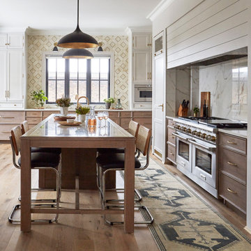
KitchenLab Interiors’ first, entirely new construction project in collaboration with GTH architects who designed the residence. KLI was responsible for all interior finishes, fixtures, furnishings, and design including the stairs, casework, interior doors, moldings and millwork. KLI also worked with the client on selecting the roof, exterior stucco and paint colors, stone, windows, and doors. The homeowners had purchased the existing home on a lakefront lot of the Valley Lo community in Glenview, thinking that it would be a gut renovation, but when they discovered a host of issues including mold, they decided to tear it down and start from scratch. The minute you look out the living room windows, you feel as though you're on a lakeside vacation in Wisconsin or Michigan. We wanted to help the homeowners achieve this feeling throughout the house - merging the causal vibe of a vacation home with the elegance desired for a primary residence. This project is unique and personal in many ways - Rebekah and the homeowner, Lorie, had grown up together in a small suburb of Columbus, Ohio. Lorie had been Rebekah's babysitter and was like an older sister growing up. They were both heavily influenced by the style of the late 70's and early 80's boho/hippy meets disco and 80's glam, and both credit their moms for an early interest in anything related to art, design, and style. One of the biggest challenges of doing a new construction project is that it takes so much longer to plan and execute and by the time tile and lighting is installed, you might be bored by the selections of feel like you've seen them everywhere already. “I really tried to pull myself, our team and the client away from the echo-chamber of Pinterest and Instagram. We fell in love with counter stools 3 years ago that I couldn't bring myself to pull the trigger on, thank god, because then they started showing up literally everywhere", Rebekah recalls. Lots of one of a kind vintage rugs and furnishings make the home feel less brand-spanking new. The best projects come from a team slightly outside their comfort zone. One of the funniest things Lorie says to Rebekah, "I gave you everything you wanted", which is pretty hilarious coming from a client to a designer.
 TKS Design Group
Download our free ebook, Creating the Ideal Kitchen. DOWNLOAD NOW
A tired primary bathroom, with varying ceiling heights and a beige-on-beige color scheme, was screaming for love. Squaring the room and adding natural materials erased the memory of the lack luster space and converted it to a bright and welcoming spa oasis. The home was a new build in 2005 and it looked like all the builder’s material choices remained. The client was clear on their design direction but were challenged by the differing ceiling heights and were looking to hire a design-build firm that could resolve that issue.
This local Glen Ellyn couple found us on Instagram (@kitchenstudioge, follow us ?). They loved our designs and felt like we fit their style. They requested a full primary bath renovation to include a large shower, soaking tub, double vanity with storage options, and heated floors. The wife also really wanted a separate make-up vanity. The biggest challenge presented to us was to architecturally marry the various ceiling heights and deliver a streamlined design.
The existing layout worked well for the couple, so we kept everything in place, except we enlarged the shower and replaced the built-in tub with a lovely free-standing model. We also added a sitting make-up vanity. We were able to eliminate the awkward ceiling lines by extending all the walls to the highest level. Then, to accommodate the sprinklers and HVAC, lowered the ceiling height over the entrance and shower area which then opens to the 2-story vanity and tub area. Very dramatic!
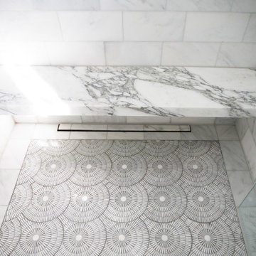
This high-end home deserved high-end fixtures. The homeowners also quickly realized they loved the look of natural marble and wanted to use as much of it as possible in their new bath. They chose a marble slab from the stone yard for the countertops and back splash, and we found complimentary marble tile for the shower. The homeowners also liked the idea of mixing metals in their new posh bathroom and loved the look of black, gold, and chrome.
Although our clients were very clear on their style, they were having a difficult time pulling it all together and envisioning the final product. As interior designers it is our job to translate and elevate our clients’ ideas into a deliverable design. We presented the homeowners with mood boards and 3D renderings of our modern, clean, white marble design. Since the color scheme was relatively neutral, at the homeowner’s request, we decided to add of interest with the patterns and shapes in the room.
We were first inspired by the shower floor tile with its circular/linear motif. We designed the cabinetry, floor and wall tiles, mirrors, cabinet pulls, and wainscoting to have a square or rectangular shape, and then to create interest we added perfectly placed circles to contrast with the rectangular shapes. The globe shaped chandelier against the square wall trim is a delightful yet subtle juxtaposition.
The clients were overjoyed with our interpretation of their vision and impressed with the level of detail we brought to the project. It’s one thing to know how you want a space to look, but it takes a special set of skills to create the design and see it thorough to implementation. Could hiring The Kitchen Studio be the first step to making your home dreams come to life?


 Bridgewater
The new owners were looking forward to living in their new home with an open floor plan, tall vaulted ceilings, and great views. It featured a large Great Room with two big French Doors separating the Dining Room from the Master Bedroom.
But after only a few months they identified a major design flaw: Each of the French Doors had ten glass windows with two large windows above each door. (Check out our before and after designs, traffic flow diagrams and photos of this project.) Glass windows and doors allowed sound and light from guests or the TV in the great room to easily sneak into the bedroom. With unique work and sleep schedules (he’s a pilot, she’s a registered nurse) this design wasn’t working.
Then there was a traffic flow design flaw: The Master Bedroom had a second entrance from a hallway. To get into the bedroom from the hallway you needed to walk down another claustrophobic hallway.
To get from the Master Bedroom to the Master Bath begin at the most remote corner of the bedroom and down a hallway between two closets. Once inside the bath, a huge triangular Jacuzzi dominating the space.
So, from a privacy and traffic flow perspective, this home had some major design issues.
When Craig Weber first met with the owners, he listened to their ideas and concerns. The owners trusted Craig to come up with the most efficient and most effective solution to this design dilemma. He offered a solution that resolved the bed-bath traffic flow problem, offered some bedroom room privacy, and updated the bath.
First, the two French Doors and windows were removed. A new wall was built with sound-absorbing materials, making the Great Room and Dining Room more comfortable spaces for entertaining while creating the bedroom privacy the owners craved.
Solving the Bedroom/Bath traffic flow problem began with removing the two existing closets. The bath door was relocated next to the hall entrance, and then a new walk-in closet was added adjacent to the hallway entrance. The solution offered easy access to and from the bath, closet and hallway without a hint of claustrophobia.
The Master Bath underwent a major transformation designed for convenience and comfort – especially during long, cold Minnesota winters.
Most everything from the former bath was torn out, beginning with the giant Jacuzzi.
A new bathtub that is wider and deeper than the standard size was installed with brushed Nickel fixtures. It’s the perfect place to relax with a glass of wine and candles.
Warm floors are a Minnesota “must have.” The bath’s new ceramic floor features in-floor electric heat. Getting in and out of the tub is easy and comfortable.
The new walk-in shower again features in-floor heating and a place to sit. The most interesting feature of this shower may the custom ceramic tile installed with unique patterns.
A new vanity Cambria Bradshaw countertops features two under-hung ceramic sinks with matching brushed Nickel fixtures.
Tall ceilings and three glass windows near the ceiling flood the room with natural light. A new energy-efficient window frames an ornamental stained glass window created by the owner’s father – a great personal touch.
A quiet place to sleep. A private dining room for entertaining. A Master Bath to die for. And easy traffic flow. The owners couldn’t have been more delighted with the outcome. And Lilly, their cat, loves it too.
 Atlas Roofing - Shingles
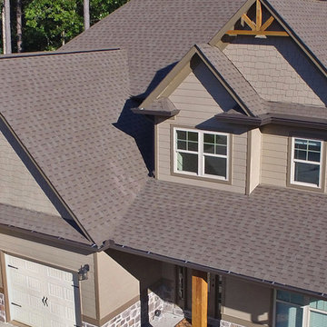
A roof is a very important, as well as expensive, feature of your home. Maintaining your roof is one of the best ways to protect you, your family and all you keep under that roof. Atlas Protects™ is more than a slogan as the company, with decades of experience, has the products and advice to help you reduce roof maintenance.
Atlas Roofing StormMaster® Slate and Shake shingles have high performance features that can help resist the many hazards that a roof can face each year. This strength means you, the homeowner, may face fewer maintenance issues.
Master The Storms
Underwriter’s Laboratory, UL 2218 is a national standard rating system for impact resistance that rates roofing materials from Class 1 through 4. A Class 4 rating indicates the highest level of impact resistance. Atlas StormMaster® Shake and StormMaster® Slate shingles have both earned Class 4 ratings. These shingles are strong enough to earn the Class 4 rating because they are manufactured with Styrene Butadiene Styrene (SBS), a rubberized polymer that gives them incredible flexibility and durability. The rubber-like quality gives StormMaster® shingles the highest protection against impact from hail, which can fracture shingles.
StormMaster® shingles are also high wind-rated which helps resist blown off shingles. Loss of shingles due to high velocity wind could lead to wind-driven rain flooding a house. StormMaster® Slate and Shake come with a Limited Wind Warranty that protects a roof up to 130 mph.
Black streaks on a roof not only look dirty, but also make a house appear old and reduce its curb appeal. Black streaks are the result of algae growth. Atlas StormMaster® shingles are built with the power of Scotchgard™ Protector, which helps a roof retain its color for years by resisting those black streaks. Atlas certifies this by having regular third-party laboratory testing to ensure an even spread of the Scotchgard™ protective copper granules. Both lines of StormMaster® are backed by an Atlas Lifetime Limited Warranty against the black streaks caused by algae.
The Final Word In Warranties
StormMaster® shingles are warranted against manufacturing defects with the exclusive Atlas Lifetime Limited Warranty for 20 years. That is the length of the Premium Protection Period for the initial non-prorated labor and material coverage of every new StormMaster® Slate roof installed with the Atlas Signature Select® System.
StormMaster® shingles give a house what it needs most; an incredibly impressive appearance and security that shelters everything and everyone under the roof. Read more about the full line of StormMaster® shingles.

 GMI Design Group
This dark, dreary kitchen was large, but not being used well. The family of 7 had outgrown the limited storage and experienced traffic bottlenecks when in the kitchen together. A bright, cheerful and more functional kitchen was desired, as well as a new pantry space.
We gutted the kitchen and closed off the landing through the door to the garage to create a new pantry. A frosted glass pocket door eliminates door swing issues. In the pantry, a small access door opens to the garage so groceries can be loaded easily. Grey wood-look tile was laid everywhere.
We replaced the small window and added a 6’x4’ window, instantly adding tons of natural light. A modern motorized sheer roller shade helps control early morning glare. Three free-floating shelves are to the right of the window for favorite décor and collectables.
White, ceiling-height cabinets surround the room. The full-overlay doors keep the look seamless. Double dishwashers, double ovens and a double refrigerator are essentials for this busy, large family. An induction cooktop was chosen for energy efficiency, child safety, and reliability in cooking. An appliance garage and a mixer lift house the much-used small appliances.
An ice maker and beverage center were added to the side wall cabinet bank. The microwave and TV are hidden but have easy access.
The inspiration for the room was an exclusive glass mosaic tile. The large island is a glossy classic blue. White quartz countertops feature small flecks of silver. Plus, the stainless metal accent was even added to the toe kick!
Upper cabinet, under-cabinet and pendant ambient lighting, all on dimmers, was added and every light (even ceiling lights) is LED for energy efficiency.
White-on-white modern counter stools are easy to clean. Plus, throughout the room, strategically placed USB outlets give tidy charging options.
 GMI Design Group
This dark, dreary kitchen was large, but not being used well. The family of 7 had outgrown the limited storage and experienced traffic bottlenecks when in the kitchen together. A bright, cheerful and more functional kitchen was desired, as well as a new pantry space.
We gutted the kitchen and closed off the landing through the door to the garage to create a new pantry. A frosted glass pocket door eliminates door swing issues. In the pantry, a small access door opens to the garage so groceries can be loaded easily. Grey wood-look tile was laid everywhere.
We replaced the small window and added a 6’x4’ window, instantly adding tons of natural light. A modern motorized sheer roller shade helps control early morning glare. Three free-floating shelves are to the right of the window for favorite décor and collectables.
White, ceiling-height cabinets surround the room. The full-overlay doors keep the look seamless. Double dishwashers, double ovens and a double refrigerator are essentials for this busy, large family. An induction cooktop was chosen for energy efficiency, child safety, and reliability in cooking. An appliance garage and a mixer lift house the much-used small appliances.
An ice maker and beverage center were added to the side wall cabinet bank. The microwave and TV are hidden but have easy access.
The inspiration for the room was an exclusive glass mosaic tile. The large island is a glossy classic blue. White quartz countertops feature small flecks of silver. Plus, the stainless metal accent was even added to the toe kick!
Upper cabinet, under-cabinet and pendant ambient lighting, all on dimmers, was added and every light (even ceiling lights) is LED for energy efficiency.
White-on-white modern counter stools are easy to clean. Plus, throughout the room, strategically placed USB outlets give tidy charging options.
 TOC design & construction inc.
Designed by: TOC design - Tania Scardellato
Construction by : TOC design & Construction inc.
Pictures by: Mathieu Laflamme
Patricia and David came to me with a dilemma, they could not sell their small home situated In the heart of Westmount. The ground floor was poorly divided, the kitchen was so small and closed in, every room on the ground floor felt like a small cave. So they made the right decision and turned to professionals.
When I first spoke with Patricia over the phone I immediately had great feeling about her and her lovely husband David.
This couple knew what they wanted, they were well informed and opened to ideas and suggestions.
I came up with 3 preliminaries and from there designed a forth. Once they saw my Renderings I could see that spark in their eyes, That’s when I knew that we were all on the same page.
The architectural drawings where completed as well as the millwork shop drawings.
The estimates where accurate and all materials choices fit perfectly with their style.
We began Construction mid February . Patricia and David left for Florida but I did not want to leave them with any surprises during the construction stage, We Skyped every week and although we had some structural, electrical and plumbing issues. The project advanced nicely. As the weeks came to an end I could see How happy they were.
WE completed this extensive renovation in 8 weeks on time and under budget.
A+ to the TOC design & Construction inc. team
Once Patricia and David settled into their new space and after I staged it for them, I asked, “ so are you still planning on moving?” to no surprise they are staying and loving there new renovated ground floor.
 Reilly's Contracting
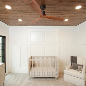
Inspiration for a transitional gender-neutral carpeted and shiplap ceiling nursery remodel in Kansas City with white walls
Sponsored
Columbus, OH

Hope Restoration & General Contracting
Columbus Design-Build, Kitchen & Bath Remodeling, Historic Renovations
 GMI Design Group
This dark, dreary kitchen was large, but not being used well. The family of 7 had outgrown the limited storage and experienced traffic bottlenecks when in the kitchen together. A bright, cheerful and more functional kitchen was desired, as well as a new pantry space.
We gutted the kitchen and closed off the landing through the door to the garage to create a new pantry. A frosted glass pocket door eliminates door swing issues. In the pantry, a small access door opens to the garage so groceries can be loaded easily. Grey wood-look tile was laid everywhere.
We replaced the small window and added a 6’x4’ window, instantly adding tons of natural light. A modern motorized sheer roller shade helps control early morning glare. Three free-floating shelves are to the right of the window for favorite décor and collectables.
White, ceiling-height cabinets surround the room. The full-overlay doors keep the look seamless. Double dishwashers, double ovens and a double refrigerator are essentials for this busy, large family. An induction cooktop was chosen for energy efficiency, child safety, and reliability in cooking. An appliance garage and a mixer lift house the much-used small appliances.
An ice maker and beverage center were added to the side wall cabinet bank. The microwave and TV are hidden but have easy access.
The inspiration for the room was an exclusive glass mosaic tile. The large island is a glossy classic blue. White quartz countertops feature small flecks of silver. Plus, the stainless metal accent was even added to the toe kick!
Upper cabinet, under-cabinet and pendant ambient lighting, all on dimmers, was added and every light (even ceiling lights) is LED for energy efficiency.
White-on-white modern counter stools are easy to clean. Plus, throughout the room, strategically placed USB outlets give tidy charging options.

 Progressive Design Build
In less than 90 days after work began, a dated kitchen is brought back to life with current trends and technologies, along with a neutral color palette.
Introduced to Progressive Design Build from a trusted referral, Mike and Holly approached their kitchen remodel with some trepidation. They had interviewed several contractors who were unsuccessful at solving key traffic flow issues around an island cabinet they wanted—until they met Progressive.
As restaurant owners, the husband and wife team were very familiar with remodeling contractors, having renovated many restaurants in the past. Design/build remodeling, however, was new to them. After learning more about the benefits of working with a design/build firm, Mike and Holly met with Progressive’s certified kitchen and bath designer, Betty Appleby. They understood immediately the value of teaming up with design and construction professionals early in the process.
Mike and Holly had done a lot of their own research and were clear about what they wanted. They had visions of an island cabinet being more usable and accessible. Progressive Design Build brought that vision to life.
While the project was under construction, the homeowners avoided the noise and dust by taking frequent trips to Europe and New York, trusting the entire remodeling project to Progressive Design Build. When they returned, all aspects of their functional and stylistic design needs were met.
Details of the finished project include a faux finish copper range hood, custom cabinetry, new stainless steel appliances, granite countertops, a new wet bar adjacent to the kitchen, and porcelain tile flooring throughout. The refrigerator was disguised using custom cabinet appliance panels, effectively integrating it with the cabinetry wall for a unified look.
This project was completed on time and on budget. As a result, the homeowners hired Progressive Design Build to complete two more home remodeling projects for them.

 Falling Waters Landscape
Photo Cred. Dustin Ortiz
This is an example of a small tropical partial sun front yard concrete paver driveway in San Diego for spring.
This is an example of a small tropical partial sun front yard concrete paver driveway in San Diego for spring.
 GMI Design Group
This dark, dreary kitchen was large, but not being used well. The family of 7 had outgrown the limited storage and experienced traffic bottlenecks when in the kitchen together. A bright, cheerful and more functional kitchen was desired, as well as a new pantry space.
We gutted the kitchen and closed off the landing through the door to the garage to create a new pantry. A frosted glass pocket door eliminates door swing issues. In the pantry, a small access door opens to the garage so groceries can be loaded easily. Grey wood-look tile was laid everywhere.
We replaced the small window and added a 6’x4’ window, instantly adding tons of natural light. A modern motorized sheer roller shade helps control early morning glare. Three free-floating shelves are to the right of the window for favorite décor and collectables.
White, ceiling-height cabinets surround the room. The full-overlay doors keep the look seamless. Double dishwashers, double ovens and a double refrigerator are essentials for this busy, large family. An induction cooktop was chosen for energy efficiency, child safety, and reliability in cooking. An appliance garage and a mixer lift house the much-used small appliances.
An ice maker and beverage center were added to the side wall cabinet bank. The microwave and TV are hidden but have easy access.
The inspiration for the room was an exclusive glass mosaic tile. The large island is a glossy classic blue. White quartz countertops feature small flecks of silver. Plus, the stainless metal accent was even added to the toe kick!
Upper cabinet, under-cabinet and pendant ambient lighting, all on dimmers, was added and every light (even ceiling lights) is LED for energy efficiency.
White-on-white modern counter stools are easy to clean. Plus, throughout the room, strategically placed USB outlets give tidy charging options.

Sponsored
Columbus, OH
Free consultation for landscape design!

Peabody Landscape Group
Columbus' Reliable Landscape Design & Contracting
 GMI Design Group
This dark, dreary kitchen was large, but not being used well. The family of 7 had outgrown the limited storage and experienced traffic bottlenecks when in the kitchen together. A bright, cheerful and more functional kitchen was desired, as well as a new pantry space.
We gutted the kitchen and closed off the landing through the door to the garage to create a new pantry. A frosted glass pocket door eliminates door swing issues. In the pantry, a small access door opens to the garage so groceries can be loaded easily. Grey wood-look tile was laid everywhere.
We replaced the small window and added a 6’x4’ window, instantly adding tons of natural light. A modern motorized sheer roller shade helps control early morning glare. Three free-floating shelves are to the right of the window for favorite décor and collectables.
White, ceiling-height cabinets surround the room. The full-overlay doors keep the look seamless. Double dishwashers, double ovens and a double refrigerator are essentials for this busy, large family. An induction cooktop was chosen for energy efficiency, child safety, and reliability in cooking. An appliance garage and a mixer lift house the much-used small appliances.
An ice maker and beverage center were added to the side wall cabinet bank. The microwave and TV are hidden but have easy access.
The inspiration for the room was an exclusive glass mosaic tile. The large island is a glossy classic blue. White quartz countertops feature small flecks of silver. Plus, the stainless metal accent was even added to the toe kick!
Upper cabinet, under-cabinet and pendant ambient lighting, all on dimmers, was added and every light (even ceiling lights) is LED for energy efficiency.
White-on-white modern counter stools are easy to clean. Plus, throughout the room, strategically placed USB outlets give tidy charging options.
 TOC design & construction inc.
Designed by: TOC design - Tania Scardellato
Construction by : TOC design & Construction inc.
Pictures by: Mathieu Laflamme
Patricia and David came to me with a dilemma, they could not sell their small home situated In the heart of Westmount. The ground floor was poorly divided, the kitchen was so small and closed in, every room on the ground floor felt like a small cave. So they made the right decision and turned to professionals.
When I first spoke with Patricia over the phone I immediately had great feeling about her and her lovely husband David.
This couple knew what they wanted, they were well informed and opened to ideas and suggestions.
I came up with 3 preliminaries and from there designed a forth. Once they saw my Renderings I could see that spark in their eyes, That’s when I knew that we were all on the same page.
The architectural drawings where completed as well as the millwork shop drawings.
The estimates where accurate and all materials choices fit perfectly with their style.
We began Construction mid February . Patricia and David left for Florida but I did not want to leave them with any surprises during the construction stage, We Skyped every week and although we had some structural, electrical and plumbing issues. The project advanced nicely. As the weeks came to an end I could see How happy they were.
WE completed this extensive renovation in 8 weeks on time and under budget.
A+ to the TOC design & Construction inc. team
Once Patricia and David settled into their new space and after I staged it for them, I asked, “ so are you still planning on moving?” to no surprise they are staying and loving there new renovated ground floor.
 TKS Design Group
Free ebook, Creating the Ideal Kitchen. DOWNLOAD NOW
Working with this Glen Ellyn client was so much fun the first time around, we were thrilled when they called to say they were considering moving across town and might need some help with a bit of design work at the new house.
The kitchen in the new house had been recently renovated, but it was not exactly what they wanted. What started out as a few tweaks led to a pretty big overhaul of the kitchen, mudroom and laundry room. Luckily, we were able to use re-purpose the old kitchen cabinetry and custom island in the remodeling of the new laundry room — win-win!
As parents of two young girls, it was important for the homeowners to have a spot to store equipment, coats and all the “behind the scenes” necessities away from the main part of the house which is a large open floor plan. The existing basement mudroom and laundry room had great bones and both rooms were very large.
To make the space more livable and comfortable, we laid slate tile on the floor and added a built-in desk area, coat/boot area and some additional tall storage. We also reworked the staircase, added a new stair runner, gave a facelift to the walk-in closet at the foot of the stairs, and built a coat closet. The end result is a multi-functional, large comfortable room to come home to!
Just beyond the mudroom is the new laundry room where we re-used the cabinets and island from the original kitchen. The new laundry room also features a small powder room that used to be just a toilet in the middle of the room.
You can see the island from the old kitchen that has been repurposed for a laundry folding table. The other countertops are maple butcherblock, and the gold accents from the other rooms are carried through into this room. We were also excited to unearth an existing window and bring some light into the room.
Designed by: Susan Klimala, CKD, CBD
Photography by: Michael Alan Kaskel
For more information on kitchen and bath design ideas go to: www.kitchenstudio-ge.com
63