
Search results for "Understood" in Home Design Ideas
 Restoration Coston
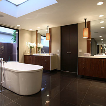
Stan Sachley design circa "1980" The architect clearly understood the proper use of space and light, while still respecting earlier mid-century desert architecture. The floors were kept clean and polished, as not to compete with the existing split travertine which ran through glass walls. This effect, blurred the indoor/outdoor living spaces. Finishes selected, were chosen to highlight a more refined and modern environment.
 Arielle Mizrahi Design
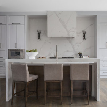
Kitchen - contemporary l-shaped dark wood floor and brown floor kitchen idea in New York with shaker cabinets, white cabinets, white backsplash, stone slab backsplash, stainless steel appliances, an island and white countertops
 Jennifer Butler Design
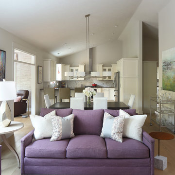
The true volume of this space is understood when you see how it expands into itself, the singular color enhancing the various edges and forms without jarring the eye (as with most color changes from walls to ceilings). The relatively neutral pallet is enlivened with purple sofas and colorful original art.
Photo by David Sparks
Find the right local pro for your project
 Advance Design Studio, Ltd.
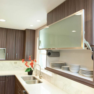
This clean cut kitchen stemmed from the design challenge to place a contemporary kitchen in a traditional Tudor style house in the Northwest Suburbs of Chicago. Our client was a self-described city person living in the country - who wanted an urban contemporary feeling incorporated into her home. She says she waited many years to find the right design team who understood her vision!
Not wanting to ignore the beautiful 50 year old oaks outside her window, Advance Design transformed her traditional kitchen into an urban kitchen utopia with the use of texture and earthy finishes keeping with the feel of the existing home. Dura Supreme Bria frameless cabinets with a soft pillowed door works to incorporate a woodsy feel in shades of grey textured foil appropriately called “Twig”. Aluminum framed opaque glass doors are hinged with a lift up Aventos hinge for a contemporary twist and a super-functional opening. Brushed nickel hardware in various sizes keeps with the clean line feel.
To keep the design organic and “fit it in” with the rest of the house, we covered the floor with a natural looking travertine porcelain laid on a 45 degree angle simulating a more traditional feel in a neutral tone of silvery-brown. The backsplash is clean and crisp with large Carrera marble tiles in a brick pattern, and a splash of energy from a vertical marble and glass mosaic accent. We then finished off the look with clean Cambria Torquay countertops portraying minimal patterning to keep the work surfaces feeling uncluttered and open.
Other areas of the home were addressed to “blend” the style in with lightly distressed grey tone hardwood floors and a “matching” renovated powder room displaying contemporary features to compliment the nearby kitchen’s style.
Photo Credits- Joe Nowak
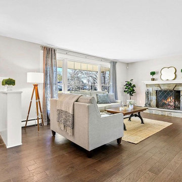
 Fresh Designs Home Staging & Interiors
Without staging, buyers would not have understood how large and functional this family room off the entrance truly is! Large, functional, pretty and inviting for family and guests!
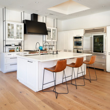
 Smith & Ragsdale Interior Design
As young professionals with a growing family, our clients came to us seeking a unique and efficient kitchen design that would enrich their daily living experiences. From the moment we met, we understood that togetherness was their ultimate goal. We opened walls and focused on an efficient space plan with high-level appliances to truly simplify the meal-making process.
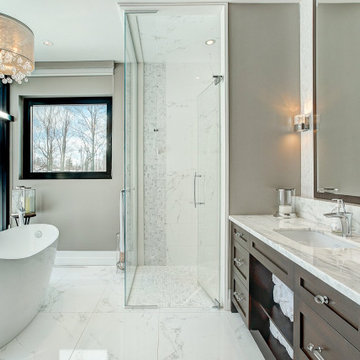
 BONE Structure
From the start, we were pleased with the warm welcome and professionalism of the BONE Structure team. We have been very satisfied of our BONE experience. Available and creative, the team has been very responsive to our needs and requests.
The schedule was respected and the structure was assembled in record time. The complete construction of our home took less than 4 months and the different tradesmen rapidly understood how efficient their work became with the steel structure with pre-cut openings to receive their materials, like plumbing, electricity, etc. After a full year in our new home, we are able to testify to its strength and energy saving qualities. Nothing has moved, no cracks or construction issues.
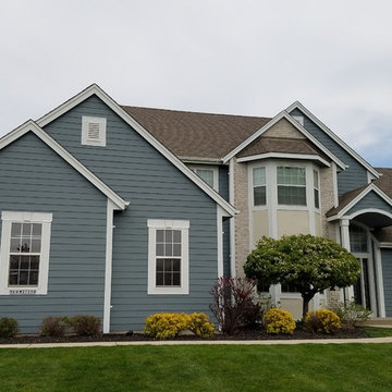
 Carl's Painting Service INC
We are so thankful that Vicki Carl helped us select our colors for exterior paint. We really wanted to have a new look, but lacked the knowledge about color to even know where to begin. Vicki really listened and understood our desire for change but also stayed true to the look of the home. It turned out amazing! We truly feel like we have a new house. Friends have been shocked (and impressed) with the before and after photos. We could not be happier with the finished product!
 Risa Boyer Architecture
Photo Credits: Marshall Steeves
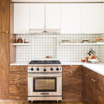
Mid-sized trendy galley light wood floor and brown floor eat-in kitchen photo in Portland with an undermount sink, flat-panel cabinets, medium tone wood cabinets, quartz countertops, white backsplash, ceramic backsplash, stainless steel appliances, an island and white countertops
Mid-sized trendy galley light wood floor and brown floor eat-in kitchen photo in Portland with an undermount sink, flat-panel cabinets, medium tone wood cabinets, quartz countertops, white backsplash, ceramic backsplash, stainless steel appliances, an island and white countertops
 ODS Architecture
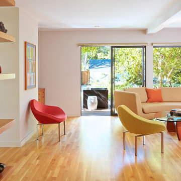
Located in Menlo Park, California, this 3,000 sf. remodel was carefully crafted to generate excitement and make maximum use of the owner’s strict budget and comply with the city’s stringent planning code. It was understood that not everything was to be redone from a prior owner’s quirky remodel which included odd inward angled walls, circular windows and cedar shingles.
Remedial work to remove and prevent dry rot ate into the budget as well. Studied alterations to the exterior include a new trellis over the garage door, pushing the entry out to create a new soaring stair hall and stripping the exterior down to simplify its appearance. The new steel entry stair leads to a floating bookcase that pivots to the family room. For budget reasons, it was decided to keep the existing cedar shingles.
Upstairs, a large oak multi-level staircase was replaced with the new simple run of stairs. The impact of angled bedroom walls and circular window in the bathroom were calmed with new clean white walls and tile.
Photo Credit: John Sutton Photography.
 Clare Sells Homes, Inc.
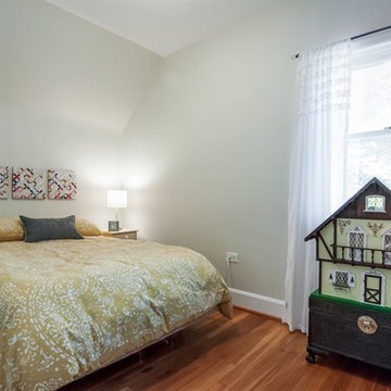
all bedrooms were painted the same light gray/green color which reads differently depending on exposure, bedding and accessories. Seller was very nervous would be too blah but understood the necessity of versatility.
 Clare Sells Homes, Inc.
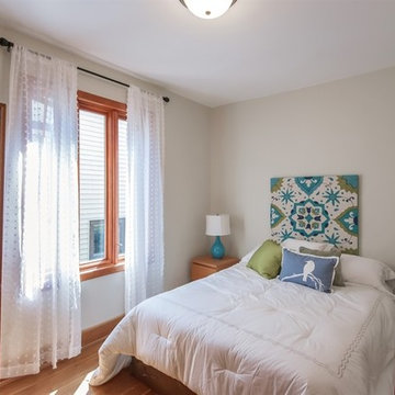
all bedrooms were painted the same light gray/green color which reads differently depending on exposure, bedding and accessories. Seller was very nervous would be too blah but understood the necessity of versatility.
 Smith & Ragsdale Interior Design
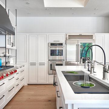
As young professionals with a growing family, our clients came to us seeking a unique and efficient kitchen design that would enrich their daily living experiences. From the moment we met, we understood that togetherness was their ultimate goal. We opened walls and focused on an efficient space plan with high-level appliances to truly simplify the meal-making process.
 Fresh Designs Home Staging & Interiors
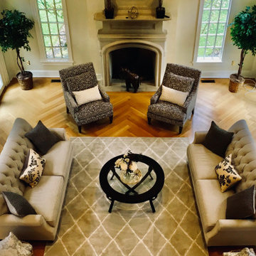
The large expanse of this beautiful but previously vacant Chester Springs home left buyers confused as to where furniture could be placed. Once staged, buyers quickly understood all the rooms and offers came rolling in!
 CRAFT Artisan Wood Floors
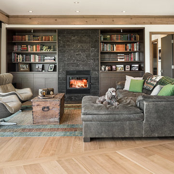
Allan has used hardwood floors in every house he has created. He notes hardwood floors are becoming more popular. He likes to focus on natural, superior, long lasting materials for all parts of the construction of his houses. His clients have understood the value of enduring materials in the kind of projects he has been fortunate to have.
Allan specifies CRAFT floors to solve some of the most common concerns in flooring selection. This includes access to interesting and unique floors of lasting quality (solid core components and longer lengths are key), responsibly sourced materials, and a reliable advanced construction that performs in any home environment including being radiant heat compatible.
 Interiors by Maite Granda
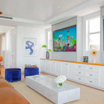
The client was referred to us by the builder to build a vacation home where the family mobile home used to be. Together, we visited Key Largo and once there we understood that the most important thing was to incorporate nature and the sea inside the house. A meeting with the architect took place after and we made a few suggestions that it was taking into consideration as to change the fixed balcony doors by accordion doors or better known as NANA Walls, this detail would bring the ocean inside from the very first moment you walk into the house as if you were traveling in a cruise.
A client's request from the very first day was to have two televisions in the main room, at first I did hesitate about it but then I understood perfectly the purpose and we were fascinated with the final results, it is really impressive!!! and he does not miss any football games, while their children can choose their favorite programs or games. An easy solution to modern times for families to share various interest and time together.
Our purpose from the very first day was to design a more sophisticate style Florida Keys home with a happy vibe for the entire family to enjoy vacationing at a place that had so many good memories for our client and the future generation.
Architecture Photographer : Mattia Bettinelli
 Duradek
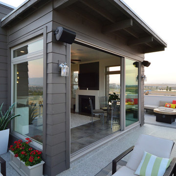
While other builders sometimes shy away from these forward-thinking designs, the Utah builder was able to confidently proceed. Having worked with Duradek of Utah previously, they understood the Duradek system and how it is incorporated into the building envelope protecting common points of vulnerability.
This trust in the Duradek system and in Duradek of Utah was paramount in their ability to plan for luxurious roof decks.
 Norris Architects, Inc.
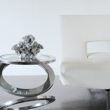
Seen by many and understood by few; The mixing of the obscure with the familiar in this living room evokes an exclusively esoteric feeling.
Mid-sized trendy open concept concrete floor family room photo in Phoenix with yellow walls and a media wall
Mid-sized trendy open concept concrete floor family room photo in Phoenix with yellow walls and a media wall
 Tiffany Brooks, HGTV Host & Interior Designer
Inquire About Our Design Services
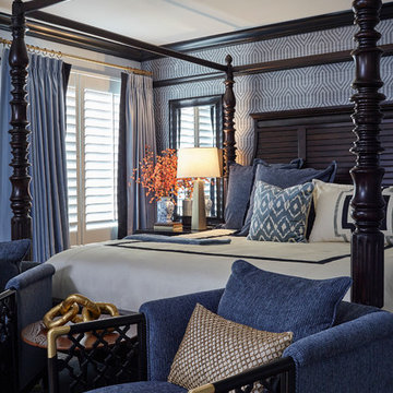
When we first started talking in the spring of 2015, I was impressed. She was witty, realistic, and understood that as much as she loves my shows on HGTV, design does not does not happen in 43 minutes! She told me about her space, and how she felt that her bedroom seemed “blah” to her. She had no retreat. Molly desperately longed for a place that she could spend time in, read in, play in and above all, relax in.
What we did:
Many people are terrified of hiring a designer. Rightfully so, they are investing a pretty penny in their homes. They want to make sure that everything, down to the last floral arrangement, is to their liking, because they will have to live it (and pay for it). Unfortunately, a client can unintentionally stifle a designer’s creativity through micro-management. This can produce lackluster results and ultimately cause more time (and money) to be spent on a project than is really necessary.
With Molly, that was never an issue. Before she even showed me the room in question, she said that I could have full creative license to do what I needed to do to her bedroom. SAY WHAAH!?
With Molly giving me complete creative freedom, I planned everything out and got down to business. The result: Bite-your-bottom-lip sexy. I don’t get jealous of too many of my clients’ spaces, but this one still takes my breath away every time I look at the pics!
The craziest part was that by adding more furniture, it actually made the space feel larger.
Molly and her husband Patrick loved the finished space, and promised me I will be back to finish the rest of the house!
Here’s the highlights of the rest of the project:
I came up with a space plan with three options.
Next, we reviewed mood boards and fabric schemes that would work for both Molly and her hubby Patrick.
We started with the bed. My goal was to add edge to its otherwise traditional style.
We decided to spice things up by painting the trim work in the room black.
We built in layers of lighting with dimmers. In a bedroom everything should be on dimmers, right? Right.
We designed and customized bedding, chairs and window treatments.
Together with Molly, we selected the most perfect wallpaper. This geometric “grasscloth” adds so much depth and dimension that was just missing before.
What I love:
That light fixture. I mean it is really, really amazing in person.
The porcupine mirror. This thing came packaged like it was the hope diamond, and everyone was terrified to handle it. But it really became a highlight of the room.
 41 West
Here's what our clients from this project had to say:
We LOVE coming home to our newly remodeled and beautiful 41 West designed and built home! It was such a pleasure working with BJ Barone and especially Paul Widhalm and the entire 41 West team. Everyone in the organization is incredibly professional and extremely responsive. Personal service and strong attention to the client and details are hallmarks of the 41 West construction experience. Paul was with us every step of the way as was Ed Jordon (Gary David Designs), a 41 West highly recommended designer. When we were looking to build our dream home, we needed a builder who listened and understood how to bring our ideas and dreams to life. They succeeded this with the utmost honesty, integrity and quality!
41 West has exceeded our expectations every step of the way, and we have been overwhelmingly impressed in all aspects of the project. It has been an absolute pleasure working with such devoted, conscientious, professionals with expertise in their specific fields. Paul sets the tone for excellence and this level of dedication carries through the project. We so appreciated their commitment to perfection...So much so that we also hired them for two more remodeling projects.
We love our home and would highly recommend 41 West to anyone considering building or remodeling a home.
10