
Search results for "Unique patterns" in Home Design Ideas
 Unique Design Solutions, LLC
The Thompson Family
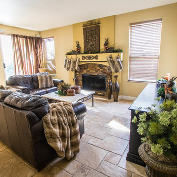
Example of a mid-sized mountain style open concept travertine floor living room design in Los Angeles with beige walls, a standard fireplace, a stone fireplace and a wall-mounted tv
Example of a mid-sized mountain style open concept travertine floor living room design in Los Angeles with beige walls, a standard fireplace, a stone fireplace and a wall-mounted tv

 Peltier Interiors
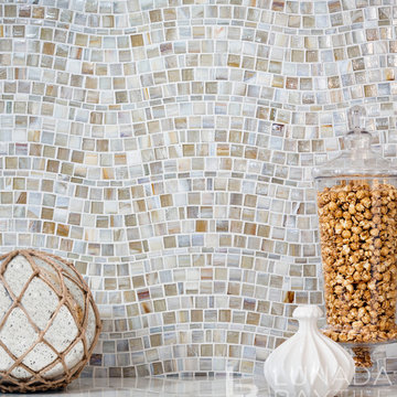
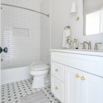
This farmhouse designed by our Virginia interior design studio showcases custom, traditional style with modern accents. The laundry room was given an interesting interplay of patterns and texture with a grey mosaic tile backsplash and printed tiled flooring. The dark cabinetry provides adequate storage and style. All the bathrooms are bathed in light palettes with hints of coastal color, while the mudroom features a grey and wood palette with practical built-in cabinets and cubbies. The kitchen is all about sleek elegance with a light palette and oversized pendants with metal accents.
---
Project designed by Vienna interior design studio Amy Peltier Interior Design & Home. They serve Mclean, Vienna, Bethesda, DC, Potomac, Great Falls, Chevy Chase, Rockville, Oakton, Alexandria, and the surrounding area.
---
For more about Amy Peltier Interior Design & Home, click here: https://peltierinteriors.com/
To learn more about this project, click here:
https://peltierinteriors.com/portfolio/vienna-interior-modern-farmhouse/
Find the right local pro for your project
 Couture Window Fashions
Minimal Style
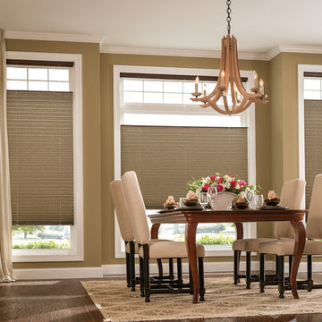
The different styles of modern taste Couture has designed various styles that meet today’s tastes, which are all capable of effectively satisfying the different needs for performing, functioning and appealing qualities.
 Etch Design Group
Photography: Mia Baxter Smail
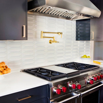
Inspiration for a huge transitional l-shaped dark wood floor and brown floor open concept kitchen remodel in Austin with flat-panel cabinets, an island, gray cabinets, quartz countertops, white backsplash, glass tile backsplash, stainless steel appliances and an undermount sink
Inspiration for a huge transitional l-shaped dark wood floor and brown floor open concept kitchen remodel in Austin with flat-panel cabinets, an island, gray cabinets, quartz countertops, white backsplash, glass tile backsplash, stainless steel appliances and an undermount sink
 IS Architecture
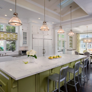
The kitchen, breakfast room and family room are all open to one another. The kitchen has a large twelve foot island topped with Calacatta marble and features a roll-out kneading table, and room to seat the whole family. The sunlight breakfast room opens onto the patio which has a built-in barbeque, and both bar top seating and a built in bench for outdoor dining. The large family room features a cozy fireplace, TV media, and a large built-in bookcase. The adjoining craft room is separated by a set of pocket french doors; where the kids can be visible from the family room as they do their homework.
 Andover Landscape Design & Construction
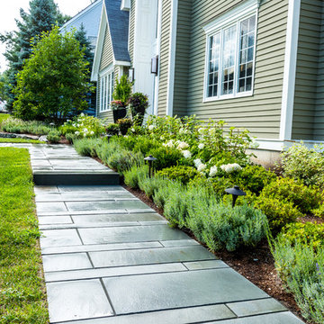
The client asked us to reconsider the front entry and associated landscape to give the house not only more curb appeal but to create a safer approach. The previous walkway was sloped and meandered for no apparent reason while the landscape plantings were overgrown and lacked the design aesthetic the client desired.
We graded the area to eliminate the slope and straightened the walkway to compliment the homes contemporary architecture. We used custom cut bluestone in a modified running bond pattern for a unique look. Additionally, we widened the front stoop and added what we like to call a Hello / Goodbye terrace directly off the entrance landing. As guests arrive or depart, there’s a comfortable transition area that allows for quick conversation and an easy pedestrian flow. We simplified the plantings by using only 3 species, lavender, boxwood, and hydrangea, along the foundation while adding ornamental grasses for additional colors and textures in other areas.
The back yard features a small deck overlooking a conservation area that we enlarged to create a dining area & a lounge with a sectional sofa. We choose a stainless steel railing system to open up the view and replaced the old wooden deck with a sustainable wood similar to mahogany called Ipe. We carried the Ipe over the side to create a horizontal lattice that encloses the underside of the deck for storage and adds to the contemporary feel of the home.


 Etch Design Group
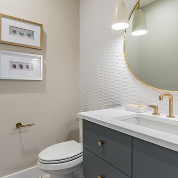
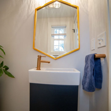
Powder room - small modern white tile powder room idea in Austin with flat-panel cabinets, blue cabinets, a two-piece toilet, beige walls, an undermount sink, quartzite countertops and white countertops
 kimberly peck architect
photos by Pedro Marti
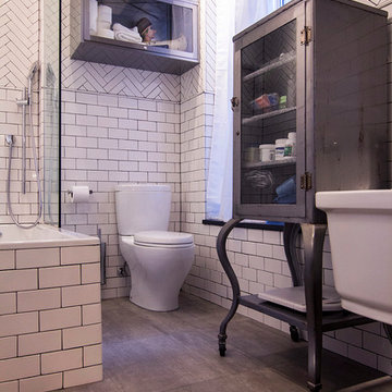
The owner’s of this apartment had been living in this large working artist’s loft in Tribeca since the 70’s when they occupied the vacated space that had previously been a factory warehouse. Since then the space had been adapted for the husband and wife, both artists, to house their studios as well as living quarters for their growing family. The private areas were previously separated from the studio with a series of custom partition walls. Now that their children had grown and left home they were interested in making some changes. The major change was to take over spaces that were the children’s bedrooms and incorporate them in a new larger open living/kitchen space. The previously enclosed kitchen was enlarged creating a long eat-in counter at the now opened wall that had divided off the living room. The kitchen cabinetry capitalizes on the full height of the space with extra storage at the tops for seldom used items. The overall industrial feel of the loft emphasized by the exposed electrical and plumbing that run below the concrete ceilings was supplemented by a grid of new ceiling fans and industrial spotlights. Antique bubble glass, vintage refrigerator hinges and latches were chosen to accent simple shaker panels on the new kitchen cabinetry, including on the integrated appliances. A unique red industrial wheel faucet was selected to go with the integral black granite farm sink. The white subway tile that pre-existed in the kitchen was continued throughout the enlarged area, previously terminating 5 feet off the ground, it was expanded in a contrasting herringbone pattern to the full 12 foot height of the ceilings. This same tile motif was also used within the updated bathroom on top of a concrete-like porcelain floor tile. The bathroom also features a large white porcelain laundry sink with industrial fittings and a vintage stainless steel medicine display cabinet. Similar vintage stainless steel cabinets are also used in the studio spaces for storage. And finally black iron plumbing pipe and fittings were used in the newly outfitted closets to create hanging storage and shelving to complement the overall industrial feel.
pedro marti
 Schloegel Design Remodel
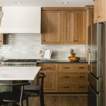
The homeowner's wide range of tastes coalesces in this lovely kitchen and mudroom. Vintage, modern, English, and mid-century styles form one eclectic and alluring space. Rift-sawn white oak cabinets in warm almond, textured white subway tile, white island top, and a custom white range hood lend lots of brightness while black perimeter countertops and a Laurel Woods deep green finish on the island and beverage bar balance the palette with a unique twist on farmhouse style.
 Shaw Floors
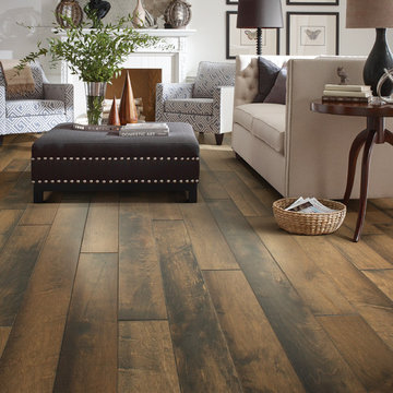
Ellison Maple in Cannonade by Anderson Hardwood Floors. Ellison exhibits a transitional aesthetic and a masterful composition full of depth and color that transcends timeless beauty. Our exclusive antiquing process emulates the unique complexity of an authentic timeworn surface. The smooth and imperfect surface texture and multi-colored staining process captures a visual tapestry within movement and dimension.
 Lori Dennis, ASID, LEED AP
Lori Dennis Interior Design
SoCal Contractor Contractor
Erika Bierman Photography
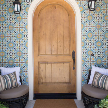
Entryway - large mediterranean entryway idea in San Diego
Entryway - large mediterranean entryway idea in San Diego
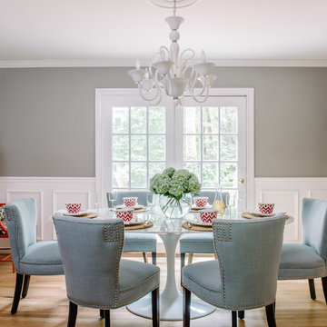
Small eclectic light wood floor and brown floor kitchen/dining room combo photo in Austin with gray walls and no fireplace

 TOC design & construction inc.
DESIGNED BY TOC design
CONSTRUCTION BY TOC design & Construction inc.
PHOTOS BY : Tania Scardellato
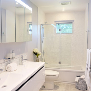
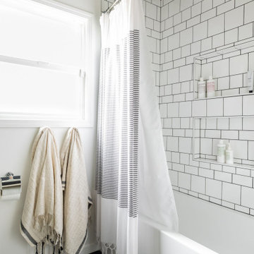
I was fortunate to have a young family approach me in desperate need to renovate there only 3 piece bathroom. This space was In dire need of a remodel, with old brown wall to wall tiles and a dated bulky yellow brown single sink vanity.
Storage was a must, lighting a necessity, and proper accessibility to the shower bath area.
We had a tight budget to respect, but a full gut of this bathroom was required. And a good thing too, once we started doing the demolition we noticed that mildew and rotting floors and walls had accumulated throughout the years. Doing it right the first time is no joke when dealing with water and electrical issues.
We discarded all reminisce of old and built from scratch, new walls, new plumbing, new electrical ,new insulation and a new window, a new fan that actually exhausted outside ( I say this laughing as you would be amazed at how many fans are installed but don’t exhaust outside, and you the client would never know unless you go inside the attic space.
Once all the hard stuff was done, the rest is just a matter of smart design. If you have a small bathroom here are some tips to guide you.
10 tips for making a small bathroom feel larger
Is your tiny bathroom cramping your functionality and style, leaving you longing for the enormous bathrooms gracing the pages of design magazines? Even if your bathroom is a fraction of the size, all it takes is some design savvy to make the most of the space you have. Consider these 10 smart tips that will help your bathroom look, feel and function like those larger contenders.
1-Get creative with corners
Space is at a premium in small bathrooms, so it's important to maximize every inch. Corners, for example, provide extra space for shelving, storage units and even hooks. Get creative and install unique design solutions that are not only functional, but also eye-catching. If you love the airiness of floating cabinets, add baskets or decorative boxes under for extra storage. If you are installing floating cabinets insure that they are installed securely to studs or plywood at wall.
2- Let solid colors shine
Busy patterns have a shrinking effect and make small bathrooms seem even smaller. Conversely, light natural hues make a space feel more open. If you're itching to get creative with design, experiment with textures but keep overpowering patterns to a minimum. Tone on tone is the best to achieve this.
3 - Maximize your bathtub
A bathtub takes up a significant portion of the room, but modern, compact options with curved basins, can make the tub feel larger when in use, all while conserving space.
4 - Select a smaller faucet
A faucet is jewelry for the bathroom. And just as accessories can overpower an outfit, a big bulky faucet isn't flattering in a small bath. Single-handle designs conserve counter space, while a wall-mount installation frees it up all together and can create quite the wow-factor, if the budget can accommodate the required changes to plumbing behind the wall.
5 - Make vanity storage simple
If you're in a storage war with your small bathroom, you're not alone in the battle. Toiletries and personal supplies without a place to call home only add clutter and chaos. Store smart with a space-saving vanity, the dual sink vanity shown here, looks quite simple, but in reality it has 4 sets of full extension drawers, and the vanity tower adds extra storage without overpowering the use of space.
6 - Show off the shower
Shower curtains may be pretty, but they interrupt the visual flow of a bathing space and make it feel significantly smaller. In bathrooms with small footprints, opt for a clear glass sliding shower door that doesn't require the clearance of one with a hinged design. Or as shown in this design and for fraction less expensive a half hinged panel installed on a fixed tempered glass panel. If you're embarking on a big remodel, create the illusion of more space by using same tile in the shower that's used throughout; instead of seeing them as two separate zones, the eye will read them as one.
7 - Discover the treasure of hidden storage
Work with a contractor, and you just might find some serious storage potential hidden behind your walls. Whether it's utilizing space between the studs for shallow shelving or a creating a small linen closet by annexing space from an adjacent room, even small additions can make a big difference.
8 - Focal Point
Tile is a beautiful, durable addition to any bathroom. For dainty spaces, consider installing tile at a diagonal to accentuate the focal point or as in this bathroom I used an oversized textured pattern to bring depth to the space at the window wall.
9 - Choose the right lights
Strategically install light to reflect and brighten a small bathroom to make it appear larger. Recessed lighting is an affordable solution for tiny rooms, offering ample light while taking up little space. Wall sconces alongside a mirror also reflect off the walls and make a room feel bright and airy. I always recommend going with LED lighting at 2800 to 3000K.
10 – Accessorize
This is your time to shine in your decorating skills, have fun with your towels, you can change the color scheme daily just by adding pops of color in your accessories, make sure to get items that serve a dual purpose, like baskets, boxes they can always be used as hampers, storing of towels and even a nice display for your guest.
 Metropolis Drafting and Construction Inc
Creation of a new master bathroom, kids’ bathroom, toilet room and a WIC from a mid. size bathroom was a challenge but the results were amazing.
The new kids’ bathroom was given a good size to work with. 5.5’ by 9’.
Allowing us to have a good size shower with a bench, 3’ vanity and comfortable space for the toilet to be placed.
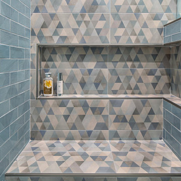
The bathroom floor is made of white Thasos marble for a neutral look since the wall tiles were so unique in color and design.
The main walls of the bathroom are made from blue subway tiles with diagonal lines pattern while the main wall is made of large 24”x6” tile with diamond/triangle shapes in different warm and cool colors.
Notice the unique shampoo niche in the bench area, it continues into the pony wall as well without any interruptions thus creating a long L-shaped space for all the bath items to remain hidden.
 Arapahoe Landscape Contractors
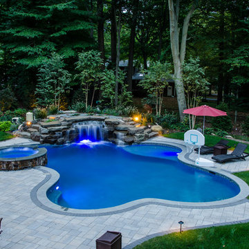
Pool fountain - large transitional backyard stone and custom-shaped natural pool fountain idea in New York
 Twelve Stones Designs, LLC
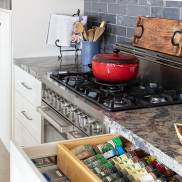
The owners of this kitchen had spent the money to upgrade the finishes in their kitchen upon building the home 12 years ago, but after living in the space for several years they realized how nonfunctional the layout really was. The (then) two preschool aged children had grown into busy, hungry teenagers with many friends who also liked to hang out at the house. So the family needed a more functional kitchen with better traffic flow, space for daily activities revolving around the kitchen at different times of day, and a kitchen that could accommodate cooking for and serving large groups. Furthermore, the dark, traditional finishes no longer reflected the homeowners’ style. They requested a brighter, more relaxed, coastal style that reflected their love of the seaside cities they like to visit.
Originally, the kitchen was U-shaped with a narrow island in the middle. The island created narrow aisles that bottle-necked at the dishwasher, refrigerator, and cooktop areas. There was a pass-through from the foyer into the kitchen, but the owners never liked that the pass-through was also located so close to the powder room. The awkward proximity was unappealing and made guests feel uncomfortable.
The kitchen’s storage was made up of lots of narrow cabinets, apothecary drawers, clipped corner units, and very few drawers. It lacked useful storage for the larger items the family used on a daily basis. And the kitchen’s only pantry was small closet that had only builder-grade, narrow shelving with no illumination to be able to see the contents inside.
Overall, the kitchen’s lighting plan was poorly executed. Only six recessed cans illuminated the entire kitchen and nook areas. The under cabinet lighting was not evenly distributed either. In fact, the builder had mis-placed the under cabinet lighting around the decorative pilasters which made for choppy, dark cubbies. Further, the builder didn’t include any lighting over the sink or the bar area, which meant whoever was doing the dishes was always in their own shadow. That, coupled with the steep overhang of the game room above made the bar area feel like a dim, cavernous space that wasn’t inviting or task oriented. The kitchen looked out into the main living space, but the raised bar and a narrow wall (which held the only large cabinet in the kitchen) created more of a barrier than a relationship to the living room or breakfast nook. In fact, one couldn’t even see the breakfast nook from the cooktop or sink areas due to its orientation. The raised bar top was too narrow to comfortably sit to either dine at or chat from due to the lack of knee space. The the homeowners confided that the kitchen felt more like a dark, dirty prison than place where the family, or their guests, wanted to gather and commune.
The clients' needs and desires were:
➢ to create a kitchen that would be a space the family loved to be in; to relate to the adjacent spaces all around, and to have better flow for entertaining large groups
➢ to remove the walls between the breakfast nook and living area and to be able to utilize the natural light from the windows in both those areas
➢ to incorporate a functional chopping block for prepping fresh food for home cooked meals, an island with a large sink and drain board, 2 pull out trash cans, and seating for at least the 2 teens to eat or do homework
➢ to design a kitchen and breakfast nook with an airy, coastal, relaxed vibe that blended with the rest of the house's coastal theme
➢ to integrate a layered lighting plan which would include ample general illumination, specific task lighting, decorative lighting, and lots of illuminated storage
➢ to design a kitchen with not only more storage for all the husband’s kitchen gadgets and collection of oils and spices, but smart storage, including a coffee/breakfast bar and a place to store and conceal the toaster oven and microwave
➢ to find a way to utilize the large open space between the kitchen, pantry area, and breakfast nook
Twelve Stones Designs achieved the owner's goals by:
➢ removing the walls between the kitchen and living room to allow the natural light to filter in from the adjacent rooms and to create a connection between the kitchen, nook, and living spaces for a sense of unity and communion
➢ removing the existing pantry and designing 3 large pantry style cabinets with LED tape lights and rollout drawers to house lots of kitchen appliances, gadgets, and tons of groceries. We also took the cabinets all the way up to the 9’ ceiling for additional storage for seasonal items and bulk storage.
➢ designing 2 islands - 1 with a gorgeous black walnut chopping block that houses a drawer for chopping and carving knives and a custom double pull out trash unit for point of use utilization - and 1 that houses the dishwasher, a large Blanco Gourmet sink with integrated drain board, woven baskets for fresh root vegetables and kitchen towels, plenty of drawer storage for kitchen items, and bar seating for up to 4 diners.
➢ closing off the space between the kitchen and the powder room to create a beautiful new private alcove for the powder room as well as adding some decorative storage. This also gave us space to include more tall storage near the new range for precision placement of the husband’s extensive oil and spice collection as well as a location for a combo-steam oven the wife wanted for baking and cooking healthy meals.
The project is enhanced functionally by:
➢ incorporated USB and standard receptacles for the kids’ laptops and phone charging in the large island
➢ designing the small island to include additional open shelving for items used on a daily basis such as a variety of bowls, plates, and colanders. This set up also works well for the husband who prefers to “plate” his dinners in restaurant-style fashion before presenting them to the table.
➢ the integration of specific storage units, such as double stacked cutlery drawers, a custom spice pull-out, a Kuerig coffee and tea pod drawer, and custom double stacked utensil drawers
➢ moving the refrigerator to the old oven location - this eliminated the bottle neck as well as created a better relationship to the eating table. It also utilizes the floor space between the pantry, nook, and kitchen
➢ creating a banquet style breakfast nook - this banquette seating not only doubles the amount of seating for large gatherings but it better utilizes the odd space between the kitchen and the previous nook area. It also helps to create a distinct pathway from the mudroom room through the pantry area, kitchen, nook, and living room.
➢ the coffee/breakfast bar area which includes the perfect location for the concealed microwave and toaster oven, convenient storage for the coffee pods and tea accoutrements. Roll-out drawers below also house the smoothie maker, hot water kettle, and a plethora of smoothie-making ingredients such as protein powders, smoothie additives, etc. Furthermore, the drawers below the Keurig house measuring utensil, cutlery, baking supplies and tupperware storage.
➢ incorporating lots of wide drawers and pullouts to accommodate large cookware.
➢ utilizing as much vertical space as possible by building storage to the ceiling which accommodates the family’s abundant amount of serving platters, baking sheets, bakeware, casserole dishes, and additional cutting boards.
The project is enhanced aesthetically by:
➢ new 5-piece Versailles pattern porcelain tile that now seamlessly joins the entire down stairs area together creating a bright, cohesiveness feeling instead of choppy separated spaces - it also adds a coastal feeling
➢ designing a cabinet to conceal the microwave and toaster oven
➢ the coastal influenced light fixtures over the nook table and island
➢ the sandy colors of the Langdon Cambria countertops. The swirling pattern and sparkling quartz pieces remind the homeowner of black-and-tan sandy beaches
➢ the striped banquet seating whose creamy white background and blue-green stripes were the inspiration for the cabinet and wall colors.
➢ All the interior doors were painted black to coordinate with the blacks and grays in the backsplash tile and countertop. This also adds a hint of tailored formality to an otherwise casual space.
➢ the use of WAC's Oculux small aperture LED units for the overhead lighting complimented with Diode LED strips for task lighting under the cabinets and inside the pantry and glass wall cabinets. All of the lighting applications are on separate dimmer switches.
Innovative uses of materials or construction methods by Realty Restoration LLC:
➢ Each 1-1/2” x 3” block of reclaimed end-grain black walnut that makes up the center island chopping block was hand milled and built in the shop. It was designed to look substantial and proportional to the surrounding elements, executed by creating the 4 inch tall top with a solid wood chamfered edge band.
➢ The metal doors on either side of the vent hood were also custom designed for this project and built in the Realty Restoration LLC shop. They are made 1x2, 11-gauge mild steel with ribbed glass. Weighing 60 lbs a piece, heavy duty cabinet hinges were added to support the weight of the door and keep them from sagging.
➢ Under-cabinet receptacles were added along the range wall in order to have a clean, uninterrupted backsplash.
Design obstacles to overcome:
➢ Because we were removing the demising walls between the kitchen and living room, we had to find a way to plumb and vent the new island. We did this by tunneling through the slab (the slab had post tension cables which prevented us from just trenching) to run a new wet vent through a nearby structural wall. We pulled the existing hot and cold lines between upper floor joists and ran them down the structural wall as well and up through a conduit in the tunnel.
➢ Since we were converting from wall overs to a gas range it allowed us to utilize the 220 feed for the wall ovens to provide a new sub panel for all the new kitchen circuits
➢ Due to framing deficiencies inherited from the original build there was a 1-1/2” differential in the floor-to-ceiling height over a 20 foot span; by utilizing the process of cutting and furring coupled with the crown moulding details on the cabinet elevations we were able to mask the problem and provide seamless transitions between the cabinet components.
Evidence of superior craftsmanship:
➢ uniquely designed, one-of-a-kind metal “X” end panels on the large island. The end panels were custom made in the Realty Restoration LLC shop and fitted to the exact dimensions of the island. The welding seams are completely indistinguishable - the posts look like they are cut from a single sheet of metal
➢ square metal posts on the small island were also custom made and designed to compliment and carry through the metal element s throughout the kitchen
➢ the beautiful, oversized end panels on the pantry cabinets which give the breakfast nook a tailored look
➢ integrating a large format 5 piece Versailles tile pattern to seamlessly flow from the existing spaces into the new kitchen space
➢ By constructing a custom cabinet that jogged around a corner we could not remodel (housing the entry way coat closet) we were able to camouflage the adjacent wall offset within the upper and lower cabinets. By designing around the existing jog in the structural walls we accomplished a few things: we were able to find the space to house, and hide, the microwave and toaster oven yet still have a clean cohesive appearance from the kitchen side. Additionally, the owners were able to keep their much needed coat closet and we didn’t have to increase the budget with unnecessary structural work.
 Drury Design
THE SETUP
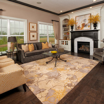
Upon moving to Glen Ellyn, the homeowners were eager to infuse their new residence with a style that resonated with their modern aesthetic sensibilities. The primary bathroom, while spacious and structurally impressive with its dramatic high ceilings, presented a dated, overly traditional appearance that clashed with their vision.
Design objectives:
Transform the space into a serene, modern spa-like sanctuary.
Integrate a palette of deep, earthy tones to create a rich, enveloping ambiance.
Employ a blend of organic and natural textures to foster a connection with nature.
THE REMODEL
Design challenges:
Take full advantage of the vaulted ceiling
Source unique marble that is more grounding than fanciful
Design minimal, modern cabinetry with a natural, organic finish
Offer a unique lighting plan to create a sexy, Zen vibe
Design solutions:
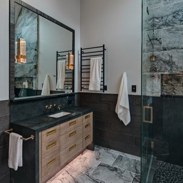
To highlight the vaulted ceiling, we extended the shower tile to the ceiling and added a skylight to bathe the area in natural light.
Sourced unique marble with raw, chiseled edges that provide a tactile, earthy element.
Our custom-designed cabinetry in a minimal, modern style features a natural finish, complementing the organic theme.
A truly creative layered lighting strategy dials in the perfect Zen-like atmosphere. The wavy protruding wall tile lights triggered our inspiration but came with an unintended harsh direct-light effect so we sourced a solution: bespoke diffusers measured and cut for the top and bottom of each tile light gap.
THE RENEWED SPACE
The homeowners dreamed of a tranquil, luxurious retreat that embraced natural materials and a captivating color scheme. Our collaborative effort brought this vision to life, creating a bathroom that not only meets the clients’ functional needs but also serves as a daily sanctuary. The carefully chosen materials and lighting design enable the space to shift its character with the changing light of day.
“Trust the process and it will all come together,” the home owners shared. “Sometimes we just stand here and think, ‘Wow, this is lovely!'”

 All Marble Tiles
Achieve a Royalty Look with Calacatta Gold Tiles
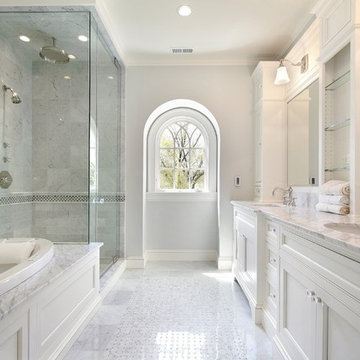
We all have that dream home we want to have. Better yet, some of us dream of a fantastic renovation of our homes; transforms them into glossy nests we can always be glad to perch in. For those of us who are already on the way to the dream house, you probably are shopping for material to use. So how about we introduce you to the good old Calacatta Gold marble?
If you are asking what that is, we can say it’s a unique way of inspiring royalty to your home using tiles. Calacatta Gold is a special stone tile mined in the hearts of Italy, on the Appian Mountains. Ever since it was discovered, it has been heavily used as a floor tile as well as wall tile, creating remarkable artistic visuals with a touch of natural gold in it. Calacatta gold tile also has one unique trait you won’t notice in most tiles; you can easily mix it with other slab colors, specifically gold extra, Calacatta Borghini, Crema and Super Extra.
Calacatta gold is also one of the few tiles with a unique pencil vein detail centering the white hue background and grey veins on the tile as well. This is the perfect choice for artistic walls and floors but be sure to use the right slab colors if you want to bring in more colors; if the slab and tile don’t match in color tones then it may affect the overall look of your walls/floors.
There are plenty of places in the house you can experiment with the pristine Calacatta gold tile. How about the living room wall that is a background for your TV and home theater system? Calacatta wall tile will create a covetable golden hue that will always shine before you. Moreover, you will definitely fall in love with your walls in the morning, when a streak of sunlight illuminates the golden yellows.
Installing the beautiful Calacatta gold tile is a pretty easy job as well. However you just need to be careful to use white thinset instead of grey. White thinsets will absorb the trowel lines whereas grey may leave behind ugly marks which may taint the exquisite nature of the tiles. If you also want your Calacatta floor tile or wall tile to last longer make sure it is properly sealed with grout.
You still have that dream home in mind? We already have you covered on the best tiles to you use. Just think Calacatta gold tile all the way, all your friends will definitely take selfies beside your shiny golden walls.
http://AllMarbleTiles.com
87