
Search results for "Unity" in Home Design Ideas
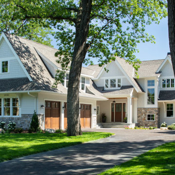
 Housing First Minnesota
2021 Artisan Home Tour
Builder: Mark D Williams Custom Homes, Inc.
Photo: Landmark Photography
Have questions about this home? Please reach out to the builder listed above to learn more.

 Studio Durham Architects
Kitchen was designed around a large island with cooktop. Original floors were patched as required, stained and refinished. Opening to Dining Room was enlarged.
Alise O'Brien Photography

 minimal windows® UK
This contemporary kitchen was flooded with light after the installation of a fixed glass roof light and minimal windows sliding doors leading out into the garden. The flush threshold of the thin framed sliding doors connects the owner / occupants of the property with their garden and thus creating a seen of unity with the indoor and outdoor spaces.
Find the right local pro for your project

 Mark Brand Architecture
Our clients for this Silicon Valley remodel wanted us to enlarge their existing kitchen by expanding into their adjacent dinette and family room area and address heat and glare issues caused by the afternoon sun at the rear of the residence. Our remodel eventually addressed almost all of the ground floor rooms. In addition we coordinated the addition of new windows throughout the house and “refreshed” the front entry and rear façade. We expanded the kitchen into the dinette area by creating an informal bar area to replace their existing dinette area. We increased indoor-outdoor flow by creating a wall of French doors and windows at the rear which included solar shading integrated into the rear wall by means of a system of interior wall panels defined by carefully laid out reveals. We created a dropped ceiling between the kitchen and the family room to define the bar counter area. A new, minimalist fireplace design replaced the existing brick fireplace. Wenge-colored cabinets and soft putty-colored walls in the dining/family room create a serene overall unity to the space. At the front entry, new doors, hardware and lighting brought this Mid-century rancher into the 21st Century. Photos by Mark Brand.

 SGDI - Sarah Gallop Design Inc.
The objective was to create a warm neutral space to later customize to a specific colour palate/preference of the end user for this new construction home being built to sell. A high-end contemporary feel was requested to attract buyers in the area. An impressive kitchen that exuded high class and made an impact on guests as they entered the home, without being overbearing. The space offers an appealing open floorplan conducive to entertaining with indoor-outdoor flow.
Due to the spec nature of this house, the home had to remain appealing to the builder, while keeping a broad audience of potential buyers in mind. The challenge lay in creating a unique look, with visually interesting materials and finishes, while not being so unique that potential owners couldn’t envision making it their own. The focus on key elements elevates the look, while other features blend and offer support to these striking components. As the home was built for sale, profitability was important; materials were sourced at best value, while retaining high-end appeal. Adaptations to the home’s original design plan improve flow and usability within the kitchen-greatroom. The client desired a rich dark finish. The chosen colours tie the kitchen to the rest of the home (creating unity as combination, colours and materials, is repeated throughout).
Photos- Paul Grdina
 Mark Brand Architecture
Our clients for this Silicon Valley remodel wanted us to enlarge their existing kitchen by expanding into their adjacent dinette and family room area and address heat and glare issues caused by the afternoon sun at the rear of the residence. Our remodel eventually addressed almost all of the ground floor rooms. In addition we coordinated the addition of new windows throughout the house and “refreshed” the front entry and rear façade. We expanded the kitchen into the dinette area by creating an informal bar area to replace their existing dinette area. We increased indoor-outdoor flow by creating a wall of French doors and windows at the rear which included solar shading integrated into the rear wall by means of a system of interior wall panels defined by carefully laid out reveals. We created a dropped ceiling between the kitchen and the family room to define the bar counter area. A new, minimalist fireplace design replaced the existing brick fireplace. Wenge-colored cabinets and soft putty-colored walls in the dining/family room create a serene overall unity to the space. At the front entry, new doors, hardware and lighting brought this Mid-century rancher into the 21st Century. Photos by Mark Brand.

 Moss Building & Design
Upon entering the home from the screened porch, MOSS installed floor to ceiling semi-custom cabinetry to be used as a sort of butler’s pantry to store kitchen items, additional entertainment ware, guests’ coats, cleaning equipment and supplies, and more. The use of the unique green tone was a beautiful touch as the color green is used throughout the home’s updated décor and brings a sense of unity to the overall space. Immediately off the long hallway is the home’s kitchen, which was completely updated. Square footage was not affected but MOSS re-designed the space so that it could be used in a more functional manner. A massive kitchen island with a beautiful soapstone countertop dominates the room. Semi-custom white cabinetry lines the perimeters. New large windows provide an incredible view of the yard. Finally, a seating area with built-ins was added to supply more space for seating and for the dining room table to be moved from the center of the kitchen, previously, to the side. The kitchen also features a beautiful fireplace which had its wooden surround updated. The home’s sunroom, located next to the kitchen, was previously a few feet lower than the rest of the home. To bring a better flow to the space, MOSS raised the entire floor of the room up to meet the rest of the main level. Stunningly, the hardwood floor matches to a “T”. In the home’s living room and office, full wall built-ins were added, allowing the homeowners to display their favorite books on topics ranging from art to history, as well as showcasing statues and art sculptures and other items that are meaningful to their family. The living room fireplace’s stone and wooden surrounds were updated by MOSS as well.

 Advance Design Studio, Ltd.
Jackie and Sean loved the Algonquin neighborhood they lived in with the peaceful neighborhood and the close proximity to work and school. What they didn’t love was how outdated their home had become. With a cramped kitchen and an unused dining room, they decided a remodel was the perfect solution to their problem. They would be able to continue to live in the area they loved, while at the same time they could have the dream home they envisioned.
After a thorough search, Jackie came across Advance Design Studio. She was impressed by all of the positive reviews she saw on the internet and saw herself identifying with all of the project stories she saw on the website. Once they met with designer Scott Christensen and owner Todd Jurs, they knew Advance Design was the right company to make their dreams a reality.
The project consisted of four main areas: the kitchen/dining/powder room, the laundry room, the master bathroom, and the kid’s bathroom. They wanted to expand the kitchen into the seldom used dining room and add a large island for hosting parties and family gatherings. They also wanted new hardwood flooring throughout the first level. The laundry room needed to be more functional, and all three bathrooms were in dire need of updating.
The closed off kitchen was opened up to create a sweeping space between the new eating area and the much larger kitchen. A handsome dry bar complete with a beverage refrigerator and lighted glass door cabinetry makes an elegant transition across from a peninsula area filled with storage. An additional decorative cabinet lighting up elegant dishware through the mullioned glass sits directly across from the drybar.
An expansive island was critical to the kitchen plans. Jackie, Sean and Scott worked closely together to create just the right details for their design. They wanted the island to be functional in addition to being the centerpiece of the room. Added storage for the kid’s school supplies was hidden behind cabinet doors so the children could do their schoolwork right at the island, and a microwave drawer glides open with the touch of a finger hidden inconspicuously within the island space. The easy to care for Cambria Britannica Quartz island top with its sweeping grey and white marble look perched atop hand-carved Craftsman corbels was absolutely what they were hoping for, blending both beauty and function perfectly.
Adding a nice contrast to the brightness of the quartz and the white cabinetry, Kodiak - Leather granite countertops were used to balance the light and dark tones of the space. Dura Supreme Classic White painted cabinets grace the perimeter, while Maple Poppy Seed stained cabinets with a beautiful soft grey woodgrain were used in the beverage center and island. The two tones compliment the large space balancing it out nicely creating interest and elegance with the simple Craftsman style full overlay doors.
A deep warm Barnwood White Oak flooring was added throughout the lower level. The new floor brings additional contrast to the bright kitchen and provides unity with the now open floorplan as it rolls in to the foyer and family room. Final details like the show-stopping lunar like duo light fixtures complete the space and intermix expertly with crisscross details of the glass door mullions, the island bar seating and even accessories in the space.
The small cluttered laundry room needed more space and more storage. With a busy family it seemed to overflow daily and did not have anywhere to hide the families “in and out stuff.” Scott designed the new space with a stackable washer and dryer and much more efficiently organized cabinetry. Doing laundry is now (almost!) a pleasure and keeping everyone’s “stuff” hidden, but readily accessible is now a snap.
The master bath was not a place where the couple enjoyed spending time getting ready for their day. The tub almost never was used, so removing it made it possible to build an extra-large shower, replacing the small cramped cube of the previous shower they hated. Clean, horizontal lines softly draw your eye around the space with porcelain tile called Driftwood Sea spray. Full overlay cabinetry in a soft white vanity with double sinks makes getting ready for the day much more convenient for the busy couple.
Long floor planks made of porcelain tile mimic real hardwood floors in a soft grey to compliment the shower, but with the ease and care of a tile surface. Cambrian Black Granite counters with a matte finish and under mount porcelain sinks with handsome brushed chrome hardware complete the handsome space. A real bonus in any master bath; a custom built in storage nook was tucked in the corner of the space for linens and heavenly storage.
The kid’s bath was in sad shape because it was original to the house. To keep the budget in control, the tub which was in great condition was retained, but focus was on the new large brick style porcelain charcoal tile on the floor, crisp white new Craftsman style cabinetry with pretty furniture details on the corner base, a striking granite top with white under mount porcelain sinks and fresh hardware and faucets. Some beautiful soft grey wood mirrors to match mom and dads were custom sized and placed under new lighting, and 4 hooks were smartly arranged down the wall for kids’ towels.
This couple was determined not to move, and made their house their dream home. Not only does their home function greatly now, but Jackie says, “When the neighbors come to visit, they’re asking if they can “steal” the design”! The added functionality, elegance, and open floor plan were exactly what this family needed in order to stay.
Advance Design Studio, Joe Nowak
 SYDfemMellE Design, Remodeling and Construction
Walking through this Industrial-Contemporary home is a treat. It intrigues your ideas and thoughts, it pushes the people within the space to feel inspired, successful and hopeful. The contemporary and industrial textures mixed together form a team of undeniable unity. This type of feeling comes form a splash of French-Country in the shiplap, and the depth of the colors and textures lining the home. When used along side the natural stains thought the home, the space has a brilliant feminine style, mixed with a masculine flavor. The textures found in the wheatgrass wallpapers throughout the space, lend a softer flavor up against the stone, and large paneled porcelain on the fireplaces. Window coverings, drapes and the window drape liners soften the direct lines in this project. Porcelain countertops create a contemporary feel in the kitchen and bathrooms. Porcelain countertops are a home run! If you're looking for a product that doesn't require maintenance but looks amazing, porcelain countertops are a product used often in high end homes and have great success. Of course, install is usually only successful when using the correct installer. Laminam porcelain countertops don't hair line fracture like many of the other porcelain countertops.
 Mark Brand Architecture
Our clients for this Silicon Valley remodel wanted us to enlarge their existing kitchen by expanding into their adjacent dinette and family room area and address heat and glare issues caused by the afternoon sun at the rear of the residence. Our remodel eventually addressed almost all of the ground floor rooms. In addition we coordinated the addition of new windows throughout the house and “refreshed” the front entry and rear façade. We expanded the kitchen into the dinette area by creating an informal bar area to replace their existing dinette area. We increased indoor-outdoor flow by creating a wall of French doors and windows at the rear which included solar shading integrated into the rear wall by means of a system of interior wall panels defined by carefully laid out reveals. We created a dropped ceiling between the kitchen and the family room to define the bar counter area. A new, minimalist fireplace design replaced the existing brick fireplace. Wenge-colored cabinets and soft putty-colored walls in the dining/family room create a serene overall unity to the space. At the front entry, new doors, hardware and lighting brought this Mid-century rancher into the 21st Century. Photos by Mark Brand.
 ONE Design
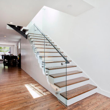
This project was an exercise in minimalism — how it can be embraced and incorporated at multiple levels. Typical of San Franciscan Victorians, the dark interior of this home was segregated and circulation spaces were narrow and dark. The stairs to the upper level was an afterthought and tucked away.
By removing the walls and rebuilding the stairs, we shifted the focus of this home’s interior and made the stairs the focal point. This project pays homage to the stairs, a critical element in the function and tone the home sets. As a transitional element, it carries the user from level to level, function to function, and mindset to mindset. The goal of this remodel was to invite the user upstairs and offer a more integrated transition to the upper level while at the same time using it to create a shaft of light into the inner recesses of the living space below.
As one ascends the stairs, the floor gradually disappears revealing a naked structural spine as the stairs reaches the upper level. The dormer addition offered ample headspace and invites columns of light to penetrate below. The cantilevered floor and shadow play this offers, dynamically marks its imprint on both levels.
Ancillary and storage spaces tucked away neatly and delicately – reminding us that expression should not be at the expense of function. Delicate and clean food preparation areas — now integrated with the rest of the home — invite us to celebrate this expression of unity.
 minimal windows® UK
This contemporary kitchen was flooded with light after the installation of a fixed glass roof light and minimal windows sliding doors leading out into the garden. The flush threshold of the thin framed sliding doors connects the owner / occupants of the property with their garden and thus creating a seen of unity with the indoor and outdoor spaces.
 minimal windows® UK
This contemporary kitchen was flooded with light after the installation of a fixed glass roof light and minimal windows sliding doors leading out into the garden. The flush threshold of the thin framed sliding doors connects the owner / occupants of the property with their garden and thus creating a seen of unity with the indoor and outdoor spaces.

 One Coast Design - Summerville, SC
The Versailles Mirror has a 1 ½” beveled clear glass mirror and gold beaded filet has a very ornately carved exquisite gold frame and is able to hang horizontally or vertically.
Additional Information: The process of painting on wood enables me to recreate the countenance of an ancient fresco. Using the wood’s grain as my canvas, I employ multiple hand layered painting techniques to build the background, and, once completed, I then sketch my design directly onto the surface. Then comes the painstaking application of paints to create colors and textures intrinsic to the piece.
The addition of layer upon layer of glazes and varnishes consummates the artwork’s depth and translucency, similar to that of stained glass…and a good sprinkling of Swarovski crystals allow it light up any room. In the end, I look for total unity in design, accenting each work of art with the perfect frame and accenting each piece with pure gold or silver leaf. -Michelle Woolley Sauter, One Coast Design
 Mark Brand Architecture
Our clients for this Silicon Valley remodel wanted us to enlarge their existing kitchen by expanding into their adjacent dinette and family room area and address heat and glare issues caused by the afternoon sun at the rear of the residence. Our remodel eventually addressed almost all of the ground floor rooms. In addition we coordinated the addition of new windows throughout the house and “refreshed” the front entry and rear façade. We expanded the kitchen into the dinette area by creating an informal bar area to replace their existing dinette area. We increased indoor-outdoor flow by creating a wall of French doors and windows at the rear which included solar shading integrated into the rear wall by means of a system of interior wall panels defined by carefully laid out reveals. We created a dropped ceiling between the kitchen and the family room to define the bar counter area. A new, minimalist fireplace design replaced the existing brick fireplace. Wenge-colored cabinets and soft putty-colored walls in the dining/family room create a serene overall unity to the space. At the front entry, new doors, hardware and lighting brought this Mid-century rancher into the 21st Century. Photos by Mark Brand.
 SGDI - Sarah Gallop Design Inc.
The objective was to create a warm neutral space to later customize to a specific colour palate/preference of the end user for this new construction home being built to sell. A high-end contemporary feel was requested to attract buyers in the area. An impressive kitchen that exuded high class and made an impact on guests as they entered the home, without being overbearing. The space offers an appealing open floorplan conducive to entertaining with indoor-outdoor flow.
Due to the spec nature of this house, the home had to remain appealing to the builder, while keeping a broad audience of potential buyers in mind. The challenge lay in creating a unique look, with visually interesting materials and finishes, while not being so unique that potential owners couldn’t envision making it their own. The focus on key elements elevates the look, while other features blend and offer support to these striking components. As the home was built for sale, profitability was important; materials were sourced at best value, while retaining high-end appeal. Adaptations to the home’s original design plan improve flow and usability within the kitchen-greatroom. The client desired a rich dark finish. The chosen colours tie the kitchen to the rest of the home (creating unity as combination, colours and materials, is repeated throughout).
Photos- Paul Grdina
 SGDI - Sarah Gallop Design Inc.
The objective was to create a warm neutral space to later customize to a specific colour palate/preference of the end user for this new construction home being built to sell. A high-end contemporary feel was requested to attract buyers in the area. An impressive kitchen that exuded high class and made an impact on guests as they entered the home, without being overbearing. The space offers an appealing open floorplan conducive to entertaining with indoor-outdoor flow.
Due to the spec nature of this house, the home had to remain appealing to the builder, while keeping a broad audience of potential buyers in mind. The challenge lay in creating a unique look, with visually interesting materials and finishes, while not being so unique that potential owners couldn’t envision making it their own. The focus on key elements elevates the look, while other features blend and offer support to these striking components. As the home was built for sale, profitability was important; materials were sourced at best value, while retaining high-end appeal. Adaptations to the home’s original design plan improve flow and usability within the kitchen-greatroom. The client desired a rich dark finish. The chosen colours tie the kitchen to the rest of the home (creating unity as combination, colours and materials, is repeated throughout).
Photos- Paul Grdina
 SGDI - Sarah Gallop Design Inc.
The objective was to create a warm neutral space to later customize to a specific colour palate/preference of the end user for this new construction home being built to sell. A high-end contemporary feel was requested to attract buyers in the area. An impressive kitchen that exuded high class and made an impact on guests as they entered the home, without being overbearing. The space offers an appealing open floorplan conducive to entertaining with indoor-outdoor flow.
Due to the spec nature of this house, the home had to remain appealing to the builder, while keeping a broad audience of potential buyers in mind. The challenge lay in creating a unique look, with visually interesting materials and finishes, while not being so unique that potential owners couldn’t envision making it their own. The focus on key elements elevates the look, while other features blend and offer support to these striking components. As the home was built for sale, profitability was important; materials were sourced at best value, while retaining high-end appeal. Adaptations to the home’s original design plan improve flow and usability within the kitchen-greatroom. The client desired a rich dark finish. The chosen colours tie the kitchen to the rest of the home (creating unity as combination, colours and materials, is repeated throughout).
Photos- Paul Grdina
 Lagois Design Build Renovate
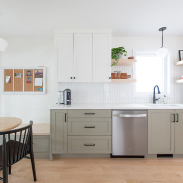
Step into a cozy and inviting atmosphere – a Hygge-inspired Scandinavian kitchen that is sure to warm the heart and bring the family closer together. Previously closed off and isolated from the rest of the home and family, we opened up walls between the kitchen and dining room and created an open-concept space that encourages togetherness and shared moments. Goodbye to isolation and hello to a kitchen that not only looks stunning but also fosters a sense of unity and connection.
The front of the home now has a full glass door as well as a full glass side panel to allow more light into the front entrance. The homeowners needed more storage, so we created a floor-to-ceiling bank of pantry cupboards in an unused part of the eat-in kitchen, and we also created more storage under the bench.
The removal of the wall was a little challenging because it was a load-bearing wall. We needed to add a full-span beam around to the back of the home and have it installed in one piece. We had to reroute the mechanical systems, a bulkhead and mechanical chase now to hide the beam and the plumbing.
The selections and colours – light cabinetry with sage-coloured lower cabinets, white countertops and natural maple hardwood – add to the beautiful open feeling the homeowners wanted. The original kitchen had dated finishes and was tired looking. The peninsula and meal-homework-and-crafts nook make the perfect setting for a young family.
 Odell Construction Inc.
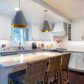
Elevate your culinary haven with our exquisite kitchen design. Immerse yourself in the timeless elegance of white shaker-style cabinets, a canvas of classic beauty that sets the stage for a culinary masterpiece. The white subway tiles, embraced by the deep allure of dark grout, create a captivating backdrop, merging tradition with a contemporary twist.
Our attention to detail shines with a bespoke custom hood that commands attention as the heart of your space. Discover the charm of convenience and sophistication with a hidden wine compartment seamlessly integrated into the custom cabinetry. The soulful character of the original wood floors, lovingly refinished, brings a warm, inviting atmosphere, inviting you to savor every step.
Embrace the artistry of contrasts in the stove area, where a copper pot filler becomes a graceful focal point against the white expanse. Copper accents gracefully meander throughout, intertwining with every element, a symphony of unity and charm.
However, it's our thoughtfully curated industrial-style lighting that truly transforms this kitchen. These fixtures bridge the gap between the classic and the contemporary, unveiling a narrative where tradition evolves into modernity.
106