
Search results for "Unsuitable" in Home Design Ideas

 Kitchens and Baths by K.A.B.
Mid-sized mountain style master beige tile medium tone wood floor double shower photo in Boston with recessed-panel cabinets, dark wood cabinets, a two-piece toilet, beige walls and a vessel sink

 Montecito Landscape
Looking South, you can lounge on the flagstone patio and take in views of the Pacific ocean. As the sun disappears over the hillside and the temperature drops, the gas fire pit stands ready to warm with the strike of a match.

Find the right local pro for your project

 Home Staging Texas
Master Bedroom with balcony overlooking the pool and entertaining areas, views galore and extra large custom walk-in closet.
unsuite bathroom and walk-in closet.
Photos by John Leonffu with Warm Focus

 Saltwater Kitchen & Bath Studio
Mike Kaskell Photography
Large transitional master white tile porcelain tile alcove shower photo in Jacksonville with shaker cabinets, blue walls, marble countertops, an undermount sink and dark wood cabinets
Large transitional master white tile porcelain tile alcove shower photo in Jacksonville with shaker cabinets, blue walls, marble countertops, an undermount sink and dark wood cabinets

Transitional master gray tile gray floor freestanding bathtub photo in Miami with shaker cabinets, blue cabinets, gray walls, an undermount sink and gray countertops

 Tranquil Spaces Design
Photography by Viva Van Assen
Example of a mid-sized trendy master gray tile and ceramic tile ceramic tile walk-in shower design in San Francisco with an undermount sink, flat-panel cabinets, light wood cabinets, quartz countertops, a wall-mount toilet and gray walls
Example of a mid-sized trendy master gray tile and ceramic tile ceramic tile walk-in shower design in San Francisco with an undermount sink, flat-panel cabinets, light wood cabinets, quartz countertops, a wall-mount toilet and gray walls


 User
Julina Marie Photography
Freestanding bathtub - large modern master white tile and ceramic tile porcelain tile freestanding bathtub idea in Cleveland with an undermount sink, furniture-like cabinets, dark wood cabinets, marble countertops, a one-piece toilet and black walls
Freestanding bathtub - large modern master white tile and ceramic tile porcelain tile freestanding bathtub idea in Cleveland with an undermount sink, furniture-like cabinets, dark wood cabinets, marble countertops, a one-piece toilet and black walls

 fijandesign
We create interiors that bring together visual character, everyday comfort and practical functionality for homes and commercial spaces across Zambia. Fijan Design begin by understanding how our clients live, work, welcome guests and use each room before developing a personalised design direction. Our experience covers living areas, kitchens, bedrooms, offices, receptions, meeting rooms, restaurants, retail spaces and hospitality environments. When you search for an Interior designer near me, you need a team that can coordinate space planning, furniture, lighting, colours, materials, finishes, storage and decorative details with a clear purpose. We focus on making every space feel organised, welcoming and suitable for long-term use rather than simply following temporary trends. Through careful planning and attention to detail, we help our clients avoid unsuitable purchases, reduce costly design mistakes and make better use of available space. Our goal is to deliver distinctive interiors that reflect your personality, support your needs and create lasting value.
 Design Phase
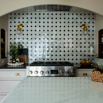
The client wanted to update a kitchen originally renovated in the 1970s to better reflect the home’s historical character. The layout presented a few constraints: limited space for cabinetry, fixed window and door placements, and the need to maintain the exterior appearance due to Heritage Hill Historical Society guidelines.
Additionally, the homeowners had some original cabinetry they wished to preserve or reuse, which added another layer of complexity. After exploring several layout options, we ultimately arrived at a design that balanced both functionality and historical integrity.
Finishes and Flooring:
Once the layout was finalized, we moved on to finish selections. The biggest challenge here was the flooring. While the client initially preferred a large-format tile, the age of the home and previous additions had left the floor uneven and unsuitable for such materials. Thankfully, the contractor was able to level the floor, making tile installation possible.
Interestingly, the client had originally chosen a different tile, but due to long lead times, she had to make a last-minute change—and in doing so, discovered the stunning flooring you see in the photos. A happy accident that truly elevated the space!
It was a pleasure working on this beautiful historic home—and even more so with such wonderful homeowners.
 Design Phase
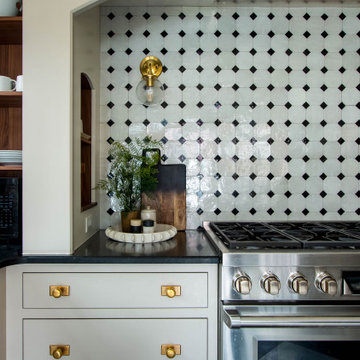
The client wanted to update a kitchen originally renovated in the 1970s to better reflect the home’s historical character. The layout presented a few constraints: limited space for cabinetry, fixed window and door placements, and the need to maintain the exterior appearance due to Heritage Hill Historical Society guidelines.
Additionally, the homeowners had some original cabinetry they wished to preserve or reuse, which added another layer of complexity. After exploring several layout options, we ultimately arrived at a design that balanced both functionality and historical integrity.
Finishes and Flooring:
Once the layout was finalized, we moved on to finish selections. The biggest challenge here was the flooring. While the client initially preferred a large-format tile, the age of the home and previous additions had left the floor uneven and unsuitable for such materials. Thankfully, the contractor was able to level the floor, making tile installation possible.
Interestingly, the client had originally chosen a different tile, but due to long lead times, she had to make a last-minute change—and in doing so, discovered the stunning flooring you see in the photos. A happy accident that truly elevated the space!
It was a pleasure working on this beautiful historic home—and even more so with such wonderful homeowners.

 LLG Residential Design LLC
Looking for a nice clean crown molding, but what something different? These homeowners did just that with a simple clean flat molding applied to the wall and ceiling to create this look.
 Pool Environments, Inc.
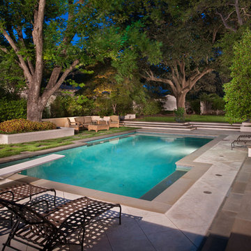
Originally designed by one of the most notable landscape architects in town, this once impressive project had faltered in recent years. The pool and spa still functioned well, and the client wanted to keep it intact. In addition, they wanted to keep as much of the existing landscaping as possible. The surrounding decks, walls, and steps were fair game. At first glance, one might think that our changes were simple material changes. Upon closer inspection, however, one can see the subtle, yet transformative changes that come together to update this classic pool in a tasteful, timeless manner, and improve the flow and usability of the deck areas, while softening the feel of the massive hardscape.
The subtle changes begin as soon as you walk out the back door of the house. The existing decking had a lot of what we call “tweeners”; areas that are overly generous walkways, yet not large enough to house furniture. The awkwardly small bluestone patio was expanded to accommodate a generous seating area, by pushing the step-down closer to the pool. Our talented stone mason carefully married the new bluestone into the existing, resulting in an imperceptible difference between the two. As you descend the new bluestone steps to the pool level, your bare feet will be thankful for the new smooth-finished limestone colored concrete, with a hand cut pattern carefully etched into its surface. The old red brick decking was so hot that the owners could not walk around the pool in bare feet. The brick coping was also replaced with an eased edge Pennsylvania Premier Stone which matches the new step treads throughout the project. Between the house and the pool, a large raised planter was reconfigured, giving additional space to the pool deck for a shaded lounge chair area.
Across the pool, a bank of rather tall painted brick retaining walls were cut down, shortened, and moved. This lessened the visual impact of the walls, which were rather overwhelming in the space, as well as opening up a new seating area, nestled under the arms of the massive pecan at the back of the property. Rather than continuing solid decking around the entire pool, the area near these walls has been transformed to large stone stepper pads set in a sea of beautiful St. Augustine lawn. This creates a visually softened area that is still suited to setting tables and chairs when the guest list calls for additional seating.
The spa area is quite possibly the most dramatic change on this project. Yet more raised planter walls divided this area into awkward spaces, unsuited to proper furniture placement. The planters were removed, new stone decks, once again expertly married into the existing, opening the area to house a large dining table and new built in bbq area. The spa itself was re-imagined with the bluestone coping, and painted brick veneer. The most impressive addition though is the new handmade glazed tiles that surround the existing cast stone water feature. This water feature was almost unnoticeable against the painted brick wall, but now the dramatic arch and pop of color draw the eye to this quaint little corner of the property.
 Lista & Vidmar - Storage & Workspace Systems
A clean, organized workplace is a productive workplace. So when sales representative Randy Kirchof was researching how to furnish his new home office, he knew it had to do a lot more than just look good.
His former home office furnishings were not only unsuitable for a thriving home-based business, they didn't work with each other, either. "My old home office had a mismatch of furniture," Randy says. "When we built our new house, I decided I was going to do it right. That meant outfitting my office with Lista cabinets."
A solid choice.
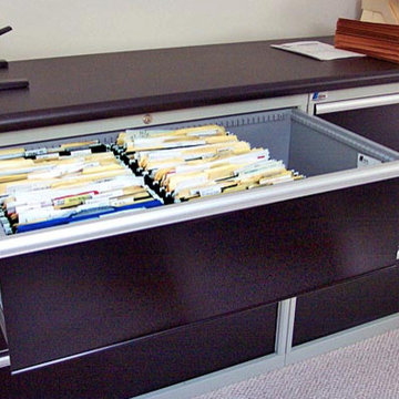
Randy's office now contains a bank of Lista drawer storage cabinets, which stand a short chair-roll from his Lista desk, and fit nicely against the short vertical wall space that meets a sloping ceiling. The drawers' sharp black finish adds a clean contrast to the office's primarily white surroundings. The desk is comprised of two Lista cabinet pedestals, each of which flanks a sizable window that overlooks the passing seasons.
A solid worktop bridges the space between the two cabinets, creating a spacious desk surface that not only maintains the aesthetic feel of the surroundings, but also enhances the space's durable functionality - features that are certainly not lost on Randy.
"Most file cabinets are rickety pieces of junk," he says. "Lista's are really solid."
It's an impression that seems to be shared by visitors as well. "Lista stuff works perfectly in a home environment. Everyone who comes up to see the office is blown away."

 Sweet Smiling Landscape Design
This beautiful property is located in the hills above of Montecito with 360 degree of views onto the Channel Islands and the surrounding mountains. Inspired by the Japanese landscape design principal of the borrowed landscape the gardens on this property serves as a kind of picture frame from which to view the natural beauty of its surroundings.
This 15-year-old costume-built home was crafted with all the style and workmanship ship found in Villa or Château in the Mediterranean. Unfortunately, the garden design was not as well thought out as the house was. Most of this property receives baking sun, drying winds and is in an extremely high fire danger area. Do to these factors many of the plants on the property were unsuitable for their location. The original planting scheme was also lifeless and colorless. Poor landscape maintenance had left many of the plants on the property sick and dying.
We came in to revive this landscape, breathing new life into it.
Creating a drought tolerant and fire wise landscape was of utmost importance to these clients. Staying true to the more formal landscape styles found in Southern Europe we also want to create an opportunity to design seamlessly blend with its natural surroundings. We did that by incorporating a lot of California native plants. This vast property also contains an avocado orchard and a vineyard. By adding California native plants the property is inviting in native birds and insects that help keep pollinate the orchard and vineyard and keep pest problems at bay. Because these clients enjoy harvesting from their land we added elements of edible landscaping to this project. We filled pottery and planter beds with fruit trees, culinary and medicinal herbs as well as flowers that can be used in cut flower arrangements. Lastly, we went through carefully pruning diseased plants, treating pest problems an improving the soil. Now the landscape is not only more beautiful it is more protected against fire, is more water wise and integrate into its surrounds with a wholistic approach.

 UpScapers: Landscape, Elevated
A lot of Vistafolia® walls are simple rectangles because, let’s face it, most walls are rectangular. But some walls just lend themselves to something a bit different and present a fun design challenge. This particular retail store is all about standing out from the crowd and presenting their customers with a unique retail experience. As such, they wouldn’t settle for an off the shelf green wall and instead wanted a truly customized design, custom fit green walls to their vision. A real wall would have been completely unsuitable and thus an artificial solution was required.
The large timber wall in the bar presented a blank canvas to work with and our in-house design team set about creating a concept that was eye-catching and unusual. By working with our 80cm x 80cm panel size in mind, we were able to minimize wastage from offcuts, to ensure the client got the most from their Vistafolia® panels and received great value for money. VistaGreen’s design team love a challenge, and it is always rewarding to see your concept turned into a finished project.
 UpScapers: Landscape, Elevated
A lot of Vistafolia® walls are simple rectangles because, let’s face it, most walls are rectangular. But some walls just lend themselves to something a bit different and present a fun design challenge. This particular retail store is all about standing out from the crowd and presenting their customers with a unique retail experience. As such, they wouldn’t settle for an off the shelf green wall and instead wanted a truly customized design, custom fit green walls to their vision. A real wall would have been completely unsuitable and thus an artificial solution was required.
The large timber wall in the bar presented a blank canvas to work with and our in-house design team set about creating a concept that was eye-catching and unusual. By working with our 80cm x 80cm panel size in mind, we were able to minimize wastage from offcuts, to ensure the client got the most from their Vistafolia® panels and received great value for money. VistaGreen’s design team love a challenge, and it is always rewarding to see your concept turned into a finished project.
2