
Search results for "Unusable" in Home Design Ideas
 User
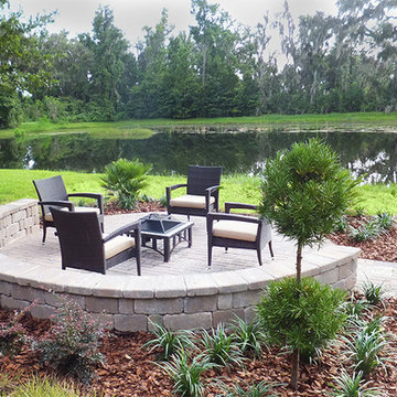
UserThis fire pit addition to an unused area off the main patio makes a great break away seating area.
Large tuscan backyard patio photo in Tampa with a fire pit
Large tuscan backyard patio photo in Tampa with a fire pit
 Yardscapes Northwest
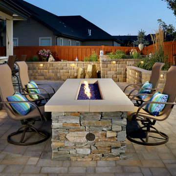
Mid-sized transitional backyard concrete paver patio kitchen photo in Boise with a roof extension
 Kimberlee Marie Interiors
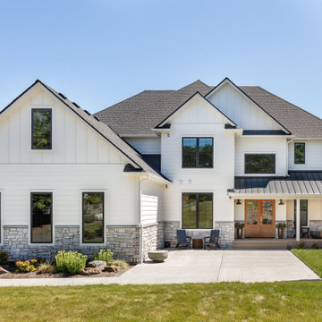
Our Seattle studio designed this stunning 5,000+ square foot Snohomish home to make it comfortable and fun for a wonderful family of six.
On the main level, our clients wanted a mudroom. So we removed an unused hall closet and converted the large full bathroom into a powder room. This allowed for a nice landing space off the garage entrance. We also decided to close off the formal dining room and convert it into a hidden butler's pantry. In the beautiful kitchen, we created a bright, airy, lively vibe with beautiful tones of blue, white, and wood. Elegant backsplash tiles, stunning lighting, and sleek countertops complete the lively atmosphere in this kitchen.
On the second level, we created stunning bedrooms for each member of the family. In the primary bedroom, we used neutral grasscloth wallpaper that adds texture, warmth, and a bit of sophistication to the space creating a relaxing retreat for the couple. We used rustic wood shiplap and deep navy tones to define the boys' rooms, while soft pinks, peaches, and purples were used to make a pretty, idyllic little girls' room.
In the basement, we added a large entertainment area with a show-stopping wet bar, a large plush sectional, and beautifully painted built-ins. We also managed to squeeze in an additional bedroom and a full bathroom to create the perfect retreat for overnight guests.
For the decor, we blended in some farmhouse elements to feel connected to the beautiful Snohomish landscape. We achieved this by using a muted earth-tone color palette, warm wood tones, and modern elements. The home is reminiscent of its spectacular views – tones of blue in the kitchen, primary bathroom, boys' rooms, and basement; eucalyptus green in the kids' flex space; and accents of browns and rust throughout.
Find the right local pro for your project
 TKS Design Group
Free ebook, Creating the Ideal Kitchen. DOWNLOAD NOW
This Glen Ellyn couple wanted to transform their dated kitchen into a more family-friendly space to use on a daily basis for cooking family meals and for entertaining friends. The existing kitchen was quite chopped up with strange soffits and different ceiling heights. To make the space flow in a more logical manner, we borrowed an unused desk area from the adjoining hallway and reconfigured a neighboring bath. Getting it to work on paper was fairly straightforward, but there was a bit of complicated beam work involved as the new kitchen flows through what was an old exterior wall. The new ceiling is now completely flush as we were able to hide the support in the ceiling joists.
A new, larger window was added at the sink, the doorway to the room was widened and the resulting space creates a more easy flow from dining room to family room.
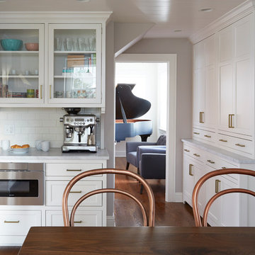
The clients chose white inset cabinets, white marble tops and an apron sink to keep the space feeling simple yet original to the home's Colonial styling.
Ship lap siding on the back of the island and at the pantry storage ceiling, a walnut butcher block, and antique brass details give the space an updated look.
Professional stainless appliances are functional and beautiful. In addition to a large built-in fridge and 36" range, a second oven is housed in the island for flexibility.
The pantry area has a convenience station that houses the family's espresso machine along with the microwave drawer. Another large bank of cabinets in the same area serves as pantry storage for dry goods.
The bathroom was also remodeled as part of this project. The full bath has a vanity, shower and convenient baby changing area.
The floor is encaustic tile, a type of concrete tile recognizable by its bold graphics. The mirror and lighting add a few modern touches to keep it in line with the Owner's personal style.
Designed by: Susan Klimala, CKD, CBD
Photography by: Carlos Vergara
For more information on kitchen and bath design ideas go to: www.kitchenstudio-ge.com
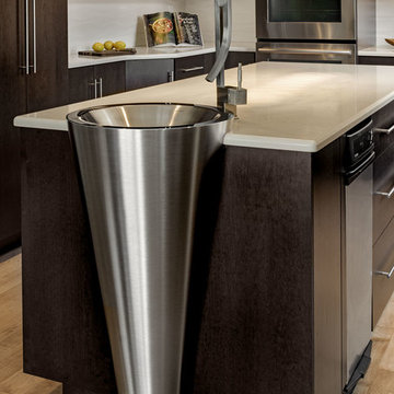
 Randy Trainor
These homeowners decided to turn their ski home into a full-time home only to find that what was perfect as a vacation home, didn't function well for year-round living. In the master bathroom an unused tub was removed to make room for a larger vanity with storage. Using the same large format tiles on the floor and the walls provide the desired spa-like feel to the space. Floor to ceiling cabinets provide loads of storage for this kosher kitchen. Two dishwashers, two utensil drawers, a divided sink and two ovens are also included so that meat and dairy could be kept separated.
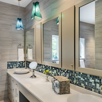 Randy Trainor
These homeowners decided to turn their ski home into a full-time home only to find that what was perfect as a vacation home, didn't function well for year-round living. In the master bathroom an unused tub was removed to make room for a larger vanity with storage. Using the same large format tiles on the floor and the walls provide the desired spa-like feel to the space. Floor to ceiling cabinets provide loads of storage for this kosher kitchen. Two dishwashers, two utensil drawers, a divided sink and two ovens are also included so that meat and dairy could be kept separated.
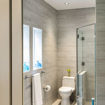 Randy Trainor
These homeowners decided to turn their ski home into a full-time home only to find that what was perfect as a vacation home, didn't function well for year-round living. In the master bathroom an unused tub was removed to make room for a larger vanity with storage. Using the same large format tiles on the floor and the walls provide the desired spa-like feel to the space. Floor to ceiling cabinets provide loads of storage for this kosher kitchen. Two dishwashers, two utensil drawers, a divided sink and two ovens are also included so that meat and dairy could be kept separated.
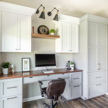
 Kowalske Kitchen & Bath
Kowalske Kitchen & Bath was the remodeling contractor for this beautiful Waukesha first floor remodel. The homeowners recently purchased the home and wanted to immediately update the space. The old kitchen was outdated and closed off from the great room. The goal was to design an open-concept space for hosting family and friends.
LAYOUT
The first step was to remove the awkward dining room walls. This made the room feel large and open. We tucked the refrigerator into a wall of cabinets so it didn’t impose. Seating at the island and peninsula makes the kitchen very versatile.
DESIGN
We created an elegant entertaining space to take advantage of the lake view. The Waukesha homeowners wanted a contemporary design with neutral colors and finishes. They chose soft gray lower cabinets and white upper cabinets. We added texture with wood accents and a herringbone marble backsplash tile.
The desk area features a walnut butcher block countertop. We also used walnut for the open shelving, detail on the hood and the legs on the island.
CUSTOM CABINETRY
Frameless custom cabinets maximize storage in this Waukesha kitchen. The upper cabinets have hidden light rail molding. Angled plug molding eliminates outlets on the backsplash. Drawers in the lower cabinets allow for excellent storage. The cooktop has a functioning top drawer with a hidden apron to hide the guts of the cooktop. The clients also asked for a home office desk area and pantry cabinet.
 Kimberlee Marie Interiors
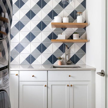
Our Seattle studio designed this stunning 5,000+ square foot Snohomish home to make it comfortable and fun for a wonderful family of six.
On the main level, our clients wanted a mudroom. So we removed an unused hall closet and converted the large full bathroom into a powder room. This allowed for a nice landing space off the garage entrance. We also decided to close off the formal dining room and convert it into a hidden butler's pantry. In the beautiful kitchen, we created a bright, airy, lively vibe with beautiful tones of blue, white, and wood. Elegant backsplash tiles, stunning lighting, and sleek countertops complete the lively atmosphere in this kitchen.
On the second level, we created stunning bedrooms for each member of the family. In the primary bedroom, we used neutral grasscloth wallpaper that adds texture, warmth, and a bit of sophistication to the space creating a relaxing retreat for the couple. We used rustic wood shiplap and deep navy tones to define the boys' rooms, while soft pinks, peaches, and purples were used to make a pretty, idyllic little girls' room.
In the basement, we added a large entertainment area with a show-stopping wet bar, a large plush sectional, and beautifully painted built-ins. We also managed to squeeze in an additional bedroom and a full bathroom to create the perfect retreat for overnight guests.
For the decor, we blended in some farmhouse elements to feel connected to the beautiful Snohomish landscape. We achieved this by using a muted earth-tone color palette, warm wood tones, and modern elements. The home is reminiscent of its spectacular views – tones of blue in the kitchen, primary bathroom, boys' rooms, and basement; eucalyptus green in the kids' flex space; and accents of browns and rust throughout.
 Nathan Taylor for Obelisk Home
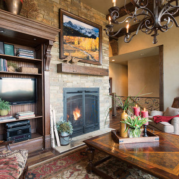
The interior of the home went from Colonial to Classic Lodge without changing the footprint of the home. Columns were removed, fur downs removed that defined space, fireplace relocated, kitchen layout and direction changed, breakfast room and sitting room flip flopped, study reduced in size, entry to master bedroom changed, master suite completely re-arranged and enlarged, custom hand railing designed to open up stairwell, hardwood added to stairs, solid knotty alder 8’ doors added, knotty alder crown moldings added, reclaimed beamed ceiling grid, tongue and groove ceiling in kitchen, knotty alder cabinetry, leather finish to granite, seeded glass insets, custom door to panty to showcase an antique stained glass window from childhood church, custom doors and handles made for study entry, shredded straw added to wall texture, custom glazing done to all walls, wood floor remnants created an antique quilt pattern for the back wall of the powder bath, custom wall treatment created by designer, and a mixture of new and antique furnishing were added, all to create a warm, yet lived in feeling for this special family.
A new central stone wall reversed with an over scaled fireplace and reclaimed flooring from the East became the anchor for this level of the home. Removing all the “divisions” of space and using a unified surface made unused rooms, part of the daily living for this family. The desire to entertain large group in a unified space, yet still feel like you are in a cozy environment was the driving force for removing divisions of space.
Photos by Randy Colwell
 Advance Design Studio, Ltd.
Jackie and Sean loved the Algonquin neighborhood they lived in with the peaceful neighborhood and the close proximity to work and school. What they didn’t love was how outdated their home had become. With a cramped kitchen and an unused dining room, they decided a remodel was the perfect solution to their problem. They would be able to continue to live in the area they loved, while at the same time they could have the dream home they envisioned.
After a thorough search, Jackie came across Advance Design Studio. She was impressed by all of the positive reviews she saw on the internet and saw herself identifying with all of the project stories she saw on the website. Once they met with designer Scott Christensen and owner Todd Jurs, they knew Advance Design was the right company to make their dreams a reality.
The project consisted of four main areas: the kitchen/dining/powder room, the laundry room, the master bathroom, and the kid’s bathroom. They wanted to expand the kitchen into the seldom used dining room and add a large island for hosting parties and family gatherings. They also wanted new hardwood flooring throughout the first level. The laundry room needed to be more functional, and all three bathrooms were in dire need of updating.
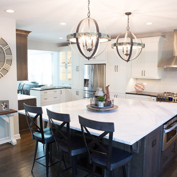
The closed off kitchen was opened up to create a sweeping space between the new eating area and the much larger kitchen. A handsome dry bar complete with a beverage refrigerator and lighted glass door cabinetry makes an elegant transition across from a peninsula area filled with storage. An additional decorative cabinet lighting up elegant dishware through the mullioned glass sits directly across from the drybar.
An expansive island was critical to the kitchen plans. Jackie, Sean and Scott worked closely together to create just the right details for their design. They wanted the island to be functional in addition to being the centerpiece of the room. Added storage for the kid’s school supplies was hidden behind cabinet doors so the children could do their schoolwork right at the island, and a microwave drawer glides open with the touch of a finger hidden inconspicuously within the island space. The easy to care for Cambria Britannica Quartz island top with its sweeping grey and white marble look perched atop hand-carved Craftsman corbels was absolutely what they were hoping for, blending both beauty and function perfectly.
Adding a nice contrast to the brightness of the quartz and the white cabinetry, Kodiak - Leather granite countertops were used to balance the light and dark tones of the space. Dura Supreme Classic White painted cabinets grace the perimeter, while Maple Poppy Seed stained cabinets with a beautiful soft grey woodgrain were used in the beverage center and island. The two tones compliment the large space balancing it out nicely creating interest and elegance with the simple Craftsman style full overlay doors.
A deep warm Barnwood White Oak flooring was added throughout the lower level. The new floor brings additional contrast to the bright kitchen and provides unity with the now open floorplan as it rolls in to the foyer and family room. Final details like the show-stopping lunar like duo light fixtures complete the space and intermix expertly with crisscross details of the glass door mullions, the island bar seating and even accessories in the space.
The small cluttered laundry room needed more space and more storage. With a busy family it seemed to overflow daily and did not have anywhere to hide the families “in and out stuff.” Scott designed the new space with a stackable washer and dryer and much more efficiently organized cabinetry. Doing laundry is now (almost!) a pleasure and keeping everyone’s “stuff” hidden, but readily accessible is now a snap.
The master bath was not a place where the couple enjoyed spending time getting ready for their day. The tub almost never was used, so removing it made it possible to build an extra-large shower, replacing the small cramped cube of the previous shower they hated. Clean, horizontal lines softly draw your eye around the space with porcelain tile called Driftwood Sea spray. Full overlay cabinetry in a soft white vanity with double sinks makes getting ready for the day much more convenient for the busy couple.
Long floor planks made of porcelain tile mimic real hardwood floors in a soft grey to compliment the shower, but with the ease and care of a tile surface. Cambrian Black Granite counters with a matte finish and under mount porcelain sinks with handsome brushed chrome hardware complete the handsome space. A real bonus in any master bath; a custom built in storage nook was tucked in the corner of the space for linens and heavenly storage.
The kid’s bath was in sad shape because it was original to the house. To keep the budget in control, the tub which was in great condition was retained, but focus was on the new large brick style porcelain charcoal tile on the floor, crisp white new Craftsman style cabinetry with pretty furniture details on the corner base, a striking granite top with white under mount porcelain sinks and fresh hardware and faucets. Some beautiful soft grey wood mirrors to match mom and dads were custom sized and placed under new lighting, and 4 hooks were smartly arranged down the wall for kids’ towels.
This couple was determined not to move, and made their house their dream home. Not only does their home function greatly now, but Jackie says, “When the neighbors come to visit, they’re asking if they can “steal” the design”! The added functionality, elegance, and open floor plan were exactly what this family needed in order to stay.
Advance Design Studio, Joe Nowak
 Masterpiece Design Group
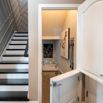
This formerly unused space below the stairs was transformed into Fido's Hideaway....Dutch doors and personalized decor complete the look!
Example of a staircase design in Orlando
Example of a staircase design in Orlando
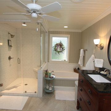
 Jackson Construction, Inc.
Formerly an unused sunroom, this space stands out as a soothing, updated master bath with vintage character. The best part is that every part of the project was done on a tight budget.
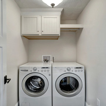
 Jeffrey L. Henry, Inc.
Kitchen Renovation - Added Laundry room attached to Kitchen in unused garage space
Inspiration for a small timeless single-wall gray floor laundry closet remodel in Other with shaker cabinets, white cabinets, beige walls and a side-by-side washer/dryer
Inspiration for a small timeless single-wall gray floor laundry closet remodel in Other with shaker cabinets, white cabinets, beige walls and a side-by-side washer/dryer
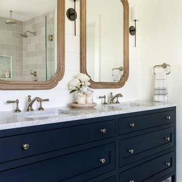 Kimberlee Marie Interiors
Our Seattle studio designed this stunning 5,000+ square foot Snohomish home to make it comfortable and fun for a wonderful family of six.
On the main level, our clients wanted a mudroom. So we removed an unused hall closet and converted the large full bathroom into a powder room. This allowed for a nice landing space off the garage entrance. We also decided to close off the formal dining room and convert it into a hidden butler's pantry. In the beautiful kitchen, we created a bright, airy, lively vibe with beautiful tones of blue, white, and wood. Elegant backsplash tiles, stunning lighting, and sleek countertops complete the lively atmosphere in this kitchen.
On the second level, we created stunning bedrooms for each member of the family. In the primary bedroom, we used neutral grasscloth wallpaper that adds texture, warmth, and a bit of sophistication to the space creating a relaxing retreat for the couple. We used rustic wood shiplap and deep navy tones to define the boys' rooms, while soft pinks, peaches, and purples were used to make a pretty, idyllic little girls' room.
In the basement, we added a large entertainment area with a show-stopping wet bar, a large plush sectional, and beautifully painted built-ins. We also managed to squeeze in an additional bedroom and a full bathroom to create the perfect retreat for overnight guests.
For the decor, we blended in some farmhouse elements to feel connected to the beautiful Snohomish landscape. We achieved this by using a muted earth-tone color palette, warm wood tones, and modern elements. The home is reminiscent of its spectacular views – tones of blue in the kitchen, primary bathroom, boys' rooms, and basement; eucalyptus green in the kids' flex space; and accents of browns and rust throughout.
 Edgewater Design Group
Our clients already had a cottage on Torch Lake that they loved to visit. It was a 1960s ranch that worked just fine for their needs. However, the lower level walkout became entirely unusable due to water issues. After purchasing the lot next door, they hired us to design a new cottage. Our first task was to situate the home in the center of the two parcels to maximize the view of the lake while also accommodating a yard area. Our second task was to take particular care to divert any future water issues. We took necessary precautions with design specifications to water proof properly, establish foundation and landscape drain tiles / stones, set the proper elevation of the home per ground water height and direct the water flow around the home from natural grade / drive. Our final task was to make appealing, comfortable, living spaces with future planning at the forefront. An example of this planning is placing a master suite on both the main level and the upper level. The ultimate goal of this home is for it to one day be at least a 3/4 of the year home and designed to be a multi-generational heirloom.
- Jacqueline Southby Photography
 Spaces Designed, Interior Design Studio, LLC
“We could never have envisioned what could be” – Steiner Ranch Homeowner and Client
It is an especially fulfilling Project for an Interior Designer when the outcome exceeds Client expectations, and imagination. This remodeling project required instilling modern sensibilities, openness, styles and textures into a dated house that was past its prime. Strategically, the goal was to tear down where it made sense without doing a complete teardown.
Starting with the soul of the home, the kitchen, we expanded out room by room to create a cohesiveness and flow that invites, supports and provides the warmth and relaxation that only a home can.
In the Kitchen, we started by removing the wooden beams and adding bright recessed lighting. We removed the old limestone accent wall and moved the sink and cooktop from the island on to the countertop – the key goal was to create room for the family to gather around the kitchen. We replaced all appliances with modern Energy Star ones, along with adding a wine rack.
The first order of business for the Living Room was to brighten it up by adding more lighting and replacing an unused section with a glass door to the backyard. Multi-section windows were replaced with large no-split glass overlooking the backyard. Once more, the limestone accent was removed to create a clean, modern look. Replacing the dated wooden staircase with the clean lines of a metal, wire and wooded staircase added interest and freshness. An odd bend in the staircase was removed to clean things up.
The Master Bedroom went from what looked like a motel room with green carpet and cheap blinds to an oasis of luxury and charm. A section of the wraparound doors were closed off to increase privacy, accentuate the best view from the bedroom and to add usable space. Artwork, rug, contemporary bed and other accent pieces brought together the seamless look across the home.
The Master Bathroom remodel started by replacing the standard windows with a single glass pane that enhanced the view of the outdoors. The dated shower was replaced by a walk-in shower and soaking tub to create the ultimate at-home spa experience. Lighted LED mirrors frame His & Hers sinks and bathe them in a soft light.
The flooring was upgraded throughout the house to reflect the contemporary color scheme.
Each of the smaller bedrooms were similarly upgraded to match the clean and modern décor of the rest of the house.
After such a transformation inside, it was only appropriate that the exterior needed an upgrade as well. All of the legacy limestone accents were replaced by stucco and the color scheme extended from the interior of the house to the gorgeous wrap around balconies, trim, garage doors etc. to complete the inside outside transformation.
 Down2Earth Landscape Design
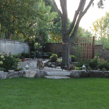
My clients wanted a backyard retreat where they could make the most of their sloping pie shaped lot. We upgraded the gardens under the tree canopy with new focal points and seasonal interest, despite the shade. A new deck with pergola and custom privacy screen to give them a cozy space within a large yard. A pea gravel courtyard, one of the sunniest spots in the backyard created a nook in a previously unused part of the yard which provides a beautiful view of all their gardens.
 Ferdinand Castillo Landscape Architect
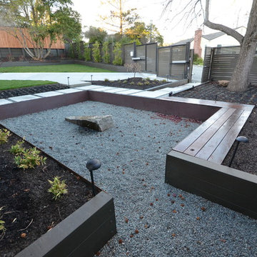
this project began with an dilapidated site with no landscape. The large front yard was unusable for this family with 2 young boys. the inspiration was to create a clean modern space but with ample room for the children to have practical outdoor play areas. the anchor of the project was to use a large 2 ton rock, already purchased by the owner, and create a center piece. the rock was converted into a water feature and the space was developed into a meditative seating pit wrapped in corten steel. the remaining areas were developed as retaining / seat walls bordering the open lawn play areas. modern railings & fence were designed to wrap the upper patio and perimeter fence. landscape lighting provide enough light for safety and mood.
 Mike Farley Pool Designer, SWD, ASLA
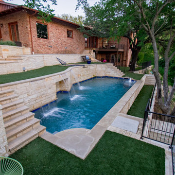
This unusable concrete backyard hillside was turned into a beautiful place for the family to play, relax and entertain friends. There is a large cabana with curtains next to the outdoor kitchen on the upper level. Step down to the spa with Spanish tile or into the pool on the lower level. See Mike's pool tour for full detail on his Youtube channel or website. FarleyPoolDesigns.com
72