
Search results for "Update" in Home Design Ideas
 User
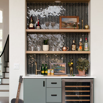
UserThis home was built in the early 2000’s. We completely reconfigured the kitchen, updated the breakfast room, added a bar to the living room, updated a powder room, a staircase and several fireplaces.
 The Green Room Interiors
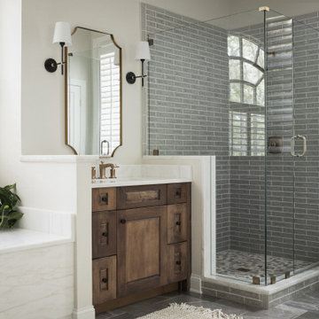
Chattanooga area updated master bath with a modern/traditional mix with rustic accents to reflect the home's mountain setting.
Bathroom - large traditional porcelain tile bathroom idea in Other with raised-panel cabinets, gray walls and a built-in vanity
Bathroom - large traditional porcelain tile bathroom idea in Other with raised-panel cabinets, gray walls and a built-in vanity
 Corynne Pless
Photo: Corynne Pless Photography © 2017 Houzz
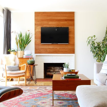
Example of an eclectic living room design in Los Angeles
Example of an eclectic living room design in Los Angeles
Find the right local pro for your project
 Alair Homes Plano
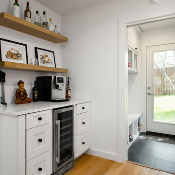
Our clients purchased this 1950 ranch style cottage knowing it needed to be updated. They fell in love with the location, being within walking distance to White Rock Lake. They wanted to redesign the layout of the house to improve the flow and function of the spaces while maintaining a cozy feel. They wanted to explore the idea of opening up the kitchen and possibly even relocating it. A laundry room and mudroom space needed to be added to that space, as well. Both bathrooms needed a complete update and they wanted to enlarge the master bath if possible, to have a double vanity and more efficient storage. With two small boys and one on the way, they ideally wanted to add a 3rd bedroom to the house within the existing footprint but were open to possibly designing an addition, if that wasn’t possible.
In the end, we gave them everything they wanted, without having to put an addition on to the home. They absolutely love the openness of their new kitchen and living spaces and we even added a small bar! They have their much-needed laundry room and mudroom off the back patio, so their “drop zone” is out of the way. We were able to add storage and double vanity to the master bathroom by enclosing what used to be a coat closet near the entryway and using that sq. ft. in the bathroom. The functionality of this house has completely changed and has definitely changed the lives of our clients for the better!
 Soglia Architecture
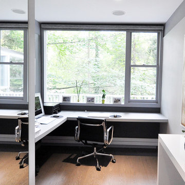
The Lincoln House is a residence in Rye Brook, NY. The project consisted of a complete gut renovation to a landmark home designed and built by architect Wilson Garces, a student of Mies van der Rohe, in 1961.
The post and beam, mid-century modern house, had great bones and a super solid foundation integrated into the existing bedrock, but needed many updates in order to make it 21st-century modern and sustainable. All single pane glass panels were replaced with insulated units that consisted of two layers of tempered glass with low-e coating. New Runtal baseboard radiators were installed throughout the house along with ductless Mitsubishi City-Multi units, concealed in cabinetry, for air-conditioning and supplemental heat. All electrical systems were updated and LED recessed lighting was used to lower utility costs and create an overall general lighting, which was accented by warmer-toned sconces and pendants throughout. The roof was replaced and pitched to new interior roof drains, re-routed to irrigate newly planted ground cover. All insulation was replaced with spray-in foam to seal the house from air infiltration and to create a boundary to deter insects.
Aside from making the house more sustainable, it was also made more modern by reconfiguring and updating all bathroom fixtures and finishes. The kitchen was expanded into the previous dining area to take advantage of the continuous views along the back of the house. All appliances were updated and a double chef sink was created to make cooking and cleaning more enjoyable. The mid-century modern home is now a 21st century modern home, and it made the transition beautifully!
Photographed by: Maegan Walton
 TVL Creative Ltd.
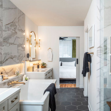
This project was not only full of many bathrooms but also many different aesthetics. The goals were fourfold, create a new master suite, update the basement bath, add a new powder bath and my favorite, make them all completely different aesthetics.
Primary Bath-This was originally a small 60SF full bath sandwiched in between closets and walls of built-in cabinetry that blossomed into a 130SF, five-piece primary suite. This room was to be focused on a transitional aesthetic that would be adorned with Calcutta gold marble, gold fixtures and matte black geometric tile arrangements.
Powder Bath-A new addition to the home leans more on the traditional side of the transitional movement using moody blues and greens accented with brass. A fun play was the asymmetry of the 3-light sconce brings the aesthetic more to the modern side of transitional. My favorite element in the space, however, is the green, pink black and white deco tile on the floor whose colors are reflected in the details of the Australian wallpaper.
Hall Bath-Looking to touch on the home's 70's roots, we went for a mid-mod fresh update. Black Calcutta floors, linear-stacked porcelain tile, mixed woods and strong black and white accents. The green tile may be the star but the matte white ribbed tiles in the shower and behind the vanity are the true unsung heroes.
 Metropolis Drafting and Construction Inc
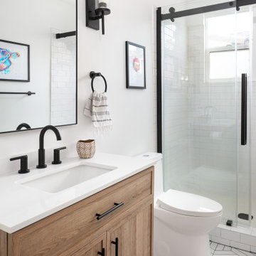
Another update project we did in the same Townhome community in Culver city. This time more towards Modern Farmhouse / Transitional design.
Kitchen cabinets were completely refinished with new hardware installed. The black island is a great center piece to the white / gold / brown color scheme.
The hallway Guest bathroom was partially updated with new fixtures, vanity, toilet, shower door and floor tile.
that's what happens when older style white subway tile came back into fashion. They fit right in with the other updates.
Sponsored
Columbus, OH

HomeCraft Remodeling
Custom Craftsmanship & Build Solutions in Franklin County, Ohio

 TKS Design Group
Download our free ebook, Creating the Ideal Kitchen. DOWNLOAD NOW
The homeowners came to us looking to update the kitchen in their historic 1897 home. The home had gone through an extensive renovation several years earlier that added a master bedroom suite and updates to the front façade. The kitchen however was not part of that update and a prior 1990’s update had left much to be desired. The client is an avid cook, and it was just not very functional for the family.
The original kitchen was very choppy and included a large eat in area that took up more than its fair share of the space. On the wish list was a place where the family could comfortably congregate, that was easy and to cook in, that feels lived in and in check with the rest of the home’s décor. They also wanted a space that was not cluttered and dark – a happy, light and airy room. A small powder room off the space also needed some attention so we set out to include that in the remodel as well.
See that arch in the neighboring dining room? The homeowner really wanted to make the opening to the dining room an arch to match, so we incorporated that into the design.
Another unfortunate eyesore was the state of the ceiling and soffits. Turns out it was just a series of shortcuts from the prior renovation, and we were surprised and delighted that we were easily able to flatten out almost the entire ceiling with a couple of little reworks.
Other changes we made were to add new windows that were appropriate to the new design, which included moving the sink window over slightly to give the work zone more breathing room. We also adjusted the height of the windows in what was previously the eat-in area that were too low for a countertop to work. We tried to keep an old island in the plan since it was a well-loved vintage find, but the tradeoff for the function of the new island was not worth it in the end. We hope the old found a new home, perhaps as a potting table.
Designed by: Susan Klimala, CKD, CBD
Photography by: Michael Kaskel
For more information on kitchen and bath design ideas go to: www.kitchenstudio-ge.com

 FA Design Build
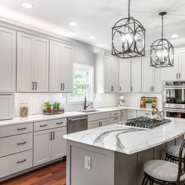
To stay or to go? This is the question our clients are still pondering. Yet, as their youngest child heads off to college, they are ready to enjoy their new kitchen or feature it in a real estate listing. Since they were unsure of their plans, we decided a pull and replace renovation was the logical — and most economical—choice. While all appliances remain in their same locations, we were able to make easy adjustments with cabinetry to update the space: convert a desk to a beverage center; increase the size of the island; install an island countertop with overhang for seating; and lengthen the perimeter cabinetry and add a tip-up, on-counter cabinet to house small appliances. The color palette was based on introducing warm grays to the space while ensuring the existing Brazilian cherry floor remained compatible with the new design. A combination of light gray and dark gray painted cabinetry (Medallion, Irish Crème and Frappe) updates the space, along with bronze finishes. A unique hex-patterned white tile backsplash with contrasting gray grout on the perimeter adds interest yet keeps the focus on the island. We installed the understated Cambria Whitehall on the perimeter with the vivid Cambria Skara Brae on the island. We worked closely with the stone fabricator to ensure the Skara Brae’s veining pattern matched the client’s vision. Above the island countertop, we installed two oversized pendants to add intensity and beauty as you enter the room.
 ARCHIA HOMES
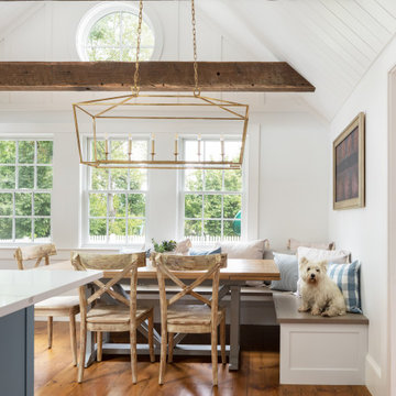
Reclaimed beams and vaulted ceilings with finish carpentry details including v-groove and board and batten add character to this dining area, while the wide plank pine flooring hints at the house's historic origin. Mimi sits at her favorite seat on the custom-made banquette, where she has a better view of whats cooking in the kitchen!
 The Alter Architect's Studio, PLLC
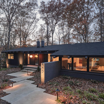
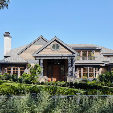
Midcentury Modern Exterior. The new primary suite was formerly an open-air carport.
Inspiration for a 1960s exterior home remodel in Charlotte
Inspiration for a 1960s exterior home remodel in Charlotte
Sponsored
Columbus, OH

Snider & Metcalf Interior Design, LTD
Leading Interior Designers in Columbus, Ohio & Ponte Vedra, Florida
 Thyme & Place Design LLC
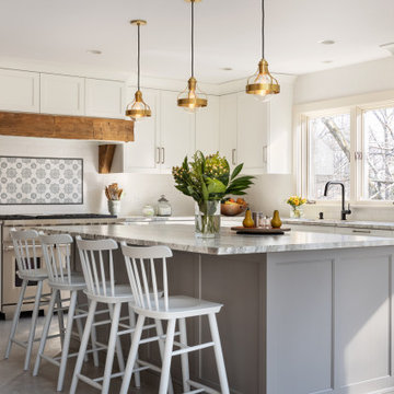
This beautiful kitchen is Thyme & Place Design's take on modern farmhouse style. White painted full access custom cabinets frame the perimeter of the space and a custom soft gray paint adorns the island cabinetry. The former kitchen felt tight and lacked style while this new kitchen has attitude to spare. Sub Zero and Wolf appliances set the stage for a cooks delight. An antique barn beam was used to create the mantle and corbels for an updated version of a mantle hood. Ample storage for everything a gourmet cook could want was provided. Deep drawers hold all the pots and pans for daily cooking. Pull out storage holds oil and vinegar bottles for instant recipe inspiration. A magic corner cabinet allows access to mixing bowls and colanders. Extra height wall cabinet storage contains several sets of dishes and most used foods at the cook’s fingertips. The island does double duty providing seating for extra guests, presenting a large expanse of countertop for all types of cooking prep. There is a microwave drawer for quick reheats and the most coveted by a baker, a built-in mixer lift. Behind the island, an oversized glass door pantry closet holds everything from pantry staples, to holiday dishes and oversized cooking and serving pieces. The dining area found a renewed sense of purpose with the removal of walls which cut it off from the rest of the home. New sky lights and a updated sliding door flood the space with light and open the view to the beautiful yard. A coffee bar was added which includes additional dish storage and a beverage center. Black ebonized maple with honey bronze hardware is a dramatic balance to the white and grey of the kitchen. The space was further opened to the family room which is now an integrated part of the family’s gatherings. Honey Bronze accents are repeated in the light fixtures over the island and as an accent on the sconces above the coffee bar.
 TKS Design Group
Free ebook, Creating the Ideal Kitchen. DOWNLOAD NOW
Our clients had been in their home since the early 1980’s and decided it was time for some updates. We took on the kitchen, two bathrooms and a powder room.
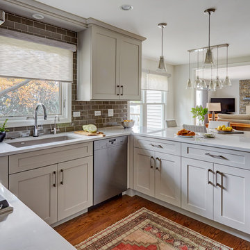
The layout in the kitchen was functional for them, so we kept that pretty much as is. Our client wanted a contemporary-leaning transitional look — nice clean lines with a gray and white palette. Light gray cabinets with a slightly darker gray subway tile keep the northern exposure light and airy. They also purchased some new furniture for their breakfast room and adjoining family room, so the whole space looks completely styled and new. The light fixtures are staggered and give a nice rhythm to the otherwise serene feel.
The homeowners were not 100% sold on the flooring choice for little powder room off the kitchen when I first showed it, but now they think it is one of the most interesting features of the design. I always try to “push” my clients a little bit because that’s when things can get really fun and this is what you are paying for after all, ideas that you may not come up with on your own.
We also worked on the two upstairs bathrooms. We started first on the hall bath which was basically just in need of a face lift. The floor is porcelain tile made to look like carrera marble. The vanity is white Shaker doors fitted with a white quartz top. We re-glazed the cast iron tub.
The master bath was a tub to shower conversion. We used a wood look porcelain plank on the main floor along with a Kohler Tailored vanity. The custom shower has a barn door shower door, and vinyl wallpaper in the sink area gives a rich textured look to the space. Overall, it’s a pretty sophisticated look for its smaller fooprint.
Designed by: Susan Klimala, CKD, CBD
Photography by: Michael Alan Kaskel
For more information on kitchen and bath design ideas go to: www.kitchenstudio-ge.com

 Lars Remodeling & Design
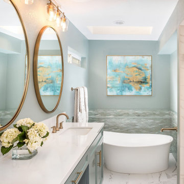
This Cardiff home remodel truly captures the relaxed elegance that this homeowner desired. The kitchen, though small in size, is the center point of this home and is situated between a formal dining room and the living room. The selection of a gorgeous blue-grey color for the lower cabinetry gives a subtle, yet impactful pop of color. Paired with white upper cabinets, beautiful tile selections, and top of the line JennAir appliances, the look is modern and bright. A custom hood and appliance panels provide rich detail while the gold pulls and plumbing fixtures are on trend and look perfect in this space. The fireplace in the family room also got updated with a beautiful new stone surround. Finally, the master bathroom was updated to be a serene, spa-like retreat. Featuring a spacious double vanity with stunning mirrors and fixtures, large walk-in shower, and gorgeous soaking bath as the jewel of this space. Soothing hues of sea-green glass tiles create interest and texture, giving the space the ultimate coastal chic aesthetic.
Sponsored
Columbus, OH
HomeCraft Remodeling
Custom Craftsmanship & Build Solutions in Franklin County, Ohio

 TKS Design Group
Download our free ebook, Creating the Ideal Kitchen. DOWNLOAD NOW
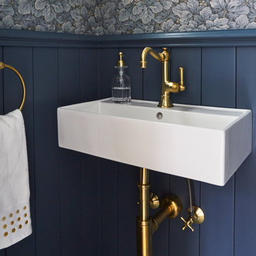
The homeowners came to us looking to update the kitchen in their historic 1897 home. The home had gone through an extensive renovation several years earlier that added a master bedroom suite and updates to the front façade. The kitchen however was not part of that update and a prior 1990’s update had left much to be desired. The client is an avid cook, and it was just not very functional for the family.
The original kitchen was very choppy and included a large eat in area that took up more than its fair share of the space. On the wish list was a place where the family could comfortably congregate, that was easy and to cook in, that feels lived in and in check with the rest of the home’s décor. They also wanted a space that was not cluttered and dark – a happy, light and airy room. A small powder room off the space also needed some attention so we set out to include that in the remodel as well.
See that arch in the neighboring dining room? The homeowner really wanted to make the opening to the dining room an arch to match, so we incorporated that into the design.
Another unfortunate eyesore was the state of the ceiling and soffits. Turns out it was just a series of shortcuts from the prior renovation, and we were surprised and delighted that we were easily able to flatten out almost the entire ceiling with a couple of little reworks.
Other changes we made were to add new windows that were appropriate to the new design, which included moving the sink window over slightly to give the work zone more breathing room. We also adjusted the height of the windows in what was previously the eat-in area that were too low for a countertop to work. We tried to keep an old island in the plan since it was a well-loved vintage find, but the tradeoff for the function of the new island was not worth it in the end. We hope the old found a new home, perhaps as a potting table.
Designed by: Susan Klimala, CKD, CBD
Photography by: Michael Kaskel
For more information on kitchen and bath design ideas go to: www.kitchenstudio-ge.com
 Simply Home Decorating
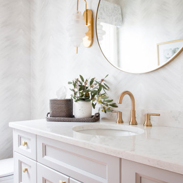
This spacious home in North Vancouver's Deep Cove community had been built and decorated just over 20 years ago and was in need of updating. Our clients who are empty nesters, spend much of their time in the kitchen and family room so we focused on these spaces keeping in mind that the more formal spaces on the main floor will follow in a few years time. For the most part the layout of their kitchen worked well for them so our role was to tweak the kitchen and family room furniture layout and to select updated finishes and furnishings. Since this home transformation is not happening all at once, we purposefully selected classic finishes, like antique brass hardware, that will tie in with the rest of the home's decor until it can be updated. The resulting refresh stays true to the original feel of the house while giving it a clean, updated look.
49