
Search results for "Usable creative" in Home Design Ideas
 TVL Creative Ltd.
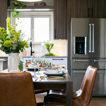
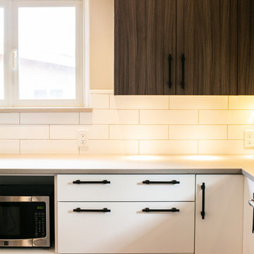
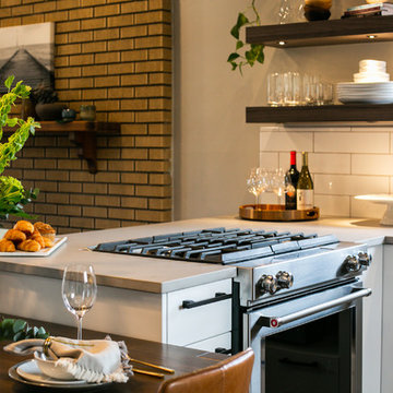
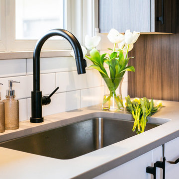
This 1950s home was sporting elements of the original kitchen and the dark space was not meeting our client’s needs. The original kitchen didn’t have much to offer in the way of functionality, so our first order of business was to create a design that would exponentially increase the usability of the kitchen. We brought in functional cabinetry, introduced uninterrupted work surfaces, and added plenty of lighting to brighten up their kitchen. They also wanted to open the new kitchen to the living room and create space for a larger dining table, so we started by removing the existing cabinetry that was visually cut the living space in two and minimized the power of the dramatic vaulted ceiling. We also extended the wood flooring into the kitchen as well to create seamless transitions between spaces. We fell in love with the idea of a two-toned cabinetry design for this kitchen and ultimately went head over heels for clean white painted base cabinets and a textured wood-look melamine on the uppers. This gave us a crisp backdrop that allowed us to bring is fun forms like the black light fixture over the table and the gorgeous silhouettes on the hardware. We played a lot with directionality in this space. The elongated open shelves and rectangular backsplash tiles give us wonderfully clean horizontal lines, but to balance those out we brought in a vertical grain pattern on the wall cabinets and added long black cabinetry pulls that emphasize the verticality of the space. The clients have a green thumb and wanted to make sure we created a home for their growing plant collection. The open shelving gives us plenty of opportunities for foliage and to showcase fun kitchen accessories. This design feels like home and brings together the clean lines and crisp finishes our clients were looking for.
 TVL Creative Ltd.
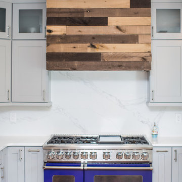
This project is an incredible transformation and the perfect example of successful style mixing! This client, and now a good friend of TVL (as they all become), is a wonderfully eclectic and adventurous one with immense interest in texture play, pops of color, and unique applications. Our scope in this home included a full kitchen renovation, main level powder room renovation, and a master bathroom overhaul. Taking just over a year to complete from the first design phases to final photos, this project was so insanely fun and packs an amazing amount of fun details and lively surprises. The original kitchen was large and fairly functional. However, the cabinetry was dated, the lighting was inefficient and frankly ugly, and the space was lacking personality in general. Our client desired maximized storage and a more personalized aesthetic. The existing cabinets were short and left the nice height of the space under-utilized. We integrated new gray shaker cabinets from Waypoint Living Spaces and ran them to the ceiling to really exaggerate the height of the space and to maximize usable storage as much as possible. The upper cabinets are glass and lit from within, offering display space or functional storage as the client needs. The central feature of this space is the large cobalt blue range from Viking as well as the custom made reclaimed wood range hood floating above. The backsplash along this entire wall is vertical slab of marble look quartz from Pental Surfaces. This matches the expanse of the same countertop that wraps the room. Flanking the range, we installed cobalt blue lantern penny tile from Merola Tile for a playful texture that adds visual interest and class to the entire room. We upgraded the lighting in the ceiling, under the cabinets, and within cabinets--we also installed accent sconces over each window on the sink wall to create cozy and functional illumination. The deep, textured front Whitehaven apron sink is a dramatic nod to the farmhouse aesthetic from KOHLER, and it's paired with the bold and industrial inspired Tournant faucet, also from Kohler. We finalized this space with other gorgeous appliances, a super sexy dining table and chair set from Room & Board, the Paxton dining light from Pottery Barn and a small bar area and pantry on the far end of the space. In the small powder room on the main level, we converted a drab builder-grade space into a super cute, rustic-inspired washroom. We utilized the Bonner vanity from Signature Hardware and paired this with the cute Ashfield faucet from Pfister. The most unique statements in this room include the water-drop light over the vanity from Shades Of Light, the copper-look porcelain floor tile from Pental Surfaces and the gorgeous Cashmere colored Tresham toilet from Kohler. Up in the master bathroom, elegance abounds. Using the same footprint, we upgraded everything in this space to reflect the client's desire for a more bright, patterned and pretty space. Starting at the entry, we installed a custom reclaimed plank barn door with bold large format hardware from Rustica Hardware. In the bathroom, the custom slate blue vanity from Tharp Cabinet Company is an eye catching statement piece. This is paired with gorgeous hardware from Amerock, vessel sinks from Kohler, and Purist faucets also from Kohler. We replaced the old built-in bathtub with a new freestanding soaker from Signature Hardware. The floor tile is a bold, graphic porcelain tile with a classic color scheme. The shower was upgraded with new tile and fixtures throughout: new clear glass, gorgeous distressed subway tile from the Castle line from TileBar, and a sophisticated shower panel from Vigo. We finalized the space with a small crystal chandelier and soft gray paint. This project is a stunning conversion and we are so thrilled that our client can enjoy these personalized spaces for years to come.
 TVL Creative Ltd.
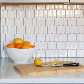
Our clients have been raising their family in this charming Lakewood ranch home for several years and were ready to make some updates to their home to make it better fit their lifestyle. In particular, the existing kitchen just wasn’t meeting their needs. They were sacrificing usable square footage to redundant circulation and the kitchen wasn’t connecting well with the other spaces in their home, so things had to change. We started by reworking the entry to the kitchen and switching up their layout to allow the kitchen to flow seamlessly with the rest of the house. To add to the open feeling we were striving for, we removed the existing ceiling soffits and created a clean transition between the kitchen and dining room, and installed the same wood flooring throughout the entire home. Aesthetically we wanted to create an inviting kitchen that felt clean and bright but could still stand up to a busy family. Soft grey shaker cabinets gave us the welcoming air we were looking for while providing a subtle contrast against the white quartz counters and backsplash tile. We utilized the same elegant pulls on all of the cabinets to add to the cohesive look of the kitchen and keep things from feeling too cluttered. We wanted to have a little fun with the backsplash without loosing the clean feeling we were going for, so we selected a crisp white picket tile to add a pop of texture. Updating the dining room light fixture and adding a pendant over the sink help to personalize the space and the charming shelves provide an opportunity to display original sculpture.
Find the right local pro for your project
 Custom Creative Remodeling
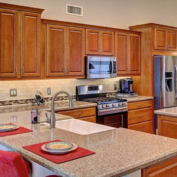
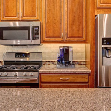
 This project was a complete kitchen remodel. The existing kitchen was dark and dated and no longer met the client’s needs. The space was awkward with no usable counter space and the cabinetry had large “dead” spots that were useless. We opened up the walls enclosing the kitchen and moved all the electrical work. We also eliminated the upper bar in peninsula and make it into on level. The design was based around elements that would complement the floor's. New Medallion cabinets were installed with a custom designed back-splash. We used mariposa buff, a Samsung quartz material for the countertops and Travertine for the backsplash. LED lighting added different layers of dimension and helped create ambiance.
If you are thinking about remodeling a space in your home please feel free to contact us. We currently are offering complimentary consultations.
www.CustomCreativeAZ.com
602-428-6112
 Custom Creative Remodeling
 This project was a complete kitchen remodel. The existing kitchen was dark and dated and no longer met the client’s needs. The space was awkward with no usable counter space and the cabinetry had large “dead” spots that were useless. We opened up the walls enclosing the kitchen and moved all the electrical work. We also eliminated the upper bar in peninsula and make it into on level. The design was based around elements that would complement the floor's. New Medallion cabinets were installed with a custom designed back-splash. We used mariposa buff, a Samsung quartz material for the countertops and Travertine for the backsplash. LED lighting added different layers of dimension and helped create ambiance.
If you are thinking about remodeling a space in your home please feel free to contact us. We currently are offering complimentary consultations.
www.CustomCreativeAZ.com
602-428-6112
 Creative Interior Solutions, LLC
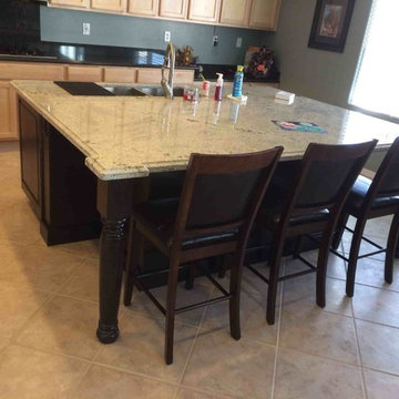
New Island, opened up kitchen
Example of an arts and crafts kitchen design in Las Vegas
Example of an arts and crafts kitchen design in Las Vegas
 TVL Creative Ltd.
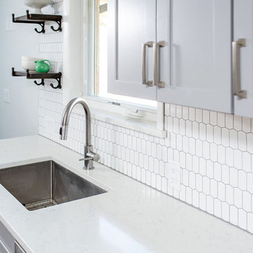
Our clients have been raising their family in this charming Lakewood ranch home for several years and were ready to make some updates to their home to make it better fit their lifestyle. In particular, the existing kitchen just wasn’t meeting their needs. They were sacrificing usable square footage to redundant circulation and the kitchen wasn’t connecting well with the other spaces in their home, so things had to change. We started by reworking the entry to the kitchen and switching up their layout to allow the kitchen to flow seamlessly with the rest of the house. To add to the open feeling we were striving for, we removed the existing ceiling soffits and created a clean transition between the kitchen and dining room, and installed the same wood flooring throughout the entire home. Aesthetically we wanted to create an inviting kitchen that felt clean and bright but could still stand up to a busy family. Soft grey shaker cabinets gave us the welcoming air we were looking for while providing a subtle contrast against the white quartz counters and backsplash tile. We utilized the same elegant pulls on all of the cabinets to add to the cohesive look of the kitchen and keep things from feeling too cluttered. We wanted to have a little fun with the backsplash without loosing the clean feeling we were going for, so we selected a crisp white picket tile to add a pop of texture. Updating the dining room light fixture and adding a pendant over the sink help to personalize the space and the charming shelves provide an opportunity to display original sculpture.
 Creative Landscapes, Inc.
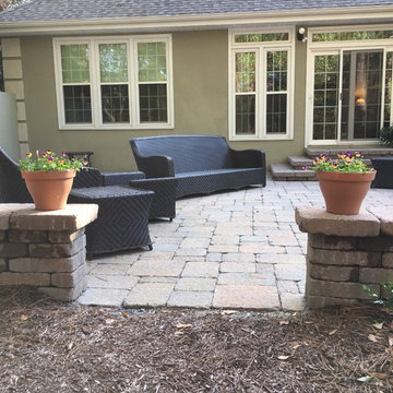
The redesigned patio is on one level thereby increasing the usable space. A landing and stairs create a smmothe transition from inside to outside.
Patio - traditional patio idea in Charleston
Patio - traditional patio idea in Charleston
 Creative Wood Products
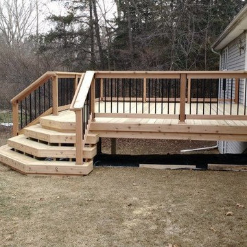
This is a recently completed deck project. The clients needed a way to access their beautiful backyard from the rear of the house. They wanted something that had a lot of usable space for entertaining, but wasn't just a "plain " square deck. The angled corner with flare staircase adds a nice bit of pizazz without taking away a lot of space. The steps are lit with Dekor brand low voltage l.e.d. lighting, and the combination of Deckorators brand round aluminum balusters with western red cedar make viewing the backyard from the house easier while cutting down on maintenance. They also add a more modern and elegant look. This is the second project we have done for these clients and they were an absolute pleasure to work with again. Thank you very much Mr. & Mrs. Bertram for allowing Creative Wood Products the pleasure of building your new deck!
 TVL Creative Ltd.
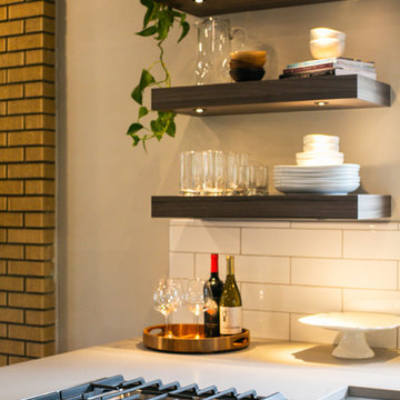
This 1950s home was sporting elements of the original kitchen and the dark space was not meeting our client’s needs. The original kitchen didn’t have much to offer in the way of functionality, so our first order of business was to create a design that would exponentially increase the usability of the kitchen. We brought in functional cabinetry, introduced uninterrupted work surfaces, and added plenty of lighting to brighten up their kitchen. They also wanted to open the new kitchen to the living room and create space for a larger dining table, so we started by removing the existing cabinetry that was visually cut the living space in two and minimized the power of the dramatic vaulted ceiling. We also extended the wood flooring into the kitchen as well to create seamless transitions between spaces. We fell in love with the idea of a two-toned cabinetry design for this kitchen and ultimately went head over heels for clean white painted base cabinets and a textured wood-look melamine on the uppers. This gave us a crisp backdrop that allowed us to bring is fun forms like the black light fixture over the table and the gorgeous silhouettes on the hardware. We played a lot with directionality in this space. The elongated open shelves and rectangular backsplash tiles give us wonderfully clean horizontal lines, but to balance those out we brought in a vertical grain pattern on the wall cabinets and added long black cabinetry pulls that emphasize the verticality of the space. The clients have a green thumb and wanted to make sure we created a home for their growing plant collection. The open shelving gives us plenty of opportunities for foliage and to showcase fun kitchen accessories. This design feels like home and brings together the clean lines and crisp finishes our clients were looking for.
 TVL Creative Ltd.
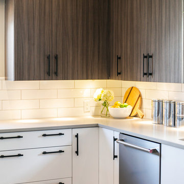
This 1950s home was sporting elements of the original kitchen and the dark space was not meeting our client’s needs. The original kitchen didn’t have much to offer in the way of functionality, so our first order of business was to create a design that would exponentially increase the usability of the kitchen. We brought in functional cabinetry, introduced uninterrupted work surfaces, and added plenty of lighting to brighten up their kitchen. They also wanted to open the new kitchen to the living room and create space for a larger dining table, so we started by removing the existing cabinetry that was visually cut the living space in two and minimized the power of the dramatic vaulted ceiling. We also extended the wood flooring into the kitchen as well to create seamless transitions between spaces. We fell in love with the idea of a two-toned cabinetry design for this kitchen and ultimately went head over heels for clean white painted base cabinets and a textured wood-look melamine on the uppers. This gave us a crisp backdrop that allowed us to bring is fun forms like the black light fixture over the table and the gorgeous silhouettes on the hardware. We played a lot with directionality in this space. The elongated open shelves and rectangular backsplash tiles give us wonderfully clean horizontal lines, but to balance those out we brought in a vertical grain pattern on the wall cabinets and added long black cabinetry pulls that emphasize the verticality of the space. The clients have a green thumb and wanted to make sure we created a home for their growing plant collection. The open shelving gives us plenty of opportunities for foliage and to showcase fun kitchen accessories. This design feels like home and brings together the clean lines and crisp finishes our clients were looking for.
 TVL Creative Ltd.
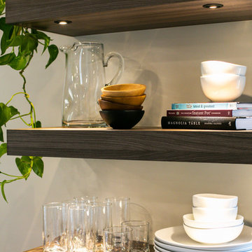
This 1950s home was sporting elements of the original kitchen and the dark space was not meeting our client’s needs. The original kitchen didn’t have much to offer in the way of functionality, so our first order of business was to create a design that would exponentially increase the usability of the kitchen. We brought in functional cabinetry, introduced uninterrupted work surfaces, and added plenty of lighting to brighten up their kitchen. They also wanted to open the new kitchen to the living room and create space for a larger dining table, so we started by removing the existing cabinetry that was visually cut the living space in two and minimized the power of the dramatic vaulted ceiling. We also extended the wood flooring into the kitchen as well to create seamless transitions between spaces. We fell in love with the idea of a two-toned cabinetry design for this kitchen and ultimately went head over heels for clean white painted base cabinets and a textured wood-look melamine on the uppers. This gave us a crisp backdrop that allowed us to bring is fun forms like the black light fixture over the table and the gorgeous silhouettes on the hardware. We played a lot with directionality in this space. The elongated open shelves and rectangular backsplash tiles give us wonderfully clean horizontal lines, but to balance those out we brought in a vertical grain pattern on the wall cabinets and added long black cabinetry pulls that emphasize the verticality of the space. The clients have a green thumb and wanted to make sure we created a home for their growing plant collection. The open shelving gives us plenty of opportunities for foliage and to showcase fun kitchen accessories. This design feels like home and brings together the clean lines and crisp finishes our clients were looking for.
 TVL Creative Ltd.
This 1950s home was sporting elements of the original kitchen and the dark space was not meeting our client’s needs. The original kitchen didn’t have much to offer in the way of functionality, so our first order of business was to create a design that would exponentially increase the usability of the kitchen. We brought in functional cabinetry, introduced uninterrupted work surfaces, and added plenty of lighting to brighten up their kitchen. They also wanted to open the new kitchen to the living room and create space for a larger dining table, so we started by removing the existing cabinetry that was visually cut the living space in two and minimized the power of the dramatic vaulted ceiling. We also extended the wood flooring into the kitchen as well to create seamless transitions between spaces. We fell in love with the idea of a two-toned cabinetry design for this kitchen and ultimately went head over heels for clean white painted base cabinets and a textured wood-look melamine on the uppers. This gave us a crisp backdrop that allowed us to bring is fun forms like the black light fixture over the table and the gorgeous silhouettes on the hardware. We played a lot with directionality in this space. The elongated open shelves and rectangular backsplash tiles give us wonderfully clean horizontal lines, but to balance those out we brought in a vertical grain pattern on the wall cabinets and added long black cabinetry pulls that emphasize the verticality of the space. The clients have a green thumb and wanted to make sure we created a home for their growing plant collection. The open shelving gives us plenty of opportunities for foliage and to showcase fun kitchen accessories. This design feels like home and brings together the clean lines and crisp finishes our clients were looking for.
 Creative Design Landscapes
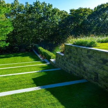
Grading is used as a design element, transforming a sloped property into a series of clean, usable lawn levels. Natural stone retaining walls establish structure while maintaining a quiet, cohesive material palette. Wide bluestone steppers cut through the turf, creating a clear, linear path that connects each elevation without disrupting the openness of the lawn.
Clipped hedging reinforces the edges and keeps the transitions defined, while soft planting along the upper wall introduces movement without taking away from the geometry. The layout prioritizes proportion, alignment, and long sightlines—allowing the space to feel expansive while remaining controlled.
 TVL Creative Ltd.
This 1950s home was sporting elements of the original kitchen and the dark space was not meeting our client’s needs. The original kitchen didn’t have much to offer in the way of functionality, so our first order of business was to create a design that would exponentially increase the usability of the kitchen. We brought in functional cabinetry, introduced uninterrupted work surfaces, and added plenty of lighting to brighten up their kitchen. They also wanted to open the new kitchen to the living room and create space for a larger dining table, so we started by removing the existing cabinetry that was visually cut the living space in two and minimized the power of the dramatic vaulted ceiling. We also extended the wood flooring into the kitchen as well to create seamless transitions between spaces. We fell in love with the idea of a two-toned cabinetry design for this kitchen and ultimately went head over heels for clean white painted base cabinets and a textured wood-look melamine on the uppers. This gave us a crisp backdrop that allowed us to bring is fun forms like the black light fixture over the table and the gorgeous silhouettes on the hardware. We played a lot with directionality in this space. The elongated open shelves and rectangular backsplash tiles give us wonderfully clean horizontal lines, but to balance those out we brought in a vertical grain pattern on the wall cabinets and added long black cabinetry pulls that emphasize the verticality of the space. The clients have a green thumb and wanted to make sure we created a home for their growing plant collection. The open shelving gives us plenty of opportunities for foliage and to showcase fun kitchen accessories. This design feels like home and brings together the clean lines and crisp finishes our clients were looking for.
 TVL Creative Ltd.
This 1950s home was sporting elements of the original kitchen and the dark space was not meeting our client’s needs. The original kitchen didn’t have much to offer in the way of functionality, so our first order of business was to create a design that would exponentially increase the usability of the kitchen. We brought in functional cabinetry, introduced uninterrupted work surfaces, and added plenty of lighting to brighten up their kitchen. They also wanted to open the new kitchen to the living room and create space for a larger dining table, so we started by removing the existing cabinetry that was visually cut the living space in two and minimized the power of the dramatic vaulted ceiling. We also extended the wood flooring into the kitchen as well to create seamless transitions between spaces. We fell in love with the idea of a two-toned cabinetry design for this kitchen and ultimately went head over heels for clean white painted base cabinets and a textured wood-look melamine on the uppers. This gave us a crisp backdrop that allowed us to bring is fun forms like the black light fixture over the table and the gorgeous silhouettes on the hardware. We played a lot with directionality in this space. The elongated open shelves and rectangular backsplash tiles give us wonderfully clean horizontal lines, but to balance those out we brought in a vertical grain pattern on the wall cabinets and added long black cabinetry pulls that emphasize the verticality of the space. The clients have a green thumb and wanted to make sure we created a home for their growing plant collection. The open shelving gives us plenty of opportunities for foliage and to showcase fun kitchen accessories. This design feels like home and brings together the clean lines and crisp finishes our clients were looking for.
 Creative Wood Products
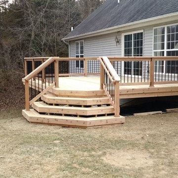
This is a recently completed deck project. The clients needed a way to access their beautiful backyard from the rear of the house. They wanted something that had a lot of usable space for entertaining, but wasn't just a "plain " square deck. The angled corner with flare staircase adds a nice bit of pizazz without taking away a lot of space. The steps are lit with Dekor brand low voltage l.e.d. lighting, and the combination of Deckorators brand round aluminum balusters with western red cedar make viewing the backyard from the house easier while cutting down on maintenance. They also add a more modern and elegant look. This is the second project we have done for these clients and they were an absolute pleasure to work with again. Thank you very much Mr. & Mrs. Bertram for allowing Creative Wood Products the pleasure of building your new deck!
 TVL Creative Ltd.
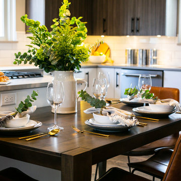
This 1950s home was sporting elements of the original kitchen and the dark space was not meeting our client’s needs. The original kitchen didn’t have much to offer in the way of functionality, so our first order of business was to create a design that would exponentially increase the usability of the kitchen. We brought in functional cabinetry, introduced uninterrupted work surfaces, and added plenty of lighting to brighten up their kitchen. They also wanted to open the new kitchen to the living room and create space for a larger dining table, so we started by removing the existing cabinetry that was visually cut the living space in two and minimized the power of the dramatic vaulted ceiling. We also extended the wood flooring into the kitchen as well to create seamless transitions between spaces. We fell in love with the idea of a two-toned cabinetry design for this kitchen and ultimately went head over heels for clean white painted base cabinets and a textured wood-look melamine on the uppers. This gave us a crisp backdrop that allowed us to bring is fun forms like the black light fixture over the table and the gorgeous silhouettes on the hardware. We played a lot with directionality in this space. The elongated open shelves and rectangular backsplash tiles give us wonderfully clean horizontal lines, but to balance those out we brought in a vertical grain pattern on the wall cabinets and added long black cabinetry pulls that emphasize the verticality of the space. The clients have a green thumb and wanted to make sure we created a home for their growing plant collection. The open shelving gives us plenty of opportunities for foliage and to showcase fun kitchen accessories. This design feels like home and brings together the clean lines and crisp finishes our clients were looking for.
 Creative Design Landscapes
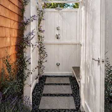
This project involved the removal of an aging wood shower enclosure and surrounding fencing, which had begun to deteriorate and contribute to poor drainage conditions. The existing area retained moisture, creating a muddy, unstable surface that impacted both usability and long-term durability.
The redesigned space introduces a fully upgraded outdoor shower system positioned discreetly behind a new white privacy enclosure. The structure was selected for its clean architectural lines, low-maintenance material, and ability to brighten and modernize the space while maintaining privacy.
A primary focus of the project was drainage correction. The ground plane was regraded and rebuilt using a permeable system consisting of oversized stone slabs set within polished black river rock. This layout allows water to move efficiently through the surface while maintaining a stable, clean, and visually refined finish. The contrast between the large-format slabs and the dark stone creates a structured, intentional foundation that elevates the overall design.
Planting was incorporated with both aesthetic and functional intent. Lavender was installed and trained along the enclosure to soften the structure and introduce seasonal fragrance. In addition to its visual contribution, it serves as a natural pest deterrent, helping to reduce mosquito activity and improve comfort within the space. Supporting plant material was kept minimal and scaled appropriately to maintain a clean, uncluttered environment.
The result is a fully integrated outdoor feature that transforms a previously underperforming area into a functional, durable, and visually cohesive extension of the home. The space now supports consistent use while delivering a refined, spa-like experience aligned with the surrounding landscape.
 Usable Space Interiors, LLC
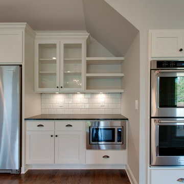
This challenging corner took a little creativity by USI. Notice the angles of the existing space and how USI optimized the space from this once un-usable space.
Behind this wall is the landing area for the stairs behind it. Since a cabinet was not feasible in this triangular space, USI incorporated floating shelves, as well as, different elevations along the entire wall, to create a feel that the design was very intentional.
7