
Search results for "Useless" in Home Design Ideas
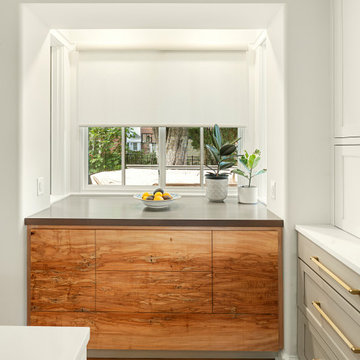
 J. Schwartz, LLC Remodeling & Fine Homebuilding
If you see the beam in the ceiling, that is where an wall was removed to open this space and make a large kitchen in the existing spaces of the home. There was another wall behind the island that created a small useless room that was also opened to the kitchen, making a great hang-out and bar area.
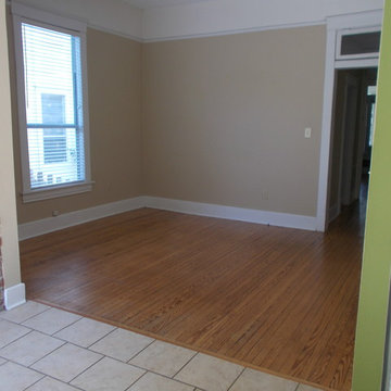
 Showhomes Home Staging of Little Rock
Sitting area in rear of home, adjacent to kitchen. This kind of area is difficult to visualize empty. Seems a cold and useless space.
Home design - traditional home design idea in Little Rock
Home design - traditional home design idea in Little Rock
 Right Building
Keli Keach
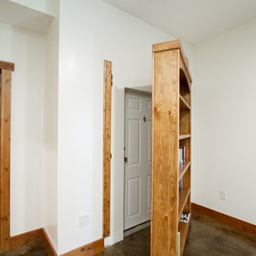
Mid-sized trendy master laminate floor and brown floor bedroom photo in Other with white walls and no fireplace
Mid-sized trendy master laminate floor and brown floor bedroom photo in Other with white walls and no fireplace
Find the right local pro for your project
 Che Interiors
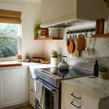
This project was a head-to-toe home renovation of a beautiful Pacifica single-family beach house. Our client bought this home 8+ years ago and had added on a master bathroom that features beautiful handcrafted Fire+Clay turquoise tiles. Little had been done, outside of painting the rooms, before we came along.
Every room in this home was hidden away, but by knocking down a few walls the kitchen, living room and dining space became one large open area with small dividing features. With a great deal of collaboration from the General Contractor, we added a skylight in the dining room, pulled up the windows in the kitchen to allow for the new cabinets to fit at a comfortable height, moved the sliding doors that were never used from the master bedroom to the dining room and replaced that opening with new large windows to flush the space with natural light. We updated the guest bathroom by repainting the walls, adding new fixtures and elements that spoke to the new language of the home.
Che Interiors, with the collaboration of our client, hand selected all the furnishings, window treatments, and decor throughout. We picked up on those blue and green hues of the master bathroom tiles and incorporated them throughout the rest of the home in custom furniture + home goods, area rugs, and more. By removing a useless closet in the dining room and adding a beautiful arch opening we created a perfect spot for the Turquoise custom buffet cabinet and carried the arch into the master bedroom to create a space for a home office that features a custom desk. Lastly, we put the cherry on top with The Shade Store’s woven beach style window treatments throughout the home.
What once was a disarray of colors and closed off spaces is now a lovely California-Chic beach home.
 Aloha Kitchen, Bath & Design
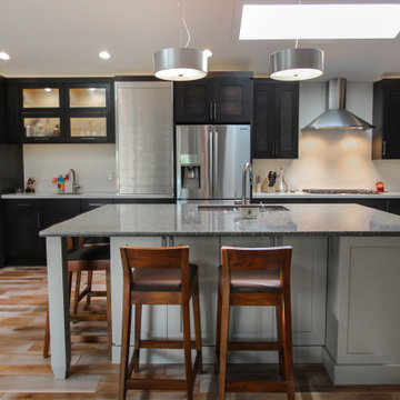
California modern rancher. Blend of warm and cool tones and material balance this space. Outdoor environment is low water use and drought resistant but still has greenery and inviting to hang out.
In the kitchen we removed the walls that made up the tiny closet of a kitchen that was in the corner under the skylight and was able to hide the ceiling height differences at the small desk area and oven cabinets and keep the skylight. The effect is a wide-open concept with the least amount of construction possible.
For the kitchen layout, we created a cozy zone for the chef to work in the corner without any cross traffic, seating area around the outside of the island keeps guest out of the work area but still close and part of the process. The warming drawer in the island positioned for proximity to the "buffet line" at the island when entertaining. On the dining end of the kitchen there is a coffee and wine bar. Coffee bar is hidden behind the metal roll up door, and the wine and liquor bar are to the left and both share the sink in the middle, making it a functional and useful space from the morning until the evening. I like to call this bar "Start and Stop" ha-ha. Even though this space is very open and airy, it has a ton of storage including underneath the seating area at the island and the little workstation, which is open and uncluttered, has lots of storage nestled in the wall and underneath the counter and hides any CPU and wires neatly.
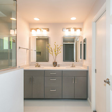
In the master bath, we updated all the colors and finishes in a clean modern European style with large format porcelain tiles and repurposed a small useless closet (with a window in it) to a second vanity for extra counter space and linen storage. Plus, we added storage over the toilet in the water closet and an updated door and casing into the walk-in closet with frosted glass panels so that at night the light in the closet glowing in those panels can act as a night light. (Photo credit; Kitchens of Diablo)
 Revive Remodeling LLC
The master bathroom was reconfigured by eliminating the doorway that separated the old fiberglass shower & toilet area to the vanity. This allowed for a large shower expansion with a pony wall and glass panel that replaced the useless space of a previous small vanity desk inside of the entry.
 Aloha Kitchen, Bath & Design
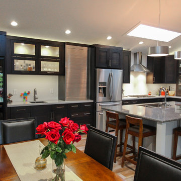
California modern rancher. Blend of warm and cool tones and material balance this space. Outdoor environment is low water use and drought resistant but still has greenery and inviting to hang out.
In the kitchen we removed the walls that made up the tiny closet of a kitchen that was in the corner under the skylight and was able to hide the ceiling height differences at the small desk area and oven cabinets and keep the skylight. The effect is a wide-open concept with the least amount of construction possible.
For the kitchen layout, we created a cozy zone for the chef to work in the corner without any cross traffic, seating area around the outside of the island keeps guest out of the work area but still close and part of the process. The warming drawer in the island positioned for proximity to the "buffet line" at the island when entertaining. On the dining end of the kitchen there is a coffee and wine bar. Coffee bar is hidden behind the metal roll up door, and the wine and liquor bar are to the left and both share the sink in the middle, making it a functional and useful space from the morning until the evening. I like to call this bar "Start and Stop" ha-ha. Even though this space is very open and airy, it has a ton of storage including underneath the seating area at the island and the little workstation, which is open and uncluttered, has lots of storage nestled in the wall and underneath the counter and hides any CPU and wires neatly.
In the master bath, we updated all the colors and finishes in a clean modern European style with large format porcelain tiles and repurposed a small useless closet (with a window in it) to a second vanity for extra counter space and linen storage. Plus, we added storage over the toilet in the water closet and an updated door and casing into the walk-in closet with frosted glass panels so that at night the light in the closet glowing in those panels can act as a night light. (Photo credit; Kitchens of Diablo)
 Spirit Tahoe Interior Design & Gallery
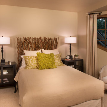
The bedroom is that part of the house where we go to recharge and rest after a hard day’s work or play. The room must be similar to our personality to make us feel at ease, but it should also be designed with style, without crowding it with useless materials that would remove the idea of spacious and special retreat.
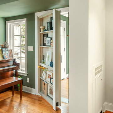 J. Schwartz, LLC Remodeling & Fine Homebuilding
If you see the beam in the ceiling, that is where an wall was removed to open this space and make a large kitchen in the existing spaces of the home. There was another wall behind the island that created a small useless room that was also opened to the kitchen, making a great hang-out and bar area.
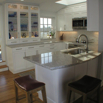
 Dreamwork Kitchens
The views out the windows? Stunning. The view Around the Kitchen? Not so Much.
This 80’s kitchen in a wonderful seaside location had become time worn. We removed the dated wood-trimmed doors and laminate countertops and replaced them with simple painted wood shaker style doors and quartz counters. Custom upper cabinets replaced the useless plaster soffit. By moving the refrigerator to a new location, we were able to create a stylish set of vitrine cabinets with custom mother of pearl tiling detail to display the owners’ collectables.
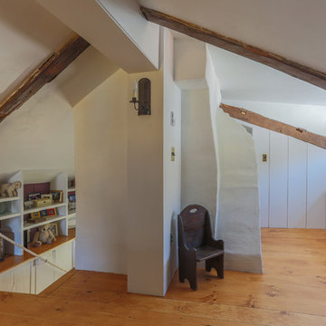
 Cummings Architecture + Interiors
The attic renovation of this First Period Ipswich, Massachusetts home (c. 1668) was inspired by English vernacular cottages of the Cotswolds. The clients wanted an additional bedroom and office space in their unused attic, while maintaining the authentic first period style of the rest of the house. This meant keeping the original roofline and low ceilings, giving the space a cozy feel. Structurally, the space needed some timber frame repair, and the original timbers were left exposed with white plaster for the Medieval English interior style. Cummings Architects paid close attention to utilizing the low ceiling height at the perimeter of the space and designed built-in storage that the clients’ previously lacked. A cozy reading nook and details like the interior window above the stairway, looking into the bedroom, changed the useless, dark attic into an intimate, personal space.
Photo by Eric Roth
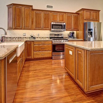
 Custom Creative Remodeling
 This project was a complete kitchen remodel. The existing kitchen was dark and dated and no longer met the client’s needs. The space was awkward with no usable counter space and the cabinetry had large “dead” spots that were useless. We opened up the walls enclosing the kitchen and moved all the electrical work. We also eliminated the upper bar in peninsula and make it into on level. The design was based around elements that would complement the floor's. New Medallion cabinets were installed with a custom designed back-splash. We used mariposa buff, a Samsung quartz material for the countertops and Travertine for the backsplash. LED lighting added different layers of dimension and helped create ambiance.
If you are thinking about remodeling a space in your home please feel free to contact us. We currently are offering complimentary consultations.
www.CustomCreativeAZ.com
602-428-6112
 S Squared Design, LLC
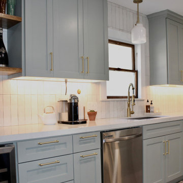
This historic home was in need of a more functional kitchen and needed more purposeful storage. We removed walls and relocated doors to make this a more open kitchen and primary bathroom which had a step down that had no place there. We added as much cabinetry with a proper pantry cabinet, pull out trash and plenty of base cabinets with drawers to make sure everything was seen and accessible. This 100 year old house was well kept but over the decades the house was feeling more compartmentalized than the homeowner wanted. Useless hallways and doors that didn't need to be there. We wanted some color without being too bold, a soft green for the kitchen and a modern large hex floor tile gave us color this house was asking for. We went with a low maintenance porcelain backsplash tile in a tone on tone white for a more handmade look. Paired with a durable quartz countertop for lots of cooking and entertaining. The old kitchen was missing enough counter space so we almost tripled it with a little re-design on my end. The original windows were stripped down and stained for a more craftsman look and we carried that wood into the beverage bar area with some shelves. This home truly has transformed into a more functional and beautiful space!
 S Squared Design, LLC
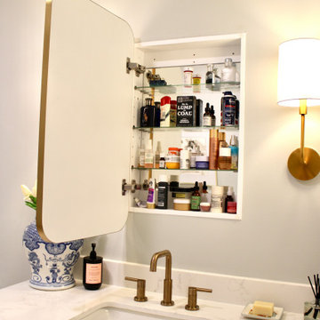
This historic home was in need of a more functional kitchen and needed more purposeful storage. We removed walls and relocated doors to make this a more open kitchen and primary bathroom which had a step down that had no place there. We added as much cabinetry with a proper pantry cabinet, pull out trash and plenty of base cabinets with drawers to make sure everything was seen and accessible. This 100 year old house was well kept but over the decades the house was feeling more compartmentalized than the homeowner wanted. Useless hallways and doors that didn't need to be there. We wanted some color without being too bold, a soft green for the kitchen and a modern large hex floor tile gave us color this house was asking for. We went with a low maintenance porcelain backsplash tile in a tone on tone white for a more handmade look. Paired with a durable quartz countertop for lots of cooking and entertaining. The old kitchen was missing enough counter space so we almost tripled it with a little re-design on my end. The original windows were stripped down and stained for a more craftsman look and we carried that wood into the beverage bar area with some shelves. This home truly has transformed into a more functional and beautiful space!
 S Squared Design, LLC
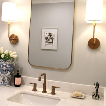
This historic home was in need of a more functional kitchen and needed more purposeful storage. We removed walls and relocated doors to make this a more open kitchen and primary bathroom which had a step down that had no place there. We added as much cabinetry with a proper pantry cabinet, pull out trash and plenty of base cabinets with drawers to make sure everything was seen and accessible. This 100 year old house was well kept but over the decades the house was feeling more compartmentalized than the homeowner wanted. Useless hallways and doors that didn't need to be there. We wanted some color without being too bold, a soft green for the kitchen and a modern large hex floor tile gave us color this house was asking for. We went with a low maintenance porcelain backsplash tile in a tone on tone white for a more handmade look. Paired with a durable quartz countertop for lots of cooking and entertaining. The old kitchen was missing enough counter space so we almost tripled it with a little re-design on my end. The original windows were stripped down and stained for a more craftsman look and we carried that wood into the beverage bar area with some shelves. This home truly has transformed into a more functional and beautiful space!
 Aloha Kitchen, Bath & Design
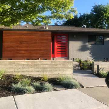
California modern rancher. Blend of warm and cool tones and material balance this space. Outdoor environment is low water use and drought resistant but still has greenery and inviting to hang out.
In the kitchen we removed the walls that made up the tiny closet of a kitchen that was in the corner under the skylight and was able to hide the ceiling height differences at the small desk area and oven cabinets and keep the skylight. The effect is a wide-open concept with the least amount of construction possible.
For the kitchen layout, we created a cozy zone for the chef to work in the corner without any cross traffic, seating area around the outside of the island keeps guest out of the work area but still close and part of the process. The warming drawer in the island positioned for proximity to the "buffet line" at the island when entertaining. On the dining end of the kitchen there is a coffee and wine bar. Coffee bar is hidden behind the metal roll up door, and the wine and liquor bar are to the left and both share the sink in the middle, making it a functional and useful space from the morning until the evening. I like to call this bar "Start and Stop" ha-ha. Even though this space is very open and airy, it has a ton of storage including underneath the seating area at the island and the little workstation, which is open and uncluttered, has lots of storage nestled in the wall and underneath the counter and hides any CPU and wires neatly.
In the master bath, we updated all the colors and finishes in a clean modern European style with large format porcelain tiles and repurposed a small useless closet (with a window in it) to a second vanity for extra counter space and linen storage. Plus, we added storage over the toilet in the water closet and an updated door and casing into the walk-in closet with frosted glass panels so that at night the light in the closet glowing in those panels can act as a night light.
 CLAUDIA MOORE
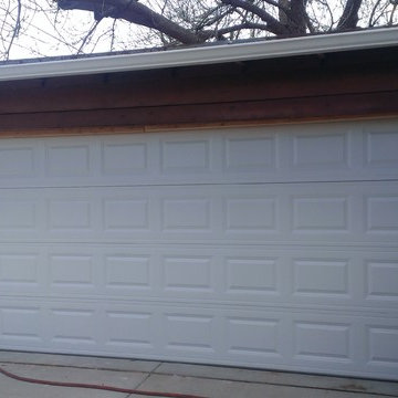
COMPLETELY REMODEL OLD USELESS 2 CAR GARAGE. REMOVED CRUMBLED CONCRETE FLOOR AND REPLACE. TAKE OFF OLD WOOD DOORS ON ALLY SIDE AND FILL IN WITH NEW BRICK TAKE OUT PART OF BACKYARD AND REPLACE WITH CONCRETE DRIVEWAY AND NEW WALKWAY TO HOUSE.
 180 Design by Lisa
Scott Kroeker Photography
Inspiration for a mid-sized modern formal and open concept dark wood floor living room remodel in Other with white walls
Inspiration for a mid-sized modern formal and open concept dark wood floor living room remodel in Other with white walls
 Drury Design
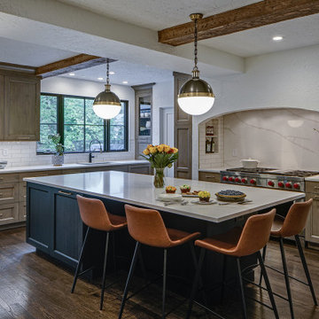
The original kitchen in this historic River Forest home was a hodgepodge of design elements created by additions to the space over the years. From a functional standpoint, the layout was overly complicated. The kitchen was an L shape with the work triangle in the small leg of the L. It was a fairly large space, but the layout made it feel like a very small kitchen. (See ‘before’ photo below.)
The traffic flow from other areas of the home entered at awkward locations, rendering some walls useless for storage or workspace.
In addition to solving functionality and flow issues, the homeowner wanted their new kitchen area to have an updated look that still tied into the home’s English Tudor style.
THE REMODEL
We took everything down to the studs and reestablished design elements like existing beams and a very particular texture on the walls and ceiling. The short leg of the L was closed off and a nice-sized walk-in pantry was put in its place. This functions as the major storage area now – just a few wall cabinets are visible for the everyday dishes.
Entries into the space were closed off and relocated to help the overall traffic flow of the home. The windows and exterior doors in the room were removed and relocated. The new ones were finished in a style to match those in some of the existing parts of the home.
THE RENEWED SPACE
This kitchen now has a nice, spacious feel for this growing family of five. A large arch was built to enclose the range and disguise some architectural details that could not be changed. This was carefully finished in the same textured surface as the original walls.
Pantries are now strategically located on both sides of the range area: a pull-out pantry on one side and a shallower pantry on the other side. The large island functions as a spacious work area and a central hub for the busy family’s many daily activities.
The transitional design elements and subdued, neutral color palette contribute to what is now a very calming and functional space for the entire family.
 Serene Interior Designs
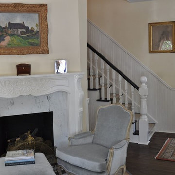
There was once a pair of useless columns here that divided the foyer from the living room, which we believe were added in the 1960s. Removing them made such a refreshing difference.
11