
Search results for "Utilized vibrant" in Home Design Ideas
 Robin's Nest Interiors
It was a pleasure to help this single dad transform a previous French Country motif into a Handsome Space with Masculine Vibe. The homeowner loves the blues you find in the Caribbean so we used those as accent colors throughout the rooms.
Entry
We painted the walls Sherwin Williams’ Latte (SW6108) to add warmth. We accessorized the homeowner’s beautiful burl wood cabinet with vibrant artwork and whimsical Chinese horses. I always recommend task lighting in a Foyer, if possible, and the rectangular lamp shade is the perfect shape to fit on the small end of the cabinet.
Powder Room
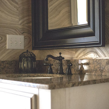
I adore the Candace Olson wallpaper we used in the Powder Room. The blocks look like sections of wood. It works great with the existing granite. Other examples of wallpaper here and here.
Great Room
We touched every surface in this Great Room from painting the walls Nomadic Desert (SW6107) to painting the ceiling Double Latte (SW9108) to make the room feel cozier to replacing the carpet with this transitional style with striated pattern to painting the white built-ins.
Furniture placement was a real challenge because the grand piano needed to stay without blocking the traffic flow through the space. The homeowner also wanted us to incorporate his chess table and chairs. We centered a small seating area in front of the fireplace utilizing two oversized club chairs and an upholstered ottoman with a wood tray that slides. The wood bases on the chairs helps their size not overpower the room. The velvet ottoman fabric with navy, azure, and teal blues is a showstopper.
We used the homeowner’s wonderful collection of unique puzzle boxes to accessorize the built-ins. We just added some pops of blues, greens and silver. The homeowner loves sculptural objects so the nickel twig wall decor was the perfect focal point above the mantle. We opted not to add anything to the mantle so it would not distract from the art piece.
We added decorative drapery panels installed on short rods between each set of doors. The homeowner was open to this abstract floral pattern in greens and blues!
We reupholstered the cushions for the chess table chairs in a fun geometric fabric that coordinates with the panel fabric. The homeowner does not use this set of doors to access the deck so we were able to position the table directly in front of them.
Kelly Sisler of Kelly Faux Creations worked her magic on the built-ins. We used Sherwin Williams’ Mega Greige (SW7031) as the base and then applied a heavy bronze glaze. It completely transformed the Great Room. Other examples of painting built-ins here and here.
We hoped you enjoyed this Handsome Space with Masculine Vibe. It was quite a transformation!
 TVL Creative Ltd.
Cramped kitchen be gone! That was the project motto and top priority. The goal was to transform the current layout from multiple smaller spaces into a connected whole that would activate the main level for our clients, a young family of four.
The biggest obstacle was the wall dividing the kitchen and the dining room. Removing this wall was central to opening up and integrating the main living spaces, but the existing ductwork that ran right through the center of the wall posed a design challenge, er design opportunity. The resulting design solution features a central pantry that captures the ductwork and provides valuable storage- especially when compared to the original kitchen's 18" wide pantry cabinet. The pantry also anchors the kitchen island and serves as a visual separation of space between the kitchen and homework area.
Through our design development process, we learned the formal living room was of no service to their lifestyle and therefore space they rarely spent time in. With that in mind, we proposed to eliminate the unused living room and make it the new dining room. Relocating the dining room to this space inherently felt right given the soaring ceiling and ample room for holiday dinners and celebrations. The new dining room was spacious enough for us to incorporate a conversational seating area in the warm, south-facing window alcove.
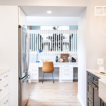
Now what to do with the old dining room?! To answer that question we took inspiration from our clients' shared profession in education and developed a craft area/homework station for both of their boys. The semi-custom cabinetry of the desk area carries over to the adjacent wall and forms window bench base with storage that we topped with butcher block for a touch of warmth. While the boys are young, the bench drawers are the perfect place for a stash of toys close to the kitchen.
The kitchen begins just beyond the window seat with their refrigerator enclosure. Opposite the refrigerator is the new pantry with twenty linear feet of shelving and space for brooms and a stick vacuum. Extending from the backside of the pantry the kitchen island design incorporates counter seating on the family room side and a cabinetry configuration on the kitchen side with drawer storage, a trashcan center, farmhouse sink, and dishwasher.
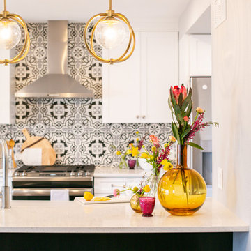
We took careful time in design and execution to align the range and sink because while it might seem like a small detail, it plays an important role in supporting the symmetrical configuration of the back wall of the kitchen. The rear wall design utilizes an appliance garage mirrors the visual impact of the refrigerator enclosure and helps keep the now open kitchen tidy. Between the appliance garage and refrigerator enclosure is the cooking zone with 30" of cabinetry and work surface on either side of the range, a chimney style vent hood, and a bold graphic tile backsplash.
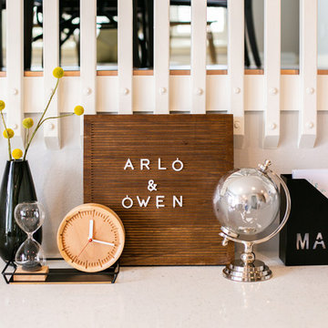
The backsplash is just one of many personal touches we added to the space to reflect our client's modern eclectic style and love of color. Swooping lines of the mid-mod style barstools compliment the pendants and backsplash pattern. A pop of vibrant green on the frame of the pantry door adds a fresh wash of color to an otherwise neutral space. The big show stopper is the custom charcoal gray and copper chevron wall installation in the dining room. This was an idea our clients softly suggested, and we excitedly embraced the opportunity. It is also a kickass solution to the head-scratching design dilemma of how to fill a large and lofty wall.
We are so grateful to bring this design to life for our clients and now dear friends.
 TVL Creative Ltd.
Cramped kitchen be gone! That was the project motto and top priority. The goal was to transform the current layout from multiple smaller spaces into a connected whole that would activate the main level for our clients, a young family of four.
The biggest obstacle was the wall dividing the kitchen and the dining room. Removing this wall was central to opening up and integrating the main living spaces, but the existing ductwork that ran right through the center of the wall posed a design challenge, er design opportunity. The resulting design solution features a central pantry that captures the ductwork and provides valuable storage- especially when compared to the original kitchen's 18" wide pantry cabinet. The pantry also anchors the kitchen island and serves as a visual separation of space between the kitchen and homework area.
Through our design development process, we learned the formal living room was of no service to their lifestyle and therefore space they rarely spent time in. With that in mind, we proposed to eliminate the unused living room and make it the new dining room. Relocating the dining room to this space inherently felt right given the soaring ceiling and ample room for holiday dinners and celebrations. The new dining room was spacious enough for us to incorporate a conversational seating area in the warm, south-facing window alcove.
Now what to do with the old dining room?! To answer that question we took inspiration from our clients' shared profession in education and developed a craft area/homework station for both of their boys. The semi-custom cabinetry of the desk area carries over to the adjacent wall and forms window bench base with storage that we topped with butcher block for a touch of warmth. While the boys are young, the bench drawers are the perfect place for a stash of toys close to the kitchen.
The kitchen begins just beyond the window seat with their refrigerator enclosure. Opposite the refrigerator is the new pantry with twenty linear feet of shelving and space for brooms and a stick vacuum. Extending from the backside of the pantry the kitchen island design incorporates counter seating on the family room side and a cabinetry configuration on the kitchen side with drawer storage, a trashcan center, farmhouse sink, and dishwasher.
We took careful time in design and execution to align the range and sink because while it might seem like a small detail, it plays an important role in supporting the symmetrical configuration of the back wall of the kitchen. The rear wall design utilizes an appliance garage mirrors the visual impact of the refrigerator enclosure and helps keep the now open kitchen tidy. Between the appliance garage and refrigerator enclosure is the cooking zone with 30" of cabinetry and work surface on either side of the range, a chimney style vent hood, and a bold graphic tile backsplash.
The backsplash is just one of many personal touches we added to the space to reflect our client's modern eclectic style and love of color. Swooping lines of the mid-mod style barstools compliment the pendants and backsplash pattern. A pop of vibrant green on the frame of the pantry door adds a fresh wash of color to an otherwise neutral space. The big show stopper is the custom charcoal gray and copper chevron wall installation in the dining room. This was an idea our clients softly suggested, and we excitedly embraced the opportunity. It is also a kickass solution to the head-scratching design dilemma of how to fill a large and lofty wall.
We are so grateful to bring this design to life for our clients and now dear friends.
Find the right local pro for your project
 Semmelmann Interiors- Voted Best Interiors 2024!
Susan Semmelmann is famed for audacious design statements, but she also cherishes the simplicity and elegance of a Step into the realm of your Dream Home with us. We curate the look and feel of your desired abode, encompassing all elements from illuminations to adornments.
While Susan Semmelmann is acclaimed for her daring design declarations, she holds a deep reverence for the allure of chic, minimalist aesthetics. Our fabrics, draperies, and furnishings are skillfully fashioned at our Fort Worth Fabric Studio - a vibrant, woman-led establishment nestled in the heart of Texas.
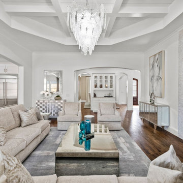
Your dream living room comes to life with a prominent white brick accent wall and fireplace, lending an urban twist to your Texan home. Resting beneath a dazzling crystal chandelier are plush beige couches, creating a harmonious balance between comfort and elegance. Our concept of a bathroom is a place for you to dissolve the day's stresses; thus, we utilized a serene, all-white palette and emphasized absolute balance within your personal retreat. Amidst designing your symmetrically placed, eggshell cabinets, we laid down a classy marble floor intended for regal footfalls. The center stage is dominated by a spotless, inviting plunge bath designed for indulgent bubble baths.
In crafting your dream kitchen, we married chic design with timeless elegance. Across a single stretch, we merged eggshell cabinets and a marble countertop with a smoothly integrated sink, dishwasher, and state-of-the-art oven. The dark wood floors and custom brown drapes add warmth and contrast to the space, accentuating the room's modern-yet-classic appeal.
With the bounty of countertop space ready to echo your personal style, we’ll inject a unique decorative flourish guaranteed to impress your visitors. For an innovative take on modern home conception, trust Susan Semmelmann and her 23 years of Interior Design experience to realize your dreams.
 Shearon Design Collective
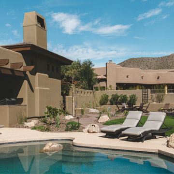
This project was driven by a commitment to sustainability and repurposing existing materials, seamlessly blending the old with the new while minimizing waste. The goal was to transform the backyard into a lush garden oasis with a low-water and low-maintenance design. Despite challenges posed by the property's proximity to the golf course and specific guidelines, a harmonious integration of desert plant life and low-water lush plants was achieved. Reusing existing materials and replacing natural grass with synthetic turf minimized water usage, while strategic plant placement utilized run-off water for sustainable irrigation. Navigating the constraints imposed by the Country Club, the project created a cohesive outdoor space and repurposed cobblestones to bridge the gap between the golf course and the rear of the property. This project achieved a balance between ecological consciousness and aesthetic beauty, allowing the garden oasis to coexist harmoniously with the golf course backdrop, providing the clients with a serene and vibrant landscape that aligns with their vision and respects the natural resources of the community.
 BBA Architects
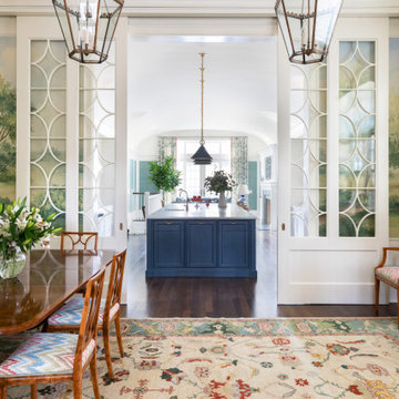
Inspired by the architecture of the prestigious Regent Street in London, the exterior of this city home has an elegant and refined street presence. A thoughtful floor plan cleverly utilizes the project’s narrow site to provide an open, but defined light-filled interior. Custom detailing paired with colorful finishes, create an inviting and vibrant family home.
View more of this home through #BBARegentStreetTownhome on Instagram.
 FUTURE DESIGN AND BUILD
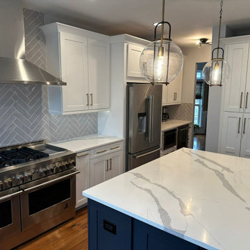
A small kitchen with white and blue cabinets can create a cozy and charming space that feels both refreshing and relaxing. White and blue cabinets are a popular choice for kitchen design as they bring a classic yet modern look to the room. When it comes to a small kitchen design, the color combination of white and blue cabinets can make the space feel cozy, but not cramped.
White cabinets in a small kitchen can make the room feel more spacious because they reflect light and make the room appear brighter. This gives the perception of more room in the kitchen. Blue cabinets, on the other hand, add a pop of color and personality to the kitchen. Together with white cabinets, they create a refreshing and vibrant look.
When working with a small kitchen with white and blue cabinets, it's important to choose countertops and backsplash materials that complement the overall design. For example, a white quartz or marble countertop can create a cohesive and elegant look. A subway tile backsplash in a neutral color can make the cabinets stand out even more, while a blue mosaic or patterned tile can add a unique touch of personality to the space.
To make the most of a small kitchen design with white and blue cabinets, you can also utilize open shelving or glass cabinet doors. This creates an opportunity to display decorative items or storage and make the space feel more open and airy.

Sponsored
Sunbury, OH

J.Holderby - Renovations
Franklin County's Leading General Contractors - 2X Best of Houzz!
 DFI Interiors
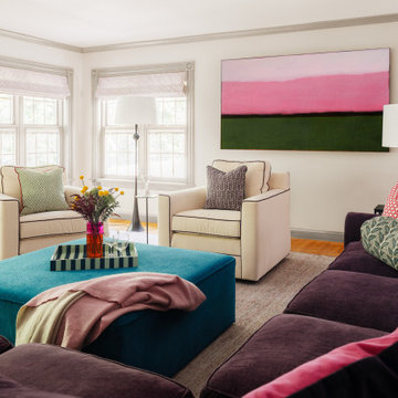
This family room project showcases our ability to create spaces that are both beautiful and functional. We incorporated a vibrant color scheme with turquoise, magenta, and greens, utilizing custom window coverings, pillows, and furniture to create a space that is both stylish and kid-resistant.
 Above All Masonry Design, Inc
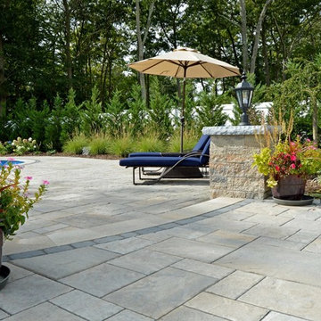
Combining minimalism with elegance, this multi-tiered hardscape design transformed the outdoor living space of a Long Island, NY home. On the heart of Long Island, designers blended style with functionality, utilizing the whole of the property for hosting guests, preparing and serving summer meals and lounging by the pool on the sun-filled patio. With the use of softly toned Techo Bloc concrete pavers, Above All Masonry Design incorporated flow and structure while balancing with the existing natural setting. Family and guests travel down the paver walkway, through the expansive outdoor kitchen and dining space and out to the poolside deck or fire pit lounge area. Balanced with vibrant landscaping and lighting design, this Long Island home can now host large groups of family and friends with ease.

 Serapool Porselen
Overlooking the breathtaking views of Bodrum, this private villa project merges modern architecture with the refined elegance of Serapool porcelain. Designed as an infinity pool, the project utilizes the Blue Bead Series, whose deep navy tones and textured surface visually merge with the sea, creating an atmosphere that is both vibrant and serene. The porcelain pool tiles offer high resistance to UV rays, chemical exposure, and thermal shocks, ensuring long-term durability. Around the pool, Beige Stone porcelain anti-slip terrace tiles provide a natural aesthetic that blends with the landscape, while the PTV ≥ 45° anti-slip rating ensures safe use along the infinity edge. Complementary details such as Blue Bead outer trim and Beige Stone flat coping pieces add refined and functional transitions at the poolside, enhancing both form and function.
 Serapool Porselen
Overlooking the breathtaking views of Bodrum, this private villa project merges modern architecture with the refined elegance of Serapool porcelain. Designed as an infinity pool, the project utilizes the Blue Bead Series, whose deep navy tones and textured surface visually merge with the sea, creating an atmosphere that is both vibrant and serene. The porcelain pool tiles offer high resistance to UV rays, chemical exposure, and thermal shocks, ensuring long-term durability. Around the pool, Beige Stone porcelain anti-slip terrace tiles provide a natural aesthetic that blends with the landscape, while the PTV ≥ 45° anti-slip rating ensures safe use along the infinity edge. Complementary details such as Blue Bead outer trim and Beige Stone flat coping pieces add refined and functional transitions at the poolside, enhancing both form and function.
 TVL Creative Ltd.
Cramped kitchen be gone! That was the project motto and top priority. The goal was to transform the current layout from multiple smaller spaces into a connected whole that would activate the main level for our clients, a young family of four.
The biggest obstacle was the wall dividing the kitchen and the dining room. Removing this wall was central to opening up and integrating the main living spaces, but the existing ductwork that ran right through the center of the wall posed a design challenge, er design opportunity. The resulting design solution features a central pantry that captures the ductwork and provides valuable storage- especially when compared to the original kitchen's 18" wide pantry cabinet. The pantry also anchors the kitchen island and serves as a visual separation of space between the kitchen and homework area.
Through our design development process, we learned the formal living room was of no service to their lifestyle and therefore space they rarely spent time in. With that in mind, we proposed to eliminate the unused living room and make it the new dining room. Relocating the dining room to this space inherently felt right given the soaring ceiling and ample room for holiday dinners and celebrations. The new dining room was spacious enough for us to incorporate a conversational seating area in the warm, south-facing window alcove.
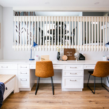
Now what to do with the old dining room?! To answer that question we took inspiration from our clients' shared profession in education and developed a craft area/homework station for both of their boys. The semi-custom cabinetry of the desk area carries over to the adjacent wall and forms window bench base with storage that we topped with butcher block for a touch of warmth. While the boys are young, the bench drawers are the perfect place for a stash of toys close to the kitchen.
The kitchen begins just beyond the window seat with their refrigerator enclosure. Opposite the refrigerator is the new pantry with twenty linear feet of shelving and space for brooms and a stick vacuum. Extending from the backside of the pantry the kitchen island design incorporates counter seating on the family room side and a cabinetry configuration on the kitchen side with drawer storage, a trashcan center, farmhouse sink, and dishwasher.
We took careful time in design and execution to align the range and sink because while it might seem like a small detail, it plays an important role in supporting the symmetrical configuration of the back wall of the kitchen. The rear wall design utilizes an appliance garage mirrors the visual impact of the refrigerator enclosure and helps keep the now open kitchen tidy. Between the appliance garage and refrigerator enclosure is the cooking zone with 30" of cabinetry and work surface on either side of the range, a chimney style vent hood, and a bold graphic tile backsplash.
The backsplash is just one of many personal touches we added to the space to reflect our client's modern eclectic style and love of color. Swooping lines of the mid-mod style barstools compliment the pendants and backsplash pattern. A pop of vibrant green on the frame of the pantry door adds a fresh wash of color to an otherwise neutral space. The big show stopper is the custom charcoal gray and copper chevron wall installation in the dining room. This was an idea our clients softly suggested, and we excitedly embraced the opportunity. It is also a kickass solution to the head-scratching design dilemma of how to fill a large and lofty wall.
We are so grateful to bring this design to life for our clients and now dear friends.
 Robin's Nest Interiors
It was a pleasure to help this single dad transform a previous French Country motif into a Handsome Space with Masculine Vibe. The homeowner loves the blues you find in the Caribbean so we used those as accent colors throughout the rooms.
Entry
We painted the walls Sherwin Williams’ Latte (SW6108) to add warmth. We accessorized the homeowner’s beautiful burl wood cabinet with vibrant artwork and whimsical Chinese horses. I always recommend task lighting in a Foyer, if possible, and the rectangular lamp shade is the perfect shape to fit on the small end of the cabinet.
Powder Room
I adore the Candace Olson wallpaper we used in the Powder Room. The blocks look like sections of wood. It works great with the existing granite. Other examples of wallpaper here and here.
Great Room
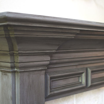
We touched every surface in this Great Room from painting the walls Nomadic Desert (SW6107) to painting the ceiling Double Latte (SW9108) to make the room feel cozier to replacing the carpet with this transitional style with striated pattern to painting the white built-ins.
Furniture placement was a real challenge because the grand piano needed to stay without blocking the traffic flow through the space. The homeowner also wanted us to incorporate his chess table and chairs. We centered a small seating area in front of the fireplace utilizing two oversized club chairs and an upholstered ottoman with a wood tray that slides. The wood bases on the chairs helps their size not overpower the room. The velvet ottoman fabric with navy, azure, and teal blues is a showstopper.
We used the homeowner’s wonderful collection of unique puzzle boxes to accessorize the built-ins. We just added some pops of blues, greens and silver. The homeowner loves sculptural objects so the nickel twig wall decor was the perfect focal point above the mantle. We opted not to add anything to the mantle so it would not distract from the art piece.
We added decorative drapery panels installed on short rods between each set of doors. The homeowner was open to this abstract floral pattern in greens and blues!
We reupholstered the cushions for the chess table chairs in a fun geometric fabric that coordinates with the panel fabric. The homeowner does not use this set of doors to access the deck so we were able to position the table directly in front of them.
Kelly Sisler of Kelly Faux Creations worked her magic on the built-ins. We used Sherwin Williams’ Mega Greige (SW7031) as the base and then applied a heavy bronze glaze. It completely transformed the Great Room. Other examples of painting built-ins here and here.
We hoped you enjoyed this Handsome Space with Masculine Vibe. It was quite a transformation!
Sponsored
Sunbury, OH
J.Holderby - Renovations
Franklin County's Leading General Contractors - 2X Best of Houzz!
 Shearon Design Collective
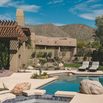
This project was driven by a commitment to sustainability and repurposing existing materials, seamlessly blending the old with the new while minimizing waste. The goal was to transform the backyard into a lush garden oasis with a low-water and low-maintenance design. Despite challenges posed by the property's proximity to the golf course and specific guidelines, a harmonious integration of desert plant life and low-water lush plants was achieved. Reusing existing materials and replacing natural grass with synthetic turf minimized water usage, while strategic plant placement utilized run-off water for sustainable irrigation. Navigating the constraints imposed by the Country Club, the project created a cohesive outdoor space and repurposed cobblestones to bridge the gap between the golf course and the rear of the property. This project achieved a balance between ecological consciousness and aesthetic beauty, allowing the garden oasis to coexist harmoniously with the golf course backdrop, providing the clients with a serene and vibrant landscape that aligns with their vision and respects the natural resources of the community.
 Price Style and Design
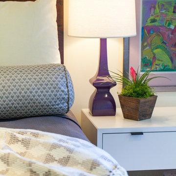
Guest bedroom in a small Berkeley Bungalow features an effective use of storage space by utilizing the homeowner's dining room table leaf as a headboard. Neutral and custom linens balance the vibrant colored lamp and artwork.
 TVL Creative Ltd.
Cramped kitchen be gone! That was the project motto and top priority. The goal was to transform the current layout from multiple smaller spaces into a connected whole that would activate the main level for our clients, a young family of four.
The biggest obstacle was the wall dividing the kitchen and the dining room. Removing this wall was central to opening up and integrating the main living spaces, but the existing ductwork that ran right through the center of the wall posed a design challenge, er design opportunity. The resulting design solution features a central pantry that captures the ductwork and provides valuable storage- especially when compared to the original kitchen's 18" wide pantry cabinet. The pantry also anchors the kitchen island and serves as a visual separation of space between the kitchen and homework area.
Through our design development process, we learned the formal living room was of no service to their lifestyle and therefore space they rarely spent time in. With that in mind, we proposed to eliminate the unused living room and make it the new dining room. Relocating the dining room to this space inherently felt right given the soaring ceiling and ample room for holiday dinners and celebrations. The new dining room was spacious enough for us to incorporate a conversational seating area in the warm, south-facing window alcove.
Now what to do with the old dining room?! To answer that question we took inspiration from our clients' shared profession in education and developed a craft area/homework station for both of their boys. The semi-custom cabinetry of the desk area carries over to the adjacent wall and forms window bench base with storage that we topped with butcher block for a touch of warmth. While the boys are young, the bench drawers are the perfect place for a stash of toys close to the kitchen.
The kitchen begins just beyond the window seat with their refrigerator enclosure. Opposite the refrigerator is the new pantry with twenty linear feet of shelving and space for brooms and a stick vacuum. Extending from the backside of the pantry the kitchen island design incorporates counter seating on the family room side and a cabinetry configuration on the kitchen side with drawer storage, a trashcan center, farmhouse sink, and dishwasher.
We took careful time in design and execution to align the range and sink because while it might seem like a small detail, it plays an important role in supporting the symmetrical configuration of the back wall of the kitchen. The rear wall design utilizes an appliance garage mirrors the visual impact of the refrigerator enclosure and helps keep the now open kitchen tidy. Between the appliance garage and refrigerator enclosure is the cooking zone with 30" of cabinetry and work surface on either side of the range, a chimney style vent hood, and a bold graphic tile backsplash.
The backsplash is just one of many personal touches we added to the space to reflect our client's modern eclectic style and love of color. Swooping lines of the mid-mod style barstools compliment the pendants and backsplash pattern. A pop of vibrant green on the frame of the pantry door adds a fresh wash of color to an otherwise neutral space. The big show stopper is the custom charcoal gray and copper chevron wall installation in the dining room. This was an idea our clients softly suggested, and we excitedly embraced the opportunity. It is also a kickass solution to the head-scratching design dilemma of how to fill a large and lofty wall.
We are so grateful to bring this design to life for our clients and now dear friends.
 StoneUnlimited Kitchen and Bath Remodeling
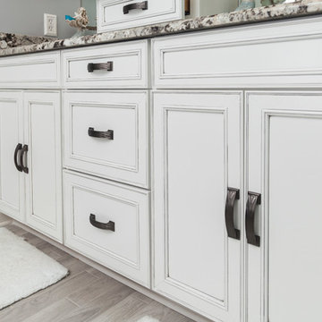
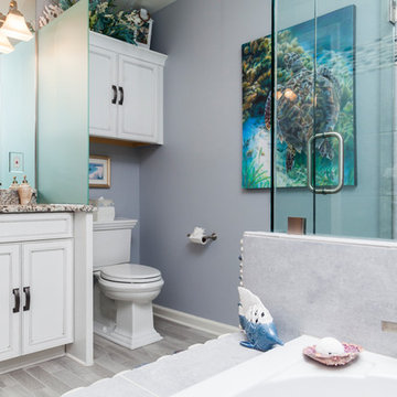
Stoneunlimited Kitchen and Bath can help you design and renovate your bathroom into a seaside oasis that will hold you over until the next time you're able to feel sand between your toes and salty water in your hair. Our Client's desire for their master bathroom was to create a beachy feel that they could enjoy year round and we were more than happy to facilitate the transformation.
The Alaskan White Granite tops mimic the look of wet sand providing contrast to the Waypoint Shaker Style cabinets and storage tower. 3"x17" Porcelain Planks in Vintage Gray add a wood component that is key to any coastal bathroom design and resemble the color of aged board walks and fishing piers. Pebbles in the tub surround, shower accent band and shower floor are similar to ones that can be found on many popular beaches. The decorative details that our client selected for the room such as mermaid dispensers, shells, and beautiful vibrant art work were the perfect touch.
Ample storage space and some privacy to the exposed toilet were needed. The 12" deep tower provides two cabinet pull outs for toiletries and other necessities as well as an 18"x18" cabinet on the top with crown molding finishes and an additional pull out cabinet at the bottom of the tower. Partial privacy for the lavatory was achieved by installing a 45"x29" glass panel.
Here are the items that were utilized in this Stoneunlimited Bathroom Remodel:
Countertops: 3CM Alaskan White Granit with Roman Ogee Edge
Cabinets: WayPoint Living Spaces Door Style: 540F, Maple with painted Pewter Glazed
Cabinet Hardware: Aberdeen Pulls
Sinks: 20"x15" white porcelain rectangular
Tub: 60" Kohler
Tile: 3" x 17" Porcelain Planks in Vintage Gray on the floor
12" x 24 Porcelain Nexus Ice for the shower and tub walls
Island Flat /Stacked Pebbles in the shower and tub surround
Fixtures: Delta in Brushed Nickel Finish
Glass Shower Enclosure: 3/8" Tempered Glass 75" Frameless with standard hinges and D style handle
Mirrors: ¼'" thick topped off with crown molding trim to match the trim finishes on the storage tower
 Castle Building & Remodeling
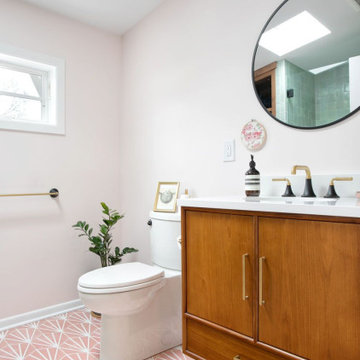
The couple desired to fully utilize their unused attic area in their house, which was built in the 1950’s with a story and a half layout. To make the most of the available square footage, they opted to construct a full shed dormer along the house’s rear side. They devised a detailed plan to transform this space into a functional area with different uses. This included an office for work-related tasks, a 3/4 bathroom for convenience, and a sizable family room. This room was designed to cater to their hobbies like listening to records and storage, indulging in good books, and unwinding in a relaxed setting. The space was also equipped with a gas stove, adding a cozy feel and a touch of vintage style. Being plant enthusiasts, the couple wanted to ensure enough sunlight to nourish their indoor greens. Hence, numerous windows and skylights were thoughtfully added to invite natural light. The new space is a true reflection of the couple’s personality, with its unique finishes and style that echo their fondness for mid-century designs. The outcome is a vibrant, neat, and entertaining area where the couple, along with their pets, can relish for many more years to come.
 StoneUnlimited Kitchen and Bath Remodeling
Stoneunlimited Kitchen and Bath can help you design and renovate your bathroom into a seaside oasis that will hold you over until the next time you're able to feel sand between your toes and salty water in your hair. Our Client's desire for their master bathroom was to create a beachy feel that they could enjoy year round and we were more than happy to facilitate the transformation.
The Alaskan White Granite tops mimic the look of wet sand providing contrast to the Waypoint Shaker Style cabinets and storage tower. 3"x17" Porcelain Planks in Vintage Gray add a wood component that is key to any coastal bathroom design and resemble the color of aged board walks and fishing piers. Pebbles in the tub surround, shower accent band and shower floor are similar to ones that can be found on many popular beaches. The decorative details that our client selected for the room such as mermaid dispensers, shells, and beautiful vibrant art work were the perfect touch.
Ample storage space and some privacy to the exposed toilet were needed. The 12" deep tower provides two cabinet pull outs for toiletries and other necessities as well as an 18"x18" cabinet on the top with crown molding finishes and an additional pull out cabinet at the bottom of the tower. Partial privacy for the lavatory was achieved by installing a 45"x29" glass panel.
Here are the items that were utilized in this Stoneunlimited Bathroom Remodel:
Countertops: 3CM Alaskan White Granit with Roman Ogee Edge
Cabinets: WayPoint Living Spaces Door Style: 540F, Maple with painted Pewter Glazed
Cabinet Hardware: Aberdeen Pulls
Sinks: 20"x15" white porcelain rectangular
Tub: 60" Kohler
Tile: 3" x 17" Porcelain Planks in Vintage Gray on the floor
12" x 24 Porcelain Nexus Ice for the shower and tub walls
Island Flat /Stacked Pebbles in the shower and tub surround
Fixtures: Delta in Brushed Nickel Finish
Glass Shower Enclosure: 3/8" Tempered Glass 75" Frameless with standard hinges and D style handle
Mirrors: ¼'" thick topped off with crown molding trim to match the trim finishes on the storage tower
 TVL Creative Ltd.
Cramped kitchen be gone! That was the project motto and top priority. The goal was to transform the current layout from multiple smaller spaces into a connected whole that would activate the main level for our clients, a young family of four.
The biggest obstacle was the wall dividing the kitchen and the dining room. Removing this wall was central to opening up and integrating the main living spaces, but the existing ductwork that ran right through the center of the wall posed a design challenge, er design opportunity. The resulting design solution features a central pantry that captures the ductwork and provides valuable storage- especially when compared to the original kitchen's 18" wide pantry cabinet. The pantry also anchors the kitchen island and serves as a visual separation of space between the kitchen and homework area.
Through our design development process, we learned the formal living room was of no service to their lifestyle and therefore space they rarely spent time in. With that in mind, we proposed to eliminate the unused living room and make it the new dining room. Relocating the dining room to this space inherently felt right given the soaring ceiling and ample room for holiday dinners and celebrations. The new dining room was spacious enough for us to incorporate a conversational seating area in the warm, south-facing window alcove.
Now what to do with the old dining room?! To answer that question we took inspiration from our clients' shared profession in education and developed a craft area/homework station for both of their boys. The semi-custom cabinetry of the desk area carries over to the adjacent wall and forms window bench base with storage that we topped with butcher block for a touch of warmth. While the boys are young, the bench drawers are the perfect place for a stash of toys close to the kitchen.
The kitchen begins just beyond the window seat with their refrigerator enclosure. Opposite the refrigerator is the new pantry with twenty linear feet of shelving and space for brooms and a stick vacuum. Extending from the backside of the pantry the kitchen island design incorporates counter seating on the family room side and a cabinetry configuration on the kitchen side with drawer storage, a trashcan center, farmhouse sink, and dishwasher.
We took careful time in design and execution to align the range and sink because while it might seem like a small detail, it plays an important role in supporting the symmetrical configuration of the back wall of the kitchen. The rear wall design utilizes an appliance garage mirrors the visual impact of the refrigerator enclosure and helps keep the now open kitchen tidy. Between the appliance garage and refrigerator enclosure is the cooking zone with 30" of cabinetry and work surface on either side of the range, a chimney style vent hood, and a bold graphic tile backsplash.
The backsplash is just one of many personal touches we added to the space to reflect our client's modern eclectic style and love of color. Swooping lines of the mid-mod style barstools compliment the pendants and backsplash pattern. A pop of vibrant green on the frame of the pantry door adds a fresh wash of color to an otherwise neutral space. The big show stopper is the custom charcoal gray and copper chevron wall installation in the dining room. This was an idea our clients softly suggested, and we excitedly embraced the opportunity. It is also a kickass solution to the head-scratching design dilemma of how to fill a large and lofty wall.
We are so grateful to bring this design to life for our clients and now dear friends.
12