
Search results for "Videos fitting" in Home Design Ideas

 Bella Tile and Stone
Mid-sized transitional enclosed light wood floor and beige floor family room photo with white walls, a standard fireplace, a tile fireplace and no tv

 Thomas Roszak Architecture, LLC
Photo credit: Scott McDonald @ Hedrich Blessing
7RR-Ecohome:
The design objective was to build a house for a couple recently married who both had kids from previous marriages. How to bridge two families together?
The design looks forward in terms of how people live today. The home is an experiment in transparency and solid form; removing borders and edges from outside to inside the house, and to really depict “flowing and endless space”. The house floor plan is derived by pushing and pulling the house’s form to maximize the backyard and minimize the public front yard while welcoming the sun in key rooms by rotating the house 45-degrees to true north. The angular form of the house is a result of the family’s program, the zoning rules, the lot’s attributes, and the sun’s path. We wanted to construct a house that is smart and efficient in terms of construction and energy, both in terms of the building and the user. We could tell a story of how the house is built in terms of the constructability, structure and enclosure, with a nod to Japanese wood construction in the method in which the siding is installed and the exposed interior beams are placed in the double height space. We engineered the house to be smart which not only looks modern but acts modern; every aspect of user control is simplified to a digital touch button, whether lights, shades, blinds, HVAC, communication, audio, video, or security. We developed a planning module based on a 6-foot square room size and a 6-foot wide connector called an interstitial space for hallways, bathrooms, stairs and mechanical, which keeps the rooms pure and uncluttered. The house is 6,200 SF of livable space, plus garage and basement gallery for a total of 9,200 SF. A large formal foyer celebrates the entry and opens up to the living, dining, kitchen and family rooms all focused on the rear garden. The east side of the second floor is the Master wing and a center bridge connects it to the kid’s wing on the west. Second floor terraces and sunscreens provide views and shade in this suburban setting. The playful mathematical grid of the house in the x, y and z axis also extends into the layout of the trees and hard-scapes, all centered on a suburban one-acre lot.
Many green attributes were designed into the home; Ipe wood sunscreens and window shades block out unwanted solar gain in summer, but allow winter sun in. Patio door and operable windows provide ample opportunity for natural ventilation throughout the open floor plan. Minimal windows on east and west sides to reduce heat loss in winter and unwanted gains in summer. Open floor plan and large window expanse reduces lighting demands and maximizes available daylight. Skylights provide natural light to the basement rooms. Durable, low-maintenance exterior materials include stone, ipe wood siding and decking, and concrete roof pavers. Design is based on a 2' planning grid to minimize construction waste. Basement foundation walls and slab are highly insulated. FSC-certified walnut wood flooring was used. Light colored concrete roof pavers to reduce cooling loads by as much as 15%. 2x6 framing allows for more insulation and energy savings. Super efficient windows have low-E argon gas filled units, and thermally insulated aluminum frames. Permeable brick and stone pavers reduce the site’s storm-water runoff. Countertops use recycled composite materials. Energy-Star rated furnaces and smart thermostats are located throughout the house to minimize duct runs and avoid energy loss. Energy-Star rated boiler that heats up both radiant floors and domestic hot water. Low-flow toilets and plumbing fixtures are used to conserve water usage. No VOC finish options and direct venting fireplaces maintain a high interior air quality. Smart home system controls lighting, HVAC, and shades to better manage energy use. Plumbing runs through interior walls reducing possibilities of heat loss and freezing problems. A large food pantry was placed next to kitchen to reduce trips to the grocery store. Home office reduces need for automobile transit and associated CO2 footprint. Plan allows for aging in place, with guest suite than can become the master suite, with no need to move as family members mature.

 RAJ Kitchen and Bath, LLC
**Check out the video of this transformation on our website**
This small kitchen was way too small for this 2 bedrooms, 2 bathrooms apartment. Not only was it a very small kitchen, but the physical location of it made it very difficult to make it any bigger. There wasn't much that could have been done without incurring astronomical cost, which would get little or no return on the investment. The client wanted a kitchen that can be optimized in its current location to add a ton of value for resale.
This was difficult to do, because there was no moving of any mechanical around in the kitchen and even if we wanted to, the management of the building would not allow. For those of you who live in condos, co-ops or apartment building, you know how difficult it is to rework these foot prints. When we showed up, we saw the problems, but we also saw a huge opportunity where we can achieve those goals in the small space. This was accomplished by making some key changes and to incorporate some new things that was not possible when this kitchen was built years ago.
The crucial part of the design that would drive the entire new layout, was selecting the only appliance; that was the Refrigerator. Once we nailed down that refrigerator, we then proceeded to design the kitchen around it. We moved it to the other side of the wall where the sink was so that we can tap into the water line from the sink plumbing. It was crucial that it stays exactly 24" deep, not an inch more because we had to keep the entry as open as possible. Also, it was going to be directly in front of another big storage unit - The pantry. It is not ideal in most cases, but we needed the rest of the space to ramp up the design and open feel towards the side where all of the activities would take place, which happend to be the dining room and the view.
Once all that was figured out, we re-positioned the sink, dishwasher and the range and proceeded to wrap the cabinets around the columns to integrate them into the space. Thirty- six inches cabinets height was used so that they can be installed higher towards the ceiling height to give more room rather than the standard 18" required height between the counter tops. This was done to make the room feel a lot bigger than it really was. Not to mention, we also didn't want the faucet to be buried under the cabinets so that was also a necessary design detail for the space.
We then lowered both knee walls so that the counter top can sit on top of them, by removing that stop point that would have otherwise defined the kitchen area. This allowed us to pick up that extra footprint into the room for added prep space and enabled us to create the illusion of a kitchen that is looking longer than it really is. Every inch mattered when designing this kitchen and we made a conscious decision to use every one of that inch.
White cabinets were selected to do just what white cabinets are design to do; make a small or dark room appear bigger, brighter and more open. In this kitchen, this was amplified the more because of the kitchen location. It was perfect! We knew we did justice to the space because while we were there taking some photos, a few potential buyers walked in and went straight for the kitchen! They said its design just to fit the apartment.
Pantry roll out shelving, Double recycle bin, fancy handles, LED lighting, Quartz counter top, beautiful backslash tiles and grey linen floors finished off the kitchen which looked over a beautiful view of the George Washington Bridge from the top of this lovely 4th floor apartment.
Credit to Masterpiece Tile and Marble (Annmarie on the selection of Tiles and countertop and Val on the Construction to complete this project).
Davor Kokic Photography
Find the right local pro for your project

 Kenny Carpets & Floors
Armstrong-Alterna installed using 16" and 8" tiles in a windmill pattern
Kitchen - traditional kitchen idea in New York
Kitchen - traditional kitchen idea in New York

 Ace Baby Furniture
Mobile Wardrobe Closet Stand for Kids: Key Features
-Made of Sturdy and High Quality Melamine Panels
-Wardrobe Drawer with Full Extension Soft Closing Slides
-Angled Shoe Racks on Both Sides
-Easy Gliding Casters for Mobility
-Designed and Manufactured in the U.S.A.
Mobile Closet Stand Product Description
A mobile closet stand that you will cherish for years with your child! Versatile, functional, yet whimsically designed to fit your chic home decor. Perfect for keeping your child's wardrobe neat and tidy. A sturdy chrome-finished clothes rod offers ample space for you to mix, match and coordinate all of your child's outfits for school, play and events. A convenient pull-out drawer serves as additional storage space for blankets, sweaters, toys, or accessories. Wheel the clothes stand from room to room for playtime and dress-up or while cleaning and remodeling your space. Your child will have fun while learning to organize their clothes, toys, and shoes.
Adult assembly required. Step-by-step instruction manual included. Toll-Free phone support and customer service. No additional tools required! Includes a handy screwdriver for your convenience in the package!
Scratch resistant and easy to clean material made in U.S.A. Coordinates well with other popular furniture finishes. The Mobile Closet Bear comes in a variety of colors (subject to availability):
Black
Cherry
Espresso Wenge
Natural Maple
Product Dimensions: 19.5” D x 36” W x 41.5”
____________________________________________
Mobile Bookcase for Kids: Key Features
-Made in the USA of Quality Melamine Panels
-Double-Sided Bookcase Storage
-Easy Gliding and Locking Casters for Mobility and Safety
-Designed and Manufactured in the U.S.A.
Product Description:
Keep everything within reach with this NEW Double-Sided Children’s Bookcase from Ace Baby Furniture. The Mobile Children’s Bookcase is the latest addition to the whimsical, practical, and ultra-functional furniture collection. This bookcase offers two-sided storage, smooth-gliding and locking casters, and chic designs for both parents and children to enjoy for years to come. Wheel this bookcase from room to room while providing ample storage space for all of your child’s storybooks, toys, and other memorabilia. Versatile for the baby’s nursery, toddler’s bedroom, or even the playroom! Give your child easy access to their favorite fairytales, fables, and storybooks so they can learn to find and organize their own literature collection! Classic designs and colors match well with almost any décor. Quality materials ensure long-term usage as your child grows and transitions. This bookcase features three display shelves on both sides, which provide enough space and storage to showcase all of your child’s most precious belongings:
-Books, Trophies, and Framed Artwork or Awards
-Toys, Board-games, Plush Animals, and Dolls
-Storage Boxes and Toy Containers
-Video Games, Laptop, Radio, Clock, and other Electronic Devices
Product Options:
-3 Shapes (Rabbit, Lion and Bear)
-5 Luxurious Colors (Espresso Wenge, Cherry, Natural Maple, White, and Black)
Product Assembly and Support Information:
-Adult assembly required.
-Step-by-step instruction manual included.
-Toll-Free phone support and customer service.
-No additional tools required! Package includes a screwdriver for your convenience!

 Ehrlich Yanai Rhee Chaney Architects
The ground floor volumes wrapped in an elongated hand-fired brick, emphasizing the horizontality of the architecture that lays solidly on the land.
(Photography by: Matthew Millman)
 RAJ Kitchen and Bath, LLC
**Check out the video of this transformation on our website**
This small kitchen was way too small for this 2 bedrooms, 2 bathrooms apartment. Not only was it a very small kitchen, but the physical location of it made it very difficult to make it any bigger. There wasn't much that could have been done without incurring astronomical cost, which would get little or no return on the investment. The client wanted a kitchen that can be optimized in its current location to add a ton of value for resale.
This was difficult to do, because there was no moving of any mechanical around in the kitchen and even if we wanted to, the management of the building would not allow. For those of you who live in condos, co-ops or apartment building, you know how difficult it is to rework these foot prints. When we showed up, we saw the problems, but we also saw a huge opportunity where we can achieve those goals in the small space. This was accomplished by making some key changes and to incorporate some new things that was not possible when this kitchen was built years ago.
The crucial part of the design that would drive the entire new layout, was selecting the only appliance; that was the Refrigerator. Once we nailed down that refrigerator, we then proceeded to design the kitchen around it. We moved it to the other side of the wall where the sink was so that we can tap into the water line from the sink plumbing. It was crucial that it stays exactly 24" deep, not an inch more because we had to keep the entry as open as possible. Also, it was going to be directly in front of another big storage unit - The pantry. It is not ideal in most cases, but we needed the rest of the space to ramp up the design and open feel towards the side where all of the activities would take place, which happend to be the dining room and the view.
Once all that was figured out, we re-positioned the sink, dishwasher and the range and proceeded to wrap the cabinets around the columns to integrate them into the space. Thirty- six inches cabinets height was used so that they can be installed higher towards the ceiling height to give more room rather than the standard 18" required height between the counter tops. This was done to make the room feel a lot bigger than it really was. Not to mention, we also didn't want the faucet to be buried under the cabinets so that was also a necessary design detail for the space.
We then lowered both knee walls so that the counter top can sit on top of them, by removing that stop point that would have otherwise defined the kitchen area. This allowed us to pick up that extra footprint into the room for added prep space and enabled us to create the illusion of a kitchen that is looking longer than it really is. Every inch mattered when designing this kitchen and we made a conscious decision to use every one of that inch.
White cabinets were selected to do just what white cabinets are design to do; make a small or dark room appear bigger, brighter and more open. In this kitchen, this was amplified the more because of the kitchen location. It was perfect! We knew we did justice to the space because while we were there taking some photos, a few potential buyers walked in and went straight for the kitchen! They said its design just to fit the apartment.
Pantry roll out shelving, Double recycle bin, fancy handles, LED lighting, Quartz counter top, beautiful backslash tiles and grey linen floors finished off the kitchen which looked over a beautiful view of the George Washington Bridge from the top of this lovely 4th floor apartment.
Credit to Masterpiece Tile and Marble (Annmarie on the selection of Tiles and countertop and Val on the Construction to complete this project).
Davor Kokic Photography
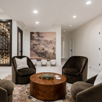
Sponsored
Delaware, OH

Buckeye Basements, Inc.
Central Ohio's Basement Finishing ExpertsBest Of Houzz '13-'21
 RAJ Kitchen and Bath, LLC
**Check out the video of this transformation on our website**
This small kitchen was way too small for this 2 bedrooms, 2 bathrooms apartment. Not only was it a very small kitchen, but the physical location of it made it very difficult to make it any bigger. There wasn't much that could have been done without incurring astronomical cost, which would get little or no return on the investment. The client wanted a kitchen that can be optimized in its current location to add a ton of value for resale.
This was difficult to do, because there was no moving of any mechanical around in the kitchen and even if we wanted to, the management of the building would not allow. For those of you who live in condos, co-ops or apartment building, you know how difficult it is to rework these foot prints. When we showed up, we saw the problems, but we also saw a huge opportunity where we can achieve those goals in the small space. This was accomplished by making some key changes and to incorporate some new things that was not possible when this kitchen was built years ago.
The crucial part of the design that would drive the entire new layout, was selecting the only appliance; that was the Refrigerator. Once we nailed down that refrigerator, we then proceeded to design the kitchen around it. We moved it to the other side of the wall where the sink was so that we can tap into the water line from the sink plumbing. It was crucial that it stays exactly 24" deep, not an inch more because we had to keep the entry as open as possible. Also, it was going to be directly in front of another big storage unit - The pantry. It is not ideal in most cases, but we needed the rest of the space to ramp up the design and open feel towards the side where all of the activities would take place, which happend to be the dining room and the view.
Once all that was figured out, we re-positioned the sink, dishwasher and the range and proceeded to wrap the cabinets around the columns to integrate them into the space. Thirty- six inches cabinets height was used so that they can be installed higher towards the ceiling height to give more room rather than the standard 18" required height between the counter tops. This was done to make the room feel a lot bigger than it really was. Not to mention, we also didn't want the faucet to be buried under the cabinets so that was also a necessary design detail for the space.
We then lowered both knee walls so that the counter top can sit on top of them, by removing that stop point that would have otherwise defined the kitchen area. This allowed us to pick up that extra footprint into the room for added prep space and enabled us to create the illusion of a kitchen that is looking longer than it really is. Every inch mattered when designing this kitchen and we made a conscious decision to use every one of that inch.
White cabinets were selected to do just what white cabinets are design to do; make a small or dark room appear bigger, brighter and more open. In this kitchen, this was amplified the more because of the kitchen location. It was perfect! We knew we did justice to the space because while we were there taking some photos, a few potential buyers walked in and went straight for the kitchen! They said its design just to fit the apartment.
Pantry roll out shelving, Double recycle bin, fancy handles, LED lighting, Quartz counter top, beautiful backslash tiles and grey linen floors finished off the kitchen which looked over a beautiful view of the George Washington Bridge from the top of this lovely 4th floor apartment.
Credit to Masterpiece Tile and Marble (Annmarie on the selection of Tiles and countertop and Val on the Construction to complete this project).
Davor Kokic Photography

 Victor Mulbauer
New Installation of Red Oak Wood, 3 1/4 in width. White-washed Bona Stain was used, Bona Finish, as well as Bona Traffic HD.
**This photo is of the Red Oak Wood (3 1/4 inch) prior to the application of the white-washed Bona Stain.

 Cassoni Furniture & Accessories
- SENDAI BOOKCASE. Sendai Crystal is the new glass version of the famous bookcase-sculpture that the architect Toyo Ito, winner of the 2013 Pritzker Prize, designed for Horm in 2004. Movement and flexibility express the emotional power of Toyo Ito, who in this domestic sculpture has captured the essence of the design of the Sendai Mediathèque in Japan, which he also designed.
48''7/8W x 18''7/8D x 76’’H.
Other width: 75’’5/8.
http://ow.ly/3yBxlk
- MILOS SOFA. Milos is a family of upholstered armchairs and sofas characterized by soft and seductive shapes. The Milos project is a collaboration of Horm with the Design Center of Orizzonti, a renowned brand from the Brianza region in Northern Italy, which offers a large and highly-specialized collection of upholstered beds for the sleeping area. Milos was born from the idea that every home is indeed unique and reflects the personality and lifestyle of its guests. For this reason, Milos sofas are removable and can be dressed and covered in a flash with over 240 fabrics from the Orizzonti collection, assuming a relaxed and playful yet elegant and sophisticated aspect, or that of great luxury and preciousness.
58''5/8W x 36''5/8D x 30’’H.
86''1/4W x 36''5/8D x 30’’H.
Seat Height: 18’’1/8.
http://ow.ly/3zwFbs
- COBRA TV STAND. Cobra is a dynamic TV stand, both from a visual and usage standpoint, built with curved plywood polished entirely by hand and featuring brake-fitted wheels and mood lighting, which is projected on the floor. Equipped with multiple sockets to power the eventual audio-visual components to set on the shelf, it features a hidden and discreet cable inlet that connects them to the video signal.
35''3/8W x 26''3/4D x 47''5/8H.
http://ow.ly/3yAqgy
- INFINITY SIDEBOARD. The Infinity series containers are made of square units of 19''5/8W x 18''7/8D x 19''5/8H with lacquered frame (11 Horm colors) and doors veneered with bois blond stained beech (Horm finish). The doors are covered with three elements of decorative lacquered laminate attached by means of hidden magnets and whose arrangement determines the line pattern shown on the front of each container. Interestingly enough, each line moves across doors in a continued and seemingly infinite pattern, regardless of the chosen arrangement. Furthermore, the magnetic attachment allows changing the element arrangement at will to produce dynamic, original designs.
59''W x 18''7/8D x 20''1/2H.
Other height: 40’’1/8.
http://ow.ly/3yAuZl
- SINAPSI SHELF. Sinapsi is the modular shelf system created by the Chilean artist Sebastian Errazuriz and inspired by the electrical impulses of brain cells. The result is a single lacquered-polyurethane element designed to organically decorate your wall without any constraints. Simply repeat the various Synapsi combinations, side by side, rotating, or mirroring them to create many different compositions and decorate walls using your own imagination.
51''1/8W x 8''1/4D x 23''5/8H.
http://ow.ly/3yzS5i

 Serpas Building and Remodeling
Beautiful Shower!
Inspiration for a small modern 3/4 gray tile, multicolored tile, white tile and porcelain tile porcelain tile and gray floor alcove shower remodel in Los Angeles with recessed-panel cabinets, white cabinets, a two-piece toilet, blue walls, an undermount sink, quartzite countertops and a hinged shower door
Inspiration for a small modern 3/4 gray tile, multicolored tile, white tile and porcelain tile porcelain tile and gray floor alcove shower remodel in Los Angeles with recessed-panel cabinets, white cabinets, a two-piece toilet, blue walls, an undermount sink, quartzite countertops and a hinged shower door

 Precision Wallcovering and Painting
Phillip Jeffries Gilded Age Wallcovering
Staircase - modern floating wallpaper staircase idea in Orange County
Staircase - modern floating wallpaper staircase idea in Orange County

 Granite Works Countertops
Calacatta Nuvo Caesarstone
Eased edge profile
Kitchen - mid-sized contemporary kitchen idea in DC Metro with shaker cabinets, solid surface countertops and an island
Kitchen - mid-sized contemporary kitchen idea in DC Metro with shaker cabinets, solid surface countertops and an island

 User
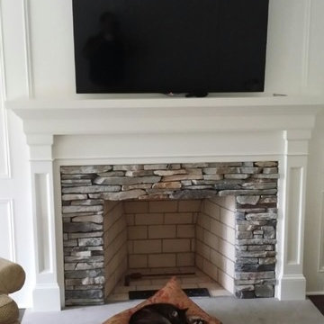
Our clients cat seems to appreciate our work in this Chagrin Falls home. The fireplace is laid with Boral Southern Ledgestone, and the mantel was custom built by our master craftsman. This is what we live for. Making dreams a reality and making a house a home. Sleep tight kitty!

 Refined House, LLC
Example of a small transitional kids' gray tile and ceramic tile ceramic tile and white floor alcove shower design with shaker cabinets, blue cabinets, a two-piece toilet, gray walls, an undermount sink, quartz countertops and a hinged shower door

 BRC Remodeling Group
This contemporary/modern bathroom uses a combination of grey and beige to make a beautiful blend of Greige. The Charcoal stain on the cabinets is also a great blend of the 2 colors giving just enough warmth to the room. We used Marazzi Lounge 14 Spritzer 12x24 porcelain tile on the ground and the decorative inlay on the shower. New Caledonia Granite and BEHR- Studio Taupe on the walls.

 Matt Fajkus Architecture
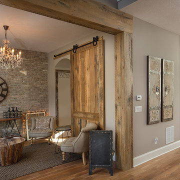
The cabin typology redux came out of the owner’s desire to have a house that is warm and familiar, but also “feels like you are on vacation.” The basis of the “Hewn House” design starts with a cabin’s simple form and materiality: a gable roof, a wood-clad body, a prominent fireplace that acts as the hearth, and integrated indoor-outdoor spaces. However, rather than a rustic style, the scheme proposes a clean-lined and “hewned” form, sculpted, to best fit on its urban infill lot.
The plan and elevation geometries are responsive to the unique site conditions. Existing prominent trees determined the faceted shape of the main house, while providing shade that projecting eaves of a traditional log cabin would otherwise offer. Deferring to the trees also allows the house to more readily tuck into its leafy East Austin neighborhood, and is therefore more quiet and secluded.
Natural light and coziness are key inside the home. Both the common zone and the private quarters extend to sheltered outdoor spaces of varying scales: the front porch, the private patios, and the back porch which acts as a transition to the backyard. Similar to the front of the house, a large cedar elm was preserved in the center of the yard. Sliding glass doors open up the interior living zone to the backyard life while clerestory windows bring in additional ambient light and tree canopy views. The wood ceiling adds warmth and connection to the exterior knotted cedar tongue & groove. The iron spot bricks with an earthy, reddish tone around the fireplace cast a new material interest both inside and outside. The gable roof is clad with standing seam to reinforced the clean-lined and faceted form. Furthermore, a dark gray shade of stucco contrasts and complements the warmth of the cedar with its coolness.
A freestanding guest house both separates from and connects to the main house through a small, private patio with a tall steel planter bed.
Photo by Charles Davis Smith

 JM Carpets
Kitchen - large country u-shaped medium tone wood floor kitchen idea in Milwaukee with white cabinets and a peninsula

 threshold interiors
Location: New York, NY, United States
This Loft was tastefully renovated back in the '90s, but was due for an update and an expansion of the kitchen and dining areas to accommodate the client's cooking skills and entertaining needs. EnlargIing the island and adding cabinetry to delineate the office, bar and dining areas was a priority. The bathroom was updated to feel like a tranquil spa with beautiful new tile, plumbing fixtures and cabinets. Our biggest challenge was coordinating the entire renovation while our client was out of town for the Summer!
Photographed by: James Salomon

 AJ Rose Carpets & Flooring
IVC Luxury Vinyl Tile - Moduleo Vision Vista - After Photo
Vinyl floor kitchen photo in Boston
Vinyl floor kitchen photo in Boston
22