
Search results for "Visual clutter" in Home Design Ideas
 Drury Design
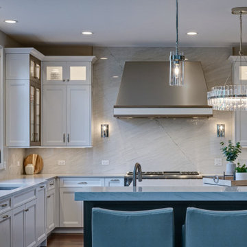
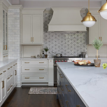
Our clients were ready to update their kitchen with soft and subtle colors to blend in with the home’s recently updated interior. It was also time to improve the layout. The kitchen needed to be reconfigured in order to facilitate a three-generation family and occasional entertaining.
Design Objectives
-Brighten up to blend with the home’s interior and flow into the adjacent family room area
-Incorporate specific storage for pantry items like bulk ingredients and small appliances
-Designate areas for a coffee bar, multiple prep areas and seating while highlighting a dry bar for display
-Keep clutter off of counters for a seamless design that facilitates visual flow through the entire area
Design Challenges
-Make a subtle statement with contrasting cabinets and countertops
-Incorporate a stand-alone, statement-making dry bar just outside the main kitchen space
-Design a statement hood that serves as a focal point without interrupting visual flow
-Update and add lighting to add more task, accent and overhead brightness.
-Have the space be usable for different tasks by different family members at the same time
-Create a space that looks classy and formal but is still inviting.
Design Solutions
-A soft grey stain and white paint were used on all the cabinets. On only the wall cabinets flanking the window was the grey introduced on the frame to make a pop against the white paint.
-The white-painted refrigerator and freezer door panel style is a custom reeded look that adds a soft contrasting detail against the main door style. Along with the open grey-stained interior cabinet above, it looks like a piece of furniture.
-The same soft tones were used for the countertops and a full, high backsplash of Chamonix quartzite that tied everything together. It’s an elegant backdrop for the hood.
-The Dry Bar, even though showcasing a dark stained cabinet, stays open and bright with a full mirror backsplash, wood retained glass floating shelves and glass wall cabinet doors. Brushed brass trim details and a fun light fixture add a pop of character.
-The same reeded door style as the refrigerator was used on the base doors of the dry bar to tie in with the kitchen.
-About 2/3 of the existing walk-in pantry was carved out for the new dry bar footprint while still keeping a shallow-depth pantry space for storage.
-The homeowners wanted a beautiful hood but didn’t want it to dominate the design. We kept the lines of the hood simple. The soft stainless steel body has a bottom accent that incorporates both the grey stain and white-painted cabinet colors.
-Even though the Kitchen had a lot of natural light from the large window, it was important to have task and subtle feature lighting. Recessed cans provide overall lighting while clear pendants shine down on the 2nd level of the seating area on the island.
-The circular clear chandelier is the statement piece over the main island while the pendants flanking the hood emphasize the quartzite backsplash and add as accent lighting in the evening along with the interior cabinet lights.
With three generations living in the home it was important to have areas that multiple family members could use at the same time without being in each other’s way. The design incorporates different zones like the coffee bar, charging station, dry bar and refrigerator drawers.
The softness of the colors and classic feel of the wood floor keep kitchen is inviting and calming.

 Homestead Doors, Inc.
Door #10
FP3190
Flat 3 Panel Interior Door with Farmhouse Sticking
Solid Poplar stiles and rails
MDF panels
Painted White
1 x 4 door casing
1 x 6 baseboard
Bravura 336B door knob
Call us for a quote on your door project
419-684-9582
Visit https://www.door.cc
 Advance Design Studio, Ltd.
Our clients in Tower Lakes, IL, needed more storage and functionality from their kitchen. They were primarily focused on finding the right combination of cabinets, shelves, and drawers that fit all their cookware, flatware, and appliances. They wanted a brighter, bigger space with a natural cooking flow and plenty of storage. Soffits and crown molding needed to be removed to make the kitchen feel larger. Redesign elements included: relocating the fridge, adding a baking station and coffee bar, and placing the microwave in the kitchen island.
Advance Design Studio’s Claudia Pop offered functional, creative, and unique solutions to the homeowners’ problems. Our clients wanted a unique kitchen that was not completely white, a balance of design and function. Claudia offered functional, creative, and unique solutions to Chad and Karen’s kitchen design challenges. The first thing to go was soffits. Today, most kitchens can benefit from the added height and space; removing soffits is nearly always step one. Steely gray-blue was the color of choice for a freshly unique look bringing a sophisticated-looking space to wrap around the fresh new kitchen. Cherry cabinetry in a true brown stain compliments the stormy accents with sharp contrasting white Cambria quartz top balancing out the space with a dramatic flair.
“We wanted something unique and special in this space, something none of the neighbors would have,” said Claudia.
The dramatic veined Cambria countertops continue upward into a backsplash behind three complimentary open shelves. These countertops provide visual texture and movement in the kitchen. The kitchen includes two larder cabinets for both the coffee bar and baking station. The kitchen is now functional and unique in design.
“When we design a new kitchen space, as designers, we are always looking for ways to balance interesting design elements with practical functionality,” Claudia said. “This kitchen’s new design is not only way more functional but is stunning in a way a piece of art can catch one’s attention.”
Decorative mullions with mirrored inserts sit atop dual sentinel pantries flanking the new refrigerator, while a 48″ dual fuel Wolf range replaced the island cooktop and double oven. The new microwave is cleverly hidden within the island, eliminating the cluttered counter and attention-grabbing wall of stainless steel from the previous space.
The family room was completely renovated, including a beautifully functional entertainment bar with the same combination of woods and stone as the kitchen and coffee bar. Mesh inserts instead of plain glass add visual texture while revealing pristine glassware. Handcrafted built-ins surround the fireplace.
The beautiful and efficient design created by designer Claudia transitioned directly to the installation team seamlessly, much like the basement project experience Chad and Karen enjoyed previously.
“We definitely will and have recommended Advance Design Studio to friends who are looking to embark on a project small or large,” Karen said.
“Everything that was designed and built exactly how we envisioned it, and we are really enjoying it to its full potential,” Karen said.
Our award-winning design team would love to create a beautiful, functional, and spacious place for you and your family. With our “Common Sense Remodeling” approach, the process of renovating your home has never been easier. Contact us today at 847-665-1711 or schedule an appointment.
Find the right local pro for your project
 Drury Design
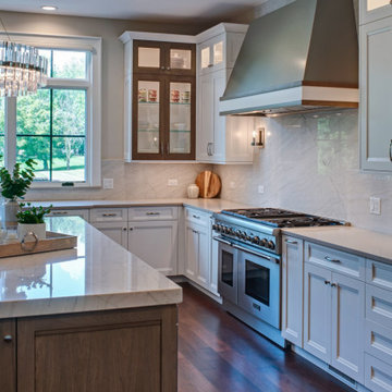
Our clients were ready to update their kitchen with soft and subtle colors to blend in with the home’s recently updated interior. It was also time to improve the layout. The kitchen needed to be reconfigured in order to facilitate a three-generation family and occasional entertaining.
Design Objectives
-Brighten up to blend with the home’s interior and flow into the adjacent family room area
-Incorporate specific storage for pantry items like bulk ingredients and small appliances
-Designate areas for a coffee bar, multiple prep areas and seating while highlighting a dry bar for display
-Keep clutter off of counters for a seamless design that facilitates visual flow through the entire area
Design Challenges
-Make a subtle statement with contrasting cabinets and countertops
-Incorporate a stand-alone, statement-making dry bar just outside the main kitchen space
-Design a statement hood that serves as a focal point without interrupting visual flow
-Update and add lighting to add more task, accent and overhead brightness.
-Have the space be usable for different tasks by different family members at the same time
-Create a space that looks classy and formal but is still inviting.
Design Solutions
-A soft grey stain and white paint were used on all the cabinets. On only the wall cabinets flanking the window was the grey introduced on the frame to make a pop against the white paint.
-The white-painted refrigerator and freezer door panel style is a custom reeded look that adds a soft contrasting detail against the main door style. Along with the open grey-stained interior cabinet above, it looks like a piece of furniture.
-The same soft tones were used for the countertops and a full, high backsplash of Chamonix quartzite that tied everything together. It’s an elegant backdrop for the hood.
-The Dry Bar, even though showcasing a dark stained cabinet, stays open and bright with a full mirror backsplash, wood retained glass floating shelves and glass wall cabinet doors. Brushed brass trim details and a fun light fixture add a pop of character.
-The same reeded door style as the refrigerator was used on the base doors of the dry bar to tie in with the kitchen.
-About 2/3 of the existing walk-in pantry was carved out for the new dry bar footprint while still keeping a shallow-depth pantry space for storage.
-The homeowners wanted a beautiful hood but didn’t want it to dominate the design. We kept the lines of the hood simple. The soft stainless steel body has a bottom accent that incorporates both the grey stain and white-painted cabinet colors.
-Even though the Kitchen had a lot of natural light from the large window, it was important to have task and subtle feature lighting. Recessed cans provide overall lighting while clear pendants shine down on the 2nd level of the seating area on the island.
-The circular clear chandelier is the statement piece over the main island while the pendants flanking the hood emphasize the quartzite backsplash and add as accent lighting in the evening along with the interior cabinet lights.
With three generations living in the home it was important to have areas that multiple family members could use at the same time without being in each other’s way. The design incorporates different zones like the coffee bar, charging station, dry bar and refrigerator drawers.
The softness of the colors and classic feel of the wood floor keep kitchen is inviting and calming.
 SM Design
St. Andrews Project — Contemporary Family Room
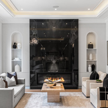
This living room is designed around the idea of quiet drama, a sophisticated composition where architectural symmetry, sculptural materials, and controlled contrast create an atmosphere that feels luxurious without becoming ostentatious.
The fireplace wall serves as the room's architectural centerpiece. A dramatic expanse of high-gloss black stone creates depth and reflection, transforming the fireplace into more than a functional element, it becomes a strong visual plane that anchors the entire room. The reflective surface captures fragments of the surrounding furnishings and lighting, adding dimensionality and allowing the space to feel richer as the light changes throughout the day.
Flanking the fireplace, finely detailed vertical wall treatment introduces texture and rhythm while maintaining the room's restrained monochromatic palette. The paired arched niches provide a softer counterpoint to the linear detailing, creating an intentional balance between geometric precision and organic curvature. Carefully edited decorative objects within the niches reinforce the sense of curation rather than clutter.
The seating arrangement is deliberately symmetrical and conversational, positioning the fireplace as a shared focal point while maintaining an intimate scale. Soft ivory upholstery and layered neutral textiles temper the strength of the black stone, while charcoal and warm taupe accents add tonal depth. The result is a palette that feels sophisticated and contemporary but remains comfortable and highly livable.
A substantial natural-stone coffee table introduces another tactile layer. Its architectural pedestal form gives the center of the room a sculptural presence, while the organic stone surface contrasts beautifully with the reflective fireplace surround and soft textiles.
Above, the recessed ceiling detail and concealed warm illumination subtly emphasize the room's architectural proportions. Rather than relying on decorative lighting alone, the layered illumination creates a soft perimeter glow that enhances the millwork and gives the room a warmer evening character.
The overall design relies on contrast as its primary decorative language: reflective black stone against matte white millwork, linear fluting against curved niches, structured architecture against organic materials, and crisp upholstery against tactile textiles. The result is a refined contemporary living environment with a strong sense of permanence, balance, and bespoke craftsmanship.
 Advance Design Studio, Ltd.
Our clients in Tower Lakes, IL, needed more storage and functionality from their kitchen. They were primarily focused on finding the right combination of cabinets, shelves, and drawers that fit all their cookware, flatware, and appliances. They wanted a brighter, bigger space with a natural cooking flow and plenty of storage. Soffits and crown molding needed to be removed to make the kitchen feel larger. Redesign elements included: relocating the fridge, adding a baking station and coffee bar, and placing the microwave in the kitchen island.
Advance Design Studio’s Claudia Pop offered functional, creative, and unique solutions to the homeowners’ problems. Our clients wanted a unique kitchen that was not completely white, a balance of design and function. Claudia offered functional, creative, and unique solutions to Chad and Karen’s kitchen design challenges. The first thing to go was soffits. Today, most kitchens can benefit from the added height and space; removing soffits is nearly always step one. Steely gray-blue was the color of choice for a freshly unique look bringing a sophisticated-looking space to wrap around the fresh new kitchen. Cherry cabinetry in a true brown stain compliments the stormy accents with sharp contrasting white Cambria quartz top balancing out the space with a dramatic flair.
“We wanted something unique and special in this space, something none of the neighbors would have,” said Claudia.
The dramatic veined Cambria countertops continue upward into a backsplash behind three complimentary open shelves. These countertops provide visual texture and movement in the kitchen. The kitchen includes two larder cabinets for both the coffee bar and baking station. The kitchen is now functional and unique in design.
“When we design a new kitchen space, as designers, we are always looking for ways to balance interesting design elements with practical functionality,” Claudia said. “This kitchen’s new design is not only way more functional but is stunning in a way a piece of art can catch one’s attention.”
Decorative mullions with mirrored inserts sit atop dual sentinel pantries flanking the new refrigerator, while a 48″ dual fuel Wolf range replaced the island cooktop and double oven. The new microwave is cleverly hidden within the island, eliminating the cluttered counter and attention-grabbing wall of stainless steel from the previous space.
The family room was completely renovated, including a beautifully functional entertainment bar with the same combination of woods and stone as the kitchen and coffee bar. Mesh inserts instead of plain glass add visual texture while revealing pristine glassware. Handcrafted built-ins surround the fireplace.
The beautiful and efficient design created by designer Claudia transitioned directly to the installation team seamlessly, much like the basement project experience Chad and Karen enjoyed previously.
“We definitely will and have recommended Advance Design Studio to friends who are looking to embark on a project small or large,” Karen said.
“Everything that was designed and built exactly how we envisioned it, and we are really enjoying it to its full potential,” Karen said.
Our award-winning design team would love to create a beautiful, functional, and spacious place for you and your family. With our “Common Sense Remodeling” approach, the process of renovating your home has never been easier. Contact us today at 847-665-1711 or schedule an appointment.
 Advance Design Studio, Ltd.
Our clients in Tower Lakes, IL, needed more storage and functionality from their kitchen. They were primarily focused on finding the right combination of cabinets, shelves, and drawers that fit all their cookware, flatware, and appliances. They wanted a brighter, bigger space with a natural cooking flow and plenty of storage. Soffits and crown molding needed to be removed to make the kitchen feel larger. Redesign elements included: relocating the fridge, adding a baking station and coffee bar, and placing the microwave in the kitchen island.
Advance Design Studio’s Claudia Pop offered functional, creative, and unique solutions to the homeowners’ problems. Our clients wanted a unique kitchen that was not completely white, a balance of design and function. Claudia offered functional, creative, and unique solutions to Chad and Karen’s kitchen design challenges. The first thing to go was soffits. Today, most kitchens can benefit from the added height and space; removing soffits is nearly always step one. Steely gray-blue was the color of choice for a freshly unique look bringing a sophisticated-looking space to wrap around the fresh new kitchen. Cherry cabinetry in a true brown stain compliments the stormy accents with sharp contrasting white Cambria quartz top balancing out the space with a dramatic flair.
“We wanted something unique and special in this space, something none of the neighbors would have,” said Claudia.
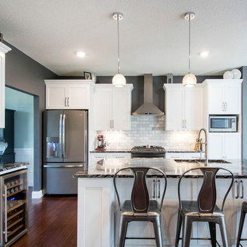
The dramatic veined Cambria countertops continue upward into a backsplash behind three complimentary open shelves. These countertops provide visual texture and movement in the kitchen. The kitchen includes two larder cabinets for both the coffee bar and baking station. The kitchen is now functional and unique in design.
“When we design a new kitchen space, as designers, we are always looking for ways to balance interesting design elements with practical functionality,” Claudia said. “This kitchen’s new design is not only way more functional but is stunning in a way a piece of art can catch one’s attention.”
Decorative mullions with mirrored inserts sit atop dual sentinel pantries flanking the new refrigerator, while a 48″ dual fuel Wolf range replaced the island cooktop and double oven. The new microwave is cleverly hidden within the island, eliminating the cluttered counter and attention-grabbing wall of stainless steel from the previous space.
The family room was completely renovated, including a beautifully functional entertainment bar with the same combination of woods and stone as the kitchen and coffee bar. Mesh inserts instead of plain glass add visual texture while revealing pristine glassware. Handcrafted built-ins surround the fireplace.
The beautiful and efficient design created by designer Claudia transitioned directly to the installation team seamlessly, much like the basement project experience Chad and Karen enjoyed previously.
“We definitely will and have recommended Advance Design Studio to friends who are looking to embark on a project small or large,” Karen said.
“Everything that was designed and built exactly how we envisioned it, and we are really enjoying it to its full potential,” Karen said.
Our award-winning design team would love to create a beautiful, functional, and spacious place for you and your family. With our “Common Sense Remodeling” approach, the process of renovating your home has never been easier. Contact us today at 847-665-1711 or schedule an appointment.

 Advance Design Studio, Ltd.
Our clients in Tower Lakes, IL, needed more storage and functionality from their kitchen. They were primarily focused on finding the right combination of cabinets, shelves, and drawers that fit all their cookware, flatware, and appliances. They wanted a brighter, bigger space with a natural cooking flow and plenty of storage. Soffits and crown molding needed to be removed to make the kitchen feel larger. Redesign elements included: relocating the fridge, adding a baking station and coffee bar, and placing the microwave in the kitchen island.
Advance Design Studio’s Claudia Pop offered functional, creative, and unique solutions to the homeowners’ problems. Our clients wanted a unique kitchen that was not completely white, a balance of design and function. Claudia offered functional, creative, and unique solutions to Chad and Karen’s kitchen design challenges. The first thing to go was soffits. Today, most kitchens can benefit from the added height and space; removing soffits is nearly always step one. Steely gray-blue was the color of choice for a freshly unique look bringing a sophisticated-looking space to wrap around the fresh new kitchen. Cherry cabinetry in a true brown stain compliments the stormy accents with sharp contrasting white Cambria quartz top balancing out the space with a dramatic flair.
“We wanted something unique and special in this space, something none of the neighbors would have,” said Claudia.
The dramatic veined Cambria countertops continue upward into a backsplash behind three complimentary open shelves. These countertops provide visual texture and movement in the kitchen. The kitchen includes two larder cabinets for both the coffee bar and baking station. The kitchen is now functional and unique in design.
“When we design a new kitchen space, as designers, we are always looking for ways to balance interesting design elements with practical functionality,” Claudia said. “This kitchen’s new design is not only way more functional but is stunning in a way a piece of art can catch one’s attention.”
Decorative mullions with mirrored inserts sit atop dual sentinel pantries flanking the new refrigerator, while a 48″ dual fuel Wolf range replaced the island cooktop and double oven. The new microwave is cleverly hidden within the island, eliminating the cluttered counter and attention-grabbing wall of stainless steel from the previous space.
The family room was completely renovated, including a beautifully functional entertainment bar with the same combination of woods and stone as the kitchen and coffee bar. Mesh inserts instead of plain glass add visual texture while revealing pristine glassware. Handcrafted built-ins surround the fireplace.
The beautiful and efficient design created by designer Claudia transitioned directly to the installation team seamlessly, much like the basement project experience Chad and Karen enjoyed previously.
“We definitely will and have recommended Advance Design Studio to friends who are looking to embark on a project small or large,” Karen said.
“Everything that was designed and built exactly how we envisioned it, and we are really enjoying it to its full potential,” Karen said.
Our award-winning design team would love to create a beautiful, functional, and spacious place for you and your family. With our “Common Sense Remodeling” approach, the process of renovating your home has never been easier. Contact us today at 847-665-1711 or schedule an appointment.
 Advance Design Studio, Ltd.
Our clients in Tower Lakes, IL, needed more storage and functionality from their kitchen. They were primarily focused on finding the right combination of cabinets, shelves, and drawers that fit all their cookware, flatware, and appliances. They wanted a brighter, bigger space with a natural cooking flow and plenty of storage. Soffits and crown molding needed to be removed to make the kitchen feel larger. Redesign elements included: relocating the fridge, adding a baking station and coffee bar, and placing the microwave in the kitchen island.
Advance Design Studio’s Claudia Pop offered functional, creative, and unique solutions to the homeowners’ problems. Our clients wanted a unique kitchen that was not completely white, a balance of design and function. Claudia offered functional, creative, and unique solutions to Chad and Karen’s kitchen design challenges. The first thing to go was soffits. Today, most kitchens can benefit from the added height and space; removing soffits is nearly always step one. Steely gray-blue was the color of choice for a freshly unique look bringing a sophisticated-looking space to wrap around the fresh new kitchen. Cherry cabinetry in a true brown stain compliments the stormy accents with sharp contrasting white Cambria quartz top balancing out the space with a dramatic flair.
“We wanted something unique and special in this space, something none of the neighbors would have,” said Claudia.
The dramatic veined Cambria countertops continue upward into a backsplash behind three complimentary open shelves. These countertops provide visual texture and movement in the kitchen. The kitchen includes two larder cabinets for both the coffee bar and baking station. The kitchen is now functional and unique in design.
“When we design a new kitchen space, as designers, we are always looking for ways to balance interesting design elements with practical functionality,” Claudia said. “This kitchen’s new design is not only way more functional but is stunning in a way a piece of art can catch one’s attention.”
Decorative mullions with mirrored inserts sit atop dual sentinel pantries flanking the new refrigerator, while a 48″ dual fuel Wolf range replaced the island cooktop and double oven. The new microwave is cleverly hidden within the island, eliminating the cluttered counter and attention-grabbing wall of stainless steel from the previous space.
The family room was completely renovated, including a beautifully functional entertainment bar with the same combination of woods and stone as the kitchen and coffee bar. Mesh inserts instead of plain glass add visual texture while revealing pristine glassware. Handcrafted built-ins surround the fireplace.
The beautiful and efficient design created by designer Claudia transitioned directly to the installation team seamlessly, much like the basement project experience Chad and Karen enjoyed previously.
“We definitely will and have recommended Advance Design Studio to friends who are looking to embark on a project small or large,” Karen said.
“Everything that was designed and built exactly how we envisioned it, and we are really enjoying it to its full potential,” Karen said.
Our award-winning design team would love to create a beautiful, functional, and spacious place for you and your family. With our “Common Sense Remodeling” approach, the process of renovating your home has never been easier. Contact us today at 847-665-1711 or schedule an appointment.
 kimberly peck architect
For this project, we transformed the top floor of a Park Slope brownstone into a modern, lightfilled
home tailored to the needs of a busy couple. The original space was outdated and lacked
cohesion, so our design focused on creating a harmonious and functional layout that reflects the
clients’ lifestyle while introducing moments of drama and creativity.
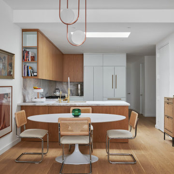
At the heart of the penthouse is an open-concept dining room, living room, and kitchen. The
living room accommodates multiple areas, including a cozy seating nook illuminated by
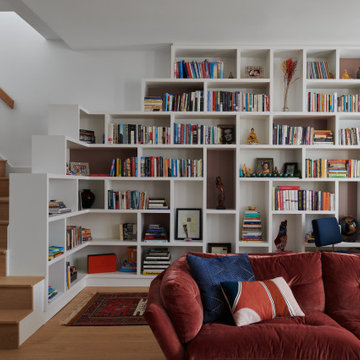
multicolored glass pendant lights. A dramatic custom-built feature spans the entire length of the
living room, integrating storage, display areas, and a unique guardwall that separates the
staircase to the couple's rooftop garden from the living space. This built-in showcases a dynamic
geometric design, with select sections backed in soft mauve for depth and visual interest. Along
the front of the space, a bespoke oak window seat with modern slatted wood fronts conceals the
AC and radiators while providing ample storage. The main seating area centers around a creamy
marble fireplace surround, a refined focal point in the living area. Wide-plank oak flooring
extends throughout the apartment and up the staircase, where a minimal aesthetic enhances the
clean, modern feel.
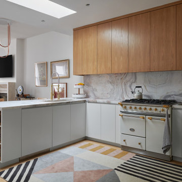
The kitchen continues the theme of modern sophistication with a palette of soft white lacquered
lower cabinets and oak upper cabinetry. The countertops and backsplash are crafted from a
striking quartzite in cream, peach, and mauve tones, adding a subtle vibrancy to the space. A
cream-enameled range takes center stage, complemented by a hidden coffee station and a
dedicated cabinet for AV supplies, ensuring a clutter-free aesthetic.
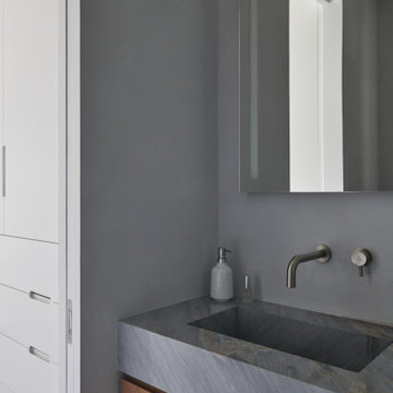
The hall guest bathroom is a playful yet refined mix of materials and textures. Peach-toned
concrete tiles cover the walls, while the floor features cream zellige tiles. Brass fixtures, a brass
mirror, and a brass wall sconce lend a touch of warmth and luxury, harmonizing with the custom
pecan-veneered vanity and custom concrete sink,
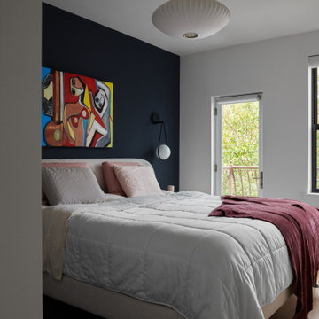
The primary bedroom suite is a serene retreat, painted in a rich, deep blue that sets a calming
tone. Accessed through a bespoke millwork closet, the ensuite bathroom is a small yet striking
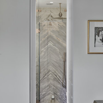
space, showcasing impeccable craftsmanship. The rear wall of the shower is clad in floor-toceiling
slabs of light blue quartzite, creating a dramatic focal point visible from the bedroom.
This quartzite extends seamlessly to form a sculptural bench within the shower, which transitions
outward into a custom sink. Beneath the sink, two wood drawers provide discreet storage. The
remaining walls are finished in soft beige Moroccan tadelakt plaster, adding a warm contrast to
the cool tones of the quartzite.
This Park Slope penthouse is a carefully curated blend of modern elegance and thoughtful
functionality, with bespoke details and rich materiality that celebrate both the character of the
space and the needs of its owners.
 kimberly peck architect
For this project, we transformed the top floor of a Park Slope brownstone into a modern, lightfilled
home tailored to the needs of a busy couple. The original space was outdated and lacked
cohesion, so our design focused on creating a harmonious and functional layout that reflects the
clients’ lifestyle while introducing moments of drama and creativity.
At the heart of the penthouse is an open-concept dining room, living room, and kitchen. The
living room accommodates multiple areas, including a cozy seating nook illuminated by
multicolored glass pendant lights. A dramatic custom-built feature spans the entire length of the
living room, integrating storage, display areas, and a unique guardwall that separates the
staircase to the couple's rooftop garden from the living space. This built-in showcases a dynamic
geometric design, with select sections backed in soft mauve for depth and visual interest. Along
the front of the space, a bespoke oak window seat with modern slatted wood fronts conceals the
AC and radiators while providing ample storage. The main seating area centers around a creamy
marble fireplace surround, a refined focal point in the living area. Wide-plank oak flooring
extends throughout the apartment and up the staircase, where a minimal aesthetic enhances the
clean, modern feel.
The kitchen continues the theme of modern sophistication with a palette of soft white lacquered
lower cabinets and oak upper cabinetry. The countertops and backsplash are crafted from a
striking quartzite in cream, peach, and mauve tones, adding a subtle vibrancy to the space. A
cream-enameled range takes center stage, complemented by a hidden coffee station and a
dedicated cabinet for AV supplies, ensuring a clutter-free aesthetic.
The hall guest bathroom is a playful yet refined mix of materials and textures. Peach-toned
concrete tiles cover the walls, while the floor features cream zellige tiles. Brass fixtures, a brass
mirror, and a brass wall sconce lend a touch of warmth and luxury, harmonizing with the custom
pecan-veneered vanity and custom concrete sink,
The primary bedroom suite is a serene retreat, painted in a rich, deep blue that sets a calming
tone. Accessed through a bespoke millwork closet, the ensuite bathroom is a small yet striking
space, showcasing impeccable craftsmanship. The rear wall of the shower is clad in floor-toceiling
slabs of light blue quartzite, creating a dramatic focal point visible from the bedroom.
This quartzite extends seamlessly to form a sculptural bench within the shower, which transitions
outward into a custom sink. Beneath the sink, two wood drawers provide discreet storage. The
remaining walls are finished in soft beige Moroccan tadelakt plaster, adding a warm contrast to
the cool tones of the quartzite.
This Park Slope penthouse is a carefully curated blend of modern elegance and thoughtful
functionality, with bespoke details and rich materiality that celebrate both the character of the
space and the needs of its owners.
 kimberly peck architect
For this project, we transformed the top floor of a Park Slope brownstone into a modern, lightfilled
home tailored to the needs of a busy couple. The original space was outdated and lacked
cohesion, so our design focused on creating a harmonious and functional layout that reflects the
clients’ lifestyle while introducing moments of drama and creativity.
At the heart of the penthouse is an open-concept dining room, living room, and kitchen. The
living room accommodates multiple areas, including a cozy seating nook illuminated by
multicolored glass pendant lights. A dramatic custom-built feature spans the entire length of the
living room, integrating storage, display areas, and a unique guardwall that separates the
staircase to the couple's rooftop garden from the living space. This built-in showcases a dynamic
geometric design, with select sections backed in soft mauve for depth and visual interest. Along
the front of the space, a bespoke oak window seat with modern slatted wood fronts conceals the
AC and radiators while providing ample storage. The main seating area centers around a creamy
marble fireplace surround, a refined focal point in the living area. Wide-plank oak flooring
extends throughout the apartment and up the staircase, where a minimal aesthetic enhances the
clean, modern feel.
The kitchen continues the theme of modern sophistication with a palette of soft white lacquered
lower cabinets and oak upper cabinetry. The countertops and backsplash are crafted from a
striking quartzite in cream, peach, and mauve tones, adding a subtle vibrancy to the space. A
cream-enameled range takes center stage, complemented by a hidden coffee station and a
dedicated cabinet for AV supplies, ensuring a clutter-free aesthetic.
The hall guest bathroom is a playful yet refined mix of materials and textures. Peach-toned
concrete tiles cover the walls, while the floor features cream zellige tiles. Brass fixtures, a brass
mirror, and a brass wall sconce lend a touch of warmth and luxury, harmonizing with the custom
pecan-veneered vanity and custom concrete sink,
The primary bedroom suite is a serene retreat, painted in a rich, deep blue that sets a calming
tone. Accessed through a bespoke millwork closet, the ensuite bathroom is a small yet striking
space, showcasing impeccable craftsmanship. The rear wall of the shower is clad in floor-toceiling
slabs of light blue quartzite, creating a dramatic focal point visible from the bedroom.
This quartzite extends seamlessly to form a sculptural bench within the shower, which transitions
outward into a custom sink. Beneath the sink, two wood drawers provide discreet storage. The
remaining walls are finished in soft beige Moroccan tadelakt plaster, adding a warm contrast to
the cool tones of the quartzite.
This Park Slope penthouse is a carefully curated blend of modern elegance and thoughtful
functionality, with bespoke details and rich materiality that celebrate both the character of the
space and the needs of its owners.
 TKS Design Group
Download our free ebook, Creating the Ideal Kitchen. DOWNLOAD NOW
For many, extra time at home during COVID left them wanting more from their homes. Whether you realized the shortcomings of your space or simply wanted to combat boredom, a well-designed and functional home was no longer a want, it became a need. Tina found herself wanting more from her Old Irving Park home and reached out to The Kitchen Studio about adding function to her kitchen to make the most of the available real estate.
At the end of the day, there is nothing better than returning home to a bright and happy space you love. And this kitchen wasn’t that for Tina. Dark and dated, with a palette from the past and features that didn’t make the most of the available square footage, this remodel required vision and a fresh approach to the space. Lead designer, Stephanie Cole’s main design goal was better flow, while adding greater functionality with organized storage, accessible open shelving, and an overall sense of cohesion with the adjoining family room.
The original kitchen featured a large pizza oven, which was rarely used, yet its footprint limited storage space. The nearby pantry had become a catch-all, lacking the organization needed in the home. The initial plan was to keep the pizza oven, but eventually Tina realized she preferred the design possibilities that came from removing this cumbersome feature, with the goal of adding function throughout the upgraded and elevated space. Eliminating the pantry added square footage and length to the kitchen for greater function and more storage. This redesigned space reflects how she lives and uses her home, as well as her love for entertaining.
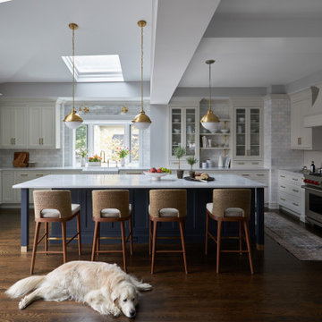
The kitchen features a classic, clean, and timeless palette. White cabinetry, with brass and bronze finishes, contrasts with rich wood flooring, and lets the large, deep blue island in Woodland’s custom color Harbor – a neutral, yet statement color – draw your eye.
The kitchen was the main priority. In addition to updating and elevating this space, Tina wanted to maximize what her home had to offer. From moving the location of the patio door and eliminating a window to removing an existing closet in the mudroom and the cluttered pantry, the kitchen footprint grew. Once the floorplan was set, it was time to bring cohesion to her home, creating connection between the kitchen and surrounding spaces.
The color palette carries into the mudroom, where we added beautiful new cabinetry, practical bench seating, and accessible hooks, perfect for guests and everyday living. The nearby bar continues the aesthetic, with stunning Carrara marble subway tile, hints of brass and bronze, and a design that further captures the vibe of the kitchen.
Every home has its unique design challenges. But with a fresh perspective and a bit of creativity, there is always a way to give the client exactly what they want [and need]. In this particular kitchen, the existing soffits and high slanted ceilings added a layer of complexity to the lighting layout and upper perimeter cabinets.
While a space needs to look good, it also needs to function well. This meant making the most of the height of the room and accounting for the varied ceiling features, while also giving Tina everything she wanted and more. Pendants and task lighting paired with an abundance of natural light amplify the bright aesthetic. The cabinetry layout and design compliments the soffits with subtle profile details that bring everything together. The tile selections add visual interest, drawing the eye to the focal area above the range. Glass-doored cabinets further customize the space and give the illusion of even more height within the room.
While her family may be grown and out of the house, Tina was focused on adding function without sacrificing a stunning aesthetic and dreamy finishes that make the kitchen the gathering place of any home. It was time to love her kitchen again, and if you’re wondering what she loves most, it’s the niche with glass door cabinetry and open shelving for display paired with the marble mosaic backsplash over the range and complimenting hood. Each of these features is a stunning point of interest within the kitchen – both brag-worthy additions to a perimeter layout that previously felt limited and lacking.
Whether your remodel is the result of special needs in your home or simply the excitement of focusing your energy on creating a fun new aesthetic, we are here for it. We love a good challenge because there is always a way to make a space better – adding function and beauty simultaneously.
Sponsored
Columbus, OH

Snider & Metcalf Interior Design, LTD
Leading Interior Designers in Columbus, Ohio & Ponte Vedra, Florida
 kimberly peck architect
For this project, we transformed the top floor of a Park Slope brownstone into a modern, lightfilled
home tailored to the needs of a busy couple. The original space was outdated and lacked
cohesion, so our design focused on creating a harmonious and functional layout that reflects the
clients’ lifestyle while introducing moments of drama and creativity.
At the heart of the penthouse is an open-concept dining room, living room, and kitchen. The
living room accommodates multiple areas, including a cozy seating nook illuminated by
multicolored glass pendant lights. A dramatic custom-built feature spans the entire length of the
living room, integrating storage, display areas, and a unique guardwall that separates the
staircase to the couple's rooftop garden from the living space. This built-in showcases a dynamic
geometric design, with select sections backed in soft mauve for depth and visual interest. Along
the front of the space, a bespoke oak window seat with modern slatted wood fronts conceals the
AC and radiators while providing ample storage. The main seating area centers around a creamy
marble fireplace surround, a refined focal point in the living area. Wide-plank oak flooring
extends throughout the apartment and up the staircase, where a minimal aesthetic enhances the
clean, modern feel.
The kitchen continues the theme of modern sophistication with a palette of soft white lacquered
lower cabinets and oak upper cabinetry. The countertops and backsplash are crafted from a
striking quartzite in cream, peach, and mauve tones, adding a subtle vibrancy to the space. A
cream-enameled range takes center stage, complemented by a hidden coffee station and a
dedicated cabinet for AV supplies, ensuring a clutter-free aesthetic.
The hall guest bathroom is a playful yet refined mix of materials and textures. Peach-toned
concrete tiles cover the walls, while the floor features cream zellige tiles. Brass fixtures, a brass
mirror, and a brass wall sconce lend a touch of warmth and luxury, harmonizing with the custom
pecan-veneered vanity and custom concrete sink,
The primary bedroom suite is a serene retreat, painted in a rich, deep blue that sets a calming
tone. Accessed through a bespoke millwork closet, the ensuite bathroom is a small yet striking
space, showcasing impeccable craftsmanship. The rear wall of the shower is clad in floor-toceiling
slabs of light blue quartzite, creating a dramatic focal point visible from the bedroom.
This quartzite extends seamlessly to form a sculptural bench within the shower, which transitions
outward into a custom sink. Beneath the sink, two wood drawers provide discreet storage. The
remaining walls are finished in soft beige Moroccan tadelakt plaster, adding a warm contrast to
the cool tones of the quartzite.
This Park Slope penthouse is a carefully curated blend of modern elegance and thoughtful
functionality, with bespoke details and rich materiality that celebrate both the character of the
space and the needs of its owners.
 TKS Design Group
Download our free ebook, Creating the Ideal Kitchen. DOWNLOAD NOW
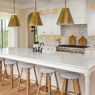
This client was referred to us from a past client. They are a busy 2-career household with young children and enjoy entertaining friends and family in their home. They have a beautiful open concept home but unfortunately the kitchen was not fitting for the rest of the home. They were not quite sure what to do with the space. We talked about trying to refresh it or do more of a minor remodel, but in the end they decided a full gut would get them to where they wanted to be.
One problem was there was no place for guests to hang out other than the large and awkward banquette area. The brick wall and tiled hood area were feeling a bit dated and tired. The space was just not functional for their lifestyle. There was no prep space near the cooktop and no landing area for items coming out of the ovens or refrigerator, plus a big dead zone in the center of the room.
Banquettes, like the one they previously had in the space, are great for small spaces, but when they get really large like this one, it makes getting in and out of the seating area awkward and uncomfortable. Plus, there was room for a large table, so we eliminated the awkward built in.
We started by removing the faux brick wall between the kitchen and back entry. We relocated the entry to the garage over a couple feet in order to get every last inch out of the new kitchen. We also made the decision to close up the primary window that faced the pretty ho hum brick wall of the neighbor’s house. There was plenty of light coming in from the seating area, so we just didn’t feel the window was adding much to the room.
Construction went smoothy. There was a bit of rework with electrical, flooring and HVAC, but in the end, we think it was well worth it.
The clients really wanted a sleek contemporary look, and we originally had planned for a full height slab backsplash, but due to it’s size, it was a budget buster. Instead, we got creative and settled on large format porcelain tiles that have a similar feel but were a fraction of the cost. We made sure the wall was plumb and level so that the fit and finish would mimic that of slab material.
The final space was quite a change. A large prep sink sits directly across from the new pro-style range with plenty additional prep space on the large island. The refrigerator and ovens now have miles of landing space, and a nice tight work triangle makes cooking a breeze.
Since we wanted a more contemporary feel, not many wall cabinets were included. Instead, we outfitted some of the drawers for dish storage with a peg system. Two large pantries flanking the refrigerator hold baking supplies and small appliances. Large drawers by the cooktop hold pots and pans, and an appliance garage tucked away to the left of the range hides away miscellaneous items. The large island also houses a microwave drawer and tons of storage, most of which is drawers offering maximum convenience.
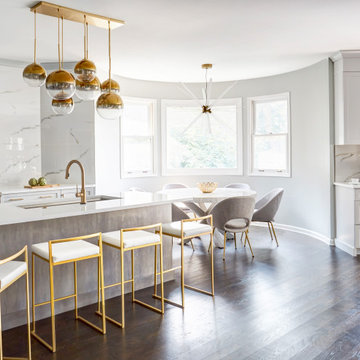
The island now seats 5-6 people comfortably along with the new table in the seating area which can seat up to 8. Entertaining will be a breeze in this space. With such a clean backdrop, we knew we would need some drama with the lighting, so we chose two sets of staggered pendants, which we adjusted for the right visual balance above the island.
We also included a small coffee station to the right of the main kitchen, which helps keep the coffee clutter out of the kitchen proper. Two tones of complimentary gray are featured in this kitchen. The perimeter is a light gray that reads almost white. The island is a gray stain that adds some depth and interest with the visible wood texture. The countertops are clean white quartz, and the hardware, barstools and light fixtures add warm brass tones. I see lots of cooking and entertaining with family and friends in the near future in this bright and airy new space.
Designed by: Susan Klimala, CKD, CBD
Photography by: Michael Kaskel
For more information on kitchen and bath design ideas go to: www.kitchenstudio-ge.com

 Ellie Lillstrom Photography
Photo: A Darling Felicity Photography © 2015 Houzz
Example of a mid-sized country porcelain tile mudroom design in Seattle with green walls
Example of a mid-sized country porcelain tile mudroom design in Seattle with green walls
 Drury Design
The Setup
For this primary bathroom project, the homeowners sought to transform their outdated, beige-toned space into a bright, functional sanctuary. The existing bathroom felt cramped and lifeless, with a small shower and limited storage options. The goal was to create a fresh, updated bathroom that maximizes the existing footprint while addressing specific desires for a more open, organized space with timeless materials.
Design objectives:
Brighten the bathroom and eliminate the dated beige color scheme
Install a freestanding tub in a compact space
Create a larger, more open shower without encroaching on the existing foot print too much
Incorporate hidden storage solutions
Maintain the existing bathroom layout while improving functionality
Update lighting and fixtures to create a contemporary feel
The Remodel
Design challenges to be solved:
- Compact Space Utilization – The small bathroom required careful planning to accommodate a freestanding tub while maintaining functionality and avoiding overcrowding.
- Hidden Storage Integration – The clients wanted a discreet hamper solution that wouldn’t clutter the limited floor space.
- Shower Niche Placement – With plumbing limitations and the clients’ desire to preserve their wavy accent tile wall, finding the perfect niche spot became a creative puzzle.
- Tile and Finish Coordination – Selecting complementary white tile and floor materials that worked harmoniously together.
- Larger Shower Space – Make the shower feel more open and brighter
The Renewed Space
Design solutions:
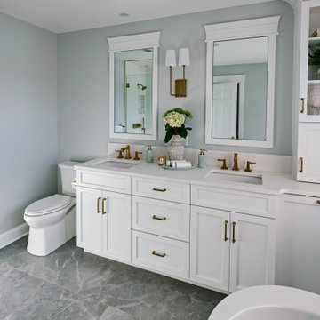
- Strategic Tub Placement – The freestanding tub was carefully positioned to maximize space, with its faucet strategically placed to allow easy access while preserving walking room. We reduced the counter depth just a bit by the tub, allowing more room for hamper cabinet and window access.
- Concealed Hamper Storage – A custom pull-out hamper was integrated into the vanity (right side, by tub), providing discreet storage within an 18-inch depth constraint.
- Shower Plumbing Wall Niche – We shifted the niche left, just enough to work around the plumbing infrastructure and still score a roomy storage spot that looks intentional.
- Sophisticated Selections – Porcelanosa curvy white tile, Kohler brushed gold fixtures, and a neutral grey tile floor created a simple, timeless aesthetic that will be loved years to come.
- Open Shower – Replacing the side wall with a clear glass surround, continuing the tile on the ceiling and extending the footprint opened up this area to the room while allowing more natural lighting into the shower space.
This bathroom transformation shows how thoughtful design turns challenges into opportunities. Brushed gold fixtures add warmth to the fresh white palette, while the perfectly balanced floor tile brings just the right depth. A partially glass-fronted vanity introduces subtle charm, giving the space a unique edge. Once cramped and outdated, this bathroom now feels bright, spacious, and serene—a testament to how every design detail makes a difference.

 kimberly peck architect
For this project, we transformed the top floor of a Park Slope brownstone into a modern, lightfilled
home tailored to the needs of a busy couple. The original space was outdated and lacked
cohesion, so our design focused on creating a harmonious and functional layout that reflects the
clients’ lifestyle while introducing moments of drama and creativity.
At the heart of the penthouse is an open-concept dining room, living room, and kitchen. The
living room accommodates multiple areas, including a cozy seating nook illuminated by
multicolored glass pendant lights. A dramatic custom-built feature spans the entire length of the
living room, integrating storage, display areas, and a unique guardwall that separates the
staircase to the couple's rooftop garden from the living space. This built-in showcases a dynamic
geometric design, with select sections backed in soft mauve for depth and visual interest. Along
the front of the space, a bespoke oak window seat with modern slatted wood fronts conceals the
AC and radiators while providing ample storage. The main seating area centers around a creamy
marble fireplace surround, a refined focal point in the living area. Wide-plank oak flooring
extends throughout the apartment and up the staircase, where a minimal aesthetic enhances the
clean, modern feel.
The kitchen continues the theme of modern sophistication with a palette of soft white lacquered
lower cabinets and oak upper cabinetry. The countertops and backsplash are crafted from a
striking quartzite in cream, peach, and mauve tones, adding a subtle vibrancy to the space. A
cream-enameled range takes center stage, complemented by a hidden coffee station and a
dedicated cabinet for AV supplies, ensuring a clutter-free aesthetic.
The hall guest bathroom is a playful yet refined mix of materials and textures. Peach-toned
concrete tiles cover the walls, while the floor features cream zellige tiles. Brass fixtures, a brass
mirror, and a brass wall sconce lend a touch of warmth and luxury, harmonizing with the custom
pecan-veneered vanity and custom concrete sink,
The primary bedroom suite is a serene retreat, painted in a rich, deep blue that sets a calming
tone. Accessed through a bespoke millwork closet, the ensuite bathroom is a small yet striking
space, showcasing impeccable craftsmanship. The rear wall of the shower is clad in floor-toceiling
slabs of light blue quartzite, creating a dramatic focal point visible from the bedroom.
This quartzite extends seamlessly to form a sculptural bench within the shower, which transitions
outward into a custom sink. Beneath the sink, two wood drawers provide discreet storage. The
remaining walls are finished in soft beige Moroccan tadelakt plaster, adding a warm contrast to
the cool tones of the quartzite.
This Park Slope penthouse is a carefully curated blend of modern elegance and thoughtful
functionality, with bespoke details and rich materiality that celebrate both the character of the
space and the needs of its owners.
 kimberly peck architect
For this project, we transformed the top floor of a Park Slope brownstone into a modern, lightfilled
home tailored to the needs of a busy couple. The original space was outdated and lacked
cohesion, so our design focused on creating a harmonious and functional layout that reflects the
clients’ lifestyle while introducing moments of drama and creativity.
At the heart of the penthouse is an open-concept dining room, living room, and kitchen. The
living room accommodates multiple areas, including a cozy seating nook illuminated by
multicolored glass pendant lights. A dramatic custom-built feature spans the entire length of the
living room, integrating storage, display areas, and a unique guardwall that separates the
staircase to the couple's rooftop garden from the living space. This built-in showcases a dynamic
geometric design, with select sections backed in soft mauve for depth and visual interest. Along
the front of the space, a bespoke oak window seat with modern slatted wood fronts conceals the
AC and radiators while providing ample storage. The main seating area centers around a creamy
marble fireplace surround, a refined focal point in the living area. Wide-plank oak flooring
extends throughout the apartment and up the staircase, where a minimal aesthetic enhances the
clean, modern feel.
The kitchen continues the theme of modern sophistication with a palette of soft white lacquered
lower cabinets and oak upper cabinetry. The countertops and backsplash are crafted from a
striking quartzite in cream, peach, and mauve tones, adding a subtle vibrancy to the space. A
cream-enameled range takes center stage, complemented by a hidden coffee station and a
dedicated cabinet for AV supplies, ensuring a clutter-free aesthetic.
The hall guest bathroom is a playful yet refined mix of materials and textures. Peach-toned
concrete tiles cover the walls, while the floor features cream zellige tiles. Brass fixtures, a brass
mirror, and a brass wall sconce lend a touch of warmth and luxury, harmonizing with the custom
pecan-veneered vanity and custom concrete sink,
The primary bedroom suite is a serene retreat, painted in a rich, deep blue that sets a calming
tone. Accessed through a bespoke millwork closet, the ensuite bathroom is a small yet striking
space, showcasing impeccable craftsmanship. The rear wall of the shower is clad in floor-toceiling
slabs of light blue quartzite, creating a dramatic focal point visible from the bedroom.
This quartzite extends seamlessly to form a sculptural bench within the shower, which transitions
outward into a custom sink. Beneath the sink, two wood drawers provide discreet storage. The
remaining walls are finished in soft beige Moroccan tadelakt plaster, adding a warm contrast to
the cool tones of the quartzite.
This Park Slope penthouse is a carefully curated blend of modern elegance and thoughtful
functionality, with bespoke details and rich materiality that celebrate both the character of the
space and the needs of its owners.
 TKS Design Group
Download our free ebook, Creating the Ideal Kitchen. DOWNLOAD NOW
For many, extra time at home during COVID left them wanting more from their homes. Whether you realized the shortcomings of your space or simply wanted to combat boredom, a well-designed and functional home was no longer a want, it became a need. Tina found herself wanting more from her Old Irving Park home and reached out to The Kitchen Studio about adding function to her kitchen to make the most of the available real estate.
At the end of the day, there is nothing better than returning home to a bright and happy space you love. And this kitchen wasn’t that for Tina. Dark and dated, with a palette from the past and features that didn’t make the most of the available square footage, this remodel required vision and a fresh approach to the space. Lead designer, Stephanie Cole’s main design goal was better flow, while adding greater functionality with organized storage, accessible open shelving, and an overall sense of cohesion with the adjoining family room.
The original kitchen featured a large pizza oven, which was rarely used, yet its footprint limited storage space. The nearby pantry had become a catch-all, lacking the organization needed in the home. The initial plan was to keep the pizza oven, but eventually Tina realized she preferred the design possibilities that came from removing this cumbersome feature, with the goal of adding function throughout the upgraded and elevated space. Eliminating the pantry added square footage and length to the kitchen for greater function and more storage. This redesigned space reflects how she lives and uses her home, as well as her love for entertaining.
The kitchen features a classic, clean, and timeless palette. White cabinetry, with brass and bronze finishes, contrasts with rich wood flooring, and lets the large, deep blue island in Woodland’s custom color Harbor – a neutral, yet statement color – draw your eye.
The kitchen was the main priority. In addition to updating and elevating this space, Tina wanted to maximize what her home had to offer. From moving the location of the patio door and eliminating a window to removing an existing closet in the mudroom and the cluttered pantry, the kitchen footprint grew. Once the floorplan was set, it was time to bring cohesion to her home, creating connection between the kitchen and surrounding spaces.
The color palette carries into the mudroom, where we added beautiful new cabinetry, practical bench seating, and accessible hooks, perfect for guests and everyday living. The nearby bar continues the aesthetic, with stunning Carrara marble subway tile, hints of brass and bronze, and a design that further captures the vibe of the kitchen.
Every home has its unique design challenges. But with a fresh perspective and a bit of creativity, there is always a way to give the client exactly what they want [and need]. In this particular kitchen, the existing soffits and high slanted ceilings added a layer of complexity to the lighting layout and upper perimeter cabinets.
While a space needs to look good, it also needs to function well. This meant making the most of the height of the room and accounting for the varied ceiling features, while also giving Tina everything she wanted and more. Pendants and task lighting paired with an abundance of natural light amplify the bright aesthetic. The cabinetry layout and design compliments the soffits with subtle profile details that bring everything together. The tile selections add visual interest, drawing the eye to the focal area above the range. Glass-doored cabinets further customize the space and give the illusion of even more height within the room.
While her family may be grown and out of the house, Tina was focused on adding function without sacrificing a stunning aesthetic and dreamy finishes that make the kitchen the gathering place of any home. It was time to love her kitchen again, and if you’re wondering what she loves most, it’s the niche with glass door cabinetry and open shelving for display paired with the marble mosaic backsplash over the range and complimenting hood. Each of these features is a stunning point of interest within the kitchen – both brag-worthy additions to a perimeter layout that previously felt limited and lacking.
Whether your remodel is the result of special needs in your home or simply the excitement of focusing your energy on creating a fun new aesthetic, we are here for it. We love a good challenge because there is always a way to make a space better – adding function and beauty simultaneously.
99