
Search results for "Visual clutter" in Home Design Ideas
 Drury Design
The Setup
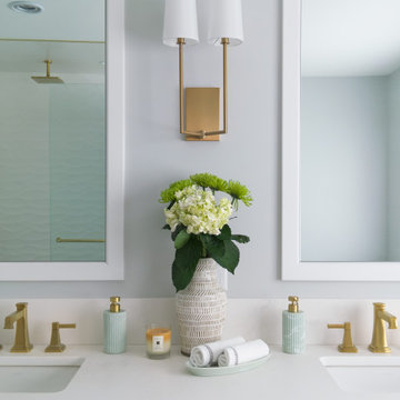
For this primary bathroom project, the homeowners sought to transform their outdated, beige-toned space into a bright, functional sanctuary. The existing bathroom felt cramped and lifeless, with a small shower and limited storage options. The goal was to create a fresh, updated bathroom that maximizes the existing footprint while addressing specific desires for a more open, organized space with timeless materials.
Design objectives:
Brighten the bathroom and eliminate the dated beige color scheme
Install a freestanding tub in a compact space
Create a larger, more open shower without encroaching on the existing foot print too much
Incorporate hidden storage solutions
Maintain the existing bathroom layout while improving functionality
Update lighting and fixtures to create a contemporary feel
The Remodel
Design challenges to be solved:
- Compact Space Utilization – The small bathroom required careful planning to accommodate a freestanding tub while maintaining functionality and avoiding overcrowding.
- Hidden Storage Integration – The clients wanted a discreet hamper solution that wouldn’t clutter the limited floor space.
- Shower Niche Placement – With plumbing limitations and the clients’ desire to preserve their wavy accent tile wall, finding the perfect niche spot became a creative puzzle.
- Tile and Finish Coordination – Selecting complementary white tile and floor materials that worked harmoniously together.
- Larger Shower Space – Make the shower feel more open and brighter
The Renewed Space
Design solutions:
- Strategic Tub Placement – The freestanding tub was carefully positioned to maximize space, with its faucet strategically placed to allow easy access while preserving walking room. We reduced the counter depth just a bit by the tub, allowing more room for hamper cabinet and window access.
- Concealed Hamper Storage – A custom pull-out hamper was integrated into the vanity (right side, by tub), providing discreet storage within an 18-inch depth constraint.
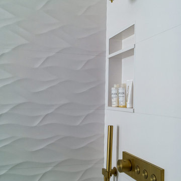
- Shower Plumbing Wall Niche – We shifted the niche left, just enough to work around the plumbing infrastructure and still score a roomy storage spot that looks intentional.
- Sophisticated Selections – Porcelanosa curvy white tile, Kohler brushed gold fixtures, and a neutral grey tile floor created a simple, timeless aesthetic that will be loved years to come.
- Open Shower – Replacing the side wall with a clear glass surround, continuing the tile on the ceiling and extending the footprint opened up this area to the room while allowing more natural lighting into the shower space.
This bathroom transformation shows how thoughtful design turns challenges into opportunities. Brushed gold fixtures add warmth to the fresh white palette, while the perfectly balanced floor tile brings just the right depth. A partially glass-fronted vanity introduces subtle charm, giving the space a unique edge. Once cramped and outdated, this bathroom now feels bright, spacious, and serene—a testament to how every design detail makes a difference.
 Drury Design
The Setup
For this primary bathroom project, the homeowners sought to transform their outdated, beige-toned space into a bright, functional sanctuary. The existing bathroom felt cramped and lifeless, with a small shower and limited storage options. The goal was to create a fresh, updated bathroom that maximizes the existing footprint while addressing specific desires for a more open, organized space with timeless materials.
Design objectives:
Brighten the bathroom and eliminate the dated beige color scheme
Install a freestanding tub in a compact space
Create a larger, more open shower without encroaching on the existing foot print too much
Incorporate hidden storage solutions
Maintain the existing bathroom layout while improving functionality
Update lighting and fixtures to create a contemporary feel
The Remodel
Design challenges to be solved:
- Compact Space Utilization – The small bathroom required careful planning to accommodate a freestanding tub while maintaining functionality and avoiding overcrowding.
- Hidden Storage Integration – The clients wanted a discreet hamper solution that wouldn’t clutter the limited floor space.
- Shower Niche Placement – With plumbing limitations and the clients’ desire to preserve their wavy accent tile wall, finding the perfect niche spot became a creative puzzle.
- Tile and Finish Coordination – Selecting complementary white tile and floor materials that worked harmoniously together.
- Larger Shower Space – Make the shower feel more open and brighter
The Renewed Space
Design solutions:
- Strategic Tub Placement – The freestanding tub was carefully positioned to maximize space, with its faucet strategically placed to allow easy access while preserving walking room. We reduced the counter depth just a bit by the tub, allowing more room for hamper cabinet and window access.
- Concealed Hamper Storage – A custom pull-out hamper was integrated into the vanity (right side, by tub), providing discreet storage within an 18-inch depth constraint.
- Shower Plumbing Wall Niche – We shifted the niche left, just enough to work around the plumbing infrastructure and still score a roomy storage spot that looks intentional.
- Sophisticated Selections – Porcelanosa curvy white tile, Kohler brushed gold fixtures, and a neutral grey tile floor created a simple, timeless aesthetic that will be loved years to come.
- Open Shower – Replacing the side wall with a clear glass surround, continuing the tile on the ceiling and extending the footprint opened up this area to the room while allowing more natural lighting into the shower space.
This bathroom transformation shows how thoughtful design turns challenges into opportunities. Brushed gold fixtures add warmth to the fresh white palette, while the perfectly balanced floor tile brings just the right depth. A partially glass-fronted vanity introduces subtle charm, giving the space a unique edge. Once cramped and outdated, this bathroom now feels bright, spacious, and serene—a testament to how every design detail makes a difference.

 Blackdog Design Build Remodel
An older kitchen, breakfast area and dining room that were separated into three rooms was opened up with a steel beam for a beautiful open concept kitchen, dining and lounge area. Project done by our Salem, NH team.
Studio One Photography
Find the right local pro for your project
 Drury Design
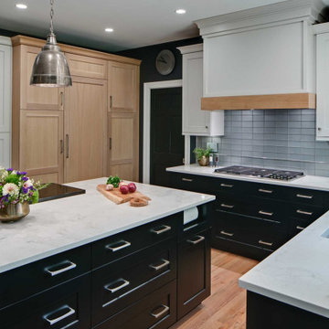
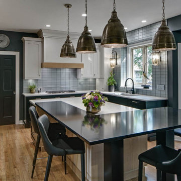
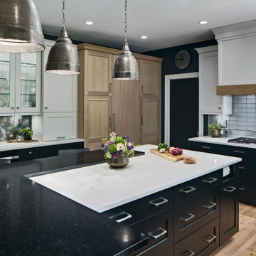
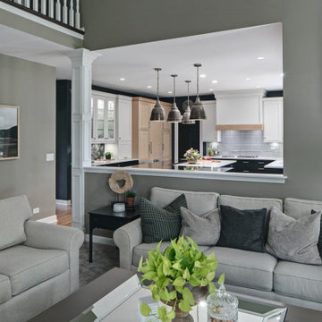
The original intent of this project was to replace the island, hood, countertops, and a few appliances. A primary bath remodel was the main priority. But once the couple realized certain features would enhance the functionality of the kitchen – not to mention completely change the aesthetic – they put the master bath on hold and decided to remodel the entire kitchen first.
Design objectives:
-Omit separate table, plan for a larger island that would seat 7 people
-Simple, clean lines – no rounded corners or weird angles
-Nothing trendy – use modern classic details
-Uncluttered countertops
-Better pantry storage for food & small appliances
-Integrated major appliances
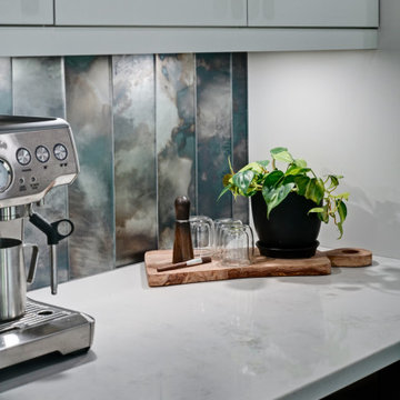
-Coffee bar
-Avoid “1 color on perimeter with second color on island”
-Integrate a harmonious variety of finishes
-Integrate black & handmade metals
Design challenges:
-Island shape to fit within confines of existing half wall between kitchen & family room & bay window/door to backyard
-Narrow kitchen with major walkway
-Planning for 7 seats at the island
-Keep guest social area away from the cook’s zone
-Place appliances according to use
-Point-of-use storage for an avid cook within a relatively small space
-Integrate colors without looking too busy
THE NEW KITCHEN
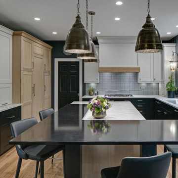
-While the island is mostly rectangular, the seating area utilizes the bay extension without interfering with the exterior door
-All seating is placed on the outside perimeter of the island, giving the cook dedicated prep space
-The L-shaped seating area & adjacent coffee bar encourage guests to gather on the outside edge of the kitchen where they can still interact with the cook
-Island prep space includes 5 feet of versatile drawer storage, double waste basket and an open paper towel dispenser
-One pantry designated for food; the other for small appliances & bulk storage; creates visual armoire look
-Microwave drawer in island faces refrigerator for easy access & less interference with cook’s zone
-Appliance garages avoid clutter on the countertops
-Off-white upper cabinets make the kitchen look larger while the black bases offer contrast without closing in the space
Once the client committed to remodeling her entire kitchen, she had a good idea of the direction she wanted the space to take. Even so, there were many details that remained open to explore & contemplate. The end result is modern, clean and ultimately transitional – a creative vision anchored in functionality and artistry!
A powder room remodel was added to the project that beautifully compliments the kitchen aesthetic. The entire staircase, all trim & doors were painted in the same tones as the kitchen, transforming the entire first floor into a cohesive & welcoming space. It was a great collaborative partnership!
 Drury Design
The original intent of this project was to replace the island, hood, countertops, and a few appliances. A primary bath remodel was the main priority. But once the couple realized certain features would enhance the functionality of the kitchen – not to mention completely change the aesthetic – they put the master bath on hold and decided to remodel the entire kitchen first.
Design objectives:
-Omit separate table, plan for a larger island that would seat 7 people
-Simple, clean lines – no rounded corners or weird angles
-Nothing trendy – use modern classic details
-Uncluttered countertops
-Better pantry storage for food & small appliances
-Integrated major appliances
-Coffee bar
-Avoid “1 color on perimeter with second color on island”
-Integrate a harmonious variety of finishes
-Integrate black & handmade metals
Design challenges:
-Island shape to fit within confines of existing half wall between kitchen & family room & bay window/door to backyard
-Narrow kitchen with major walkway
-Planning for 7 seats at the island
-Keep guest social area away from the cook’s zone
-Place appliances according to use
-Point-of-use storage for an avid cook within a relatively small space
-Integrate colors without looking too busy
THE NEW KITCHEN
-While the island is mostly rectangular, the seating area utilizes the bay extension without interfering with the exterior door
-All seating is placed on the outside perimeter of the island, giving the cook dedicated prep space
-The L-shaped seating area & adjacent coffee bar encourage guests to gather on the outside edge of the kitchen where they can still interact with the cook
-Island prep space includes 5 feet of versatile drawer storage, double waste basket and an open paper towel dispenser
-One pantry designated for food; the other for small appliances & bulk storage; creates visual armoire look
-Microwave drawer in island faces refrigerator for easy access & less interference with cook’s zone
-Appliance garages avoid clutter on the countertops
-Off-white upper cabinets make the kitchen look larger while the black bases offer contrast without closing in the space
Once the client committed to remodeling her entire kitchen, she had a good idea of the direction she wanted the space to take. Even so, there were many details that remained open to explore & contemplate. The end result is modern, clean and ultimately transitional – a creative vision anchored in functionality and artistry!
A powder room remodel was added to the project that beautifully compliments the kitchen aesthetic. The entire staircase, all trim & doors were painted in the same tones as the kitchen, transforming the entire first floor into a cohesive & welcoming space. It was a great collaborative partnership!
 Drury Design
The original intent of this project was to replace the island, hood, countertops, and a few appliances. A primary bath remodel was the main priority. But once the couple realized certain features would enhance the functionality of the kitchen – not to mention completely change the aesthetic – they put the master bath on hold and decided to remodel the entire kitchen first.
Design objectives:
-Omit separate table, plan for a larger island that would seat 7 people
-Simple, clean lines – no rounded corners or weird angles
-Nothing trendy – use modern classic details
-Uncluttered countertops
-Better pantry storage for food & small appliances
-Integrated major appliances
-Coffee bar
-Avoid “1 color on perimeter with second color on island”
-Integrate a harmonious variety of finishes
-Integrate black & handmade metals
Design challenges:
-Island shape to fit within confines of existing half wall between kitchen & family room & bay window/door to backyard
-Narrow kitchen with major walkway
-Planning for 7 seats at the island
-Keep guest social area away from the cook’s zone
-Place appliances according to use
-Point-of-use storage for an avid cook within a relatively small space
-Integrate colors without looking too busy
THE NEW KITCHEN
-While the island is mostly rectangular, the seating area utilizes the bay extension without interfering with the exterior door
-All seating is placed on the outside perimeter of the island, giving the cook dedicated prep space
-The L-shaped seating area & adjacent coffee bar encourage guests to gather on the outside edge of the kitchen where they can still interact with the cook
-Island prep space includes 5 feet of versatile drawer storage, double waste basket and an open paper towel dispenser
-One pantry designated for food; the other for small appliances & bulk storage; creates visual armoire look
-Microwave drawer in island faces refrigerator for easy access & less interference with cook’s zone
-Appliance garages avoid clutter on the countertops
-Off-white upper cabinets make the kitchen look larger while the black bases offer contrast without closing in the space
Once the client committed to remodeling her entire kitchen, she had a good idea of the direction she wanted the space to take. Even so, there were many details that remained open to explore & contemplate. The end result is modern, clean and ultimately transitional – a creative vision anchored in functionality and artistry!
A powder room remodel was added to the project that beautifully compliments the kitchen aesthetic. The entire staircase, all trim & doors were painted in the same tones as the kitchen, transforming the entire first floor into a cohesive & welcoming space. It was a great collaborative partnership!
 Drury Design
The original intent of this project was to replace the island, hood, countertops, and a few appliances. A primary bath remodel was the main priority. But once the couple realized certain features would enhance the functionality of the kitchen – not to mention completely change the aesthetic – they put the master bath on hold and decided to remodel the entire kitchen first.
Design objectives:
-Omit separate table, plan for a larger island that would seat 7 people
-Simple, clean lines – no rounded corners or weird angles
-Nothing trendy – use modern classic details
-Uncluttered countertops
-Better pantry storage for food & small appliances
-Integrated major appliances
-Coffee bar
-Avoid “1 color on perimeter with second color on island”
-Integrate a harmonious variety of finishes
-Integrate black & handmade metals
Design challenges:
-Island shape to fit within confines of existing half wall between kitchen & family room & bay window/door to backyard
-Narrow kitchen with major walkway
-Planning for 7 seats at the island
-Keep guest social area away from the cook’s zone
-Place appliances according to use
-Point-of-use storage for an avid cook within a relatively small space
-Integrate colors without looking too busy
THE NEW KITCHEN
-While the island is mostly rectangular, the seating area utilizes the bay extension without interfering with the exterior door
-All seating is placed on the outside perimeter of the island, giving the cook dedicated prep space
-The L-shaped seating area & adjacent coffee bar encourage guests to gather on the outside edge of the kitchen where they can still interact with the cook
-Island prep space includes 5 feet of versatile drawer storage, double waste basket and an open paper towel dispenser
-One pantry designated for food; the other for small appliances & bulk storage; creates visual armoire look
-Microwave drawer in island faces refrigerator for easy access & less interference with cook’s zone
-Appliance garages avoid clutter on the countertops
-Off-white upper cabinets make the kitchen look larger while the black bases offer contrast without closing in the space
Once the client committed to remodeling her entire kitchen, she had a good idea of the direction she wanted the space to take. Even so, there were many details that remained open to explore & contemplate. The end result is modern, clean and ultimately transitional – a creative vision anchored in functionality and artistry!
A powder room remodel was added to the project that beautifully compliments the kitchen aesthetic. The entire staircase, all trim & doors were painted in the same tones as the kitchen, transforming the entire first floor into a cohesive & welcoming space. It was a great collaborative partnership!
Sponsored
Columbus, OH

Snider & Metcalf Interior Design, LTD
Leading Interior Designers in Columbus, Ohio & Ponte Vedra, Florida
 Drury Design
The original intent of this project was to replace the island, hood, countertops, and a few appliances. A primary bath remodel was the main priority. But once the couple realized certain features would enhance the functionality of the kitchen – not to mention completely change the aesthetic – they put the master bath on hold and decided to remodel the entire kitchen first.
Design objectives:
-Omit separate table, plan for a larger island that would seat 7 people
-Simple, clean lines – no rounded corners or weird angles
-Nothing trendy – use modern classic details
-Uncluttered countertops
-Better pantry storage for food & small appliances
-Integrated major appliances
-Coffee bar
-Avoid “1 color on perimeter with second color on island”
-Integrate a harmonious variety of finishes
-Integrate black & handmade metals
Design challenges:
-Island shape to fit within confines of existing half wall between kitchen & family room & bay window/door to backyard
-Narrow kitchen with major walkway
-Planning for 7 seats at the island
-Keep guest social area away from the cook’s zone
-Place appliances according to use
-Point-of-use storage for an avid cook within a relatively small space
-Integrate colors without looking too busy
THE NEW KITCHEN
-While the island is mostly rectangular, the seating area utilizes the bay extension without interfering with the exterior door
-All seating is placed on the outside perimeter of the island, giving the cook dedicated prep space
-The L-shaped seating area & adjacent coffee bar encourage guests to gather on the outside edge of the kitchen where they can still interact with the cook
-Island prep space includes 5 feet of versatile drawer storage, double waste basket and an open paper towel dispenser
-One pantry designated for food; the other for small appliances & bulk storage; creates visual armoire look
-Microwave drawer in island faces refrigerator for easy access & less interference with cook’s zone
-Appliance garages avoid clutter on the countertops
-Off-white upper cabinets make the kitchen look larger while the black bases offer contrast without closing in the space
Once the client committed to remodeling her entire kitchen, she had a good idea of the direction she wanted the space to take. Even so, there were many details that remained open to explore & contemplate. The end result is modern, clean and ultimately transitional – a creative vision anchored in functionality and artistry!
A powder room remodel was added to the project that beautifully compliments the kitchen aesthetic. The entire staircase, all trim & doors were painted in the same tones as the kitchen, transforming the entire first floor into a cohesive & welcoming space. It was a great collaborative partnership!
 Drury Design
The original intent of this project was to replace the island, hood, countertops, and a few appliances. A primary bath remodel was the main priority. But once the couple realized certain features would enhance the functionality of the kitchen – not to mention completely change the aesthetic – they put the master bath on hold and decided to remodel the entire kitchen first.
Design objectives:
-Omit separate table, plan for a larger island that would seat 7 people
-Simple, clean lines – no rounded corners or weird angles
-Nothing trendy – use modern classic details
-Uncluttered countertops
-Better pantry storage for food & small appliances
-Integrated major appliances
-Coffee bar
-Avoid “1 color on perimeter with second color on island”
-Integrate a harmonious variety of finishes
-Integrate black & handmade metals
Design challenges:
-Island shape to fit within confines of existing half wall between kitchen & family room & bay window/door to backyard
-Narrow kitchen with major walkway
-Planning for 7 seats at the island
-Keep guest social area away from the cook’s zone
-Place appliances according to use
-Point-of-use storage for an avid cook within a relatively small space
-Integrate colors without looking too busy
THE NEW KITCHEN
-While the island is mostly rectangular, the seating area utilizes the bay extension without interfering with the exterior door
-All seating is placed on the outside perimeter of the island, giving the cook dedicated prep space
-The L-shaped seating area & adjacent coffee bar encourage guests to gather on the outside edge of the kitchen where they can still interact with the cook
-Island prep space includes 5 feet of versatile drawer storage, double waste basket and an open paper towel dispenser
-One pantry designated for food; the other for small appliances & bulk storage; creates visual armoire look
-Microwave drawer in island faces refrigerator for easy access & less interference with cook’s zone
-Appliance garages avoid clutter on the countertops
-Off-white upper cabinets make the kitchen look larger while the black bases offer contrast without closing in the space
Once the client committed to remodeling her entire kitchen, she had a good idea of the direction she wanted the space to take. Even so, there were many details that remained open to explore & contemplate. The end result is modern, clean and ultimately transitional – a creative vision anchored in functionality and artistry!
A powder room remodel was added to the project that beautifully compliments the kitchen aesthetic. The entire staircase, all trim & doors were painted in the same tones as the kitchen, transforming the entire first floor into a cohesive & welcoming space. It was a great collaborative partnership!
 Drury Design
The original intent of this project was to replace the island, hood, countertops, and a few appliances. A primary bath remodel was the main priority. But once the couple realized certain features would enhance the functionality of the kitchen – not to mention completely change the aesthetic – they put the master bath on hold and decided to remodel the entire kitchen first.
Design objectives:
-Omit separate table, plan for a larger island that would seat 7 people
-Simple, clean lines – no rounded corners or weird angles
-Nothing trendy – use modern classic details
-Uncluttered countertops
-Better pantry storage for food & small appliances
-Integrated major appliances
-Coffee bar
-Avoid “1 color on perimeter with second color on island”
-Integrate a harmonious variety of finishes
-Integrate black & handmade metals
Design challenges:
-Island shape to fit within confines of existing half wall between kitchen & family room & bay window/door to backyard
-Narrow kitchen with major walkway
-Planning for 7 seats at the island
-Keep guest social area away from the cook’s zone
-Place appliances according to use
-Point-of-use storage for an avid cook within a relatively small space
-Integrate colors without looking too busy
THE NEW KITCHEN
-While the island is mostly rectangular, the seating area utilizes the bay extension without interfering with the exterior door
-All seating is placed on the outside perimeter of the island, giving the cook dedicated prep space
-The L-shaped seating area & adjacent coffee bar encourage guests to gather on the outside edge of the kitchen where they can still interact with the cook
-Island prep space includes 5 feet of versatile drawer storage, double waste basket and an open paper towel dispenser
-One pantry designated for food; the other for small appliances & bulk storage; creates visual armoire look
-Microwave drawer in island faces refrigerator for easy access & less interference with cook’s zone
-Appliance garages avoid clutter on the countertops
-Off-white upper cabinets make the kitchen look larger while the black bases offer contrast without closing in the space
Once the client committed to remodeling her entire kitchen, she had a good idea of the direction she wanted the space to take. Even so, there were many details that remained open to explore & contemplate. The end result is modern, clean and ultimately transitional – a creative vision anchored in functionality and artistry!
A powder room remodel was added to the project that beautifully compliments the kitchen aesthetic. The entire staircase, all trim & doors were painted in the same tones as the kitchen, transforming the entire first floor into a cohesive & welcoming space. It was a great collaborative partnership!
 Drury Design
The original intent of this project was to replace the island, hood, countertops, and a few appliances. A primary bath remodel was the main priority. But once the couple realized certain features would enhance the functionality of the kitchen – not to mention completely change the aesthetic – they put the master bath on hold and decided to remodel the entire kitchen first.
Design objectives:
-Omit separate table, plan for a larger island that would seat 7 people
-Simple, clean lines – no rounded corners or weird angles
-Nothing trendy – use modern classic details
-Uncluttered countertops
-Better pantry storage for food & small appliances
-Integrated major appliances
-Coffee bar
-Avoid “1 color on perimeter with second color on island”
-Integrate a harmonious variety of finishes
-Integrate black & handmade metals
Design challenges:
-Island shape to fit within confines of existing half wall between kitchen & family room & bay window/door to backyard
-Narrow kitchen with major walkway
-Planning for 7 seats at the island
-Keep guest social area away from the cook’s zone
-Place appliances according to use
-Point-of-use storage for an avid cook within a relatively small space
-Integrate colors without looking too busy
THE NEW KITCHEN
-While the island is mostly rectangular, the seating area utilizes the bay extension without interfering with the exterior door
-All seating is placed on the outside perimeter of the island, giving the cook dedicated prep space
-The L-shaped seating area & adjacent coffee bar encourage guests to gather on the outside edge of the kitchen where they can still interact with the cook
-Island prep space includes 5 feet of versatile drawer storage, double waste basket and an open paper towel dispenser
-One pantry designated for food; the other for small appliances & bulk storage; creates visual armoire look
-Microwave drawer in island faces refrigerator for easy access & less interference with cook’s zone
-Appliance garages avoid clutter on the countertops
-Off-white upper cabinets make the kitchen look larger while the black bases offer contrast without closing in the space
Once the client committed to remodeling her entire kitchen, she had a good idea of the direction she wanted the space to take. Even so, there were many details that remained open to explore & contemplate. The end result is modern, clean and ultimately transitional – a creative vision anchored in functionality and artistry!
A powder room remodel was added to the project that beautifully compliments the kitchen aesthetic. The entire staircase, all trim & doors were painted in the same tones as the kitchen, transforming the entire first floor into a cohesive & welcoming space. It was a great collaborative partnership!
 TKS Design Group
Download our free ebook, Creating the Ideal Kitchen. DOWNLOAD NOW
For many, extra time at home during COVID left them wanting more from their homes. Whether you realized the shortcomings of your space or simply wanted to combat boredom, a well-designed and functional home was no longer a want, it became a need. Tina found herself wanting more from her Old Irving Park home and reached out to The Kitchen Studio about adding function to her kitchen to make the most of the available real estate.
At the end of the day, there is nothing better than returning home to a bright and happy space you love. And this kitchen wasn’t that for Tina. Dark and dated, with a palette from the past and features that didn’t make the most of the available square footage, this remodel required vision and a fresh approach to the space. Lead designer, Stephanie Cole’s main design goal was better flow, while adding greater functionality with organized storage, accessible open shelving, and an overall sense of cohesion with the adjoining family room.
The original kitchen featured a large pizza oven, which was rarely used, yet its footprint limited storage space. The nearby pantry had become a catch-all, lacking the organization needed in the home. The initial plan was to keep the pizza oven, but eventually Tina realized she preferred the design possibilities that came from removing this cumbersome feature, with the goal of adding function throughout the upgraded and elevated space. Eliminating the pantry added square footage and length to the kitchen for greater function and more storage. This redesigned space reflects how she lives and uses her home, as well as her love for entertaining.
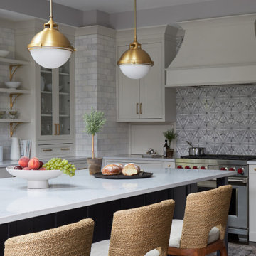
The kitchen features a classic, clean, and timeless palette. White cabinetry, with brass and bronze finishes, contrasts with rich wood flooring, and lets the large, deep blue island in Woodland’s custom color Harbor – a neutral, yet statement color – draw your eye.
The kitchen was the main priority. In addition to updating and elevating this space, Tina wanted to maximize what her home had to offer. From moving the location of the patio door and eliminating a window to removing an existing closet in the mudroom and the cluttered pantry, the kitchen footprint grew. Once the floorplan was set, it was time to bring cohesion to her home, creating connection between the kitchen and surrounding spaces.
The color palette carries into the mudroom, where we added beautiful new cabinetry, practical bench seating, and accessible hooks, perfect for guests and everyday living. The nearby bar continues the aesthetic, with stunning Carrara marble subway tile, hints of brass and bronze, and a design that further captures the vibe of the kitchen.
Every home has its unique design challenges. But with a fresh perspective and a bit of creativity, there is always a way to give the client exactly what they want [and need]. In this particular kitchen, the existing soffits and high slanted ceilings added a layer of complexity to the lighting layout and upper perimeter cabinets.
While a space needs to look good, it also needs to function well. This meant making the most of the height of the room and accounting for the varied ceiling features, while also giving Tina everything she wanted and more. Pendants and task lighting paired with an abundance of natural light amplify the bright aesthetic. The cabinetry layout and design compliments the soffits with subtle profile details that bring everything together. The tile selections add visual interest, drawing the eye to the focal area above the range. Glass-doored cabinets further customize the space and give the illusion of even more height within the room.
While her family may be grown and out of the house, Tina was focused on adding function without sacrificing a stunning aesthetic and dreamy finishes that make the kitchen the gathering place of any home. It was time to love her kitchen again, and if you’re wondering what she loves most, it’s the niche with glass door cabinetry and open shelving for display paired with the marble mosaic backsplash over the range and complimenting hood. Each of these features is a stunning point of interest within the kitchen – both brag-worthy additions to a perimeter layout that previously felt limited and lacking.
Whether your remodel is the result of special needs in your home or simply the excitement of focusing your energy on creating a fun new aesthetic, we are here for it. We love a good challenge because there is always a way to make a space better – adding function and beauty simultaneously.
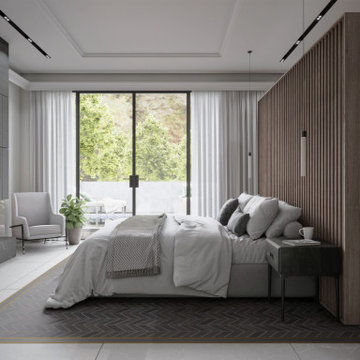
 Ferriss - Architectural Renderings
7 mistakes in bedroom design and ways to avoid them.
ERROR # 1 - Incorrect bed size.
This is a problem with any furniture in principle. When, according to the plan and ergonomic calculations, it becomes size to size, but in fact, it looks cumbersome, visually overflowing the space or, on the contrary, turns out to be too small and looks awkward.
How to avoid: Always be guided by the proportions of the size of the furniture in the room. Try to choose as big a bed as possible, but stay realistic. The main thing is that the width of the passageways in the bedroom should not be less than 70cm, and for comfortable movement, it is better to do everything 100cm.
ERROR # 2 - Poor lighting and switches.
Even in a small bedroom, you need multiple light sources. A single chandelier in the center of the ceiling is not enough, because it creates the effect of darkening the corners, and the room seems uncomfortable.
How to avoid: Hang a sconce over your headboard. Don't forget to light up the space next to the mirror and wardrobe. And be sure to place switches close to the bed so that you don't have to go to the other end of the room after an evening with a book in bed.
Do not forget about a sufficient number of outlets, this should be done even at the planning stage.
ERROR # 3 - Few storage locations
The fewer well-thought-out cabinets and shelving, the more things are visible. And the clutter spoils even the most stylish and expensive interior.
How to avoid: In addition to bedside tables, a chest of drawers (for storing small things) and a built-in wardrobe can be placed in a small bedroom: unlike a usual one, it takes up space from floor to ceiling, thereby accommodating more items. In addition, the built-in structure looks more solid and often merges with the walls, making the setting complete.
ERROR # 4 - Carpet of the wrong size.
The carpet in the bedroom is a great addition, and sometimes the final touch of the whole composition. But often people choose the wrong size or do not use it at all.
How to avoid: Choosing the right size can be guided by the unspoken rule, according to which the carpet should be 1 meter larger than the bed, both lengthwise and across. If the room is large, then it is recommended that the indentation of the carpet from the wall is 45-50 cm, if it is small, then 20-30 cm can be dispensed with.
ERROR # 5 Typical design.
If you buy a typical bed, bedside tables, and wardrobe from one manufacturer, then the interior will turn out to be formulaic and impersonal. No accessories and color schemes will help him.
How to avoid: The interior should reflect the character of its owner, and the person living in it will feel comfortable. Explore different collections of furniture and try to assemble a capsule in the same color scheme, but at the same time different in texture and shape.
ERROR # 6 Empty walls.
Even if the bedroom is a room for relaxation, it would be a mistake to make a space out of it that is intended solely for sleeping. Ascetic furnishings, unadorned walls, boring furniture, and bed linen - all this does not improve the mood at all, but, on the contrary, creates a gloomy mood.
How to avoid: The walls in the bedroom are a blank slate that you can transform into something original, beautiful, and unique to your liking. Even if you just paint one of the walls in a contrasting color, and decorate the other with several photos from the Internet, printed and inserted into frames, you can transform the atmosphere of the room as a whole.
ERROR # 7 Too dark interior.
One should not be deceived by the beauty of the thick dark tones of interior paint. It has long been known that dark blue, burgundy, blueberry, chocolate, and black for the bedroom should not be used in large quantities, since such an environment will have a tangible effect and interfere with a vigorous awakening in the morning.
How to avoid: If you like a rich range, try choosing derived shades a few tones lighter, for example, instead of black or graphite, choose gray-brown, dove-gray for the walls, and blue can be replaced with cornflower blue or azure.
Don't forget to combine dark tones with lots of whites, creams, complementing shimmery accessories, and vibrant décor.
https://www.ferriss.co/
#ferriss #We_bring_objects_to_life #3drendering #architecture #San_Francisco
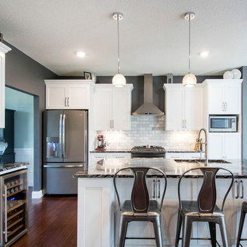


 San Luis Kitchen Co.
Doors and drawer-heads stained Dark Lager contrast with black face-frames for a dramatic look. The gray quartz counter is extended full height at the back splash.
A bank of floor to ceiling cabinets separates the dining area from the kitchen, confining the space in both rooms. Note the massive blank end of the cabinets – in desperation to reduce the scale of this monolith, the homeowners decorated it with a clock and small nick-knacks, but it didn’t help. This is not a welcoming entrance to the kitchen. On the dining side, there is a hutch (with mirrored back), which ostensibly could serve as a buffet, however it is inconvenient to the prep area of the kitchen as it is tucked behind the tall pantry cabinets. And on the opposite wall is a separate wet bar which could serve more conveniently with a more unified kitchen and dining space.
You would think that the large pantry cabinets would be a plus in a kitchen, however their placement and the deep fixed shelves belie any positive contribution.
The looming wall of cabinetry confines the space and is a claustrophobe’s nightmare. Then note the clutter and chaos of storing small food items (normally most of your daily supplies don’t come in giant bulk quantities and sizes) on deep fixed shelves. Nothing really fits and canned goods become lost behind cereal boxes while baking supplies are piled on top of the snacks!
The decision to remodel – the lady of the house wanted her kitchen to reflect the couples’ modern lifestyle. They are passionate people who love to entertain their friends and family – they need an open and accessible space that is both dramatic in bearing and easy to use on a daily basis.
San Luis Kitchen began design by helping the homeowners choose a style and color scheme for their kitchen. The decision was made – a slab style cabinet door in a “Dark Lager” stain on maple wood. Because the homeowners did not want handles on their cabinets, we used a face frame cabinet construction to allow for “finger-pull” opening of the doors and drawers. The face frame is colored black as a contrast to the doors for a bold finish. Dark gray engineered-quartz counters and full height backsplash complete the picture.
Kitchen layout and design is next. The sink remains at the corner window with the dishwasher moved to the left wall – giving space for a 36” range-top and dramatic 42” rectilinear hood. The refrigerator remains in place but is replaced with a black model. The cabinet above it is now 24” deep for a custom look and a built-in microwave/oven combo are placed to the right. Simple-line contemporary trim and uniform black and stainless modern appliances reinforce the linear aesthetic created by the doorstyle and face frame detailing.
In place of the pantry, San Luis Kitchen designed a true buffet – accessible from both kitchen and dining sides. The storage needs are met by upper cabinets, base corner swing-out shelves and drawers, and a tall (adjustable) roll-out shelf unit on the dining side. We added an end wall (with niches) and extended the cabinetry and counter beyond as a welcome to the kitchen. In the dining room glass doors for display items grace the buffet. The wet bar is now visually and functionally joined to the kitchen – matching cabinetry and the more open overall plan tie everything together as a whole.
Now in their new kitchen, the homeowners can prepare, serve, and enjoy a meal with their guests. The mosaic glass backsplash used at the bar adds pizzazz for fun gatherings and an evening’s entertainment.

 Carolina V. Gentry, RID
This forever home, perfect for entertaining and designed with a place for everything, is a contemporary residence that exudes warmth, functional style, and lifestyle personalization for a family of five. Our busy lawyer couple, with three close-knit children, had recently purchased a home that was modern on the outside, but dated on the inside. They loved the feel, but knew it needed a major overhaul. Being incredibly busy and having never taken on a renovation of this scale, they knew they needed help to make this space their own. Upon a previous client referral, they called on Pulp to make their dreams a reality. Then ensued a down to the studs renovation, moving walls and some stairs, resulting in dramatic results. Beth and Carolina layered in warmth and style throughout, striking a hard-to-achieve balance of livable and contemporary. The result is a well-lived in and stylish home designed for every member of the family, where memories are made daily.


 Advance Design Studio, Ltd.
Laundry rooms and mudrooms can be a headache for many homeowners. They are usually cramped with poor functionality and little storage space. Joe and Kristin suffered all those aches and more, as their laundry room lacked clothing storage. Shoes were crammed in every corner. There was nowhere to fold clothes without taking them to the kitchen. They were ready for a complete laundry room remodel project.
Joe and Kristin interviewed several local remodeling companies but didn’t connect with anyone who could understand their vision. During the summer, when they were attending their son’s race venue, they noticed fellow kart racers Todd and Christine Jurs’ sponsor banner for their remodeling company, Advance Design Studio. Immediately they were thrilled that they knew someone they trusted who could handle the renovation.
“We wanted someone that we actually knew, who has a little bit more invested than an outside person that we don’t have any ties to,” Kristin said.
Project Designer Nicole Ryan came to their home in Warrenville for the initial consultation. Kristin, an avid HGTV viewer, brought her ideas to Nicole. Throughout the design process, they worked together designing the space, selecting materials, and choosing colors. Nicole made sure to incorporate Kristin’s must-haves into the finished laundry room remodel.
“It was really easy. Nicole made the transition very easy,” Kristin said of Nicole’s work in the design phase of the project. With the materials selected and the drawings finalized, it was time to begin construction. Kristin and Joe were impressed with how quickly and cleanly this phase went.
“Everyone that came in was very respectful, very neat, and that was a big part for me because I didn’t want dust going through the rest of my house,” Kristin said.
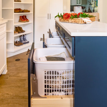
The new combination mudroom/laundry room is everything Kristin and Joe hoped. There is plenty of storage, three pull-out laundry hampers for presorting laundry, a large central island for folding clothes, a designated bar to hang dry, and even a unique rotating shoe rack to keep shoes from cluttering the space.
“My rotating shoe rack,” Kristin said when asked what her favorite part of her new laundry room was. “We have four kids. We have a lot of shoes and sporting events. So it makes sense to have all that space for shoes.”
The center island has an exceptional feature as well. It has wheels. Kristin wanted to be able to move the island out of the way for different functions in the room. An island with wheels can be placed wherever needed in the space.
The two existing closets were reconfigured with built-in closet storage systems to make them more functional than before with shelves for baskets holding gloves and hats, umbrellas, and coats.
“They love it,” Project Designer Nicole Ryan said. “They had a vision of how they wanted the space to function but didn’t know exactly how to get it there. My design took all their needs and used the most efficient products to get them the desired outcome. Tons of function, while still looking beautiful!”
The “White” Hudson Panel Dura Supreme cabinetry on the perimeter brightens the space and contrasts the popular blue “Gale Force” Dura Supreme cabinetry of the rolling island. The black and white encaustic design porcelain tile backsplash adds visual interest to the room above the white quartz countertops. Additionally, an oil-rubbed bronze bar for hanging clothes is conveniently located above the washer/dryer, and a stainless-steel under-mount sink with a matching Kohler faucet offers perfect functionality.
“I would definitely recommend Advance Design; they’ve been wonderful. They were so helpful. Any little changes we had, they were able to accommodate,” Kristin said.

 Advance Design Studio, Ltd.
Laundry rooms and mudrooms can be a headache for many homeowners. They are usually cramped with poor functionality and little storage space. Joe and Kristin suffered all those aches and more, as their laundry room lacked clothing storage. Shoes were crammed in every corner. There was nowhere to fold clothes without taking them to the kitchen. They were ready for a complete laundry room remodel project.
Joe and Kristin interviewed several local remodeling companies but didn’t connect with anyone who could understand their vision. During the summer, when they were attending their son’s race venue, they noticed fellow kart racers Todd and Christine Jurs’ sponsor banner for their remodeling company, Advance Design Studio. Immediately they were thrilled that they knew someone they trusted who could handle the renovation.
“We wanted someone that we actually knew, who has a little bit more invested than an outside person that we don’t have any ties to,” Kristin said.
Project Designer Nicole Ryan came to their home in Warrenville for the initial consultation. Kristin, an avid HGTV viewer, brought her ideas to Nicole. Throughout the design process, they worked together designing the space, selecting materials, and choosing colors. Nicole made sure to incorporate Kristin’s must-haves into the finished laundry room remodel.
“It was really easy. Nicole made the transition very easy,” Kristin said of Nicole’s work in the design phase of the project. With the materials selected and the drawings finalized, it was time to begin construction. Kristin and Joe were impressed with how quickly and cleanly this phase went.
“Everyone that came in was very respectful, very neat, and that was a big part for me because I didn’t want dust going through the rest of my house,” Kristin said.
The new combination mudroom/laundry room is everything Kristin and Joe hoped. There is plenty of storage, three pull-out laundry hampers for presorting laundry, a large central island for folding clothes, a designated bar to hang dry, and even a unique rotating shoe rack to keep shoes from cluttering the space.
“My rotating shoe rack,” Kristin said when asked what her favorite part of her new laundry room was. “We have four kids. We have a lot of shoes and sporting events. So it makes sense to have all that space for shoes.”
The center island has an exceptional feature as well. It has wheels. Kristin wanted to be able to move the island out of the way for different functions in the room. An island with wheels can be placed wherever needed in the space.
The two existing closets were reconfigured with built-in closet storage systems to make them more functional than before with shelves for baskets holding gloves and hats, umbrellas, and coats.
“They love it,” Project Designer Nicole Ryan said. “They had a vision of how they wanted the space to function but didn’t know exactly how to get it there. My design took all their needs and used the most efficient products to get them the desired outcome. Tons of function, while still looking beautiful!”
The “White” Hudson Panel Dura Supreme cabinetry on the perimeter brightens the space and contrasts the popular blue “Gale Force” Dura Supreme cabinetry of the rolling island. The black and white encaustic design porcelain tile backsplash adds visual interest to the room above the white quartz countertops. Additionally, an oil-rubbed bronze bar for hanging clothes is conveniently located above the washer/dryer, and a stainless-steel under-mount sink with a matching Kohler faucet offers perfect functionality.
“I would definitely recommend Advance Design; they’ve been wonderful. They were so helpful. Any little changes we had, they were able to accommodate,” Kristin said.
 San Luis Kitchen Co.
So to begin, we start with an existing kitchen that is outdated and just too neutral for the homeowners. They wanted unity and drama in their space, not mundane confusion! Mismatched appliances – white refrigerator, stainless range, black dishwasher – give a disjointed and unplanned vibe to the room and are crammed together in less than half of the available kitchen space. The beautiful wood floor extends throughout the house, but in the kitchen it falls flat – as the medium gold cabinets and almond tile counters provide no contrast and no interest.
A bank of floor to ceiling cabinets separates the dining area from the kitchen, confining the space in both rooms. Note the massive blank end of the cabinets – in desperation to reduce the scale of this monolith, the homeowners decorated it with a clock and small nick-knacks, but it didn’t help. This is not a welcoming entrance to the kitchen. On the dining side, there is a hutch (with mirrored back), which ostensibly could serve as a buffet, however it is inconvenient to the prep area of the kitchen as it is tucked behind the tall pantry cabinets. And on the opposite wall is a separate wet bar which could serve more conveniently with a more unified kitchen and dining space.
You would think that the large pantry cabinets would be a plus in a kitchen, however their placement and the deep fixed shelves belie any positive contribution.
The looming wall of cabinetry confines the space and is a claustrophobe’s nightmare. Then note the clutter and chaos of storing small food items (normally most of your daily supplies don’t come in giant bulk quantities and sizes) on deep fixed shelves. Nothing really fits and canned goods become lost behind cereal boxes while baking supplies are piled on top of the snacks!
The decision to remodel – the lady of the house wanted her kitchen to reflect the couples’ modern lifestyle. They are passionate people who love to entertain their friends and family – they need an open and accessible space that is both dramatic in bearing and easy to use on a daily basis.
San Luis Kitchen began design by helping the homeowners choose a style and color scheme for their kitchen. The decision was made – a slab style cabinet door in a “Dark Lager” stain on maple wood. Because the homeowners did not want handles on their cabinets, we used a face frame cabinet construction to allow for “finger-pull” opening of the doors and drawers. The face frame is colored black as a contrast to the doors for a bold finish. Dark gray engineered-quartz counters and full height backsplash complete the picture.
Kitchen layout and design is next. The sink remains at the corner window with the dishwasher moved to the left wall – giving space for a 36” range-top and dramatic 42” rectilinear hood. The refrigerator remains in place but is replaced with a black model. The cabinet above it is now 24” deep for a custom look and a built-in microwave/oven combo are placed to the right. Simple-line contemporary trim and uniform black and stainless modern appliances reinforce the linear aesthetic created by the doorstyle and face frame detailing.
In place of the pantry, San Luis Kitchen designed a true buffet – accessible from both kitchen and dining sides. The storage needs are met by upper cabinets, base corner swing-out shelves and drawers, and a tall (adjustable) roll-out shelf unit on the dining side. We added an end wall (with niches) and extended the cabinetry and counter beyond as a welcome to the kitchen. In the dining room glass doors for display items grace the buffet. The wet bar is now visually and functionally joined to the kitchen – matching cabinetry and the more open overall plan tie everything together as a whole.
Now in their new kitchen, the homeowners can prepare, serve, and enjoy a meal with their guests. The mosaic glass backsplash used at the bar adds pizzazz for fun gatherings and an evening’s entertainment.
Wood-Mode Fine Custom Cabinetry: Brookhaven's Fairfield
 TKS Design Group
Download our free ebook, Creating the Ideal Kitchen. DOWNLOAD NOW
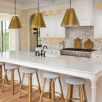
For many, extra time at home during COVID left them wanting more from their homes. Whether you realized the shortcomings of your space or simply wanted to combat boredom, a well-designed and functional home was no longer a want, it became a need. Tina found herself wanting more from her Old Irving Park home and reached out to The Kitchen Studio about adding function to her kitchen to make the most of the available real estate.
At the end of the day, there is nothing better than returning home to a bright and happy space you love. And this kitchen wasn’t that for Tina. Dark and dated, with a palette from the past and features that didn’t make the most of the available square footage, this remodel required vision and a fresh approach to the space. Lead designer, Stephanie Cole’s main design goal was better flow, while adding greater functionality with organized storage, accessible open shelving, and an overall sense of cohesion with the adjoining family room.
The original kitchen featured a large pizza oven, which was rarely used, yet its footprint limited storage space. The nearby pantry had become a catch-all, lacking the organization needed in the home. The initial plan was to keep the pizza oven, but eventually Tina realized she preferred the design possibilities that came from removing this cumbersome feature, with the goal of adding function throughout the upgraded and elevated space. Eliminating the pantry added square footage and length to the kitchen for greater function and more storage. This redesigned space reflects how she lives and uses her home, as well as her love for entertaining.
The kitchen features a classic, clean, and timeless palette. White cabinetry, with brass and bronze finishes, contrasts with rich wood flooring, and lets the large, deep blue island in Woodland’s custom color Harbor – a neutral, yet statement color – draw your eye.
The kitchen was the main priority. In addition to updating and elevating this space, Tina wanted to maximize what her home had to offer. From moving the location of the patio door and eliminating a window to removing an existing closet in the mudroom and the cluttered pantry, the kitchen footprint grew. Once the floorplan was set, it was time to bring cohesion to her home, creating connection between the kitchen and surrounding spaces.
The color palette carries into the mudroom, where we added beautiful new cabinetry, practical bench seating, and accessible hooks, perfect for guests and everyday living. The nearby bar continues the aesthetic, with stunning Carrara marble subway tile, hints of brass and bronze, and a design that further captures the vibe of the kitchen.
Every home has its unique design challenges. But with a fresh perspective and a bit of creativity, there is always a way to give the client exactly what they want [and need]. In this particular kitchen, the existing soffits and high slanted ceilings added a layer of complexity to the lighting layout and upper perimeter cabinets.
While a space needs to look good, it also needs to function well. This meant making the most of the height of the room and accounting for the varied ceiling features, while also giving Tina everything she wanted and more. Pendants and task lighting paired with an abundance of natural light amplify the bright aesthetic. The cabinetry layout and design compliments the soffits with subtle profile details that bring everything together. The tile selections add visual interest, drawing the eye to the focal area above the range. Glass-doored cabinets further customize the space and give the illusion of even more height within the room.
While her family may be grown and out of the house, Tina was focused on adding function without sacrificing a stunning aesthetic and dreamy finishes that make the kitchen the gathering place of any home. It was time to love her kitchen again, and if you’re wondering what she loves most, it’s the niche with glass door cabinetry and open shelving for display paired with the marble mosaic backsplash over the range and complimenting hood. Each of these features is a stunning point of interest within the kitchen – both brag-worthy additions to a perimeter layout that previously felt limited and lacking.
Whether your remodel is the result of special needs in your home or simply the excitement of focusing your energy on creating a fun new aesthetic, we are here for it. We love a good challenge because there is always a way to make a space better – adding function and beauty simultaneously.
101