
Search results for "Visually expanded" in Home Design Ideas
 Pierre Jean-Baptiste Interiors
This redesign transformed the main living level into a thoughtful blend of comfort, sophistication, and functionality. Each space was curated with custom details, refined finishes, and bold design statements that elevate the everyday.
Breakfast Room
The breakfast room was reimagined as a cozy yet elevated gathering spot. A tinted glass expandable table anchors the space, offering both style and versatility for daily meals or larger gatherings. A custom-built nook features cabinetry and floating shelves backed with a faux wall treatment wallpaper, creating a textured backdrop that doubles as both storage and display. Performance fabric chairs not only add a touch of elegance but also stand up beautifully to everyday use.
Living Space
In the living area, style and comfort work hand in hand. Designer-grade occasional tables and a plush new sofa with chaise set the tone, while an oversized canvas-framed painting becomes the artful focal point behind the seating. To frame the room, a wall of sheer gold curtains enhances natural light and provides a shimmering backdrop for two round LED chandeliers that float dramatically at the center of the space.
A 65” TV now sits atop a sleek walnut media stand, flanked by six floating shelves for both balance and display. Patterned side chairs and a light-colored area rug add visual contrast, ensuring the neutral, monochromatic palette feels layered and dynamic.
Primary Bedroom
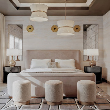
The primary bedroom was transformed into a serene yet statement-making retreat. A geometric-patterned rug grounds the space, while beige grasscloth wallpaper adds warmth and texture to the walls. To enhance depth, the ceiling coffers were painted in Sherwin Williams’ Iron Ore in a flat finish—a bold, moody choice that sets off the lighter tones below.
Two chandeliers were hung at different heights to create a sense of visual intrigue, complementing the dark round nightstands and dresser. The king-sized bed, upholstered in beige, becomes the anchor point, softened by layered design essentials: a round mirror, button art, and criss-cross mirrors above the nightstands. The result is a bedroom that feels both polished and inviting, balancing modern lines with timeless details.
 Marie Burgos Design
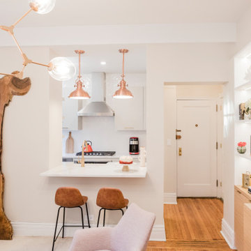
At the center of the home is a newly expanded kitchen—its design is rooted in practicality and visual appeal. Previously enclosed and limited in functionality, the kitchen was opened up with the addition of a peninsula that extends into the living room. This peninsula serves multiple roles: casual dining space, food prep area, storage solution, and visual anchor.
Custom cabinetry was designed to fit the galley-style layout efficiently. Pale grey cabinets establish a soft and calming foundation punctuated by sophisticated brass hardware that adds warmth and subtle contrast. A full-height pantry maximizes storage without overwhelming the space.
Photography by Francis Augustine
 Eugene Pintail LLC
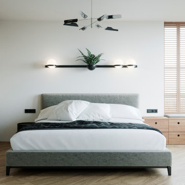
Gylden æra embraces the timeless elegance of Scandinavian minimalism in a compact apartment. By streamlining layout and materials, it creates a serene, deliberate environment where simplicity speaks volumes.
Every detail is intentionally crafted—from the seamless integration of functional areas to the uncluttered circulation paths. The design presents a visual calm that enhances both daily living and quiet reflection.
Soft woods, matte surfaces, and warm neutrals anchor the scheme. Subtle use of light tones amplifies natural light and expands spatial perception. Textural variations—like woven textiles, fine-grain wood, and matte finishes—add depth without compromising simplicity.
Minimalist lighting design—wall-mounted fixtures, linear pendants—complements the space's architectural rhythm without drawing attention away. Strategic layering of natural and ambient light enhances mood while maintaining visual clarity.
Gylden æra feels both peaceful and poised—moderated yet expressive. It captures a balance of restrained luxury and everyday comfort, honoring Scandinavian roots.
Find the right local pro for your project
 Kitchens of Diablo
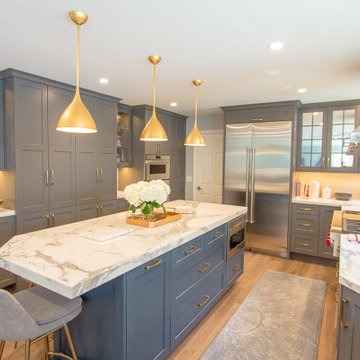
A stunning transformation from an old yellow oak kitchen to a beautiful grey and blue kitchen with gold accents. This kitchen was expanded into the living room and a bay window was added to bring in more natural light into the space. Brining more lighting in invited the painted cabinets to something different than a white kitchen. The perimeter cabinets are painted grey and the island blue. (storm gray & gale force by dura supreme) The cabinets are beautifully accented by gold hardware from Berenson in brushed gold. The real show stopper in this kitchen is the island. A beautiful blue color with a stunning real marble countertop. (calacatta bettolgi classic) The gold and white pendant lights really bring this whole kitchen together. (Visual comfort lighting - Aerin Agnes pendant 18" - in Gild) To make this kitchen even more beautiful is the luxury appliances from Subzero, Wolf, and Cove in stainless steel panels. Function within beauty is applied by the Rohl farmhouse sink that brings in the traditional aspect of this kitchen. This kitchen overall is a gorgeous transition with ample natural lighting exemplified by the mirrored doors instead of the traditional glass doors on cabinets.
 Patricia Brennan Architects
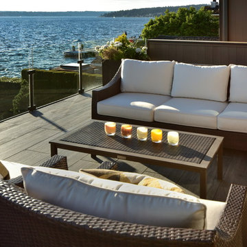
The lifestyle of living on Lake Washington is naturally inclined towards entertaining and outdoor living. However, the homeowners of this Kirkland residence found that occupying the exterior space was difficult in part because there were few spaces that were protected from the harsh western exposure. They longed for a covered patio and more.
Conversations and designs focused on creating a four-season space that addressed the high-exposure demands of the site while also providing a comfortable space to relax and entertain.
The concept of extending the existing second floor level deck as a way to provide protection emerged as an early solution in the process. With the use of natural stone pavers and treads, the existing lower level patio was nearly doubled in usable area with different zones for intimate or large gatherings. The stone treads transition gracefully into the landscaped portion of the site.
The deck above was expanded upon and resurfaced with a low maintenance porcelain pedestal paver system. A glass panel railing is constructed without a top rail, which allows for views of the water to remain unobstructed while sitting or standing.
A custom outdoor fireplace was designed to act as a central focal point and to provide definition for the gathering spaces. The concrete mass is punctured through with a two-way fireplace, providing visual and bodily warmth for
year-round comfort and use of the space.
An updated, modernized outdoor kitchen was a necessity for larger gatherings. Durable yet elegant surfaces were required for this high use area. Cabinetry incorporates Parklex wood panels that are sustainably sourced and finished for long-term durability. Countertops and backsplash were comprised of an exterior-grade porcelain slab. Stainless steel appliances complete a low maintenance workspace.
Energy efficient products were mindful components of this project. New and dimmable LED recessed and indirect lighting provides illumination for entertaining late into the night. Tread lighting provides a beacon of light for returning boaters coming in from the lake.
The homeowner shared their pleasure with their new spaces commenting that the design seamlessly integrates with the existing house. They find themselves enjoying and using their outdoor spaces more thoroughly and on a daily basis. The surprise for them was the unintended additional space resulting from the expanded deck above.
 EAG Studio
On a quiet street just steps from San Francisco’s beloved Dolores Park, a formerly modest urban structure has been transformed into a luminous vertical residence that quietly redefines contemporary city living. Through a comprehensive remodel and both vertical and horizontal expansion, the project turns a constrained urban footprint into a sequence of serene, art-forward living spaces that unfold upward toward expansive city views.
The architecture balances restraint and warmth: crisp contemporary geometry softened by natural materials, artful lighting, and carefully curated interiors. The result is a home that feels simultaneously grounded and elevated—deeply connected to its neighborhood yet remarkably private.
Reimagining the Urban Envelope
The original building has been almost entirely reconceived. The facade now reads as a disciplined composition of plaster volumes and precisely detailed window openings framed by subtle projecting bands. The geometry references San Francisco’s classic rhythm of bayed facades while stripping the language down to a refined modern expression.
Behind this quiet exterior lies a dramatically expanded interior volume. The redesign adds both additional floor area and new vertical circulation, transforming what was once a conventional city house into a multi-level architectural sequence organized around light, art, and views.
At the roofline, planted terraces soften the building’s silhouette and create a green crown visible from surrounding hillsides.
Interiors as a Sequence of Galleries
Inside, the home unfolds as a series of spatial moments connected by a sculptural stair and gallery-like corridors.
Wide plank oak floors run throughout, providing continuity and warmth against a palette of plaster walls, dark steel detailing, and natural stone. The hallways function almost as curated galleries, with layered artworks suspended in front of mesh panels that create depth and subtle shadow.
Light filters through carefully placed windows and stair openings, transforming circulation spaces into contemplative transitions rather than mere passageways.
A Living Room Anchored by Stone and Light
The primary living room occupies one of the home’s central floors, where a quiet interplay of texture and geometry defines the space.
A monumental fireplace wrapped in dark stone forms the room’s anchor, its mass contrasting with a recessed ceiling plane that seems to float above the seating area. Integrated perimeter lighting creates a soft architectural glow that washes the ceiling and walls.
Furniture is sculptural yet understated—rounded lounge chairs in warm ochre velvet, tailored sofas, and a striking marble cocktail table whose expressive veining becomes a focal artwork in itself. Deep blue carpeting grounds the seating arrangement and subtly absorbs light, enhancing the calm atmosphere.
Above the fireplace, a delicate projection artwork introduces a moment of visual poetry—an unexpected cinematic gesture that transforms the wall into a quietly animated canvas.
Kitchen as Architectural Furniture
The kitchen expresses a different register: crisp, tactile, and materially rich.
Custom walnut cabinetry spans the wall in a continuous plane, punctuated only by the sculpted hood and integrated appliances. The wood’s depth and warmth are balanced by expanses of pale marble that flow seamlessly from countertop to backsplash.
Three dome pendants hover above the island like industrial sculptures, casting pools of warm light onto the stone surface.
A row of vivid red stools introduces a controlled burst of color, a small but confident departure from the otherwise restrained palette.
Dining With a Living Backdrop
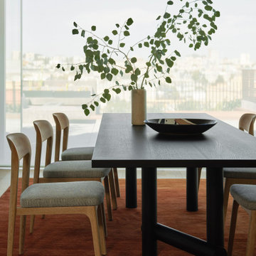
Adjacent to the kitchen, the dining room opens toward a glass wall overlooking a vertical garden of climbing ivy. The greenery becomes a constantly changing backdrop—lush and shadowy during the day, atmospheric and cinematic after sunset.
A dark wood table anchors the room, surrounded by pale oak chairs whose understated forms echo Scandinavian design traditions. The simplicity of the furniture allows the view and natural light to become the dominant experience.
Intimate Spaces and Material Contrast
Throughout the home, smaller rooms offer moments of intimacy and material experimentation.
The powder room pairs textured wall coverings with a dramatic black marble vanity whose bold veining feels almost geological. A suspended mirror and slender pendant create a sculptural composition against the tactile backdrop.
The primary bedroom, by contrast, feels serene and expansive. Floor-to-ceiling glazing frames sweeping views of the city, while soft textiles and warm wood paneling create a cocooning effect. Slender black columns subtly define a sitting area without interrupting the openness of the space.
Bathing Above the City
In the primary bathroom, a sculptural freestanding tub sits beside a panoramic window overlooking San Francisco’s hills and rooftops.
The room’s palette—light oak, grey stone, and matte metals—reinforces the spa-like atmosphere. Floating cabinetry and integrated lighting maintain a sense of visual lightness despite the richness of the materials.
Entertaining Above the Park
Higher in the house, a lounge and bar area becomes the social heart of the home. Here, dark stone slabs with dramatic veining wrap the bar wall like a piece of monumental art.
Open shelving displays glassware and spirits, while integrated wine storage hints at the home’s entertaining ambitions. A soft leather sectional and low glass table create a relaxed setting for conversation, framed by expansive views of the city skyline.
Cinema and Retreat
The lower level introduces yet another atmosphere: a dedicated media room designed for immersive viewing.
Dark walls, plush seating, and soft lighting create a cinematic environment that contrasts intentionally with the airy upper floors. It’s a retreat within the home—intimate, quiet, and removed from the brightness above.
Architecture That Balances Discipline and Warmth
What makes the project particularly compelling is its balance between architectural discipline and lived warmth.
Every element—from the carefully framed views to the restrained material palette—contributes to a cohesive spatial narrative. Yet the home never feels austere. Natural materials, curated art, and layered lighting create a sense of comfort and depth.
The result is a house that feels both architecturally rigorous and deeply human.
A Contemporary Interpretation of San Francisco Living
In a neighborhood defined by historic homes and iconic park views, this transformation offers a contemporary interpretation of San Francisco living.
It respects the city’s urban density while embracing openness, light, and vertical living. The home rises quietly above its surroundings, culminating in panoramic vistas that stretch across rooftops, hills, and sky.
What began as a conventional structure has become something far more nuanced: a modern urban sanctuary—part gallery, part retreat, and wholly connected to the vibrant city just beyond its walls.
 Advance Design Studio, Ltd.
Mike and Anne of Barrington Hills desperately needed to update and renovate both their kid’s hall bath and guest bath, and in their 1980’s home each project presented a different set of unique challenges to overcome. When they set out to identify the right remodeling company to partner with, it was important to find a company that could help them to visualize design solutions for the bath renovations. When they came across Advance Design Studio’s website, they were immediately drawn to the solution-oriented remodeling process and the family friendly company.
They say they chose Advance Design because of the integrated approach of “Common Sense Remodeling”, making the design, project management and construction all happen in one place. When they met with Project Designer Michelle Lecinski, they knew they chose the right company. “Michelle’s excellent work on the initial designs made it easy to proceed with Advance Design Studio,” Mike said.
Like most homeowners anticipating a big renovation project, they had some healthy fears; with two bathrooms being remodeled at the same time they worried about timeframes and staying within budget. With the help of Michelle, and the “Common Sense” guidelines, they were confident that Advance Design would stay true, orchestrating all the moving parts to stay within both the estimated timeline and budget.
The guest bath offered the biggest design challenge. A dormer obstruction made the already cramped shower awkward to access. Mike and Anne also wanted the shower size to be expanded, making it more accommodating. Working with Advance’s construction expert DJ Yurik, Michelle relocated the shower concealing the original dormer and creating a larger, more comfortable and aesthetically pleasing guest shower.
The unsightly and not at all user-friendly closet was removed and replaced with elegant White Maple Dura Supreme cabinetry with much improved function featuring dual tall linen cabinets, a special makeup area and two sinks, providing a dual vanity which was extremely important for better guest use.
The Fossil Brown quartz countertop is in pleasing contrast to the white cabinetry, and coordinates nicely with the mocha porcelain tile gracing the shower for an accent. The decorative glazed turquoise tile backsplash, tile border, and bottle niche adds a taste of marine green to the room, while marble-looking porcelain tile makes guests feel they are staying in a 5-star hotel. Polished nickel Kohler plumbing fixtures were chosen to add a touch of sophistication. This renovated guest bath is comfortable and elegant, and Anne and Mike’s house guests may never want to leave!
“The end result was updated and restyled bathrooms that the client will enjoy and increase the value of their home,” Designer Michelle said.
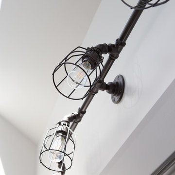
The children’s hall bath had its own set of challenges. The current placement of the sink was not conducive to the best use of the existing space, nor did it allow for any visual interest, something Advance’s designers always work to achieve even within the tight confines of a small bath. Advance removed the linen closet and used the gain in wall space to create a dramatic focal point on the vanity wall. They also took additional space that wasn’t being used for new Storm Gray Dura Supreme tall built-in linen cabinets, creating functional storage space that the former bath lacked. A customized glass splash panel was created for the bath, and the high ceilings with skylights were accented with a custom-made track lighting fixture featuring industrial pipe and cage materials.
Authentic cement encaustic tile was used wall to wall surrounding the vanity to create a dramatic and interesting back drop for the new elegant and stately furniture-like double sink wall. Hand-made encaustic tile originated in Western Europe beginning in the 1850’s and reminded Mike and Anne of tile they had seen and loved from their travels overseas. Today, encaustic tile has made a re-appearance in today’s modern bath design with its wide array of appealing patterns and artistic use of color.
Oil rubbed bronze Kohler fixtures echo the black accents in the beautiful tile pattern and reflect the matte black of the unique lighting detail. Easy to maintain Blanca Arabescato Quartz countertops add practicality and natural beauty and compliments the warm wood porcelain tile floors. This handsome bath has generated praise from friends and family even before it’s complete unveiling as photos of the space leaked out on social media! It’s not only completely functional to use, but especially pretty to look at.
“Advance Design Studio did a terrific job for us. We really appreciated how easy it was to work with them on a complex project of the complete remodeling of two bathrooms. They very capably handled all the details from design, to project management, to construction. It is a great group of people to work with and we would welcome the opportunity to work with them again anytime,” Mike said.


 Terri Becker Designs
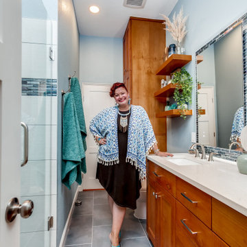
The soothing coastal vibes of this bathroom remodel are sure to take you to a place of calm. What a transformation this project underwent! Not only did we transform this bathroom into a spa-like sanctuary, but we also did it ahead of schedule. That's a rare occurrence in the construction and design industry.
We removed the tub and extended out the wall for the shower, which the homeowners chose to expand. This created a walk-in space, made to look even bigger by its frameless glass and large format, linen-look porcelain tile on the walls. For the shower floor, we selected a blue multicolored penny tile, and for the accent band, an opulent glass mosaic tile in dreamy ocean tones. The accent tile also graces the back of a new wall niche. This shower is now beautiful and functional.
To address the issues of storage, we removed a wall, freeing up space near the toilet, which was much-needed. Now there is a custom-built linen pantry crafted from alder wood stretching to the ceiling, adding to the visual height of the room and making the bathroom just work better.
A new vanity, also made of alder wood, and the linen closet were both stained a rich, warm tone to show off that gorgeous grain. For the walls, we chose a cool blue hue that is soothing and fresh.
The accent tile from the shower was carried behind the vanity's two LED mirrors for a bold visual impact. I love the reflection of the light on the tile! The LED mirrors are pretty high-tech, with a defogger and a dimmer to adjust the light levels.
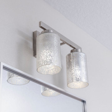
Topping the vanity is a creamy quartz countertop, two under-mount sinks, and plumbing and cabinetry hardware in brushed nickel finishes. The cabinet knobs have a stunning iridescent shell that's hard to miss.
For the floors, we went with a large-format porcelain tile in dark grey that complements the coloring of the space as well as the look and feel.
As a final touch, floating shelves in the same rich wood-tone create additional space for décor items and storage. I styled the shelves with items to inspire and soothe this dreamy bathroom.
 EAG Studio
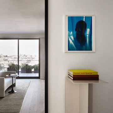
On a quiet street just steps from San Francisco’s beloved Dolores Park, a formerly modest urban structure has been transformed into a luminous vertical residence that quietly redefines contemporary city living. Through a comprehensive remodel and both vertical and horizontal expansion, the project turns a constrained urban footprint into a sequence of serene, art-forward living spaces that unfold upward toward expansive city views.
The architecture balances restraint and warmth: crisp contemporary geometry softened by natural materials, artful lighting, and carefully curated interiors. The result is a home that feels simultaneously grounded and elevated—deeply connected to its neighborhood yet remarkably private.
Reimagining the Urban Envelope
The original building has been almost entirely reconceived. The facade now reads as a disciplined composition of plaster volumes and precisely detailed window openings framed by subtle projecting bands. The geometry references San Francisco’s classic rhythm of bayed facades while stripping the language down to a refined modern expression.
Behind this quiet exterior lies a dramatically expanded interior volume. The redesign adds both additional floor area and new vertical circulation, transforming what was once a conventional city house into a multi-level architectural sequence organized around light, art, and views.
At the roofline, planted terraces soften the building’s silhouette and create a green crown visible from surrounding hillsides.
Interiors as a Sequence of Galleries
Inside, the home unfolds as a series of spatial moments connected by a sculptural stair and gallery-like corridors.
Wide plank oak floors run throughout, providing continuity and warmth against a palette of plaster walls, dark steel detailing, and natural stone. The hallways function almost as curated galleries, with layered artworks suspended in front of mesh panels that create depth and subtle shadow.
Light filters through carefully placed windows and stair openings, transforming circulation spaces into contemplative transitions rather than mere passageways.
A Living Room Anchored by Stone and Light
The primary living room occupies one of the home’s central floors, where a quiet interplay of texture and geometry defines the space.
A monumental fireplace wrapped in dark stone forms the room’s anchor, its mass contrasting with a recessed ceiling plane that seems to float above the seating area. Integrated perimeter lighting creates a soft architectural glow that washes the ceiling and walls.
Furniture is sculptural yet understated—rounded lounge chairs in warm ochre velvet, tailored sofas, and a striking marble cocktail table whose expressive veining becomes a focal artwork in itself. Deep blue carpeting grounds the seating arrangement and subtly absorbs light, enhancing the calm atmosphere.
Above the fireplace, a delicate projection artwork introduces a moment of visual poetry—an unexpected cinematic gesture that transforms the wall into a quietly animated canvas.
Kitchen as Architectural Furniture
The kitchen expresses a different register: crisp, tactile, and materially rich.
Custom walnut cabinetry spans the wall in a continuous plane, punctuated only by the sculpted hood and integrated appliances. The wood’s depth and warmth are balanced by expanses of pale marble that flow seamlessly from countertop to backsplash.
Three dome pendants hover above the island like industrial sculptures, casting pools of warm light onto the stone surface.
A row of vivid red stools introduces a controlled burst of color, a small but confident departure from the otherwise restrained palette.
Dining With a Living Backdrop
Adjacent to the kitchen, the dining room opens toward a glass wall overlooking a vertical garden of climbing ivy. The greenery becomes a constantly changing backdrop—lush and shadowy during the day, atmospheric and cinematic after sunset.
A dark wood table anchors the room, surrounded by pale oak chairs whose understated forms echo Scandinavian design traditions. The simplicity of the furniture allows the view and natural light to become the dominant experience.
Intimate Spaces and Material Contrast
Throughout the home, smaller rooms offer moments of intimacy and material experimentation.
The powder room pairs textured wall coverings with a dramatic black marble vanity whose bold veining feels almost geological. A suspended mirror and slender pendant create a sculptural composition against the tactile backdrop.
The primary bedroom, by contrast, feels serene and expansive. Floor-to-ceiling glazing frames sweeping views of the city, while soft textiles and warm wood paneling create a cocooning effect. Slender black columns subtly define a sitting area without interrupting the openness of the space.
Bathing Above the City
In the primary bathroom, a sculptural freestanding tub sits beside a panoramic window overlooking San Francisco’s hills and rooftops.
The room’s palette—light oak, grey stone, and matte metals—reinforces the spa-like atmosphere. Floating cabinetry and integrated lighting maintain a sense of visual lightness despite the richness of the materials.
Entertaining Above the Park
Higher in the house, a lounge and bar area becomes the social heart of the home. Here, dark stone slabs with dramatic veining wrap the bar wall like a piece of monumental art.
Open shelving displays glassware and spirits, while integrated wine storage hints at the home’s entertaining ambitions. A soft leather sectional and low glass table create a relaxed setting for conversation, framed by expansive views of the city skyline.
Cinema and Retreat
The lower level introduces yet another atmosphere: a dedicated media room designed for immersive viewing.
Dark walls, plush seating, and soft lighting create a cinematic environment that contrasts intentionally with the airy upper floors. It’s a retreat within the home—intimate, quiet, and removed from the brightness above.
Architecture That Balances Discipline and Warmth
What makes the project particularly compelling is its balance between architectural discipline and lived warmth.
Every element—from the carefully framed views to the restrained material palette—contributes to a cohesive spatial narrative. Yet the home never feels austere. Natural materials, curated art, and layered lighting create a sense of comfort and depth.
The result is a house that feels both architecturally rigorous and deeply human.
A Contemporary Interpretation of San Francisco Living
In a neighborhood defined by historic homes and iconic park views, this transformation offers a contemporary interpretation of San Francisco living.
It respects the city’s urban density while embracing openness, light, and vertical living. The home rises quietly above its surroundings, culminating in panoramic vistas that stretch across rooftops, hills, and sky.
What began as a conventional structure has become something far more nuanced: a modern urban sanctuary—part gallery, part retreat, and wholly connected to the vibrant city just beyond its walls.
 Gregory Thomas, Residential Architect
Dining Room
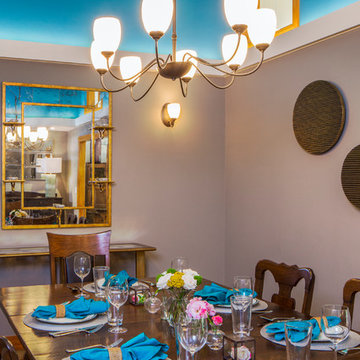
The original house had an extremely limited dining space, but the addition and remodel design made sure to provide for a table that could be expanded considerably when desired.
A mirror at the back of room expands the space visually, and the reflections reveal family heirloom furniture that were included from the very first discussions. One is a 'Hoosier' from the family's home in the Midwest.
Rendezvous Bay paint by Benjamin Moore above cove lighting • Waynesboro Taupe by Benjamin Moore below cove lighting • stained oak trim • oak floors •
Construction by CG&S Design-Build.
Photography by Tre Dunham, Fine focus Photography
 Advance Design Studio, Ltd.
Mike and Anne of Barrington Hills desperately needed to update and renovate both their kid’s hall bath and guest bath, and in their 1980’s home each project presented a different set of unique challenges to overcome. When they set out to identify the right remodeling company to partner with, it was important to find a company that could help them to visualize design solutions for the bath renovations. When they came across Advance Design Studio’s website, they were immediately drawn to the solution-oriented remodeling process and the family friendly company.
They say they chose Advance Design because of the integrated approach of “Common Sense Remodeling”, making the design, project management and construction all happen in one place. When they met with Project Designer Michelle Lecinski, they knew they chose the right company. “Michelle’s excellent work on the initial designs made it easy to proceed with Advance Design Studio,” Mike said.
Like most homeowners anticipating a big renovation project, they had some healthy fears; with two bathrooms being remodeled at the same time they worried about timeframes and staying within budget. With the help of Michelle, and the “Common Sense” guidelines, they were confident that Advance Design would stay true, orchestrating all the moving parts to stay within both the estimated timeline and budget.
The guest bath offered the biggest design challenge. A dormer obstruction made the already cramped shower awkward to access. Mike and Anne also wanted the shower size to be expanded, making it more accommodating. Working with Advance’s construction expert DJ Yurik, Michelle relocated the shower concealing the original dormer and creating a larger, more comfortable and aesthetically pleasing guest shower.
The unsightly and not at all user-friendly closet was removed and replaced with elegant White Maple Dura Supreme cabinetry with much improved function featuring dual tall linen cabinets, a special makeup area and two sinks, providing a dual vanity which was extremely important for better guest use.
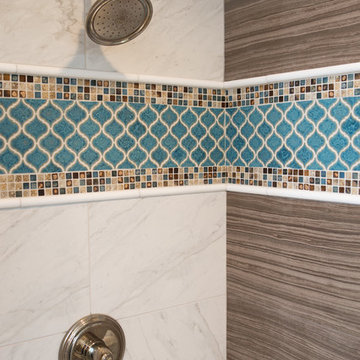
The Fossil Brown quartz countertop is in pleasing contrast to the white cabinetry, and coordinates nicely with the mocha porcelain tile gracing the shower for an accent. The decorative glazed turquoise tile backsplash, tile border, and bottle niche adds a taste of marine green to the room, while marble-looking porcelain tile makes guests feel they are staying in a 5-star hotel. Polished nickel Kohler plumbing fixtures were chosen to add a touch of sophistication. This renovated guest bath is comfortable and elegant, and Anne and Mike’s house guests may never want to leave!
“The end result was updated and restyled bathrooms that the client will enjoy and increase the value of their home,” Designer Michelle said.
The children’s hall bath had its own set of challenges. The current placement of the sink was not conducive to the best use of the existing space, nor did it allow for any visual interest, something Advance’s designers always work to achieve even within the tight confines of a small bath. Advance removed the linen closet and used the gain in wall space to create a dramatic focal point on the vanity wall. They also took additional space that wasn’t being used for new Storm Gray Dura Supreme tall built-in linen cabinets, creating functional storage space that the former bath lacked. A customized glass splash panel was created for the bath, and the high ceilings with skylights were accented with a custom-made track lighting fixture featuring industrial pipe and cage materials.
Authentic cement encaustic tile was used wall to wall surrounding the vanity to create a dramatic and interesting back drop for the new elegant and stately furniture-like double sink wall. Hand-made encaustic tile originated in Western Europe beginning in the 1850’s and reminded Mike and Anne of tile they had seen and loved from their travels overseas. Today, encaustic tile has made a re-appearance in today’s modern bath design with its wide array of appealing patterns and artistic use of color.
Oil rubbed bronze Kohler fixtures echo the black accents in the beautiful tile pattern and reflect the matte black of the unique lighting detail. Easy to maintain Blanca Arabescato Quartz countertops add practicality and natural beauty and compliments the warm wood porcelain tile floors. This handsome bath has generated praise from friends and family even before it’s complete unveiling as photos of the space leaked out on social media! It’s not only completely functional to use, but especially pretty to look at.
“Advance Design Studio did a terrific job for us. We really appreciated how easy it was to work with them on a complex project of the complete remodeling of two bathrooms. They very capably handled all the details from design, to project management, to construction. It is a great group of people to work with and we would welcome the opportunity to work with them again anytime,” Mike said.
 Soorikian Architecture
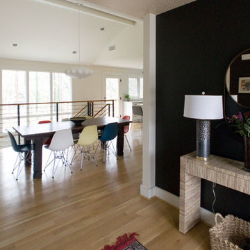
This was an extensive whole home renovation and addition. The project involved expanding a very cramped living, dining, kitchen space by pushing the rear wall back and expanding into the existing carport of this mid-century home. As well, a master suite was added to the home. A major goal of the renovation also was to connect the living space visually and physically with the home's fantastic rear yard.
Photos by Karen Soorikian
 Amazing Spaces
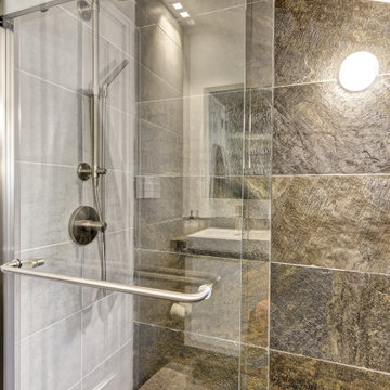
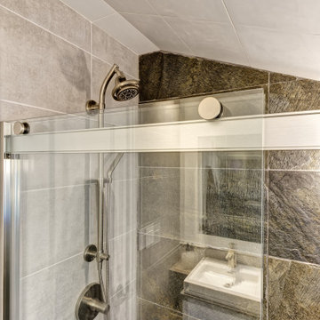
Talk about your small spaces. In this case we had to squeeze a full bath into a powder room-sized room of only 5’ x 7’. The ceiling height also comes into play sloping downward from 90” to 71” under the roof of a second floor dormer in this Cape-style home.
We stripped the room bare and scrutinized how we could minimize the visual impact of each necessary bathroom utility. The bathroom was transitioning along with its occupant from young boy to teenager. The existing bathtub and shower curtain by far took up the most visual space within the room. Eliminating the tub and introducing a curbless shower with sliding glass shower doors greatly enlarged the room. Now that the floor seamlessly flows through out the room it magically feels larger. We further enhanced this concept with a floating vanity. Although a bit smaller than before, it along with the new wall-mounted medicine cabinet sufficiently handles all storage needs. We chose a comfort height toilet with a short tank so that we could extend the wood countertop completely across the sink wall. The longer countertop creates opportunity for decorative effects while creating the illusion of a larger space. Floating shelves to the right of the vanity house more nooks for storage and hide a pop-out electrical outlet.
The clefted slate target wall in the shower sets up the modern yet rustic aesthetic of this bathroom, further enhanced by a chipped high gloss stone floor and wire brushed wood countertop. I think it is the style and placement of the wall sconces (rated for wet environments) that really make this space unique. White ceiling tile keeps the shower area functional while allowing us to extend the white along the rest of the ceiling and partially down the sink wall – again a room-expanding trick.
This is a small room that makes a big splash!
Sponsored
Columbus, OH

Snider & Metcalf Interior Design, LTD
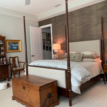
Leading Interior Designers in Columbus, Ohio & Ponte Vedra, Florida
 Gerarden Fabrication & Design
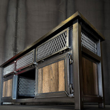
This custom-fabricated industrial credenza is a robust statement piece that artfully combines a heavy-duty, dark welded steel skeleton with the rich, natural warmth of solid wood. The piece is crowned with a substantial wood countertop and features matching solid wood side panels, creating a sophisticated contrast against the raw metal framework.
The storage design prioritizes both visual texture and functional utility. The top tier features a series of industrial expanded metal mesh panels, providing excellent ventilation and a rugged aesthetic. Below, the main storage area integrates a mix of solid wood cabinet doors and an open central bay also backed with expanded metal mesh. Every door and panel is meticulously encased in a custom-welded heavy steel frame, which highlights the premium barrel hinges and the architectural strength of this bespoke industrial design.
 Jordan Design Build Group
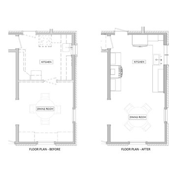
One small window, faux woodgrain cabinets and lots of doors made this closed-off Arlington kitchen feel dark and drab, the total opposite of the vibrant young family of four that lives here. To brighten and open up the small kitchen, we removed the wall separating the dining room, expanded the window above the sink and installed a French door to let even more light in from an adjoining sun room. Light now pours into the kitchen, making it feel welcoming, airy and bright. To accommodate the expanded kitchen, we removed a hulking set of built-ins from the dining room which provided two extra feet to work with. The larger footprint allowed us to relocate major appliances and provide a generous amount of storage and prep space including a food safe butcher block to the right of the range. Natural wood elements such as the chopping block, reclaimed shelves and beautiful new floors add character and warmth to the all-white kitchen.
One of the must-haves in this renovation was a farmhouse sink which is a great way to maximize function when a smaller sink base is used. We opted to take the tile backsplash all the way to the ceiling along the window wall, creating a more polished look with the added bonus of making the ceiling feel taller. The subway tiles’ subtle texture adds depth to the simple white-on-white motif and the change to a herringbone pattern behind the range adds visual interest without feeling too busy. A crisp white backdrop is perfect for adding pops of color with dishware, accessories and the family’s vintage stand mixer. The newly renovated kitchen-dining area is much better suited for this family’s active lifestyle and the updated design now complements the rest of their stylish home.
Photos by Stacy Zarin Goldberg
 Timberline Patio Covers
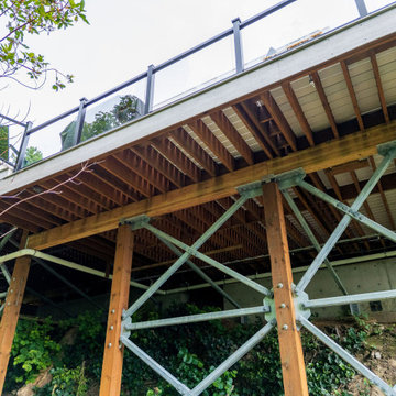
This Kirkland, Washington outdoor living project was thoughtfully designed to create a clean, modern space while also planning ahead for future upgrades. The new deck features TimberTech Legacy decking in Whitewash Cedar, bringing a warm, natural wood look with the durability of composite materials. A custom pattern on the upper deck adds visual interest and elevates the overall design.
The staircase is finished with a picture-framed border and notched fascia, creating a seamless and polished transition between levels. To enhance both safety and aesthetics, we installed TimberTech Impression railing with sleek black framing and glass infill, preserving open views while maintaining a contemporary feel. Two custom gates were also integrated for functionality and accessibility.
Below the deck, a full undercover system was installed using white smooth panels and a vinyl gutter system, transforming the space into a dry, usable area year-round. This not only expands the homeowner’s living space but also protects the structure from moisture.
A key feature of this project is the forward-thinking infrastructure. The deck was framed to accommodate a future outdoor kitchen and fire feature, with gas and electrical rough-ins already in place. This allows the homeowner to easily expand their outdoor space without major reconstruction down the line.
From structural planning to finishing details, this project blends modern design, durability, and long-term functionality, creating an outdoor environment that’s ready to enjoy today and built for tomorrow.
 THE Remodel Group
Creating a personal wellness retreat doesn't always mean starting from scratch. Through thoughtful design-build solutions, this Portland metro primary bathroom renovation showcases how reimagining your existing space can deliver extraordinary results.
Nestled into the side of Cooper Mountain, this stunning remodel artfully balances bold neutrality with warm, natural elegance. The centerpiece of the transformation—a spacious cedar-clad sauna—connects harmoniously with the expanded double shower, where biophilic accent tile reflects in the striking wall tile like dappled sunlight on water. The refined vanity area, featuring expertly repainted cabinetry and luminous countertops, ties the space together with subtle sophistication.
The success of this luxury renovation stems from strategic space planning and custom craftsmanship. By removing the existing oversized tub and deck—elements that weren't serving the homeowners' needs—we created space for a fully custom two-person sauna. The shower expansion, though modest at 12 inches, significantly enhanced the comfort and functionality for two users, demonstrating how thoughtful design can maximize every square foot.
What sets this project apart is its fully integrated design-build approach. Rather than relying on prefabricated solutions, the custom sauna was designed and constructed from the ground up. This complex undertaking required seamless coordination among electrical, plumbing, and HVAC trades across the Portland Metro Area, all working together to transform a standard bathroom into a high-performance wellness retreat.
Client collaboration played a pivotal role in the project's success. Through detailed 3D renderings, curated photo books, and hands-on material samples, the homeowners could confidently visualize and participate in design decisions. Every element—from the rich cedar sauna cladding to the plumbing fixtures—was carefully selected to create a perfect balance of aesthetics, performance, and budget considerations.
Speaking of budget, strategic decisions helped prioritize the homeowners' main objectives: a comfortable two-person sauna and an expanded shower. Instead of complete replacement, the existing cabinetry received a professional refinishing, maintaining a fresh, cohesive look while reducing material costs. By thoughtfully retaining elements like plumbing fixtures, electrical wiring, and the toilet location, we avoided unnecessary expenses while upgrading lighting with efficient LED fixtures where needed.
This primary bathroom and sauna project exemplifies how a collaborative design-build approach can transform your vision into reality. By combining strategic space planning, custom craftsmanship, and budget-conscious decisions, we created a personalized wellness retreat that delivers both luxury and functionality.

Sponsored
Columbus, OH
Snider & Metcalf Interior Design, LTD
Leading Interior Designers in Columbus, Ohio & Ponte Vedra, Florida
 San Luis Kitchen Co.
Recently, this Victorian style home welcomed its new owners with open arms – the only glitch in the budding relationship, the kitchen. The U shaped kitchen huddled in just half of the nice large room available to it – a long peninsula bisecting the space creating an awkward divide between the work area and the cramped breakfast nook/serving area.
The new owners enjoy cooking and they needed space for both of them to work in the kitchen at the same time. The old U shape did not accommodate this. The sink was too close to the range, the peninsula hemmed them in without providing a focused workstation, and the refrigerator sat at the end competing with people entering the space. And finally, the kitchen just lacked style – it did not fit with the Victorian style architecture and décor of the home.
San Luis Kitchen to the rescue! After attending a few of our monthly design seminars, the homeowners decided to take the remodeling plunge. They brought us a sketch of the space, explained their need for a more functional 2-cook space, and expressed interest in replacing the peninsula with an island. After visiting the home, we identified some other areas of design opportunity/constraint – an exterior door that was seldom used, an existing wood floor that extended throughout the house, a beautiful view from the breakfast nook windows, and a large existing pantry.
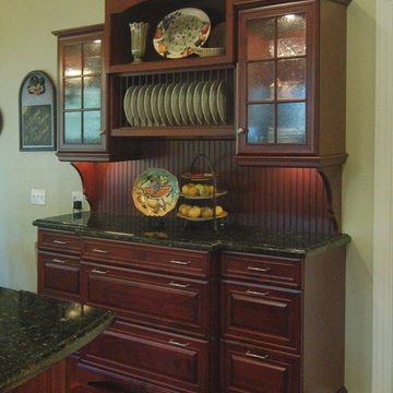
Our first thought for the new kitchen was to provide a visual focal point. The homeowners were excited by the idea of a “mantle” type wood hood which we situated facing out toward the formal dining room as the opening statement for the kitchen. We also added an island set at 90 degrees to the prior location of the peninsula – decorative open shelves face out from the island creating more visual interest. The new island not only reinforces the focal point of the hood, but also, working with the new built-in hutch, embraces the breakfast nook and integrates it with the rest of the kitchen. (Changing the peninsula to an island did create a need to patch the hardwood floor – thankfully the homeowner was able to find a source for replacement flooring that was almost a seamless blend)
Working with both the homeowners and their interior designer, we decided to combine a creamy white finish for the main cabinets with a cordovan maple stain for the island and hutch. The goal of this color scheme was a bright happy kitchen (the white) with a formal furniture feel to the cabinetry (the dark red maple pieces). Often, in Victorian or other classic style spaces, we see different pieces brought together (over time or as a planned design) to form a cohesive but diverse whole.
As functional considerations for the design, the main sink was moved to the island and a prep sink was added in the corner between the new cook-top and a designated bake center/prep station located where the old range had been. This gives space for both homeowners to work in the kitchen simultaneously using multiple workstations. We added a built-in refrigerator with decorative door panels (to blend comfortably with the cabinets), a wall oven/microwave combo – both of which are now in the space that used to have the redundant exterior door – expanding the kitchen all the way to the far wall. And lastly, keeping the basic structure of the existing pantry, we refaced it with matching doors and added rollout shelves for convenience.
The new kitchen gracefully meets all of the homeowners needs both as a showpiece and as a backdrop to their daily lives. Now they are comfortably ensconced in their entire home, including the kitchen!
 Patricia Brennan Architects
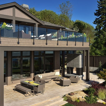
The lifestyle of living on Lake Washington is naturally inclined towards entertaining and outdoor living. However, the homeowners of this Kirkland residence found that occupying the exterior space was difficult in part because there were few spaces that were protected from the harsh western exposure. They longed for a covered patio and more.
Conversations and the design process focused on creating a four-season space that addressed the high-exposure demands of the site while also providing a comfortable space to relax and entertain.
The concept of extending the existing second floor level deck as a way to provide protection emerged as an early solution in the process. With the use of natural stone pavers and treads, the existing lower level patio was nearly doubled in usable area with different zones for intimate or large gatherings. The stone treads transition gracefully into the landscaped portion of the site.
The deck above was expanded upon and resurfaced with a low maintenance porcelain pedestal paver system. A glass panel railing is constructed without a top rail, which allows for views of the water to remain unobstructed while sitting or standing.
A custom outdoor fireplace was designed to act as a central focal point and to provide definition for the gathering spaces. The concrete mass is punctured through with a two-way fireplace, providing visual and bodily warmth for
year-round comfort and use of the space.
An updated, modernized outdoor kitchen was a necessity for larger gatherings. Durable yet elegant surfaces were required for this high use area. Cabinetry incorporates Parklex wood panels that are sustainably sourced and finished for long-term durability. Countertops and backsplash were comprised of an exterior-grade porcelain slab. Stainless steel appliances complete a low maintenance workspace.
Energy efficient products were mindful components of this project. New and dimmable LED recessed and indirect lighting provides illumination for entertaining late into the night. Tread lighting provides a beacon of light for returning boaters coming in from the lake.
The homeowner shared their pleasure with their new spaces commenting that the design seamlessly integrates with the existing house. They find themselves enjoying and using their outdoor spaces more thoroughly and on a daily basis. The surprise for them was the unintended additional space resulting from the expanded deck above.
 Amazing Spaces
Talk about your small spaces. In this case we had to squeeze a full bath into a powder room-sized room of only 5’ x 7’. The ceiling height also comes into play sloping downward from 90” to 71” under the roof of a second floor dormer in this Cape-style home.
We stripped the room bare and scrutinized how we could minimize the visual impact of each necessary bathroom utility. The bathroom was transitioning along with its occupant from young boy to teenager. The existing bathtub and shower curtain by far took up the most visual space within the room. Eliminating the tub and introducing a curbless shower with sliding glass shower doors greatly enlarged the room. Now that the floor seamlessly flows through out the room it magically feels larger. We further enhanced this concept with a floating vanity. Although a bit smaller than before, it along with the new wall-mounted medicine cabinet sufficiently handles all storage needs. We chose a comfort height toilet with a short tank so that we could extend the wood countertop completely across the sink wall. The longer countertop creates opportunity for decorative effects while creating the illusion of a larger space. Floating shelves to the right of the vanity house more nooks for storage and hide a pop-out electrical outlet.
The clefted slate target wall in the shower sets up the modern yet rustic aesthetic of this bathroom, further enhanced by a chipped high gloss stone floor and wire brushed wood countertop. I think it is the style and placement of the wall sconces (rated for wet environments) that really make this space unique. White ceiling tile keeps the shower area functional while allowing us to extend the white along the rest of the ceiling and partially down the sink wall – again a room-expanding trick.
This is a small room that makes a big splash!
54