
Search results for "Visually expanded" in Home Design Ideas
 Altura Architects
Tucked into a hillside, this mountain modern house looks to blend in with its surroundings and take advantage of spectacular mountain views. Outdoor terraces and porches connect and expand the living areas to the landscape, while thoughtful placement of windows provide a visual connection to the outdoors. The home’s green building features include solar hot water panels, rainwater cisterns, high-efficiency insulation and FSC certified cedar shingles and interior doors. The home is Energy Star and GreenBuilt NC certified.
 LABEXPERIMENT
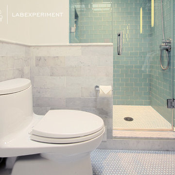
Luxurious and modern fixtures create a functional and beautiful shower, and the continuous penny floor tile expands the visual space. Hidden storage in the pony wall keeps the shower neat and tidy.
 ODS Architecture
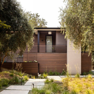
In a wooded area of Lafayette, a mid-century home was re-imagined for a graphic designer and kindergarten teacher couple and their three children. A major new design feature is a high ceiling great room that wraps from the front to the back yard, turning a corner at the kitchen and ending at the family room fireplace. This room was designed with a high flat roof to work in conjunction with existing roof forms to create a unified whole, and raise interior ceiling heights from eight to over ten feet. All new lighting and large floor to ceiling Fleetwood aluminum windows expand views of the trees beyond.
The existing home was enlarged by 700 square feet with a small exterior addition enlarging the kitchen over an existing deck, and a larger amount by excavating out crawlspace at the garage level to create a new home office with full bath, and separate laundry utility room. The remodeled residence became 3,847 square feet in total area including the garage.
Exterior curb appeal was improved with all new Fleetwood windows, stained wood siding and stucco. New steel railing and concrete steps lead up to the front entry. Front and rear yard new landscape design by Huettl Landscape Architecture dramatically alters the site. New planting was added at the front yard with landscape lighting and modern concrete pavers and the rear yard has multiple decks for family gatherings with the focal point a concrete conversation circle with central fire feature.
Everything revolves around the corner kitchen, large windows to the backyard, quartz countertops and cabinetry in painted and walnut finishes. The homeowners enjoyed the process of selecting Heath Tile for the kitchen backsplash and white oval tiles at the family room fireplace. Black brick tiles by Fireclay were used on the living room hearth. The kitchen flows into the family room all with views to the beautifully landscaped yards.
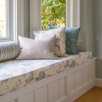
The primary suite has a built-in window seat with large windows overlooking the garden, walnut cabinetry in a skylit walk-in closet, and a large dramatic skylight bouncing light into the shower. The kid’s bath also has a skylight slot with light angling downward over double sinks. More colorful tile shows up in these spaces, as does a geometric patterned tile in the downstairs office bath shower.
The large yard is taken full advantage of with concrete paved walkways, stairs and firepit circle. New retaining walls in the rear yard helped to add more level usable outdoor space, with wood slats to visually blend them into the overall design.
The end result is a beautiful transformation of a mid-century home, that both captures the client’s personalities and elevates the house into the modern age.
Find the right local pro for your project
 Isla Homes
I built this on my property for my aging father who has some health issues. Handicap accessibility was a factor in design. His dream has always been to try retire to a cabin in the woods. This is what he got.
It is a 1 bedroom, 1 bath with a great room. It is 600 sqft of AC space. The footprint is 40' x 26' overall.
The site was the former home of our pig pen. I only had to take 1 tree to make this work and I planted 3 in its place. The axis is set from root ball to root ball. The rear center is aligned with mean sunset and is visible across a wetland.
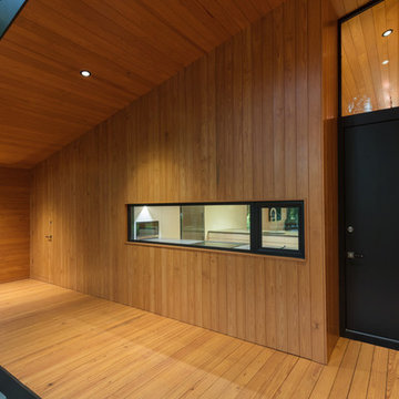
The goal was to make the home feel like it was floating in the palms. The geometry had to simple and I didn't want it feeling heavy on the land so I cantilevered the structure beyond exposed foundation walls. My barn is nearby and it features old 1950's "S" corrugated metal panel walls. I used the same panel profile for my siding. I ran it vertical to math the barn, but also to balance the length of the structure and stretch the high point into the canopy, visually. The wood is all Southern Yellow Pine. This material came from clearing at the Babcock Ranch Development site. I ran it through the structure, end to end and horizontally, to create a seamless feel and to stretch the space. It worked. It feels MUCH bigger than it is.
I milled the material to specific sizes in specific areas to create precise alignments. Floor starters align with base. Wall tops adjoin ceiling starters to create the illusion of a seamless board. All light fixtures, HVAC supports, cabinets, switches, outlets, are set specifically to wood joints. The front and rear porch wood has three different milling profiles so the hypotenuse on the ceilings, align with the walls, and yield an aligned deck board below. Yes, I over did it. It is spectacular in its detailing. That's the benefit of small spaces.
Concrete counters and IKEA cabinets round out the conversation.
For those who could not live in a tiny house, I offer the Tiny-ish House.
Photos by Ryan Gamma
Staging by iStage Homes
Design assistance by Jimmy Thornton
 Windhill+Co.
We gave this rather dated farmhouse some dramatic upgrades that brought together the feminine with the masculine, combining rustic wood with softer elements. In terms of style her tastes leaned toward traditional and elegant and his toward the rustic and outdoorsy. The result was the perfect fit for this family of 4 plus 2 dogs and their very special farmhouse in Ipswich, MA. Character details create a visual statement, showcasing the melding of both rustic and traditional elements without too much formality. The new master suite is one of the most potent examples of the blending of styles. The bath, with white carrara honed marble countertops and backsplash, beaded wainscoting, matching pale green vanities with make-up table offset by the black center cabinet expand function of the space exquisitely while the salvaged rustic beams create an eye-catching contrast that picks up on the earthy tones of the wood. The luxurious walk-in shower drenched in white carrara floor and wall tile replaced the obsolete Jacuzzi tub. Wardrobe care and organization is a joy in the massive walk-in closet complete with custom gliding library ladder to access the additional storage above. The space serves double duty as a peaceful laundry room complete with roll-out ironing center. The cozy reading nook now graces the bay-window-with-a-view and storage abounds with a surplus of built-ins including bookcases and in-home entertainment center. You can’t help but feel pampered the moment you step into this ensuite. The pantry, with its painted barn door, slate floor, custom shelving and black walnut countertop provide much needed storage designed to fit the family’s needs precisely, including a pull out bin for dog food. During this phase of the project, the powder room was relocated and treated to a reclaimed wood vanity with reclaimed white oak countertop along with custom vessel soapstone sink and wide board paneling. Design elements effectively married rustic and traditional styles and the home now has the character to match the country setting and the improved layout and storage the family so desperately needed. And did you see the barn? Photo credit: Eric Roth
 ODS Architecture
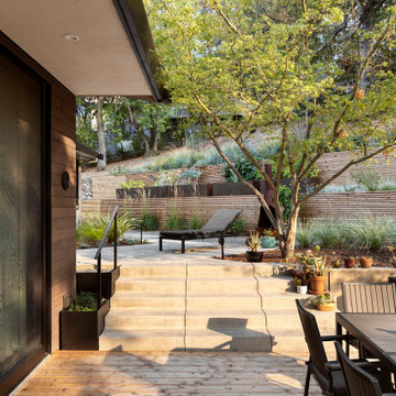
In a wooded area of Lafayette, a mid-century home was re-imagined for a graphic designer and kindergarten teacher couple and their three children. A major new design feature is a high ceiling great room that wraps from the front to the back yard, turning a corner at the kitchen and ending at the family room fireplace. This room was designed with a high flat roof to work in conjunction with existing roof forms to create a unified whole, and raise interior ceiling heights from eight to over ten feet. All new lighting and large floor to ceiling Fleetwood aluminum windows expand views of the trees beyond.
The existing home was enlarged by 700 square feet with a small exterior addition enlarging the kitchen over an existing deck, and a larger amount by excavating out crawlspace at the garage level to create a new home office with full bath, and separate laundry utility room. The remodeled residence became 3,847 square feet in total area including the garage.
Exterior curb appeal was improved with all new Fleetwood windows, stained wood siding and stucco. New steel railing and concrete steps lead up to the front entry. Front and rear yard new landscape design by Huettl Landscape Architecture dramatically alters the site. New planting was added at the front yard with landscape lighting and modern concrete pavers and the rear yard has multiple decks for family gatherings with the focal point a concrete conversation circle with central fire feature.
Everything revolves around the corner kitchen, large windows to the backyard, quartz countertops and cabinetry in painted and walnut finishes. The homeowners enjoyed the process of selecting Heath Tile for the kitchen backsplash and white oval tiles at the family room fireplace. Black brick tiles by Fireclay were used on the living room hearth. The kitchen flows into the family room all with views to the beautifully landscaped yards.
The primary suite has a built-in window seat with large windows overlooking the garden, walnut cabinetry in a skylit walk-in closet, and a large dramatic skylight bouncing light into the shower. The kid’s bath also has a skylight slot with light angling downward over double sinks. More colorful tile shows up in these spaces, as does a geometric patterned tile in the downstairs office bath shower.
The large yard is taken full advantage of with concrete paved walkways, stairs and firepit circle. New retaining walls in the rear yard helped to add more level usable outdoor space, with wood slats to visually blend them into the overall design.
The end result is a beautiful transformation of a mid-century home, that both captures the client’s personalities and elevates the house into the modern age.
 Che Bella Interiors Design + Remodeling
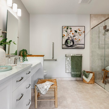
With an eye toward accessibility, this bathroom is designed to ease the everyday routines of a homeowner who often uses a wheelchair. Universal design strategies guided the project structurally with ADA-compatible elements incorporated throughout. One side of the vanity is set lower and left intentionally open underneath to accommodate the wheelchair when needed.
Visually, the project shines just as bright with white shaker-style cabinetry balanced by warm tones found elsewhere. Oversized warm gray porcelain wall tile partners beautifully with a diminutive square tile on the shower floor, while brushed nickel hardware and quartz countertops complete a timeless, classic appeal.
Photos by Spacecrafting Photography


 Windhill+Co.
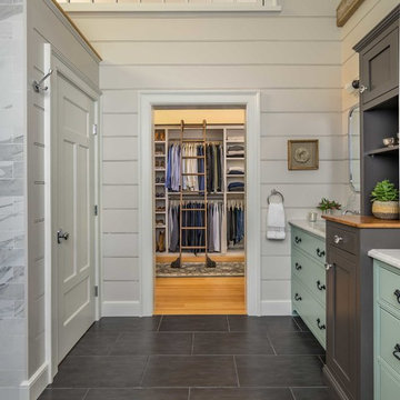
We gave this rather dated farmhouse some dramatic upgrades that brought together the feminine with the masculine, combining rustic wood with softer elements. In terms of style her tastes leaned toward traditional and elegant and his toward the rustic and outdoorsy. The result was the perfect fit for this family of 4 plus 2 dogs and their very special farmhouse in Ipswich, MA. Character details create a visual statement, showcasing the melding of both rustic and traditional elements without too much formality. The new master suite is one of the most potent examples of the blending of styles. The bath, with white carrara honed marble countertops and backsplash, beaded wainscoting, matching pale green vanities with make-up table offset by the black center cabinet expand function of the space exquisitely while the salvaged rustic beams create an eye-catching contrast that picks up on the earthy tones of the wood. The luxurious walk-in shower drenched in white carrara floor and wall tile replaced the obsolete Jacuzzi tub. Wardrobe care and organization is a joy in the massive walk-in closet complete with custom gliding library ladder to access the additional storage above. The space serves double duty as a peaceful laundry room complete with roll-out ironing center. The cozy reading nook now graces the bay-window-with-a-view and storage abounds with a surplus of built-ins including bookcases and in-home entertainment center. You can’t help but feel pampered the moment you step into this ensuite. The pantry, with its painted barn door, slate floor, custom shelving and black walnut countertop provide much needed storage designed to fit the family’s needs precisely, including a pull out bin for dog food. During this phase of the project, the powder room was relocated and treated to a reclaimed wood vanity with reclaimed white oak countertop along with custom vessel soapstone sink and wide board paneling. Design elements effectively married rustic and traditional styles and the home now has the character to match the country setting and the improved layout and storage the family so desperately needed. And did you see the barn? Photo credit: Eric Roth
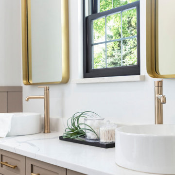
 TVL Creative Ltd.
This 1910 West Highlands home was so compartmentalized that you couldn't help to notice you were constantly entering a new room every 8-10 feet. There was also a 500 SF addition put on the back of the home to accommodate a living room, 3/4 bath, laundry room and back foyer - 350 SF of that was for the living room. Needless to say, the house needed to be gutted and replanned.
Kitchen+Dining+Laundry-Like most of these early 1900's homes, the kitchen was not the heartbeat of the home like they are today. This kitchen was tucked away in the back and smaller than any other social rooms in the house. We knocked out the walls of the dining room to expand and created an open floor plan suitable for any type of gathering. As a nod to the history of the home, we used butcherblock for all the countertops and shelving which was accented by tones of brass, dusty blues and light-warm greys. This room had no storage before so creating ample storage and a variety of storage types was a critical ask for the client. One of my favorite details is the blue crown that draws from one end of the space to the other, accenting a ceiling that was otherwise forgotten.
Primary Bath-This did not exist prior to the remodel and the client wanted a more neutral space with strong visual details. We split the walls in half with a datum line that transitions from penny gap molding to the tile in the shower. To provide some more visual drama, we did a chevron tile arrangement on the floor, gridded the shower enclosure for some deep contrast an array of brass and quartz to elevate the finishes.
Powder Bath-This is always a fun place to let your vision get out of the box a bit. All the elements were familiar to the space but modernized and more playful. The floor has a wood look tile in a herringbone arrangement, a navy vanity, gold fixtures that are all servants to the star of the room - the blue and white deco wall tile behind the vanity.
Full Bath-This was a quirky little bathroom that you'd always keep the door closed when guests are over. Now we have brought the blue tones into the space and accented it with bronze fixtures and a playful southwestern floor tile.
Living Room & Office-This room was too big for its own good and now serves multiple purposes. We condensed the space to provide a living area for the whole family plus other guests and left enough room to explain the space with floor cushions. The office was a bonus to the project as it provided privacy to a room that otherwise had none before.
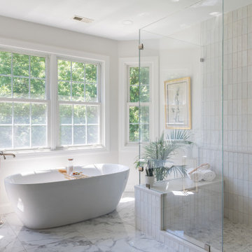

 Altura Architects
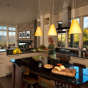
Tucked into a hillside, this modern mountain house looks to blend in with its surroundings and take advantage of spectacular mountain views. Outdoor terraces and porches connect and expand the living areas to the landscape, while thoughtful placement of windows provide a visual connection to the outdoors. The home’s green building features include solar hot water panels, rainwater cisterns, high-efficiency insulation and FSC certified cedar shingles and interior doors. The home is Energy Star and GreenBuilt NC certified.
 Lauren Nicole Designs
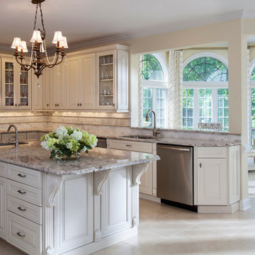
A neutral kitchen done right. The light and bright kitchen decor expands this space and offers a large amount of natural lighting. The different textures in tile flooring, marble counter tops, back splash, and dining table keep it visually interesting, even in the same color.
 Ann Lowengart Interiors
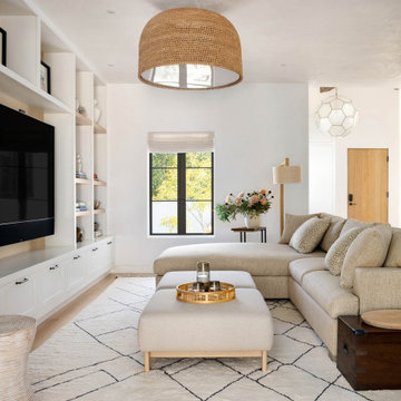
The three-level Mediterranean revival home started as a 1930s summer cottage that expanded downward and upward over time. We used a clean, crisp white wall plaster with bronze hardware throughout the interiors to give the house continuity. A neutral color palette and minimalist furnishings create a sense of calm restraint. Subtle and nuanced textures and variations in tints add visual interest. The stair risers from the living room to the primary suite are hand-painted terra cotta tile in gray and off-white. We used the same tile resource in the kitchen for the island's toe kick.

Sponsored
Columbus, OH

Snider & Metcalf Interior Design, LTD
Leading Interior Designers in Columbus, Ohio & Ponte Vedra, Florida
 Nar Design Group
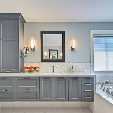
This home remodel is a celebration of curves and light. Starting from humble beginnings as a basic builder ranch style house, the design challenge was maximizing natural light throughout and providing the unique contemporary style the client’s craved.
The Entry offers a spectacular first impression and sets the tone with a large skylight and an illuminated curved wall covered in a wavy pattern Porcelanosa tile.
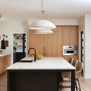
The chic entertaining kitchen was designed to celebrate a public lifestyle and plenty of entertaining. Celebrating height with a robust amount of interior architectural details, this dynamic kitchen still gives one that cozy feeling of home sweet home. The large “L” shaped island accommodates 7 for seating. Large pendants over the kitchen table and sink provide additional task lighting and whimsy. The Dekton “puzzle” countertop connection was designed to aid the transition between the two color countertops and is one of the homeowner’s favorite details. The built-in bistro table provides additional seating and flows easily into the Living Room.
A curved wall in the Living Room showcases a contemporary linear fireplace and tv which is tucked away in a niche. Placing the fireplace and furniture arrangement at an angle allowed for more natural walkway areas that communicated with the exterior doors and the kitchen working areas.
The dining room’s open plan is perfect for small groups and expands easily for larger events. Raising the ceiling created visual interest and bringing the pop of teal from the Kitchen cabinets ties the space together. A built-in buffet provides ample storage and display.
The Sitting Room (also called the Piano room for its previous life as such) is adjacent to the Kitchen and allows for easy conversation between chef and guests. It captures the homeowner’s chic sense of style and joie de vivre.

 Jennifer Grey Interiors Design & Color Specialist
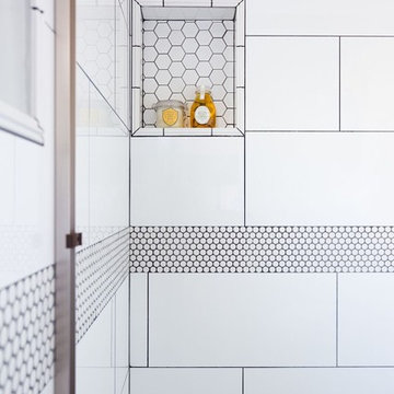
To maximize the look of this fairly compact bathroom, we added large white 12x24 rectangular wall tile in the shower to expand the space visually, with an added band of vintage style penny tile fully wrapping around and inside the shower, in effort of creating the look of a larger space. For the shampoo niche, hex tile was added for visual contrast, which is also repeated on the shower floor.
Photography by Amy Bartlam
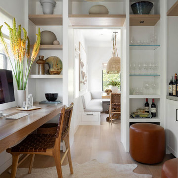 Ann Lowengart Interiors
The three-level Mediterranean revival home started as a 1930s summer cottage that expanded downward and upward over time. We used a clean, crisp white wall plaster with bronze hardware throughout the interiors to give the house continuity. A neutral color palette and minimalist furnishings create a sense of calm restraint. Subtle and nuanced textures and variations in tints add visual interest. The stair risers from the living room to the primary suite are hand-painted terra cotta tile in gray and off-white. We used the same tile resource in the kitchen for the island's toe kick.

Sponsored
Columbus, OH
Snider & Metcalf Interior Design, LTD
Leading Interior Designers in Columbus, Ohio & Ponte Vedra, Florida
 User
UserOur approach to the dining room wall was a key decision for the entire project. The wall was load bearing and the homeowners considered only removing half of it. In the end, keeping the overall open concept design was important to the homeowners, therefore we installed a load bearing beam in the ceiling. The beam was finished with drywall to be cohesive so it looked like it was a part of the original design. Now that the kitchen and dining room were open, paint colors were used to designate the spaces and create visual boundaries. This made each area feel like it’s its own space without using any structures.
The original L-shaped kitchen was cut short because of bay windows that overlooked the backyard patio. These windows were lost in the space and not functional; they were replaced with double French doors leading onto the patio. A brick layer was brought in to patch up the window swap and now it looks like the French doors always existed. New crown molding was installed throughout and painted to match the kitchen cabinets.
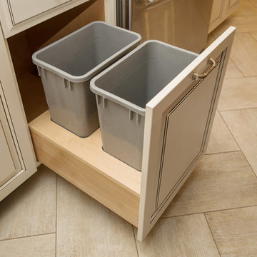
This window/door replacement allowed for a large pantry cabinet to be installed next to the refrigerator which was not in the old cabinet configuration. The replaced perimeter cabinets host custom storage solutions, like a mixer stand, spice organization, recycling center and functional corner cabinet with pull out shelving. The perimeter kitchen cabinets are painted with a glaze and the island is a cherry stain with glaze to amplify the raised panel door style.
We tripled the size of the kitchen island to expand countertop space. It seats five people and hosts charging stations for the family’s busy lifestyle. It was important that the cooktop in the island had a built in downdraft system because the homeowners did not want a ventilation hood in the center of the kitchen because it would obscure the open concept design.
The countertops are quartz and feature an under mount granite composite kitchen sink with a low divide center. The kitchen faucet, which features hands free and touch technology, and an instant hot water dispenser were added for convenience because of the homeowners’ busy lifestyle. The backsplash is a favorite, with a teal and red glass mosaic basket weave design. It stands out and holds its own among the expansive kitchen cabinets.
All recessed, under cabinet and decorative lights were installed on dimmer switches to allow the homeowners to adjust the lighting in each space of the project. All exterior and interior door hardware, hinges and knobs were replaced in oil rubbed bronze to match the dark stain throughout the space. The entire first floor remodel project uses 12x24 ceramic tile laid in a herringbone pattern. Since tile is typically cold, the flooring was also heated from below. This will also help with the homeowners’ original heating issues.
When accessorizing the kitchen, we used functional, everyday items the homeowners use like cutting boards, canisters for dry goods and place settings on the island. Ultimately, this project transformed their small, outdated kitchen into an expansive and functional workspace.

 360º Design, Valhalla, NY
An extreme renovation makeover for my clients teenagers bathroom. We expanded the footprint and upgraded all facets of the existing space. We selected a more mature, sophisticated, spa like vibe that fit her likes and needs, while maintaining a modern, subdued palette that was calming + inviting and showcased the sculptural elements in the room. There really was nowhere but up to go in this space.
 Cantoni Dallas
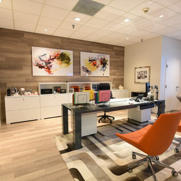
While Cantoni’s Founder & CEO, Michael Wilkov (aka MW) was away at the fall 2014 High Point Market, Cantoni’s Dallas Visuals Team came out to play…spearheading the secret operation known as “MW’s Office Makeover,” Anne Mancuso gathered her troops to give the big boss’ office a serious and much needed facelift in just 4 days! To read the full story, visit the Cantoni Blog here: http://cantoni.com/blog/2014/11/office-makeover/
Photos by David DeLeon
50