
Search results for "Visually" in Home Design Ideas

 Meridith Baer Home
Photography by Bernard André www.bernardandre.com
Bedroom - country master bedroom idea in Los Angeles with white walls
Bedroom - country master bedroom idea in Los Angeles with white walls

 Ohana Home & Design
Large 1950s master blue tile and porcelain tile porcelain tile, gray floor and double-sink japanese bathtub photo in Minneapolis with flat-panel cabinets, dark wood cabinets, a two-piece toilet, white walls, an undermount sink, quartzite countertops, a hinged shower door, white countertops and a built-in vanity


Find the right local pro for your project

 Elizabeth Taich Design
Elizabeth Taich Design is a Chicago-based full-service interior architecture and design firm that specializes in sophisticated yet livable environments.
IC360
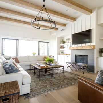


 Lane Lamerson Interiors
Brett Beyer Photography
Inspiration for a cottage freestanding bathtub remodel in New York with shaker cabinets, medium tone wood cabinets and white walls
Inspiration for a cottage freestanding bathtub remodel in New York with shaker cabinets, medium tone wood cabinets and white walls




 Astro Design Inc.
This countryside kitchen includes a beautiful blue statement island, which adds originality to the classic space with a transitional spin. The cabinetry is made by Downsview and the design is done through Astro Design Centre in Ottawa Canada.
Astro Design, Ottawa
DoubleSpace Photography
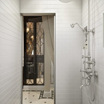
 ArchiCGI 3D Rendering
Classic Bathroom Interior. 3D Visualization
Amazing Ideas. Perfect Rendering quality and effective Design presentation.
Inspiration for a rustic home design remodel in Edinburgh
Inspiration for a rustic home design remodel in Edinburgh
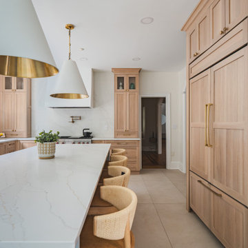
 Boss Design Center
This thoughtfully designed kitchen blends the clean simplicity of Scandinavian style with the warmth of natural materials. Light oak shaker cabinetry pairs seamlessly with a soft blue quartzite island, creating a balanced palette that feels fresh yet timeless. Brass hardware, a farmhouse sink, and oversized pendant lights add refined character without overpowering the space.
A custom range hood and full-height ceramic tile backsplash provide subtle texture and visual interest, while panel-ready appliances and smart storage solutions keep the look streamlined. The spacious island offers ample prep space and casual seating, making it both functional and welcoming for everyday life.
From the light porcelain tile flooring to the gold-toned fixtures and tailored detailing, every element works in harmony to create a bright, inviting kitchen that celebrates craftsmanship and modern living.


 Change Your Bathroom©
The goal of this project was to upgrade the builder grade finishes and create an ergonomic space that had a contemporary feel. This bathroom transformed from a standard, builder grade bathroom to a contemporary urban oasis. This was one of my favorite projects, I know I say that about most of my projects but this one really took an amazing transformation. By removing the walls surrounding the shower and relocating the toilet it visually opened up the space. Creating a deeper shower allowed for the tub to be incorporated into the wet area. Adding a LED panel in the back of the shower gave the illusion of a depth and created a unique storage ledge. A custom vanity keeps a clean front with different storage options and linear limestone draws the eye towards the stacked stone accent wall.
Houzz Write Up: https://www.houzz.com/magazine/inside-houzz-a-chopped-up-bathroom-goes-streamlined-and-swank-stsetivw-vs~27263720
The layout of this bathroom was opened up to get rid of the hallway effect, being only 7 foot wide, this bathroom needed all the width it could muster. Using light flooring in the form of natural lime stone 12x24 tiles with a linear pattern, it really draws the eye down the length of the room which is what we needed. Then, breaking up the space a little with the stone pebble flooring in the shower, this client enjoyed his time living in Japan and wanted to incorporate some of the elements that he appreciated while living there. The dark stacked stone feature wall behind the tub is the perfect backdrop for the LED panel, giving the illusion of a window and also creates a cool storage shelf for the tub. A narrow, but tasteful, oval freestanding tub fit effortlessly in the back of the shower. With a sloped floor, ensuring no standing water either in the shower floor or behind the tub, every thought went into engineering this Atlanta bathroom to last the test of time. With now adequate space in the shower, there was space for adjacent shower heads controlled by Kohler digital valves. A hand wand was added for use and convenience of cleaning as well. On the vanity are semi-vessel sinks which give the appearance of vessel sinks, but with the added benefit of a deeper, rounded basin to avoid splashing. Wall mounted faucets add sophistication as well as less cleaning maintenance over time. The custom vanity is streamlined with drawers, doors and a pull out for a can or hamper.
A wonderful project and equally wonderful client. I really enjoyed working with this client and the creative direction of this project.
Brushed nickel shower head with digital shower valve, freestanding bathtub, curbless shower with hidden shower drain, flat pebble shower floor, shelf over tub with LED lighting, gray vanity with drawer fronts, white square ceramic sinks, wall mount faucets and lighting under vanity. Hidden Drain shower system. Atlanta Bathroom.

 User
UserASID Design Excellence First Place Residential – Kitchen and Bathroom: Michael Merrill Design Studio was approached three years ago by the homeowner to redesign her kitchen. Although she was dissatisfied with some aspects of her home, she still loved it dearly. As we discovered her passion for design, we began to rework her entire home--room by room, top to bottom.

Sponsored
Columbus, OH

Snider & Metcalf Interior Design, LTD
Leading Interior Designers in Columbus, Ohio & Ponte Vedra, Florida

 Stephanie James Interiors
Stephanie James: “Understanding the client’s style preferences, we sought out timeless pieces that also offered a little bling. The room is open to multiple dining and living spaces and the scale of the furnishings by Chaddock, Ambella, Wesley Hall and Mr. Brown and lighting by John Richards and Visual Comfort were very important. The living room area with its vaulted ceilings created a need for dramatic fixtures and furnishings to complement the scale. The mixture of textiles and leather offer comfortable seating options whether for a family gathering or an intimate evening with a book.”
Photographer: Michael Blevins Photo

 Third Coast Interiors
Inspiration for a mid-sized transitional open concept dark wood floor and brown floor living room remodel in Chicago with gray walls, a standard fireplace, a tile fireplace and no tv


 dRemodeling Design-Build
Gray painted framed mirrors add depth to the softly painted grey washed walls and subtly connects the gray veining throughout the carrara marble countertop and gray painted double vanity.


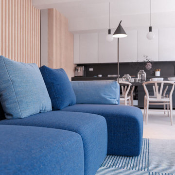
 www.cgvizstudio.com
London Apartment 3D Architecture Visualization is designed by CG VIZ STUDIO. As urban living spaces shrink, London architects rethink the small apartment. A grooved timber partition is the focal point of this pared-back apartment in central London. An open-plan dining and sitting area are situated on the apartment’s front elevation, illuminated by four large sash windows that overlook the street.
 ArchiCGI 3D Rendering
Incredibly creative and eye-catching #3dRendering project with the emotional touch from Archicgi Team.
This Bedroom Visualization is a great example of what an efficient zoning should look like.
Basically, the bedroom is divided into three parts: relaxation space, the bedroom itself and the cinema zone. The best part about this division is that they are separated by a lot of space.
The quality of this Interior Design Presentation allows displaying the wide range of textures and bright colors. The red is splashed in bright accents against white surface of walls, furniture and linens.
The golden brown wood of the wardrobe matches the decorative lightening balls and gives it a touch of royal solemnity.
Another thing about this Bedroom Visualization is the way the #3Dartist contrasts the textures. It emphasizes their best features.

 Advance Design Studio, Ltd.
After six years of living in their Huntley IL home, Chris and Meghan were tired of their dark, dingy, outdated kitchen and it was finally time for a long-anticipated change. “The kitchen is the place where we live, it’s where we do everything,” Meghan said. “It was important that it be a space where we wanted to be.” Meghan loves cooking and enjoys including their girls in healthy meal prepping, this led them to want a brighter, more enjoyable kitchen with increased functionality and improved storage.
For Chris especially, the laundry room was an entirely dysfunctional eyesore. “We had a washer and a dryer, but it was all kind-of cobbled together!” Chris said. “There were always laundry piles everywhere, we weren’t really sure what we wanted to do in there, but it was time for us to make a change.” The mess of the space was stressful every time they walked in the door from the garage each day. Kids’ backpacks and shoes piled up haphazardly in the makeshift boot-bench closet left the family feeling disorganized and stressed. They needed space for folding clothes and locker cubbies to help keep the family organized.
Having known Christine and Todd in the Huntley community for years, Chris and Meghan were familiar with their work. “We already trusted them personally and having seen their projects for years we knew they did top notch work. After we reviewed the initial round of designs, we knew that hiring them was definitely the right choice,” Meghan and Chris said. Although Chris had done a lot of work in their home himself, the kitchen and laundry room renovation was such a large undertaking that he didn’t want to steal time away from his family to spend what would surely be many long weekends doing the job himself. “That would not have been a wise choice for us,” Chris laughed.
“Our designer, Michelle was very, very, easy to work with; anything we wanted to see or weren’t sure about, she went above and beyond to make this easy for us. She was easy to get hold of and always quick to respond,” the couple said. Michelle pulled ideas that mirrored the couple’s taste and style and was adept at directing the couple to limited choices that didn’t overwhelm them and kept the process moving. “I have a hard time making decisions. Michelle made the decision-making process so easy. I loved how she listened to what I liked and then presented three great options for me to choose from,” Meghan said.
The main objectives for the kitchen were better storage solutions, they wanted the space to reflect their lifestyle and taste, and they wanted it to last for years with low maintenance. One of the first steps in creating a more functional kitchen was relocating the refrigerator, creating an improved workflow for the busy family.
“We didn’t know that we could even move the refrigerator to a new location where it is now, that was something that we never would have thought of,” Chris said. “The new refrigerator location makes the kitchen feel so much bigger. We didn’t add any space, but our whole kitchen with the new design just seems like it’s so much larger than before!” Meghan said.
The perimeter mist colored cabinets helped warm and brighten the entire room, while the graphite colored cabinets on the island added contrast. Using this fresh, clean color palette satisfied the couple’s desire for a bright space that was the exact opposite of what they had before. Organization accessories were also added to the cabinets such as a spice drawer tray and roll outs to create hidden convenience.
“I absolutely love the hidden spices – it makes cooking so much more enjoyable!” Chris said. “And all the pull outs, and the double trash bin, who would think you could get so excited about organization!” the couple said in unison.
One thing they hated in their original kitchen was how dark the space felt. Added lighting on the ceiling with the new light fixtures combined with the lighter cabinetry colors throughout solved this problem. “Our new kitchen has this warm, almost cozy feeling that our old kitchen never had, it’s just a space that I love spending my time in now,” Meghan said. The light airy feeling was accentuated with the use of floating white shelves on either side of the decorative range hood. “We have so much cabinetry space, the new design is amazing we actually have more storage space than we will ever need,” Meghan said.
The island was extended to create more work surface and added space for stool seating. “The new island changes how we live. Now the kids can be in the kitchen with us, doing homework, eating breakfast, and the three of us have special dinners there when Chris is working late,” Meghan said.
The Carrara Marmi Quartz countertops were chosen because they are, not only beautiful, but are made from hard-working material that doesn’t require maintenance. The white subway tile backsplash that wraps to the ceiling behind the focal point cooktop range/hood compliments the crisp white countertops perfectly, while brushed brass hardware and light fixtures keep the design fresh and new.
The couple had a few fears at the beginning of the project, as most homeowners do. Their biggest fear was being out of their kitchen and laundry room for an extended time. The crew made it very easy for the family to work in a limited space keeping the washer and dryer hooked up the majority of the time, and also getting appliances working with minimal downtime.
“They above and beyond accommodated us to get us through the process,” Meghan said. “They did a great job making sure we were as comfortable as possible throughout the process,” Chris added.
“Our project manager DJ did a great job. He was very good at updating us on schedule changes, getting guys in as quickly as possible. Everyone that stepped in the house was nice and did great work,” said Chris. They thought Advance’s carpenter was phenomenal and were impressed when he took a conceptual idea from a photograph and worked with designer Michelle to create a one of a kind range/hood that has become the topic of conversation with friends and family who visit the new kitchen. “He was in our house literally every day for several weeks. He was easy to work with and good at what he did,” Meghan and Chris said.
The focal point of the kitchen; a hand-crafted, custom-built ventilation hood was clad with handpicked reclaimed barnwood. Advance Design’s carpenter built the framework and the cladding to create a one-of-a-kind design element that the couple loves.
“I think it was especially fun for him to create something unique from scratch, showcasing his talent in this area,” Meghan said. “I love that my kitchen is not like everyone else’s. I got to pick out the wood on my hood and watch it being built and was able to choose what pieces of wood went where on it. It’s totally unique.”
Red Oak flooring was toothed-in throughout the kitchen and the rest of the first floor anywhere changes were made. Then the whole floor was refinished to tone down the orange undertones in the existing floor stain, ultimately changing the color complexion of the entire first floor. The result is a completely new feeling to the entire home.
Renovating the laundry room was extremely important to Meghan and Chris, but they had trouble visualizing what the possibilities were for the seemingly small space. Michelle produced beautiful 3D illustrations that helped them envision the space in a whole new way.
“I must have told Michelle 100 times that I am a visual person, seeing the designs in 3D made it so easy to make decisions and see what we could really do with our space,” Meghan said.
A dividing wall and doorway were removed between the existing laundry room and hallway formerly containing a coat closet, providing space to design specialized graphite colored cabinetry matching the kitchen island to house custom storage cubbies for each family member. Adding the tall utility cabinetry in the new laundry area helped solve the storage issue, tucking away cleaning supplies, household items, and even the cat got its own cubby.
“I love how everything is now hidden in its own space. I can’t tell you how much I hated coming home and seeing everything sitting around on counters,” Chris said.
Electrical outlets were planned for the inside of utility cabinets, so devices could charge in hidden locations. Stacking the washer and dryer allowed for wider countertop space to provide a folding area and a special space for clothes to hang. “The way I do laundry has been completely transformed! I can actually fold clothes and hang them now right out of the washer and dryer,” Meghan said.
“The end result in the kitchen and the laundry/mud room was an updated light and bright space, with a smarter work flow that better meets the needs of this family,” Michelle said.
“I would totally recommend Advance Design,” Meghan said. “Sometimes I sit and just look at my kitchen and laundry room and think ‘Wow, I can’t believe I get to live here!’ It’s an understatement to say we love our new space.”
35