
Search results for "Wave bye bye" in Home Design Ideas
 Windhill+Co.
What Makes an Ocean Wave, Wave?
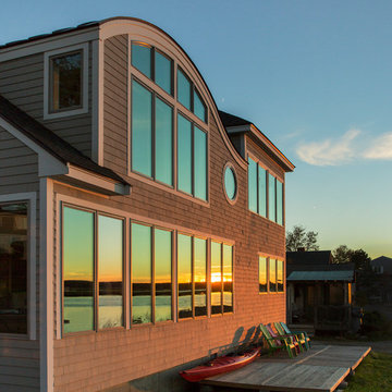
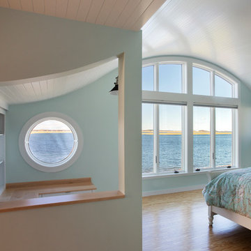
The quintessential New England ocean-front cottage poised for perfection, how could you possibly improve? What was already an amazing property on the shore in Ipswich, MA, gave way to a ‘face lift’. The ocean facing roofline with steep pitch created a blank canvas, our favorite! Constructing an eyebrow shaped dormer transformed the second floor by ‘opening the home’s eyes’, adding a master bedroom suite and reading nook…to die for. Ocean views and natural light were maximized by the strong use of glass and transparent finishes. The dramatic roofline resembles an ocean wave, befitting of the home’s coastal cottage location and style.
Eric Roth
 Treefrog Design
Snowberry Lane Photography
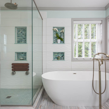
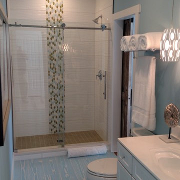
Example of a large transitional master white tile and glass tile porcelain tile and gray floor bathroom design in Seattle with turquoise cabinets, a vessel sink, quartz countertops, a hinged shower door, white walls and recessed-panel cabinets
Example of a large transitional master white tile and glass tile porcelain tile and gray floor bathroom design in Seattle with turquoise cabinets, a vessel sink, quartz countertops, a hinged shower door, white walls and recessed-panel cabinets
 HomeTech Renovations, Inc.
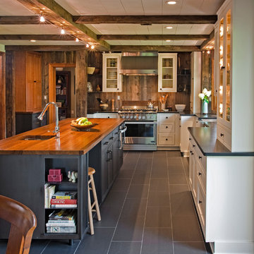
Randal Bye
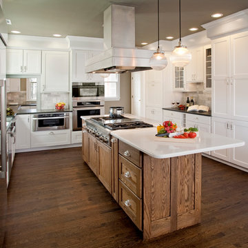
Eat-in kitchen - large traditional l-shaped dark wood floor eat-in kitchen idea in Philadelphia with a farmhouse sink, shaker cabinets, white cabinets, granite countertops, white backsplash, stone tile backsplash, stainless steel appliances and an island
Eat-in kitchen - large traditional l-shaped dark wood floor eat-in kitchen idea in Philadelphia with a farmhouse sink, shaker cabinets, white cabinets, granite countertops, white backsplash, stone tile backsplash, stainless steel appliances and an island
Find the right local pro for your project

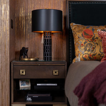
 In Detail Interiors
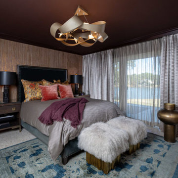
A master bedroom with rich color, texture and personality!
With a colorful master bathroom that blends the perfect matte finish, semi-primitive blast of pattern with rich, saturated jewel tones and a little calacatta gold tile – determining the best fabrics and finishes for the master bedroom felt like a HUGE challenge. How do you stand up to something so fabulously unique and still create a soft respite for someone to slumber?!
This bedroom was a small space with existing Vetrazzo floors and an entire wall dedicated to floor-to-ceiling fixed glass pane windows. Between the cracks in the plaster ceiling and the lacquered pink dresser we knew we had our work cut out.
Saturated colors create a fairy tale bedroom
Fast forward to finding the perfect, sumptuously soft evergreen mohair for the headboard and furry tuffets for the foot of the bed. Texture became the name of the game and a certain level of color variation had to tie through from selection to selection. Cladding the walls with a gilt woven cloth wall covering that also pulled a sort of skin-tone clay from detail found in the Vetrazzo flooring (OMG! so pretty!) and grounding everything with a sort of deco-inspired one-of-a-kind wool rug. The layers of unexpected style helped develop a more collected – less stylized – feeling overall.
Then it was bye-bye to the pink lacquer! A local artisan worked on a faux finish for the custom dresser that the client had already invested in and we just gave it a refresh with a deep bronze finish. Balancing this piece with the playful silk tassel pendant lights that frame a beautiful original painting of red headed queens by artist Nancy Rhodes Harper.
Exquisite lighting for a sexy master bedroom
Additionally, the swirl and swoop of the forged metal light fixture overhead play off the more structured spinal-column type pattern of the black out window treatments that truly act as their own piece of art. Each element has its place and plays with the visual and textural aesthetics that make our client (and our team) swoon.
Want more colorful and moody interior spaces? Check out another one of our recent projects here! Then call us for more information on how we can help you! Read more about our full-service interior design here!
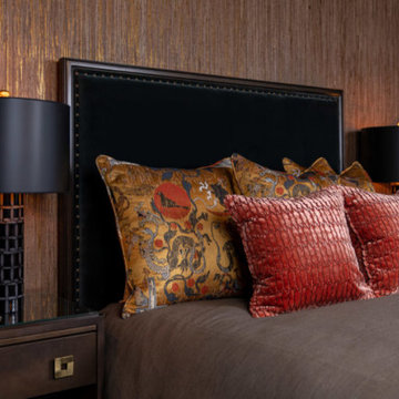 In Detail Interiors
A master bedroom with rich color, texture and personality!
With a colorful master bathroom that blends the perfect matte finish, semi-primitive blast of pattern with rich, saturated jewel tones and a little calacatta gold tile – determining the best fabrics and finishes for the master bedroom felt like a HUGE challenge. How do you stand up to something so fabulously unique and still create a soft respite for someone to slumber?!
This bedroom was a small space with existing Vetrazzo floors and an entire wall dedicated to floor-to-ceiling fixed glass pane windows. Between the cracks in the plaster ceiling and the lacquered pink dresser we knew we had our work cut out.
Saturated colors create a fairy tale bedroom
Fast forward to finding the perfect, sumptuously soft evergreen mohair for the headboard and furry tuffets for the foot of the bed. Texture became the name of the game and a certain level of color variation had to tie through from selection to selection. Cladding the walls with a gilt woven cloth wall covering that also pulled a sort of skin-tone clay from detail found in the Vetrazzo flooring (OMG! so pretty!) and grounding everything with a sort of deco-inspired one-of-a-kind wool rug. The layers of unexpected style helped develop a more collected – less stylized – feeling overall.
Then it was bye-bye to the pink lacquer! A local artisan worked on a faux finish for the custom dresser that the client had already invested in and we just gave it a refresh with a deep bronze finish. Balancing this piece with the playful silk tassel pendant lights that frame a beautiful original painting of red headed queens by artist Nancy Rhodes Harper.
Exquisite lighting for a sexy master bedroom
Additionally, the swirl and swoop of the forged metal light fixture overhead play off the more structured spinal-column type pattern of the black out window treatments that truly act as their own piece of art. Each element has its place and plays with the visual and textural aesthetics that make our client (and our team) swoon.
Want more colorful and moody interior spaces? Check out another one of our recent projects here! Then call us for more information on how we can help you! Read more about our full-service interior design here!


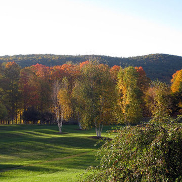
 The Cultural Landscape Foundation
Sunday July 19, 3:00 to 4:30pm | Falls Village
Pittman Residence by Designed by A.E. Bye, Dialogue led by Kimberly Mercurio of Kimberly Mercurio Landscape Architecture
Designed by twentieth-century landscape architect A.E. Bye, the Pittman Residence in Falls Village, Connecticut features an artistic landscape design both inspired by and accentuating the area’s natural ecological character. Embodying the architect’s own creative aesthetic, the property incorporates various undulating landforms that draw on the presence of natural shadows to create a memorable landscape that lingers in the minds of visitors long after they bid the property ado. This season, join landscape architect and scholar Kimberly Mercurio as she leads an engaging dialogue on the design history of the Pittman Residence and the significance of Bye’s play on shadows in landscape architecture. With her immense knowledge of A.E. Bye’s work, having recently completed the A.E. Bye/Landscape Architecture Archives Research Fellowship at Penn State University and received a grant from Dumbarton Oaks to further study and document his achievements, Mercurio’s presentation promises to be both educational and inspiring. Photo courtesy Kimberly Mercurio
 Coronado Stone Products
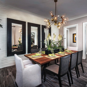
Looking for something unique! Adding The Wave from Coronado Stone Products to your project can help you create a one of a kind look. These 32”x32” textured panels create a subtle continuous wave texture that adds depth and character to any wall. Image by - Lennar Inland Empire/Los Angeles and Applied Photography. http://www.coronado.com/AllProjects-TheWave


 S Squared Design, LLC
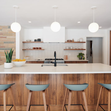
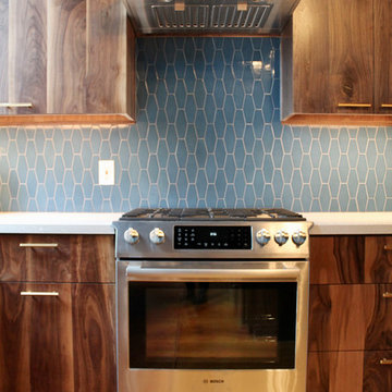
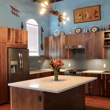
This loft was in need of a mid century modern face lift. In such an open living floor plan on multiple levels, storage was something that was lacking in the kitchen and the bathrooms. We expanded the kitchen in include a large center island with trash can/recycles drawers and a hidden microwave shelf. The previous pantry was a just a closet with some shelves that were clearly not being utilized. So bye bye to the closet with cramped corners and we welcomed a proper designed pantry cabinet. Featuring pull out drawers, shelves and tall space for brooms so the living level had these items available where my client's needed them the most. A custom blue wave paint job was existing and we wanted to coordinate with that in the new, double sized kitchen. Custom designed walnut cabinets were a big feature to this mid century modern design. We used brass handles in a hex shape for added mid century feeling without being too over the top. A blue long hex backsplash tile finished off the mid century feel and added a little color between the white quartz counters and walnut cabinets. The two bathrooms we wanted to keep in the same style so we went with walnut cabinets in there and used the same countertops as the kitchen. The shower tiles we wanted a little texture. Accent tiles in the niches and soft lighting with a touch of brass. This was all a huge improvement to the previous tiles that were hanging on for dear life in the master bath! These were some of my favorite clients to work with and I know they are already enjoying these new home!
 In Detail Interiors
A master bedroom with rich color, texture and personality!
With a colorful master bathroom that blends the perfect matte finish, semi-primitive blast of pattern with rich, saturated jewel tones and a little calacatta gold tile – determining the best fabrics and finishes for the master bedroom felt like a HUGE challenge. How do you stand up to something so fabulously unique and still create a soft respite for someone to slumber?!
This bedroom was a small space with existing Vetrazzo floors and an entire wall dedicated to floor-to-ceiling fixed glass pane windows. Between the cracks in the plaster ceiling and the lacquered pink dresser we knew we had our work cut out.
Saturated colors create a fairy tale bedroom
Fast forward to finding the perfect, sumptuously soft evergreen mohair for the headboard and furry tuffets for the foot of the bed. Texture became the name of the game and a certain level of color variation had to tie through from selection to selection. Cladding the walls with a gilt woven cloth wall covering that also pulled a sort of skin-tone clay from detail found in the Vetrazzo flooring (OMG! so pretty!) and grounding everything with a sort of deco-inspired one-of-a-kind wool rug. The layers of unexpected style helped develop a more collected – less stylized – feeling overall.
Then it was bye-bye to the pink lacquer! A local artisan worked on a faux finish for the custom dresser that the client had already invested in and we just gave it a refresh with a deep bronze finish. Balancing this piece with the playful silk tassel pendant lights that frame a beautiful original painting of red headed queens by artist Nancy Rhodes Harper.
Exquisite lighting for a sexy master bedroom
Additionally, the swirl and swoop of the forged metal light fixture overhead play off the more structured spinal-column type pattern of the black out window treatments that truly act as their own piece of art. Each element has its place and plays with the visual and textural aesthetics that make our client (and our team) swoon.
Want more colorful and moody interior spaces? Check out another one of our recent projects here! Then call us for more information on how we can help you! Read more about our full-service interior design here!
 Construction Landscape, LLC.
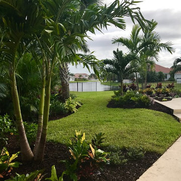
Bye Bye neighbors, you know what they say palm trees can make the best neighbors. Using Dwarf date palm and a silver fountain palm as the center piece makes for a lovely tropical buffer. Landscape designed and installed by Construction Landscape With Designs by Jennifer Bevins. Servicing The Treasure and Space Coast 772-492-8382.
 S Squared Design, LLC
This loft was in need of a mid century modern face lift. In such an open living floor plan on multiple levels, storage was something that was lacking in the kitchen and the bathrooms. We expanded the kitchen in include a large center island with trash can/recycles drawers and a hidden microwave shelf. The previous pantry was a just a closet with some shelves that were clearly not being utilized. So bye bye to the closet with cramped corners and we welcomed a proper designed pantry cabinet. Featuring pull out drawers, shelves and tall space for brooms so the living level had these items available where my client's needed them the most. A custom blue wave paint job was existing and we wanted to coordinate with that in the new, double sized kitchen. Custom designed walnut cabinets were a big feature to this mid century modern design. We used brass handles in a hex shape for added mid century feeling without being too over the top. A blue long hex backsplash tile finished off the mid century feel and added a little color between the white quartz counters and walnut cabinets. The two bathrooms we wanted to keep in the same style so we went with walnut cabinets in there and used the same countertops as the kitchen. The shower tiles we wanted a little texture. Accent tiles in the niches and soft lighting with a touch of brass. This was all a huge improvement to the previous tiles that were hanging on for dear life in the master bath! These were some of my favorite clients to work with and I know they are already enjoying these new home!
 Cummings Architecture + Interiors
Situated along Eagle River, looking across to the mouth of the Ipswich Harbor, this was clearly a little cape house that was married to the sea. The owners were inquiring about adding a simple shed dormer to provide additional exposure to the stunning water view, but they were also interested in what Mathew would design if this beach cottage were his.
Inspired by the waves that came ashore mere feet from the little house, Mathew took up a fat marker and sketched a sweeping, S-shape dormer on the waterside of the building. He then described how the dormer would be designed in the shape of an ocean wave. “This way,” he explained, “you will not only be able to see the ocean from your new master bedroom, you’ll also be able to experience that view from a space that actually reflects the spirit of the waves.”
Mathew and his team designed the master suite and study using a subtle combination of contemporary and traditional, beach-house elements. The result was a completely unique and one-of-a-kind space inside and out. Transparencies are built into the design via features like gently curved glass that reflects the water and the arched interior window separating the bedroom and bath. On the exterior, the curved dormer on the street side echoes these rounded shapes and lines to create continuity throughout. The sense of movement is accentuated by the continuous, V-groove boarded ceiling that runs from one ocean-shaped dormer through to the opposite side of the house.
The bedroom features a cozy sitting area with built in storage and a porthole window to look out onto the rowboats in the harbor. A bathroom and closet were combined into a single room in a modern design that doesn't sacrifice any style or space and provides highly efficient functionality. A striking barn door made of glass with industrial hardware divides the two zones of the master suite. The custom, built-in maple cabinetry of the closets provides a textural counterpoint to the unique glass shower that incorporates sea stones and an ocean wave motif accent tile.
With this spectacular design vision, the owners are now able to enjoy their stunning view from a bright and spacious interior that brings the natural elements of the beach into the home.
Photo by Eric Roth
 FineLine Kitchens, Inc.
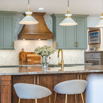
Hi everyone, I'm Sarah and Ogun we are here with fine line kitchens. So we are a couple working together. I do the interior design and remodeling of the space material selection meeting with the clients. And I handled operations outside, you know meaning all the construction work that is taking place the inside. The houses that we work in. I handle all the aspects of the construction, so today's project is very special. We're in Vienna and the client had a very big family. It's a family of seven that lives here. So we had a few aspects that we needed to keep in mind while designing this one. Having everybody be able to sit on the island. So we wanted plenty of seating all the way around. We didn't want anybody standing or anything like that. So what we did is we maximize the space. The center island is the biggest part of the kitchen. We use a natural stone to kind of give it a beautiful texture versus quartz. It's kind of standard white or kind of fabricated, so I wanted something very natural. We did this because I took my inspiration from the outside, so the inspiration if you look at the view right in front of me is there are so many greens there's a lot of brass accents and I wanted to bring this. Into this kitchen while designing it for my clients. She is very warm very. She wanted a very homey, comfy kind of look for the kitchen. So that's what we did today. As you can see, the cabinets are sage green, very light, so I still think it's a neutral, but it's a lighter color that again brings the outside in and we combine that with the oak right behind me so it's a slightly warm oak. It's not very dark. It's not very light. It's a medium brown and the same color went on the island. To kind of tie these two in and the backsplash, my favorite part is where you can see a little bit of design. It is, in my opinion still classic, but includes a pattern so the outside part is as we said in the beginning, is handled by my husband. I'd like him to speak a little bit about that. Thanks, Sarah, I want to talk to you guys a little bit about the construction part of this project. Originally this kitchen was located mostly in this area. They had their stove there sing. It was more of a peninsula layout in Sarah's and the customer vision they wanted. They wanted to get rid of the peninsula and they want to be able to have a huge island that can at least sit seven people because they're familiar with seven. So we wanted to make sure that we can achieve this design and bring it to life so that they can be happy with this layout. Some of the challenges we had, the house, the home being, you know, old home. There were a lot of you know the older electrical and plumbing that had to be replaced. We had to relocate the stove from here to this area. Over here we had put a nice foot fan that we had to relocate all the ductwork and the plumbing. Was being on the peninsula area. We had to relocate it to the center islands. So we achieved all this and kind of like bring it to bring in this kitchen up to date it looks beautiful. That's true, so yes, the old layout did not function for my clients because everything was kind of gathered on one side of the kitchen. So there was like a peninsula right there. So the end of this island kind of continued straight. And that was just the L shape. Kind of where everything was and there used to be another big table here, so they were using only kind of half of the space. So like I said at the beginning, our vision was to kind of feed everybody at the island, create some symmetry. 'cause I love that. So as you can see behind me, this is kind of the focal point symmetrical. Everything is kind of even we wanted to also panel the fridge here so it mimics the pantry and another size. So when you're looking at it, it is bringing again that symmetry back again. I hope you enjoyed this kitchen and this video and I'll see you soon. So how do you think this project turned out? It's nice. I like the color. I think it turned out nice. It's kind of like a little bit different color than what we always do. So I realize. Are you giving me a little bit of credit here that I did something different? Are you proud? I'm so proud of you. Other than that I like it. That they have kind of like a two sink. So if this was our kitchen, if we ever like you can have your own. I can have mine if we ever get into a fight then this can be like my own kitchen. Why are we gonna bring in a fight right now? So I'm cooking anyway. You're grilling most of the time, So what are you even talking about? My kitchen? That's my kitchen. You can just take the small sink. That's fine. It's always good to have your own space right there, so anyways. Thank you guys for watching. We hope to see you soon and if you have any questions please click the link below. It'll lead you to our website, house, YouTube and all of the social media is so nice to have you guys. We'll see you soon. Thanks bye bye-bye.
 RoomService 360
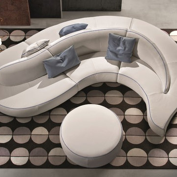
Wave Leather Sectional Sofa combines modern elements for a whimsical, somewhat unconventional layout and visual effect. Italian by origin, Wave Sectional is made by Gamma Arredamenti, juxtaposing sculptural shape with rich exquisite details. Designed to offer a 360 degree access, Wave Sectional befits any lobby or entrance hall as well as galleries that promote spherical vistas.
 FineLine Kitchens, Inc.
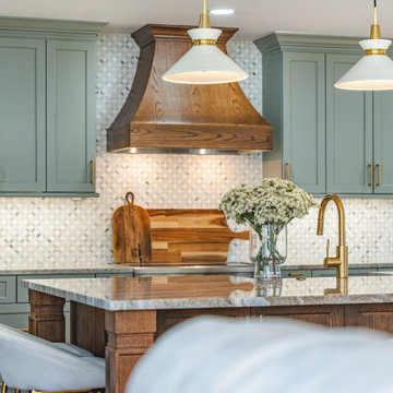
Hi everyone, I'm Sarah and Ogun we are here with fine line kitchens. So we are a couple working together. I do the interior design and remodeling of the space material selection meeting with the clients. And I handled operations outside, you know meaning all the construction work that is taking place the inside. The houses that we work in. I handle all the aspects of the construction, so today's project is very special. We're in Vienna and the client had a very big family. It's a family of seven that lives here. So we had a few aspects that we needed to keep in mind while designing this one. Having everybody be able to sit on the island. So we wanted plenty of seating all the way around. We didn't want anybody standing or anything like that. So what we did is we maximize the space. The center island is the biggest part of the kitchen. We use a natural stone to kind of give it a beautiful texture versus quartz. It's kind of standard white or kind of fabricated, so I wanted something very natural. We did this because I took my inspiration from the outside, so the inspiration if you look at the view right in front of me is there are so many greens there's a lot of brass accents and I wanted to bring this. Into this kitchen while designing it for my clients. She is very warm very. She wanted a very homey, comfy kind of look for the kitchen. So that's what we did today. As you can see, the cabinets are sage green, very light, so I still think it's a neutral, but it's a lighter color that again brings the outside in and we combine that with the oak right behind me so it's a slightly warm oak. It's not very dark. It's not very light. It's a medium brown and the same color went on the island. To kind of tie these two in and the backsplash, my favorite part is where you can see a little bit of design. It is, in my opinion still classic, but includes a pattern so the outside part is as we said in the beginning, is handled by my husband. I'd like him to speak a little bit about that. Thanks, Sarah, I want to talk to you guys a little bit about the construction part of this project. Originally this kitchen was located mostly in this area. They had their stove there sing. It was more of a peninsula layout in Sarah's and the customer vision they wanted. They wanted to get rid of the peninsula and they want to be able to have a huge island that can at least sit seven people because they're familiar with seven. So we wanted to make sure that we can achieve this design and bring it to life so that they can be happy with this layout. Some of the challenges we had, the house, the home being, you know, old home. There were a lot of you know the older electrical and plumbing that had to be replaced. We had to relocate the stove from here to this area. Over here we had put a nice foot fan that we had to relocate all the ductwork and the plumbing. Was being on the peninsula area. We had to relocate it to the center islands. So we achieved all this and kind of like bring it to bring in this kitchen up to date it looks beautiful. That's true, so yes, the old layout did not function for my clients because everything was kind of gathered on one side of the kitchen. So there was like a peninsula right there. So the end of this island kind of continued straight. And that was just the L shape. Kind of where everything was and there used to be another big table here, so they were using only kind of half of the space. So like I said at the beginning, our vision was to kind of feed everybody at the island, create some symmetry. 'cause I love that. So as you can see behind me, this is kind of the focal point symmetrical. Everything is kind of even we wanted to also panel the fridge here so it mimics the pantry and another size. So when you're looking at it, it is bringing again that symmetry back again. I hope you enjoyed this kitchen and this video and I'll see you soon. So how do you think this project turned out? It's nice. I like the color. I think it turned out nice. It's kind of like a little bit different color than what we always do. So I realize. Are you giving me a little bit of credit here that I did something different? Are you proud? I'm so proud of you. Other than that I like it. That they have kind of like a two sink. So if this was our kitchen, if we ever like you can have your own. I can have mine if we ever get into a fight then this can be like my own kitchen. Why are we gonna bring in a fight right now? So I'm cooking anyway. You're grilling most of the time, So what are you even talking about? My kitchen? That's my kitchen. You can just take the small sink. That's fine. It's always good to have your own space right there, so anyways. Thank you guys for watching. We hope to see you soon and if you have any questions please click the link below. It'll lead you to our website, house, YouTube and all of the social media is so nice to have you guys. We'll see you soon. Thanks bye bye-bye.
 Construction Landscape, LLC.
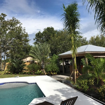
Bye Bye neighbors, you know what they say palm trees can make the best neighbors. Using Dwarf date palm and a silver fountain palm as the center piece makes for a lovely tropical buffer. LLandscape designed and installed by Construction Landscape With Designs by Jennifer Bevins. Servicing The Treasure and Space Coast 772-492-8382.
3